What is Sugimoto Seascapes?
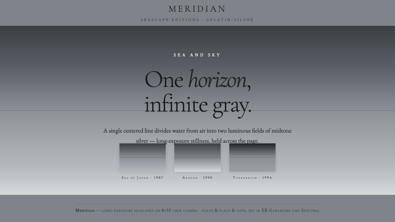
Sugimoto Seascapes holds time still at the horizon, turning sea, sky, and silence into a single luminous field of neutral gray.
Sugimoto Seascapes in brief
Sugimoto Seascapes is a visual language distilled from Hiroshi Sugimoto’s long-exposure Seascapes photographs: a centered hairline horizon divides sea from sky, while both fields dissolve into luminous neutral gray. The effect is austere but not empty. Its subject is duration itself, made visible through the almost imperceptible relationship between water, air, light, and distance.
The system depends on restraint rather than contrast. There are no warm accents, saturated colors, hard borders, or decorative effects competing with the horizon. Silver-gray grounds establish a quiet atmosphere; smooth tonal transitions create depth without illustration; and the horizon acts as the one decisive structural mark. Everything else remains subordinate to stillness.
Typography provides the human voice within this otherwise elemental landscape. Classical serif letterforms, drawn from Sugimoto’s books and portfolios and represented here by EB Garamond, introduce literary gravity without becoming ornate. The result is a design language for interfaces, editorial pages, presentations, and portfolios that treats calm as an active compositional choice.
Where does Sugimoto Seascapes come from?
The Seascapes series began in 1980 and continued across the 1990s, 2000s, and into the 2010s. Sugimoto photographed coastlines worldwide with an 8×10 view camera, using long exposure to reduce the ocean and atmosphere to two nearly unbroken tonal fields. Geography remains present, but it is deliberately quiet: the location matters less than the recurring encounter between sea, sky, and the passage of time.
The work belongs to a meeting point between conceptual photography, large-format fine-art black-and-white printing, and minimalism. Its conceptual force comes from repetition and reduction. Each image returns to the same basic condition, yet the neutral gray is never merely generic; subtle changes in light, water, and air allow duration to register without narrative or spectacle.
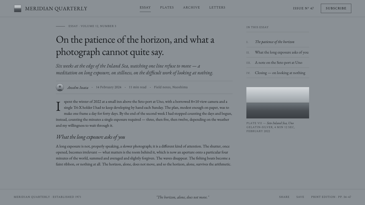
The design system translates that photographic discipline into digital form. A silver-gray ground takes the place of the printed photographic field. A fine centered rule takes the place of the horizon. Gradation replaces illustration, while the absence of sharp transitions preserves the sensation of looking through atmosphere rather than at a constructed surface. The translation is not a literal imitation of a photograph; it is an adaptation of the decisions that make the photographs feel still.
Typography completes the bridge between artwork and interface. Sugimoto’s books and portfolios establish a precedent for restrained classical serif type set against generous quiet space. In digital applications, that typographic voice keeps titles, captions, navigation, and explanatory text from becoming overly technical. The system therefore carries both sides of the source: the impersonal calm of the seascape and the considered presence of the artist’s printed page.
What defines the Sugimoto Seascapes look?
Neutral Gray
The palette is strictly neutral, moving through silver, mist, charcoal, and near-white gray rather than introducing hue. This restraint keeps attention on luminosity and atmosphere. Darker tones provide orientation and text contrast, while lighter fields preserve the sense of open air. Gray is not a compromise between colors here; it is the primary material.
Centered Horizon
The horizon is always centered and treated as a hairline rule. Its position creates equilibrium without symmetry becoming decorative. It divides the page into sea and sky while allowing both areas to remain visually continuous. The line should feel discovered rather than imposed: precise, quiet, and almost weightless.
Soft Tonal Gradation
Depth comes from continuous tonal movement instead of hard-edged shapes. Gray should drift gradually from one value to another, allowing transitions to suggest distance, haze, and reflected light. The absence of abrupt boundaries is essential. Gradation is the system’s main spatial device and must never become a decorative color effect.
Classical Serif Type
Typography uses a restrained classical serif voice, with EB Garamond as a representative reference. Letterforms should feel literary and durable, not luxurious or theatrical. A limited range of sizes and weights creates hierarchy through proportion and placement. The type supports contemplation by leaving room around words and avoiding visual urgency.
Atmospheric Space
Empty space is treated as atmosphere rather than unused background. Generous margins and unhurried gaps give the horizon room to register and prevent content from becoming crowded. Components should appear separated by air, not by ornamental dividers. The page feels composed when every element has enough distance to remain distinct.
Photographic Flatness
The system favors the flat presence of a fine-art photograph over simulated materiality. Surfaces should not imitate paper grain, glossy glass, warm film, or physical objects. Any depth must come from tone and spacing. The interface should feel like a quiet photographic plate translated into a screen, not a collection of decorated panels.
Absolute Restraint
The defining rule is subtraction. Warm accents, saturated color, aggressive contrast, hard shadows, ornamental icons, and crowded controls all weaken the system because they interrupt the sustained gaze. Every element must justify its presence through information, orientation, or rhythm. What remains should feel inevitable rather than merely minimal.
Who shaped Sugimoto Seascapes?
Sugimoto is the Japanese photographer whose international Seascapes practice supplies the source material for this design language. Beginning in 1980, he used long exposure and an 8×10 view camera to photograph sea and sky worldwide. His work joins conceptual photography, large-format fine-art black-and-white printing, and minimalism through sustained attention to time and tonal quiet.
The series is the central body of work behind the style. Its repeated structure—a single centered horizon dividing two luminous gray fields—turns variation into a question of atmosphere rather than subject. The photographs demonstrate how a very limited visual vocabulary can remain expressive when time, water, and air are allowed to carry meaning.
The horizon functions as the series’ most recognizable figure: a line that is both boundary and continuity. It separates sea from sky without turning either into a framed object. In the digital system, this figure becomes the principal organizing device, establishing calm through exact placement and allowing every other element to gather around it.
The silver-gray field is more than a background. It is the atmosphere in which content appears, carrying the soft luminosity and infinite midtone gradation associated with the photographs. Its role is to support contemplation, reduce visual noise, and make small shifts in type, spacing, and tone perceptible.
How do you use Sugimoto Seascapes today?
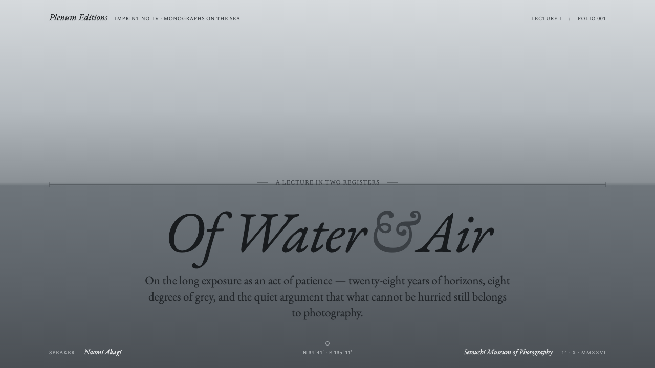
For presentation covers, use the centered horizon as the primary event. Let the title sit with ample breathing room above or below the line, using classical serif type in a restrained scale. Content slides should preserve the same quiet division and avoid filling every area with information. A cover may be nearly empty; that emptiness is part of the statement.
For content and data slides, organize information through spacing, tonal hierarchy, and placement rather than colorful diagrams or decorative panels. A chart can appear as a quiet field with a fine rule or a carefully controlled tonal distinction. Labels should remain legible without becoming dominant. The slide should feel like an extension of the seascape: measured, continuous, and precise.
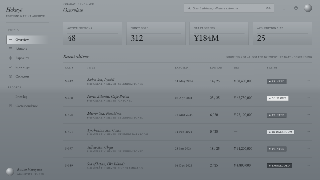
For web interfaces, the style suits dashboards and pricing pages that need authority without visual aggression. Use a silver-gray ground, restrained serif headings, neutral text, and clear tonal separation between states or tiers. Cards should feel like fields within one atmosphere rather than floating objects. Controls need simple outlines and generous spacing so that the calm remains functional rather than merely poetic.
For editorial and marketing work, Sugimoto Seascapes supports essays, portfolios, cultural programs, galleries, and products positioned around reflection or craft. Use the horizon to mark transitions, captions to provide the human scale, and broad quiet areas to frame imagery or key statements. Marketing pages can alternate light and darker neutral fields, but every shift should feel atmospheric and purposeful rather than theatrical.
The common mistake is confusing restraint with emptiness or monochrome with automatic sophistication. Adding warm beige, saturated accents, sharp cards, heavy shadows, decorative icons, or too many competing type styles breaks the source logic. Another mistake is placing the horizon wherever it happens to fit. It is the system’s central commitment: if its position, delicacy, and continuity are not respected, the result becomes generic minimalism instead of Sugimoto Seascapes.
Sugimoto Seascapes — FAQ
Is Sugimoto Seascapes simply a grayscale style?
No. Grayscale is only the visible starting point. The identity depends on the centered horizon, continuous tonal movement, atmospheric spacing, classical serif typography, and refusal of warm or saturated accents. A page can be gray and still feel unrelated if it uses hard edges, crowded composition, or decorative depth. The style is a system of attention, not merely a palette.
Can the horizon be moved to create more dynamic layouts?
The defining version keeps the horizon centered. Movement can come from the placement of type, the amount of surrounding space, or the direction of tonal gradation, but relocating the line changes the system’s central premise. If a variation is necessary, it should be understood as a distinct interpretation rather than an invisible adjustment. The horizon’s calm precision is what gives the style its identity.
Does the style require photographic imagery?
No, but any imagery should respect the source material’s quiet treatment of sea, sky, time, and atmosphere. Images work best when they remain tonally controlled and do not introduce warm color, saturated spectacle, or hard graphic separation. In some applications, a tonal field and a horizon rule may communicate the reference more faithfully than a literal photograph placed as decoration.
Can it work on a dark background?
A darker neutral field can work, especially when it is treated as a change in atmospheric density rather than a dramatic inversion. The essential conditions remain: neutrality, soft transitions, restrained type, and a quiet horizon. Avoid turning the dark version into a high-contrast interface with bright accents, sharp cards, or glowing effects, because those choices replace contemplation with spectacle.
What makes the typography feel authentic to the system?
Authentic typography is classical, restrained, and given enough space to remain legible without demanding attention. A serif family such as EB Garamond can carry titles, captions, and body text through controlled variation in scale and weight. The important qualities are literary presence and compositional patience. Ornate display faces, excessive contrast, or dense typographic layering pull the design away from the photographic source.
Related design styles
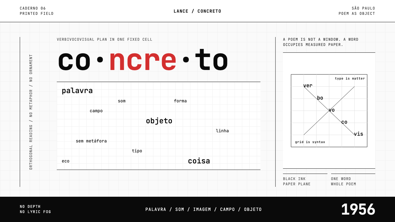 Brazilian Concrete PoetryWords become objects. Monospace cells, black-white paper, one cadmium red rup…
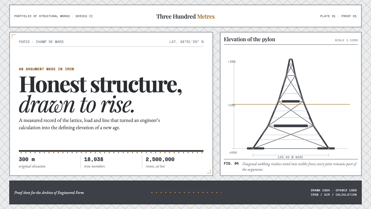 Eiffel Tower (1889)Structure speaks plainly. Graphite lattice, bronze rivets and measured type m…
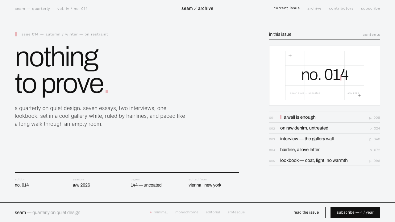 Helmut Lang MinimalismNothing to prove. Cool gallery white, 1px black hairlines, lowercase Archivo…
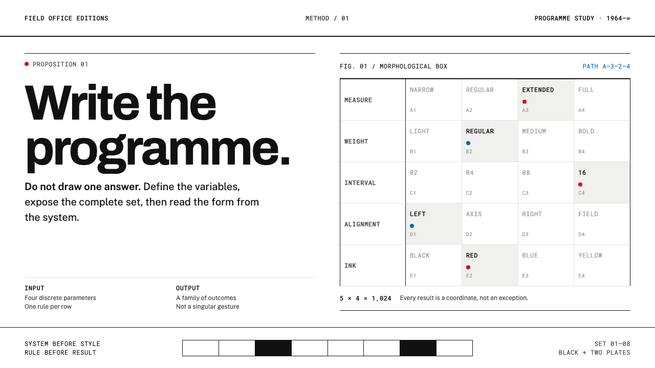 Karl Gerstner ProgrammesDesign becomes a programme. Black hairlines and a strict matrix turn paramete…
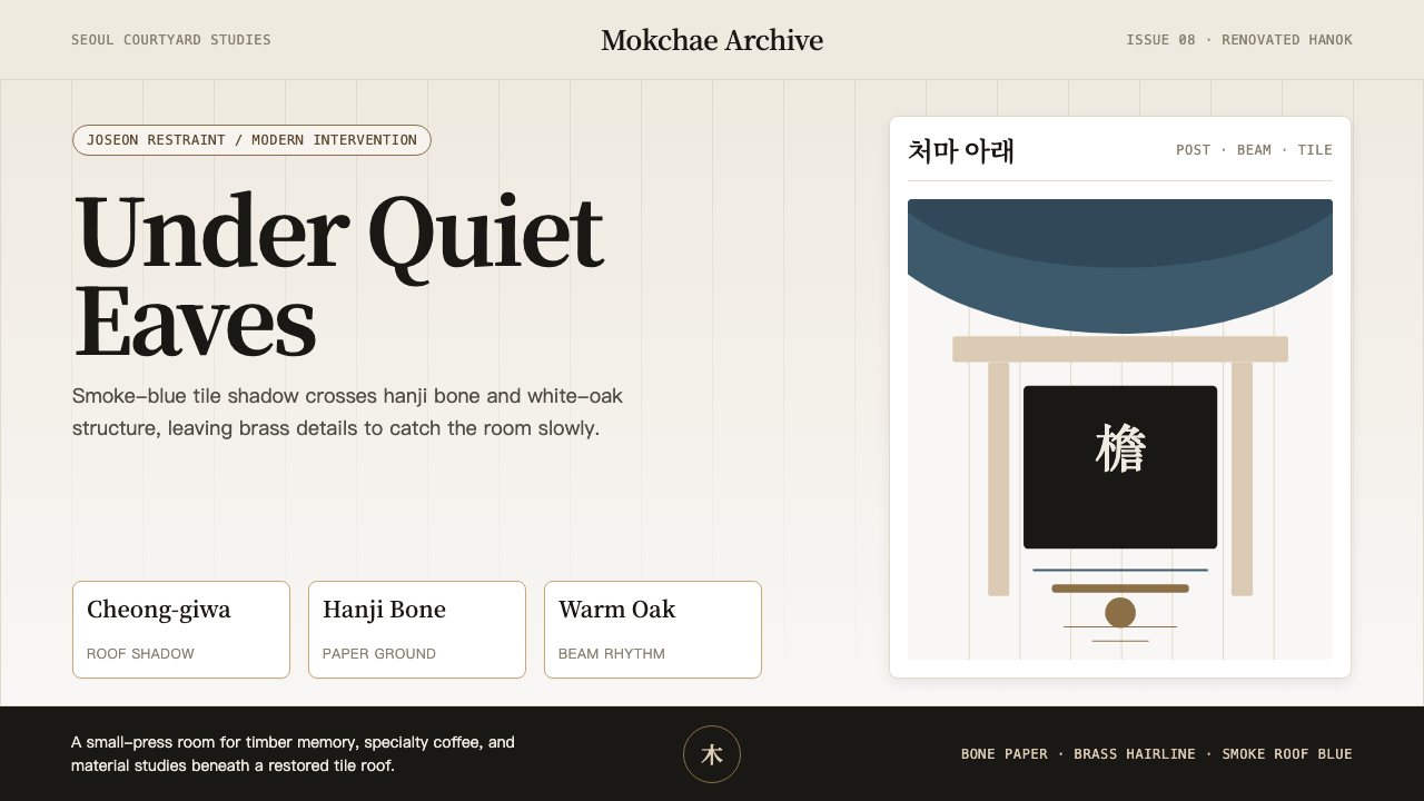 Korean Hanok Eaves RevivalJoseon restraint, not generic minimalism. Smoke-blue eaves cross hanji bone a…
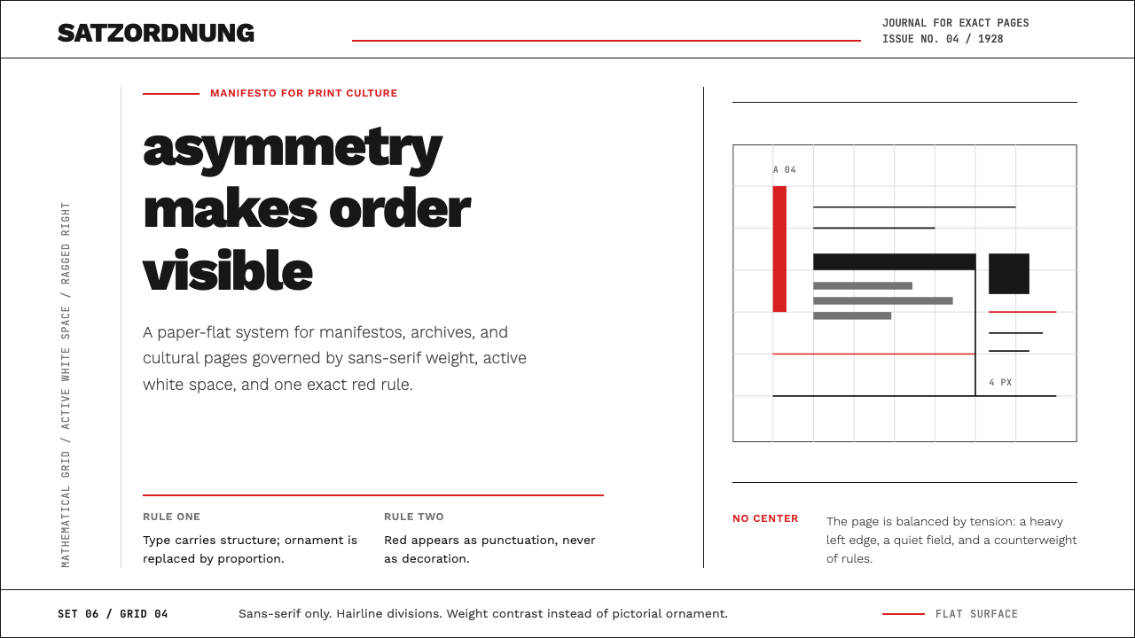 New Typography (Tschichold 1928)Tschichold's 1928 doctrine in CSS. Asymmetric grid, hairline rules, red-and-b…