What is Ikko Tanaka?
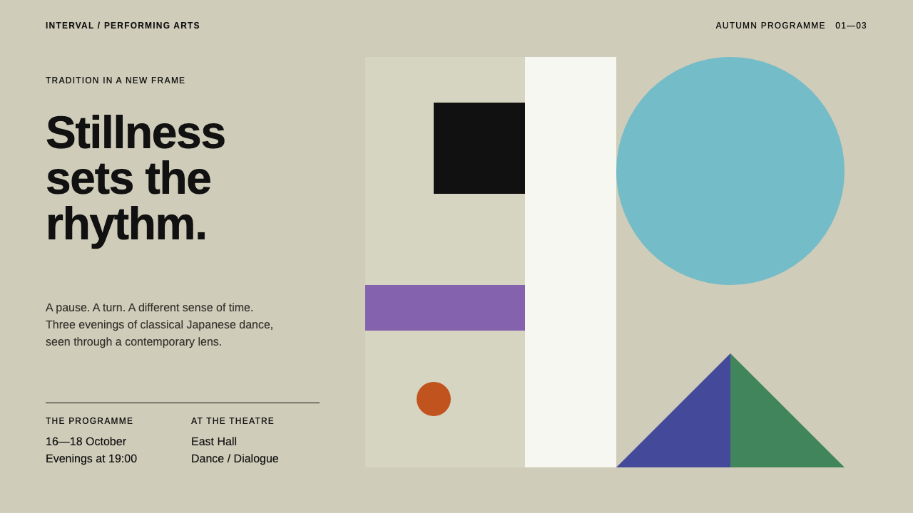
Ikko Tanaka's Nihon Buyo poster builds a dancer's face from nothing but black squares, a violet band, a white column, vermilion dots and one great sky-blue disc.
Ikko Tanaka in brief
The Ikko Tanaka style is drawn from the 1981 Nihon Buyo poster by the Japanese graphic designer Ikko Tanaka, made for UCLA in Los Angeles. In it, a dancer's face is assembled from nothing but black squares for the hair, a violet band across the brow, a white paper column for the face, vermilion circles for eyes and lips, and one large sky-blue disc standing in for a hair ornament, all sitting on flat warm-grey panels.
Every element is a whole shape with a hard edge. Colour fields carry the content, a flush-left block of Helvetica-style type carries the words, and empty panels are left empty on purpose. There is no line drawing, no shading and no gradient, only squares, circles, half-circles and right-angled triangles arranged on a modernist grid.
Applied to interfaces, the style gives calm with weight. It suits portfolios, cultural programmes and any product that wants to feel quiet and confident at once, where the layout itself is the decoration and the white space is part of the message.

Where does Ikko Tanaka come from?
Ikko Tanaka was one of the central figures of Japanese postwar graphic design. His practice, according to the sources, runs from the 1950s to 2002, and from 1980 he served as art director for Muji, the retailer whose restrained identity became inseparable from his taste. He also worked as art director for the Seibu Saison group, and he was associated with the Nippon Design Center, the agency that brought together a generation of Japanese designers. The copywriter and creative director Kazuko Koike, a long-time collaborator, is also listed among the key figures connected to the work.
The Nihon Buyo poster came in 1981, commissioned from Tokyo for the performing arts programme at UCLA in Los Angeles. It announced a programme of traditional Japanese dance, and Tanaka chose not to illustrate it with a photograph or a literal drawing. Instead, he distilled a dancer's face into geometry. The result looks at once ancient and entirely modern: a stylised face in the manner of classical Japanese painting, built from the vocabulary of European modernist grids.
That doubling is the heart of the style. It descends from the Rinpa tradition, the Japanese school known for bold, flattened, decorative treatment of nature and design, where colour fields and cut-out shapes carry the picture. Tanaka married that flatness and decorative sense to the discipline of modernism: a rigorous grid, a neutral grotesque typeface, and a clear hierarchy. The sources describe the lineage as Rinpa-influenced Japanese modernism, rooted in Japanese postwar graphic design.
Tanaka's later work, including his art direction for Muji and for Seibu Saison, used the same restraint at a larger scale. Pale grounds, empty space and a few exact shapes became a way of speaking for retail, culture and everyday objects. A design system based on the Nihon Buyo poster inherits that quiet confidence: it is easy to reproduce, because it asks for only a few forms, but difficult to do well, because every placement is exposed.
What defines the Ikko Tanaka look?
Whole shapes with hard edges
Everything is a complete geometric shape: square, circle, half-circle or right-angled triangle. Edges are crisp, with no blur, no outline and no shading. A shape is either on the page or it is not, which gives the composition its decisiveness.
Colour fields carry the content
Meaning is given by large fields of flat colour rather than by illustration: black for mass, violet for a band of accent, vermilion for small points of heat, and one sky-blue disc as the single big gesture. Colour is composed like a pictogram, not sprinkled like decoration.
Warm-grey panels
The ground is divided into flat panels of a warm, slightly greige grey. They work like the screens of a folding screen or the tiles of a grid, and they set a quiet, paper-like tone. Panels differ subtly in value so that structure is visible without lines.
Flush-left Helvetica-style type
Words sit in a neutral grotesque, set flush left in a compact block tucked into a corner. The type is plain and small relative to the shapes. It acts as caption rather than ornament, and the contrast between its neutrality and the poster's boldness creates the tension.
Empty panels left empty
Some panels carry nothing at all. This is deliberate: emptiness gives rhythm, lets the eye rest, and makes the occupied panels more powerful. The rule is to resist filling space, because the silence is part of the composition.
A modernist grid under Japanese decoration
Beneath the flat decorative surface sits a rigorous grid. Elements align to shared edges and share consistent proportions. The visual pleasure comes from the meeting of two traditions: the flatness of the Rinpa school and the order of European modernism.

Who shaped Ikko Tanaka?
Japanese graphic designer whose 1981 Nihon Buyo poster is the source of this style; his practice ran from the 1950s to 2002, with art direction for Muji from 1980.
Copywriter and creative director, a long-time collaborator of Tanaka, listed among the key figures connected with his work.
Business figure associated with the Seibu Saison group, for which Tanaka served as art director.
The Japanese design agency associated with Tanaka's early career and with the circle of postwar Japanese graphic designers.
How do you use Ikko Tanaka today?
On slides, the Ikko Tanaka style is well suited to arts programmes, design talks, cultural institutions and any presentation that wants poise. A cover can be a warm-grey panel with a single sky-blue disc and a small flush-left title. Content slides use two or three panels, one shape per idea and a lot of silence. Resist adding more shapes; the power of the style comes from what is missing.
For data slides, treat each figure as a block. Bars become solid rectangles, shares become circles or half-circles, and one value is picked out in vermilion while the rest stay black or grey. Labels sit flush left in the neutral typeface. Avoid gridlines, gradients and decorative icons; the shapes already give the chart its character.
On the web, the system fits portfolios, gallery and museum sites, performance programmes, studio pages and quiet brand sites. A grid of flat panels forms the layout; each panel may hold a shape, an image, or a block of text, and some may be empty. Interaction should be gentle: a hover that changes a panel's colour, not one that moves it. Buttons are plain rectangles or circles in solid colour.
In editorial and marketing work, the look excels at posters, programmes, catalogues and invitations. A single bold composition and a tiny block of text is often enough. Photography can be used, but it should be cropped hard to a clean shape and placed within the panel grid. Copy should be spare, factual and unhurried, in the same register as the visuals.
The common mistake is to take the geometry as a licence for clutter: adding too many shapes, too many colours, or fine decorative detail ruins the composition. Another is to soften it with rounded corners, shadows or gradients, which contradicts the whole point. Finally, do not fill the empty panels with filler content; if a panel has nothing to say, leave it blank.

Ikko Tanaka — FAQ
What is the Ikko Tanaka design style?
It is a modernist, geometric style drawn from Ikko Tanaka's 1981 Nihon Buyo poster: hard-edged squares, circles and half-circles in flat colour on warm-grey panels, with flush-left neutral type and deliberately empty space.
Who was Ikko Tanaka?
A leading Japanese postwar graphic designer. His practice ran from the 1950s to 2002, he was associated with the Nippon Design Center, and he served as art director for Muji from 1980 and for the Seibu Saison group.
What is the Rinpa influence?
Rinpa is the Japanese tradition of bold, flattened, decorative treatment, where colour fields and cut shapes carry the picture. Tanaka combined that flatness with the order of modernist grids, which is why the poster feels both traditional and modern.
What was the poster made for?
It was made in 1981 for a programme of traditional Japanese dance at UCLA in Los Angeles. Rather than illustrate dancing, Tanaka distilled the dancer's face into a few pure shapes.
Why leave panels empty?
Emptiness is part of the composition. It gives rhythm, lets the eye rest and makes the filled panels more powerful. Filling every panel would remove the calm that defines the style.
Related design styles
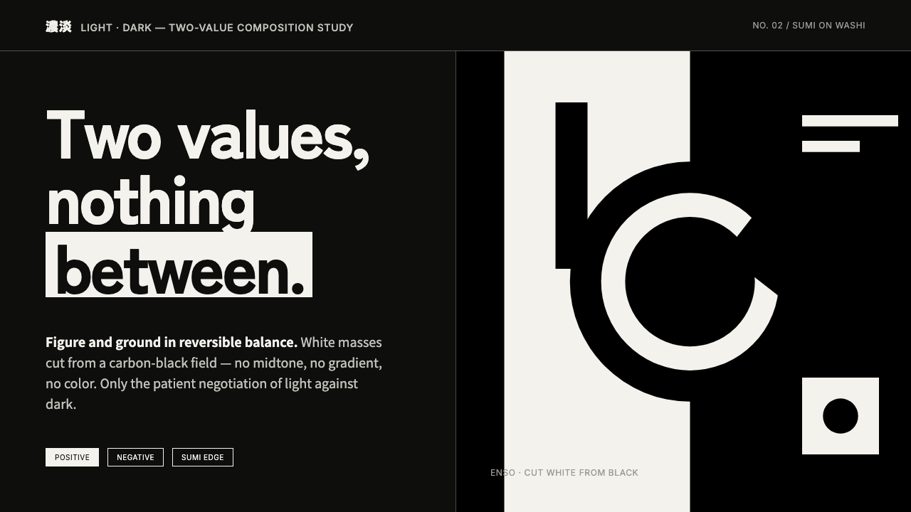 Notan Light-DarkTwo values, nothing between. White masses cut from a carbon-black field, figu…
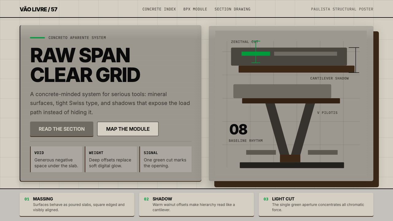 Paulista BrutalismStructural honesty, made heavy. Mineral grays, Inter grids, and walnut cantil…
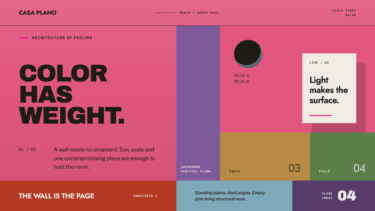 Barragán Cuadra San CristóbalColor carries the architecture. Burning pink planes, hard angles and one razo…
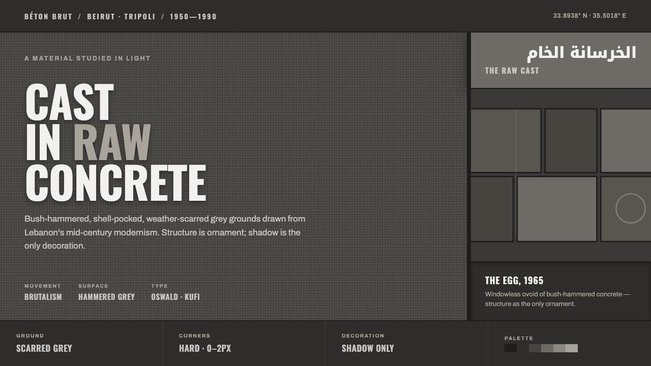 Beirut Brutalist GrayStructure is the only ornament. Scarred bush-hammered grey, monumental Oswald…
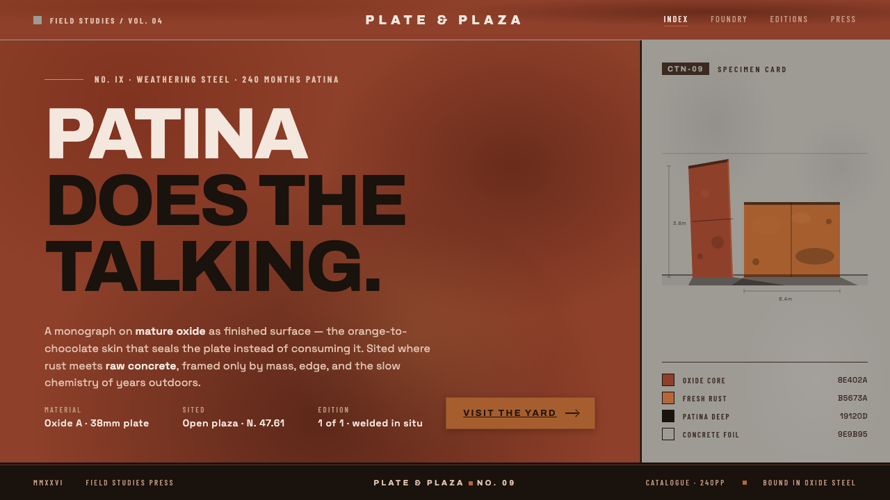 Corten Rust SculpturePatina does the talking. Saturated rust-oxide planes hard against raw concret…
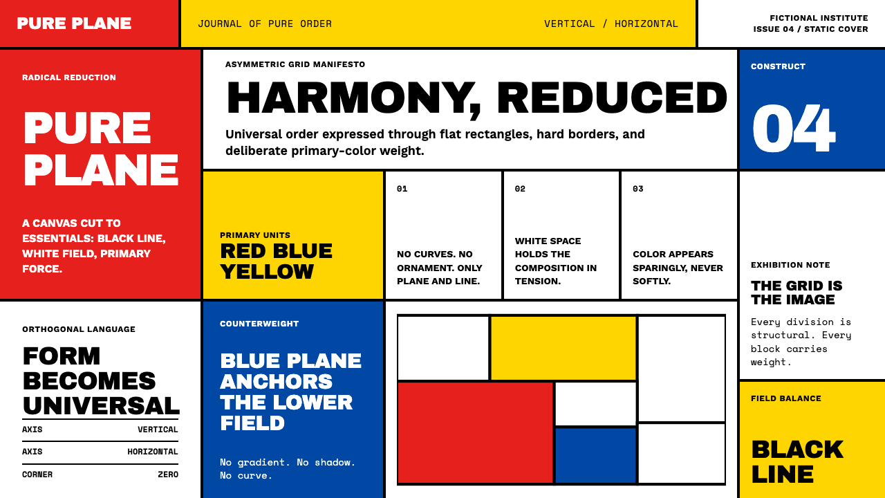 De StijlPrimary colors, locked in a black grid. Mondrian's compositions, in thick bor…