What is Barragán Cuadra San Cristóbal?
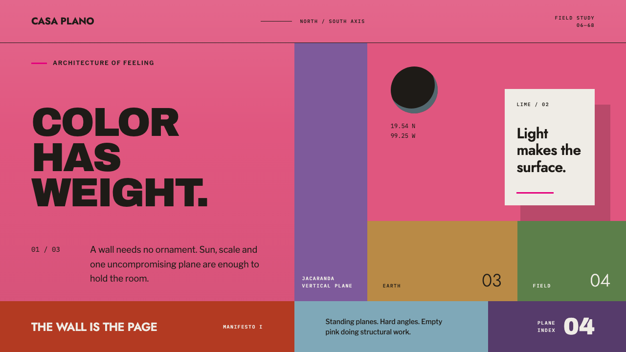
At Cuadra San Cristóbal, Luis Barragán proved that color could be architecture itself — a burning pink wall is not painted onto a building, it is the building, standing as a plane you walk beside rather than a surface applied after the fact.
Barragán Cuadra San Cristóbal in brief
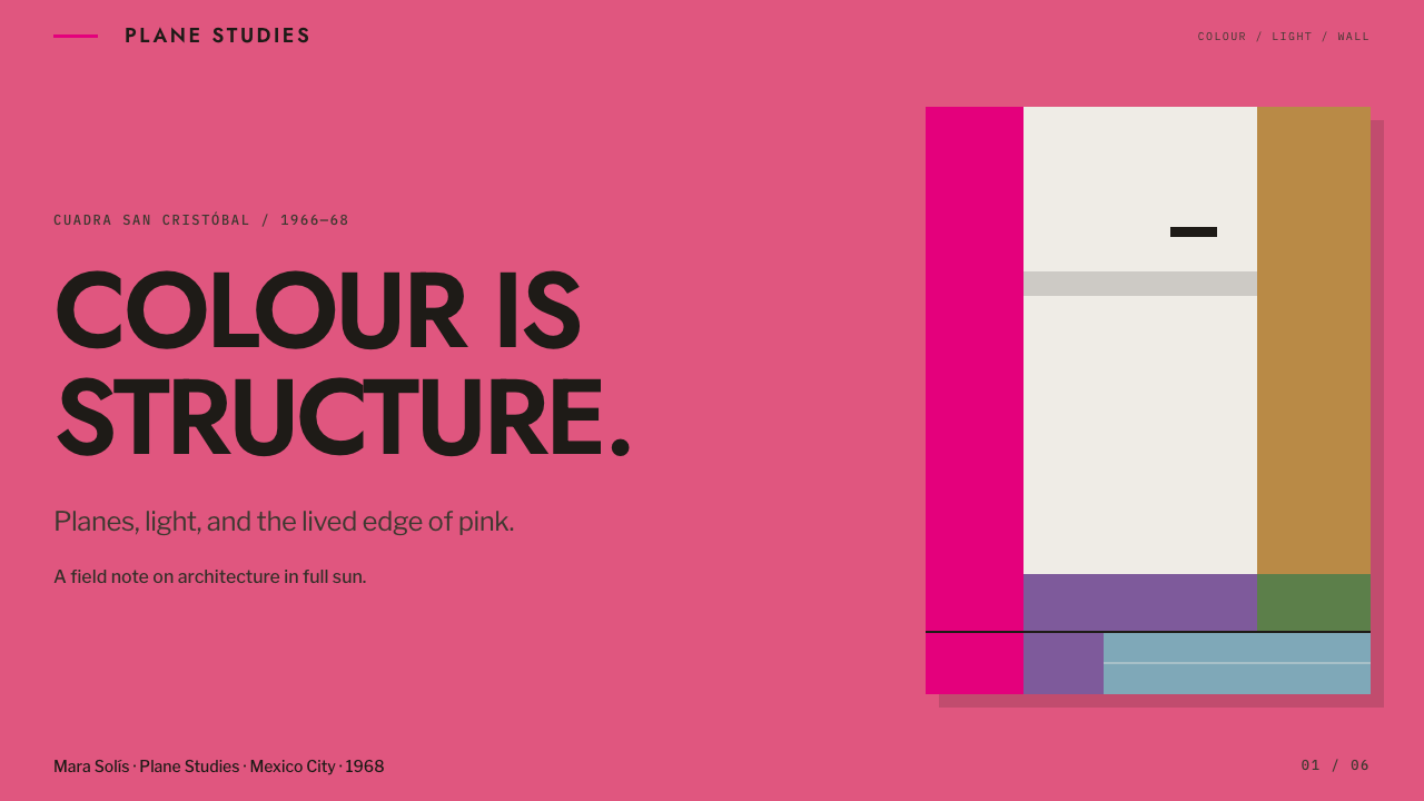
Cuadra San Cristóbal is a working stable, a house, a pool, and a fountain arranged not as a collection of rooms and facades but as a sequence of standing planes of color set against open sky and bare ground. A long pink stucco wall runs the length of the north–south axis, a lower purple wall sits alongside it, and the ground itself contributes color: ochre rammed earth and green pasture fill the space between the walls. None of this is applied ornament in the way a mural or a painted sign would be — the color is structural, inseparable from the wall it belongs to.
The visual logic that emerges from this arrangement treats color as content rather than background. A conventional building might be neutral-toned with color reserved for accents or signage; here the relationship is inverted. The pink wall is not a backdrop for something else to happen in front of — it is the primary visual event, and everything else in the composition, including the horses, the water, and the human figures who might pass through, is understood in relation to that plane.
Because the walls are flat, unadorned stucco set at hard right angles, the overall effect is one of extreme simplicity paired with extreme intensity. There is no texture play, no surface pattern, no decorative molding — just large, saturated, geometrically precise planes meeting the sky and the ground. A single hard-edged shadow, cast by the strong overhead sun typical of the Mexican highlands, becomes one of the only other compositional elements present, functioning almost like a second material in the design.
Where does Barragán Cuadra San Cristóbal come from?
Cuadra San Cristóbal was built between 1966 and 1968 in Los Clubes, a residential development in Atizapán de Zaragoza in the State of Mexico, just outside Mexico City, by the architect Luis Barragán. The project belongs to the mature period of what Barragán himself called arquitectura emocional, or emotional architecture — a conviction that a building's purpose was not merely to shelter or organize function but to produce a direct emotional and sensory response in the people who moved through it.
Barragán did not choose the project's colors alone. The specific palette at Cuadra San Cristóbal — including the burning pink of the main wall — was selected in collaboration with the painter Chucho Reyes, whose eye for saturated, culturally rooted Mexican color was central to how the final walls read. This collaboration reflects a working method in which Barragán, though the architect of record, treated color choice as important enough to require a specialist's judgment rather than treating it as a secondary architectural decision.
The project also involved the architect Andrés Casillas, who worked with Barragán on the design and construction, and the landscape contribution of Yutaka Saito, whose involvement helped situate the built planes within the pasture, rammed earth, and open sky that give the walls their sense of standing in a landscape rather than enclosing an interior. The stable's practical program — housing horses, providing a pool for them, and organizing the movement of water and animals through the site — was never separated from its aesthetic ambition; the functional and the emotional were treated as a single problem.
Cuadra San Cristóbal belongs to a broader current of Mexican modernism that, unlike much of the International Style modernism developing in Europe and the United States at the same time, refused to treat color as something to be avoided in favor of neutral concrete, glass, and steel. Barragán's work, including this project, is understood as a specifically Mexican response to modernism — one that retained modernism's commitment to clean geometric form while reintroducing intense, culturally specific color as a primary architectural material rather than an imported European restraint.
What defines the Barragán Cuadra San Cristóbal look?
Color as Structure
The defining principle is that color is never applied to a surface after the fact; it is the wall itself, inseparable from the material and the plane it forms. A design following this logic should treat its primary color choice as a load-bearing element of the composition — something the layout is built around — rather than as a decorative fill added at the end of the process.
Standing Planes
The composition is built from a small number of large, flat, vertical planes — walls set at hard right angles — rather than from complex massing or varied surface treatment. Applied to layout, this favors a small number of large, confidently colored rectangular blocks over many small decorative elements competing for attention.
Ground as Palette
Color does not come only from constructed walls; the ochre of rammed earth and the green of pasture are treated as equal, deliberate components of the overall color composition alongside the pink and purple walls. This suggests incorporating natural or textural ground tones as intentional color choices within a layout, not merely as neutral filler between designed elements.
Asymmetric, Load-Bearing Emptiness
Large areas of a single color, such as the expanse of pink wall, are left completely empty of detail, and this emptiness is not wasted space — it is load-bearing, carrying the emotional weight of the composition. In layout terms, this argues for large uninterrupted color fields positioned asymmetrically, rather than evenly distributing content and color across a balanced grid.
Hard-Edged Shadow
The strong overhead sun of the Mexican highlands casts a single sharp, hard-edged shadow rather than a soft or diffuse one, and this shadow functions as one of the composition's few additional elements. A design should use shadow sparingly and with a hard, defined edge, treating it as a compositional line rather than a soft naturalistic effect.
Right-Angled Geometry
Every wall and plane meets its neighbor at a hard right angle; there are no curves, chamfers, or softened corners anywhere in the composition. This total commitment to orthogonal geometry means a layout following this style should avoid rounded corners or soft transitions, letting every edge remain a crisp, decisive line.
Who shaped Barragán Cuadra San Cristóbal?
Barragán designed Cuadra San Cristóbal as part of his mature body of work in what he called arquitectura emocional, or emotional architecture, which held that a building's primary responsibility was to produce direct emotional and sensory experience through simplified geometric form, saturated color, water, and light. His willingness to treat color as structural rather than decorative, and his refusal to follow the neutral-material conventions of International Style modernism, make Cuadra San Cristóbal a defining statement of his approach.
Reyes, a painter, worked with Barragán to select the specific color palette used at Cuadra San Cristóbal, including the burning pink of the main wall. His involvement underscores how central color decisions were to the final architecture — treated as significant enough to warrant a painter's specialized judgment rather than being left entirely to the architect.
Casillas worked alongside Barragán on the design and construction of Cuadra San Cristóbal, contributing to the realization of the project's precise geometric planes and functional stable program. His collaboration reflects the practical, hands-on process behind translating Barragán's emotional-architecture principles into a working structure.
Saito's landscape contribution helped situate the project's standing color planes within their setting of rammed earth and pasture, reinforcing the sense that the walls stand in an open landscape rather than enclosing an interior space. This landscape integration is part of why the ground itself — its ochre and green — reads as an intentional component of the overall color composition.
How do you use Barragán Cuadra San Cristóbal today?
This style transfers into digital and print design through one central discipline: letting color occupy large, confidently empty planes rather than treating it as an accent applied to an otherwise neutral layout. The page or screen itself should be understood as the wall — color is the primary architectural material of the composition, not a finishing touch.
For presentation slides, a cover page built from a single saturated color plane occupying most of the frame, with the title set in near-black or off-white type positioned asymmetrically near one edge, captures the logic directly. Content slides should resist the temptation to add multiple accent colors; instead, one dominant saturated plane per slide, paired with a secondary structural color for a supporting block, mirrors the pink-and-purple wall relationship at Cuadra San Cristóbal.
For web interfaces, this approach suits landing pages and brand-forward sites where the goal is emotional impact rather than dense information display. A hero section built as one large color plane, with content positioned off-center and generous empty space left intentionally within the colored field, uses emptiness the way the pink wall uses emptiness — as a carrier of feeling rather than a gap to be filled. Buttons and interactive elements should sit as smaller, contrasting rectangular blocks rather than as rounded, softened shapes.
For editorial and marketing layouts, full-bleed color sections that alternate between one saturated tone and a neutral ground echo the alternation between the pink wall and the ochre or green ground at the original site. A single accent — a secondary color reserved for one call-to-action or one highlighted element — should function the way the purple wall functions: present, but clearly secondary to the dominant plane.
A common mistake when applying this style is diluting the saturation of the primary color to make it feel 'safer' or adding texture and gradient to a plane that should remain completely flat. The emotional force of this style depends on the color being bold, unmodulated, and confidently large; softening it into a pastel or breaking it up with decorative texture removes the exact quality that makes the style recognizable and powerful.
Barragán Cuadra San Cristóbal — FAQ
Why is the pink wall considered architecture rather than paint?
The pink is inseparable from the stucco wall it forms — it is not decoration applied to a neutral structure afterward, but part of how the wall was conceived and built from the start, functioning as one of the primary standing planes that organizes the entire site. Treating it as mere paint would miss the point that at Cuadra San Cristóbal, color and structure were designed as a single, unified decision.
Did Barragán choose the colors by himself?
No — the specific palette, including the burning pink of the main wall, was chosen in collaboration with the painter Chucho Reyes. This collaboration reflects how seriously color was treated in the project: significant enough a decision to bring in a painter's specialized eye rather than leaving it solely to the architect.
How does this style differ from simply using bright colors in a design?
The distinction lies in scale, emptiness, and structural role. Cuadra San Cristóbal does not scatter bright color across many small elements; it commits an entire large, flat, geometrically precise plane to a single saturated color and leaves it otherwise empty, so the color itself carries emotional and compositional weight rather than serving as an accent among many competing elements.
Why does the design avoid curves and soft edges entirely?
Every wall at Cuadra San Cristóbal meets its neighbor at a hard right angle, part of a broader commitment within Barragán's emotional architecture to simplified, geometrically precise form. Curves or softened corners would introduce a visual complexity that competes with the clarity of the large color planes, undermining the stark, confident quality that gives the composition its emotional force.
Is this style suited to information-dense interfaces like dashboards?
Not naturally. The style depends on large, uninterrupted color planes and generous emptiness to carry emotional weight, which is difficult to reconcile with the dense grids, small text, and numerous simultaneous data points typical of a dashboard. It is far better suited to landing pages, brand statements, and editorial moments where impact and mood matter more than displaying many pieces of information at once.
Related design styles
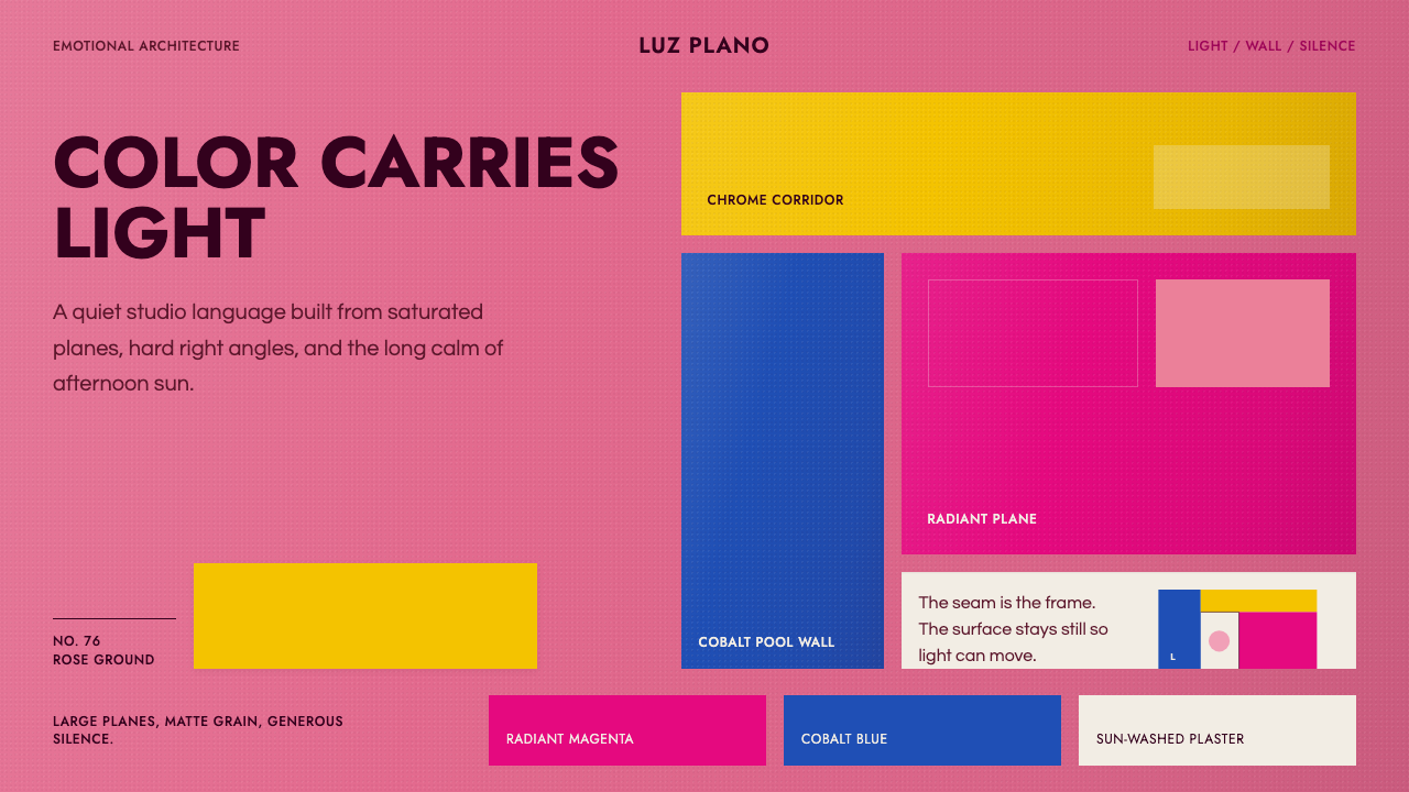 Barragán Emotional ArchitectureColor becomes architecture. Rose stucco, cobalt seams, and chrome-yellow plan…
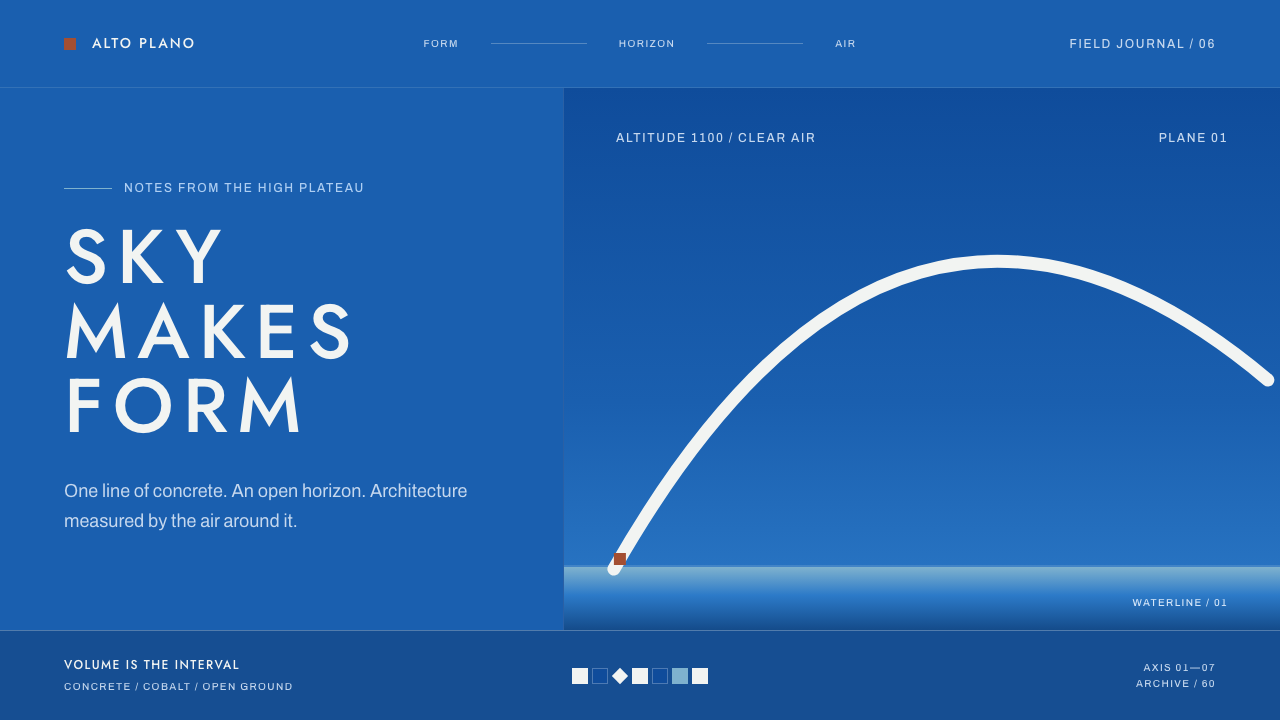 Niemeyer Brasília CurvesEmptiness makes the monument. Concrete-white arcs cut across a saturated coba…
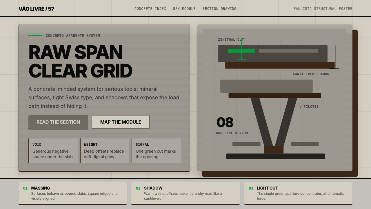 Paulista BrutalismStructural honesty, made heavy. Mineral grays, Inter grids, and walnut cantil…
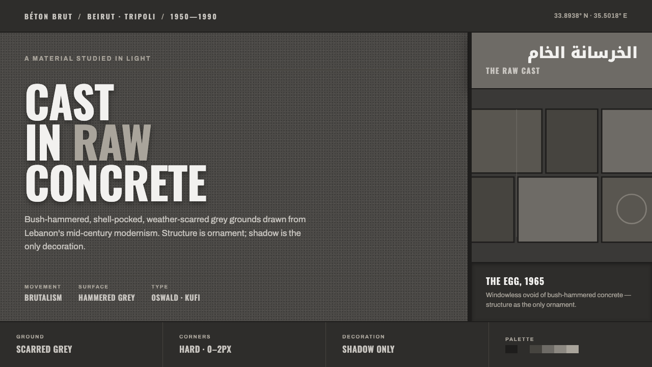 Beirut Brutalist GrayStructure is the only ornament. Scarred bush-hammered grey, monumental Oswald…
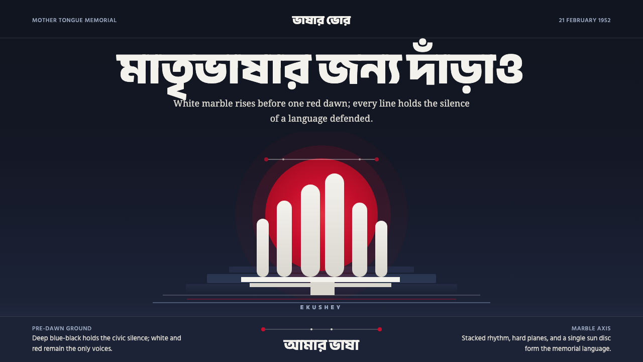 Dhaka Shaheed MinarSolemn before dawn. Marble columns and one red sun hold the page in civic sil…
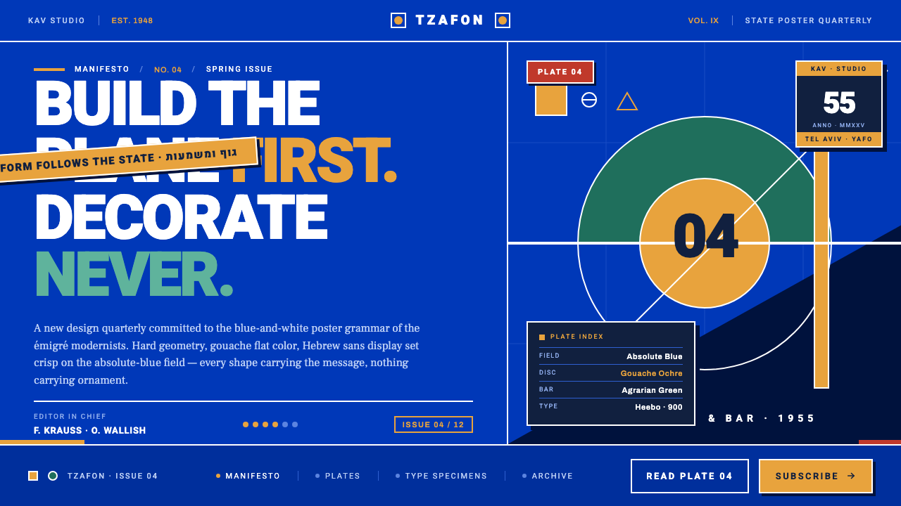 Israeli Bezalel ModernismForm follows the state. Hard Bauhaus discs and ochre bars on absolute blue, H…