What is Santiago Metro Station Art?
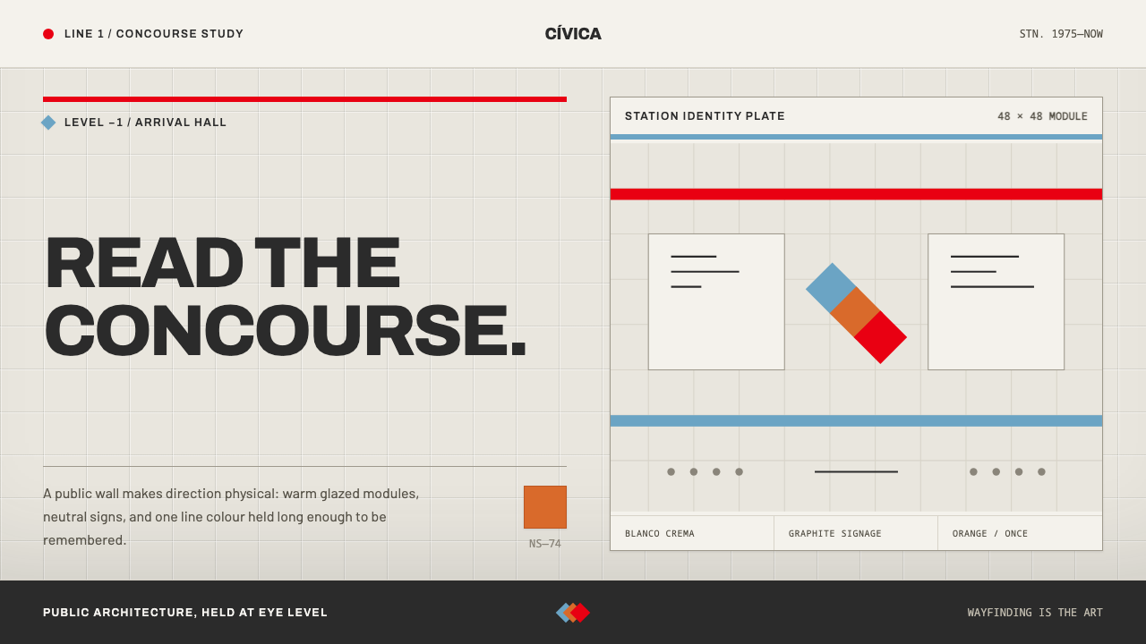
Santiago's Metro was built as state architecture, not as a branding exercise — and its clarity lives in the wall itself: warm glazed tile, hard graphite lettering and one remembered orange.
Santiago Metro Station Art in brief
The Santiago Metro Station Art style is a light-ground, warm and orderly design language drawn from the concourses of the Santiago Metro in Chile. Its identity comes from the architecture rather than from a logo: a grid of glazed tile in warm cream, graphite-colored signage in a hard grotesque voice, a colored band and pictogram that distinguish each station, and a single orange that Chileans remember from the seats of the first trains.
The Metro was built as a piece of state architecture. Line 1 opened in 1975 with concourses in glazed Muriglass tile, the walls specified as blanco crema under warm lamps, and a dark ceiling and dark floor pressing the light band into the middle of the field. Every station then earned its own color, its own pictogram and, since 1992, its own artwork. The look is clear because the building is clear: light, wall, color and sign were designed together to move people to where they need to go.
The design system is that concourse translated into screens and slides. A warm tile ground replaces white. Hard, calm lettering replaces expressive type. Colored bands divide and identify. And orange appears only where it signals something. The style is not about decoration. It is about civic clarity, the sense that a public space can be warm and legible at once, and that information design can be a form of care for the person who has to find their way.
Where does Santiago Metro Station Art come from?
The Metro belongs to a particular moment. The source record gives the era as 1950 to 1990 and anchors it with three dates: the NS-74 trains were tested in April 1973, Line 1 was inaugurated on 15 September 1975, and the MetroArte program followed in 1992 and 1993. The tradition it belongs to is state modernism in public transport, in which a government builds infrastructure as a statement of civic ambition, and the passenger's experience of space, light and information is treated as part of the engineering.
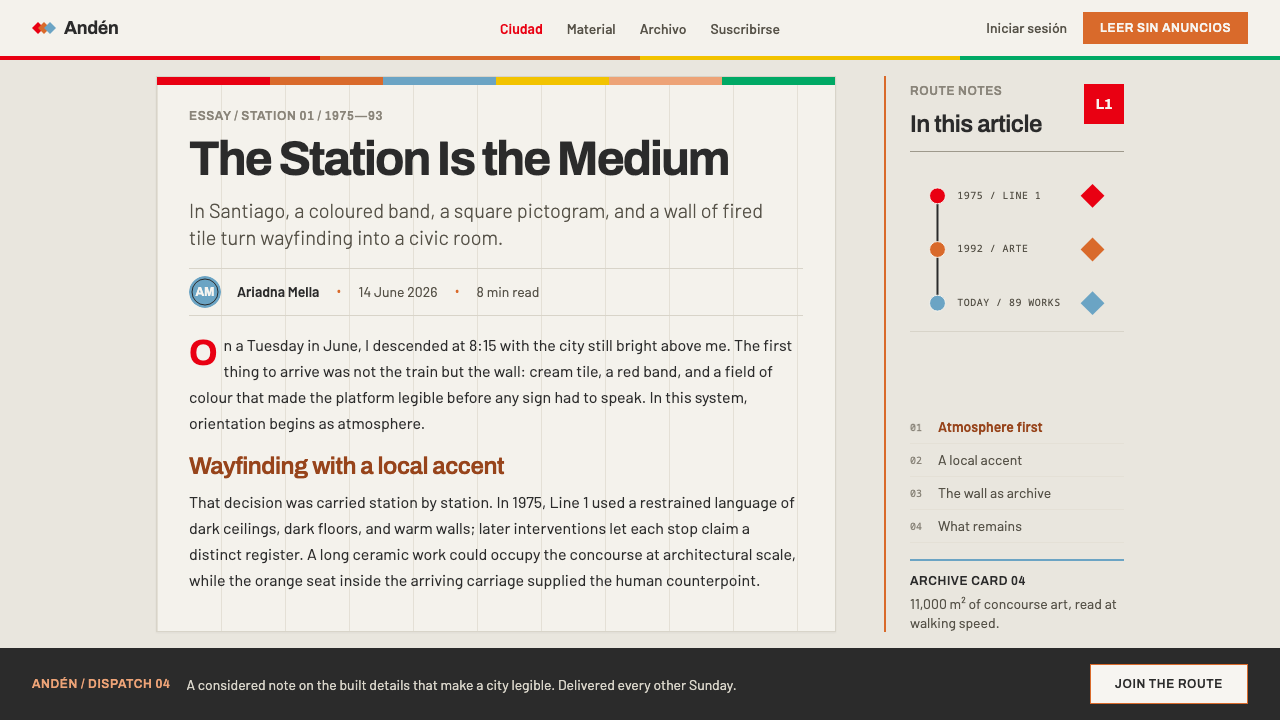
The look of the first stations came from decisions about materials and light. The concourses were clad in glazed Muriglass tile, and the walls were specified in blanco crema, a creamy white that reads warm under the lamps used in the stations. A dark ceiling and dark floor press the light into a band in the middle of the field, at the height of the passenger's eyes. This is lighting and material design acting as interface design: the brightest zone is where people look for information. The tile surface itself, modular and permanent, would later become the support for the system's art.
Wayfinding followed the same logic. Each station carries its own color and its own pictogram, so that a passenger can recognize a stop without reading, and the lettering is a hard grotesque of the kind associated with Swiss-influenced wayfinding, a cold, unlyrical voice whose job is to send people where they need to go. Then, from 1992, came a further layer: each station was given its own artwork. MetroArte has since fired 89 pieces into more than eleven thousand square metres of wall, a scale that makes the program part of the architecture rather than an exhibition hung on it. It connects the Metro to the tradition of Chilean public muralism, in which art belongs to the shared walls of the city.
One more element gives the system its memory. The first-generation NS-74 trains had orange seats, and that orange is what Chileans recall most strongly about the Metro. Within the style it is treated as a rare signal color against the cream, graphite and station bands. The names attached to the record, Juan Parrochia, Peter Himmel, Jaime Escudero and Mario Toral, point to the mixed cast of planning, design and art that built the system. For designers the lesson is that identity can be a consequence of care in the build rather than an overlay on top of it.
What defines the Santiago Metro Station Art look?
Glazed Tile Grid
The ground is a grid of glazed tile, each module small, regular and slightly glossy under warm light. The grid is not decoration but the wall's own structure, and it gives layout a natural rhythm: panels, cards and image areas align to its modules. Keep the grid present in subtle ways, through consistent gutters and alignment, rather than by drawing lines everywhere.
Blanco Crema Ground
The base color is a creamy white, specified as blanco crema, and it should always look warm, as if seen under station lamps. Pure white and pure black are both avoided. The cream keeps large surfaces comfortable, and it lets the color bands and the orange signal read clearly without glare.
Light Band, Dark Frame
A dark ceiling and dark floor press the light into a band in the middle of the field at eye height. In layouts, this becomes a composition with darker edges and a brighter central zone: a dark header and footer framing a light content area, or darker margins around a bright central column. The eye goes to the lit middle, where the information sits.
Graphite Grotesque Signage
Signage is set in a hard grotesque, calm, even and unlyrical, in a graphite tone rather than pure black. The voice is neutral on purpose: it gives instructions and does not seek to charm. Use one family, a small number of sizes, and left-aligned, clearly spaced lines. Station names and directions should be the most legible things on the page.
Station Colour Bands
Every station has its own color, shown as a band. In this system, colored bands identify sections, categories or places and divide the page into recognizable zones. Each band is a flat, confident stripe rather than a floating fill, and each color belongs to one place. A user should be able to tell where they are by color before reading a word.
Pictograms and Art in the Wall
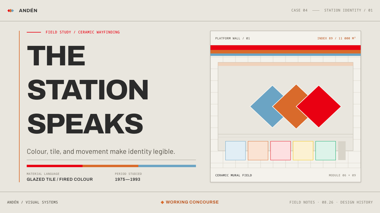
Each station has its own pictogram, a simple, geometric symbol that works at a glance, and, since 1992, its own artwork: 89 MetroArte pieces fired into more than eleven thousand square metres of wall. The art is part of the wall, not an object hung in front of it. In design, illustrations and symbols should sit inside panels and tiles, integrated into the surface, rather than float above it.
One Orange Signal
A single orange, remembered from the seats of the first NS-74 trains, is the system's signal color. It appears sparingly, for the primary action, the current location or the one thing a person must not miss. Everything else is cream, graphite and the station bands, so the orange can work as a pointer. If orange is everywhere, it signals nothing.
Who shaped Santiago Metro Station Art?
Juan Parrochia is the name the reference record attaches to the planning side of the Metro, the state-modernist ambition that treated a subway as a public building and not just a transport line. He stands for the idea that civic infrastructure can be designed with the passenger in mind from the first drawing. For designers, the value is the principle of starting with the whole system: planning, light, material and sign in a single plan.
Both names appear in the reference record alongside Parrochia and Toral, without a role specified there. They are best read as part of the circle of professionals who gave the Metro its coherent look, somewhere between the wayfinding side and the art side that the record's movements point to. The lesson is that a system this consistent is the work of several hands pulling in one direction.
Mario Toral is a Chilean muralist whose name anchors the strand of public muralism in this record. His inclusion links the Metro to the tradition in which art belongs to shared civic walls, which is the same idea MetroArte expresses by firing art into the wall of every station. For design, it supports the principle that imagery should be part of the architecture of a page.
How do you use Santiago Metro Station Art today?
Santiago Metro Station Art is a civic style. It works best wherever people must find their way, make a choice or understand where they are, and wherever warmth and authority need to coexist. It is less suited to products built on spectacle or intimacy, where its calm, public tone can feel distant.
For presentation slides, the cover can be a cream tile-grid field with a dark band above and below, the title set in graphite grotesque lettering, and one small orange mark. Content slides should give each section its own colored band and pictogram, the way each station has one, so the audience always knows where they are. Data slides should keep categories in the band colors and reserve orange for the single number or bar the audience must notice.
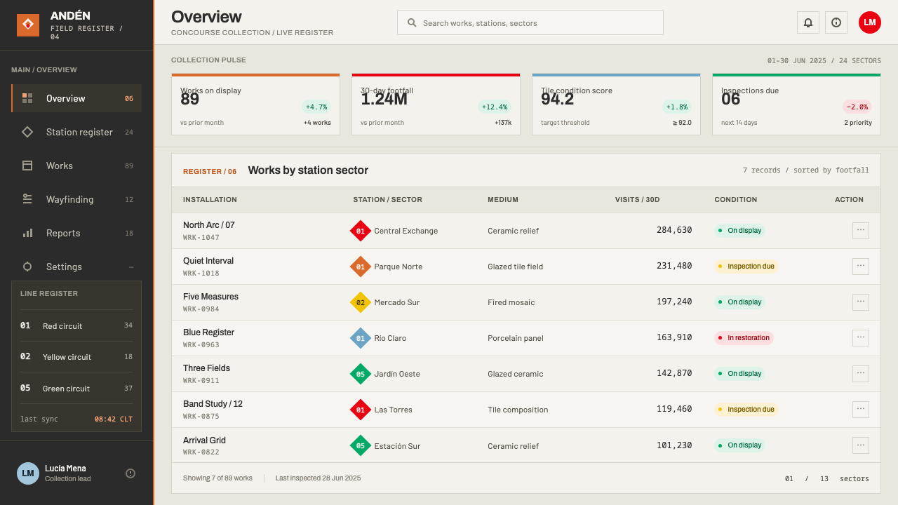
For web interfaces, the style fits transit and mobility products, public services, civic portals, utilities, ticketing, maps, onboarding flows and any dashboard where orientation matters. Build navigation around colored section bands and simple pictograms, use cream surfaces on a modular grid, keep text in one calm grotesque, and make orange the only action color. Avoid heavy shadows; the surfaces are tile, not floating cards. Confirmations and warnings can be handled with the band colors so that orange stays reserved for the primary path.
For editorial and marketing work, the style suits city guides, civic reporting, institutional publications, cultural programs and brands that want to project public-minded reliability. Section color coding gives long publications a legible map. Illustration should sit inside panels as if fired into the wall, and photography works best at modest contrast with warm tones. Campaigns can introduce a new band color per chapter while keeping the cream, graphite and orange constant.
The most common mistake is orange everywhere. When every button, link and highlight is orange, the signal disappears and the page loses its direction. The second mistake is replacing cream and graphite with pure white and pure black, which removes the warmth that makes the style feel civic rather than clinical. The third is using several typefaces or expressive display fonts, which undermines the neutral voice. And remember that colors are tied to places: reusing a band color for unrelated purposes confuses the map the user is trying to build.
Santiago Metro Station Art — FAQ
What is MetroArte?
MetroArte is the program, begun in 1992 and 1993, that gave stations of the Santiago Metro their own artworks. The record counts 89 pieces fired into more than eleven thousand square metres of wall. Because the art is fired into the wall rather than hung on it, it reads as part of the architecture, and the design style carries that over by embedding imagery in panels and tiles.
Why does the style use only one orange?
Because the orange is a signal, and a signal only works when it is rare. It comes from the seats of the first NS-74 trains, which Chileans remember more strongly than any other color of the Metro. In the style, everything else is cream, graphite and the station bands, so orange can point to the primary action, the current location or the one item that matters.
Is this a Swiss style?
Not exactly. The record describes the Metro's wayfinding as Swiss-influenced, which explains the hard grotesque lettering and the emphasis on clarity. But the overall result is distinct: a warm cream tile ground, a color-coded station system, art fired into the walls and one orange from a specific train. Think of it as a civic modernism in which Swiss clarity is applied to a warm, public, architectural surface.
Does the style suit products that are not about transport?
Yes, whenever the underlying problem is orientation. Any product with many sections, categories or locations can borrow the logic of one color and one pictogram per place, a warm neutral ground and a single signal color. It suits public services, education, healthcare navigation, large documentation sets and internal tools. It is less natural for highly expressive or playful brands.
How many colors can the system have?
As many as you have distinct places or categories, provided each color has one meaning. In the Metro, every station earns its own color, so the palette of bands can be large. The discipline is that bands stay flat and confident, the ground stays cream, the lettering stays graphite and orange stays a rare signal. Variety belongs in the bands, never in the base.
Related design styles
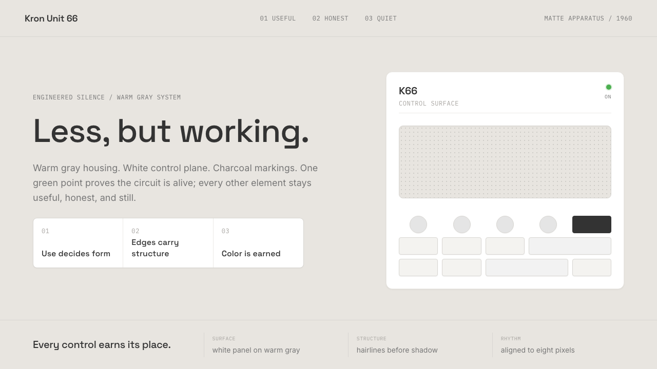 Dieter Rams / BraunQuiet by design. Warm gray, white panels, hairline grids, and one earned gree…
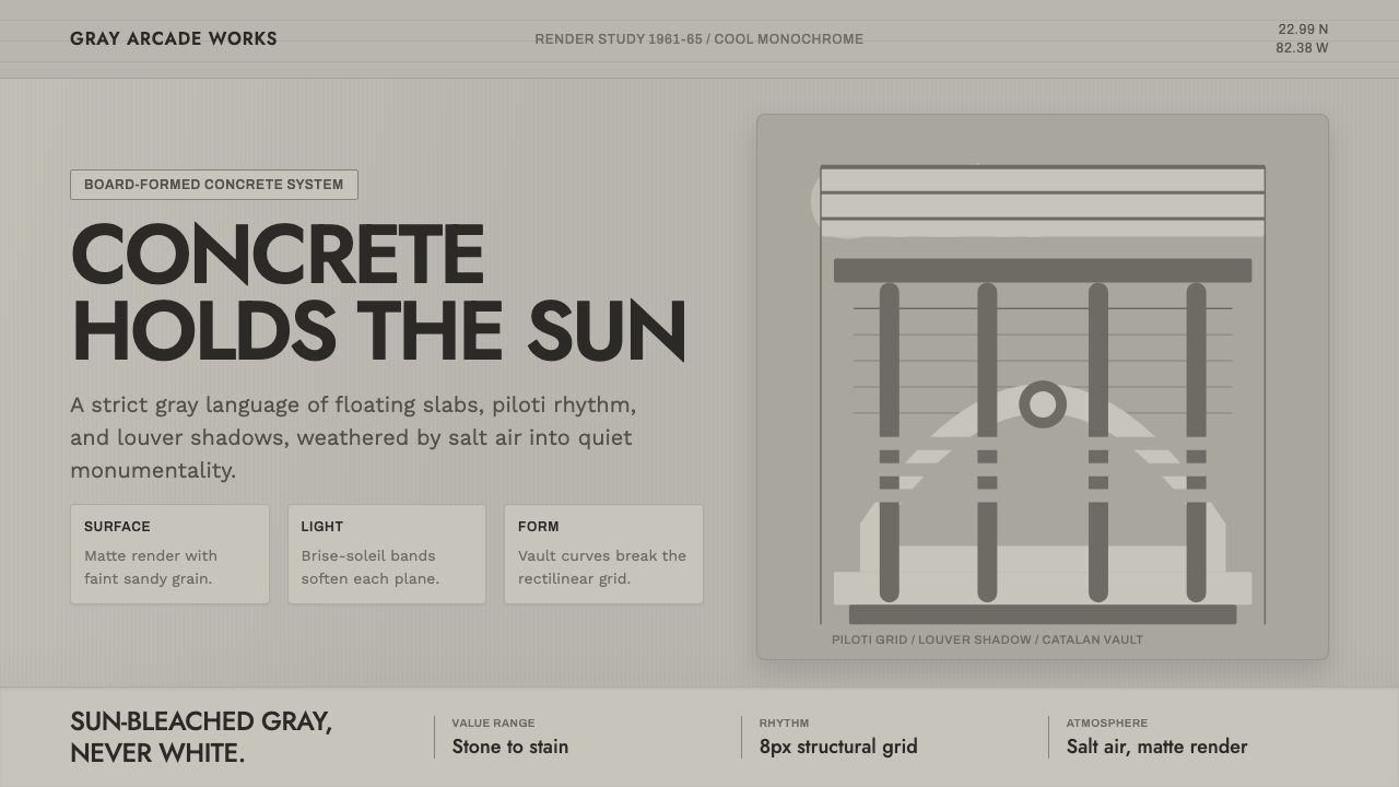 Havana Modernist GrayQuiet monumentality. Jost type, louver bands, and concrete grays hold tropica…
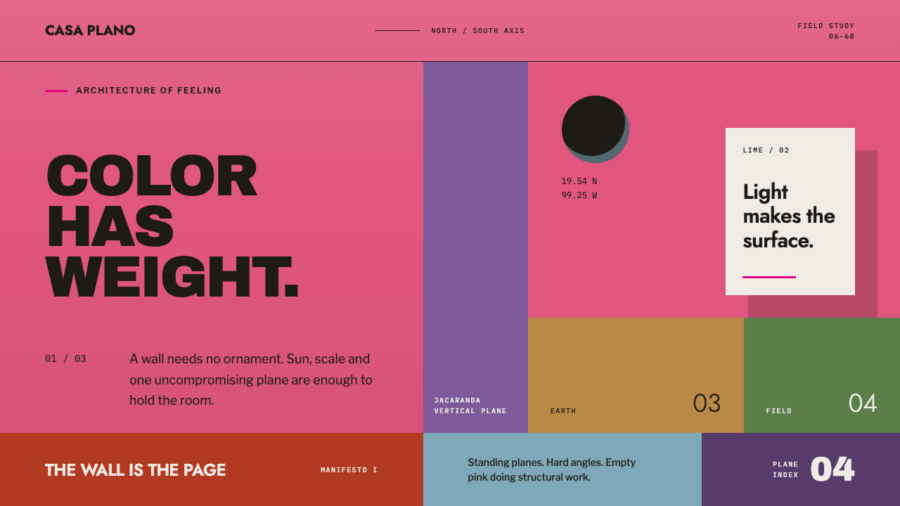 Barragán Cuadra San CristóbalColor carries the architecture. Burning pink planes, hard angles and one razo…
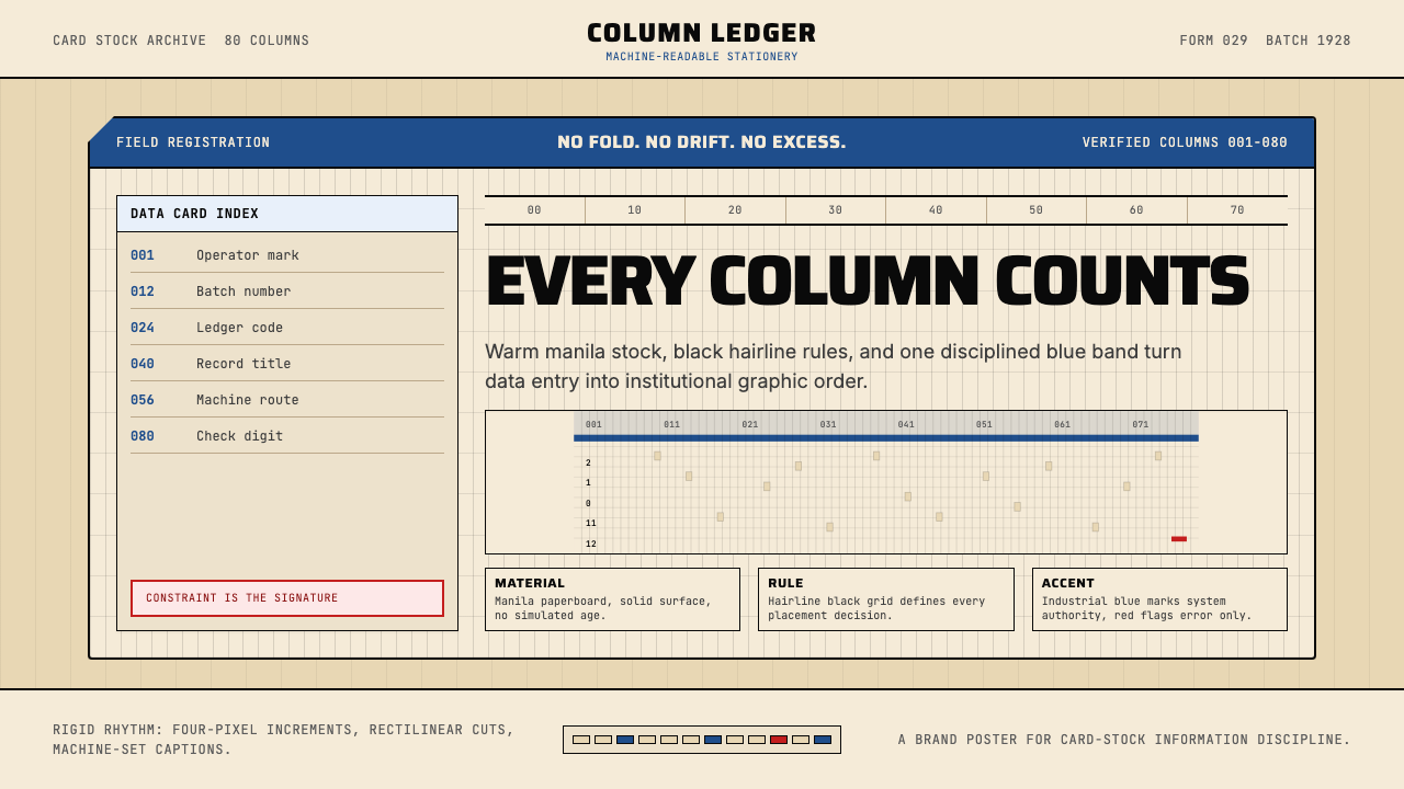 IBM Punchcard 029 (1928)Constraint becomes authority. Manila stock, hairline grid, industrial blue.
 JAL Crane MarkReduction carries authority. One red circle mark breathes on cool off-white.
 Jerusalem Stone GrayRestraint as civic virtue. Cool dressed-limestone gray-beige, ashlar coursing…