What is Tiong Bahru SIT Flats?
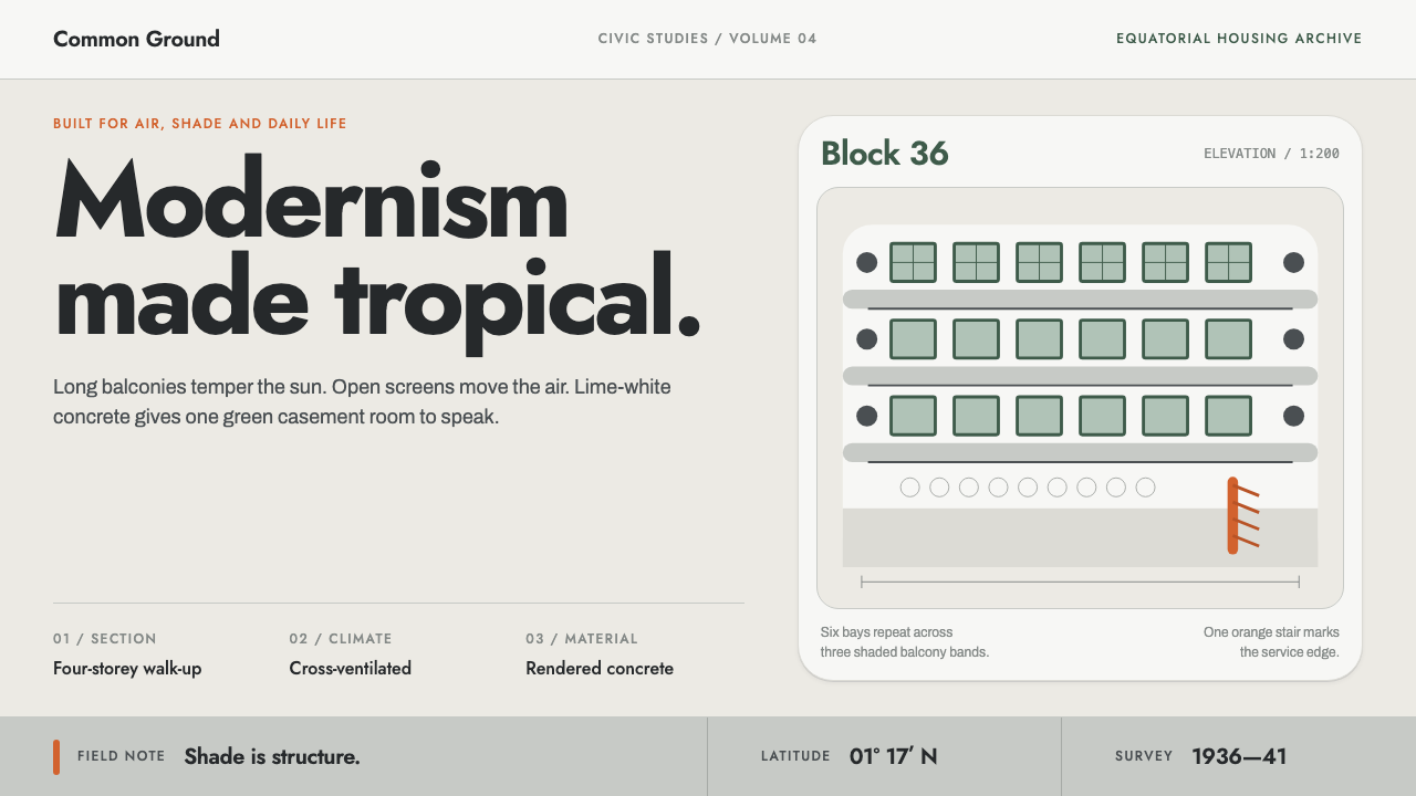
Tiong Bahru is Streamline Moderne rebuilt for the tropics: lime-white bands, rounded corners, green window frames and one orange spiral stair doing all the accenting.
Tiong Bahru SIT Flats in brief
Tiong Bahru SIT Flats is a design style taken from the pre-war housing estate that the Singapore Improvement Trust built in Singapore between 1936 and 1941. The estate is made of four-storey walk-up blocks in whitewashed, rendered concrete, with cantilevered balconies rounded at both ends, projecting horizontal fins, porthole windows and external spiral stairs painted orange. The style carries that vocabulary into design: everything runs horizontal and banded, corners are radiused rather than cut, and the palette stays on lime render until a single green window frame or a single orange stair does the accenting.
The idea behind it is modernism made tropical. Streamline Moderne, with its long horizontal lines, curved corners and ship-like details, was a fashionable international idiom in the 1930s. In a hot, humid climate it had to be re-engineered, so air-wells, pre-cast ventilation blocks and green mild-steel casements do the work that large panes of glass did in cooler countries. The result is a style that looks modern but is built around shade, air and rain. It has an elegance that is practical to the core.
Visually, the style is light, warm and disciplined. Surfaces are pale and matte; the structure is expressed in repeated bands; and there is almost no ornament apart from the gentle curve of a balcony end and the circle of a window. Colour is used once, firmly, in a small area. The restraint is the point: the estate still reads as drawn, and the design system aims to read the same way.

Where does Tiong Bahru SIT Flats come from?
Tiong Bahru was built by the Singapore Improvement Trust, a colonial-era body whose job was to provide better housing in the city, between 1936 and 1941. It is one of the earliest large public housing estates in Singapore, and the source classes it under colonial-era public housing. The Trust's housing work was later taken over by the Housing and Development Board, whose ground-floor void decks are the subject of a neighbouring style, but Tiong Bahru belongs to the earlier chapter, before independence, when public housing was a colonial project and its architecture was still being invented.
Its architectural language is Streamline Moderne, the 1930s fashion for rounded corners, strong horizontals, nautical details and smooth white walls. In Singapore the idiom met a climate that made literal copying impractical. The source describes the response as tropical modernism: air-wells to move air through the block, pre-cast ventilation blocks that make breathable screens in walls, projecting horizontal fins that shade windows, and green mild-steel casements in place of large glass panes. The porthole windows and rounded balconies keep the nautical flavour, while the structure underneath is tuned to heat and rain. The estate shows how an international style becomes local when it is made to work.
The details are worth reading as design. The cantilevered balconies are rounded at both ends, so the building's corners are soft while its lines remain strict. The horizontal fins create a rhythm of light and shadow that reads as banding from a distance. The external spiral stairs, painted orange, are the only strongly coloured elements on otherwise lime-white facades. And the green window frames provide a cool second accent. Everything else is render. The palette is therefore very limited, and each colour has a clear job.
The source records that twenty blocks were gazetted in 2003, and they still read as drawn. The conservation status is part of the story, because it signals that these buildings are valued as heritage and that the design is considered worth keeping intact. The key figures named are the architects Alfred G. Church and Langdon Williams, together with the Singapore Improvement Trust itself. The design system takes the estate literally: horizontals and bands, radiused corners, a lime-render ground, and one green or orange accent. That restraint is the design language.
What defines the Tiong Bahru SIT Flats look?
Horizontal Bands and Fins
Everything runs horizontal. Projecting fins and balcony edges create long, parallel bands of light and shadow, and the layout follows by organising content into stacked horizontal strips rather than tall columns. Rules, dividers and section backgrounds are long and level. The effect is a calm, stable, ground-hugging rhythm that suggests shelter from sun and rain, and it keeps even a dense page feeling orderly.
Radiused Corners
Corners are curved, not chamfered or cut. The balcony ends are rounded on both sides, and the style applies the same softness to panels, buttons and image frames. The radius is consistent and moderate: a generous curve, not a pill or a circle. It brings a gentle, streamlined look without turning playful. The straight lines stay strict while the ends soften, which is exactly how the buildings read.
Lime Render
The ground is the colour of limewash on rendered concrete: a warm, pale, slightly greenish white-grey. It is not stark white and it is not cream; it is the neutral of a building that has weathered gently in humid air. The tone is matte and chalky, with no gloss. It lets the accents show clearly and keeps the whole composition light, airy and sun-bleached.
The Single Green
Green appears as the colour of the steel window frames, a deep, cool, slightly greyed green set against the pale render. It is used in a limited number of places, as an outline or a small block, and never as a large wash. The green provides the system's quiet accent and also the colour for interactive or structural elements such as links, borders and selected states.
The Orange Stair
The external spiral stair, painted orange, is the estate's one loud note. The style honours that by using orange once per composition, as a single decisive accent: a call to action, a key figure, or a vertical or spiral element. If green is the system's quiet accent, orange is its signature. It should never share the stage with a second loud colour, or the stair stops being a stair and becomes decoration.
Porthole and Air-Well Openings
Round windows and open air-wells punctuate the facades. In design they appear as circular crops, round icons and framed openings used sparingly to relieve the horizontals. The circle is the only strong curved shape besides the radiused corner, and it signals a ship-like, streamlined origin. Openings are always functional-looking: they let something through, whether light, air or the eye.
Ventilation-Block Texture
Pre-cast ventilation blocks make perforated screens in the walls, with repeating openwork patterns that let air through while giving privacy. As a motif they supply a regular, geometric texture: a lattice of small repeating shapes that can fill a header, a side panel or a divider. It is a texture that is also a structure, so it should be used in small, disciplined doses and kept to the same pale-on-pale tonal range as the render.

Who shaped Tiong Bahru SIT Flats?
An architect named in the source among the key figures of the estate, associated with the Singapore Improvement Trust's pre-war design work. Whatever the exact division of labour behind the drawings, the name stands for the authored idiom of the estate: Streamline Moderne adapted to climate, executed with controlled repetition. For the design system he is the figure behind the discipline of banding, rounding and restrained accent.
Another architect named in the source, listed alongside Church. The pairing of two named architects with an institution mirrors how the buildings read: individual authorship submerged in a consistent collective language. The estate does not announce a star hand; it shows a shared vocabulary applied across blocks, which is the model for how a design system should scale.
The colonial-era body that commissioned and built the estate between 1936 and 1941, created to improve housing conditions. As the client, it chose a modern, ventilated, practical form of mass housing and carried it through to a consistent result. Its later duties were taken over by the Housing and Development Board. In the design system it stands for the institutional patience that lets a restrained idea stay intact for decades.
How do you use Tiong Bahru SIT Flats today?
Tiong Bahru SIT Flats is a strong choice for brands and products that want to feel modern without being cold, local without being nostalgic, and calm without being dull. It suits architecture, hospitality, lifestyle, property, culture and any product that values good proportion and clear air.
For presentation slides, a cover can use a lime-white field with a long horizontal band across the lower third, a single rounded panel for the title and one orange accent, such as a small circle or a spiral-like element. Content slides stack horizontal strips, each carrying one idea, with consistent radiused corners. Data slides suit horizontal bar charts, timelines and stacked bands, with green for the main series and orange held for the single highlighted value.
For web interfaces the style fits booking platforms, property listings, cafe and boutique sites, portfolios and well-being apps. Cards and buttons have a moderate corner radius; section backgrounds alternate in long pale bands; navigation is a clean horizontal bar. Green handles links, borders and selected states, and orange is reserved for the primary action or the one thing the user must not miss. Pricing pages work well as three horizontal strips, one per plan, rather than three tall columns.
For editorial and marketing work the style suits architecture writing, neighbourhood guides, hotel and travel pages, and campaigns that celebrate craft and place. Layouts use wide margins, long horizontal images and captions set on pale bands. Photography of buildings, balconies and stairs fits naturally, shot straight-on and in daylight, so that the horizontal lines are preserved.
The common mistake is to treat the palette as three equal colours. The lime render must dominate, with green and orange as small, separate accents; if all three share the page equally, the restraint disappears. The second mistake is over-rounding: pill buttons and circular cards turn a streamlined idiom into a toy. A third is to add decorative ornament or heavy shadows, which contradicts the plain, rendered surface. Keep the horizontals, keep the radius moderate and keep the accents singular.

Tiong Bahru SIT Flats — FAQ
What is Streamline Moderne, and how is this different from it?
Streamline Moderne is a 1930s idiom of long horizontal lines, rounded corners and ship-like details on smooth white walls. This style takes its vocabulary from one tropical estate, Tiong Bahru, so it adds climate-driven features: ventilation-block screens, air-wells, green steel window frames and an orange external stair. It is Streamline Moderne with a local, practical accent and a very small palette.
Why only one accent colour at a time?
Because the estate does it that way: pale render, then one green window frame or one orange stair. Using the accents sparingly makes each of them meaningful and keeps the page light. If green and orange appear together in large amounts, the restraint that defines the style is lost, and the composition becomes a generic tri-colour scheme.
How round should the corners be?
Round enough to read as a deliberate curve, not so round that the shape becomes a pill or a circle. The balconies are rounded at both ends while the lines between them stay straight, so the right approach is a consistent, moderate radius applied to panels, buttons and image frames. Keep long edges straight and let only the ends soften.
Is this a nostalgic or heritage style?
It draws on a heritage-listed estate, but the effect is modern rather than nostalgic. The buildings were fresh and forward-looking when built, and the style keeps that clarity: bands, curves, light surfaces and a single accent. It suits contemporary products that value place and craft, and it avoids sepia, faux wear or other markers of the past.
Can it work on a dark background?
The style is built on pale lime render and daylight, so it is naturally a light system. A dark version is possible, but the pale-on-pale tonal harmony and the sun-bleached feel would be lost. If you go dark, keep the horizontals and radiused corners, keep the accent colours singular, and use a dark neutral that is warm rather than blue-black.
Related design styles
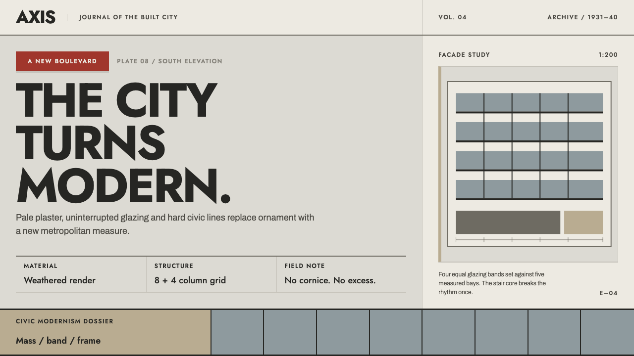 Bucharest Interwar ModernismModernism gathers civic weight. Sooted plaster, strict glazing bands and one…
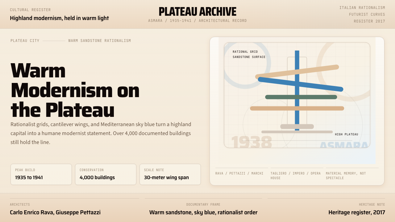 Eritrean Asmara Italian ModernismHuman modernism, not cold monumentality. Sandstone panels, sky-blue cantileve…
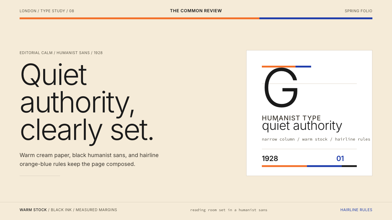 Gill Sans (BBC, 1928)Quiet authority, clearly set. Warm cream, black humanist sans, and hairline o…
 Nordic Classicism AsplundStone, not cream. Engraved Trajan capitals on cool chalk stucco, fluted colum…
 Ordnance Survey One-InchPrecision has a paper trail. Buff margins, red contours and engraved black ru…
 Santiago Metro Station ArtCivic clarity lives in the wall. Glazed tile grid, graphite signage, one oran…