What is Barragán Emotional Architecture?
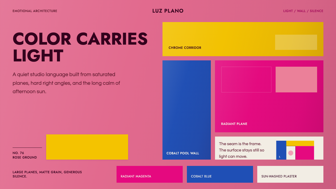
Barragán Emotional Architecture treats color as a structural material — not a coat of paint over a wall, but the very thing that makes a plane of stucco glow, calm, or hold the light of a Mexican afternoon.
Barragán Emotional Architecture in brief
Barragán Emotional Architecture distills the work of Mexican architect Luis Barragán, and in particular his 1976 house Casa Gilardi, into a system built on large, flat planes of saturated color rather than pattern, texture, or ornament. A wall here is not decorated; it is a single plane of rose-pink or radiant magenta stucco, smooth-troweled and left otherwise bare, so that its color is the entire architectural statement.
What distinguishes this from ordinary bright-color design is the treatment of light. Barragán built for the specific, raking quality of Mexican sunlight — walls positioned to catch low sun at an angle so that a flat plane of color appears to glow from within rather than simply reflecting light evenly. Cobalt-blue corridors and chrome-yellow columns sit alongside the rose stucco, each color occupying its own plane rather than blending into the next, so that moving through a space means moving through a sequence of distinct colored volumes.
The system is equally defined by what it withholds. Negative space is generous and deliberate — walls stand empty of ornament, courtyards stay uncluttered, and green, Barragán's one forbidden color, is reserved entirely for planted gardens and never appears on a built surface or in an interface. This restraint is what keeps a palette this saturated from feeling loud: every color plane has room to breathe, and nothing competes with it.
Where does Barragán Emotional Architecture come from?
Luis Barragán, born in Guadalajara in 1902, trained as a civil engineer before turning to architecture, and spent early formative years traveling through Morocco and Spain, where he absorbed the walled courtyards, quiet reflecting pools, and saturated color of Moorish and Andalusian building traditions. He brought these impressions home to Mexico and fused them with the vernacular architecture of Mexican haciendas and convents — thick walls, high enclosures, and an interior life turned inward and away from the street.
In the early 1950s, working alongside the German-Mexican sculptor Mathias Goeritz, Barragán helped articulate the concept of arquitectura emocional, or emotional architecture — the position that a building's first duty is to move whoever inhabits it, not merely to serve function efficiently. This idea, developed around their collaboration on the experimental museum-chapel El Eco, became the guiding principle behind Barragán's mature work: architecture as an instrument for producing calm, wonder, or serenity through space, light, water, and color alone.
Casa Gilardi, completed in 1976, was Barragán's last major residential commission and is widely treated as the fullest, most concentrated expression of his mature language. Built around a narrow site, the house is organized as a sequence of colored volumes — a cobalt-blue corridor that opens unexpectedly onto an indoor swimming pool lit from above, with a single chrome-yellow column rising directly out of the water. The house demonstrated that Barragán's approach could resolve an unusually constrained, narrow urban lot into a sequence of dramatic, emotionally distinct spaces using color and light rather than added square footage.
Barragán's honors and legacy carried his language forward well past his own lifetime — he won the Pritzker Architecture Prize in 1980, international architecture's highest honor, and his own home and studio in Mexico City was later inscribed as a UNESCO World Heritage Site, one of the few twentieth-century buildings in the Americas to receive that designation. His archive is now held and stewarded by the Barragán Foundation, and successive generations of architects, from Mexico and internationally, continue to cite his handling of color, light, and enclosure as a foundational reference for how saturated color can function as architecture rather than surface decoration.
What defines the Barragán Emotional Architecture look?
Color as Architecture
In this system, a color is never applied as a finish over a neutral structure — it is the structure's identity. A wall's rose-pink or a corridor's cobalt-blue is not a paint choice layered on afterward; it is treated as inseparable from the plane itself, the way Barragán's stucco walls carry no other visual information beyond their single, saturated hue. Removing the color would mean removing the architecture, not just its decoration.
Rose and Magenta Stucco
The system's signature warm tone is a smooth-troweled rose-pink that shifts toward a more radiant magenta in stronger light — a hand-finished, matte plaster surface rather than a printed or glossy one. This warmth is not soft or pastel; it is confident and saturated enough to hold its own against strong sun, reading as substantial and grounded rather than decorative or delicate.
Cobalt Blue Planes
Deep cobalt blue appears as a cooling counterpoint to the warm rose, typically used for corridors, water, and enclosing walls that frame a sequence of movement through space. Where the rose reads as warmth and openness, the cobalt reads as depth and containment — the color of a passage rather than a destination, guiding the eye and the body toward what comes next.
Chrome Yellow Accents
Yellow appears sparingly and with maximum impact — a single plane or vertical element rather than a broad field, positioned to catch direct light and act as a focal point within an otherwise calmer composition. Its rarity is the source of its power: because chrome yellow is used so selectively, wherever it appears becomes the place the eye is meant to land first.
Raking Sunlight and Shadow
The system assumes a strong, directional, low-angle light source, the specific quality of Mexican sunlight at midday and late afternoon, and every flat color plane is understood as something that light moves across rather than something lit evenly and neutrally. A wall's color shifts in intensity through the day, and hard-edged shadow becomes a compositional element in its own right, dividing a single colored plane into brighter and darker zones.
Generous Negative Space
Walls, courtyards, and corridors are left deliberately empty of ornament, texture, or applied pattern, giving each saturated color plane room to be read on its own rather than competing with surrounding detail. This restraint is what allows a palette this intense to feel calm rather than overwhelming — quiet is treated as a material in its own right, placed with the same intention as color.
Green Reserved for Nature
Green is the one color deliberately excluded from every built surface — walls, floors, furnishings — and reserved entirely for planted courtyards and gardens seen through an opening or from a window. This absence is a rule, not an oversight: by keeping green out of the architecture itself, the system preserves a clear boundary between what is built and what is alive, and makes the garden, when it does appear, feel like a considered reveal rather than incidental landscaping.
Who shaped Barragán Emotional Architecture?
Barragán, born in Guadalajara in 1902, developed a mature architectural language that fused the walled courtyards and saturated color of Moorish and Andalusian tradition, absorbed during travels through Morocco and Spain, with the vernacular forms of Mexican haciendas and convents. He was awarded the Pritzker Architecture Prize in 1980, and his own house and studio in Mexico City is now a UNESCO World Heritage Site — a rare distinction for a twentieth-century residential building.
The German-Mexican sculptor Goeritz collaborated closely with Barragán in the early 1950s, and together they articulated the concept of emotional architecture — the idea that a building's primary purpose is to move the spirit of whoever inhabits it. Their joint work on the experimental museum-chapel El Eco gave the concept its first built expression and set the philosophical foundation for everything Barragán designed afterward, including Casa Gilardi.
Completed in 1976 on a narrow urban site in Mexico City, Casa Gilardi was Barragán's last major residential work and is treated as the clearest, most concentrated statement of his mature style — a sequence of cobalt-blue corridor, indoor sunlit pool, and single chrome-yellow column that turns a constrained lot into a dramatic architectural experience built almost entirely from color and light.
Following Barragán's death in 1988, his archive of drawings, photographs, and project records passed into the stewardship of the Barragán Foundation, which continues to manage and preserve the record of his built and unbuilt work. The foundation's holdings remain a primary reference point for architects and historians studying how his handling of color, enclosure, and light was actually constructed.
How do you use Barragán Emotional Architecture today?
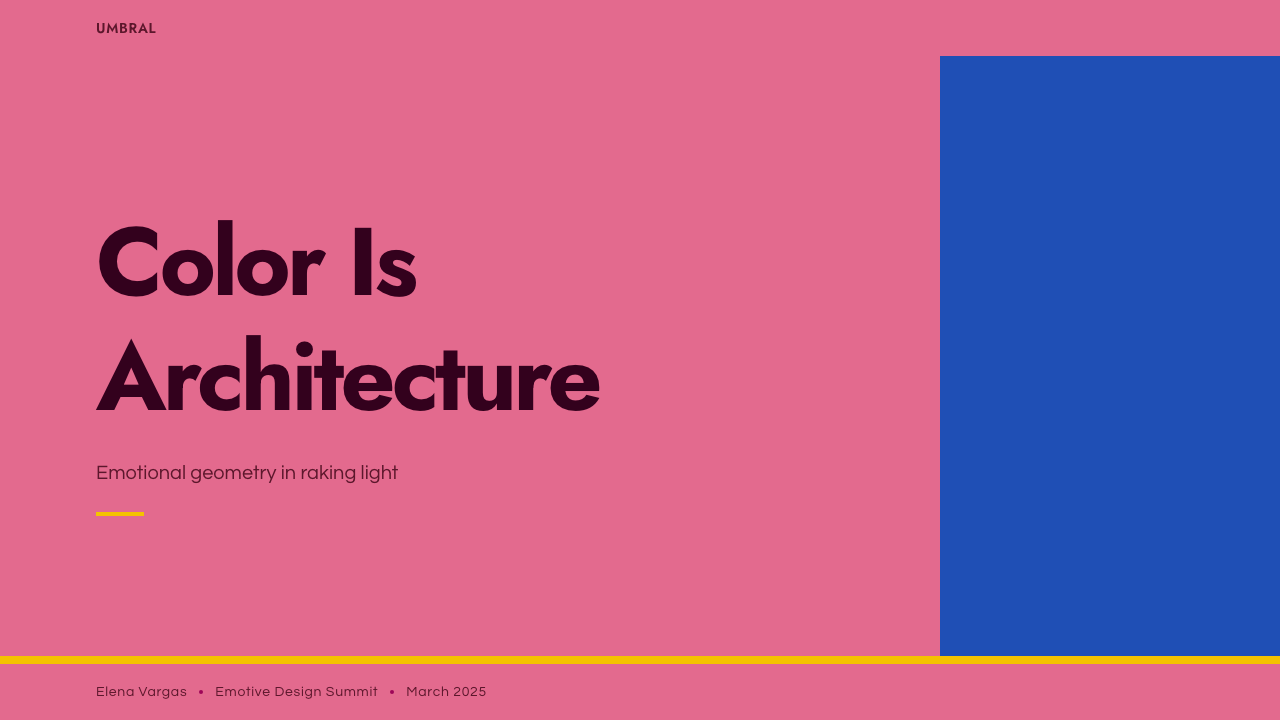
For presentation slides, this system's confidence with large, flat color fields works well for cover slides and section breaks in decks that want to feel considered and calm rather than busy — architecture and design portfolios, hospitality and real-estate pitches, wellness and lifestyle brand decks. A cover slide can use one dominant color plane — rose or cobalt — occupying most of the frame, with the title placed in a small, quiet corner rather than centered and large, echoing how a Barragán wall holds its color without needing further emphasis. Content slides should limit themselves to one or two color planes at most; introducing a third competing hue undermines the system's core discipline of restraint.
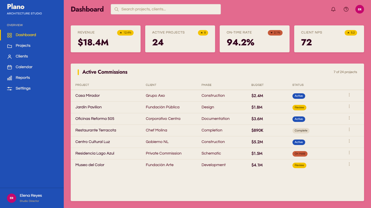
For web interfaces, the system suits hospitality, real estate, wellness, and design-forward lifestyle brands far better than data-dense software — a boutique hotel site, an architecture studio portfolio, a high-end furniture or interiors retailer. Dashboards are a difficult fit: the system's large, undivided color planes work against the need for dense, scannable information, and its restraint toward ornament leaves few natural cues for interactive states like hover or selection. Where it succeeds in UI, it tends to be in full-bleed hero sections and generously spaced content pages rather than tightly packed interface chrome.
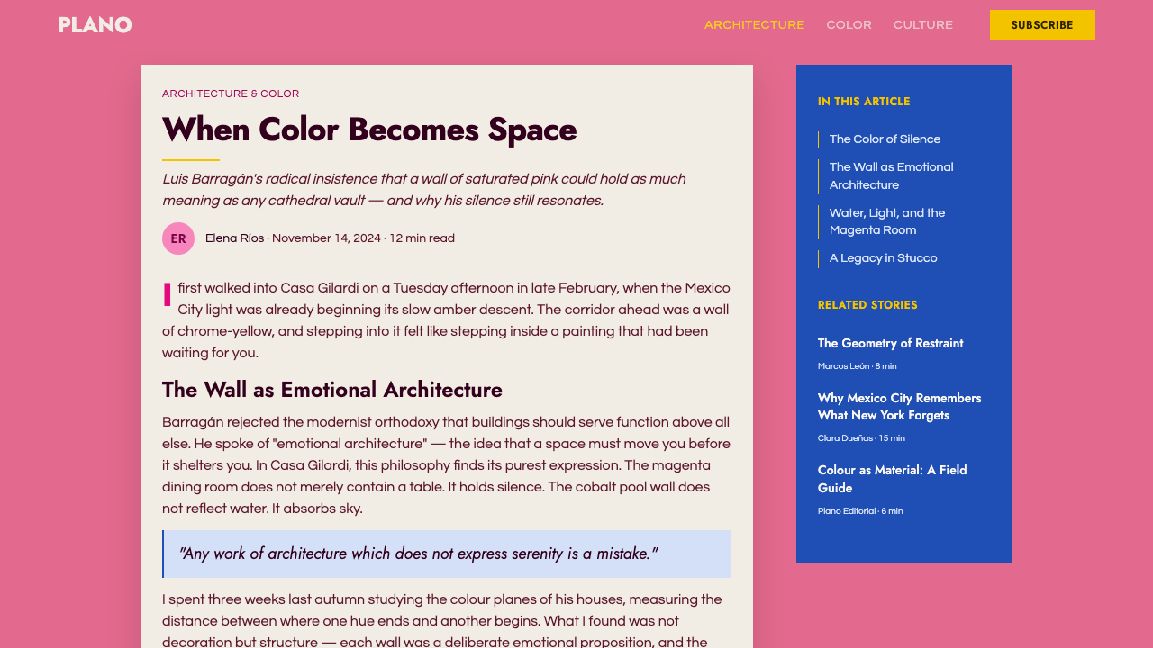
For editorial and marketing work, this is a strong fit for the system, since Barragán's own work photographs and reads almost like editorial composition already. A long-form article on architecture, travel, or design history can use full-width color planes as section breaks, in the same rose, cobalt, and chrome-yellow sequence Casa Gilardi itself uses. Marketing material for hospitality, wellness, or high-end real estate brands benefits from the same restraint — a single saturated color field with minimal text, trusting the color itself to carry the emotional weight of the message rather than layering on additional graphic devices.
The most common misapplication is treating the palette as a decorative accent rather than a structural choice — adding rose-pink or cobalt as a highlight color within an otherwise conventional, cluttered layout. That inverts the entire logic of the source: in genuine Barragán-derived work, color is not applied to structure, it is the structure. A second frequent error is allowing green to creep into the interface as a functional color, for success states or growth metrics and so on; the system's one hard rule is that green belongs to nature alone, and violating it breaks the palette's internal logic more than any other single choice would.
Barragán Emotional Architecture — FAQ
Why is this called "emotional architecture" rather than just "colorful minimalism"?
The term comes directly from Barragán himself, developed with the sculptor Mathias Goeritz in the early 1950s as a deliberate rejection of architecture judged purely on efficiency or function. Emotional architecture argues that a building's real job is to produce a feeling — calm, wonder, serenity — in the person moving through it, and that color, light, water, and enclosure are the tools for doing that. Calling it simply colorful minimalism would miss the point entirely: the minimalism here is in service of feeling, not restraint for its own sake.
Why does the system forbid green so strictly?
Because Barragán treated green as belonging exclusively to living, planted material — gardens, courtyards, trees seen through an opening — and never let it appear on a built, painted, or applied surface. Keeping green out of the architecture itself preserves a clean boundary between what is constructed and what is alive, so that when a garden does appear in view, it reads as a deliberate, framed moment rather than blending into the built palette around it.
Does this style require actual raking sunlight to work, or can it succeed under flat, even lighting?
The system was conceived around a very specific, strong, low-angle light, and a lot of its emotional effect — walls that appear to glow, hard shadow lines that divide a plane into zones of intensity — depends on that directional quality. Under flat, even lighting, the color planes still read clearly, but some of the drama is lost; digital or interior applications can compensate by using directional shadow and gradient cues deliberately, rather than assuming ambient light will do the work automatically.
How is Casa Gilardi different from Barragán's earlier, equally famous projects?
Casa Gilardi, completed in 1976, was Barragán's last major residential commission, built on an unusually narrow urban lot that forced a more concentrated, sequential use of color and space than his earlier, larger properties allowed. Its indoor pool with a single yellow column rising from cobalt-blue water is often singled out as the clearest, most distilled demonstration of his mature language — which is why this system draws primarily from that project rather than his broader body of work.
Is this system suitable for a brand that wants to feel playful and energetic rather than calm?
Not naturally. The system's saturated colors are held in check by extreme restraint — generous negative space, one or two dominant planes at a time, no competing pattern or texture — and that restraint is what produces its sense of composure rather than excitement. A brand chasing energy and playfulness would be better served by a system built on contrast, motion cues, and layered pattern; using this palette without its accompanying discipline just produces a diluted, less confident version of a fundamentally calm design language.
Related design styles
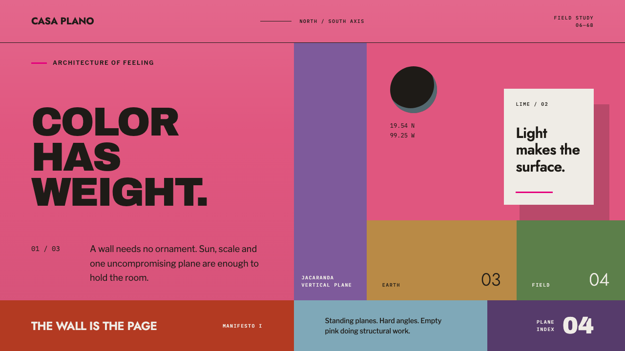 Barragán Cuadra San CristóbalColor carries the architecture. Burning pink planes, hard angles and one razo…
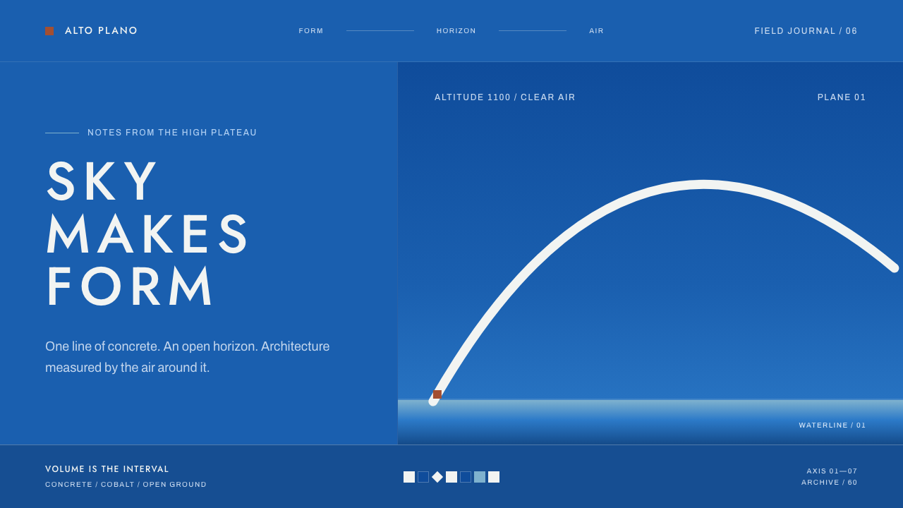 Niemeyer Brasília CurvesEmptiness makes the monument. Concrete-white arcs cut across a saturated coba…
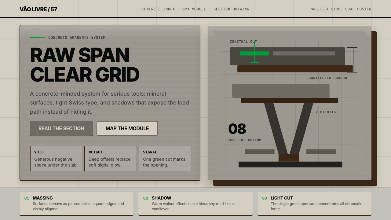 Paulista BrutalismStructural honesty, made heavy. Mineral grays, Inter grids, and walnut cantil…
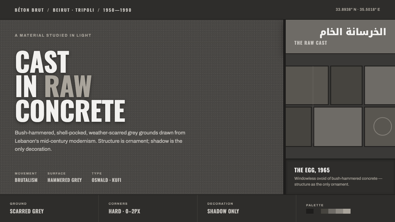 Beirut Brutalist GrayStructure is the only ornament. Scarred bush-hammered grey, monumental Oswald…
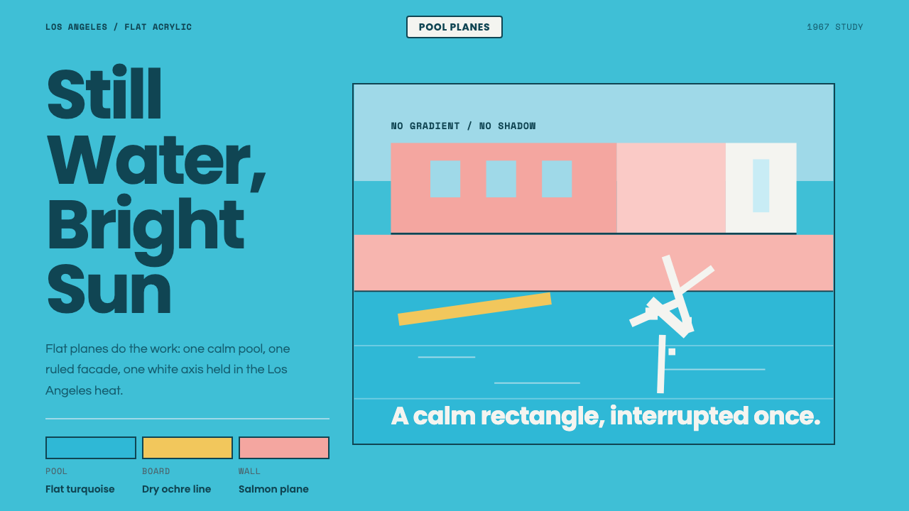 Hockney Pool BlueSerenity turns graphic. Turquoise planes, salmon edges, one white splash.
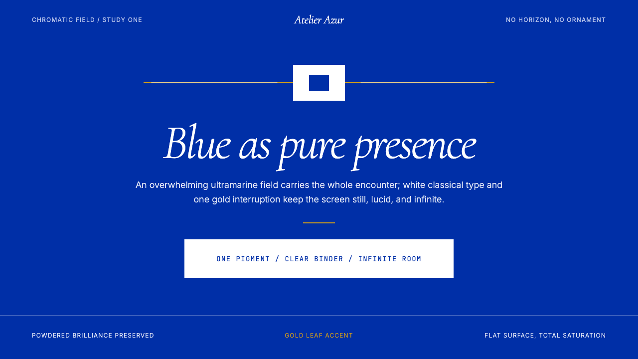 Klein Blue (IKB)Color becomes the content. Pure ultramarine field, white italic serif, one go…