What is Hard-Edge Painting?
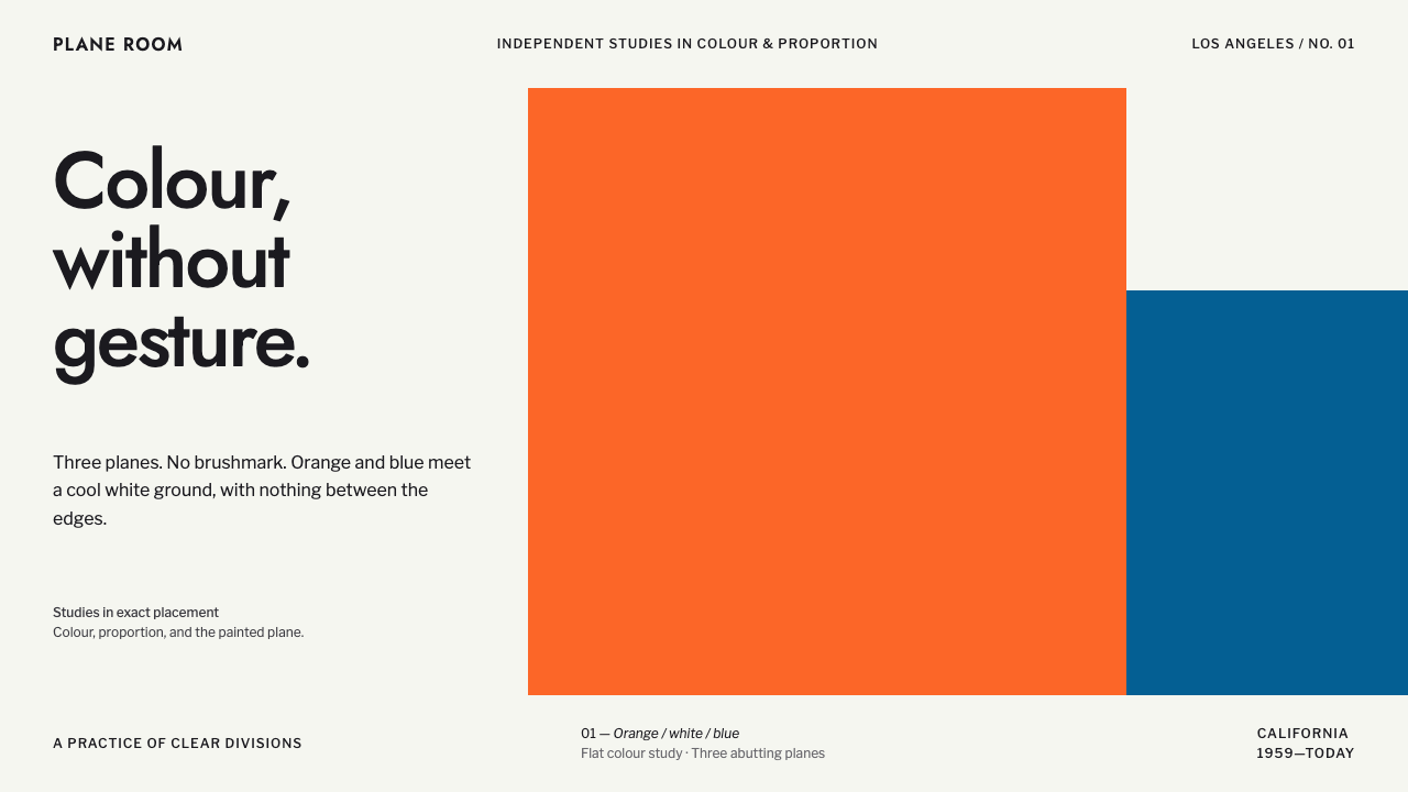
Hard-edge painting asked what happens when colour is left alone: flat fields of orange, blue and white meeting on razor-sharp edges, with no brushmark, outline or gutter between them.
Hard-Edge Painting in brief
Hard-edge painting is a strand of abstract art in which flat, uniform fields of colour meet along crisp, precisely defined edges. There is no visible brushwork, no gradation within a field, and no outline separating one colour from the next. The colours touch directly, and the edge between them is the only drawing in the picture.
The name became attached to a group of Los Angeles painters through the 1959 exhibition known as Four Abstract Classicists. The four were Frederick Hammersley, Karl Benjamin, Lorser Feitelson and John McLaughlin. Their canvases are built from flat oil fields of orange, green, blue, yellow and red, and where a ground is needed it is a plain white plane. McLaughlin's quieter pictures use white fields crossed by dark bars, while Hammersley's work includes a white band that organises the whole composition.
As a design language, hard-edge is calm, confident and very easy to read. It rejects decoration and gesture, and puts its trust in proportion, placement and the relationship between a few colours. That restraint gives it unusual weight. It looks designed, not decorated, and it suits settings that want to seem serious without seeming cold.

Where does Hard-Edge Painting come from?
The story begins with the 1959 exhibition in Los Angeles titled Four Abstract Classicists. It was organised by the critic Jules Langsner, who gave the show its name and, in the process, gave a label to a way of painting that had been developing quietly on the American West Coast. The word classicist was chosen on purpose. These artists were not interested in the emotional turbulence associated with gestural abstraction. They wanted order, clarity and balance.
The four painters were not a single school in the sense of sharing one manifesto. Each arrived at flatness by his own route. Frederick Hammersley's compositions often feel like carefully weighed arrangements of shapes. Karl Benjamin explored colour relationships in energetic, rhythmic patterns. Lorser Feitelson, the older of the group, had a long career behind him and brought a sense of geometric discipline. John McLaughlin pushed toward the most reduced results, with fields of white and dark rectangular bars that seem almost architectural.
The setting mattered. Southern California in the 1950s was a place of open space, new buildings and mid-century modernism, and the clean edge of a hard-edge painting echoes the clean edge of a modernist house against the sky. The style is often described as part of West Coast modernism, and it sits comfortably in the longer tradition of abstract classicism, which values balance over drama.
Hard-edge painting continued through the 1950s and 1960s and was absorbed into wider currents of abstraction that valued flat colour and clear shapes. Its influence on graphic design is easy to see. A field of solid colour with a short caption beneath it, in the manner of a museum wall label, became a common way to present an object, and the same logic can be seen in posters, book covers and corporate identities that borrow from the idiom of the gallery.
What defines the Hard-Edge Painting look?
Flat Colour Fields
Every area of colour is uniform. There is no gradient, no texture, no suggestion of light falling across a surface. This is the core of the idiom: colour is treated as a material in its own right, not as a way of describing something else. A field of orange is simply orange, and its presence on the page is entirely a matter of size, position and what sits beside it.
Razor-Sharp Edges
The edge is the drawing. Colours meet directly, with no gutter, outline or soft transition between them. The crispness has to be absolute, because any blur or halo would turn a decision into an accident. When two fields of strong colour touch, the border can vibrate slightly, and designers use that tension deliberately.
Saturated Palette
The characteristic colours are orange, green, blue, yellow and red, used at full strength and in small numbers. Pictures rarely use more than a few at once, and the combinations are chosen for how they push against each other. Orange and blue, a pair that sits near opposites on the colour wheel, is especially central to the look, with cool white acting as the quiet partner.
The White Ground
Where the work needs a calm ground, it is a plain white plane, not an off-white texture or a tinted wash. White is treated as one more colour field, one that gives the others room. Hammersley's white band and McLaughlin's white fields crossed by dark bars show the two ways it can work: as a structuring element and as a pure, quiet surface.
Cut, Not Stacked, Composition
Compositions are divided rather than layered. A large area is split into two or three abutting planes, and the relationship between those planes carries the whole picture. There are no overlapping cards floating above a background, no drop shadows to imply depth. The layout reads as a flat, cut surface, much like a piece of paper carefully sliced into colour.
Wall-Label Typography
The paintings themselves carry no text, so any typography is added with care. A clean mid-century sans-serif, in the vein of the grotesques of the period, works best, set small and plain beneath a solid colour field like a caption on a museum wall. The type does not compete with the colour; it simply identifies it.

Who shaped Hard-Edge Painting?
One of the four painters in the 1959 show. His work is known for carefully balanced arrangements of flat shapes, including the white band that organises a composition. For designers he is a reminder that a single quiet element, such as a band of white, can structure an entire layout.
A painter in the group who explored colour relationships in energetic, rhythmic compositions of flat fields. His pictures show how a small, bright palette can produce movement without any gesture, a useful model for lively but disciplined design.
A member of the 1959 group whose long engagement with geometric abstraction gave the show some of its sense of discipline. He is often counted among the artists who helped establish abstract classicism as a recognisable West Coast tendency.
The most reduced of the four. His pictures use white fields crossed by dark bars, a structure so spare it recalls architecture. Designers borrow his approach for quiet passages, where a few dark vertical bars on a white plane create rhythm without a single decorative element.
The critic who organised the 1959 exhibition and gave it its title. Although not a painter, he shaped how the work was understood by naming a tendency and arguing for its classical qualities. His role is a reminder that styles are often defined as much by the writing around them as by the work itself.
How do you use Hard-Edge Painting today?
Hard-edge is one of the most useful historical idioms for contemporary layouts that need to look confident and restrained at once. It works because it is built from very few decisions, each of which is visible. The trade-off is that it has no tolerance for sloppiness: a slightly soft edge, a stray shadow or an extra accent colour breaks the whole effect.
For presentation slides, a hero or cover slide can be split into two or three abutting planes of colour, with the title set in a clean sans-serif on one of them. A section divider can be a single solid field with a short caption beneath it. Content slides work best when they remain mostly white, using a few dark vertical bars or a single band of colour to organise the page. Data slides gain from the idiom when bars and segments are drawn as flat, edge-to-edge blocks without outlines or shadows.
For web interfaces, hero sections can be cut into adjoining colour planes, product or portfolio tiles can be solid colour with a wall-label caption beneath, and a single disc, typically red, can mark the main call to action. Cards should not float. Instead of drop shadows, use contrast between adjacent planes to separate regions. The result suits galleries, architecture studios, design offices and any site that wants to present work with seriousness and space.
For editorial and marketing work, the style gives a strong identity from very little. A book cover or campaign poster can rest on two colour fields and one line of text. Quiet paragraphs can follow McLaughlin's method, standing a few dark verticals on a white ground to set rhythm. The style rewards generous margins and short copy, and it pairs well with clear photography placed as flat rectangles.
The most common mistake is to soften it. Adding a gradient, a subtle shadow or a rounded, glossy button turns the style into something generic. A second frequent error is to use too many colours at once; the original pictures rely on a few, and the force of the style comes from restricting them. Finally, avoid using it for content that depends on warmth, texture or sentiment, where its cool, impersonal clarity will feel distant.

Hard-Edge Painting — FAQ
What is hard-edge painting?
It is a style of abstract painting that uses flat, uniform fields of colour meeting along crisp edges, with no visible brushwork, gradient or outline. The term became associated with a group of Los Angeles painters after the 1959 exhibition Four Abstract Classicists.
Who were the Four Abstract Classicists?
Frederick Hammersley, Karl Benjamin, Lorser Feitelson and John McLaughlin. The 1959 show was organised in Los Angeles by the critic Jules Langsner. Although they each worked in their own way, they shared a commitment to flat colour, clear edges and balance.
How do I use the style in a user interface without making it look like a poster?
Keep the structure and drop the drama. Use solid colour planes to organise regions of the screen, keep the typography small and plain, and reserve a single saturated colour for the main action. Retain ordinary spacing, clear labels and standard controls; the idiom supplies the look, not the behaviour, so usability should not change.
Does it work with a dark background?
The original idiom is built on light grounds and cool white, and it is at its best there. A dark version can work if you commit to flat fields and sharp edges, but the saturated oranges and blues will behave differently against black, so test combinations carefully and avoid glow or transparency effects.
What typefaces suit it?
A clean mid-century sans-serif. Geometric or grotesque designs in that spirit fit well, such as Jost and Libre Franklin. Set the text small and plain, in the manner of a wall label, so that the colour fields remain the main event.
Related design styles
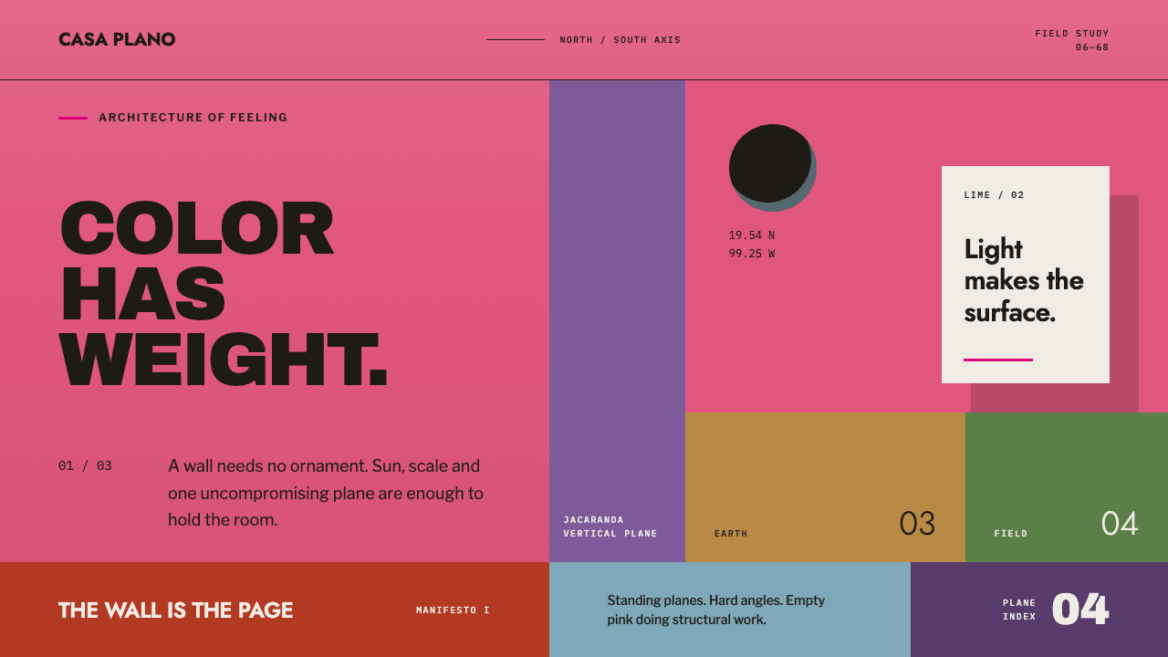 Barragán Cuadra San CristóbalColor carries the architecture. Burning pink planes, hard angles and one razo…
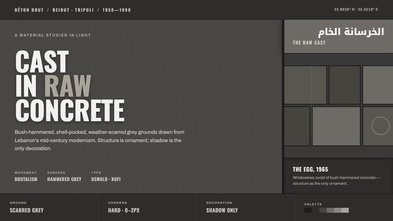 Beirut Brutalist GrayStructure is the only ornament. Scarred bush-hammered grey, monumental Oswald…
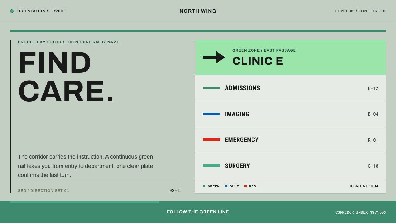 Hospital Wayfinding 1970Colour removes hesitation. Enamel green rails and open grotesque plates lead…
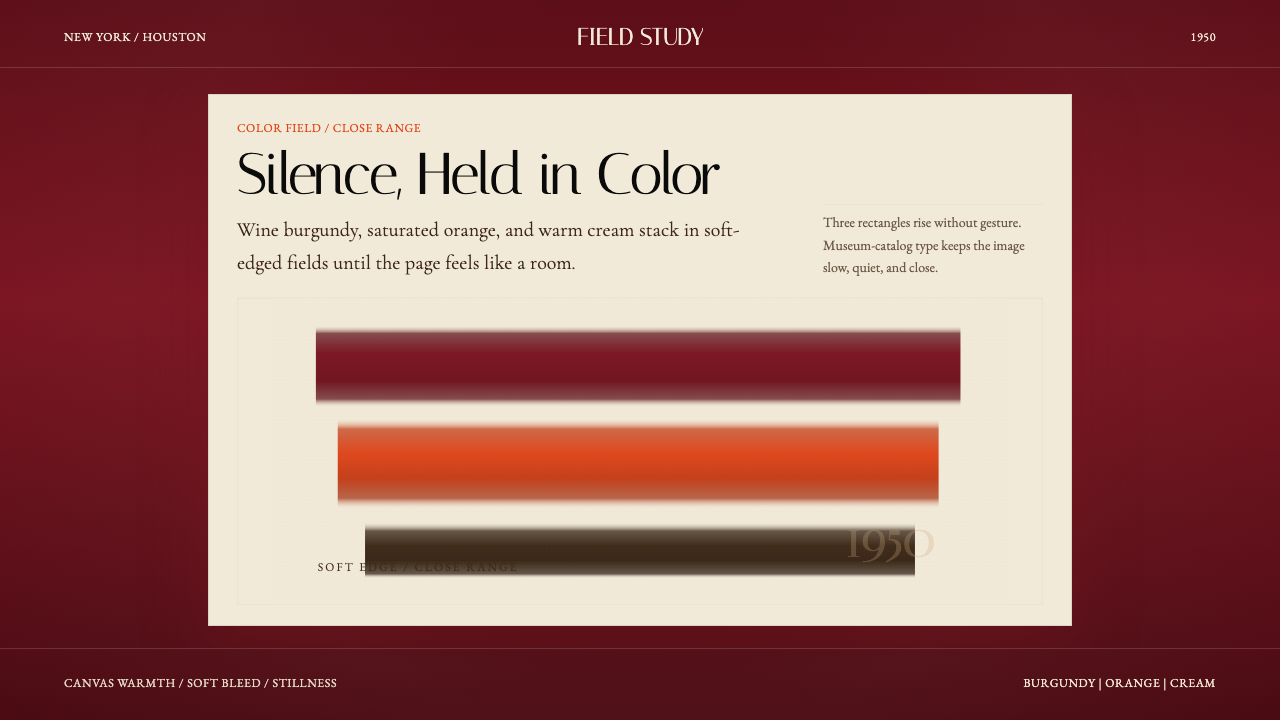 Mark Rothko Color Field (1950)Silence made visible. Burgundy, orange, and cream stack in soft-edged fields.
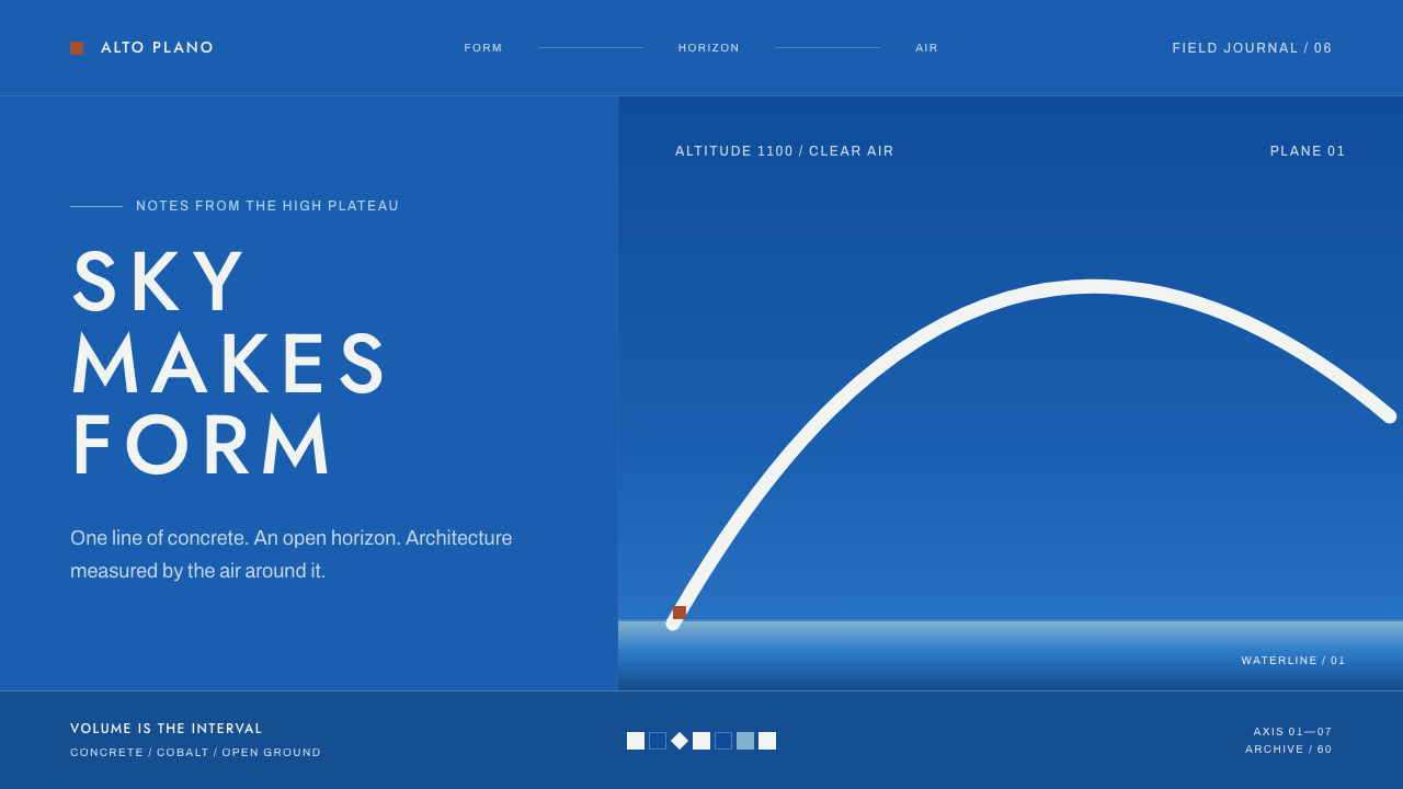 Niemeyer Brasília CurvesEmptiness makes the monument. Concrete-white arcs cut across a saturated coba…
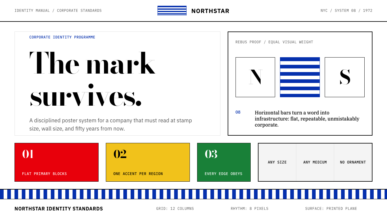 Paul Rand / IBM Corporate IdentityCorporate modernism stays exact. Blue 8-bar stripes, high-contrast serif, har…