What is Casablanca Néo-Mauresque?
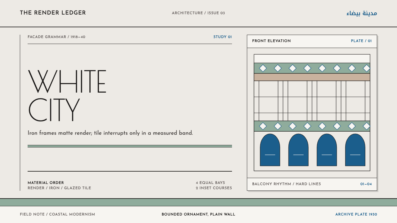
Casablanca Néo-Mauresque turns the White City's interwar facades into a design language — chalky render, black wrought iron, and tile and plaster ornament held strictly inside bands and panels.
Casablanca Néo-Mauresque in brief
Casablanca Néo-Mauresque is the hybrid building style of interwar Casablanca, the one the French called néo-mauresque: Art Deco massing and Parisian apartment planning crossed with carved plaster friezes, horseshoe openings, and panels of glazed zellige tile set into lime-washed render. As a design system it translates that facade into a page — a matte white ground, black iron-like linework, and ornament that lives only in bounded bands and inset panels.
Its central idea is that ornament has a boundary. On a Casablanca apartment block the decoration is rich — carved plaster, glazed tile, drawn iron — but it never covers the wall. It is confined to a frieze under the cornice, a panel beside the entrance, a tiled skirt around a door. The expanse of plain render around it is not empty space; it is what makes the ornament legible. The system keeps that proportion: a great deal of quiet surface, a little intense pattern, and nothing that behaves like wallpaper.
Once you know the ingredients the look is easy to recognise. The ground is chalky, sun-flattened and matte rather than glossy. Every rail, grille and letterform is drawn in black iron, so line is the primary graphic tool. Celadon green, warm plaster and a deeper entrance-tile blue arrive as measured interruptions, never as fills for a whole composition. And the layout follows the building: vertical bays cut across by deep horizontal balcony slabs, with an arcade of equal spans along the base.
Where does Casablanca Néo-Mauresque come from?
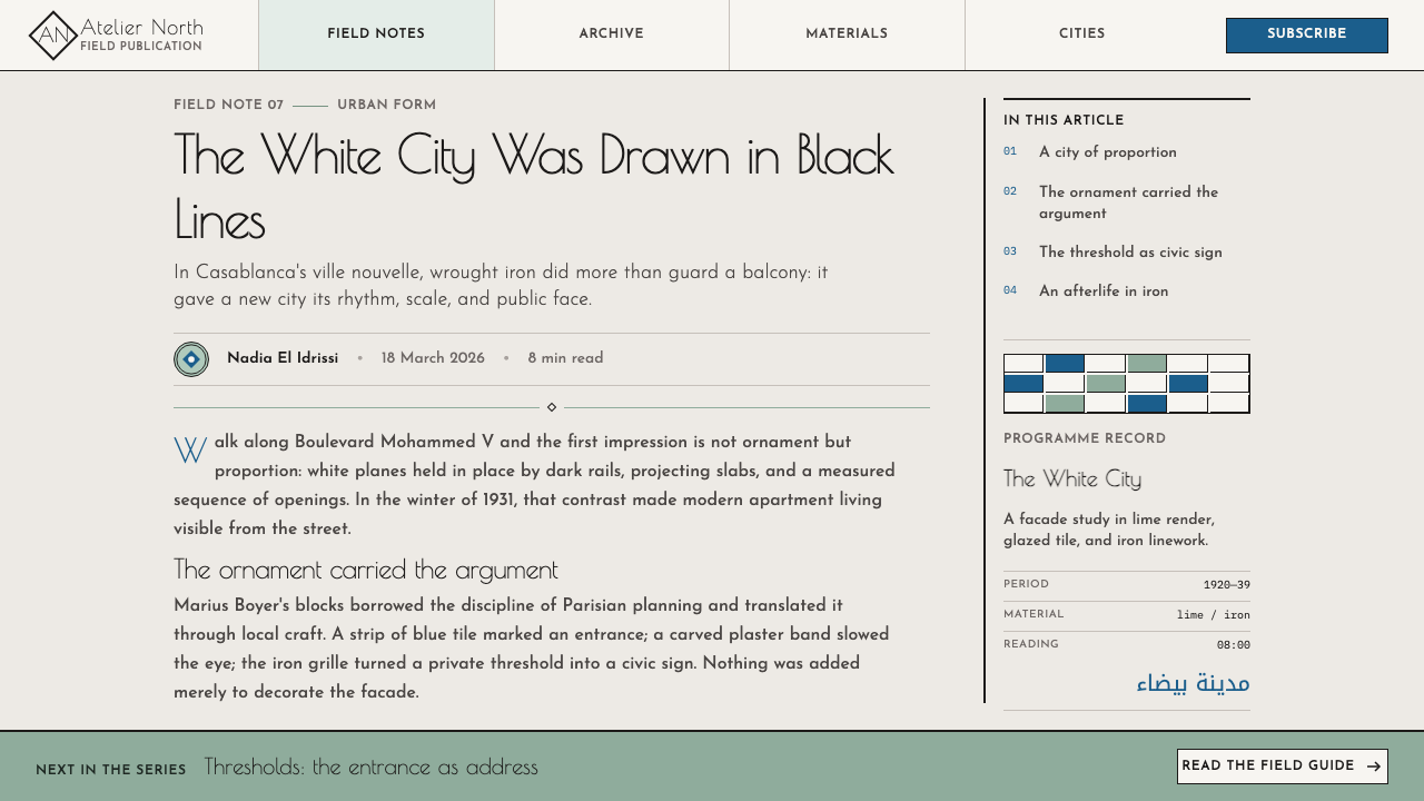
The style belongs to a specific place and a specific building boom. The reference dates the protectorate-era boom in Casablanca to roughly 1918–1940, within a wider period running from 1900 to 1950. In those years the city grew a ville nouvelle, a planned new district centred on what is now Boulevard Mohammed V, laid out as a modern quarter beside the older town. The programme was large and fast: apartment houses, commercial blocks and public buildings had to go up in quantity, under strong sun, with a clear idea of how a modern city should look.
The architects answered with a hybrid. From Paris came Art Deco massing — geometric, stepped, confident volumes — and the planning of the Parisian apartment building, with its repeated bays, regular floors and street-level commerce. From Morocco came a vocabulary of crafted surfaces: carved plaster friezes, horseshoe openings, and glazed zellige, the cut-tile mosaic craft of the Maghreb, set into walls finished in lime-wash. The French called the result néo-mauresque. The related term Arabisance is also used for European architecture that borrows Moorish and North African forms as a surface vocabulary. The reference list files this style under three headings: Art Deco, néo-mauresque / Arabisance, and French colonial modernism.
Marius Germinal Boyer is the name most closely tied to the look. His apartment blocks, rendered pale and white, are the reason the city earned its nickname, the White City. The framework around them was the work of planners such as Henri Prost, the French urbanist associated with the layout of the new city, while Edmond Brion and Auguste Cadet appear beside Boyer as members of the same interwar generation shaping Casablanca's streets. The cumulative effect of that shared effort was a visual consistency across whole districts: white blocks, black iron balconies, and bands of tile and plaster ornament repeating from street to street.
It is worth stating the context honestly. The style grew out of a colonial building boom: European architects selected, abstracted and recombined Moroccan craft forms for buildings commissioned under a French protectorate. Writing about this architecture generally has to hold two things at once — that the craft vocabulary was Moroccan, and that the framework that put it on apartment blocks was colonial. For a designer borrowing the style today, the lesson that survives is formal and carries no such baggage: the discipline with which ornament is rationed, framed, and kept subordinate to a plain surface and a strong structural rhythm.
What defines the Casablanca Néo-Mauresque look?
Chalky Ground
The ground is lime-washed render seen in strong sun: chalky, slightly rough, flattened by light rather than glossed by it. In design terms that means a warm-leaning off-white with a matte finish — no sheen, no glow, no glassy highlights. The plain surface is the dominant element of the system and the reason everything else is legible. Treat it as architecture treats a wall: most of a facade is simply wall.
Iron Linework
Black wrought iron draws every rail, grille and balcony guard on a Casablanca block, and the system lets black do the same job on the page: linework, rules, icons and letterforms are all drawn in it. The result is a line that feels forged rather than sketched — upright, even, confident, with turns that look bent rather than brushed. Type belongs to the ironwork too. Letterforms should be sturdy and readable from across a street, like a ground-floor shop sign.
Bounded Ornament
This is the system's defining rule. Decoration appears only in bands and inset panels: a frieze under a cornice line, a tiled panel beside a doorway, a patterned strip that closes a section. It is never wallpaper. Each ornamented zone has a clear edge, a clear purpose, and plain surface on both sides of it. If a pattern tiles across the full width of a layout or fills a background, the style has already been broken.
Measured Tile Colors
Celadon green, warm plaster and a deeper entrance-tile blue are the only chromatic notes, and each behaves like tile on a facade: it interrupts the white render in a limited, deliberate place and then stops. Colour here is local, not atmospheric. A panel, a band or a single call to action may carry it; a full-page background or a full-width hero should not. The green and blue are the cool of glaze, the plaster is the warm pause between them, and the combination works best when one leads and the others support.
Horseshoe and Arcade
Two openings recur: the horseshoe arch, whose curve swells past a half-circle before it narrows, and the ground-floor arcade of equal spans. Both translate into layout as framing devices. An arched or arcade-like frame can hold an image, a card or a pricing tier, and equal spans give a calm, repeating rhythm along the base of a composition. The curve is occasional and structural — a doorway, a window — never a decorative wave.
Bays and Balconies
The facade logic is vertical bays cut across by deep, projecting balcony slabs. In a layout this becomes columns of content interrupted by strong horizontal bars that carry section labels, dividers or a row of tiles. The cut is deliberate: it stops the verticals reading as a grid of boxes and stacks the page in floors, each with its own job. Depth comes from structure — projecting slabs, recessed openings — rather than from gradients or glossy sheen.
Deco Massing
Beneath the ornament, the buildings are Art Deco in their massing: clear geometric volumes, a defined base, shaft and crown, corners turned with confidence. For a page this means a firm overall structure — a distinct header zone, body and footer — before any decoration is applied. The Parisian apartment planning behind the facades adds regularity: repeated floors, repeated bays, an orderly street front. Ornament is a layer on top of that order, never a substitute for it.

Who shaped Casablanca Néo-Mauresque?
Boyer is the architect most closely tied to the look of interwar Casablanca; his white apartment blocks are credited with giving the city its nickname, the White City. His buildings show the whole recipe at work: Art Deco massing, apartment-house regularity, and Moroccan ornament confined to friezes and panels on a plain lime-washed field. For this system he is the reference point for restraint — the example of how little ornament a facade needs once that ornament is placed correctly.
Prost is the French urbanist associated with the planned growth of the new city. His contribution is less a facade than a framework: the ville nouvelle was laid out as a coherent district, with streets and blocks that made a consistent building style possible in the first place. The design lesson is structural. A recognisable visual language needs a shared underlying grid, and the facades of Casablanca could rhyme with one another because the plan behind them was orderly.
Brion and Cadet are the two further architects the style's reference list names beside Boyer, and they belong to the same interwar generation that built the new city's apartment houses and commercial streets in a shared idiom. Their value for a designer is as evidence of a system rather than a signature: when several hands working on different sites produce facades that obviously belong together, the shared rules — white render, iron line, bounded ornament, tile accents — are doing the authoring.
How do you use Casablanca Néo-Mauresque today?
The style transfers well wherever a design needs warmth and civic dignity without giving up order. Its principles are about rationing: how much ornament, where it sits, and how much plain surface surrounds it. Applying it well means understanding that ratio rather than simply pasting a tile motif onto a layout.
For presentation slides, a cover works when the title sits in black on the chalky ground and a single band of tile-coloured ornament runs across the lower part like a frieze under a cornice. Content slides use the bay logic: a strong horizontal bar carries the slide label, columns sit beneath it, and any pattern appears once, as a bounded strip. For data slides, draw axes, gridlines and annotations in the same black iron line, give celadon or blue only to the key series, and keep the rest of the chart plain.
In web interfaces the style suits products that want to feel established and civic: hospitality and travel, cultural institutions, booking flows, and mid-density dashboards. Navigation and cards take black outlines on the white ground. An arched or arcade-like frame can hold a pricing tier, with equal spans giving every plan the same weight. Reserve the tile colours for state and emphasis — a selected plan, a primary action — and put ornament in headers and section dividers, not behind data tables.
Editorial pages gain a lot from the frieze idea: a bounded ornamental strip can open an article or close a section the way a plaster band finishes a facade. Marketing pages can be built as stacked floors — a hero floor, a feature floor, a testimonial floor — separated by strong horizontal bands, with at most one tile panel per floor. Photography of whitewashed walls, ironwork and glazed tile is the natural image language; generic stock imagery works against the idea.
The most common mistake is to treat the ornament as the style and the restraint as optional. Tiling a pattern across a whole background, scattering arches as decoration, or using the three tile colours at equal strength all collapse the facade logic into pastiche. A second mistake is gloss: gradients, glowing shadows and polished highlights belong to a different material world than lime render. When in doubt, remove ornament until the plain surface dominates, then put back one band.
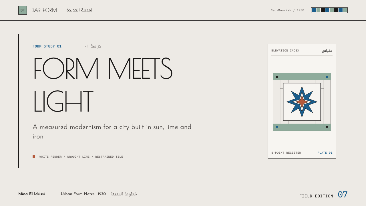
Casablanca Néo-Mauresque — FAQ
What does néo-mauresque mean?
It is the French term for the hybrid style that rose in interwar Casablanca: Art Deco massing and Parisian apartment planning combined with Moroccan craft forms such as carved plaster friezes, horseshoe openings and glazed zellige tile. The word literally means neo-Moorish. A related term, Arabisance, describes European architecture that borrows Moorish and North African forms mainly as surface vocabulary.
How is it different from generic Moroccan or Moorish styling?
Generic Moorish styling tends to fill surfaces: dense geometric pattern, saturated colour, ornament everywhere. This system's identity is the opposite. The plain matte wall dominates and ornament is rationed into bands and panels. It also keeps the Art Deco geometry of the building volumes and the regularity of a Parisian apartment block. If a page is pattern wall to wall, it is not this style.
Can the style work on a dark background?
The reference is a light system: the sun-flattened white ground is the central image of the White City, so a dark inversion needs care. If one is unavoidable, make the iron black the ground and let the chalky white become the line and panel colour, with tile tones kept to small, bounded accents. The result reads as a different mood, a night-time facade rather than a sunlit one, and it loses some of the matte render that gives the style its character.
What kinds of products suit it best?
It fits anything that benefits from a calm, civic, established feeling with a touch of craft: hospitality, travel, cultural organisations, architecture and design studios, editorial publications and considered consumer brands. It struggles where speed and density dominate, such as trading terminals or dense admin tools, because its generosity with plain surface works against packing information tightly.
Is it appropriate to borrow a style that comes from a colonial building boom?
The style came out of a French protectorate building boom, and its craft vocabulary comes from Moroccan makers. A thoughtful use credits those sources by name — Casablanca, zellige, carved plaster, wrought iron — and applies the ornament with the same discipline the original facades required, rather than as exotic decoration. Treat it as the architecture of a particular city, not as a generic costume.
Related design styles
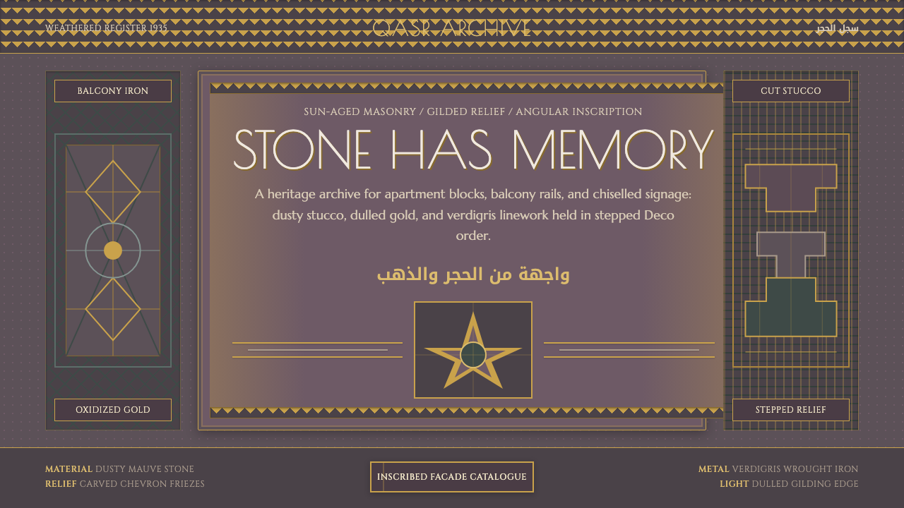 Cairo Downtown Art DecoStone-real glamour. Mauve stucco, dulled gold rules, and verdigris Deco geome…
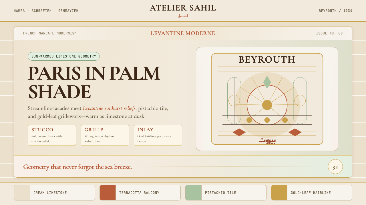 Lebanese Art Deco (Beirut)Cosmopolitan warmth. Cormorant friezes, gold hairlines, terracotta-pistachio…
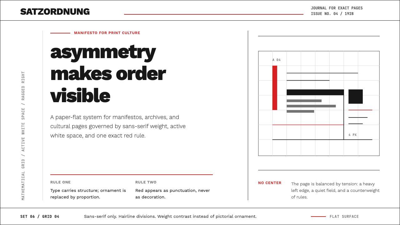 New Typography (Tschichold 1928)Tschichold's 1928 doctrine in CSS. Asymmetric grid, hairline rules, red-and-b…
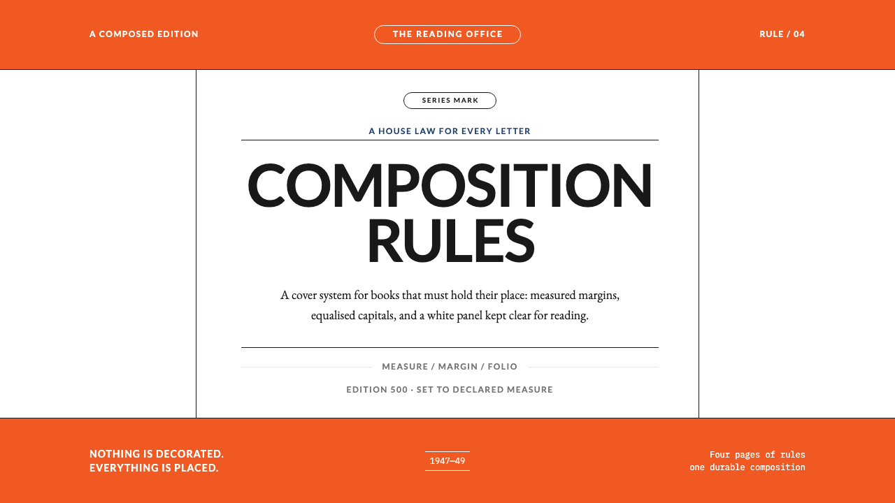 Tschichold Penguin RulesOrder becomes visible. Orange bands frame a white panel of equalised Lato cap…
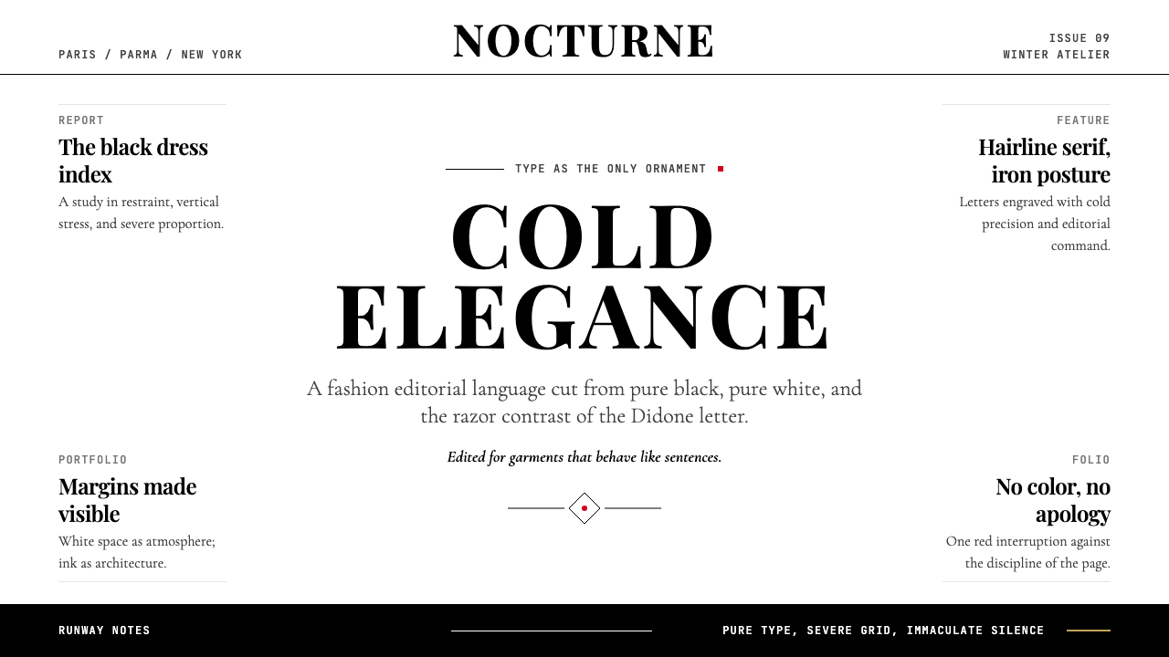 Vogue DidoneCold authority. Black-on-white Didone, red accent, and vast editorial whitesp…
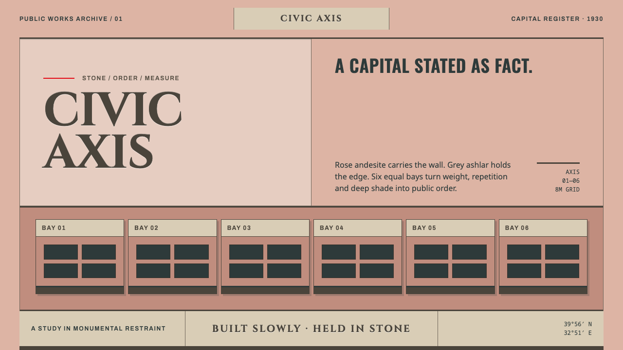 Ankara Republican ArchitectureAuthority moves slowly. Rose andesite, grey ashlar and six equal bays enforce…