What is Pahlavi Stamp 1935?
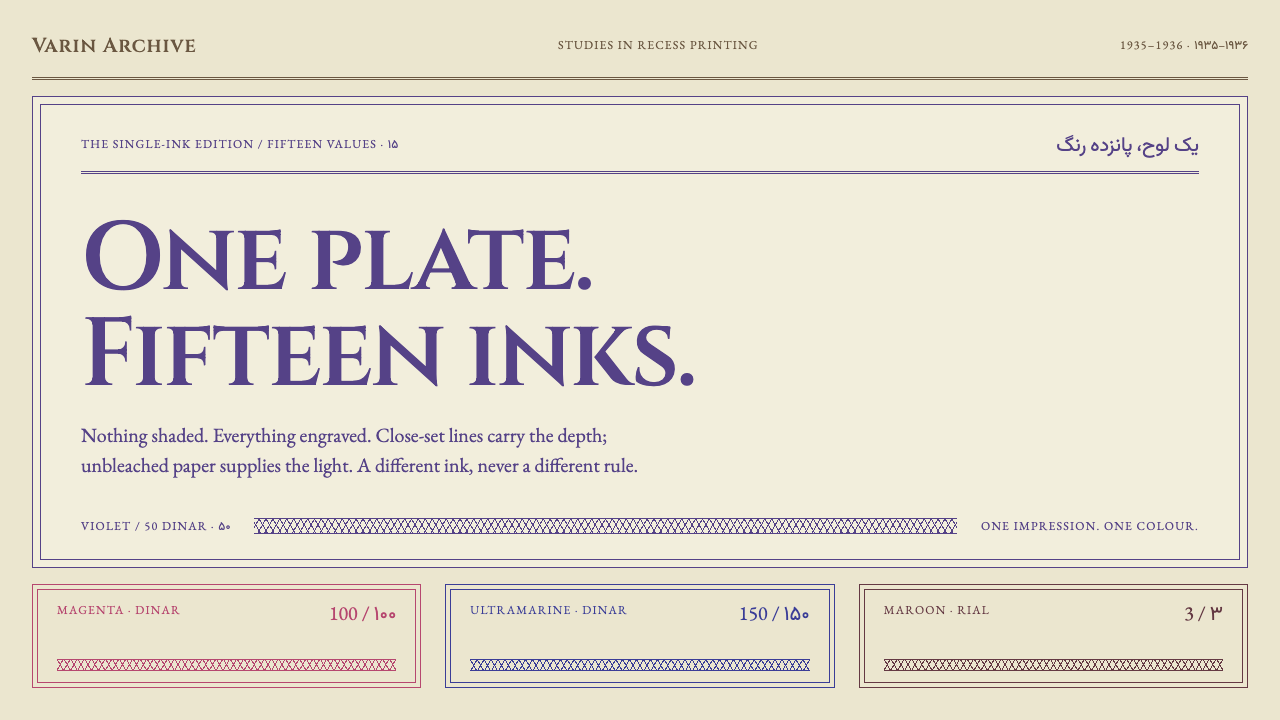
A postage stamp carries a whole state in a few square centimetres, and the Pahlavi series of 1935 prints it with one ink and engraved line alone.
Pahlavi Stamp 1935 in brief
Pahlavi Stamp 1935 is a design style modelled on the definitive postage series that Iran issued in 1935 and 1936, when the Latin name on its own stamps changed from Postes Persanes to Postes Iraniennes. The series is that decision printed fifteen times over: one design, one recess-printed ink for each value, on a single kind of unbleached wove paper. At the centre sits an oval bust of the Shah, held between column shafts and bull capitals in the Achaemenid manner, with the denomination set twice, in Latin and in Persian numerals.
What defines the look is that nothing in it is tonal. A photograph gradates smoothly from light to dark; an engraved stamp cannot. Every shade, every curve of a cheek and every fold of drapery is made from line alone: cross-hatching that thickens where a form turns away, parallel shading that closes up toward solid, and a border of interlaced curves cut by machine. From a distance the lines fuse into tone, but close up the sheet is made entirely of strokes of the same ink.
As a design system, the style inherits that discipline. Ink is flat and single, corners are hard, edges are the toothed edges of real perforations, and one rule governs colour: no panel ever carries two colours at once. The result is violet Roman capitals and close-cut lines on warm unbleached stock, and a lesson in how much authority a document can project with so little.

Where does Pahlavi Stamp 1935 come from?
The series is most easily understood through one small change of wording. In 1935 the Latin name the country printed on its own stamps was changed from Postes Persanes to Postes Iraniennes. A stamp is one of the few objects a state sends abroad in bulk, and the name on it is a declaration of identity. By reissuing a full definitive set under the new name, the postal administration in Tehran turned an administrative decision into a body of physical objects that would travel in letters around the world. The setting is the Pahlavi state in the years from 1925 to 1941, and the reference definitives date from 1935 to 1936.
The series was printed by Joh. Enschedé en Zonen, a Dutch security printer, which matters for the style: the look is that of a European intaglio house working to the brief of a Persian state. The process is recess printing. A design is cut as fine grooves into a metal plate, ink is forced into the grooves and wiped from the surface, and damp paper is pressed against the plate with great force so that it draws the ink out. The ink lies on the paper in slightly raised lines, which is why an engraved stamp feels different under a fingertip from a lithographed one, and why it is hard to imitate.
The imagery reaches back well before the dynasty. Column shafts and bull capitals belong to the architecture of the Achaemenid empire, the ancient Persian imperial tradition best known from its monumental stone halls. Setting them around the Shah's portrait was a deliberate act of lineage: the Pahlavi state presented itself as heir to a continuous Persian past and as a modernizing present. The project record names this strand Pahlavi Achaemenid revivalism, and it explains why a modern portrait on a modern stamp is framed like a monument.
Beyond the national story, the stamp belongs to a wider tradition of interwar state philatelic design: dignified, symmetrical, engraved, and issued in sets that treat every value as a variant of one frame. Printing each denomination in a different single ink was a practical convenience for postal clerks, who could tell values apart at a glance, and it was also a visual system. The set reads as a family, with the same oval, the same columns and the same lettering, and colour carrying the only difference. That is the design logic the style carries forward.
What defines the Pahlavi Stamp 1935 look?
One ink, one panel
The governing rule is that a single panel never carries two colours. Each value is printed in one ink, and colour works as a label rather than as decoration: it tells you which denomination you are holding. The inks are chosen from an engraver's range, saturated but a little weighty, and they sit on the paper as a uniform, flat stratum.
Violet Roman capitals
Lettering is Roman capitals with classical proportions, set in the same ink as everything else and often in violet. Country name, legends and denominations are all capitals, with generous spacing between letters, so the text reads like an inscription cut in stone. The denomination is stated twice, in Latin and in Persian numerals, and the two systems sit beside each other as equals. There are no lowercase headlines, no italics, and no change of typeface for emphasis.
Line as tone
Depth is built from engraved line, never from fill. Cross-hatching thickens where the form turns into shadow, parallel strokes lie closer together as they approach darkness, and light is simply paper left bare. The eye mixes the lines into grey at a distance, while up close every stroke remains visible. Translated to screens, this means texture is expressed as fine repeated lines rather than gradients, and shading is a matter of line density.
Unbleached paper ground
The ground is a sheet of unbleached wove paper: warm, slightly ivory, with an even, grain-free surface. It is never pure white. The paper is part of the picture, since the lightest tones of the engraving are simply the stock showing through, and the ink sits on it like something pressed in rather than painted on. A screen version keeps the warmth of the ground and avoids the clinical white of default interfaces.
Guilloche border
The frame is a guilloche, a band of interlaced curves turned on a rose engine, a machine that cuts repeating geometric patterns with great regularity. These patterns were historically hard to forge, and they signal that the object is official. On a stamp they also do visual work, holding the composition in a precise outline and separating the picture from the margin. The border is regular, continuous and slightly dense, and it never competes with the portrait at the centre.
Formal symmetry
The composition is centred and symmetrical. An oval holds the principal subject, column shafts stand on either side as supports, and bull capitals crown them. Text sits above and below on the central axis. This is the opposite of an asymmetric, dynamic layout, and the effect is monumental: the stamp stands like a facade. The symmetry carries the message of stability, and it is why the style suits subjects that need to feel settled rather than in motion.
Perforations and hard corners
The outer edge is physical: a real perforated edge, with the small tooth pattern left by the holes through which a stamp is torn from its sheet. Corners are square and hard, with no rounding, and there is no drop shadow lifting the object off its background. The stamp is understood as a flat printed thing, handled and posted, not as a floating card.

Who shaped Pahlavi Stamp 1935?
Reza Shah Pahlavi is the ruler whose oval bust sits at the centre of the series, and the rule, from 1925 to 1941, that frames the design. The portrait is the single focal subject in the composition, flanked by the monuments of an older Persian court. For a design system, the useful thing to take from this is the structure: one formal centre, surrounded by symbols of continuity, rather than the person.
A Dutch security printer, named in the project record as the printing house behind the series. Its role is the craft side of the style: the cutting of the plate, the cross-hatching and shading, the machine-turned border, and the discipline of printing one ink to one value. Much of what looks like a stylistic choice in the set is really a consequence of the recess-printing process in the hands of a house that did it professionally.
The postal administration in Tehran is the commissioning body and the institutional voice behind the name change from Postes Persanes to Postes Iraniennes. Its role in the story is that of a client who understood a stamp as both a working tool and a piece of national messaging. The set's coherence, with all fifteen values obeying the same frame, reflects that dual purpose.
How do you use Pahlavi Stamp 1935 today?
Pahlavi Stamp 1935 is a system for authority and provenance. It communicates that something is official, issued and checked, using almost no colour and no decoration beyond line. The transferable idea is the economy of means: one ink, one frame, one lettering style, with engraved texture rather than gradients doing all the visual work.
For presentation slides, the cover can be set as a framed panel in a single ink, with an oval or central emblem, wide-spaced capitals above and below, and a guilloche-style border. Content slides treat the sheet as a plate: one ink per slide or per section, so that colour acts like a denomination marking progress through the deck. Data slides use hatching density instead of colour fills, with bars or areas drawn as parallel lines of varied closeness, which suits tonal comparison in a single hue.
For web interfaces, the style is a natural fit for certificates, verification pages, account statements, membership cards, credentials and anything that must feel validated. Pricing tiers can behave like denominations: the same card structure repeated for each tier, with a single different ink identifying each one, and no gradients or glows. Tables use fine rules, buttons are square-cornered and filled with one flat ink, and focus states are drawn as a line rather than a soft ring.
For editorial and marketing work, it suits heritage brands, archives, museums, postal and print-related businesses, collectible and limited-edition products, invitations and announcements. Headlines are widely spaced capitals centred on the page, supporting text is set in a restrained book face, and ornamental dividers are replaced by a thin ruled line or a short guilloche band. The tone is formal, and the layout should feel like a document someone had to sign.
A common mistake is to add a second ink to a panel for emphasis, which immediately breaks the logic of the set. Others are placing the pattern on bright white, applying noise or grain filters to fake an engraved texture, and covering every surface with hatching until the text cannot be read. The strongest versions are sparing: the line work is concentrated in the portrait or emblem and the border, and the rest of the page is paper.

Pahlavi Stamp 1935 — FAQ
What is intaglio, and why does it matter for the look?
Intaglio is a printing method in which the image is cut as grooves in a plate, filled with ink and pressed onto paper, so the ink lies in fine slightly raised lines. Because the plate can only hold lines, an intaglio image has no continuous tone. Shading comes from hatching, from lines drawn closer or thicker, and from cross-hatching. That constraint is the whole look: every texture is built from strokes, and the design system keeps that grammar.
Why does each panel use only one colour?
The set was printed with one recess-printed ink per value, so a stamp is one colour by construction, and the colour tells you the denomination. The design system adopts this as a rule: colour is a label for a whole panel, not a decoration within it. The benefit is clarity and coherence across a family of pages or cards. If you need more variety, change the line density or the amount of paper left bare, but keep the ink single.
Can the style work on dark backgrounds?
It is fundamentally a paper style. The ink sits on a warm unbleached sheet, and the lightest tones are the paper itself. A dark inversion changes the logic: the ground becomes the ink and the lines become light, which is closer to a different tradition of engraved banknotes and reversed plates. If you try it, keep the single-colour rule, keep the border and capitals, and accept that it will read as a variation rather than the reference.
Is this a political style, and can it be used neutrally?
The reference carries political meaning: the portrait, the Achaemenid imagery and the name change are all part of a state project. A design system can take the visual grammar without the personality: single ink, engraved line, symmetrical frame, capitals, guilloche border. For neutral use, replace the portrait with an emblem, an object or a title, and keep the columns and border as structure. That keeps the authority of the form without echoing its original message.
How is it different from a generic vintage or retro filter?
A vintage filter degrades an image: it adds grain, fades colour and stains the paper. This style does the opposite. It is crisp, ordered and exact, and it gets its age from construction rather than damage. The lines are clean, the corners are hard, the perforations are real, and the single ink is flat. If an implementation relies on distress effects to look old, it has missed the point of an object that was made to look precise.
Related design styles
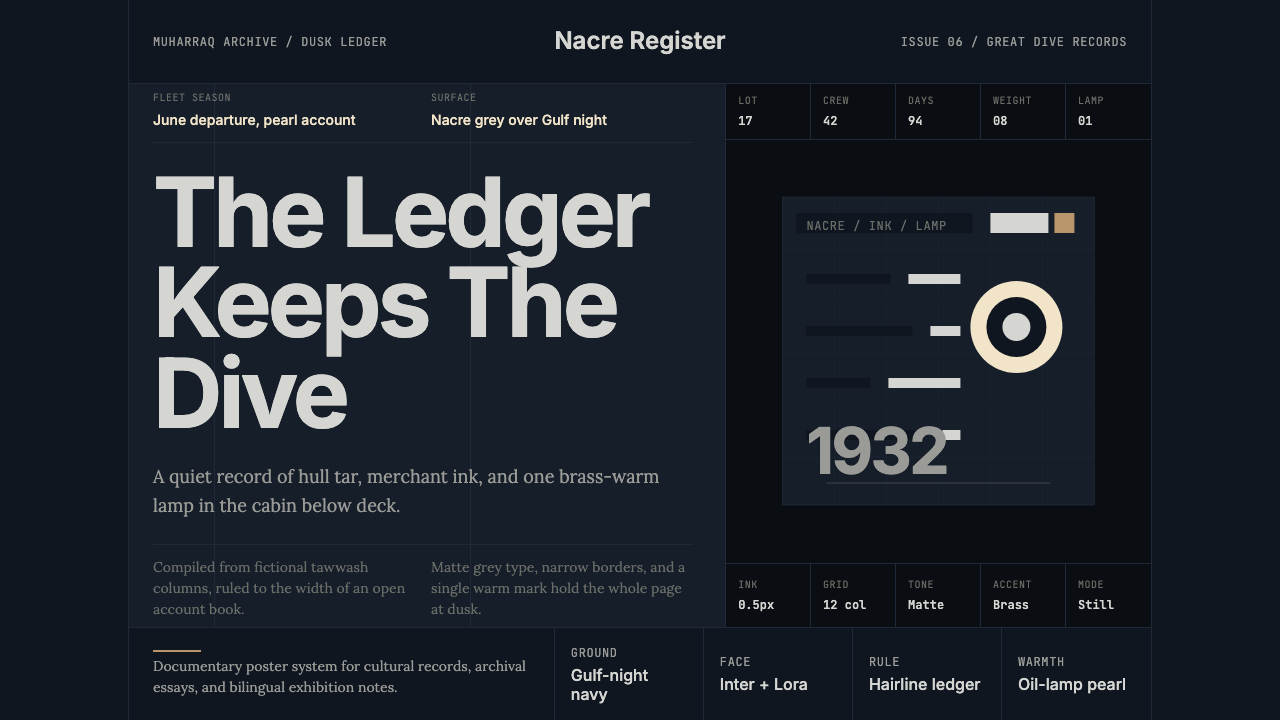 Bahraini Pearl Diving GreyQuiet authority at dusk. Nacre grey type and hairline grids hold one brass-wa…
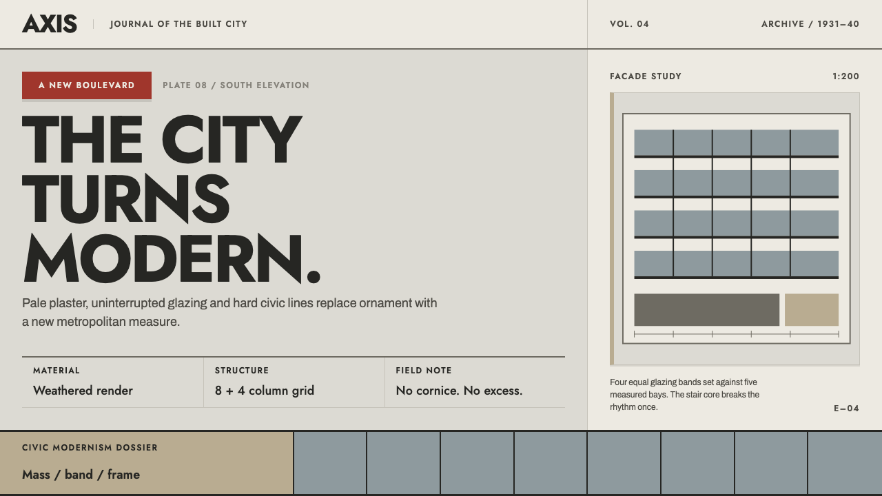 Bucharest Interwar ModernismModernism gathers civic weight. Sooted plaster, strict glazing bands and one…
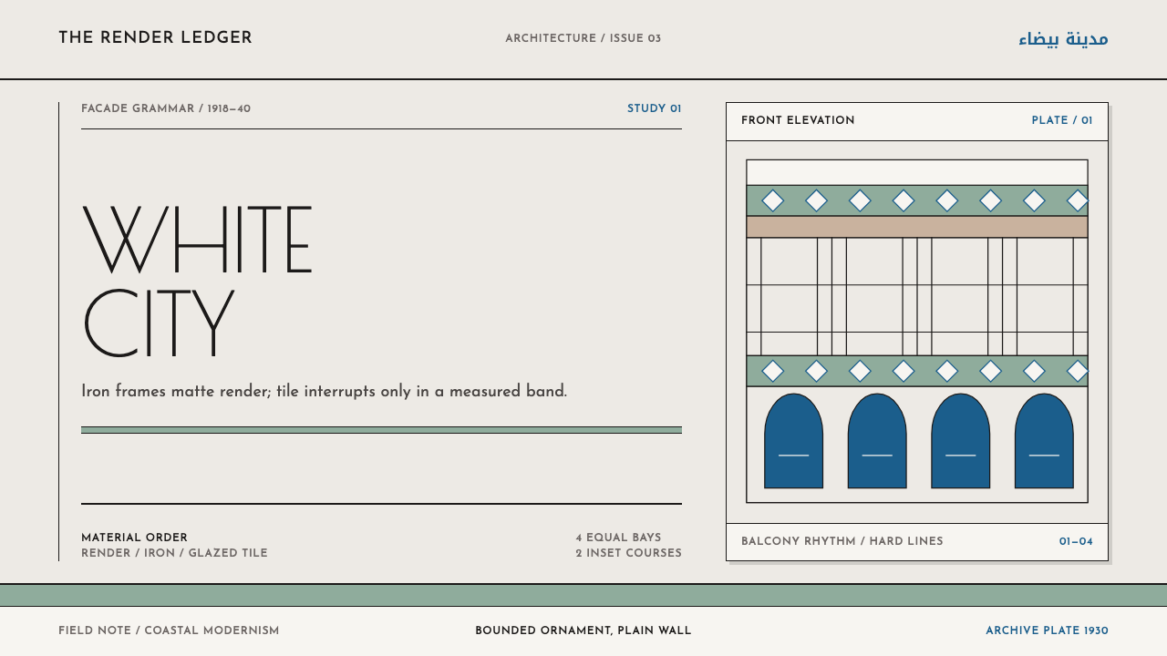 Casablanca Néo-MauresqueOrnament knows its boundary. Matte render, black iron, and celadon tile land…
 Gill Sans (BBC, 1928)Quiet authority, clearly set. Warm cream, black humanist sans, and hairline o…
 Nordic Classicism AsplundStone, not cream. Engraved Trajan capitals on cool chalk stucco, fluted colum…
 The New Yorker ClassicQuiet authority. Cream paper, EB Garamond columns, ink cartoons, and one red…