What is Tschichold Penguin Rules?
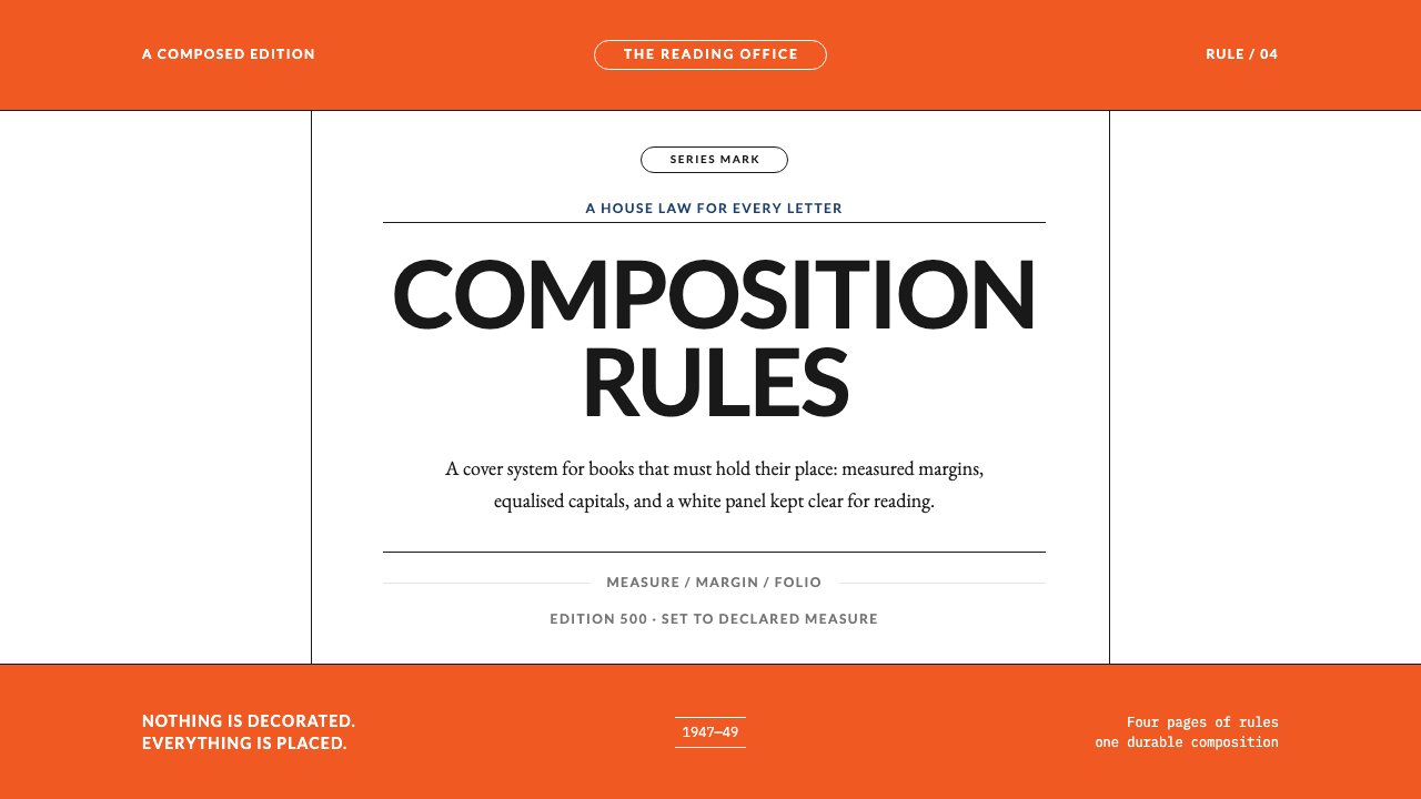
Jan Tschichold's Penguin work is what happens when design stops being taste and becomes law: four pages of rules, some five hundred redesigned titles, and a system in which any compositor would get the same result.
Tschichold Penguin Rules in brief
Tschichold Penguin Rules is a style drawn from the two years that the typographer Jan Tschichold spent redesigning Penguin Books, from 1947 to 1949. Visually it is easy to describe. A white centre panel sits between two colour bands, orange in this system. Author and title are set in capitals of a humanist sans-serif. A cartouche, the little frame that carries the Penguin mark, sits above them. Hairline rules, measured margins and letter-spaces equalised by eye complete the page.
What distinguishes it is that it is a rulebook before it is a look. Penguin already had the tri-band cover when Tschichold arrived. What it did not have was a law. In two years he redesigned some five hundred titles and wrote four pages, the Penguin Composition Rules, fixing indentation, punctuation, capitals, footnotes and folios for every compositor working on the list. The style reads as that law made visible.
Nothing in it is decorated. Everything is placed. There are no shadows, no ageing effects and no ornament, only elements put exactly where they belong. A reader may never notice an individual rule, but across a shelf of paperbacks the sum is unmistakable: calm, trustworthy and consistent. The aim was never to look beautiful. It was that anyone following the instructions would produce the same book.
Where does Tschichold Penguin Rules come from?
Penguin Books was launched in 1935 as a mass-market paperback publisher under Allen Lane, and its early covers were already unmistakable: a horizontal tri-band, colour above and below, white in the middle, a penguin mark at the top. The structure was the work of Edward Young. The lettering tradition around those early covers owed much to the humanist sans-serif associated with Eric Gill, whose letterforms rest on classical proportion rather than machine geometry. By the mid-1940s the series had grown fast, and printers across Britain were setting its books in slightly different ways.
Allen Lane brought in Jan Tschichold in 1947. Tschichold had been one of the leading voices of the New Typography in the 1920s, with its asymmetry, sans-serif and rejection of tradition, and had since moved toward classical book typography with its symmetry, proportion and respect for the reader's habits. It has been summed up as 'New Typography turned classical', and the Penguin years are where the turn becomes a system. His covers are centred and composed, not asymmetrical and dynamic.
The Penguin Composition Rules are the real centrepiece. Four pages long, they specified indentation, punctuation, capitals, footnotes and folios, the details that vary from compositor to compositor unless somebody writes them down. This was not an aesthetic preference but a production method. A paperback list set at many printers needs written instructions so that a book from one house looks like a book from another. The style is a record of that insistence on legible, repeatable order.
Tschichold's tenure ran from 1947 to 1949, but the rules outlived it. Hans Schmoller, who followed him as Penguin's typographic lead, kept them in force, and they continued to govern the list for decades. The legacy sits between British book typography and mass-market paperback design: a carefully engineered quietness that happens to be cheap to print and easy to recognise, which is a rare combination.
What defines the Tschichold Penguin Rules look?
Tri-Band Structure
The cover is divided into three horizontal zones: a colour band above, a colour band below and a white panel between them. In this system the bands are orange. Colour here works as a category signal and a frame, never as a background for text, so the page stays calm while still being recognisable from across a room.
White Centre Panel
All the typography lives on a white panel. The white is the page itself, the place where text is read, while colour is confined to the bands. This separation keeps type crisp and legible and gives the whole design a bookish authority. Nothing overlaps, floats or bleeds into the panel.
Humanist Sans Capitals
Author and title are set in capitals of a humanist sans-serif, a letterform based on classical proportion rather than machine geometry. In the digital system an open humanist sans such as Lato performs this role. The capitals are never left to a font's default spacing; each pair is adjusted so the whole line reads as even.
Equalised Letter-Spacing
Letter-spaces are equalised by eye rather than by machine default, so that the visual weight of white space between letters is even. A wide A next to a straight H needs a different gap from two straight letters, and a typographer who respects the rule sets each pair accordingly. The result is a line of capitals that feels evenly lit.
Cartouche and Hairline Rules
A cartouche above the title carries the Penguin mark, and hairline rules separate the elements of the panel. The rules are very fine, enough to organise the page without becoming ornaments. They behave like the lines on a drawing: functional, quiet and exact.
Measured Margins
Margins and the position of each element are fixed by rule rather than by feel. The centred axis organises the panel, with title, author and mark stacked on it in a stated order. Because positions are specified, the same layout can be reproduced by anyone, and a shelf of different titles shares one underlying geometry.
Rule as Consistency
The deepest feature is not visual at all. The Composition Rules existed so that any compositor following them would arrive at the same result. Order is visible rather than assumed. A designer applying the style should therefore write down decisions as rules, not just execute them once.

Who shaped Tschichold Penguin Rules?
Tschichold redesigned some five hundred Penguin titles in two years, from 1947 to 1949, and wrote the four-page Penguin Composition Rules. A former voice of the New Typography, he brought classical book typography to a mass-market list. His great contribution was less any single cover than the idea that a house style should be a written law, so that quality survives being passed from one hand to the next.
Young is credited with the original Penguin tri-band cover structure and the penguin mark, the framework that Tschichold inherited rather than replaced. His design set up the colour bands and white panel that the later rules refined. The Tschichold style is, in that sense, a conversation with Young's structure: it keeps the skeleton and disciplines everything inside it.
Lane founded Penguin in 1935 and brought Tschichold in to bring order to a fast-growing list. His commercial insight, that good books should be cheap and recognisable, depended on exactly the kind of system the Composition Rules provided. The project shows a publisher understanding design as infrastructure, a way of making hundreds of titles feel like one trusted series.
Schmoller followed Tschichold as Penguin's typographic lead and kept the Composition Rules in force. The fact that they governed the list for decades after Tschichold left is itself a measure of how well they worked. Schmoller represents the quieter part of a system's success: stewardship, in which the rules are maintained and applied rather than reinvented.
Gill's name is attached to the humanist sans-serif tradition behind early Penguin covers. His letterforms rest on classical proportion, giving sans-serif capitals a warmth and a rhythm that machine-geometric faces lack. That lineage explains why the style prefers a humanist sans, and why its capitals respond so well to careful, optical spacing.
How do you use Tschichold Penguin Rules today?
Tschichold Penguin Rules is a style for work in which reading and trust matter more than impact. It suits documents, reports, libraries and any product that wants to feel like a well-made book. To apply it correctly, think of a rulebook first: decide the proportions, margins, spacing and hierarchy, write them down, and then let the design follow.
For presentation slides, a cover can reproduce the tri-band structure directly: a colour band above, a colour band below, and a white panel with the title and author centred on a single axis. Content slides keep the white panel as the working area, with generous margins and a quiet hierarchy of capitals and lowercase. Data slides suit tables with hairline rules and restrained figures, where order is shown through alignment and spacing rather than boxes and fills.
For web interfaces, it is a natural fit for documentation, knowledge bases, long-form reading views and pricing pages that should feel like a printed leaflet. Use a centred reading column on a white ground, with the colour bands as header and footer frames. Components should remain flat and quiet: thin rules instead of heavy borders, no drop shadows, and no gradient fills. Spacing tokens should be specified once and applied everywhere, in the spirit of the rules themselves.
For editorial and marketing work, the style gives a publisher's voice, calm and authoritative, to catalogues, series pages, newsletters and book-like reports. Use colour as a category code, the way the original bands marked different parts of a list, and keep everything else within the white panel. A series of consistent pages will build recognition faster than any individual flourish.
The most common mistake is to copy the look without the discipline. Capital letters with default spacing look careless, because the unevenness that the rules existed to remove returns at once. Another mistake is to decorate the bands with textures, shadows or extra rules; the design only works if everything is placed and nothing ornamental is added. And a third is to mix several typefaces; the system depends on a single humanist sans handled with care.
Tschichold Penguin Rules — FAQ
What are the Penguin Composition Rules?
They are a four-page set of instructions that Jan Tschichold wrote during his time at Penguin, from 1947 to 1949. They fixed indentation, punctuation, capitals, footnotes and folios for every compositor working on the list. Their purpose was consistency across many printers, so that books set in different places looked as if they came from one house. They stayed in force for decades after Tschichold left.
Why is Tschichold's Penguin work centred when he once argued for asymmetry?
Because by the time he reached Penguin his approach had changed. He had been a leading voice of the New Typography in the 1920s, but the Penguin years are best described as the New Typography turned classical. In book work, symmetry and proportion serve readers who bring long habits to the page, and a centred axis organises a small cover panel simply and legibly.
What does 'letter-spaced by eye' actually mean?
It means that the gaps between capital letters are adjusted according to their visual weight, not left to a font's automatic spacing. A pair like an open diagonal letter beside a vertical stem needs a different gap from two straight stems if the white space is to look even. On screen this means applying manual kerning to titles and setting capitals with deliberate tracking, never relying on defaults.
Is this the same as Swiss International Style?
No. It shares an interest in order, clarity and the grid-like discipline of rules, but it is classical where Swiss style is asymmetric and modernist. The layout here is centred and bookish, the type is a humanist sans rather than a neo-grotesque, and the roots are in British book typography and mass-market paperback design. It is order of a different temperament, warmer and more traditional.
How should the colour bands be used in a digital product?
Treat them as frames and category signals, not as backgrounds for text. Use one colour, orange in this system, for header and footer bands, keep the reading area on white, and apply the colour consistently so that it carries meaning. If you need several categories, assign each its own band colour, as the original series did, but never let the bands compete with the white panel in the middle.
Related design styles
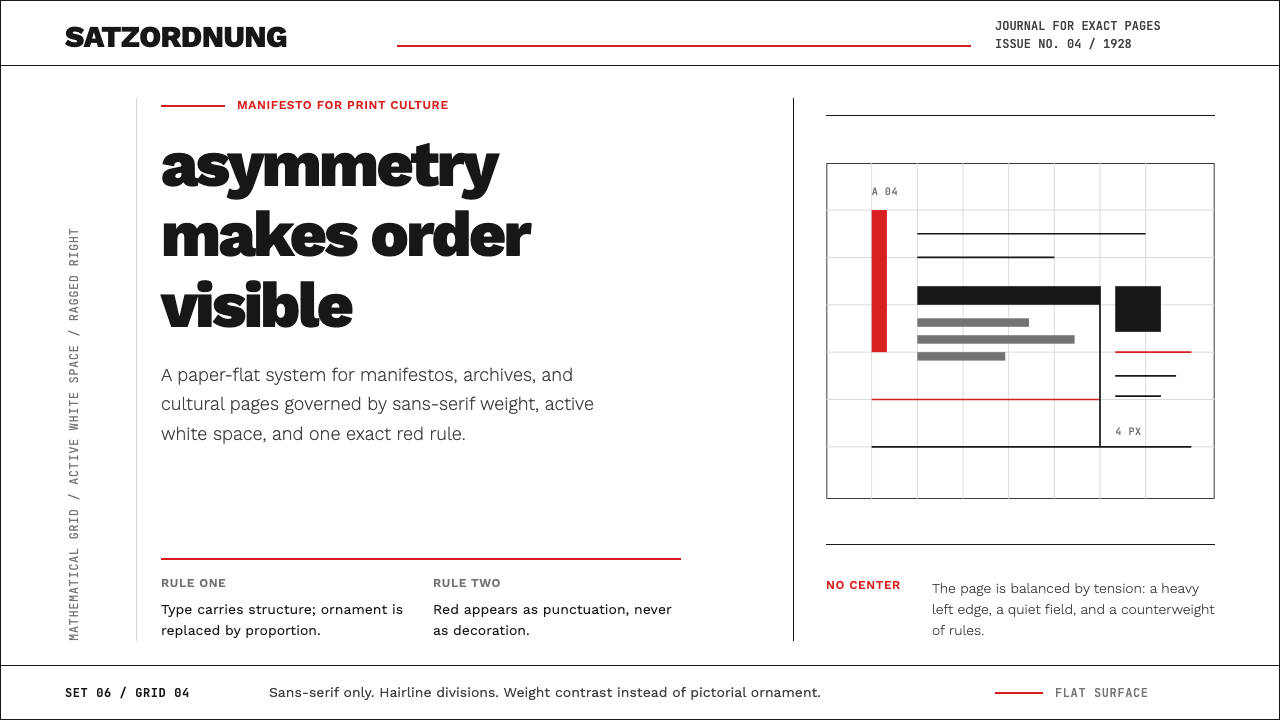 New Typography (Tschichold 1928)Tschichold's 1928 doctrine in CSS. Asymmetric grid, hairline rules, red-and-b…
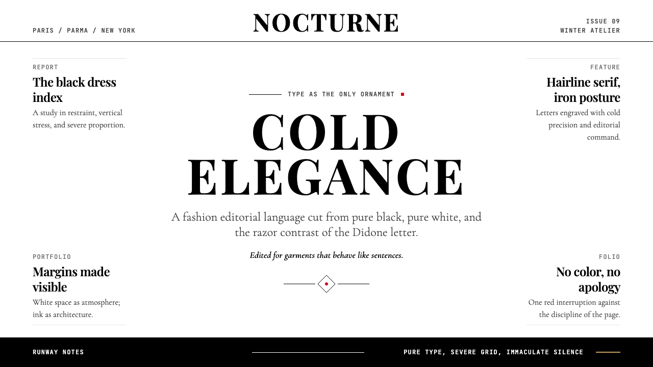 Vogue DidoneCold authority. Black-on-white Didone, red accent, and vast editorial whitesp…
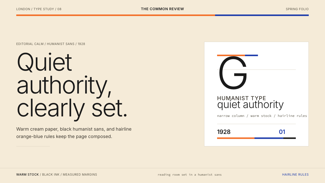 Gill Sans (BBC, 1928)Quiet authority, clearly set. Warm cream, black humanist sans, and hairline o…
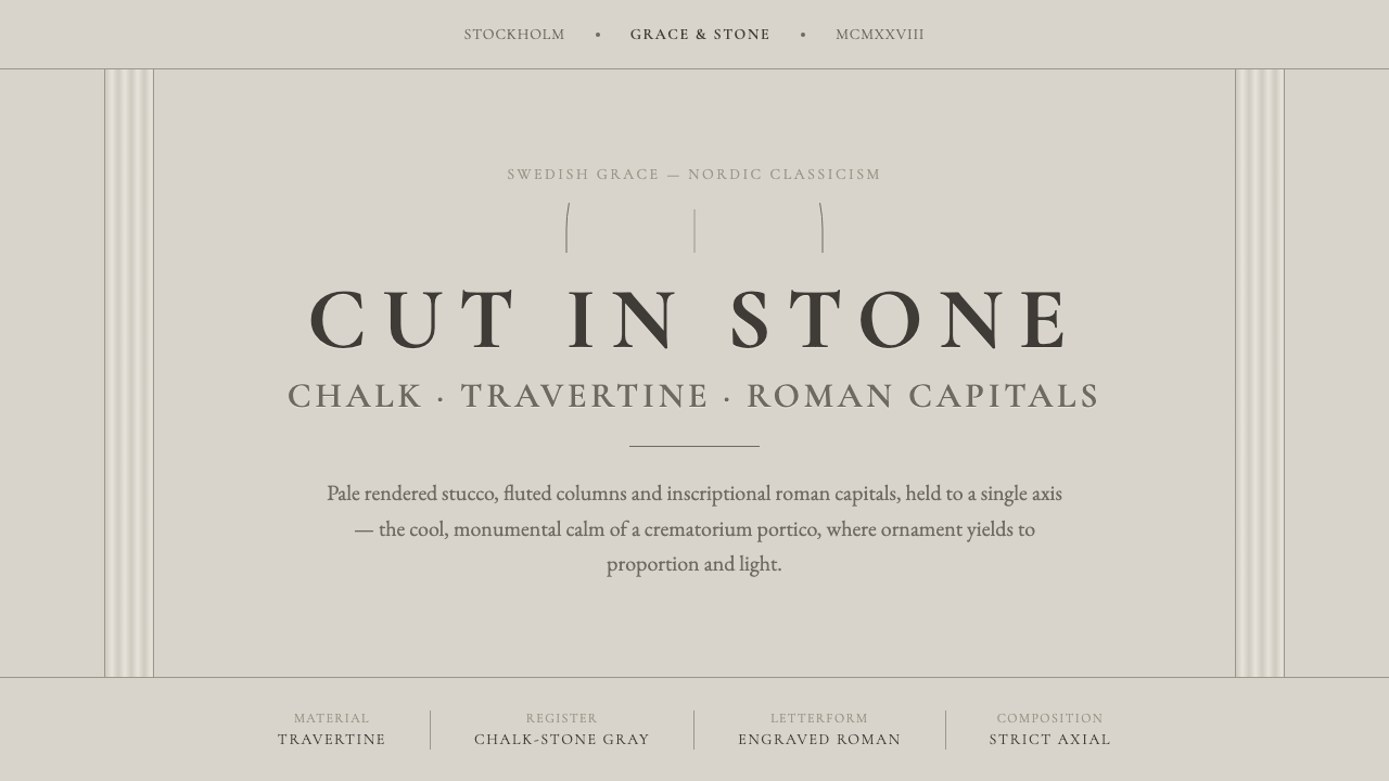 Nordic Classicism AsplundStone, not cream. Engraved Trajan capitals on cool chalk stucco, fluted colum…
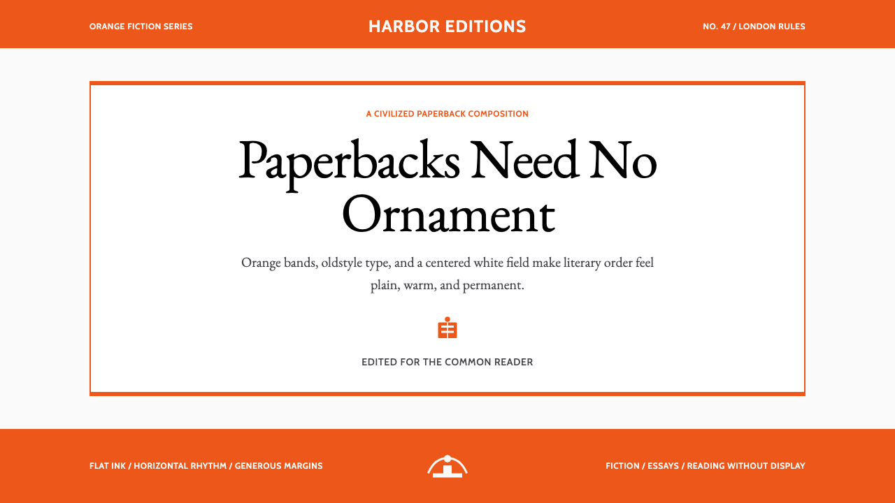 Penguin Classics OrangePaperback authority. Orange tri-bands, serif title panel, and flat ink enforc…
 Eiffel Tower (1889)Structure speaks plainly. Graphite lattice, bronze rivets and measured type m…