What is Sucre White City?
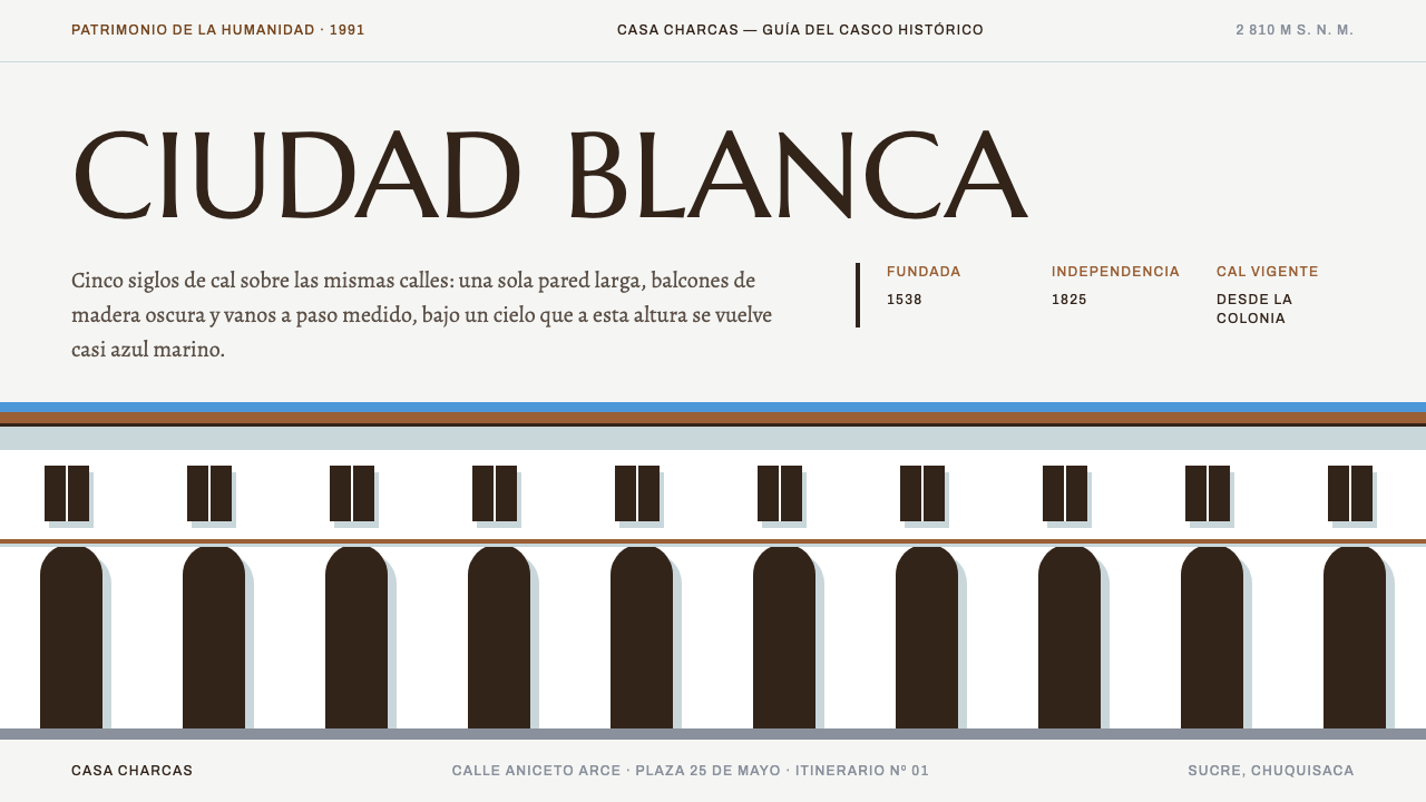
Sucre is called the White City because building rules have kept its historic centre lime-washed for nearly five centuries, and the design system reads like a walk down one of its streets: long white walls, dark openings on a strict rhythm, hard eave shadows.
Sucre White City in brief
Sucre White City is a design system drawn from the historic centre of Sucre, the constitutional capital of Bolivia, set in a high Andean valley. The city is known as La Ciudad Blanca, the White City, because its building rules have required the facades of the old centre to be whitewashed with lime for nearly five hundred years. The visual language takes that single fact and builds on it: a lime-white ground, long unbroken spans, and dark openings placed along a strict rhythm.
The palette is made of a handful of real materials and the sky above them. There is whitewashed stucco for the walls, hand-thrown clay tile for the roofs, dark timber for the balconies, near-black joinery for doors and window grilles, and the deep, saturated blue that is only seen at high altitude. Nothing in the system imitates a texture; each colour is simply the colour of something that is actually there.
Type follows the same civic logic. Headlines are set in inscriptional capitals, like the lettering on a plaque beside a doorway, while body text uses a serif drawn with Spanish in mind, so that accents and the letter ñ are native forms rather than patched-in additions. Shadows are hard-edged, like the shade cast by a deep eave at midday. The result suits heritage, museum, university and Spanish-language long-form content.

Where does Sucre White City come from?
The city was founded in 1538 under the name La Plata. Its founder is recorded as Pedro Anzúrez de Campo Redondo, and the settlement was laid out according to the Spanish colonial grid, the regular street plan prescribed by the Laws of the Indies. That grid is the underlying geometry of the design system: long straight street frontages, uniform building lines and repeated openings.
The look draws on Spanish colonial urbanism, but also on Andean Baroque, the regional variation of Baroque architecture that blended European forms with local craftsmanship, and on Bolivian republican civic architecture, the buildings that expressed the aspirations of the independent state after the colonial period. The white walls are the common thread, a surface against which carved portals, timber balconies and tiled roofs stand out.
In 1825, Bolivian independence was declared in Sucre, and the city's name was changed in honour of Antonio José de Sucre, the military leader associated with the independence struggle and named among the key figures connected with this system. The historic centre was inscribed on the UNESCO World Heritage List in 1991, recognising its architectural ensemble and its continuity from the colonial era.
The whiteness itself is a rule rather than an accident. Because the city's regulations have maintained the practice of lime-washing, the visual unity of the centre is a deliberate civic decision repeated over generations. That makes it an unusually good model for a design system, which is also a set of rules intended to keep many separate pieces looking like one place.
What defines the Sucre White City look?
Lime-wash white ground
The page is the colour of whitewashed stucco: warm, slightly chalky, never clinical. Large areas of it stay empty, reading as long wall spans between openings, and give the layout its calm.
Dark openings on a strict rhythm
Dark elements such as buttons, images and navigation items are spaced at regular intervals, like doors and windows along a street frontage. The repetition provides order, and the contrast with the white wall makes each opening clear.
Plaque capitals for headlines
Headlines are set in inscriptional capitals in the manner of lettering carved or painted on a plaque beside a doorway. They give titles the weight of a civic notice and keep the page formal.
Spanish-ready serif body
Body text is set in a serif designed with Spanish in mind, so accented vowels and the ñ have their own properly drawn forms. This matters for cultural and institutional content, where mis-set diacritics immediately look careless.
Hard eave shadows
Shadows have sharp edges and are offset in one direction, as if cast by a deep roof overhang under strong sun. There is no soft blur; shade is simply a darker shape beside the white.
Material palette with highland blue
Accents come from clay tile, dark timber, near-black joinery and the saturated blue of the high-altitude sky. Each is used sparingly, and none is decorative; they mark places where a real material would appear in the street.

Who shaped Sucre White City?
Recorded as the founder of the city in 1538, when it was established as La Plata.
Military leader associated with Bolivian independence, in whose honour the city was later named.
How do you use Sucre White City today?
In slide decks, use the system for heritage reports, museum proposals, university lectures and cultural presentations. Keep slide backgrounds in lime white, set titles in plaque capitals, and place dark rectangular images or text blocks at regular intervals, like windows. Body text in the Spanish-ready serif works well for bilingual or Spanish-language decks. For data slides, use dark ink on white and a single earthy tile or timber colour for emphasis; avoid bright charts that would read as foreign to the palette.
On the web, the pattern suits institutional sites, cultural organisations, tourism boards, archives and universities. Build page sections as long white bands separated by evenly spaced dark elements, and keep navigation formal and regular. Buttons can be dark, rectangular and plainly labelled, with a hard offset shadow on hover. In dashboards or pricing pages, the same discipline helps: a white surface, a strict repeating rhythm of rows or plans, and dark emphasis only where something needs action.
For editorial and marketing work, the system is well matched to long-form writing, especially in Spanish. A feature about a restoration project, a historical essay or an exhibition catalogue can use plaque capitals for headings, a calm serif for the text, and a large photograph of a facade as the single visual event. The generous white space supports slow reading.
A common mistake is to treat the style as a generic minimalist white theme. Without the rhythm of dark openings and the hard shadow, the page loses its architectural character and becomes a blank sheet. Another mistake is softening the shadows or rounding the corners, which would turn a sharp, civic geometry into a friendly app template. A third is using the highland blue as a large background colour; it works best as a small, saturated note, the way sky appears between rooflines.
Finally, take the Spanish typography seriously. If the content includes accented characters, check that every one renders in the intended serif, because the credibility of a heritage or institutional site depends on getting its language right.

Sucre White City — FAQ
Why is Sucre called the White City?
Its building rules have kept the facades of the historic centre lime-washed white for nearly five centuries, so the old town reads as one continuous white surface broken by dark doors, windows, timber balconies and clay roofs. The Spanish name is La Ciudad Blanca.
What is the historical background of the city?
It was founded in 1538 as La Plata on the Spanish colonial grid. Bolivian independence was declared there in 1825, after which the city was renamed in honour of Antonio José de Sucre. The historic centre became a UNESCO World Heritage site in 1991.
Which architectural traditions does it draw on?
Mainly Spanish colonial urbanism with its Laws of the Indies grid, Andean Baroque, and Bolivian republican civic architecture. The white wall unifies all three and provides the surface against which their different details can be read.
Why does the typography emphasise Spanish?
Because the content it serves is often Spanish. Body text uses a serif drawn with Spanish in mind, so accents and the letter ñ appear as native glyphs rather than composed approximations. This gives heritage and institutional pages the polish they need.
What kind of projects is this style best for?
Heritage organisations, museums, universities, archives and long-form Spanish-language publications are the best fits. It is less suitable for playful consumer apps, where its formal rhythm and hard shadows would feel stiff.
Related design styles
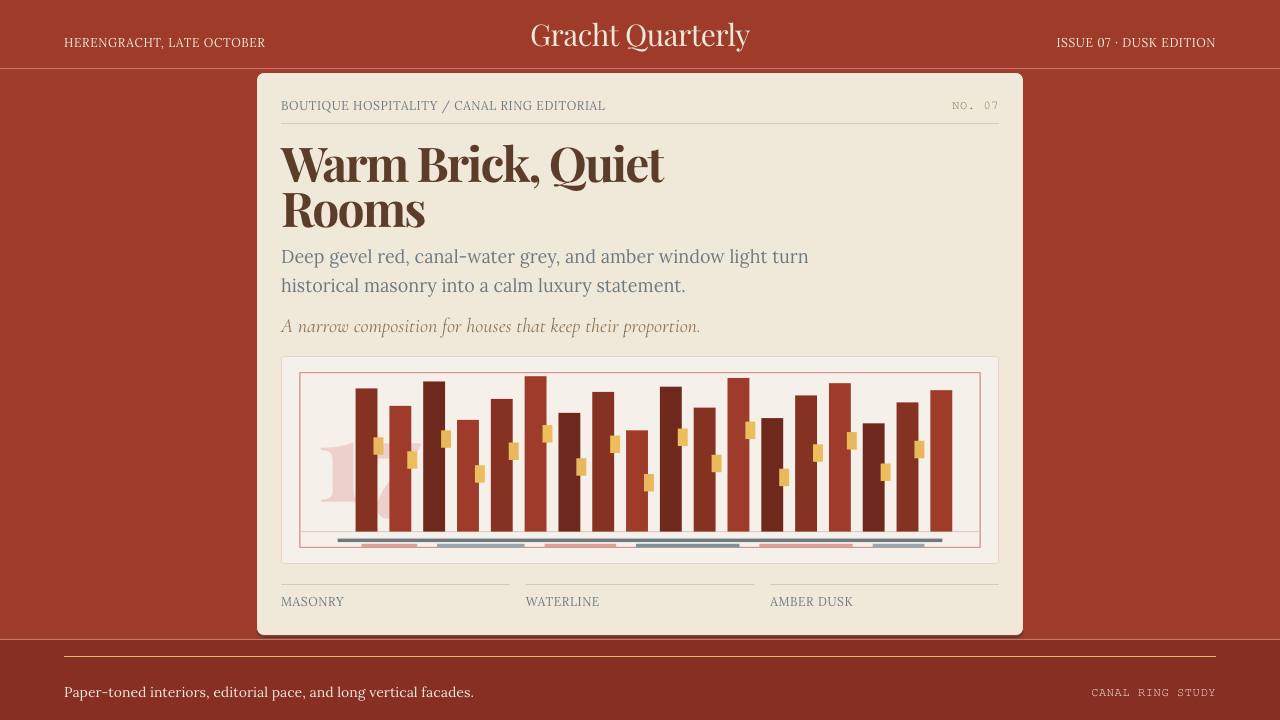 Amsterdam Canal HouseQuiet luxury in brick and cream. Playfair serif, narrow columns, amber window…
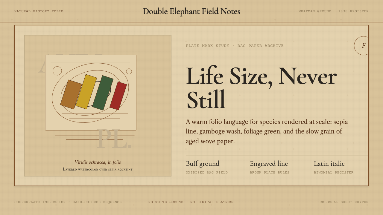 Audubon Birds of AmericaAged natural history breathes. Buff rag paper, sepia rules, and italic binomi…
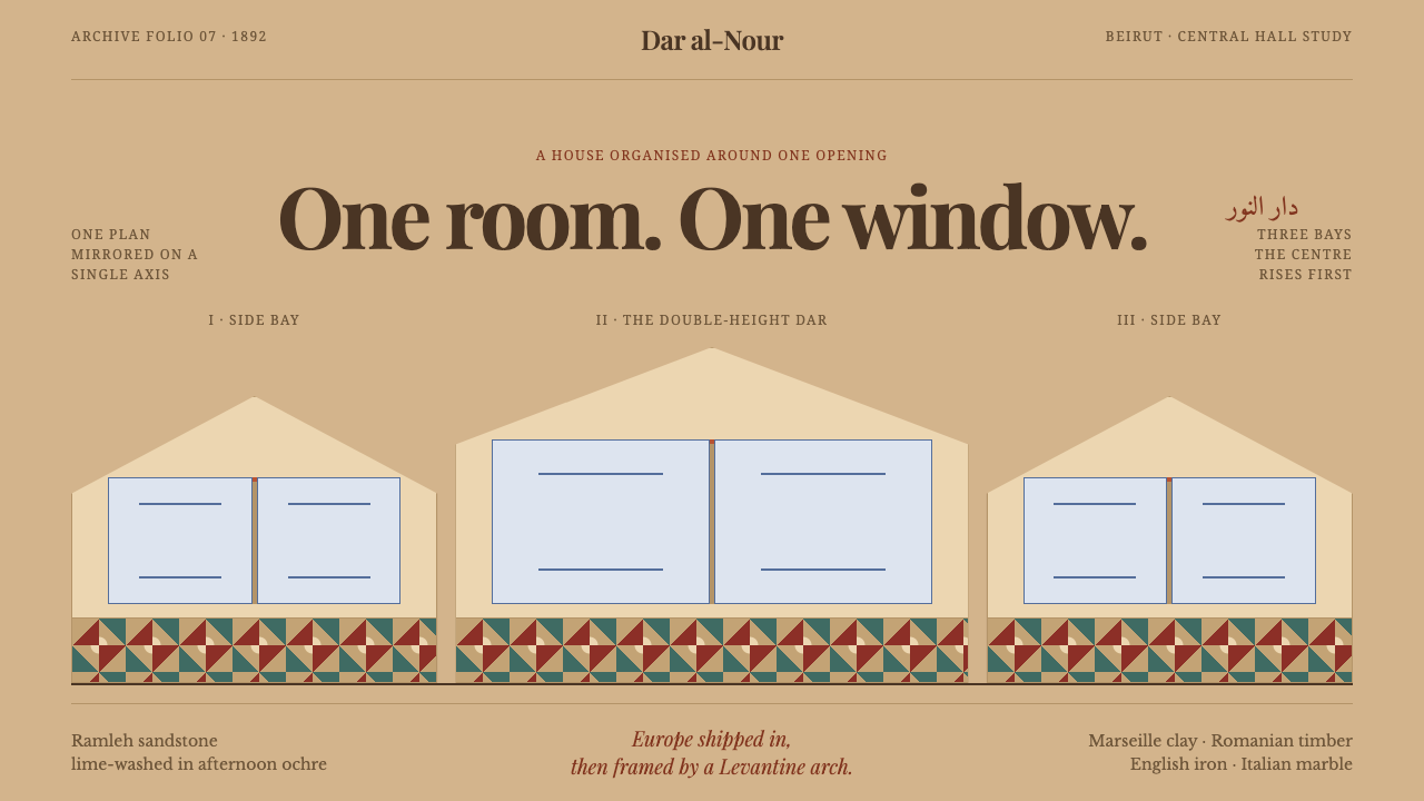 Beirut Triple-Arch HouseSymmetry holds the house together. Sandstone ochre frames three pointed bays…
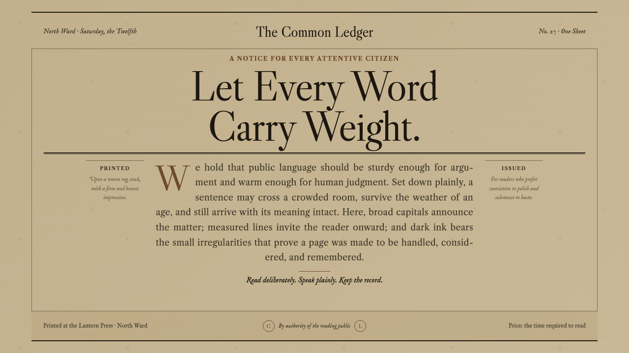 Caslon English Text SerifWarm authority, pressed into paper. Caslon capitals and engraved rules comman…
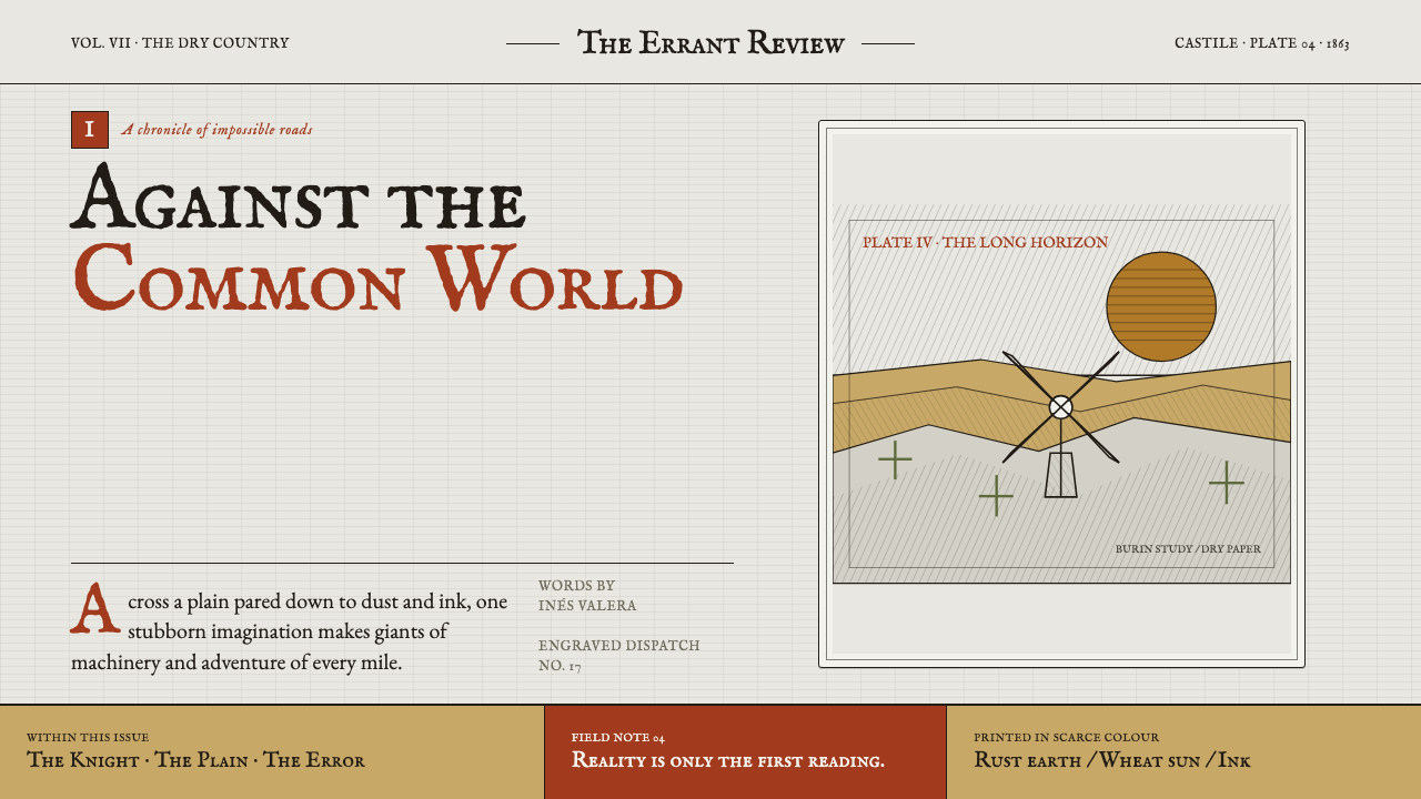 Don Quixote (1605)Imagination defies the plain. Rust capitals and cross-hatched ink score a dry…
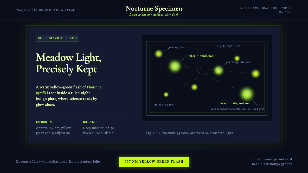 Firefly BioluminescenceQuietly luminous. Yellow-green 557 nm sparks drift through ruled indigo plate…