What is Studio Mumbai?
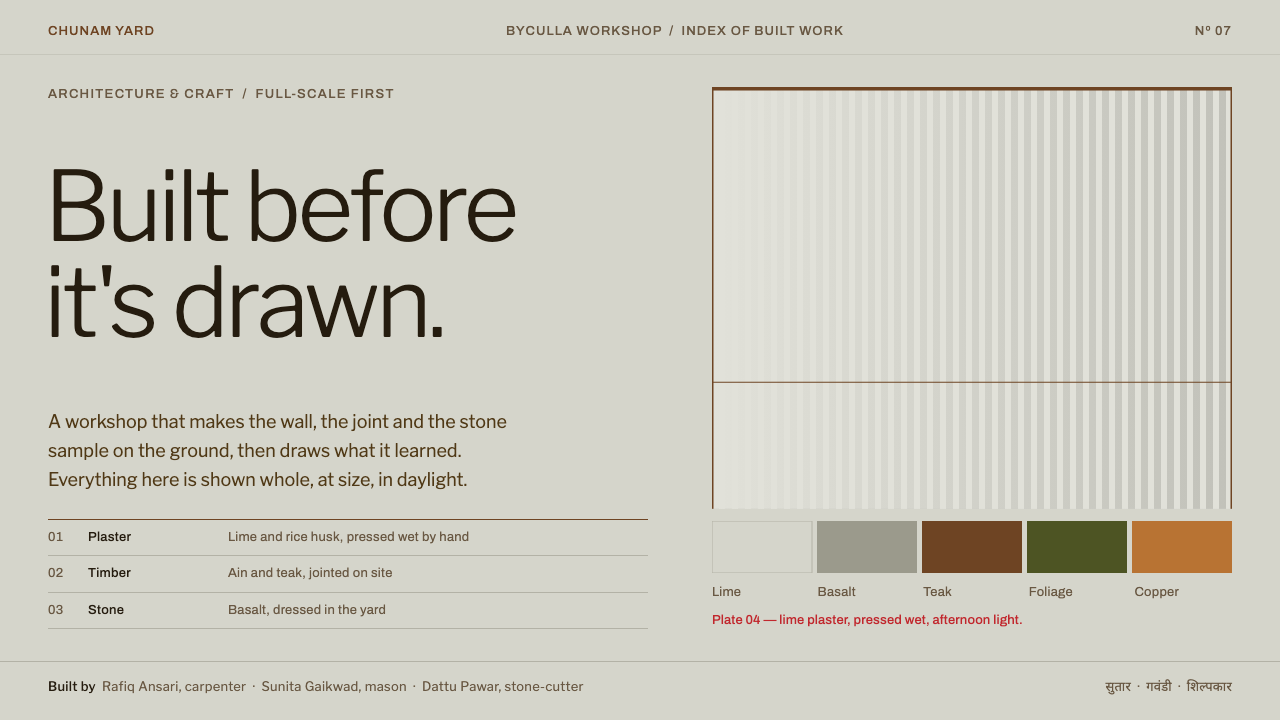
Studio Mumbai designs like a workshop rather than an office: build first, draw later, with pale lime-plaster grey, thin teak lines, small left-aligned type and a single line of vermilion.
Studio Mumbai in brief
Studio Mumbai is a design system drawn from a workshop courtyard in Byculla, in Mumbai. The picture it starts from is physical: a pale grey wall of lime plaster mixed with rice husk, full-size mock-ups and stone samples laid on the ground in front of it, and teak frames cut and jointed on site by the studio's own carpenters. The interface tries to feel like that courtyard rather than like a conventional architecture website.
In practice the system uses large open fields in a cool plaster grey, thin hardwood-coloured lines that act like beams and posts, and small, left-aligned type that never raises its voice. Photographs of materials are shown whole and enlarged, because the studio's argument is made through things rather than through slogans. Vermilion appears only once, as a single line of caption text; it is never spread across buttons, banners or backgrounds.
The overall effect is quiet, tactile and slightly austere. It suits projects that let objects speak, such as architecture practices, handmade furniture and material catalogues, where the interface should step back and leave room for stone, timber, plaster and the traces of hands on them.

Where does Studio Mumbai come from?
Studio Mumbai was founded in 1995 by Bijoy Jain, and it is based in Mumbai, India, with its workshop in the Byculla district. Jain's practice is known for working in a way that reverses the usual order of architecture: carpenters, masons and architects make things first, at full scale, and drawings follow. The studio's own craftspeople are part of the design process rather than contractors who receive a finished set of plans.
That method places the studio within several overlapping traditions. Craft-based, hand-built architecture treats making as a form of thinking. Critical regionalism, the idea that buildings should respond to local climate, materials and culture rather than to a generic international style, explains the reliance on regional materials such as lime, timber and stone. Indian tropical modernism adds the practical intelligence of buildings that handle heat, shade and rain through proportion and material rather than through machinery.
Several works mark the studio's public profile. Palmyra House, from 2007, is one of the early projects that brought international attention. In 2010 the studio took part in the Venice Biennale, and in 2017 it presented Maniera 06. In 2023 it was connected to a project with Fondation Cartier. Kazuyo Sejima is also named among the figures connected with the studio's story, reflecting the international architectural dialogue in which Jain's work has been shown.
The website of the studio follows the same restraint as its buildings, and the design system distils that restraint: pale ground, slender structural lines, small type and one rare point of vermilion. The geography of the studio is also part of the picture, since it works across Mumbai, Alibag and Nandgaon on the Konkan coast, places where the climate and local materials shape every decision.
What defines the Studio Mumbai look?
Lime-plaster grey fields
Backgrounds are a cool, pale grey, slightly green in the shade, like a wall of lime and rice husk burnished by hand. The surface is left open and unbroken, so content sits on it the way objects sit in front of a courtyard wall.
Thin teak rules
Structure is drawn with fine hardwood-coloured lines that work like beams and posts. They divide space and mark edges without adding weight, so the layout reads as a lightly jointed frame rather than as a set of boxes.
Small, left-aligned type
Text is set small, flush left and without display flourishes. The modest scale and ragged right edge give the page the tone of a workshop notebook, not a showroom brochure.
One vermilion line
Vermilion is used exactly once, on a single line of caption text. It is not a brand colour to be distributed across components; its rarity is what lets it register as a small human mark on the wall.
Whole, enlarged material photographs
Photographs of stone, timber and plaster are shown uncropped and large, as if samples were laid out on the ground. The page treats materials as primary content rather than as decoration around a message.
Built-first logic
Components are plain and unadorned, as if made on site rather than rendered. There are no glossy effects or ornamental flourishes, only surfaces, edges and joints, which keeps the interface honest about what it is.

Who shaped Studio Mumbai?
Founder of Studio Mumbai in 1995; the architect whose workshop method of making first and drawing later defines the practice.
Architect named among the figures connected with the studio's international story.
How do you use Studio Mumbai today?
In slide decks, this style works for project presentations and studio portfolios. Fill each slide with a pale grey field, place one large, uncropped material or building photograph, and add a short, small caption flush left. Thin warm-brown rules can separate sections. Reserve vermilion for one caption in the entire deck, perhaps the title of the most important project. For data slides, use sparse tables with fine rules and avoid coloured fills: the numbers should look like notes beside a drawing.
On the web, the pattern is built for architecture practices, craft studios, furniture makers and material libraries. Use open grey space for galleries, let images stand at full width, and keep navigation as small text links aligned left. Cards should be flat and defined by hairlines rather than by shadows. In dashboards or pricing contexts, translate the same logic: grey surfaces, thin dividers, and a single vermilion line for the one piece of information that needs attention, such as a status or a deadline.
For editorial and marketing work, the style supports long, quiet essays about process. A feature on how a house was built, a catalogue of stone and timber samples, or an exhibition page can use large photographs, brief captions and generous empty space. The voice should be factual and unhurried, closer to a workshop log than to promotional copy.
A common mistake is to treat vermilion as an accent colour and scatter it across buttons, links and icons. Once it appears more than once, the effect of a single mark on a wall is lost and the page becomes generic. Another mistake is replacing the grey with pure white and the hardwood lines with black, which removes the warmth of materials; the system depends on tone rather than contrast. A third is cropping photographs into tight circles or cards, which contradicts the idea of showing materials whole.
Finally, keep the layout slow. This is not a style for dense dashboards or aggressive calls to action. If a page needs urgency or high information density, borrow the palette and the line work, but accept that the result will be a quieter, more reflective interface than most commercial templates.

Studio Mumbai — FAQ
Who is Bijoy Jain and what is Studio Mumbai?
Bijoy Jain founded Studio Mumbai in 1995. It is an architecture and design practice based in Mumbai, with a workshop in Byculla, where carpenters, masons and architects make things at full scale before drawing them. Its work is associated with craft-based, hand-built architecture and critical regionalism.
Why only one line of vermilion?
The studio's own website uses vermilion on a single line of caption text, and the design system keeps that discipline. A colour used only once reads as a human mark on a pale wall; spread across components, it becomes ordinary branding and loses its meaning.
What does the plaster-grey background refer to?
It refers to the courtyard wall of the Byculla workshop, plastered with lime mixed with rice husk and burnished by hand. The grey is pale and cool, slightly greenish in shade, and it is meant to feel like a real material surface rather than a neutral digital background.
Which projects are associated with the studio?
Notable milestones include Palmyra House in 2007, participation in the Venice Biennale in 2010, Maniera 06 in 2017, and a project connected with Fondation Cartier in 2023. These show the studio's progression from regional commissions to international exhibition.
Is this style suitable for a commercial product?
It can be, provided the product is object-led and low in density, such as a furniture maker, a craft brand or a material library. It is a poor fit for transaction-heavy interfaces that need strong calls to action, because the style deliberately avoids emphasis and decoration.
Related design styles
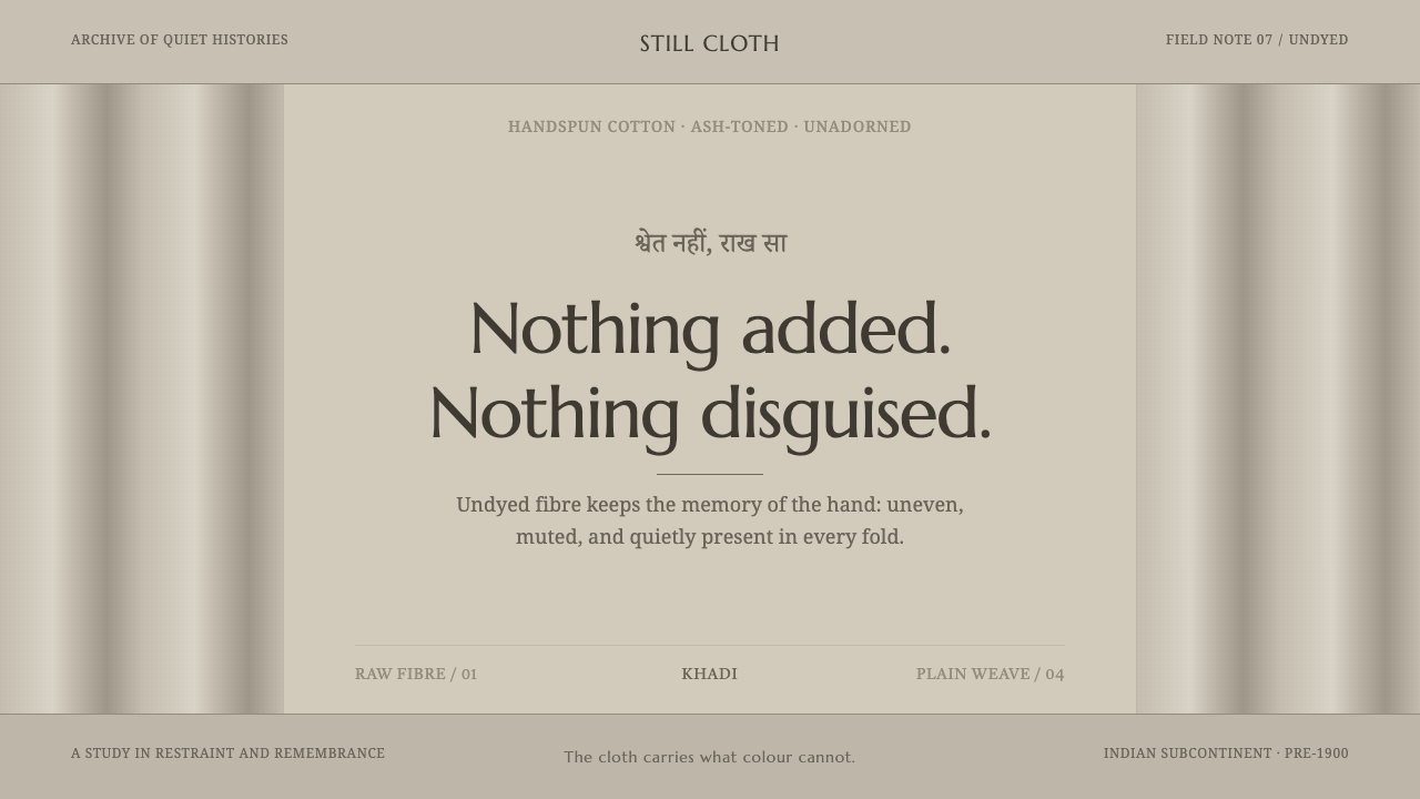 Hindu Widow White SariRestraint carries the weight. Ash-toned khadi, quiet serif type, and vertical…
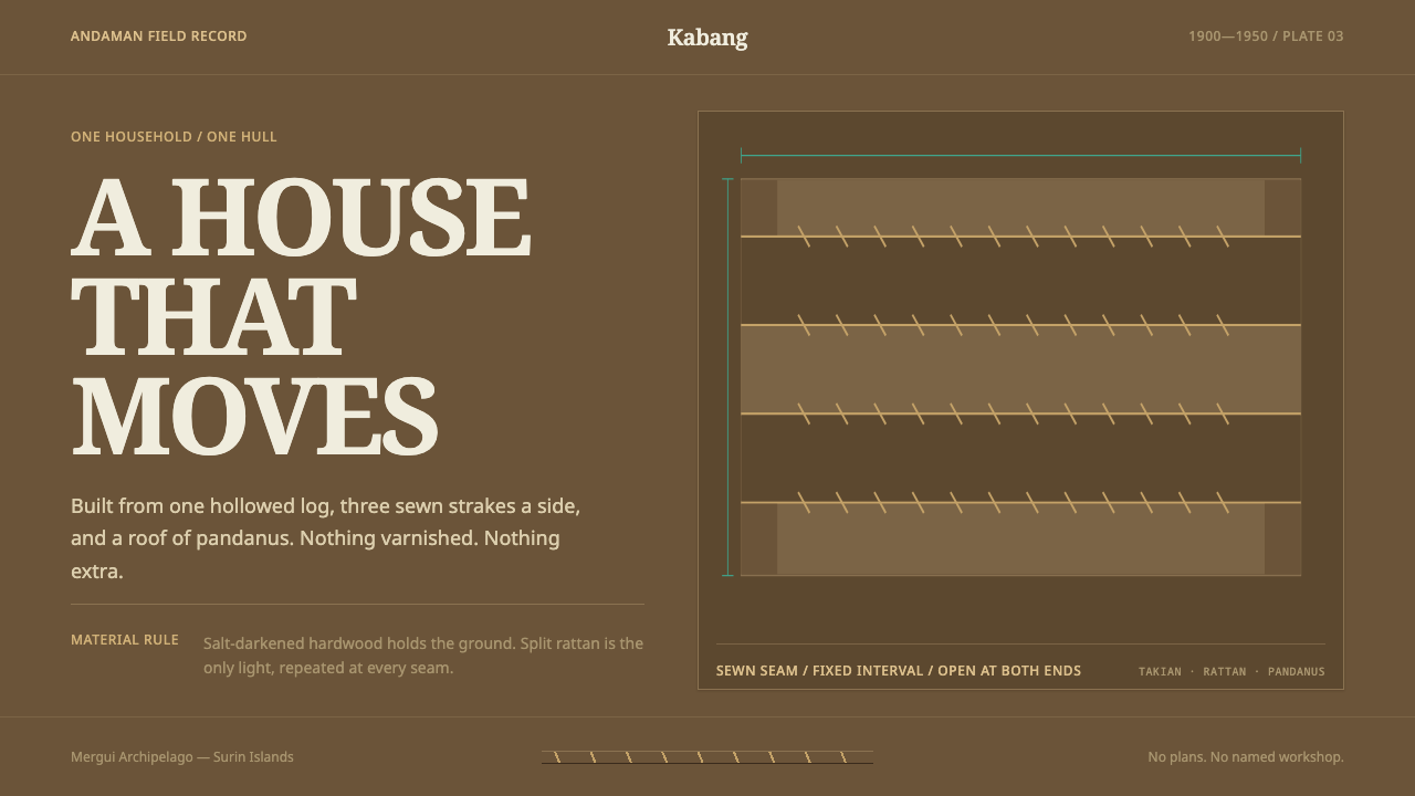 Moken KabangNothing extra survives at sea. Salt-dark wood and rattan seams make a spare m…
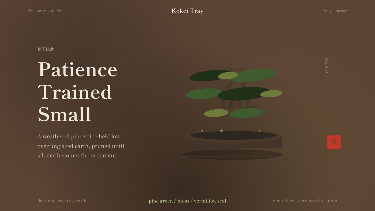 Bonsai CultivationQuiet asymmetry. Pine green rests on dark tray earth, sealed by one vermilion…
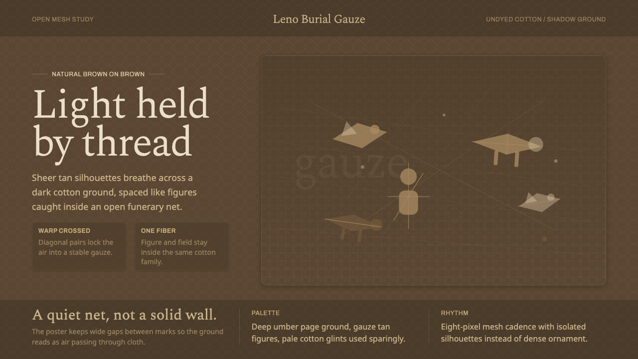 Chancay Gauze TextileQuiet woven dignity. Tan silhouettes float through a dark open cotton mesh.
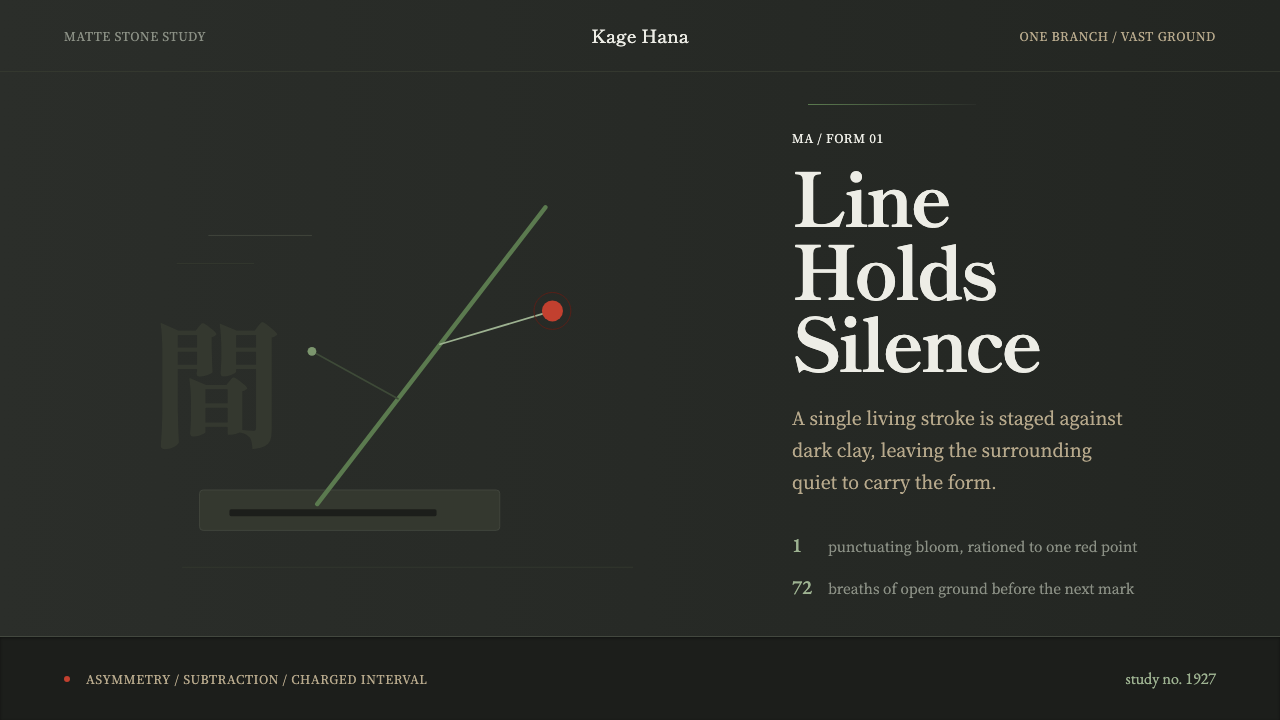 Ikebana SōgetsuQuiet becomes form. Dark stone, Mincho type, one green line and a single red…
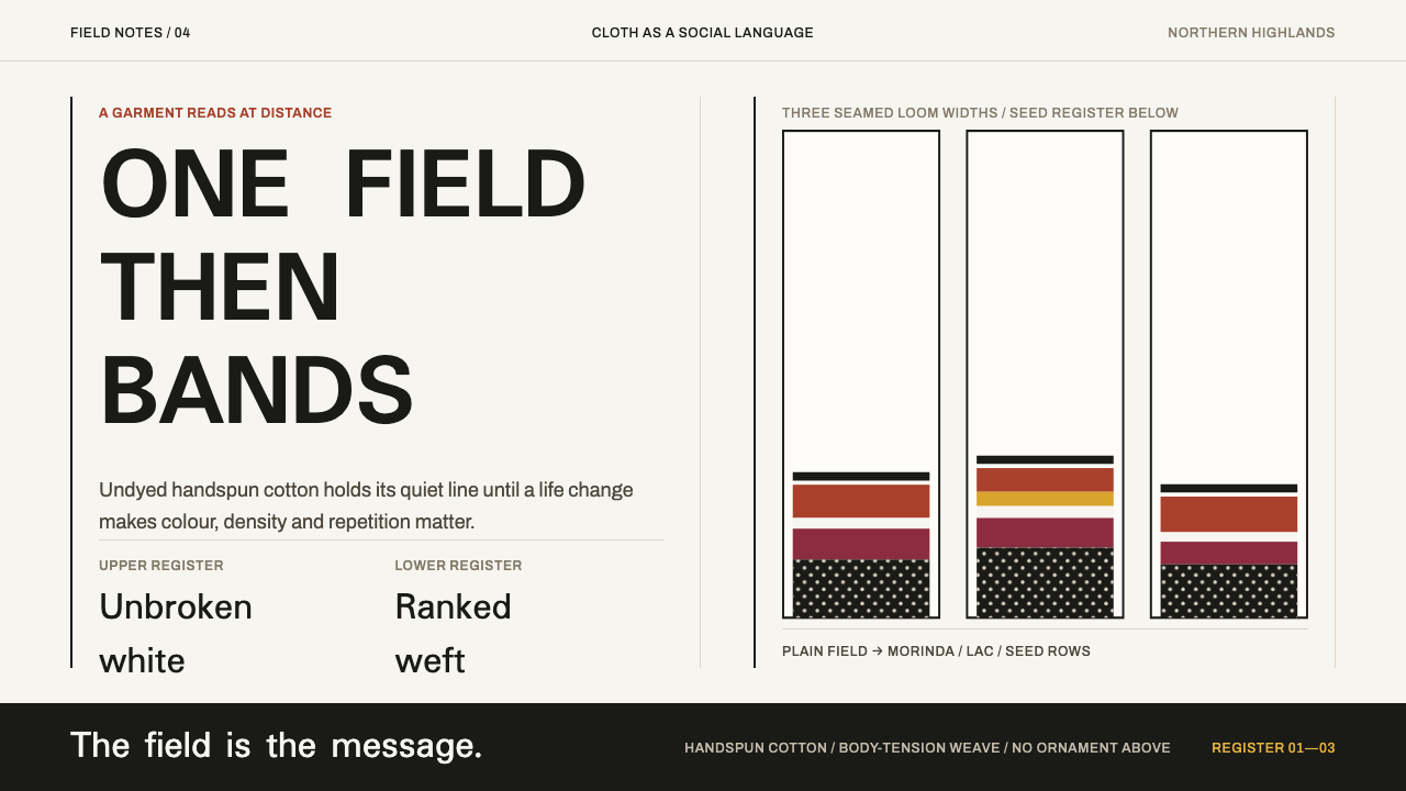 Karen Woven TunicOne field, then bands. Warm cotton white gives way to morinda registers and r…