What is Stray Cyber City?
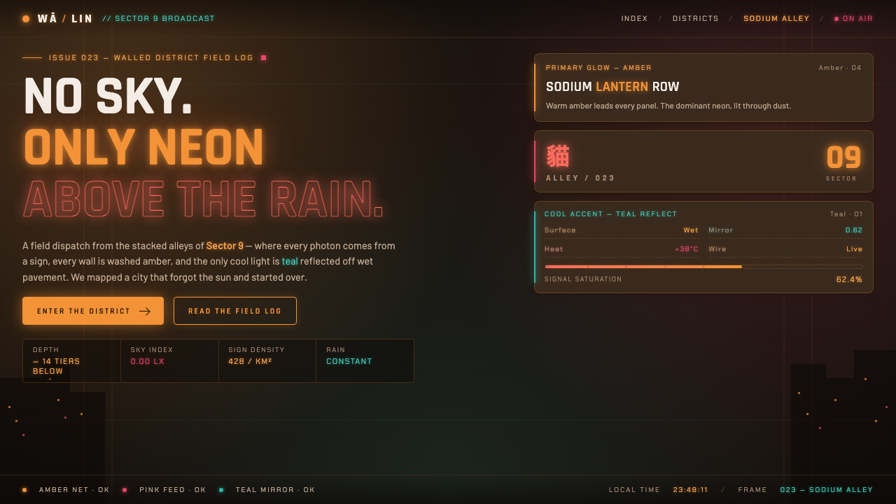
Stray Cyber City is a sunless neon-noir world where warm amber and pink-orange light stains every surface, and a single cool teal reflection keeps the darkness alive.
Stray Cyber City in brief
Stray Cyber City translates the atmosphere of Stray into a design language built from darkness, density, and artificial light. Its world is modeled on the Kowloon Walled City: narrow, layered, dusty, and without any visible sky. Interface surfaces should feel like walls and shopfronts in a wet alley, not like clean panels floating in open space.
The visual hierarchy is carried by light rather than by spaciousness. A deep sodium-lit brown ground establishes the environment; warm amber neon acts as the dominant signal; hot pink and red provide supporting glow; a single cool teal accent introduces contrast without breaking the palette. The result is warm, humid, crowded, and faintly dangerous.
This is atmospheric cyberpunk rather than sterile futuristic technology. Surfaces may be grimy, reflections may be uneven, and layers may overlap. Yet the system still needs readable structure: light should direct attention, color should distinguish function, and darkness should create depth. The design succeeds when the interface feels inhabited rather than merely decorated.
Where does Stray Cyber City come from?
The source places Stray Cyber City in 2022, as an atmospheric cyberpunk adventure experienced from a cat’s-eye perspective. Its defining premise is not a bright technological future but a sealed urban environment: there is no daylight, only the colored illumination of signs, windows, and reflected street glow.
The city is inspired by the Kowloon Walled City in Hong Kong, whose presence in the reference material supplies the system’s sense of compression and vertical density. Walls, alleys, signs, wires, refuse, and wet ground are understood as overlapping visual evidence of habitation. The city should feel assembled through accretion, with every surface carrying traces of another layer behind it.
Its production origin is placed in Western Europe through BlueTwelve Studio in France, while its imagined city draws from Hong Kong. The resulting identity belongs to a broader field of cozy cyberpunk, Kowloon Walled City density, and neon-noir environment art. It is intimate rather than monumental: the viewpoint stays close to surfaces, corners, reflections, and small pockets of colored light.
When translated into interface, this origin becomes a rule of atmosphere. Darkness is the base condition, amber is the guiding illumination, pink and red intensify the urban heat, and teal appears as a rare interruption. The system does not reproduce a literal street scene; it extracts the emotional logic of a crowded, sunless city and applies that logic to screens.
What defines the Stray Cyber City look?
Sodium Darkness
The ground is dark but not neutral. It carries a brown, sodium-lit warmth, so black areas feel like shadowed masonry rather than empty space. This warm darkness gives the brighter signs somewhere to bloom and keeps the interface from becoming a cold technological void.
Amber Command
Warm amber is the principal visual signal. It should carry the most important actions, active states, and navigational emphasis, behaving like the strongest sign in an alley. Its presence is luminous and functional at once: it attracts attention while preserving the world’s nocturnal warmth.
Hot Supporting Glow
Pink-orange and red appear as supporting illumination rather than competing primaries. They can mark urgency, secondary activity, or the visual heat of crowded urban surfaces. Their best use is concentrated and layered, allowing the amber lead to remain legible.
Teal Interruption
Cool teal is intentionally scarce. It reads as reflected sign-light or a distant technological presence against the warm field, so even a small teal element can become a landmark. Using it everywhere would destroy its narrative role and flatten the warm-cool tension.
Wet Reflection
Depth comes through reflection and diffusion across surfaces rather than through polished dimensional effects. Amber, pink, red, and teal may appear as broken glows on dark ground, suggesting rain, grime, and uneven pavement. The effect should feel environmental, not glossy.
Accumulated Density
The composition should feel layered and inhabited. Signs, labels, panels, wires, shadows, and fragments of information can sit close together, provided their hierarchy remains deliberate. Empty space is used as a dark alley or pause between signals, not as a default luxury.
Who shaped Stray Cyber City?
BlueTwelve Studio is the French studio named in the source material as the production origin of Stray. Within this design reference, it anchors the relationship between a Western European creative context and a city imagined through Kowloon Walled City density.
Annapurna Interactive appears in the approved material as one of the key figures attached to the Stray reference. Its inclusion places the design system within the game’s broader creative identity rather than treating the visual language as an isolated interface trend.
Koola is listed in the source as a key figure associated with Stray Cyber City. Because the approved material gives no further role description, the name should be retained as part of the reference lineage without adding unsupported biography or production claims.
Viv is likewise named among the key figures in the approved source. The figure belongs to the system’s documented reference set, while the available material intentionally leaves the specific contribution open rather than defining it beyond the name.
How do you use Stray Cyber City today?
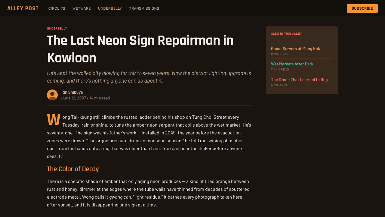
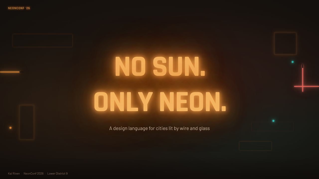
For presentation slides, use the cover as a nocturnal street entrance: a deep warm ground, a concentrated amber title treatment, and small pink or red signals that suggest nearby activity. Content slides should preserve that hierarchy with dense but controlled information blocks. Data slides can treat charts as illuminated signage, using amber for the main reading, hot colors for secondary conditions, and teal only when a cool contrast carries real meaning.
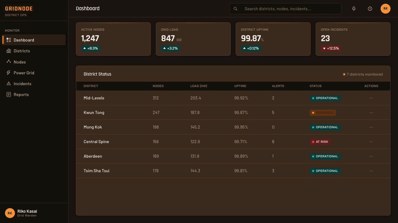
For web interfaces, the style fits dashboards, monitoring tools, and pricing pages that need a strong atmosphere without losing functional focus. Keep the environment dark and warm, give primary actions the clearest amber presence, and use pink or red for urgency or status. Teal can identify a distinct category, external signal, or cool counterpoint, but it should remain rare enough to feel intentional.
For editorial and marketing work, build the page like a sequence of connected alleys rather than a single polished stage. Use dense information clusters, narrow reading paths, dark interruptions, and glowing calls to action. Marketing panels can alternate between nearly swallowed darkness and intense sign-like color, while editorial sections use wet reflections, cropped fragments, and layered labels to suggest a living urban environment.
The system also works well for product launches, game-related campaigns, nightlife identities, and experiences that want intimacy rather than glossy futurism. Imagery should feel close to the ground and surrounded by atmosphere. A small pool of teal reflected across a dark field can carry more narrative force than a page filled with equally bright colors.
The common mistake is treating cyberpunk as permission to use every neon color at once. That produces generic visual noise and removes the world’s specific identity. Stray Cyber City depends on a warm amber lead, hot supporting colors, a dark sodium-lit ground, and one restrained cool accent. It also fails when grime becomes random clutter: density must still guide the eye, or the interface becomes difficult rather than atmospheric.
Stray Cyber City — FAQ
Is Stray Cyber City meant to be a literal reconstruction of Kowloon Walled City?
No. The source describes the city as modeled on or inspired by Kowloon Walled City, not as a documentary reconstruction. The design system extracts qualities of density, enclosure, layered surfaces, wet streets, and neon-noir atmosphere, then turns those qualities into interface rules. Its goal is emotional and visual translation rather than historical replication.
Why is teal restricted to a single accent?
Teal provides the system’s cool counterpoint to its amber, pink, and red warmth. Because it is scarce, it can read as a reflection, landmark, or distinct signal. If it becomes a general-purpose color, the warm-cool tension disappears and the palette turns into undifferentiated neon decoration.
Can this style work on a light background?
It can be adapted, but the result will lose much of the system’s core logic. Stray Cyber City depends on the absence of daylight, the depth of a sodium-lit brown ground, and the way neon emerges from darkness. A light variant may borrow the amber, pink, red, and teal relationships, but it should be treated as an interpretation rather than the canonical expression.
How can the interface stay readable when the style is so dense?
Density should be organized through light hierarchy, not added indiscriminately. Reserve the strongest amber emphasis for the primary path, let supporting colors describe secondary conditions, and keep text grouped into clear clusters. Dark space must remain available for pauses and separation. The city can feel crowded while the reading order stays deliberate.
What makes this different from generic neon cyberpunk?
Its identity comes from restriction and atmosphere. The palette is warm and grounded rather than broadly multicolored; teal is rare rather than ubiquitous; darkness behaves like an environment rather than a backdrop; and density comes from accumulated urban layers rather than random effects. The result is closer to a lived-in alley than to a polished science-fiction showroom.
Related design styles
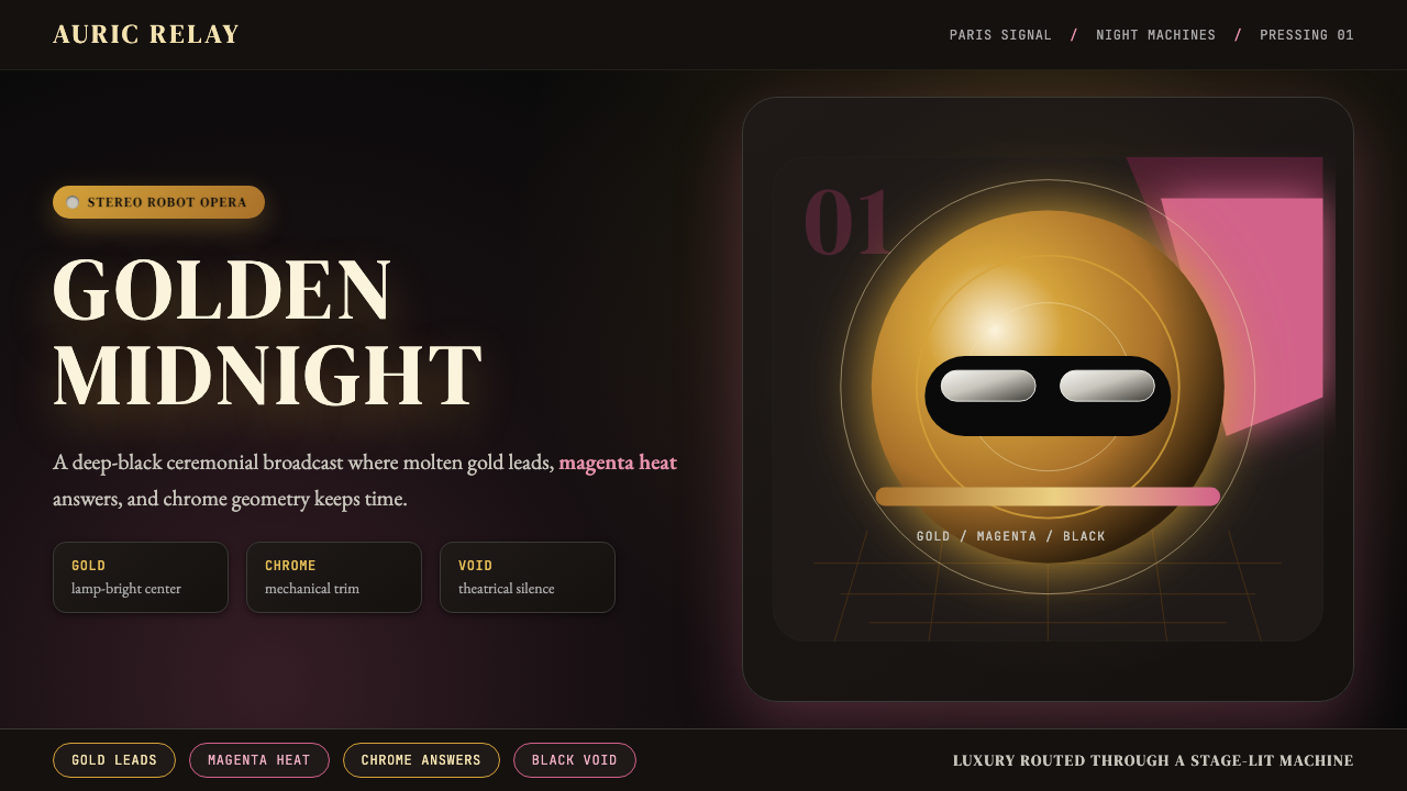 Daft Punk Discovery (Gold-Helmet)Warm sci-fi disco. Gold serif caps orbit a magenta void with chrome-disc geom…
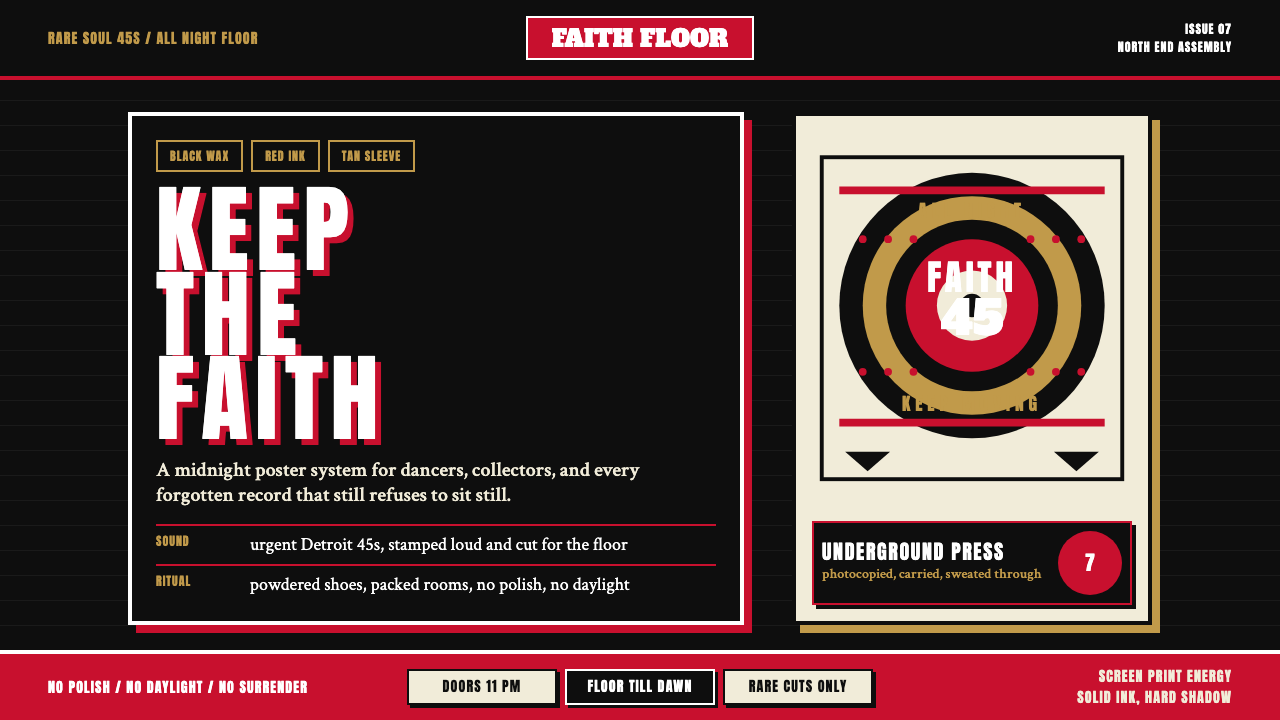 Northern Soul Wigan (1970)Underground urgency. Black ground, fist-red type, and tan vinyl rings hit lik…
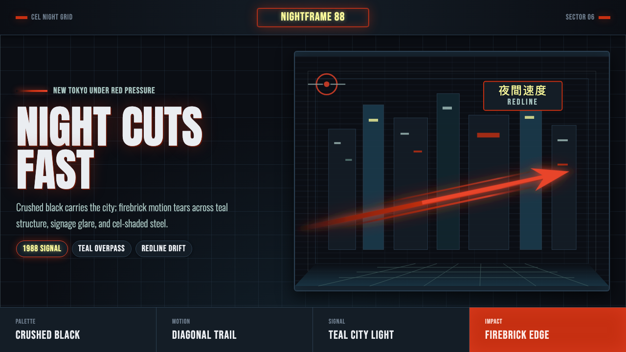 Akira Neo-TokyoNight moves fast. Firebrick trails cut crushed black, teal grids, and condens…
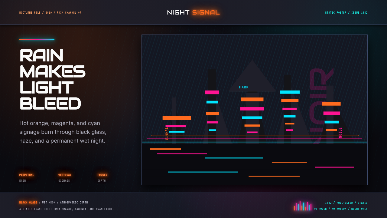 Blade Runner 1982 Neon NoirRain-soaked noir. Orange, magenta, and cyan neon cut black glass.
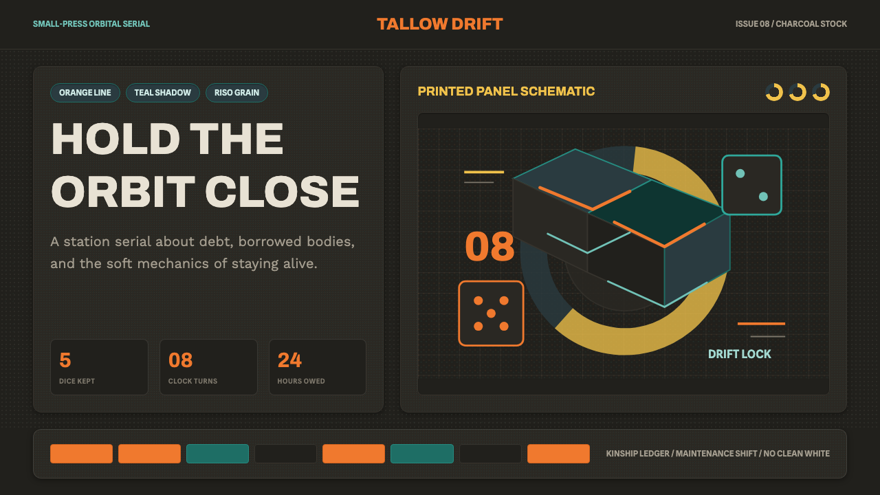 Citizen SleeperWarm sci-fi, handmade. Orange-on-teal panels glow with riso grain and dice-cl…
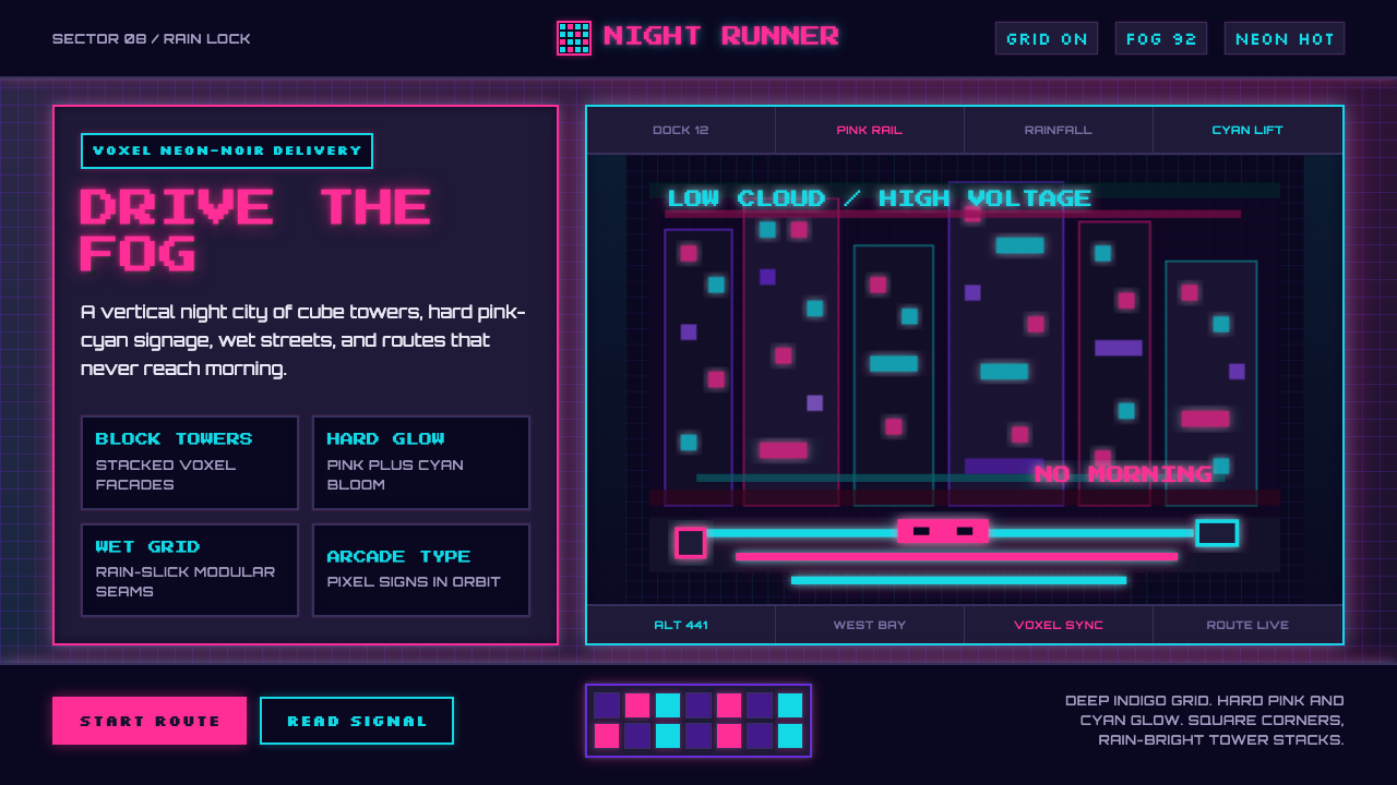 CloudpunkNeon-noir goes voxel. Pink-cyan glow cuts deep-indigo grids and blocky tower…