What is Citizen Sleeper?
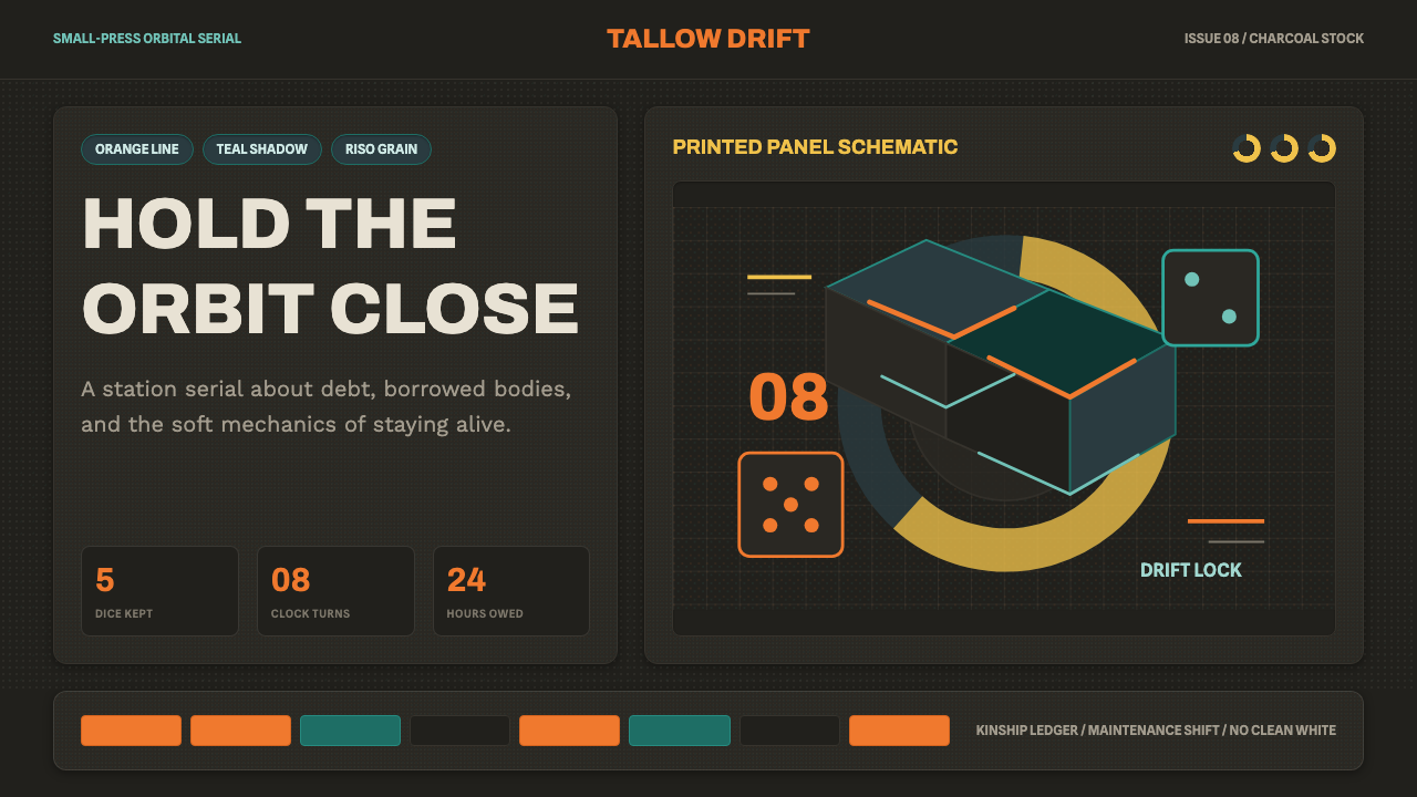
Citizen Sleeper renders science fiction as something handmade and lived-in — warm orange against deep teal, ink-dark panels textured like a risograph print, and a UI built from the same dice and countdown clocks used at a tabletop.
Citizen Sleeper in brief
Citizen Sleeper (Essen Arp) is a warm, hand-inked science-fiction system built to feel drawn rather than rendered. The ground is always dark charcoal ink, never clean white or gray digital chrome; against it, warm orange functions as the primary accent, played off a cooler teal for secondary information. Character and environment art comes from comic illustration rather than 3D concept art — expressive linework softened by a visible grain, the kind of texture a risograph duplicator leaves on a small-press zine page. The interface itself is structured around dice faces and segmented circular 'clocks,' the countdown trackers borrowed directly from tabletop role-playing design.
This is deliberately not the chrome-and-neon science fiction of most genre design. Where cyberpunk visual systems lean on gloss, saturation, and high-tech polish, this style leans on texture, warmth, and visible imperfection — grain in the color fields, ink that looks like it was laid down by hand, panels bordered like a comic page rather than floating as sterile digital cards. The imperfection is not a rendering limitation; it is the point. In a setting about synthetic bodies and indifferent megacorporations, hand-drawn warmth is what signals that something in the frame is still human.
Form and function are unusually fused in this system. The dice-and-clock geometry is not decorative iconography layered onto a generic UI — it is a direct visualization of the underlying mechanics: dice results allocated to actions, progress toward events tracked by circular trackers that fill in segment by segment. The visual identity and the interaction model are, in effect, the same object seen from two angles.
Where does Citizen Sleeper come from?
Citizen Sleeper was released in 2022 by Jump Over the Age, a small, UK-based independent studio built around creator Gareth Damian Martin, whose background is as much in game writing and criticism as in design. The game casts the player as a 'sleeper' — a consciousness housed in a synthetic body — aboard a rundown station on the far edge of a system otherwise dominated by megacorporations, of which the studio-credited Essen Arp is the most directly threatening to the player's freedom. That premise — a fragile, failing body and a precarious, improvised community, set against indifferent corporate power — is the emotional register the whole visual system was built to carry.
The game's key art came from Guillaume Singelin, a French comic artist working in the bande dessinée tradition of European graphic novels rather than the concept-art pipeline typical of big-budget science-fiction games. That lineage matters: bande dessinée illustration prizes expressive, economical linework and character warmth over photorealistic rendering, and bringing that sensibility into a game interface is what gives Citizen Sleeper's people and environments their handmade, humane quality even inside a hard science-fiction setting.
The visible grain across the game's color fields and UI panels is a deliberate translation of risograph printing into a digital surface. Risograph duplicators, originally built for high-volume office copying, were adopted from the 1990s onward by independent publishers and zine-makers for their distinctive look: slightly imperfect registration between color layers, a soft grain, and a flat, ink-like density that photographic or vector-perfect printing doesn't produce. Borrowing that texture connects the game's science fiction directly to small-press, handmade print culture rather than to the glossy studio aesthetics that dominate the genre.
The dice-and-clock interface has its own lineage, in the narrative tabletop role-playing design that flourished through the 2010s, where dice pools resolve actions and segmented 'clocks' track slow-building consequences across a session. Citizen Sleeper adapts that tabletop grammar directly into a solo digital game, and by 2022 that adaptation was inseparable from the game's visual identity: the interface doesn't just support the system, it depicts it, with dice faces and clock segments rendered as first-class visual elements rather than hidden behind abstracted menus. The identity matured through further releases and expansions into 2024, but the core grammar — warm orange, deep teal, charcoal ink, riso grain, dice and clocks — was set from the start.
What defines the Citizen Sleeper look?
Color
Warm orange is the primary, hero-level accent, set against a cooler, more recessive teal used for secondary information and structural elements. Both colors sit on a dark charcoal-ink ground that is never lightened toward white or gray. The pairing reads as warm-versus-cool rather than bright-versus-muted — both hues are confident and saturated, but orange always leads.
Dark Ink Ground
Every surface in this system is built on dark charcoal ink rather than a light background — there is no clean-white variant to fall back on. The darkness is treated as a material, like ink soaked into paper, rather than as a simple 'dark mode' inversion of a light design. This grounding is what allows the warm orange accent to glow rather than merely contrast.
Hand-Drawn Line Illustration
Character and environment art draws on the European bande dessinée comics tradition: expressive, economical linework that prizes gesture and warmth over photorealistic rendering. This is a humane counterpoint to the synthetic, corporate world the fiction describes, and it is the single element most responsible for the system's 'handmade' feeling.
Riso-Print Grain
A visible grain sits across color fields and panels, echoing the slightly imperfect color registration and soft texture of risograph duplication — the printing method long associated with independent zines and small-press comics. The grain is not noise added for effect; it is what keeps flat digital color from reading as sterile.
Dice & Clock Geometry
Dice faces and segmented circular 'clock' trackers structure the interface directly, rather than sitting as decoration on top of a generic dashboard. A clock fills in wedge by wedge as an event approaches; a die face represents an available action. This geometry is borrowed directly from tabletop role-playing design and functions here as both visual signature and literal interface mechanism.
Comic-Panel Composition
Content is framed the way a comic page is framed — bordered panels holding a scene or a piece of information, rather than borderless cards floating on a neutral field. This composition choice reinforces the illustration lineage and gives even purely informational screens the feel of a page being read rather than a dashboard being scanned.

Who shaped Citizen Sleeper?
The creator behind Jump Over the Age and the primary designer and writer of Citizen Sleeper, with a background in game writing and criticism as well as design. Martin is credited with the systemic design that fused tabletop-style dice-and-clock mechanics directly into the game's visual interface, making the two inseparable.
A French comic artist working in the bande dessinée tradition, brought in to provide the game's key art. His expressive, economical linework — closer to graphic-novel illustration than 3D concept art — gives the game's synthetic-body science fiction its distinctly humane, hand-drawn visual register.
The small, UK-based independent studio behind Citizen Sleeper. Its scale and independence are directly visible in the finished visual system: a handmade, textured, comic-adjacent aesthetic that would be unusual for a larger studio's science-fiction property built around glossier, more conventional genre chrome.
The broader European comics tradition that shaped the game's character and environment art — a lineage distinct from American superhero comics or Japanese manga, known for its emphasis on expressive line, restrained color, and character-driven visual storytelling, all of which carry directly into this design system.
The independent zine and small-press printing tradition built around risograph duplication, valued for its grainy texture and slightly imperfect color registration. Translating that specific, handmade print quality into a digital game interface is what keeps this system from reading as generic dark-mode science fiction.
How do you use Citizen Sleeper today?
This style reads as warm, humane, and handmade even while staying unmistakably science-fiction, which makes it a strong choice for anything that wants a futuristic mood without the cold, corporate gloss of chrome-and-neon genre design. It works best where storytelling, character, or a sense of lived-in struggle matters more than sleek precision.
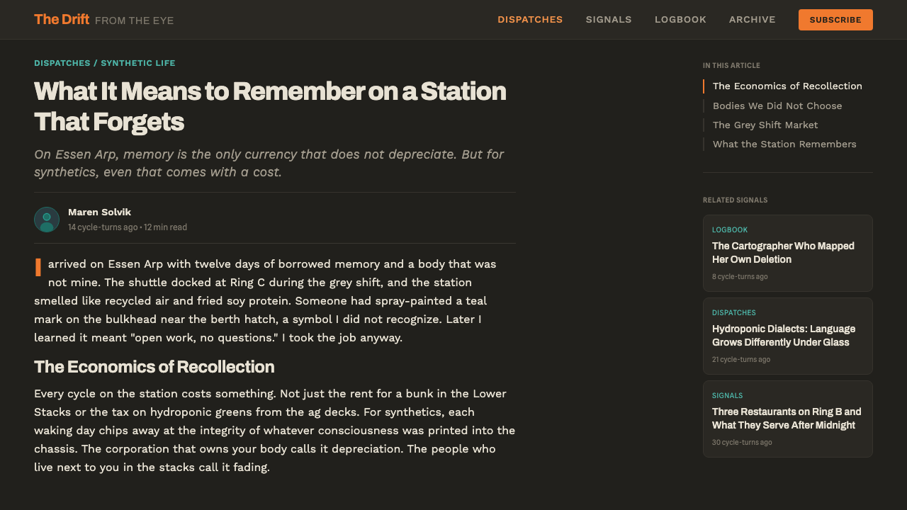
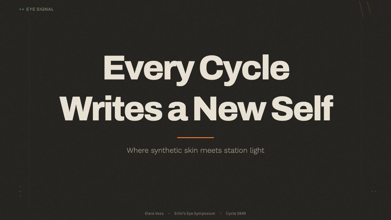
On presentation slides, a cover works well as a comic-panel composition: a bordered illustration in warm orange and teal on a charcoal-ink ground, with title type sitting inside or beside the frame like a caption rather than floating free. Content slides should keep the dark ink ground and frame each section as a bordered panel rather than a borderless card, using teal for supporting labels and orange only for what truly needs emphasis. Data slides are a natural fit for the dice-and-clock motif specifically — a metric shown as a segmented circular tracker filling toward a goal reads immediately as part of this system, where a generic bar chart does not.
For web interfaces, the style suits narrative-driven products, indie creative tools, journaling or habit-tracking apps, and anything wanting a science-fiction mood with emotional warmth rather than sterile precision. A dark charcoal-ink base with orange reserved for primary actions and teal for secondary status information carries the identity cleanly. The style needs to keep its texture to stay itself — rendering it in perfectly clean, grain-free vector shapes drifts it toward generic dark-mode UI and loses what makes it recognizable.
In editorial and marketing contexts, the style suits long-form narrative writing, devlogs, and zine-adjacent publishing particularly well. Pull quotes read naturally inside a bordered comic-panel treatment, and hero art should stay in the linework-plus-grain register rather than shifting to photography or glossy 3D render, which would break the handmade illusion the whole system depends on.
The most common mistake is over-cleaning the art — stripping out the grain and softening the linework until what remains is generic 'orange and teal dark mode' with none of the handmade specificity that defines this style. A second common error is leaning toward neon glow and high saturation, which pulls the mood toward cyberpunk rather than this warmer, more melancholic register. A third is dropping the dice-and-clock motif in favor of generic progress bars, which discards the single most distinctive and functional signature the system has.
Citizen Sleeper — FAQ
Is this the same as cyberpunk or neon sci-fi?
No, though they're neighbors in the genre. Cyberpunk visual systems lean on gloss, high saturation, and neon glow — a sleek, often aggressive high-tech surface. This style instead leans on texture, warmth, and visible imperfection: grain, hand-inked linework, a comic-panel structure. Where cyberpunk feels sharp and electric, this feels worn, humane, and a little melancholic — closer to a well-loved paperback than a chrome storefront.
Do you need an actual risograph printer to get the grain right?
No — the grain can be approximated purely digitally. The goal is a soft, slightly irregular texture across color fields, as if the color didn't sit perfectly flat, plus a sense that different color layers aren't quite perfectly aligned with one another. Overlaying a subtle noise or grain texture and letting color edges feel slightly hand-placed rather than mathematically precise gets close to the effect without needing physical print production.
Can this style work on a light background?
Not faithfully. The dark charcoal-ink ground is fundamental to the system — it's what makes orange glow and what sells the sense of ink on a page rather than pixels on a screen. Move the same elements onto a light ground and the identity collapses into a generic warm-toned illustration style, losing the specific 'ink-dark comic panel' quality that makes it recognizable as this system.
Do I need actual dice or tabletop RPG mechanics to use the dice-and-clock motif?
No. The dice face and the segmented circular clock are visual and structural devices that can be borrowed purely as design language — a clock is simply a distinctive way to show progress toward a goal, and a die face is a distinctive way to represent a discrete choice or state. Any product with progress tracking or a set of discrete options can use this geometry without needing an underlying game system to justify it.
What kinds of products suit this style, and where does it struggle?
It suits narrative games, storytelling apps, indie creative and writing tools, journaling products, and zine-adjacent cultural publications — anything that benefits from feeling handmade, warm, and a little imperfect. It struggles in buttoned-up enterprise, financial, or B2B contexts where the audience expects polish, precision, and a more conventionally 'clean' visual register; the style's deliberate texture and warmth can read as unfinished rather than intentional in those settings.
Related design styles
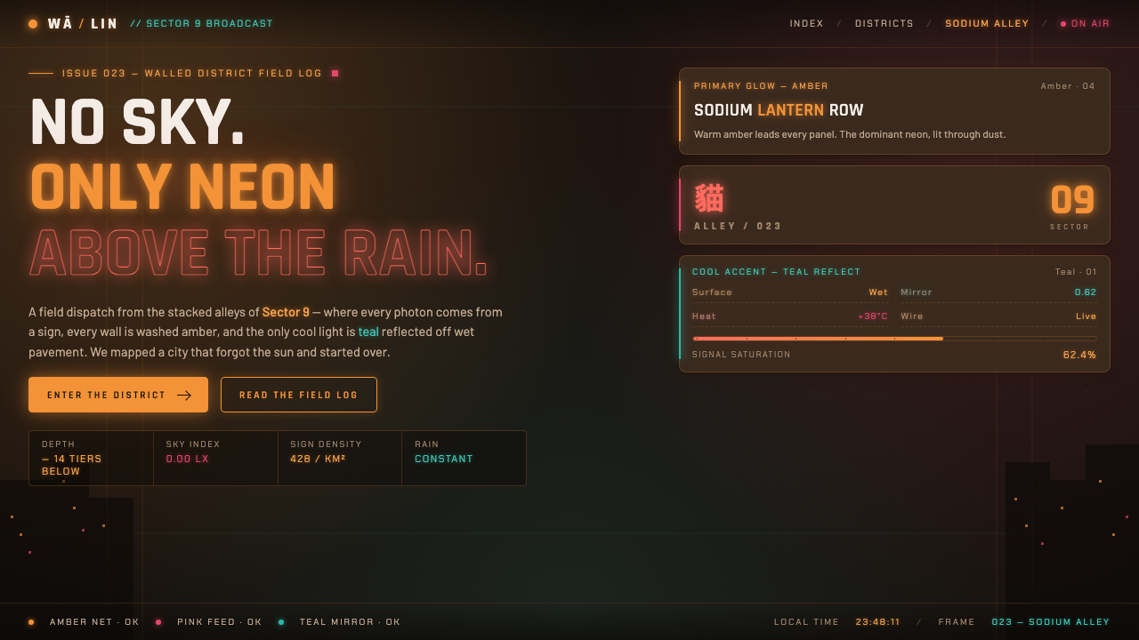 Stray Cyber CityNo sky, only neon. Warm amber and pink signs glowing over wet alleys, with on…
 Arrival LogogramFirst contact turns quiet. Fog gray, serif notes, and smoke-black rings decod…
 Don Quixote (1605)Imagination defies the plain. Rust capitals and cross-hatched ink score a dry…
 Letterboxd Cinephile Orange-GreenMidnight cinephilia glows. Fraunces italics and orange-green-blue dots cut th…
 Y Tu Mamá TambiénSun-bleached road-movie warmth. Highway gold and dusty teal on dusky film, ha…
 Bean-to-Bar ChocolateOrigin tastes tactile. Cocoa serif, kraft panel, and molded squares carry the…