What is Steins;Gate CRT?
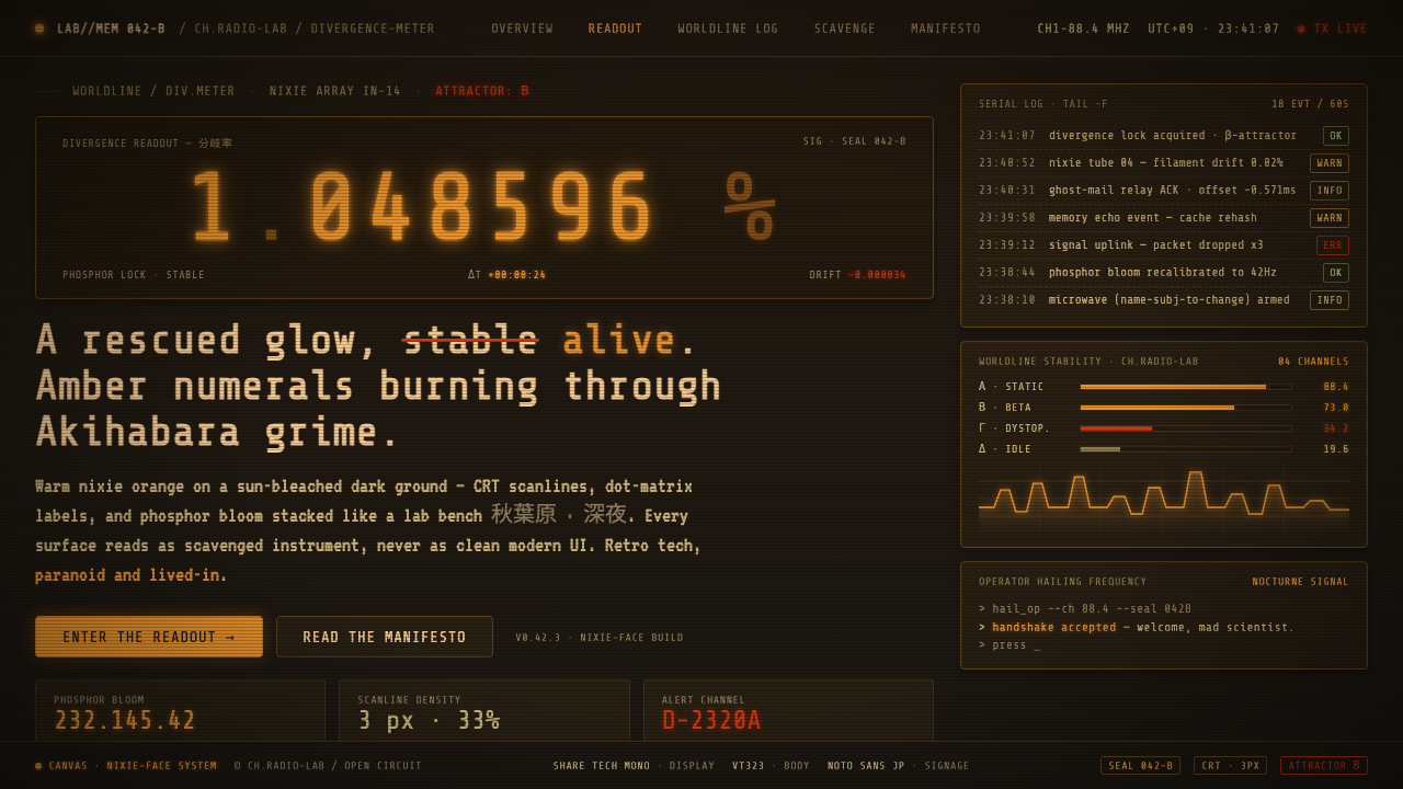
Steins;Gate CRT turns scavenged laboratory hardware into atmosphere: amber digits, exhausted phosphor, and an Akihabara that looks permanently warmed by old film.
Steins;Gate CRT in brief
Steins;Gate CRT is a dark retro-technology aesthetic built around the Divergence Meter: a scavenged nixie-tube display whose amber-orange numerals glow against black. Its visual language expands that one prop into an entire environment. CRT terminals, dot-matrix readouts, phosphor bloom, rusted surfaces, and warm electrical light make technology feel found rather than designed, repaired rather than replaced.
The style belongs to low-fi cyber-nostalgia rather than polished futurism. Its city is Akihabara seen through a degraded signal: sun-bleached, over-exposed, slightly grimy, and persistently yellowed, as if an old film reel had been stored too long. The palette moves through nixie amber, hot orange-red, rust, washed khaki, and warm black, but none of these colors should feel fresh, glossy, or decorative.
Its emotional register is junk-tech obsession. The interface may imply intelligence, paranoia, experimentation, and intense private knowledge, yet it remains materially imperfect. Light blooms too far, scanlines interrupt clarity, and the dark ground absorbs detail. The result is lived-in and brilliant rather than sleek: a visual world where every display seems to have history, heat, dust, and a previous owner.
Where does Steins;Gate CRT come from?
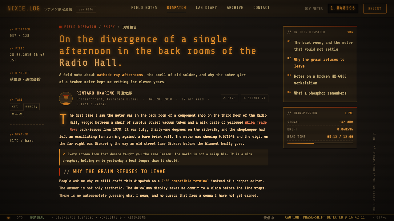
The aesthetic comes from the 2011 anime by White Fox, adapted from the 2009 visual novel Steins;Gate. Its setting is 2010 Akihabara, Tokyo: a place already closely associated with electronics, screens, specialist hobbies, and otaku culture. That setting gives the visual language a concrete social texture. Technology is not presented as distant infrastructure; it is close at hand, accumulated in rooms, carried through streets, and assembled from whatever can be found.
The Divergence Meter supplies the style's strongest organizing image. A nixie-tube display is inherently physical: numerals appear as luminous objects inside a device rather than as abstract marks on an immaculate screen. Warm amber light on black therefore becomes more than a color contrast. It suggests a machine with age, voltage, and fragile internal space, making information appear consequential and slightly uncanny.
The show's Akihabara extends that object-level logic into the surrounding grade. Sun-bleached warmth, washed khaki, rust, and over-exposure keep the city from becoming a conventional blue-black cyberpunk nightscape. Instead, the environment feels like an aging urban signal recorded on imperfect media. Its darkness is warm and dusty, while its highlights feel electrical and overdriven rather than cleanly illuminated.
Steins;Gate CRT sits at the meeting point of low-fi cyber-nostalgia, Akihabara otaku junk-tech aesthetics, and science-fiction visual-novel adaptation. Chiyomaru Shikura, White Fox, and huke are identified with its source material as key figures. Together, the framework is not generic retro futurism: it is a specifically lived-in vision of speculative technology, where improbable ideas arrive through familiar, worn, enthusiast-maintained objects.
What defines the Steins;Gate CRT look?
Nixie Amber
Amber-orange numerals are the primary source of life in the composition. They should feel like light produced inside old hardware: concentrated at the character, softening at its edges, and surrounded by darkness that makes each readout seem precious. Hot orange-red may heighten urgency, but amber remains the emotional center because it carries both technical precision and nostalgic warmth.
Warm Darkness
The dark ground is never a neutral void. It is sun-faded, dusty, and faintly brown or khaki in feeling, allowing orange light and rusted accents to belong to the same world. This warmth prevents the style from becoming sterile noir. Darkness should conceal, absorb, and frame information, while still suggesting the accumulated grime of an active room.
CRT Degradation
Scanlines, phosphor bloom, and imperfect screen behavior are structural atmosphere rather than nostalgic stickers. They interrupt the image just enough to imply a physical display surface between the viewer and the information. The signal should remain legible, but it should never feel frictionless; slight interference makes the machine seem present and under strain.
Sun-Bleached City
The exterior world is over-exposed and low-fi, with warm yellowing instead of pristine daylight. Washed khaki and rust keep streets, signage, and backgrounds from appearing digitally fresh. This grade gives Akihabara a sense of memory and media decay: urban life is visible, but viewed through an image that has aged unevenly.
Junk-Tech Materiality
Technology should look scavenged, modified, and continuously handled. Interfaces benefit from dot-matrix logic, terminal-like fields, rough labels, and details that suggest components rather than abstract software surfaces. The desired feeling is not incompetence. It is resourceful obsession: someone capable has made a system work with limited, mismatched, and highly personal equipment.
Bloom and Restraint
Luminous effects work because the surrounding palette is restrained. A few heated readouts, warning-like accents, or glowing marks can dominate an otherwise muted field of warm black, rust, and faded khaki. If everything glows, the atmosphere becomes decorative noise. The visual hierarchy depends on reserving brightness for the information that must feel charged, unstable, or significant.
Who shaped Steins;Gate CRT?
Chiyomaru Shikura is listed among the key figures associated with the source material for Steins;Gate CRT. In this context, the name anchors the theme to the Steins;Gate visual-novel origin rather than treating its amber displays, CRT artifacts, and junk-tech mood as an anonymous collection of retro effects.
White Fox produced the 2011 anime adaptation. The adaptation supplies the theme's immediate audiovisual context: an Akihabara rendered through warm degradation, over-exposure, dark displays, and the recurring visual authority of the Divergence Meter.
huke is listed as a key figure in the approved source material. Within the Steins;Gate CRT frame, the name marks the aesthetic as part of a specific science-fiction visual-novel adaptation lineage, where character, setting, display technology, and mood are expected to operate as one visual system.
How do you use Steins;Gate CRT today?
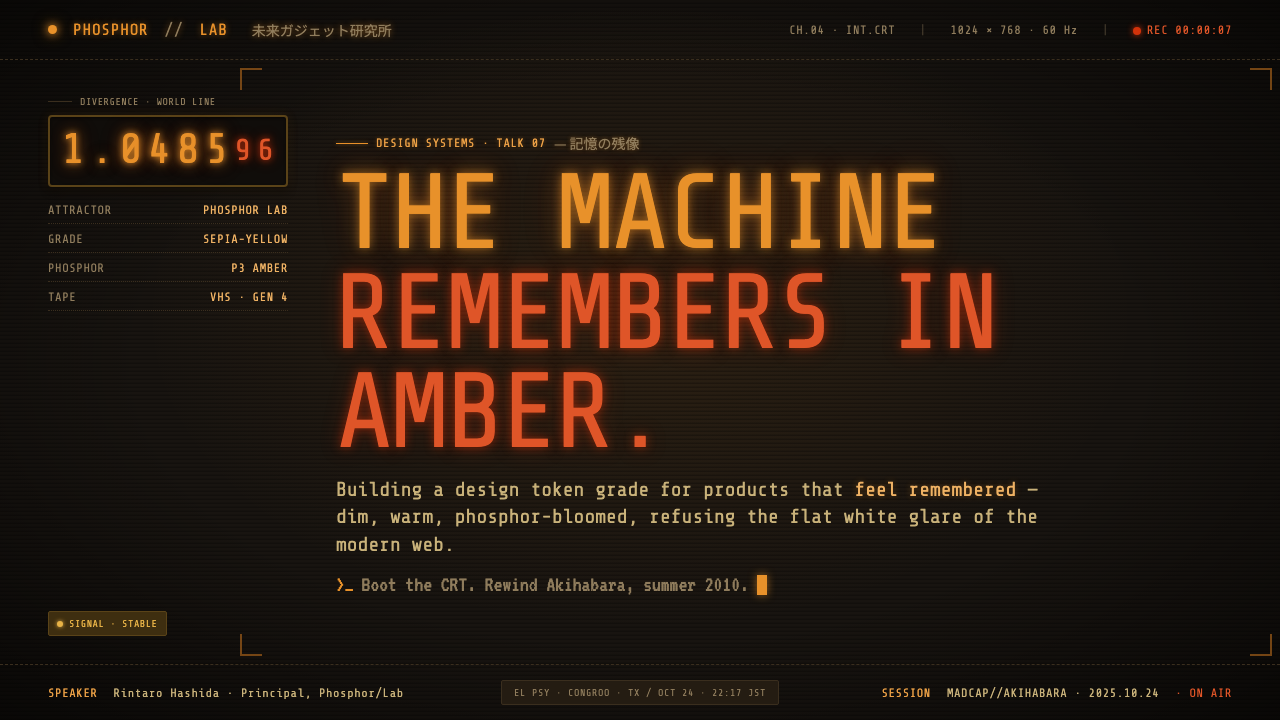
For presentation covers, use the Divergence Meter principle rather than decorating a slide with generic vintage effects. Let a dark, warm, sun-worn ground carry one decisive amber readout or terminal-like title treatment. Supporting information can sit quietly in faded khaki or rust-adjacent tones, while a small orange-red accent introduces urgency. On content slides, preserve the feeling of a diagnostic display: clear groupings, restrained luminous markers, and empty dark areas that make information appear to emerge from the screen.
Data slides work especially well when charts behave like instrument output rather than glossy business graphics. Use muted structural marks for context and reserve amber brightness for the series, threshold, or value the audience should notice first. Dot-matrix-inspired labels, scanline texture, and gentle phosphor bloom can establish the display language, but they must not obscure the data. The point is measured tension: every metric should look as though it has been recovered from a machine that matters.
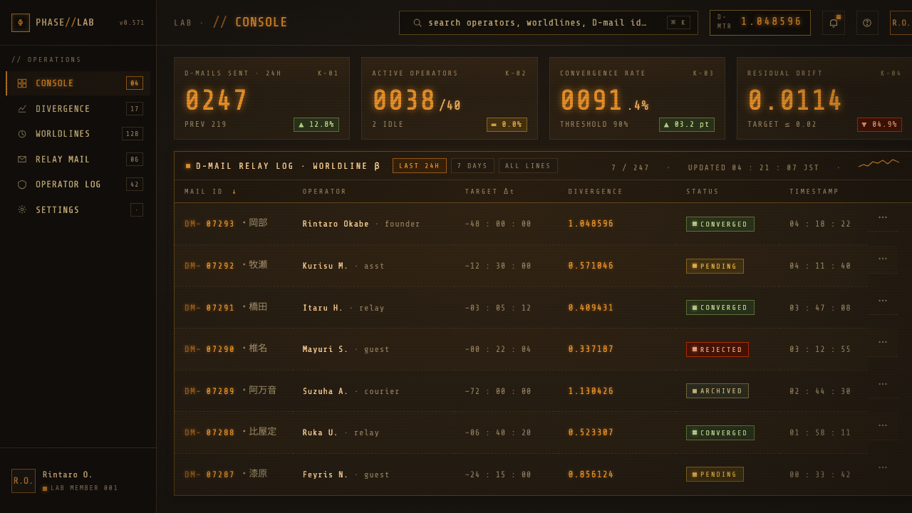
For web interfaces, the style suits dashboards, monitoring tools, research logs, scenario explorers, and pricing pages that benefit from an experimental technical mood. Warm-black panels can organize dense information without feeling corporate-cold; amber indicators can identify live states, key totals, or calls to action. Build interfaces as if they are maintained systems rather than luxury products. Fields, panels, and readouts should imply circuitry, terminals, and accumulated use, while navigation remains direct enough for real tasks.
Editorial and marketing applications benefit from the contrast between ordinary copy and charged machine imagery. A campaign page can open with a degraded terminal-like signal, then move into readable text on sun-bleached dark fields. Rust and washed khaki can support archival notes, metadata, or secondary modules, while amber is held back for narrative pivots and primary actions. The mood is strongest when writing speaks with the same specificity as the visual world: curious, technical, intimate, and slightly paranoid.
The common mistake is confusing junk-tech nostalgia with indiscriminate damage. Adding scanlines, noise, bloom, orange text, and every available retro symbol to every surface produces clutter rather than atmosphere. Steins;Gate CRT needs contrast between obscurity and signal, quiet material decay and meaningful illumination. Keep the palette aged, the display effects selective, and the hierarchy legible; the style succeeds when it feels like a real, imperfect system carrying unusually important information.
Steins;Gate CRT — FAQ
Is Steins;Gate CRT simply a cyberpunk style?
No. It shares science-fiction technology and dark displays with cyberpunk, but its mood is warmer, more domestic, and more degraded. Conventional cyberpunk often emphasizes polished neon cities and distant high technology. Steins;Gate CRT centers on scavenged hardware, old display behavior, sun-bleached urban color, and the feeling that extraordinary theory is being pursued through ordinary, imperfect equipment.
Why is amber more important than a generic orange accent?
Amber is tied to the nixie-tube image at the center of the theme. It reads as emitted light inside a physical device, not merely as a bright brand color placed on a dark interface. Used this way, it gives numerals and status signals an archival, electrical presence. Generic orange can support urgency, especially near orange-red, but amber carries the particular warmth and technological nostalgia of the Divergence Meter.
Can the style use a bright background?
It can, particularly when drawing on the over-exposed and sun-bleached city grade, but a bright field should still feel aged rather than clean. Washed khaki and yellowed warmth can create contrast with a dark terminal module or amber readout. A pristine white interface with isolated retro ornaments loses the style's material tension, because the relationship between warm darkness and emitted display light is central to the system.
How much CRT texture is appropriate?
Use enough to make the display surface perceptible, but not enough to turn reading into work. Scanlines and phosphor bloom should support the idea that information is passing through aging hardware. They are most effective around readouts, imagery, or transitional fields, while body copy and critical controls remain calm and readable. The effect should feel like signal behavior, not like a filter placed over everything.
Where does Steins;Gate CRT work poorly?
It is a poor fit when the product needs spotless neutrality, cheerful simplicity, or immediate sensory lightness. Its grime, darkness, signal interference, and obsessive technical mood can make a simple task feel more consequential than it is. It works best when the subject already supports investigation, systems, archives, experimentation, or speculative narrative. The style should deepen a relevant story, not force every product into a laboratory-terminal costume.
Related design styles
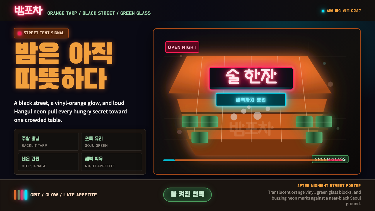 Pojangmacha Soju TentNight appetite glows. Orange tarp panels burn over black, cut by Hangul neon…
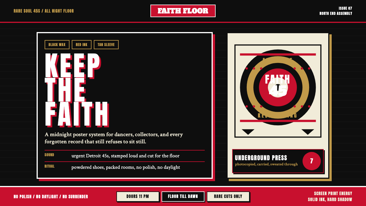 Northern Soul Wigan (1970)Underground urgency. Black ground, fist-red type, and tan vinyl rings hit lik…
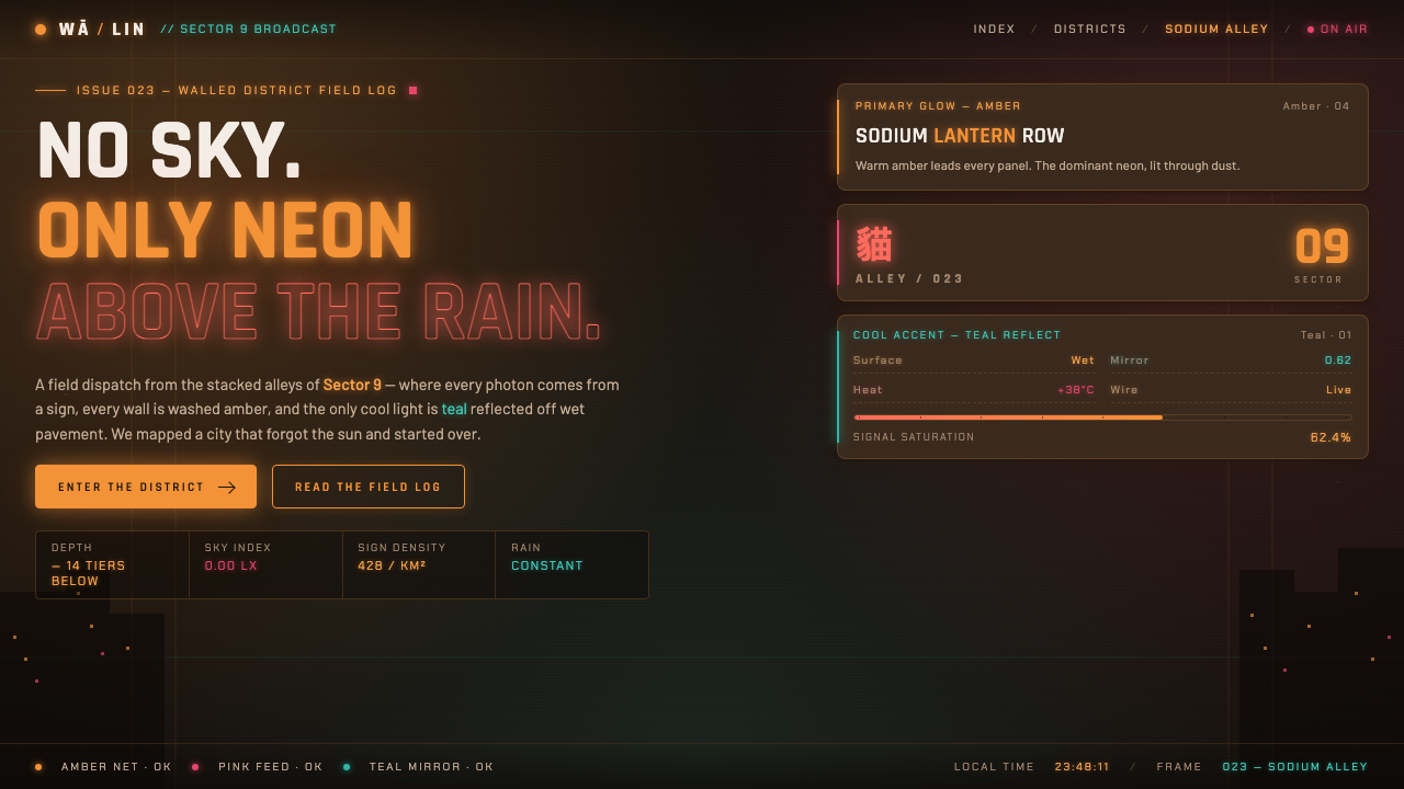 Stray Cyber CityNo sky, only neon. Warm amber and pink signs glowing over wet alleys, with on…
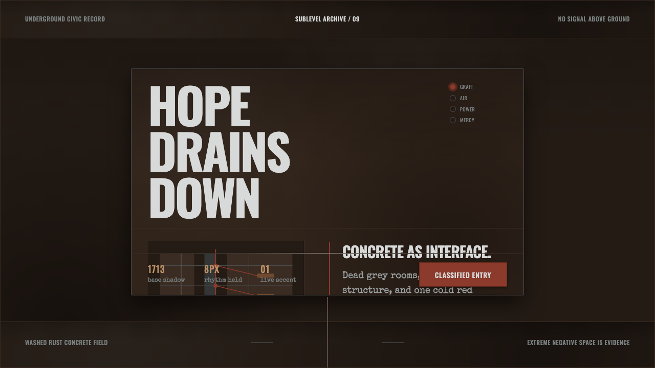 Texhnolyze Lux UndergroundHope drains into concrete. Rust-red grafts cut through dead grey negative spa…
 Vinyl Crate DiggingThe back room of a used record store. Stax-orange labels on near-black vinyl,…
 Amores Perros New WaveRaw street cinema. Crushed black, sodium amber, Oswald credits, heavy 35mm gr…