What is Kill Bill (2003)?
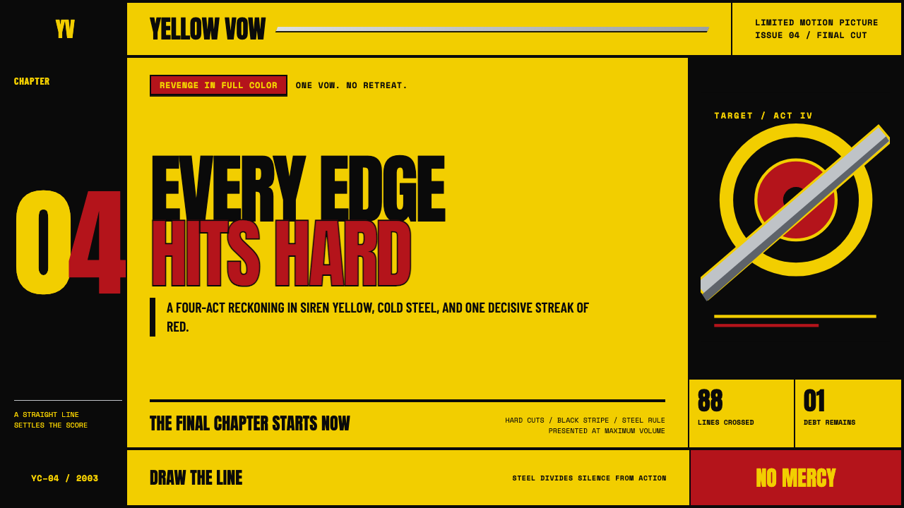
Kill Bill turns revenge into a graphic system: chrome yellow, slab type, black cuts, and a blade-sharp refusal of visual compromise.
Kill Bill (2003) in brief
Kill Bill is a Hollywood design language built from the visual force of Quentin Tarantino’s 2003–2004 two-volume revenge picture. Its most recognizable signal is the Bride’s chrome-yellow tracksuit, interrupted by one black side stripe. Around it sit the cold suggestion of katana steel, the oversized slab lettering of a 1970s exploitation title card, and the severe contrast of yellow against grindhouse black.
The style does not aim for atmosphere through delicacy. It works through declaration. Fields are flat, saturated, and abrupt; titles occupy space as physical events rather than polite labels. The page feels divided into acts, as though every heading were a chapter card and every transition were a hard editorial cut. A restrained flash of Crazy-88 red supplies danger without becoming the dominant voice.
Its central idea is katana logic: every edge should have purpose, every line should feel deliberate, and every title should land with impact. This makes Kill Bill less useful as a decorative surface treatment than as a compositional discipline. The look succeeds when contrast, scale, and interruption organize information with the same certainty as a blade dividing a frame.
Where does Kill Bill (2003) come from?
The style belongs to the 2003–2004 release period of Kill Bill: Vol. 1 arrived in October 2003, followed by Vol. 2 in April 2004. Its setting is Hollywood, USA, but its stated cultural direction is outward-facing: an homage to Hong Kong wuxia and Japanese chanbara. That combination matters because the visual language does not present itself as a single inherited tradition. It is assembled through deliberate cinematic reference, collision, and amplification.
Its listed movements define the system’s temperament. Grindhouse exploitation revival contributes the screen-filling title card, the extreme contrast, and the willingness to make graphic impact feel loud rather than refined. Chanbara samurai cinema contributes the blade as a visual model: straightness, cold metal, sudden division, and concentrated force. Pastiche postmodernism allows these references to coexist without being softened into a uniform historical recreation.
The result is an aesthetic of intentional quotation rather than seamless realism. Chrome yellow can read as costume, warning, and poster field at once. Black can function as absence, interruption, or a theatrical ground for typography. Steel is not merely a material reference; it becomes a rule for composition, suggesting a clean line that separates one visual act from the next.
The source material identifies Quentin Tarantino, Uma Thurman, Robert Richardson, David Wasco, and Catherine Marie Thomas as key figures. Together, these names mark the style as a film-world system rather than an isolated graphic trend. Kill Bill’s design vocabulary is inseparable from its chaptered cinematic presentation, its saturated visual contrasts, and its cross-cultural homage to wuxia and chanbara traditions.
What defines the Kill Bill (2003) look?
Chrome Yellow
Chrome yellow is the dominant field and emotional ignition point. It should feel concentrated, immediate, and impossible to overlook, rather than cheerful or decorative. Used behind a large title, it creates the sense of a warning card or a costume entering the frame. Its authority depends on restraint elsewhere: yellow carries the volume, while surrounding elements remain black, steel-like, or nearly neutral.
Slab Typography
Typography behaves like an object with mass. Broad, slab-like letterforms should fill space, establish hierarchy instantly, and withstand a harsh black-and-yellow field without disappearing. Headings are not ornamental captions; they are chapter announcements. The strongest compositions allow a title to be oversized, tightly placed, and visually final, with supporting copy kept quieter and more disciplined.
Hard Cuts
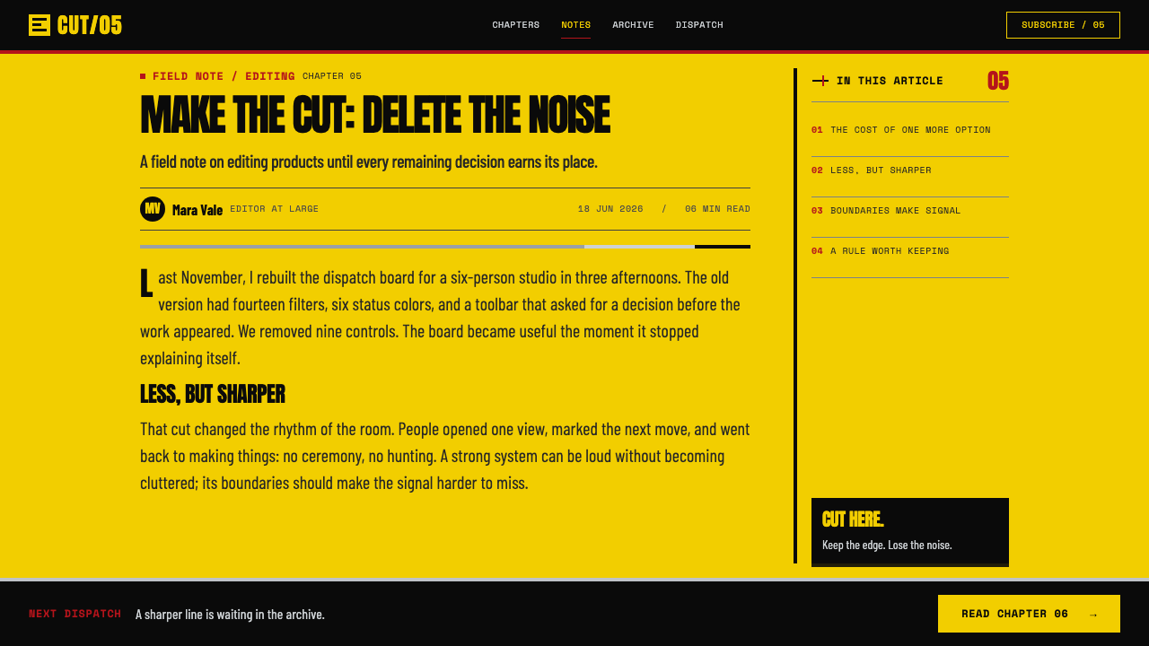
Transitions should feel edited, not blended. Yellow gives way to black in a decisive break; one chapter ends before the next begins. This principle applies to section changes, panels, image crops, and hierarchy shifts. Avoid softened boundaries or gradual atmospheric drift. A Kill Bill composition gains tension when the viewer can identify exactly where one visual statement stops and another begins.
Blade Dividers
Dividers borrow their character from brushed steel and katana edges. They should be straight, cool, and visibly intentional, serving as cuts through the composition rather than decorative separators. A line can establish a chapter boundary, frame a title, or direct the eye across a field. Its effect comes from precision and isolation, not from multiplying rules until the page becomes busy.
Controlled Red
Crazy-88 red is an accent, not a second dominant world. It works best as a single arterial interruption: a warning, a mark of danger, or a small event that interrupts yellow and black. Because the base palette is already forceful, red needs little area to change the emotional temperature. Repeating it everywhere weakens the surprise and turns violence into ordinary decoration.
Flat Saturation
Color arrives as a firm field rather than a simulated light effect. The style rejects gradual tonal transitions across a surface because they weaken the poster-like certainty of the composition. Flat saturation makes yellow, black, and red read as graphic decisions. It also keeps the visual world closer to a title card, a costume signal, or a printed exploitation image than to polished luxury advertising.
No Mercy in Spacing
Spacing is part of the drama. Large empty fields can isolate a title like a confrontation, while tight proximity can make a chapter label feel compressed and urgent. The system does not require every region to breathe equally. Instead, it uses abrupt shifts between open ground and dense information to control pacing, much like alternating silence and impact in a chaptered revenge story.
Who shaped Kill Bill (2003)?
Listed as a key figure in the source material, Tarantino anchors Kill Bill within a Hollywood framework that openly pays homage to Hong Kong wuxia, Japanese chanbara, and grindhouse exploitation revival. The design language reflects that stated collision of references: chapter cards, saturated fields, harsh interruption, and cinematic quotation held together as one forceful system.
Uma Thurman is named among the key figures, and the Bride’s chrome-yellow tracksuit is central to the supplied visual description. That garment gives the style a portable emblem: yellow as character signal, the lone black stripe as disciplined interruption, and a silhouette clear enough to become a complete compositional idea.
Robert Richardson appears in the source material’s key-figure list. Within this visual system, the relevant lesson is the supplied contrast between saturated color fields and the cold sheen of katana steel. It is a language of clear separation, strong surfaces, and images that announce their presence instead of dissolving into subtle atmosphere.
David Wasco is identified as a key figure in the source material. Kill Bill’s page language benefits from the film-world logic implied by the supplied details: tracksuit, steel, exploitation card, numbered acts, and blade-like dividers. These are not unrelated motifs; they create a setting in which each surface feels staged, selected, and ready for a decisive cut.
Catherine Marie Thomas is also listed as a key figure. The style’s defining visual cues remain deliberately few: chrome yellow, a black stripe, steel, slab type, chaptered structure, and sparing red. That economy is important. The design language has impact because every recurring motif is immediately legible and no additional ornament competes for attention.
How do you use Kill Bill (2003) today?
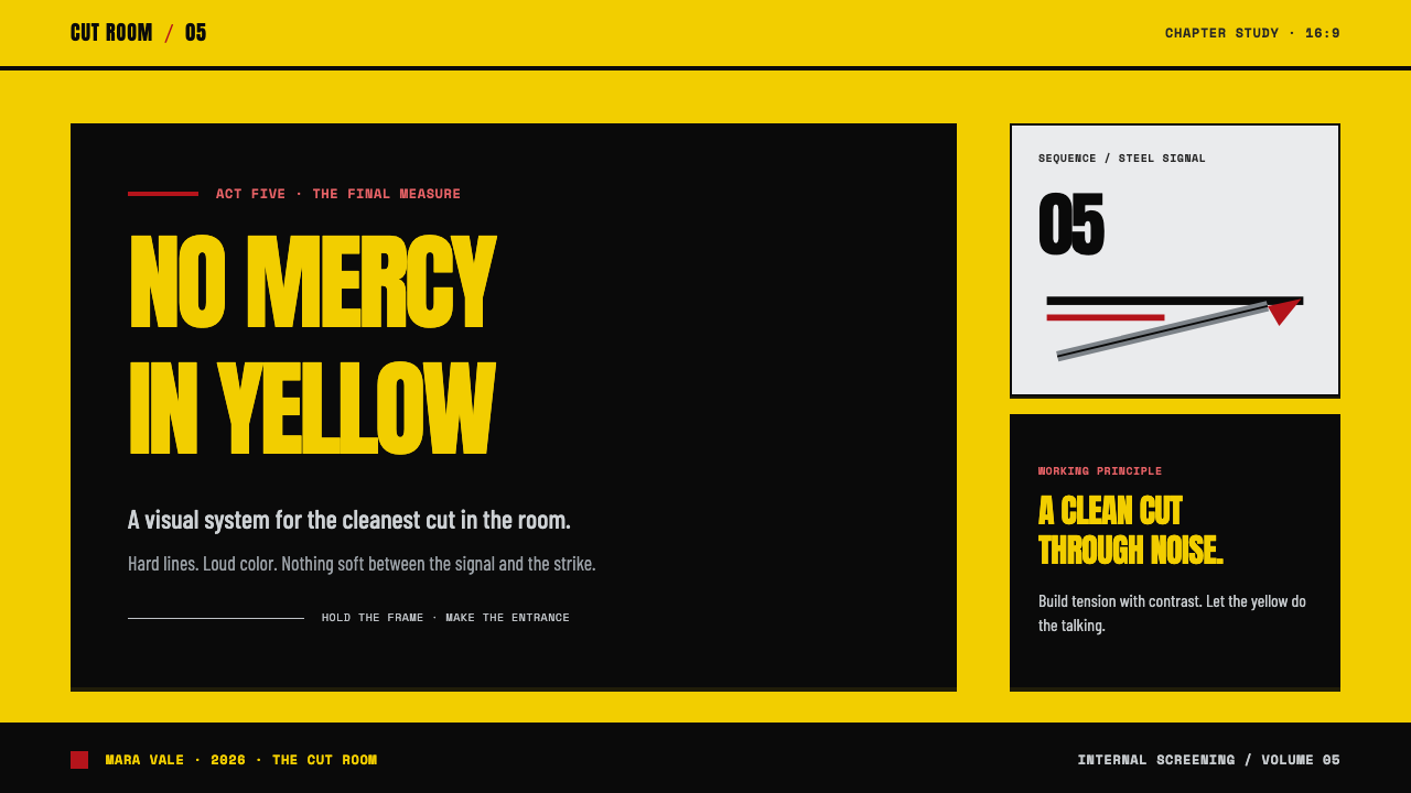
For presentation covers, treat the slide as a single confrontation. Let chrome yellow or grindhouse black claim most of the field, then place one large slab title with enough room to feel unavoidable. A steel-like divider or a black stripe can provide direction without turning the cover into an illustration. The cover should read as a chapter card before it reads as a conventional business slide.
For presentation content pages, use numbered acts and hard section boundaries to make sequence obvious. Keep body copy contained in calm, readable blocks while headings do the loud work. On data pages, transform comparison into contrast: one dominant result can receive the yellow field, supporting information can sit on black or neutral ground, and red can identify an exceptional risk or interruption. The goal is decisive scanning, not visual aggression for its own sake.
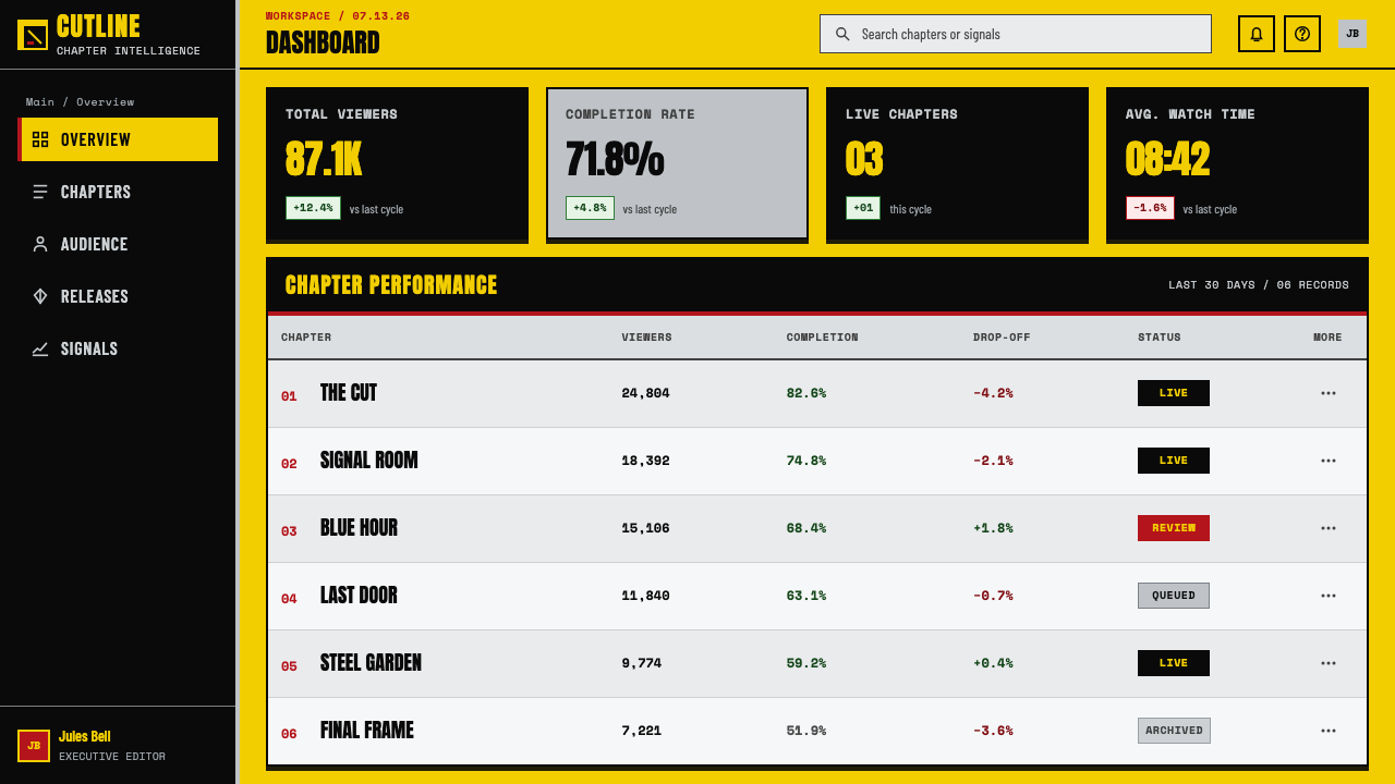
For web interfaces, this style fits dashboards, scoreboards, progress views, and pricing pages where status and hierarchy need immediate recognition. Use yellow for the primary route, black for the strongest structural zones, and steel-like lines to divide tasks or plans. Buttons, labels, and warnings should feel typographic and direct. The interface should still protect legibility; the cinematic reference is strongest when it clarifies action rather than obstructing it.
For editorial and marketing work, Kill Bill supports campaign pages, event identities, launch announcements, and high-energy feature stories. Build sections as chapters, let a headline interrupt a broad field, and reserve red for one consequential moment such as urgency, scarcity, or a warning. Images, when used, should enter as hard crops or high-contrast fragments that participate in the same cut-and-countercut rhythm as the typography.
A common mistake is copying the yellow-and-black palette while ignoring the system of restraint behind it. If every panel shouts, nothing has impact; if red appears everywhere, it stops functioning as an interruption; if dividers multiply, they cease to feel like blades. Avoid soft decorative effects, crowded ornamental details, and playful color variation. The style needs a dominant field, a clear cut, and a small number of visual decisions carried through with conviction.
Kill Bill (2003) — FAQ
Is Kill Bill style simply yellow and black?
No. Yellow and black are the fastest visual shorthand, but the style depends on how they are organized: flat saturated fields, slab type with physical presence, chapter-like sequencing, hard cuts, blade-like dividers, and sparing red. Without that hierarchy, the palette can look like generic warning signage rather than a cinematic revenge system.
Can this style work without using the Bride’s tracksuit imagery?
Yes. The tracksuit is a powerful source cue, but the transferable system is more abstract: chrome yellow interrupted by a lone black line, cold steel-like separation, forceful slab typography, and chaptered contrast. Referencing those compositional relationships is usually more durable than reproducing a costume image directly.
How should red be used in a Kill Bill-inspired layout?
Use it as a rare, consequential accent associated with the supplied Crazy-88 arterial spray reference. A single red marker can signal danger, a critical state, or an irreversible moment. It should interrupt the main yellow-and-black structure rather than compete with it. If red becomes a routine background or repeated decorative motif, its shock value disappears.
Does the style need a dark background?
No. The source material explicitly frames the system through hard cuts between siren yellow and grindhouse black, not through a permanently dark page. A yellow-led composition can be equally authentic when black enters as stripe, title field, divider, or chapter interruption. What matters is the abrupt relationship between the fields, not making every surface dark.
Where does Kill Bill-inspired design work poorly?
It struggles where calm reassurance, softness, or low-stimulation reading is the central requirement. Its visual vocabulary is deliberately loud, sharp, and confrontational, so it can overwhelm intimate editorial work, gentle service experiences, or information that needs a quiet neutral tone. Use it when decisive contrast and chaptered momentum support the message, not merely because the reference is recognizable.
Related design styles
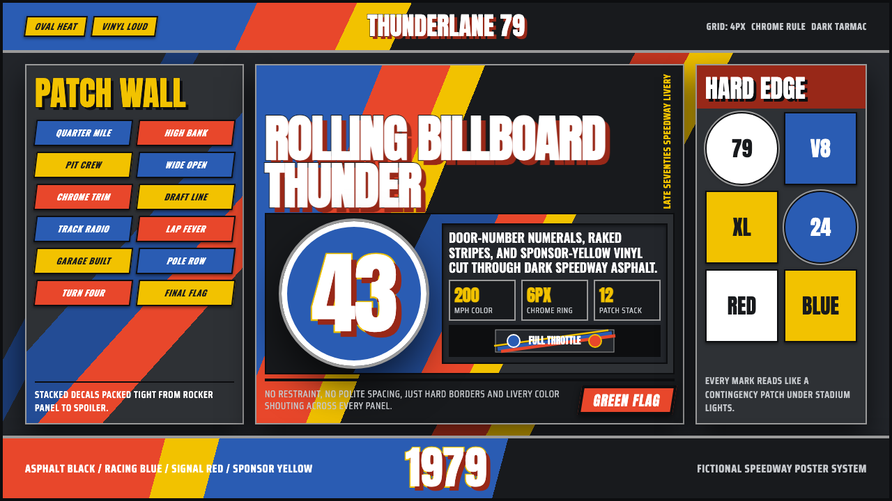 NASCAR Stock CarLoud as a rolling billboard. Blue, red, and sponsor yellow collide in a hard-…
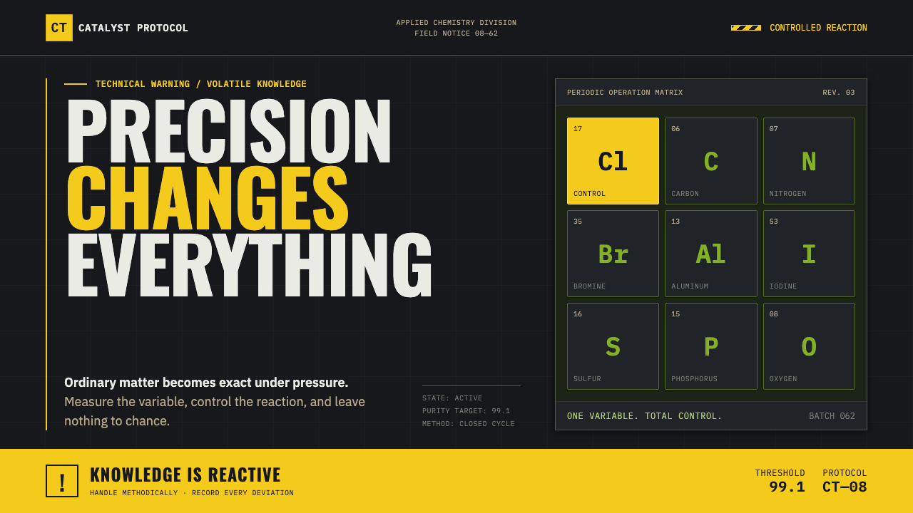 Breaking Bad (2008)Precision turns dangerous. Hazmat yellow and element tiles cut through asphal…
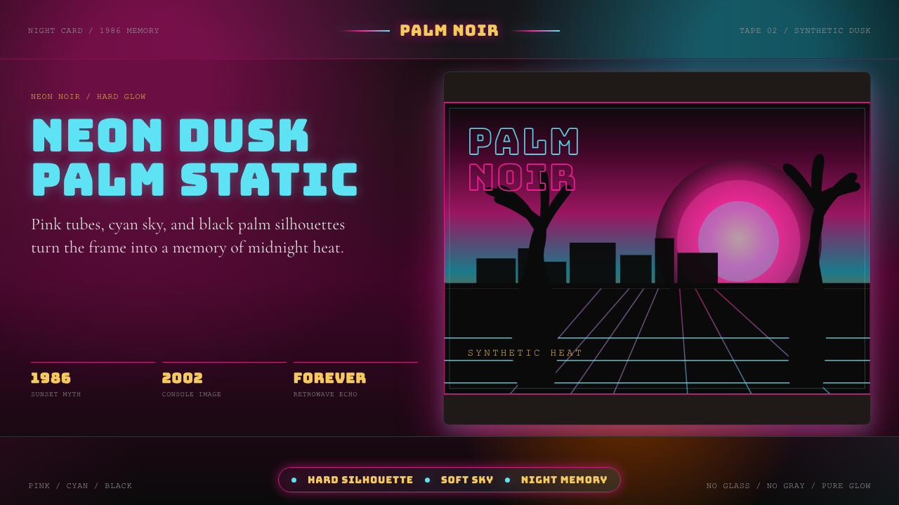 GTA Vice City (2002)Neon-noir nostalgia. Pink-cyan dusk, chunky type, and palm silhouettes.
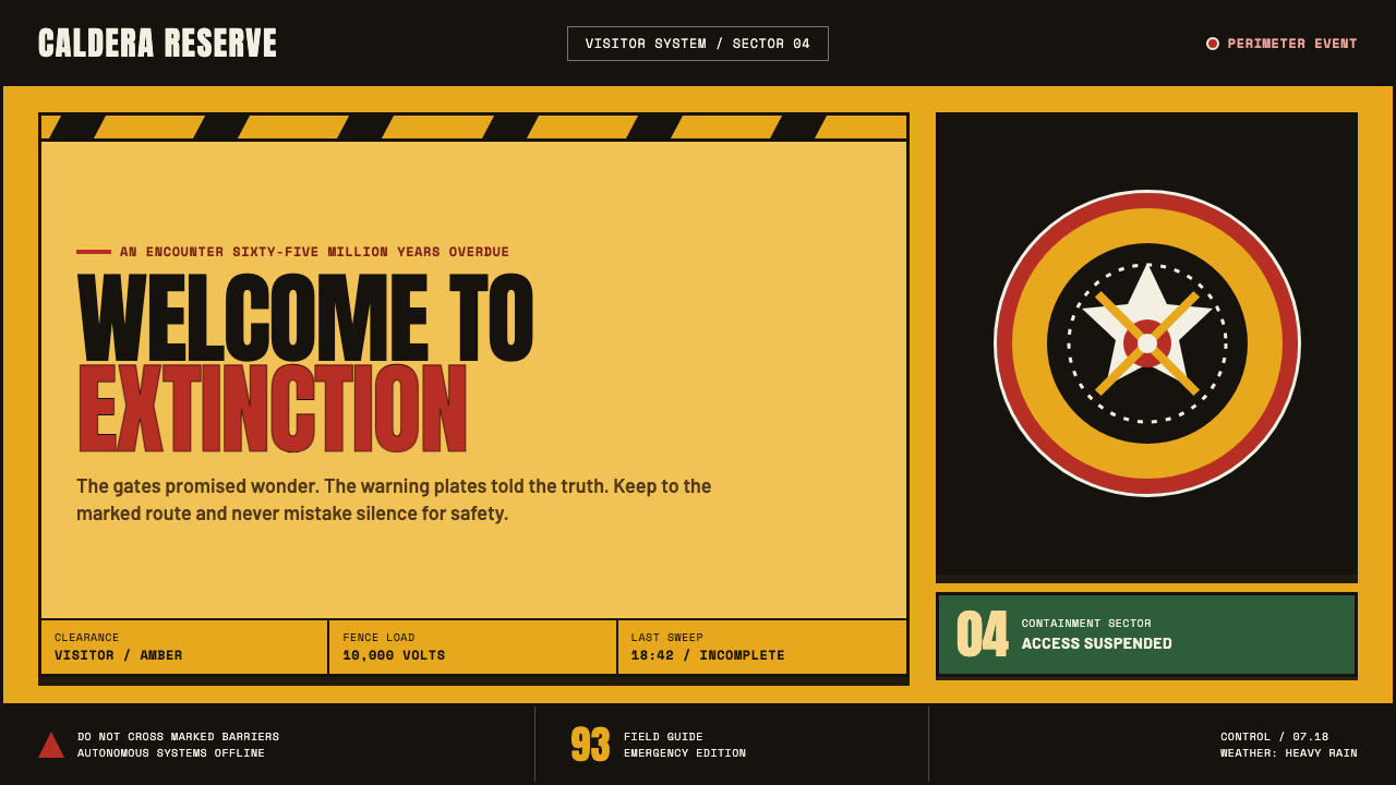 Jurassic Park (1993)Warm welcome, lethal edge. Amber plates, red rings and black chevrons turn aw…
 Polish Solidarity Stadium GraphicDefiance fills the stands. Stadium red, Anton stencil type, and chalk-white b…
 Pulp Fiction (1994)Cheap print, dangerous rhythm. Goldenrod stock, pulp red, and black chapter c…