What is Vinyl Crate Digging?
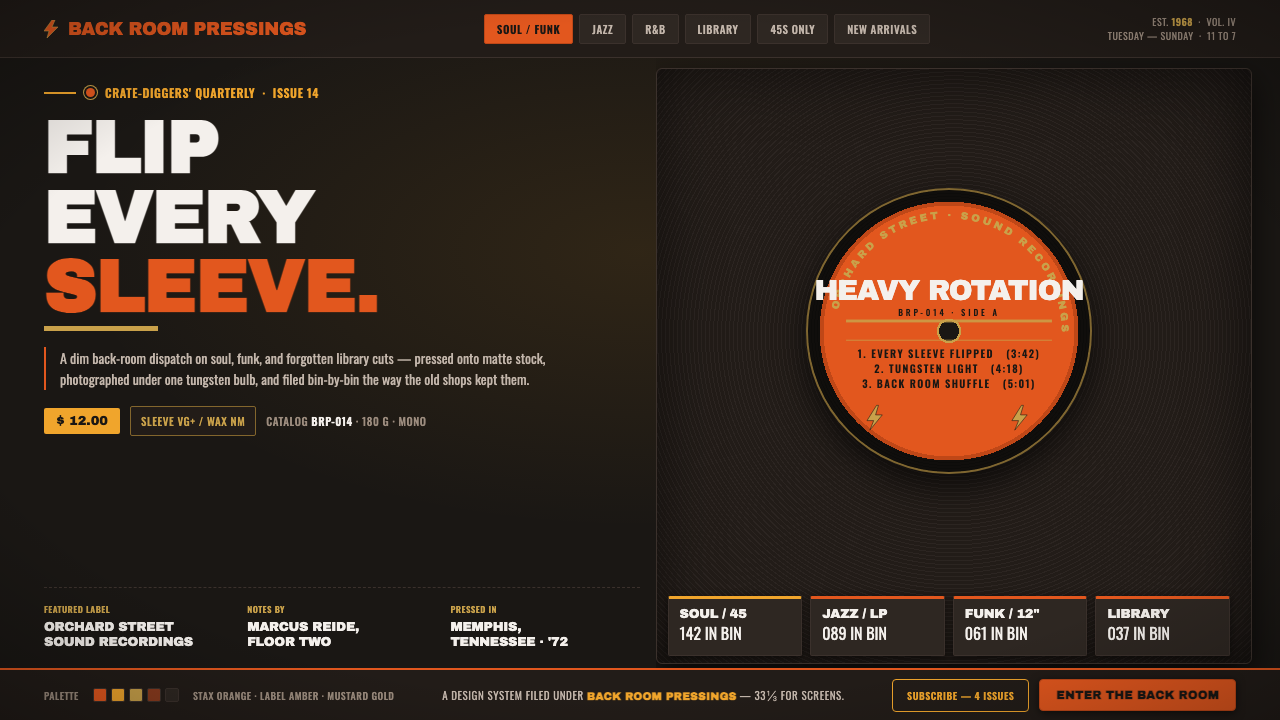
Vinyl Crate Digging brings the dim back room of a used record store to the screen: black vinyl, worn paper stock, Stax-orange label energy, and type built to be read from across a crowded aisle.
Vinyl Crate Digging in brief
Vinyl Crate Digging is a dark visual language drawn from North American used record shops and the collector and DJ culture that grew around LPs from 1950 to 1990. Its imagined setting is not a polished hi-fi showroom but the back room of a shop: wooden crates, sleeves stacked tightly upright, matte-black record stock, dust-softened surfaces, and warm tungsten light falling unevenly across a discovery.
The visual center is literal record culture. Near-black grounds evoke vinyl resting against black sleeves; circular crops suggest a label seen through a sleeve opening; concentric rings recall the grooves that hold recorded sound. Orange, especially the documented orange associated with vintage Stax and soul-label graphics, is not decorative brightness. It functions as the flash of identification that helps a hand find the record worth pulling from a crate.
This is a signage-heavy style. Heavy condensed lettering behaves like shop-window lettering, record-bin dividers, price cards, and label copy designed to remain legible in a crowded physical environment. The atmosphere is tactile but not nostalgic in a soft-focus sense: it values the friction of paper, storage, repetition, collecting, and the small act of uncovering something overlooked.
Where does Vinyl Crate Digging come from?
The style belongs to the LP era of 1950 to 1990, when the record sleeve, center label, shop bin, and handwritten or printed divider were part of how music was encountered. In North American used record shops, records were organized physically rather than summoned instantly. Looking for music meant moving through categories, sleeves, labels, and partial clues; the visual language of crate digging begins with that slow, material search.
Soul and jazz label graphic design supplied much of its visual charge. Stax Records, Atco Records, and Capitol / Liberty are the approved reference points because their label worlds made typography, circular crops, and strong printed color feel inseparable from the object being played. The signature Stax orange-label and yellow-lightning-bolt era of 1971 to 1975 provides a particularly vivid cue: a warm, high-impact label signal set against the darkness of vinyl.
Record-store culture turned these printed objects into a shared environment. Sleeves accumulated wear; records were filed, refiled, priced, and handled; labels became quick visual evidence of genre, era, or possibility. DJ crate-digging culture sharpened that way of seeing. A record did not need to announce itself loudly to matter: its value could reside in an unfamiliar label, a fragment of sleeve design, or the visual confidence of a disc pulled from deep in a bin.
On screen, Vinyl Crate Digging translates this environment without pretending that the interface is an actual record store. It retains the conditions that make the source setting recognizable: darkness as the ground, warm print-like accents as discovery signals, compressed signage as navigation, and groove-like circles as a reminder that music was once stored in a visible physical form.
What defines the Vinyl Crate Digging look?
Black Vinyl Ground
The base is near-black, matte, and dense, like vinyl against black record stock. It should feel absorbing rather than empty: a field that lets labels, paper edges, and pale text emerge as objects found under low light. Cream and white grounds break the premise because they replace the shop’s darkness with a gallery-like cleanliness.
Orange Label Signal
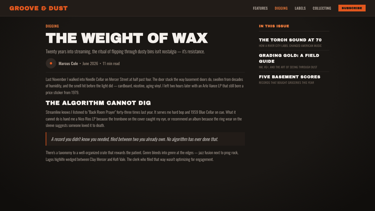
Orange is the decisive warm accent, tied to the documented Stax and soul-label cue in the source material. It is strongest when concentrated in circular labels, short notices, selection states, or a single graphic interruption. Surrounded by black, it reads as printed identity and discovery rather than as a general-purpose decorative color.
Condensed Signage Type
Typography should have the urgency of shop signage: heavy, narrow, upright, and easy to scan quickly. Large words can feel like crate categories or window announcements, while smaller copy works like label metadata and stock information. The point is not luxury refinement. It is physical legibility, density, and the sense that type has been printed to survive handling.
Grooves and Circular Crops
Concentric rings are the style’s most direct structural motif. They can suggest a full disc, a partial record edge, groove texture, or the framed center label without becoming literal illustration. Circular crops work best when cut decisively and allowed to disappear beyond an edge, as if the interface has captured only part of a larger physical collection.
Tungsten Warmth
Warmth comes from the imagined tungsten-lit room, not from a bright or sugary palette. It appears in orange print, muted sleeve-like surfaces, and small moments of contrast against the dark ground. This gives the style its dusty human temperature: the feeling of standing near a crate after the shop has become quieter, rather than looking at a glossy music campaign.
Physical Density
Layouts should feel filed, stacked, and handled. Tight groupings, overlapping sleeve-like planes, label-scale details, and clear category markers evoke a collection that is deep enough to search. The composition may be dense, but it needs an organizing logic: each cluster should resemble a bin, a sleeve face, or a label system, never random visual clutter.
Who shaped Vinyl Crate Digging?
Stax Records is central to the theme’s strongest color cue. Its documented orange-label graphics, especially the 1971 to 1975 orange-label and yellow-lightning-bolt era, establish the relationship between a warm printed signal and the dark physical field of a record. In this style, that contrast becomes a rule for emphasis: the label should feel found, not merely placed.
Atco Records is an approved reference point within the soul and jazz label-graphic world behind Vinyl Crate Digging. Its role here is not to supply a separate decorative language, but to anchor the theme in the broader North American record-label environment: printed identity, sleeve-and-label recognition, and graphics encountered through collecting rather than passive viewing.
Capitol / Liberty appears among the key label references for the style’s LP-era context. Together with Stax and Atco, it supports a visual world in which a record’s face, label, filing position, and printed marks are meaningful cultural evidence. The interface should preserve that sense of recognition through hierarchy and cropping, rather than turning labels into generic retro ornaments.
How do you use Vinyl Crate Digging today?
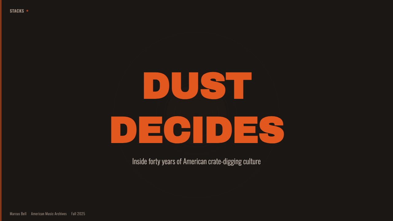
For presentation covers, use the darkness as a stage rather than a backdrop. A cropped disc or groove field can occupy a dominant area, with a single orange label-like element carrying the title, series name, or key idea. Content slides should then become bin systems: compressed headings, firm categories, and compact bodies of text arranged like records ready to be flipped through. Keep the visual warmth selective so the material remains readable.
Data slides can use the language without turning information into decoration. Treat circular forms as record-derived containers for a key metric or category, and use label-like accents to identify the most important comparison. Bars, lists, and tables should remain direct and high contrast. The record motif should clarify grouping and sequence, not obscure the data behind simulated sleeve wear or excessive texture.
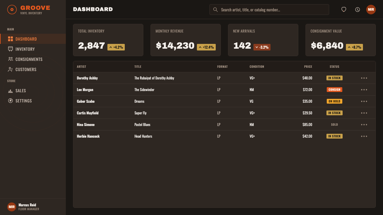
For web interfaces, Vinyl Crate Digging suits music libraries, archival browsers, collector tools, media dashboards, and pricing pages that need a strong point of view. Navigation can resemble shop signage, while cards can behave like sleeves or stacked inventory. On dashboards, use the warm accent for an active selection, new discovery, or meaningful status; let the dark ground and pale typography carry the rest of the system.
Editorial and marketing layouts benefit from the style’s sense of search and provenance. A feature page can open with an oversized cropped label, then move through tightly filed sections, sleeve-like image frames, and concise metadata. The common mistake is to scatter retro symbols everywhere: too many discs, too much orange, or fake dirt quickly turns the work into costume. The stronger approach is to keep the physical references structural, with darkness, signage, crop, and label contrast doing the work.
Vinyl Crate Digging — FAQ
Is Vinyl Crate Digging simply a retro music style?
No. Retro is an outcome, not the system. Vinyl Crate Digging is specifically rooted in the used-record-shop environment and North American crate-digging culture of the LP era. Its important cues are material: black record stock, circular labels, grooves, condensed signage, storage density, and the moment of discovery. Generic retro decoration may resemble the period without reproducing that searching, physical logic.
Can the style use a light background?
A light background works against the source material. The style begins with literal black vinyl on black record stock and the dim back room of a used record shop; cream and white are explicitly outside that premise. Light text, paper-like details, and warm label accents should emerge from darkness so that the composition keeps its low-light, object-based character.
How should orange be used without overpowering the page?
Use it as a label signal, not as the page’s default field. Its strength comes from appearing against near-black vinyl-like grounds, where it can mark a title, active state, category, or important discovery. If orange becomes the dominant background across every section, it loses the contrast that makes the Stax-related cue feel like printed identity.
Does the style require literal record illustrations?
No. Literal records are only one possible expression. Concentric rings, partial circular crops, label-scale blocks, and sleeve-like stacking can all establish the connection more elegantly. The goal is to preserve the visual conditions of record handling and recognition, not to fill every surface with obvious music symbols.
Related design styles
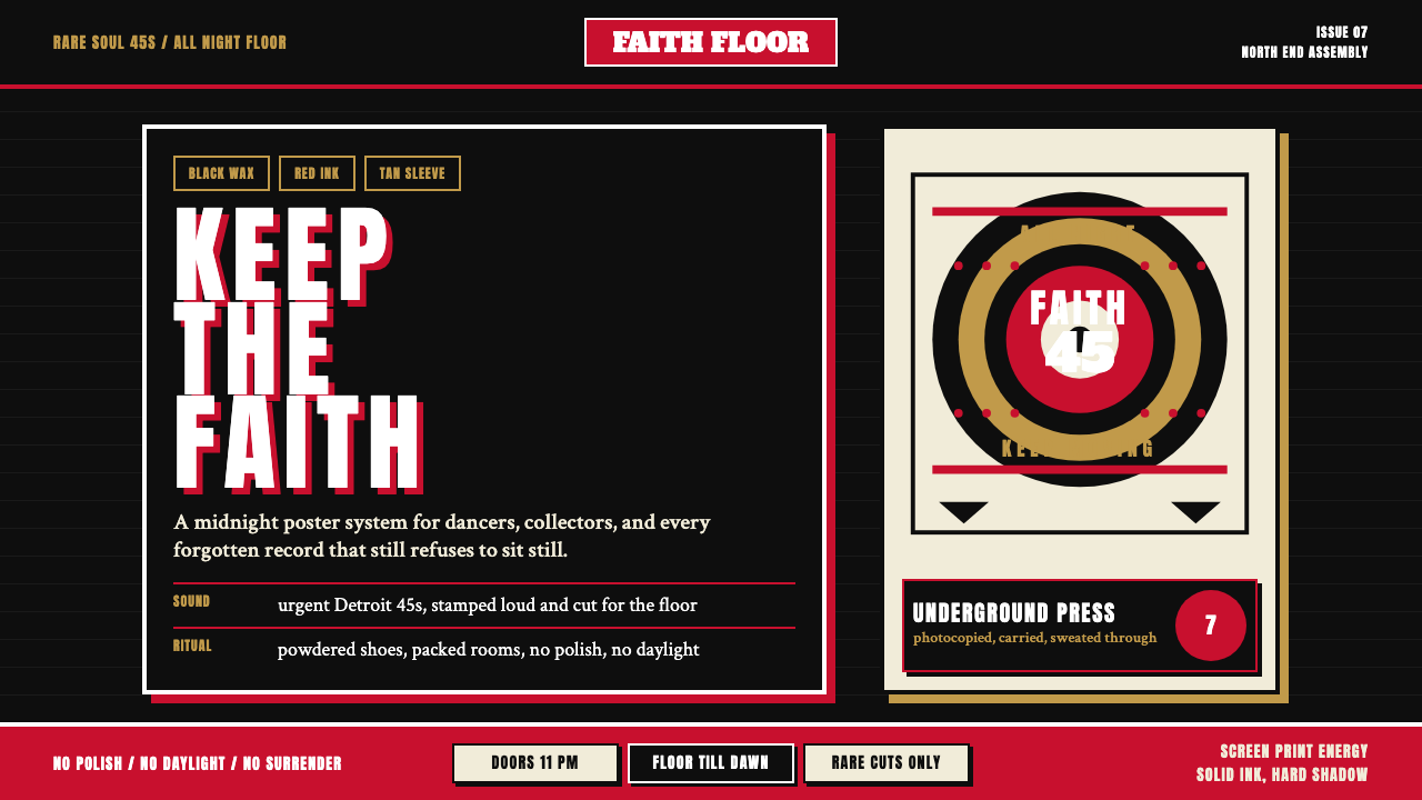 Northern Soul Wigan (1970)Underground urgency. Black ground, fist-red type, and tan vinyl rings hit lik…
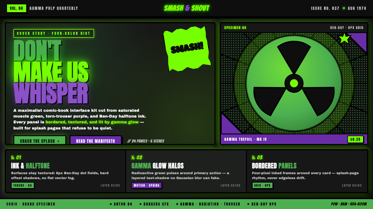 Hulk Gamma GreenDon't make us whisper. Muscle green, trouser purple, inked panels, Ben-Day ha…
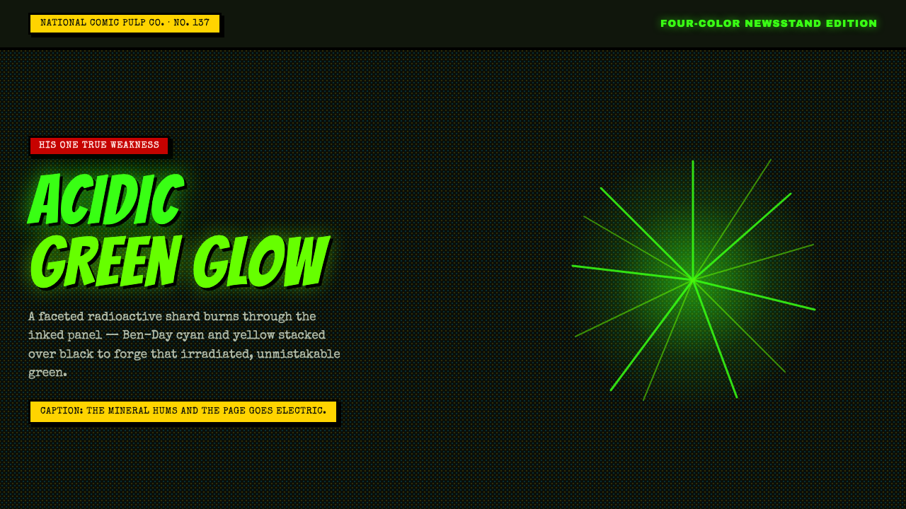 Kryptonite GreenRadioactive pulp glows hard. Neon green shard, black gutters, Ben-Day grit.
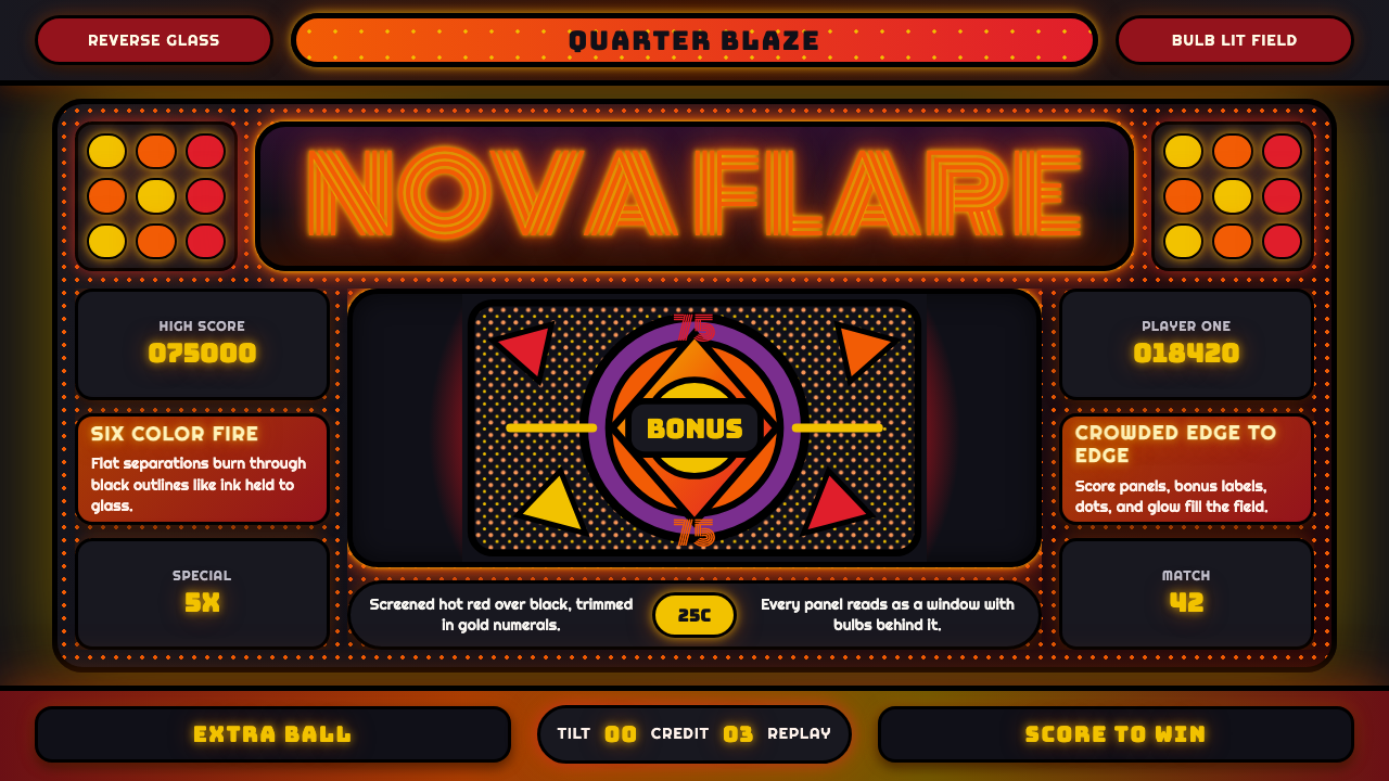 Pinball BackglassGlows like paid light. Monoton type, black outlines, orange-red halftones cro…
 Pojangmacha Soju TentNight appetite glows. Orange tarp panels burn over black, cut by Hangul neon…
 Rockabilly Greaser (1950)Loud after midnight. Asphalt black, chrome-yellow circles, and one lipstick-r…