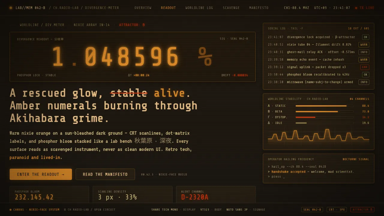
About Steins;Gate CRT
Steins;Gate's visual grade is built around a single object: the Divergence Meter, a scavenged nixie-tube display whose warm amber-orange digits glow against black. That prop's palette — nixie amber, hot orange-red, rust, washed khaki — bleeds outward into the whole show's Akihabara, rendered as a sun-bleached, over-exposed, low-fi city that always feels one shade too yellow, like old film stock left in a drawer. This is retro technology nostalgia, not clean minimalism: CRT terminals, dot-matrix readouts, and phosphor bloom sit over a grimy, desaturated ground that is warm but never bright, aged but never pastel. It reads as junk-tech obsession — brilliant, paranoid, lived-in.
- Origin
- Akihabara, Tokyo, Japan
- Era
- 2011 anime (White Fox), adapted from the 2009 visual novel; setting is 2010 Akihabara
- Key figures
- Chiyomaru Shikura · White Fox · huke
- Movements
- Low-fi cyber-nostalgia · Akihabara otaku junk-tech aesthetic · Sci-fi visual novel adaptation
Steins;Gate CRT design spec
Colors
Typography
The other 11 sections — buttons, cards, spacing, motion, techniques and more — open once you unlock. Download the DESIGN.md or send it to your AI in one click. Unlock once, yours forever.
Sign up nowStyles similar to Steins;Gate CRT
Also inspired by film, games & music, with a close feel.
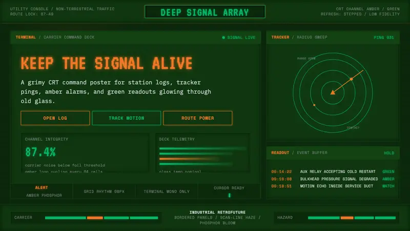 Alien: Isolation (Sevastopol)Lo-fi dread glows. Amber phosphor and terminal green pulse through bordered CRT panels.
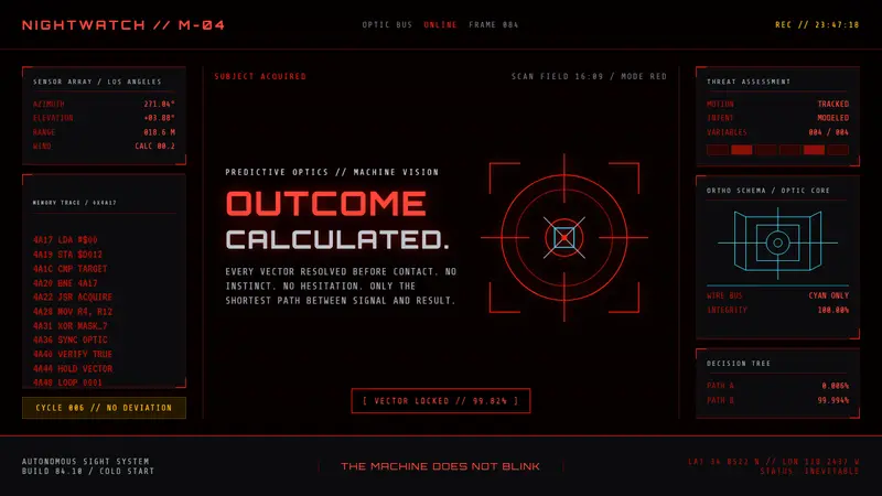 Terminator HUD (1984)The machine never blinks. Blood-red reticles and mono data burn across absolute black.
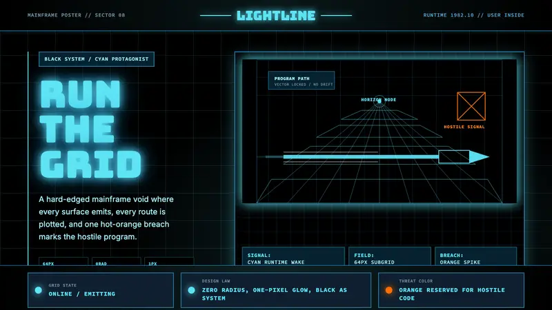 Tron Grid (1982)Cyber-precision in black. Neon cyan grids, Bungee type, and one orange breach cut the void.
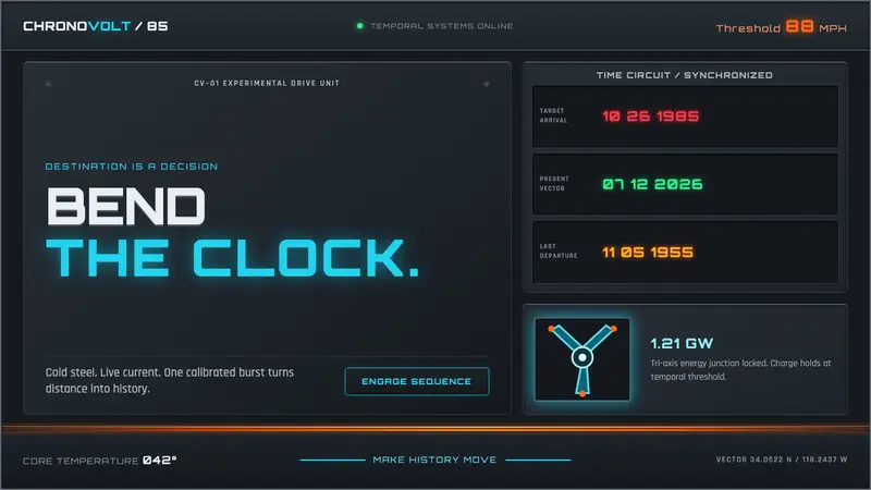 Back to the Future (1985)Cold steel, live current. Cyan circuits and orange trails turn the dashboard into a time machine.