What is SSENSE?
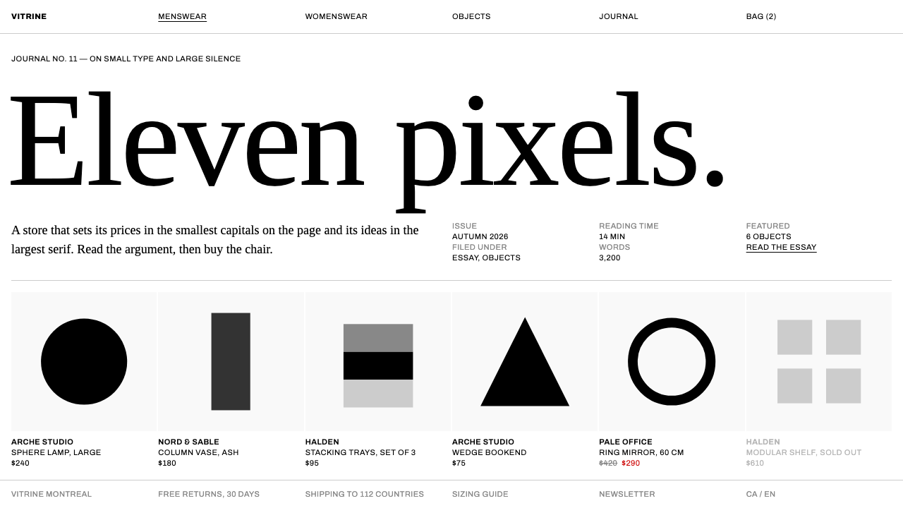
SSENSE turned a deliberately small, all-caps grotesque on pure white into the house style of online high fashion, then set a sharp editorial serif against it so that selling and reading share one grid.
SSENSE in brief
SSENSE is a Montreal luxury retailer whose website has become one of the most imitated looks in online fashion. The style can be described in a single sentence: black type on pure white, a hierarchy built from greys, and one red reserved for sale prices. Everything else is removed. Product images are cut out and placed on white, and the text under each one is small, set entirely in capitals and aligned flush left, so that it reads like the wall label beside an object in a gallery.
The second half of the system arrived with the 2017 redesign led by Eric Hu and Matthew Tsang. They paired the anonymous, neutral grotesque with a sharply drawn editorial serif of strong contrast. The grotesque handles commerce: it is cool, impersonal and quick to scan. The serif handles culture: it is sharp, literary and slightly theatrical. The two voices never mix inside the same job, which is why the contrast feels intentional rather than messy.
The most unusual feature is structural. Essays and features are dropped directly into the product grid, and a garment tile and a culture article share the same tight, flush-left layout with almost no gutter between them. Reading and shopping are not separate zones of the site. The result is a retailer that behaves like a magazine, with the quietness of a gallery and the authority of a publication.

Where does SSENSE come from?
SSENSE was founded in 2003 in Montreal, Quebec, and the company's name is closely tied to Rami Atallah, the figure most often associated with building the business. In its first years it was an online store with a taste for the experimental end of fashion, and the plainness of its interface was part of the pitch: a retailer confident enough in its selection that it did not need to decorate the page.
The look draws on several established traditions. The anonymous, upright grotesque belongs to Swiss neo-grotesque typography, the mid-twentieth-century approach that treats lettering as a neutral carrier of information rather than a personality. Luxury minimalism supplies the white, the restraint and the idea that scarcity of ornament signals expensiveness. Editorial commerce, the practice of mixing magazine content with the shop floor, supplies the structure that places essays among products.
The identity that most people recognise today comes from the 2017 redesign and has been refined through the 2020s. Eric Hu and Matthew Tsang led the work, and Johannes Breyer is also named among the key figures connected with the system. Fonts were drawn for the company by the type foundry Dinamo, which gave the retailer a custom grotesque rather than a stock one, so that the neutrality is itself a designed thing.
The style spread because it solved a real problem for fashion retail. Product photography varies wildly from brand to brand, and a decorative interface fights with it. A white page with small capital labels becomes a neutral mount, a kind of passe-partout, that lets many different brands sit side by side without clashing. The editorial serif then gives the retailer a voice of its own on top of that neutral base, which is why imitators who copy only the white page and the small type often miss what made the original distinctive.
What defines the SSENSE look?
Pure white ground
The page is plain white with no tint, texture or panel colour. It acts as a neutral mount for product photography, so garments from very different brands sit together without visual conflict.
Small capital grotesque
Labels are set in a deliberately small neutral grotesque, all capitals, tightly spaced and placed directly below the cut-out product. The scale is slightly smaller than comfortable, which gives the text the quiet authority of a museum wall label.
Grey hierarchy
Importance is expressed through black and shades of grey rather than through colour or weight changes. Primary information is black, secondary details recede into grey, and there is no decorative accent in between.
One red for sale prices
The only colour in the whole system is a red used for reduced prices. Because nothing else on the page is coloured, that red is read instantly and never needs a badge or banner.
High-contrast editorial serif
Feature headlines and essay titles use a sharply drawn serif with strong thick-thin contrast. Set large against the small grotesque, it creates a dramatic change of voice between selling and storytelling.
Commerce and culture in one grid
Product tiles and articles share the same tight, flush-left structure with almost no gap. A visitor moves from a jacket to an essay without any change of layout, so reading and buying feel like the same activity.

Who shaped SSENSE?
Figure most closely associated with founding and building SSENSE in Montreal from 2003.
Led the 2017 redesign with Matthew Tsang, pairing the neutral grotesque with a sharp editorial serif.
Co-led the 2017 redesign that set essays directly into the product grid.
Named among the key figures connected with the SSENSE identity system.
How do you use SSENSE today?
In slide decks, this style suits lookbooks, brand reviews and any presentation that depends on images. Keep every slide white, cut the images cleanly, and label them in small capitals directly beneath, aligned to the left. Use the editorial serif only for a section title or a pull quote so that it keeps its drama. For data slides, rely on black and grey: tables with thin rules, a single red figure for the number that has moved the most, and no coloured chart fills.
On the web, the pattern is ideal for product catalogues, boutique shops, galleries and portfolio sites that sell objects. Build the grid tight, give each tile an image and a short capital label, and let the layout stay identical across categories. In dashboards and pricing pages, apply the same restraint: grey hierarchy, small capital column headings, and red only for reduced or negative values. Resist the temptation to add coloured status chips; the discipline of the system is part of what makes it feel premium.
For editorial and marketing work, bring the serif forward. A long-form article, a campaign introduction or a designer interview can open with a large high-contrast headline and then settle into quiet grotesque body copy. Because essays sit in the same grid as products, a newsletter or landing page can alternate a story with a row of items and still look like one document.
A common mistake is to copy only the surface: white page, small caps, and nothing else. Without the contrast serif and the shared grid, the result looks merely sparse. Another mistake is adding brand colour, rounded buttons or soft drop shadows, each of which undermines the wall-label effect. A third is letting the red spread to headings and links; once red appears more than once or twice on a screen, it stops meaning a price.
Finally, remember that the style depends on strong photography. Cut-out products need clean edges and consistent lighting, because the white page offers nowhere to hide. If the images are weak, the minimal interface will expose that instead of flattering it.

SSENSE — FAQ
Who is behind the SSENSE design?
The company was founded in 2003 in Montreal and is closely associated with Rami Atallah. The current identity comes from a 2017 redesign led by Eric Hu and Matthew Tsang, with Johannes Breyer also named among the key figures. The custom typefaces were produced by the foundry Dinamo.
Why is the type so small and in capitals?
The scale is intentionally a little smaller than comfortable, and the capitals keep labels even and anonymous. Together they make product text behave like the label beside an object on a gallery wall, so the garment remains the focus and the interface stays quiet.
What does the red mean in this system?
Red is the only colour in the system and it is reserved for sale prices. Because the rest of the page is black, grey and white, a reduced price is noticed without needing badges or banners. Using red for anything else weakens that signal.
How do the serif and grotesque work together?
The neutral grotesque handles commerce: labels, prices and navigation. The sharp high-contrast serif handles culture: essay titles, features and interviews. Keeping each typeface to its own job is what makes the pairing feel deliberate rather than mixed.
Which traditions does the look draw on?
It draws on Swiss neo-grotesque typography for its neutral lettering, luxury minimalism for its white restraint, and editorial commerce for its habit of placing magazine content inside the shop grid. The combination, rather than any single borrowing, is what makes the style recognisable.
Related design styles
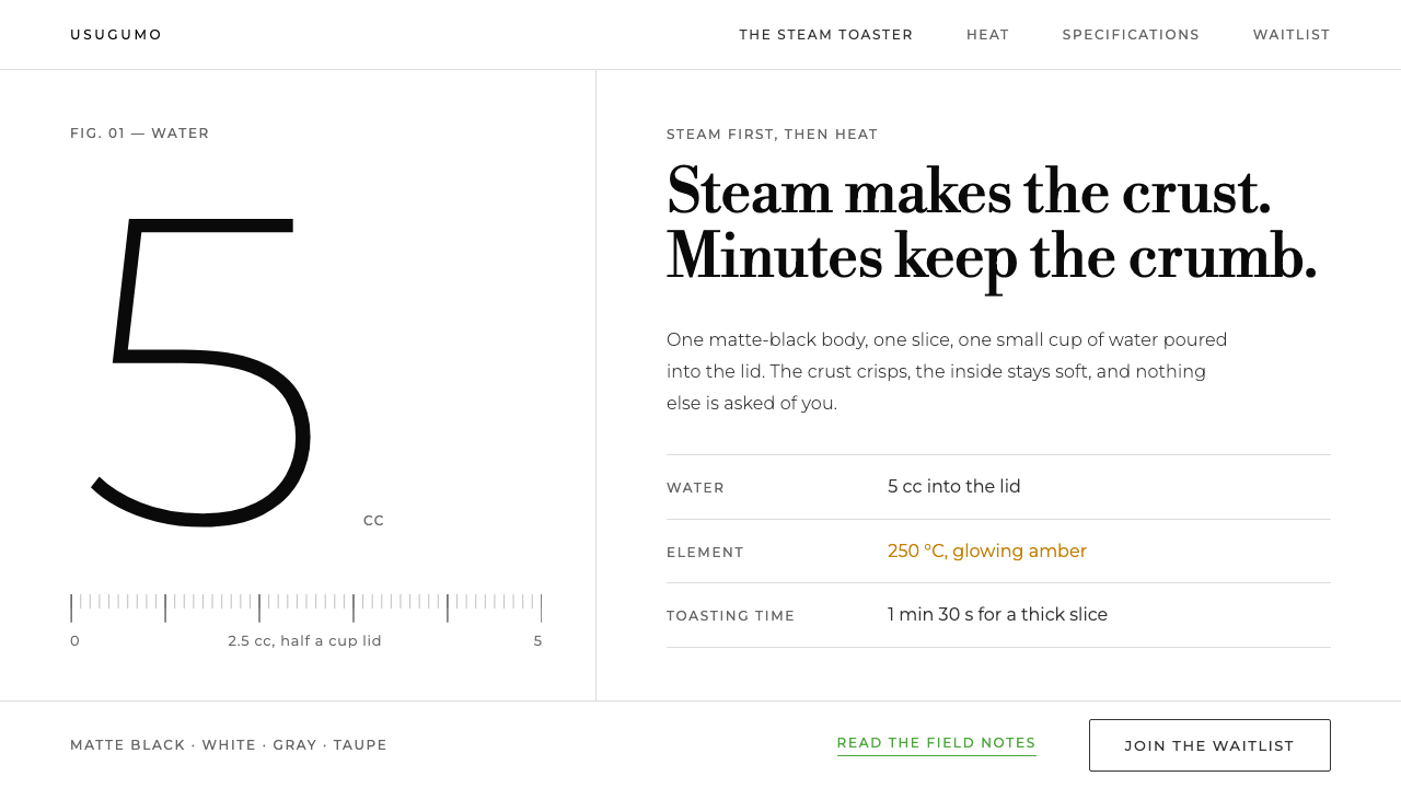 BALMUDA The ToasterOne object, one white room. Grey ink, Bodoni lines, huge light numerals, gree…
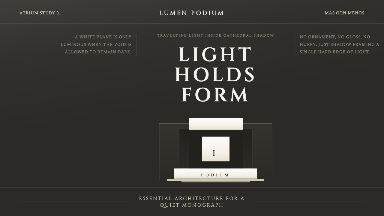 Campo Baeza Luminous WhiteLight becomes architecture. Travertine-white planes float in cathedral gray.
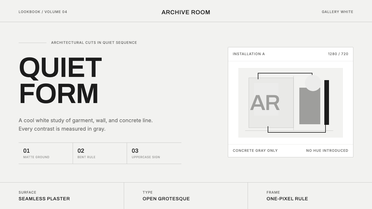 COS Gallery MinimalSilence has structure. Cool gallery white, Archivo uppercase, and concrete-gr…
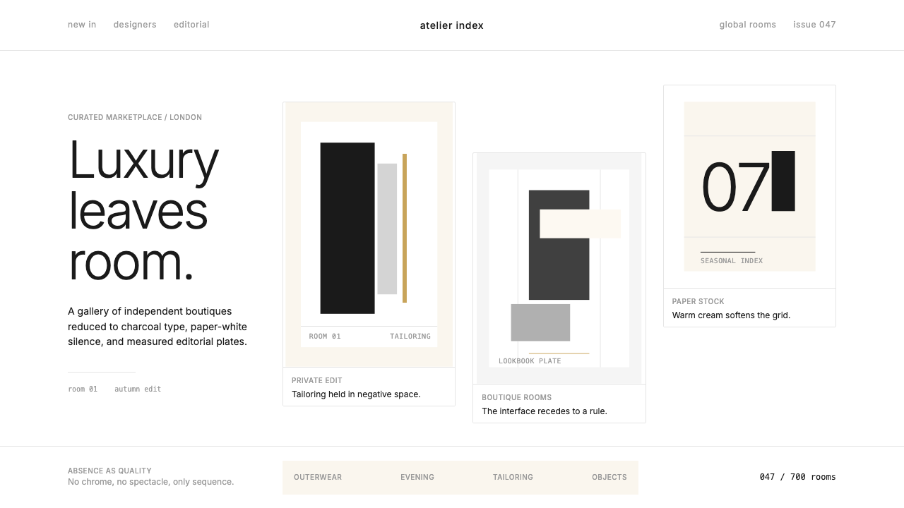 FarfetchLuxury as absence. Charcoal type, white canvas, and hairline editorial plates.
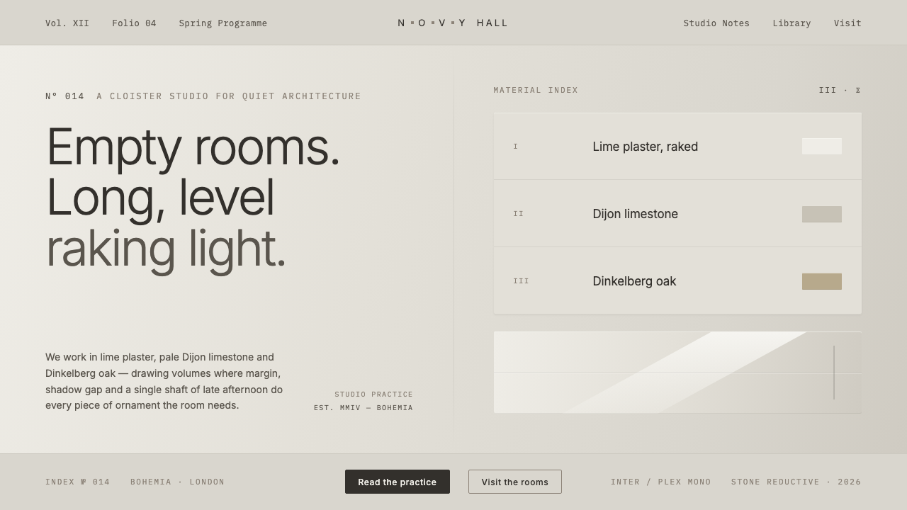 John Pawson MinimalismMonastic reduction. Cool stone-grey, pale oak, hairline shadow gaps as the on…
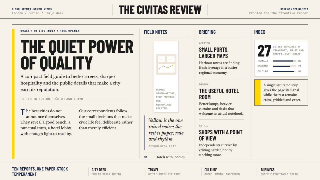 Monocle MagazineQuiet authority. Yellow spine, warm paper and dense ruled columns speak at li…