What is John Pawson Minimalism?
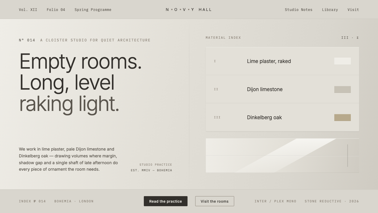
John Pawson reduces architecture to its quietest essentials — cool stone-grey surfaces, pale oak warmth, disciplined geometry, and the conviction that emptiness can carry more presence than ornament.
John Pawson Minimalism in brief
John Pawson Minimalism is a late-modern, monastic form of reduction associated with the British architect John Pawson and the mature minimalist work of the 1990s and 2000s. Its visual language is built from cool creamy-grey stone grounds, muted limestone and pale oak neutrals, white lime-plaster, concrete, seamless volumes, and an almost complete refusal of ornament. The result is not empty in the impoverished sense. It is quiet because every competing gesture has been removed.
The defining idea is that space should be allowed to register as space. Surfaces meet cleanly, materials remain legible, and light moves across planes without being interrupted by decoration. A wall is not made expressive through pattern; it becomes expressive through proportion, emptiness, texture, and the narrow shadow gap where one plane separates from another. The architecture asks the eye to slow down and notice what remains when visual noise is absent.
On screen, this discipline becomes a design system of generous negative space, restrained neutral grotesques, pale mineral surfaces, and barely visible structural separations. Color is atmospheric rather than symbolic: stone-grey establishes calm, limestone softens the ground, and pale oak introduces human warmth without becoming rustic. Shadows are hairline and quiet. Nothing should feel glossy, embellished, busy, or theatrically luxurious.
Where does John Pawson Minimalism come from?
John Pawson Minimalism belongs to the Western European tradition of minimalism, monastic or reductive architecture, and late modernism. Its mature period is identified with the 1990–2010 era, when reduction was treated not simply as a visual fashion but as a way of organizing space, material, and attention. The work seeks a condition in which architecture becomes quieter as it becomes more exact.
Pawson's architectural language is defined by the controlled relationship between white lime-plaster, pale Dijon limestone, Dinkelberg oak, and concrete. These materials are arranged into seamless monastic volumes rather than layered into decorative compositions. Their differences are subtle but important: mineral surfaces provide cool stillness, oak introduces restrained warmth, and concrete gives the ensemble weight without requiring visual spectacle.
The Novy Dvur Monastery in the Czech Republic is the canonical statement of this approach and dates from 2004. It concentrates the system's central concerns: emptiness, raking light, monastic volume, and hairline shadow gaps. The building is understood through the way light moves through quiet space and the way small separations between surfaces clarify the larger mass. Its power comes from subtraction and precision rather than accumulation.
The style's geographic identity remains rooted in Western Europe, while its key works extend across the Czech Republic, the United Kingdom, and Europe. Its influence is best understood as a transferable discipline rather than a decorative signature. The screen-based interpretation keeps the same priorities: cool stone-grey grounds, limestone and oak neutrals, generous margins, quiet grotesque typography, and a refusal of ornamental effects. The intended atmosphere is contemplative, exact, and materially grounded.
What defines the John Pawson Minimalism look?
Material Palette
The palette is drawn from cool stone-grey, muted limestone, pale oak, white lime-plaster, and concrete. These tones should remain quiet and close in value, with contrast created through material association and surface separation rather than saturated color. Oak is the warmest note, but it should read as pale and controlled, never honeyed, rustic, or decorative.
Negative Space
Emptiness is an active compositional material. Large uninterrupted fields give typography, objects, and transitions enough room to be perceived without competition. Space should feel deliberate rather than unfinished: margins, pauses, and quiet zones establish the rhythm of the system and allow the smallest detail to carry weight.
Typography
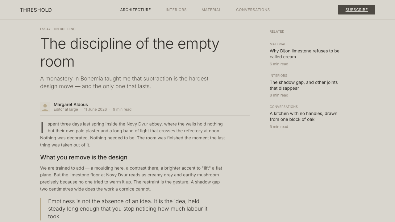
Typography uses quiet neutral grotesques with clear shapes and restrained personality. Serif faces, expressive display lettering, and typographic ornament are outside the system. Hierarchy comes from scale, spacing, placement, and contrast against the mineral ground. Text should feel architectural: aligned, calm, and present without demanding attention.
Seamless Volumes
Elements are grouped into broad, continuous fields instead of visibly assembled modules. Panels, cards, and sections should feel like volumes within a calm whole, with transitions handled through tonal shifts, recesses, or shadow gaps. The composition avoids busy stacking and makes each boundary appear necessary.
Raking Light
Light is treated as a quiet agent that reveals planes rather than a decorative glow. Directional illumination can separate a wall from a recess, bring out the grain of pale oak, or make a mineral surface legible. The effect should remain soft in atmosphere but precise in direction, giving depth without theatrical spotlighting.
Hairline Shadow Gaps
The narrow shadow gap is the system's only ornament because it is not ornament in the usual sense. It clarifies where surfaces meet, separates adjacent volumes, and gives the eye a precise line to follow. On screen, this becomes a barely visible divider, recess, or tonal seam used only when it explains structure.

Who shaped John Pawson Minimalism?
John Pawson is the British architect whose work gives this system its name and discipline. His architecture distils space through material restraint, seamless volumes, generous emptiness, and precise transitions. The screen translation follows the same logic: remove visual noise until surfaces, margins, light, and proportion become the primary content.
Novy Dvur Monastery in the Czech Republic, completed in 2004, is the canonical work for this language. Its design concentrates on emptiness, raking light, monastic volumes, and hairline shadow gaps. It demonstrates how a building can achieve intensity through quiet surfaces and carefully controlled absence.
Dinkelberg oak represents the warmer side of Pawson's material vocabulary. Used beside stone, lime-plaster, and concrete, it prevents reduction from becoming sterile while preserving a pale, controlled atmosphere. In digital work, its role is best translated as a restrained warmth within an otherwise mineral palette.
How do you use John Pawson Minimalism today?
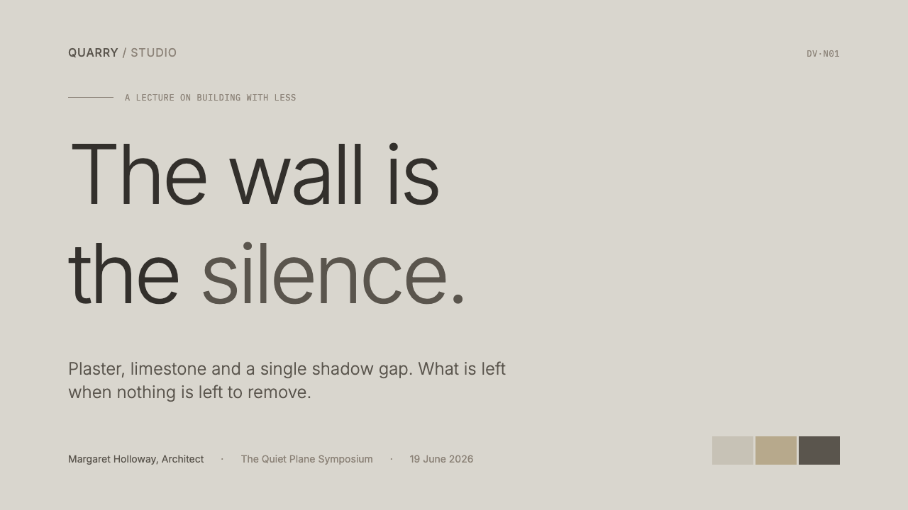
For presentation slides, use the style to establish a calm architectural field before introducing information. A cover can place a concise title within a broad stone-grey ground, with a pale oak or limestone plane providing the only tonal shift. Content slides should preserve generous margins and let quiet alignment create authority. Data slides work best when charts are treated as pale volumes and structural marks remain subtle, allowing the information to feel measured rather than presented as spectacle.
For web interfaces, John Pawson Minimalism suits dashboards, settings tools, and pricing pages that need composure and trust. Use a cool mineral ground, restrained panels, neutral grotesque type, and clear separation between surfaces. Dashboard states should be differentiated through tonal contrast and placement before relying on accent color. Pricing tiers should feel like related architectural bays within one continuous structure, with hierarchy created by space and material shifts rather than badges, gradients, or decorative emphasis.
For editorial and marketing work, the system supports a slow, premium reading experience. Give articles a narrow, comfortable text measure surrounded by expansive quiet space, and let section changes appear as changes in surface or a fine shadow seam. Product stories can pair material close-ups with sparse captions and large intervals. Marketing pages should resist the urge to fill every field; a single carefully placed image, sentence, or call to action can carry more authority than a crowded sequence of promotional blocks.
The style is especially effective when the subject itself involves architecture, interiors, materials, hospitality, art, or considered luxury. Photography should emphasize planes, grain, stone, light, and emptiness rather than visual abundance. Calls to action should be clear but quiet, integrated into the same material field as the surrounding content. The overall experience should feel inhabitable: a place the viewer enters, understands, and is not pressured to leave quickly.
The common mistake is confusing minimalism with a pale interface that has simply had its content removed. Pawson's discipline depends on exact relationships between surfaces, margins, light, and boundaries. Removing everything without establishing proportion produces vacancy; adding warm cream, serif type, glossy effects, decorative icons, or conspicuous shadows breaks the system's cool monastic character. Every remaining element should explain structure, guide attention, or provide necessary warmth.
John Pawson Minimalism — FAQ
Is John Pawson Minimalism the same as generic minimalist design?
No. Generic minimalism can mean reduction of almost any kind, while Pawson's language is materially and spatially specific. It depends on cool stone-grey and limestone neutrals, pale oak warmth, white lime-plaster, concrete, monastic volumes, generous emptiness, raking light, and hairline shadow gaps. The identity comes from the relationship among these elements, not from using fewer elements in the abstract.
Can the style use warm colors or warm cream backgrounds?
Warmth is allowed through pale oak and carefully controlled material contrast, but warm cream is outside the intended system. The ground should remain cool, creamy-grey, or stone-like rather than yellowed or cozy. This distinction matters because the style's atmosphere depends on mineral calm balanced by restrained wood warmth, not on a generally warm palette.
Why are hairline shadow gaps so important?
They perform the work that ornament would perform in another style, but through structure rather than decoration. A shadow gap explains where planes meet, gives a large volume a precise edge, and lets light reveal separation without adding a graphic motif. In a digital interface, a fine divider or tonal seam should be used for the same reason: to clarify a relationship that would otherwise remain ambiguous.
How should imagery be handled in this style?
Imagery should reinforce the material and spatial logic. Favor planes, stone, lime-plaster, pale oak, concrete, raking light, and emptiness. Cropping should feel deliberate and quiet, with enough surrounding space for the image to register as a surface rather than a burst of visual content. Images that depend on decorative abundance, glossy spectacle, or busy layering will fight the system.
What makes this style feel luxurious without becoming decorative?
Its sense of luxury comes from control, material clarity, and the amount of space given to each decision. Pale stone, oak, lime-plaster, and concrete feel considered when their relationships are precise and uninterrupted. The impression is one of quality and permanence rather than display. Adding more effects usually weakens that impression by replacing quiet confidence with visible effort.
Related design styles
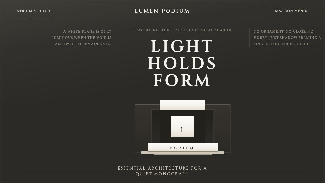 Campo Baeza Luminous WhiteLight becomes architecture. Travertine-white planes float in cathedral gray.
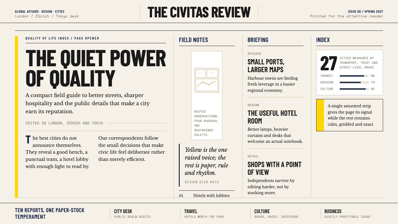 Monocle MagazineQuiet authority. Yellow spine, warm paper and dense ruled columns speak at li…
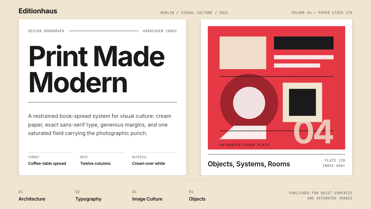 Gestalten Design BookCoffee-table calm. Cream paper, tight sans, one saturated block, and a strict…
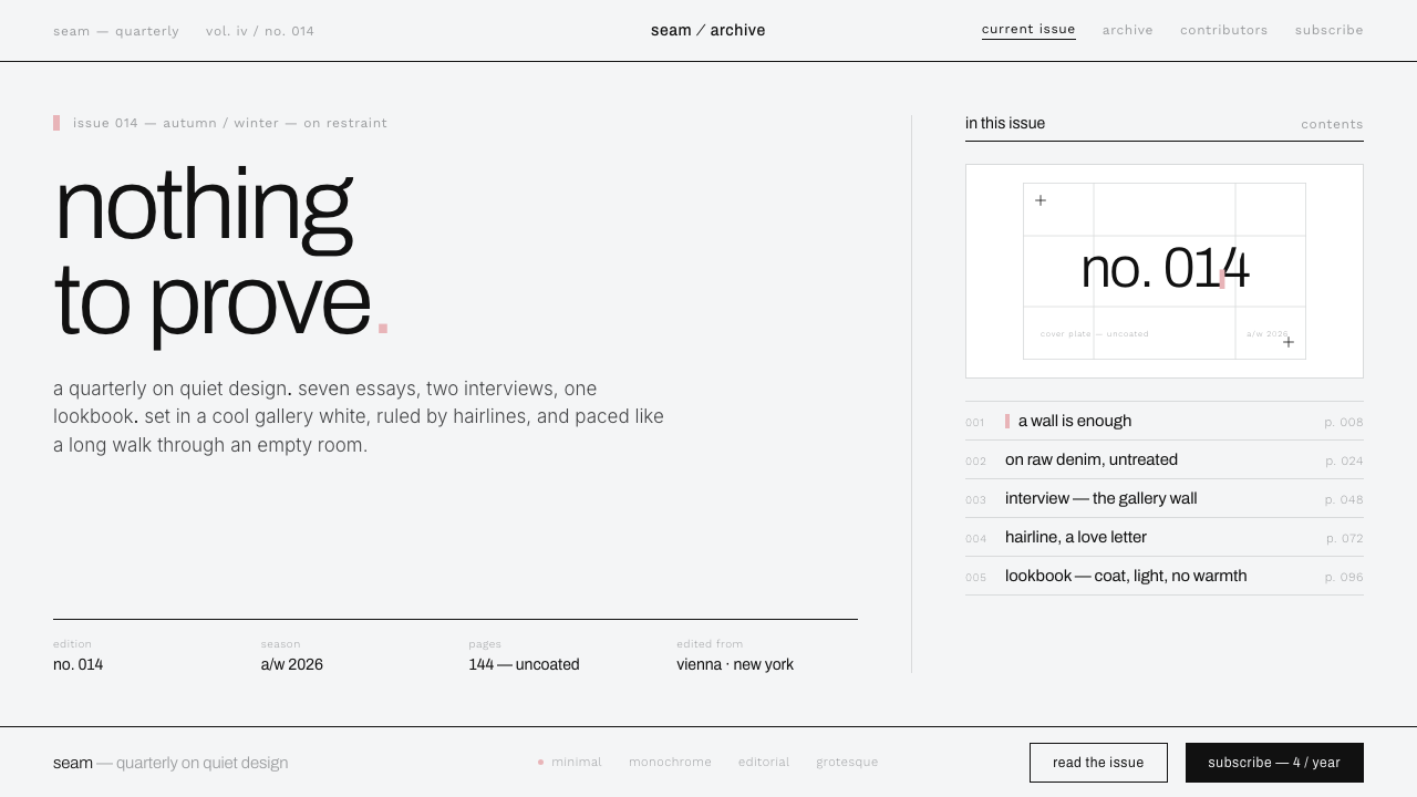 Helmut Lang MinimalismNothing to prove. Cool gallery white, 1px black hairlines, lowercase Archivo…
 Jasper Morrison Super NormalRefuses spectacle. Matte greige ground, plain Helvetica, gentle 20px radii —…
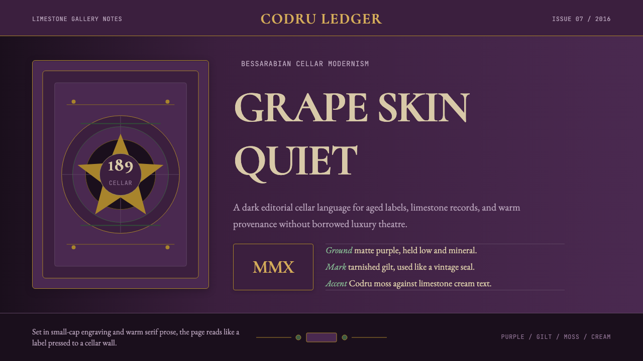 Moldovan Vineyard ModernistCellar restraint. Grape-purple field, Cormorant SC type, and tarnished gilt b…