What is Jasper Morrison Super Normal?

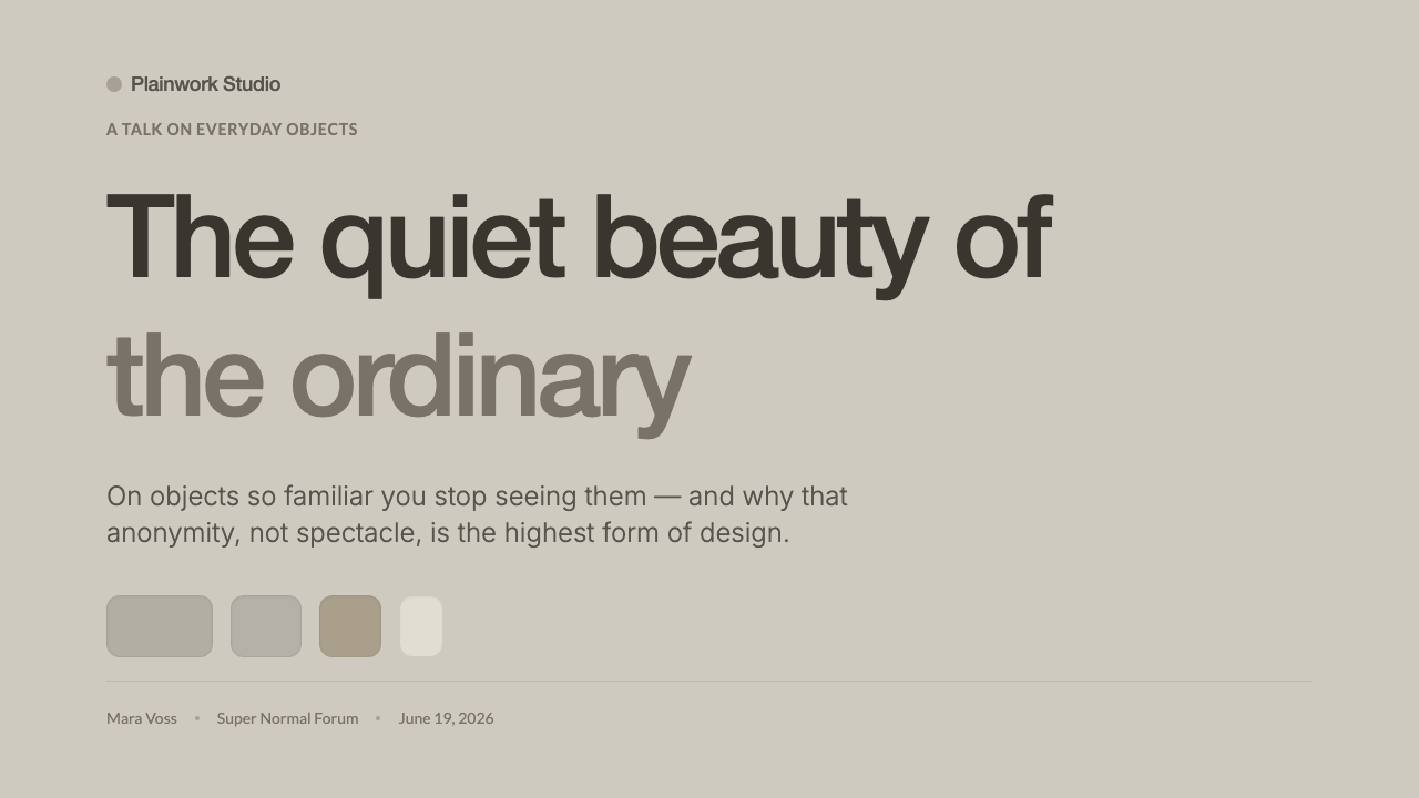
Super Normal finds beauty in the objects that disappear into daily life — quiet forms, matte surfaces, and a design value measured by use rather than spectacle.
Jasper Morrison Super Normal in brief
Super Normal is Jasper Morrison and Naoto Fukasawa’s quiet manifesto for the beauty of unassuming everyday objects. It values the molded Air-Chair, anonymous tools, and matte aluminium that no one notices yet everyone uses. The point is not that these objects lack design, but that their design does not demand attention. They become familiar, useful, and almost invisible.
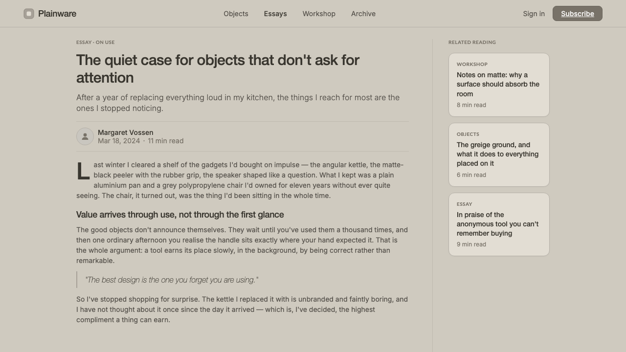
Translated into interface design, the system creates a warm greige ground, plain Helvetica or similarly humanist sans-serif type, matte low-contrast surfaces, and gently rounded forms that feel natural to handle. Nothing is polished into spectacle. Contrast is calm, hierarchy is legible, and visual interest comes from the relationship between elements rather than from ornament, novelty, or dramatic effects.
Super Normal is therefore more demanding than ordinary minimalism. Removing decoration is easy; making an interface feel complete without decoration requires confidence in proportion, language, spacing, and behavior. Every surface should support recognition, every control should invite use, and every visual decision should make the product feel more familiar rather than more theatrical.
Where does Jasper Morrison Super Normal come from?
Super Normal emerged within the design culture of the 1990–2010 period, with its clearest public form arriving through the Super Normal exhibition and book of 2006. Its regional context was the United Kingdom and Western Europe, especially London, where industrial design had increasingly moved beyond the need to announce modernity through novelty. The movement’s central question was simple: can an object be excellent without looking extraordinary?
Jasper Morrison and Naoto Fukasawa proposed Super Normal as a way of naming a quality already present in everyday life. Their examples were not precious collector’s pieces but ordinary things whose success came from being right in the hand, right in the room, and right for the task. The concept rejects the assumption that design must be visually loud in order to be meaningful. Familiarity is not a failure of authorship; it can be evidence that an object has settled naturally into use.
The movement belongs to everyday-object design and post-spectacle minimalism, but it is warmer than a purely reductive doctrine. It does not celebrate emptiness for its own sake. Instead, it asks designers to notice the quiet intelligence of common forms: the anonymous tool, the molded chair, the durable metal surface, the object whose usefulness becomes more important than its identity. In interface work, this becomes a discipline of restraint: visual language should support habit, trust, and ease rather than compete for attention.
What defines the Jasper Morrison Super Normal look?
Warm Greige Ground
The ground is warm rather than clinical: a matte greige field that softens the interface without becoming decorative. It creates an atmosphere closer to an ordinary interior, a useful object, or a familiar workspace than to a luminous digital screen. The background should recede quietly, giving content and controls enough presence without producing stark contrast.
Plain Typography
Typography is plain, familiar, and unperformed. Helvetica provides a useful reference: a straightforward sans-serif voice whose authority comes from clarity rather than personality. Type should be set with calm hierarchy, restrained emphasis, and generous readability. Headlines do not need expressive display treatment; body copy should feel as dependable as a label on a well-made everyday object.
Matte Low Contrast
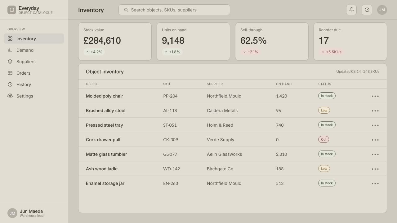
Surfaces are matte and low contrast, with distinctions carried through tone, placement, and tactile suggestion rather than glossy effects. Cards, fields, and controls should feel like parts of one coherent material world. The interface avoids the artificial shine of spectacle and instead builds confidence through quiet consistency.
Hand-Friendly Form
Forms are gently rounded, approachable, and easy to understand at a glance. The softened geometry recalls molded objects such as the Air-Chair: practical, stable, and shaped by use. Rounded controls should not become playful decoration; their purpose is to make interaction feel natural, forgiving, and physically plausible.
Value Through Use
The system places usefulness above visual recognition. A control is successful when it becomes obvious through repeated use, not when it attracts attention through novelty. Labels, states, and actions should be understandable without theatrical explanation. The best result is an interface that users remember as comfortable and dependable rather than as a visual event.
Post-Spectacle Restraint
Super Normal refuses visual drama as a default strategy. There are no ornamental flourishes, aggressive gradients, or exaggerated contrasts competing with the task. Restraint does not mean making every element anonymous or weak; it means allowing distinction to emerge only where it improves orientation, comprehension, or use.
Who shaped Jasper Morrison Super Normal?
Morrison is one of the two designers named in the Super Normal manifesto. His contribution is associated with the quiet intelligence of everyday objects: forms that are useful, familiar, and almost invisible because they settle naturally into life. In this system, his position becomes a standard for judging whether an interface is serving use or merely performing style.
Fukasawa co-proposed Super Normal with Morrison and helped establish its focus on objects that are recognized through use rather than spectacle. His presence in the concept reinforces the value of human-scale interaction, intuitive form, and quiet familiarity. Interface elements should feel similarly inevitable once encountered.
The molded Air-Chair is a key example of the kind of object Super Normal celebrates. Its importance is not spectacle but the way molded form, practical function, and everyday familiarity converge. As an interface reference, it suggests rounded structures that feel stable and useful without calling attention to their construction.
Anonymous tools represent the movement’s respect for objects whose identities recede behind their tasks. They are not designed to become visual trophies; they become dependable through repeated handling. In interface terms, this means prioritizing clear actions, familiar cues, and surfaces that support habit over novelty.
How do you use Jasper Morrison Super Normal today?
For presentation slides, Super Normal works best when the cover establishes a calm field rather than a dramatic opening scene. Use the warm greige ground, plain typography, and one quietly rounded structural device to create recognition. Content slides should organize information through spacing, alignment, and restrained tonal contrast. Data slides should feel like useful instruments: charts are legible, labels are direct, and emphasis appears only where it helps the audience read the result.
For web interfaces, the style suits dashboards, pricing pages, and tools that users return to frequently. Keep the background warm and matte, make panels feel materially related, and use rounded controls with clear labels. Pricing tiers should be distinguished through hierarchy and quiet tonal shifts rather than glossy badges or aggressive promotional color. The interface should become easier to navigate with familiarity, not more visually demanding.
For editorial and marketing work, the system supports a close, trustworthy voice. Articles can use generous margins, plain headings, and soft divisions between sections, allowing the text to carry the argument. Marketing pages should present the product through ordinary situations and useful details rather than inflated claims. Photography or object imagery should feel observed and unforced, reinforcing the idea that value is found in everyday use.
The style also works for product education, documentation, and service experiences where users need confidence more than excitement. A quiet visual system can make instructions feel approachable, while consistent forms help readers recognize repeated actions. The key is to let the interface behave like a familiar object: clear at first contact, comfortable over time, and unobtrusive when the task is complete.
The common mistake is confusing Super Normal with blandness. Removing contrast, hierarchy, or personality entirely produces an interface that is merely vague. The system still needs careful form, readable type, warm material cues, and meaningful emphasis. Another mistake is adding fashionable effects to prove that the design is modern. If an element exists only to attract attention, it should be questioned; if it improves use, recognition, or comfort, it belongs.
Jasper Morrison Super Normal — FAQ
Is Super Normal simply another form of minimalism?
It overlaps with minimalism but has a different emphasis. Minimalism often describes the reduction of visual elements, while Super Normal asks what remains valuable in ordinary use. Its goal is not emptiness or visual purity for their own sake. It is to make objects and interfaces feel natural, dependable, and quietly complete.
How can an interface feel Super Normal without becoming anonymous?
Give personality to the material and behavioral decisions rather than to decoration. Warm greige, matte surfaces, gently rounded forms, and plain type create a recognizable atmosphere. Clear language and dependable interaction create the deeper identity. The interface does not need a loud signature if users can recognize its care through repeated use.
Can Super Normal use strong contrast or dramatic visual effects?
It can use emphasis when emphasis improves orientation or comprehension, but drama should not become the default language. Strong contrast, gloss, and visual effects easily turn an everyday interface into a performance. The better test is functional: does the treatment help someone find, understand, or operate something? If not, it is probably spectacle rather than Super Normal.
What makes a rounded form feel useful instead of decorative?
The form should support recognition, touch, grouping, or a sense of approachability. Rounded controls work when they make the interaction feel forgiving and hand-friendly, as the molded Air-Chair suggests. They become decorative when the same softness is applied without regard to hierarchy or behavior. In Super Normal, form follows the experience of use.
Related design styles
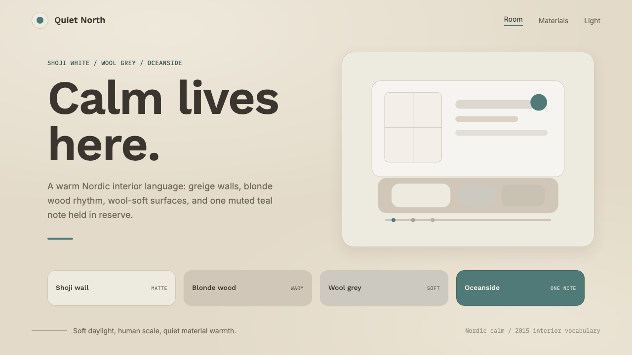 Scandinavian HyggeCalm is the brief. Greige walls, wool-grey cards, and one muted teal line.
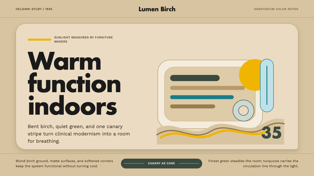 Aalto Finnish ModernModernism made humane. Birch fields, canary yellow, and soft plywood curves b…
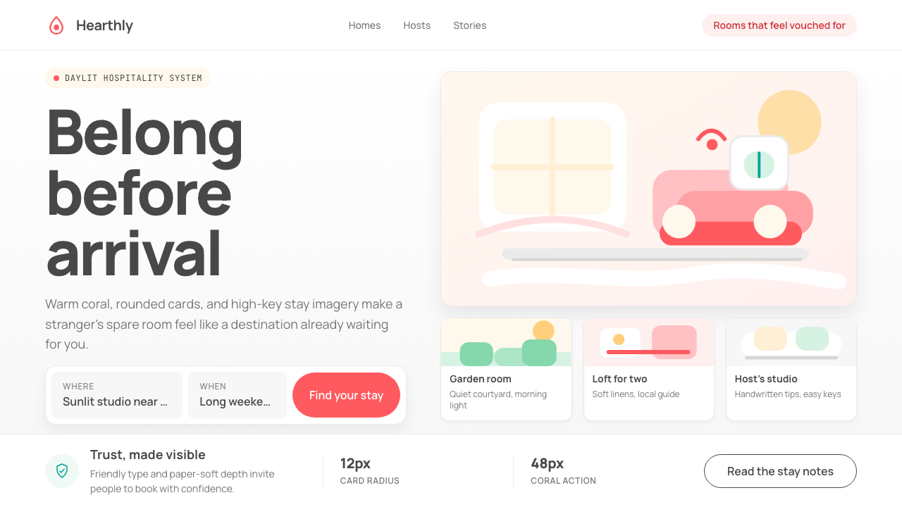 Airbnb 2014Coral red, soft pill cards, Cereal type. The Bélo wraps strangers in warm, da…
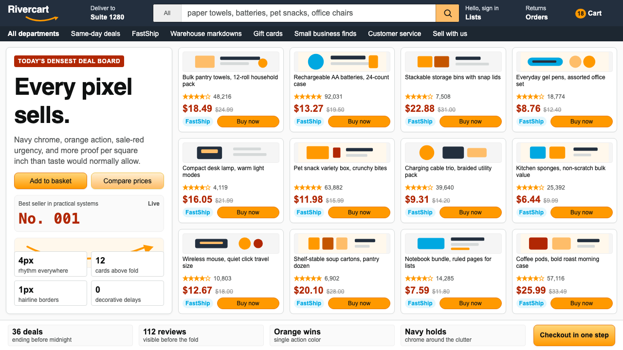 AmazonUgly sells efficiently. Navy chrome, orange buttons, red prices crowd a dense…
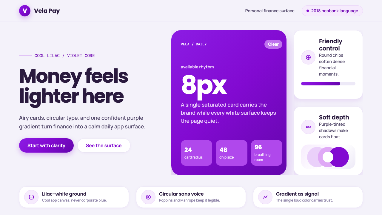 Circular FintechFinance feels light. Lilac-white space, rounded cards, and one vivid purple g…
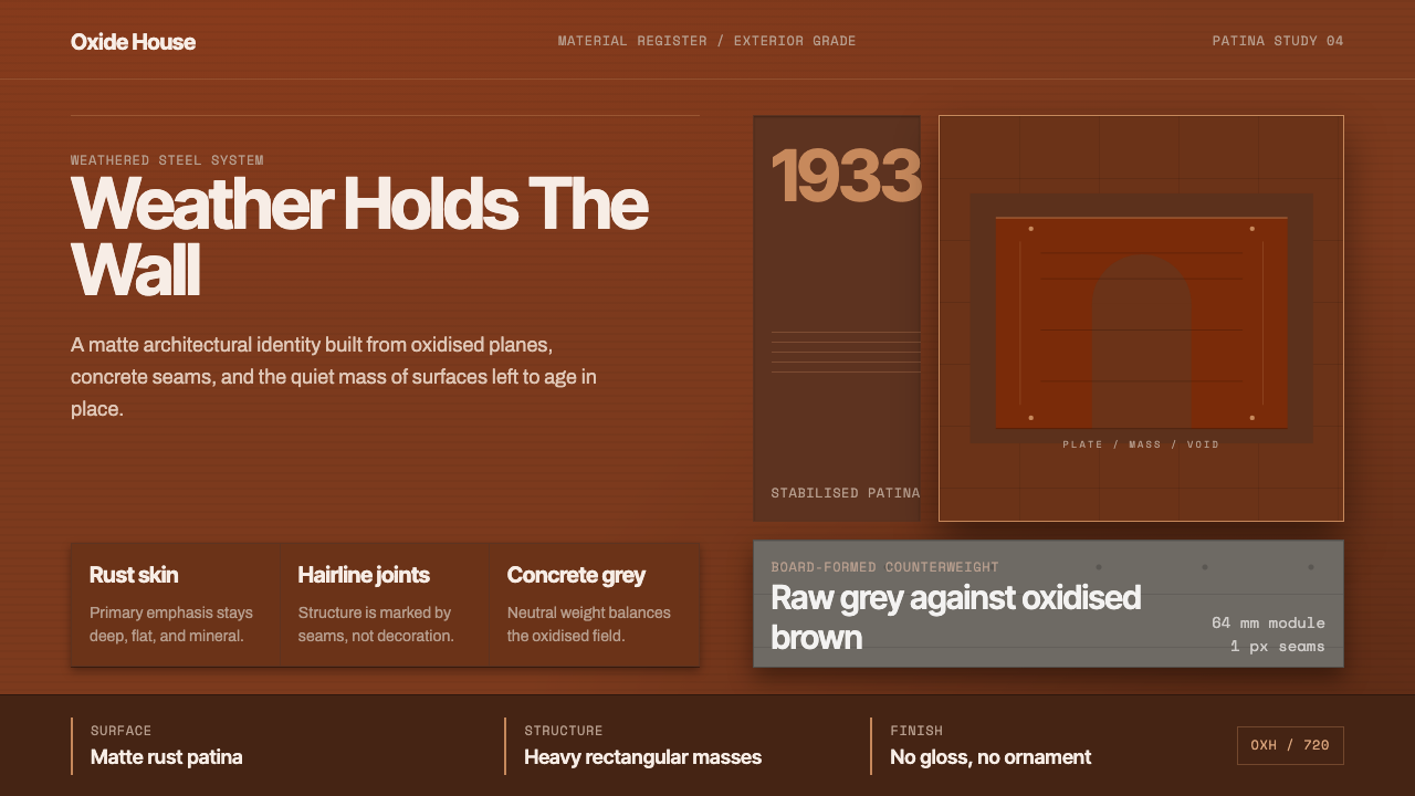 Corten Weathering SteelWeight over ornament. Rust-brown planes and concrete-grey seams make mass vis…