What is BALMUDA The Toaster?
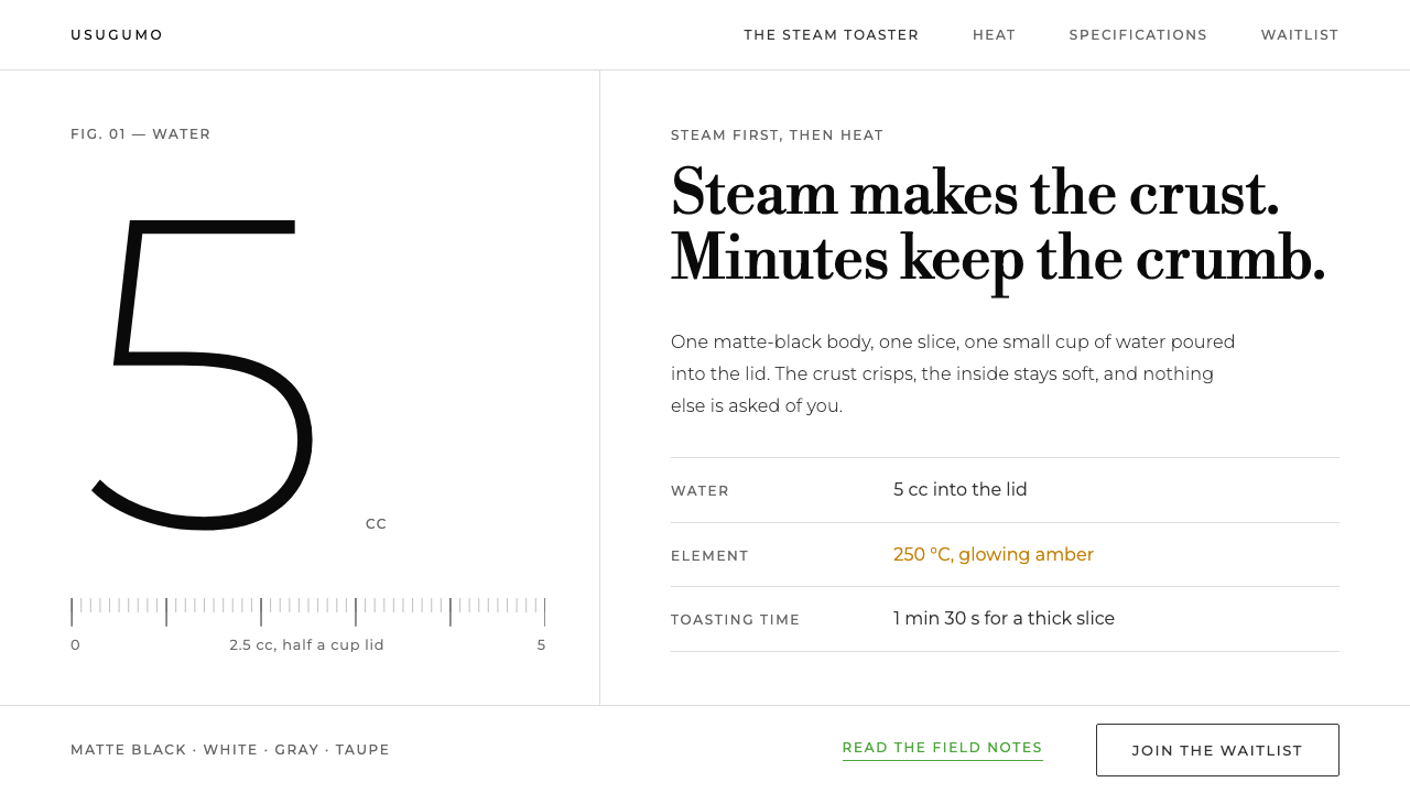
BALMUDA's Toaster page treats a single appliance as a subject worth a long look: one object, one white room, a ladder of grey ink, and a green that only ever means 'click'.
BALMUDA The Toaster in brief
BALMUDA The Toaster is a product-page style that grew out of a single appliance, introduced in 2015 by the Tokyo company BALMUDA. Its visual language is a photo essay rather than a catalogue: one matte-black toaster standing on a seamless pure-white studio sweep, one slice of bread beside it, and almost nothing else. The page is organised around a question that is unusual in consumer electronics, namely how long it takes to get a slice of toast exactly right, and every design decision serves that one story.
The style is defined as much by what it leaves out as by what it contains. Nothing is boxed, lifted or tinted: there are no cards with soft shadows, no coloured section bands and no gradient washes behind the hero. Sections are separated by air and by hairlines, and hierarchy comes from a ladder of greys running from near-black headings down to quiet secondary text, not from a palette. Two typefaces share the work: a geometric sans for headings and specifications, and Libre Bodoni, a high-contrast serif, reserved for the editorial lines that carry the brand's voice.
Numbers are the quiet protagonists. Temperatures, minutes and millilitres are set large and in a light weight, so a figure reads as a small piece of typographic sculpture rather than a footnote. Colour is rationed with equal discipline. A single brand green appears only where something can be clicked, while amber belongs to the bread and the heating element in the photography. The result suits brands that want to tell one thing slowly and thoroughly, a style that persuades through patience rather than volume.

Where does BALMUDA The Toaster come from?
BALMUDA was founded in Tokyo in 2003, and the background material for this style names Gen Terao as its key figure. The company's early years are not the subject here; the style is anchored to one moment, 2015, when The Toaster was released. The Japanese-language description of that launch stresses how unusual it was. The product was introduced without conventional advertising, buyers are described as queuing for about three months, and what was being sold was less an appliance than 'a slice of toast cooked just right'.
That framing places the style at the meeting point of three currents named in its background notes. Japanese post-appliance product design can be read as an approach in which a kitchen appliance is judged not as a box of functions but as an object that earns a place on the counter and in a morning routine. Single-object consumer electronics describes a company that stakes its reputation on one carefully resolved product instead of a sprawling range. Slow-commerce product storytelling is the idea that a purchase page can behave like an essay, giving the reader time to understand why a thing is made the way it is.
These currents explain why the page borrows so much from studio photography. A seamless white sweep is the working surface of the product photographer, and using it for the whole interface turns the screen into an extension of the studio: the background is not a decorative layer but the room in which the object is shown. The slice of bread and the amber of the heating element supply the only warmth, while the interface stays neutral so that the object can carry the feeling.
The current visual treatment runs from roughly 2015 to 2024, a span of nearly a decade. That longevity is consistent with the premise. A style built from grey ink, hairlines and one action colour has very little fashion in it to expire, and the pairing of a geometric sans with a Bodoni-style serif reads as editorial rather than as the product of any particular year. What ties it to its moment is mainly an attitude: that one well-made object can be introduced slowly, through explanation, rather than loudly, through advertising.
What defines the BALMUDA The Toaster look?
Studio White Ground
The page is one seamless field of pure white, behaving like the curved backdrop of a photographic studio. There is no cream paper tone, no tinted section band and no pattern. Because the ground is so clean, the matte-black body of the toaster and the amber of the bread and heating element become the only strong values on the screen, and the eye lands on them without being steered.
Grey Ink Ladder
Text colour is organised as a ladder of greys rather than a palette: the deepest grey for headings, softer greys for body copy, and the lightest for captions and small print. Hierarchy is carried by tonal steps, not by hue. Colour proper is almost absent, which is exactly why the single green and the amber of the bread register so strongly when they appear.
Green Means Click
The brand green is reserved for interaction: links, buttons and the small cues that invite a click. It never decorates a heading, tints a panel or colours an ornamental rule. A reader learns the rule within a single screen, which is that if it is green, it does something. That discipline keeps the interface legible without icons or borders.
Sans and Bodoni Pairing
Headings and specifications use a geometric sans, while editorial lines use Libre Bodoni. The sans handles information; the serif, with its hairline strokes and strong vertical stress, handles voice. The pairing mirrors the page's two jobs, specifying and storytelling, and keeps them visibly distinct without needing a divider.
Large, Light Numerals
Temperatures, times and volumes are set at display size in a light weight. Large but thin numbers read as calm rather than loud: they have presence without the shouting quality of heavy, bold statistics. The page treats these figures as its illustrations, in the way another site might place a row of icons.
Air and Hairlines
Nothing is boxed, lifted or tinted. Sections are separated by generous vertical space and by fine rules, never by cards, drop shadows or background fills. Elevation does not exist in this system: the page is a flat sheet on which things are placed, and spacing does the work that containers would do elsewhere.
One Object at a Time
Imagery follows the same restraint as the layout: one product, one slice of bread, one angle at a time. There is no lifestyle crowd and no collage of use cases. Amber is allowed in exactly two places, the bread and the heating element, so the colour in the photograph and the colour in the interface never compete.

Who shaped BALMUDA The Toaster?
Gen Terao is the single key figure named in this style's background material. The Japanese-language description refers to BALMUDA as his company and ties the launch of The Toaster to his name. In design terms, his importance lies in the decision the page embodies: to present one product, without conventional advertising, and to let a slice of toast stand as the argument. The style inherits that stance, a founder's conviction that one thing done properly deserves a whole page.
BALMUDA, founded in Tokyo in 2003, is the company behind The Toaster and the institutional author of the style. The background material places it within Japanese post-appliance product design and single-object consumer electronics. It appears here as an organisation rather than a person because the visual language belongs as much to the company's way of introducing products as to any individual designer.
Released in 2015, The Toaster is the object at the centre of every frame. Its matte-black body is the darkest value on the page, which is why the white ground is so effective, and its heating element supplies an amber that appears nowhere else. It is best understood less as a product than as the protagonist of the style: every rule in the system exists to keep attention on it.
How do you use BALMUDA The Toaster today?
The BALMUDA Toaster style is best understood as a way of presenting one thing with patience. It suits any brand or project whose value is a single well-made object, service or idea rather than a catalogue, and it asks the designer to resist the urge to add, since every addition has to justify itself against the white.
For presentation slides, the cover should be almost empty: a pure-white field, one photograph or object cut-out, and a single large numeral or short editorial line in the serif. Content slides work as essays, one idea per slide, with the heading in the geometric sans in the darkest grey and supporting text a step lighter. Data slides are where the style shines. Set the key figure at display size in a light weight and let a hairline and a caption carry the rest, instead of building a chart with filled bars and legends.
On the web, the style fits product detail pages, launch pages and specification-led microsites. Build the page as a vertical sequence of scenes separated by air and hairlines. Use the green only for links and buttons, and keep forms, pricing tables and dashboards flat, with ruled rows instead of cards and tonal greys for state instead of coloured badges. A dashboard in this idiom becomes a sheet of large, light numerals with thin rules between them, which suits monitoring a few important measures far better than a dense data table.
In editorial and marketing work, the serif is the voice and the sans is the information. Set short, lyrical statements in the Bodoni-style face at a generous size, and keep the specification, such as times, temperatures and quantities, in the sans beneath. Photography should be single-subject and studio-lit against white, never a lifestyle collage. Email and print layouts translate easily because the system does not depend on coloured blocks or shadows.
The most common mistake is to add warmth by tinting. Cream backgrounds, rounded cards, soft shadows and coloured badges all feel friendly, but they break the premise that the page is a clean studio. The second mistake is to spread the green around: once it appears on headings, icons or decorative rules it stops meaning 'click', and the whole interface loses its signal. Likewise, amber should stay with the subject of the photograph and never migrate into interface chrome.

BALMUDA The Toaster — FAQ
Why is the page almost entirely white and grey?
Because the page is meant to behave like a photo studio. A pure-white sweep and a ladder of greys remove every distraction between the reader and the object, so the black body of the toaster, the slice of bread and the amber of the heating element are the only strong things in view. Colour that is not doing a job, such as a tinted band or a decorative accent, would pull attention away from the one thing the page exists to show.
What exactly is the green for?
Interaction, and nothing else. Links, buttons and the small cues that invite a click are green; headings, rules, icons and panels are not. Keeping the rule absolute means the reader never has to wonder whether something is clickable, and it lets the interface skip the borders and button chrome that other styles rely on.
Is this only a style for appliances?
No, but it suits a particular kind of subject: a single object, service or idea that deserves a long look. The background material places it alongside single-object consumer electronics and slow-commerce storytelling, so it works for a flagship product, a launch page or a one-product brand. It is a poor fit for marketplaces and catalogues with hundreds of items, where the unboxed, one-subject-per-scene rhythm becomes unmanageable.
Why pair a geometric sans with a Bodoni-style serif?
The two faces do different jobs. The geometric sans handles information, meaning headings and specifications, in a neutral, evenly drawn voice. The Bodoni-style serif, with its sharp contrast between thick and thin strokes, is saved for editorial lines where the brand wants to speak with some lyricism. Keeping the voices separate means a reader can tell at a glance whether a line is data or narrative.
Can the style be used in dark mode?
It is defined as a light style: the pure-white studio sweep is its premise, and the matte-black object is meant to be the darkest thing on the page. Inverting the ground would turn a dark object on white into a dark object on dark, and the amber and the green would no longer read in the same way. A dark variant is better treated as a different style than as a theme switch.
Related design styles
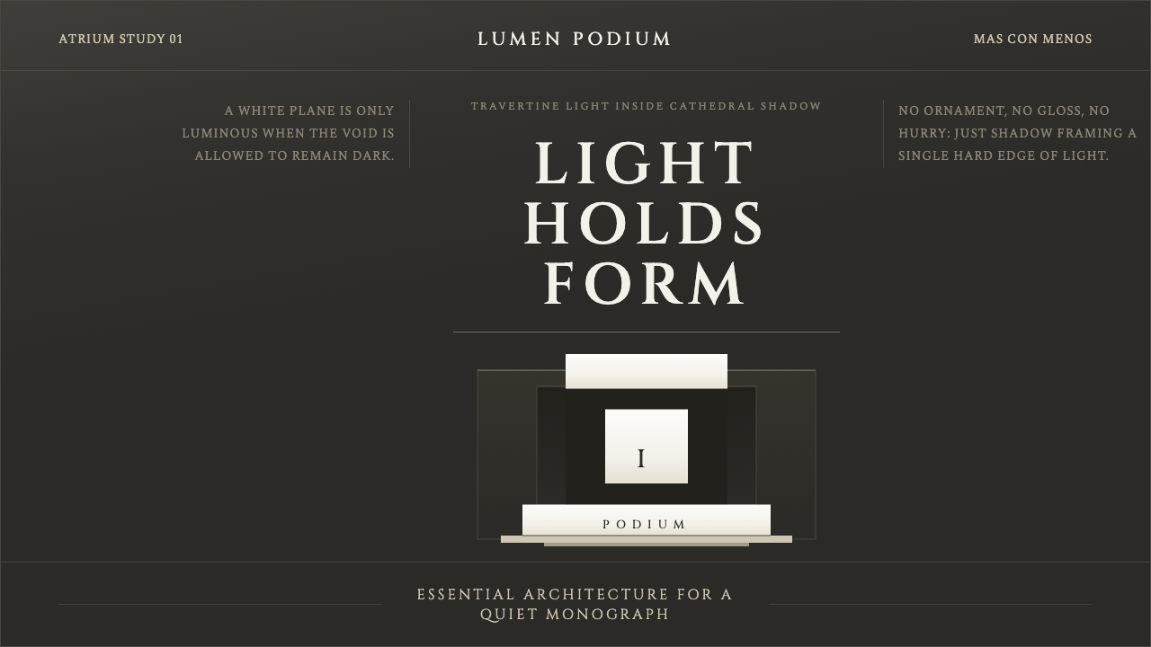 Campo Baeza Luminous WhiteLight becomes architecture. Travertine-white planes float in cathedral gray.
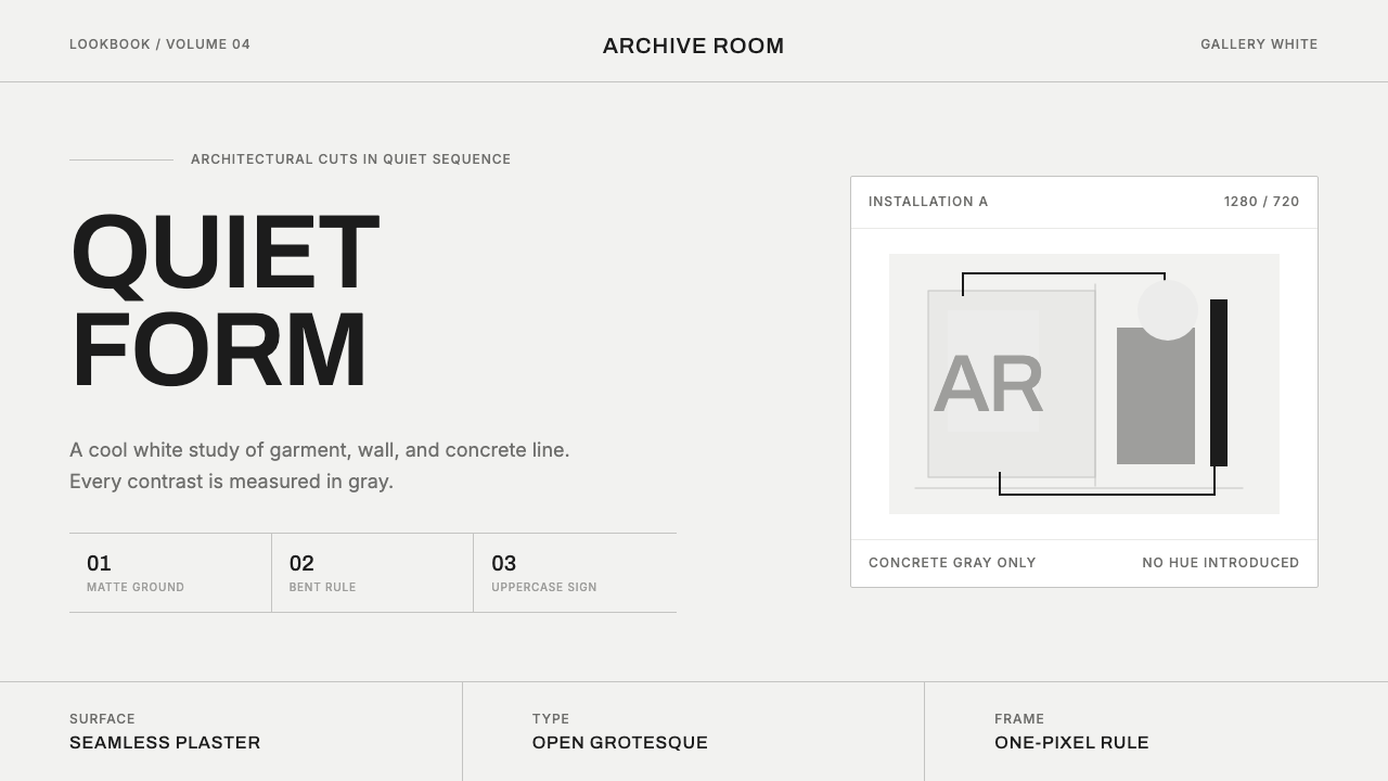 COS Gallery MinimalSilence has structure. Cool gallery white, Archivo uppercase, and concrete-gr…
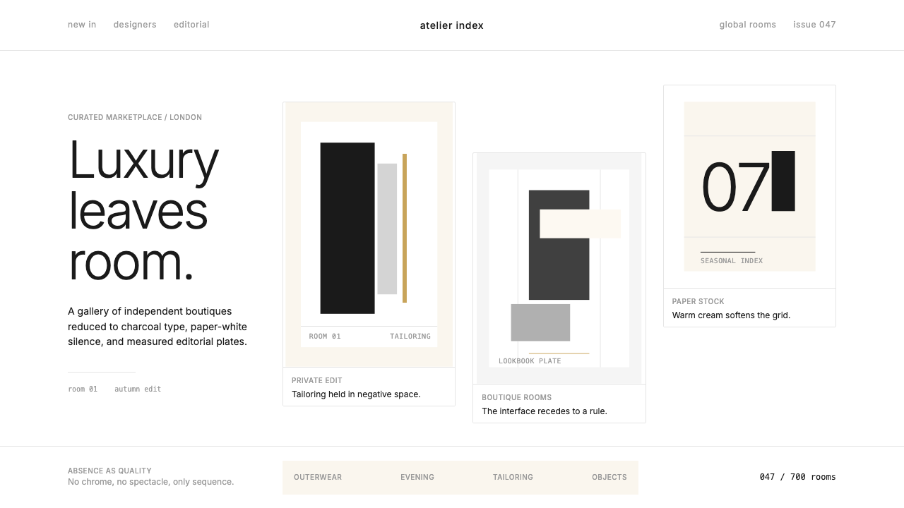 FarfetchLuxury as absence. Charcoal type, white canvas, and hairline editorial plates.
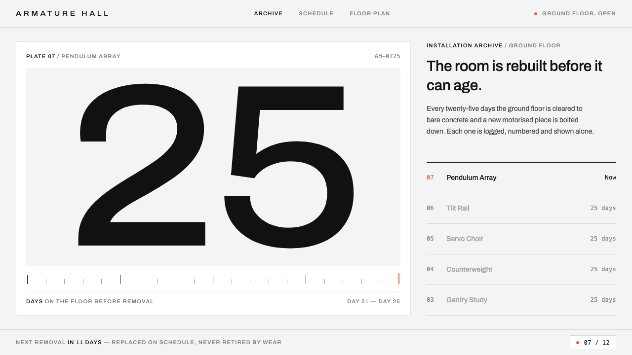 Gentle MonsterObjects filed like machine parts. Grey sweep, tracked Archivo, hairline rules…
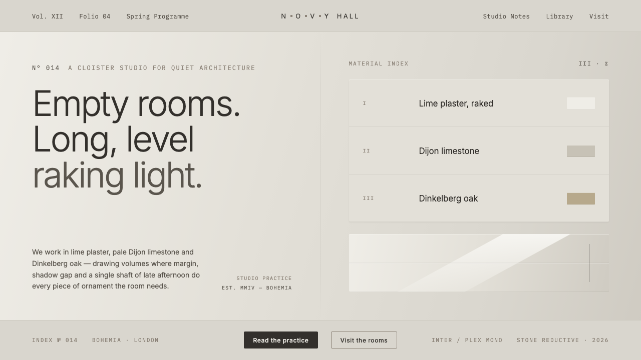 John Pawson MinimalismMonastic reduction. Cool stone-grey, pale oak, hairline shadow gaps as the on…
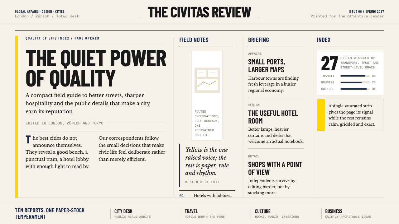 Monocle MagazineQuiet authority. Yellow spine, warm paper and dense ruled columns speak at li…