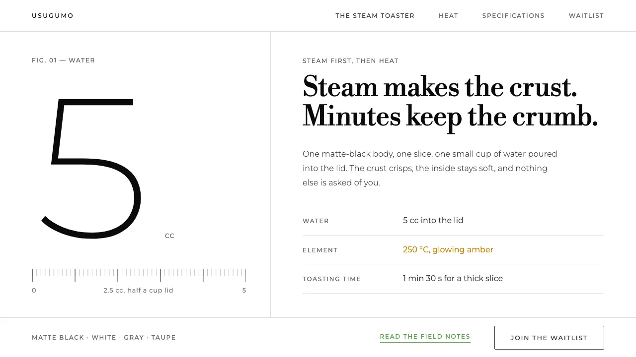
About BALMUDA The Toaster
A product page built like a photo essay: one matte-black toaster on a pure-white studio sweep, one slice of bread, and the time it takes to get it right. Type runs in a grey ink ladder — Montserrat for heads and specs, Libre Bodoni for the editorial lines.
Nothing is boxed, lifted or tinted. Sections are separated by air and hairlines, numerals are set large and light, and the brand green #4BA53A shows up only where you can click.
- Origin
- Tokyo, Japan
- Era
- 2003 founded; The Toaster released 2015; current visual ~2015–2024
- Key figures
- Gen Terao
- Movements
- Japanese post-appliance product design · Single-object consumer electronics · Slow-commerce product storytelling
BALMUDA The Toaster design spec
Colors
Background
Surface
Primary
Secondary
Accent
Text
Typography
Libre BodoniHeadings
MontserratBody
ui-monospaceMono
Unlock for 1 credit
The other 11 sections — buttons, cards, spacing, motion, techniques and more — open once you unlock. Download the DESIGN.md or send it to your AI in one click. Unlock once, yours forever.
Sign up nowHave an account? Sign in
Styles similar to BALMUDA The Toaster
Also inspired by brands & products, with a close feel.
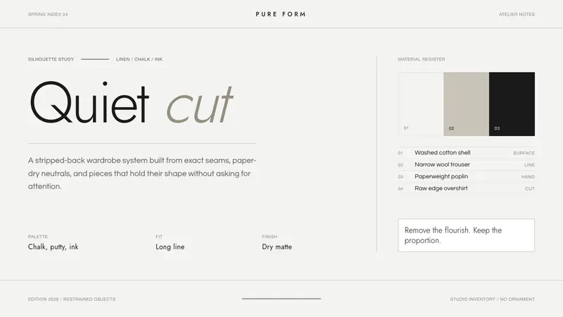 Jil Sander PurePrecision feels luxurious. Near-black geometric sans on curated near-white, with exact alignment.
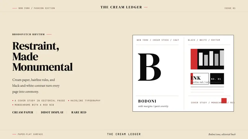 Harper's BazaarLuxury through restraint. Cream paper, Didot scale, and hairline rules carry the drama.
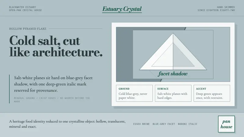 Maldon Sea Salt PyramidCold mineral luxury. Salt-white facets on blue-grey ground, struck once with deep green.
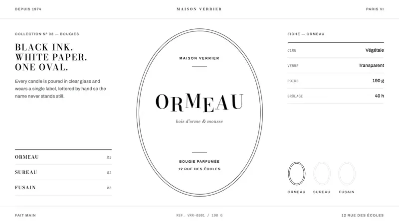 diptyqueBlack ink, white paper, one oval. Bodoni capitals ride off the baseline in a hairline keyline.