What is Gentle Monster?
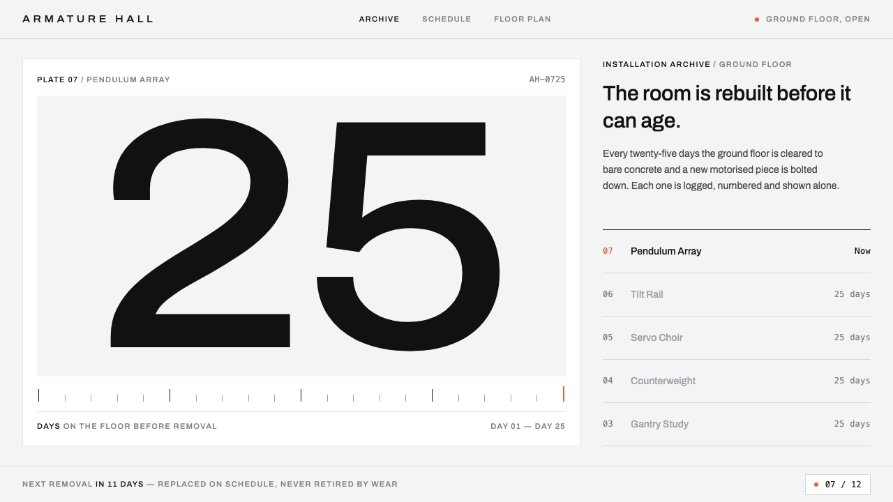
Gentle Monster files a pair of glasses like a machine part: one object per plate, centred on a cool grey sweep, set in small tracked type with hairline rules, zero rounded corners and a single touch of orange.
Gentle Monster in brief
The Gentle Monster style is the visual system of a Seoul eyewear brand that treats a pair of glasses as a specimen and a shop as an instrument. Every frame is shown centred on the same cool, machine-grey backdrop, one object per plate, hard-lit and shot straight on. On screen, that discipline becomes a grey page, near-black grotesque type set small and tracked wide, hairline dividers, no rounded corners at all, and a single orange accent used sparingly.
The point of the system is the contrast between its calm surface and the brand's physical theatre. In the stores, Gentle Monster builds what are closer to kinetic sculpture galleries than shops: pale, raw-concrete spaces housing mechanical arms, motor-driven installations and robots. The ground-floor works are swapped out on a schedule, as whole pieces, rather than being allowed to age. The screen system takes the opposite stance (cool, orderly, catalogue-like) so that the strange object, and never the interface, is what the viewer notices.
Motion belongs to the same story. In this system movement behaves like a motor: mechanical, deliberate and repeatable, not springy or playful. The hero area is designed to be swapped on a schedule, echoing the way the stores replace their installations. A page built in this style is therefore less a fixed layout than a frame with a changing centre: the grid stays still while the one object on show changes. The result suits objects that are already interesting: the style does not try to make a frame look exciting, it simply removes everything that could distract from how odd the frame already is.

Where does Gentle Monster come from?
Gentle Monster was founded in Seoul in 2011 by Hankook Kim. The brand grew from eyewear into something closer to a retail art practice, and the key figures listed for the system include two groups as well as the founder: the installation team and the store-design team. That tells you where the authorship sits: in the building of spaces and mechanisms as much as in graphics. The list names no separate graphic studio, which fits the way the screen reads as a continuation of the store rather than a distinct marketing layer: the same attitude toward the object, applied by the same culture of making.
The most documented expression of the idea is the Quantum Project at the Hongdae flagship. Its installation was replaced every 25 days, continuously for 29 months, so the ground floor was never allowed to settle into a fixed look. Turnover on that scale is an operating principle: the brand decided that novelty would be built into the shop's schedule instead of being left to seasonal refreshes. The practice sits in the traditions of kinetic and robotic sculpture and of retail-as-exhibition, where selling and showing are the same act.
In 2021 the brand opened Haus Dosan, which stacks the same logic across several floors. Where Hongdae was one rotating stage, Dosan is a building of them. Both belong to a Korean avant-garde eyewear design culture in which the store is part of the product, a place to meet an unfamiliar object before deciding whether you want to wear it.
The screen system draws on the brand's product imagery rather than its installations. Each frame is placed in the middle of the same grey ground, like a specimen or a plate in a catalogue, and the page takes that grey as its own background. Type is near-black and small. Corners are square and dividers are hairlines. One orange accent is left over for signals. The logic is that of an archive: when the objects are strange and the stores are theatrical, the interface should behave like the drawer in which they are filed.
What defines the Gentle Monster look?
Machine-Grey Sweep
The page background is the same cool grey that sits behind every product photograph. Using the photograph's own ground as the page colour removes the visible edge between image and interface, so a frame appears to float on the page itself. The grey is neutral and slightly cold, with none of the warmth of paper; the effect is that of a lab bench or a machine workshop.
One Object per Plate
Each frame is shown alone, centred, hard-lit and shot straight on, with no scene around it. The treatment makes eyewear read as a specimen: a designed object to be examined, not worn by someone attractive. In grids, consistent framing and equal spacing let dozens of very different frames be compared like entries in a catalogue.
Small, Widely Tracked Archivo
Text is set in near-black Archivo, small in size and tracked wide. Small, spaced letters read like engraved labels on equipment; they ask to be read slowly and leave room around themselves. Hierarchy is created by case, spacing and position rather than by jumps in size, so the page keeps the same quiet voice from navigation to captions.
Hairlines and Zero Radius
Dividers are hairline rules, and corners are never rounded. Buttons, fields and tiles are square, defined by thin outlines rather than fills. This produces an instrument-panel precision: each element has a clear edge, nothing is cushioned, and the overall impression is mechanical rather than friendly.
One Orange Dot
A single orange accent is available for signals: a status, an active state, a point that needs attention. It appears rarely and in small amounts, like an indicator light on a machine. Because everything else is grey and near-black, even a very small orange mark is the most important thing on the screen.
Motor-Like Motion
Movement is treated as mechanism rather than flourish. Transitions are steady and deliberate, with a sense of being driven rather than bouncing. The hero is built to be replaced on a schedule, so the system accommodates change at its centre while leaving the structure around it fixed.
A Scheduled Hero
The hero area is not a permanent fixture but a slot designed to be swapped on a schedule, in the way the stores replace their installations. The surrounding structure (the grey ground, the grid, the type) never changes; only the object in the slot does. This separates the identity from any single campaign, and it means the brand can change what it shows as often as its calendar demands without redesigning the site.

Who shaped Gentle Monster?
Founder of Gentle Monster, which he started in Seoul in 2011. His approach of letting a retail space behave like an exhibition, and of changing it on a fixed schedule, is the source of the screen system's attitude: calm, ordered and always ready to put something different at the centre. Treating the shop as an instrument rather than a display case is what turns a pair of glasses into a specimen.
The group that builds the robotic and motor-driven works inside the stores, including the pieces that rotated every 25 days in the Quantum Project at Hongdae for 29 months. Their work explains the motion language: movement in this system is mechanical, deliberate and scheduled.
The in-house team responsible for the spatial identity of stores such as Haus Dosan, which opened in 2021 and stacks the brand's exhibition logic across several floors. Their pale, concrete, machine-filled spaces are the physical counterpart of the grey sweep and the hairline grid.
How do you use Gentle Monster today?
The style is for brands and projects where one object has to carry a whole page: eyewear, jewellery, hardware, tools, sneakers, exhibition objects, anything that photographs well alone. Its strength is making a single item feel precious and examined. It is a poor fit for content-heavy pages with many competing objects at once. Because the ground, the framing and the type are fixed, new objects can be added by anyone on a team without a designer in the loop, and the page still looks intentional.
For presentation slides, the cover is a grey field with one object or one image centred, a small tracked title and a hairline beneath. Content slides repeat the sweep: one idea per slide, text small and widely spaced, hairlines between rows. Data slides should use tables and thin-line charts in near-black on the grey, with the orange used to mark the one data point to discuss.
For web interfaces, it suits product detail pages, collection browsers, gallery sites and campaign pages. Make the page the grey, centre one product plate, put the label and price in small tracked type, and separate with hairlines. Buttons are square outlines. Use orange for the active or critical state. Build the hero as a slot that can be replaced on a schedule, so that campaigns change without restructuring the page.
For editorial and marketing work, treat each item as a plate in a catalogue or exhibition guide: object, small caption, reference number. The style works well for lookbooks, exhibition catalogues, drop announcements and pop-up pages. Because the surrounding space is quiet, it gives bold or odd objects room to be strange.
The most common mistake is to warm or soften it with rounded buttons, pastel backgrounds, soft shadows, or orange used as a large background. Another is lifestyle photography that breaks the specimen logic. The orange must stay a point, not a field. And if the type is enlarged to fill space, the instrument-label voice is lost; leave the space empty instead.

Gentle Monster — FAQ
Why does the website look like a catalogue rather than a store?
Because the brand's drama lives in its physical stores and installations, and the screen's job is to present the object clearly. By treating each frame as a specimen on a neutral grey plate, the system lets the product, rather than the interface, supply the surprise. The grey ground, small tracked type and hairline rules are what make that neutral plate feel like an archive rather than an empty page.
How often does the brand change its installations?
The Quantum Project at the Hongdae flagship replaced its installation every 25 days, for 29 months running. Haus Dosan, opened in 2021, applies the same logic across several floors. The screen system mirrors this by making the hero area replaceable on a schedule.
Can I use the orange as a brand colour?
Not in this style. The orange is an indicator, not a brand colour, and it works because it is rare. Use it for a status, an active state or one call-out per screen, and keep every other surface grey, white or near-black. A useful test is to cover the orange with a finger: if the page stops making sense, the colour is carrying structure it should not.
Why zero rounded corners?
Rounded corners soften an object and make it feel friendly or consumer-grade. Zero radius signals a machine part: precise, fabricated, unsentimental. It also helps the hairline system, because thin rules meet cleanly at square corners. Mixing round and square shapes breaks the instrument-panel logic.
Does it work for something other than eyewear?
Yes, wherever an object can be photographed alone and the audience wants to inspect it. Watches, audio equipment, ceramics, tools and furniture suit it. It works less well for services or software, where there is no single object to place at the centre. The key question is whether a viewer wants to look closely at a single thing; if they do, the grey plate, the small type and the hairlines give that looking a quiet room.
Related design styles
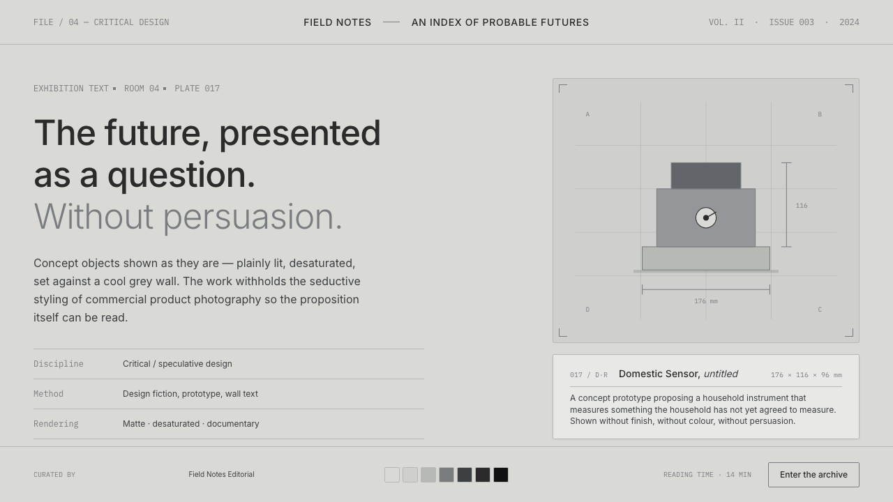 Speculative DesignRefuses to seduce. Cool-grey wall, Inter labels, matte concept objects — the…
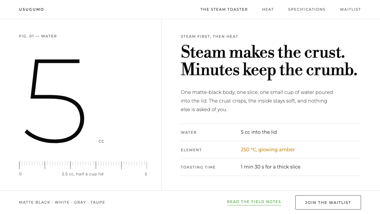 BALMUDA The ToasterOne object, one white room. Grey ink, Bodoni lines, huge light numerals, gree…
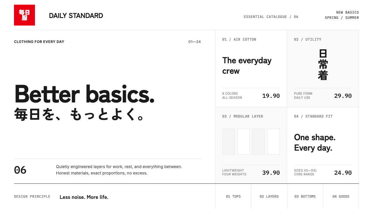 UNIQLO LifeWear (2006)Whitespace is the product. A hard modular grid and one rationed red square en…
 Brazilian Concrete PoetryWords become objects. Monospace cells, black-white paper, one cadmium red rup…
 Cargo Collective PortfolioInterface disappears. White space, full-bleed blocks, mono metadata and hairl…
 Sol LeWitt ConceptualInstruction becomes art. Mono certificates face wavering graphite grids in fo…