What is Speculative Design (Dunne & Raby)?
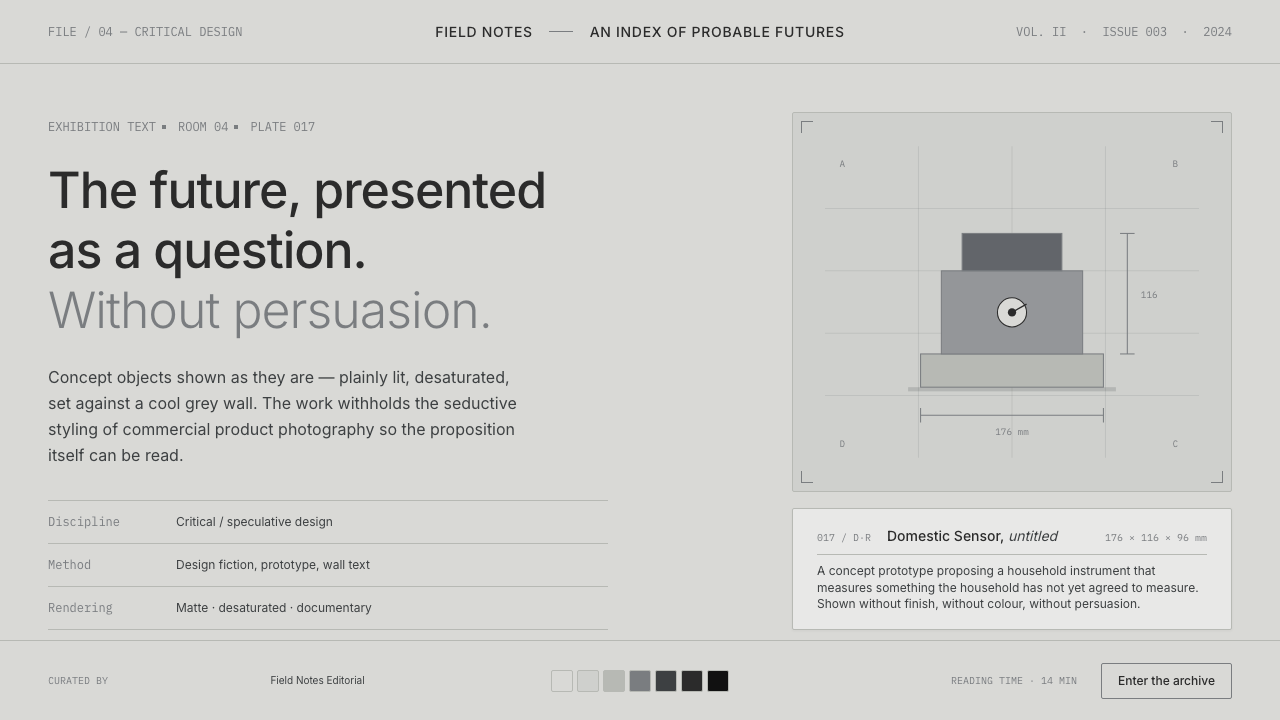
Speculative Design refuses to seduce: it places a cool-grey wall, a matte concept object, and a quiet question where a product promise would normally stand.
Speculative Design (Dunne & Raby) in brief
Speculative Design is the exhibition language associated with Anthony Dunne and Fiona Raby: sober, conceptual, and deliberately undesigned. Cold rendered prototypes and plainly photographed objects sit against a museum-like grey field, presented without the visual pressure of advertising or commercial product styling.
Its central gesture is critical rather than promotional. The object is not offered as something to desire, buy, or immediately use; it is presented as a device for asking what the future might become, who might live inside it, and which assumptions current design quietly carries forward. The future appears as a question rather than a promise.
The visual system is restrained almost to neutrality. Inter labels, matte surfaces, pale grey surroundings, controlled composition, and generous empty space establish an atmosphere of observation. The lack of colour is not an absence of personality but a deliberate refusal to make the work emotionally easy, fashionable, or persuasive.
Where does Speculative Design (Dunne & Raby) come from?
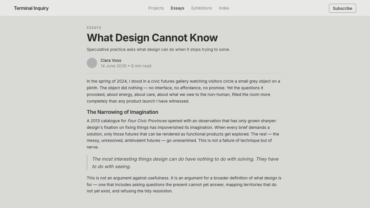
The source places Speculative Design in London, particularly around the Royal College of Art and the Dunne & Raby studio, during the 2000s and 2010s. Its setting is not a conventional product-design showroom but the gallery: a cool, neutral environment in which objects can be examined as ideas rather than consumed as solutions.
The language belongs to a wider field described through speculative design, critical design, design fiction, and conceptual design. These labels identify a practice concerned with imagined conditions and questions. The exhibition object does not need to function as a finished commercial product; its role is to make an otherwise abstract possibility concrete enough to inspect.
Speculative Everything, published in 2013, provides the clearest historical marker in the supplied material. The title places the practice within a period when design was being used to stage possible futures and to question the values embedded in everyday technological culture. The visual restraint supports that purpose by keeping attention on the proposition rather than on stylistic seduction.
The exhibition atmosphere also belongs to a broader institutional lineage associated with MoMA and the London Design Museum. In this setting, the wall, label, photograph, and prototype form a single communicative apparatus. The work is not separated from its framing; the framing tells the viewer to pause, assess, and interpret instead of moving directly toward desire or purchase.
What defines the Speculative Design (Dunne & Raby) look?
Colour
The palette stays near-colourless: cool grey, pale neutral ground, subdued object surfaces, and restrained tonal variation. Colour is allowed to appear only when the concept requires it, never as an automatic device for excitement, hierarchy, or brand appeal. The neutral field makes the absence of persuasion visible.
Typography
Inter labels establish a plain, contemporary voice. Type behaves like museum information: clear, measured, and subordinate to the object while remaining fully legible. Headings, captions, and explanatory text should differ through quiet changes in scale, spacing, and emphasis rather than theatrical display.
Gallery Neutrality
The wall is not a decorative backdrop. Its cool grey neutrality creates a controlled distance between viewer and object, allowing the concept to remain unresolved. Broad empty fields, quiet edges, and sparse placement make the exhibition feel closer to an argument under examination than to a showroom awaiting conversion.
Concept Objects
Objects appear matte, cold, and slightly detached from ordinary product language. They can resemble prototypes, models, or plainly photographed artifacts, but their purpose is communicative rather than commercial. The surface does not invite touch so much as it invites interpretation: what kind of world would make this object necessary?
Image and Rendering
Photography is plain and controlled; rendering is cool and descriptive. Neither treatment turns the object into a lifestyle image. Cropping, lighting, and perspective should clarify the proposition while avoiding spectacle, emotional atmosphere, or claims of inevitability. The image documents a possibility without pretending that the possibility is already desirable.
Question over Promise
Every visual decision protects ambiguity. The layout does not rush toward a call to action, and the object does not arrive with a polished promise of improvement. Speculative Design gains force from this pause: it creates enough clarity to make the question visible, then leaves the viewer responsible for the response.
Who shaped Speculative Design (Dunne & Raby)?
Anthony Dunne is one of the two figures directly associated with this language. In the supplied material, his work with Fiona Raby anchors the movement’s deliberately undesigned exhibition character: cool, conceptual, and focused on the future as critique rather than advertisement.
Fiona Raby is the second central figure named in the source. Her association with Dunne places the practice within the London studio and Royal College of Art context, where concept objects and exhibition framing become tools for quiet provocation.
Jason Evans is identified in the supplied material as a key figure within the surrounding speculative and critical design field. The source gives no individual biography, so his significance here is best understood as part of the wider authorship and network around this exhibition language.
Kellenberger-White is also named among the key figures connected with the theme. Without additional biographical claims, the important point is the collective nature of the field: Speculative Design is presented as a shared practice of conceptual framing, not as a single author’s signature look.
How do you use Speculative Design (Dunne & Raby) today?
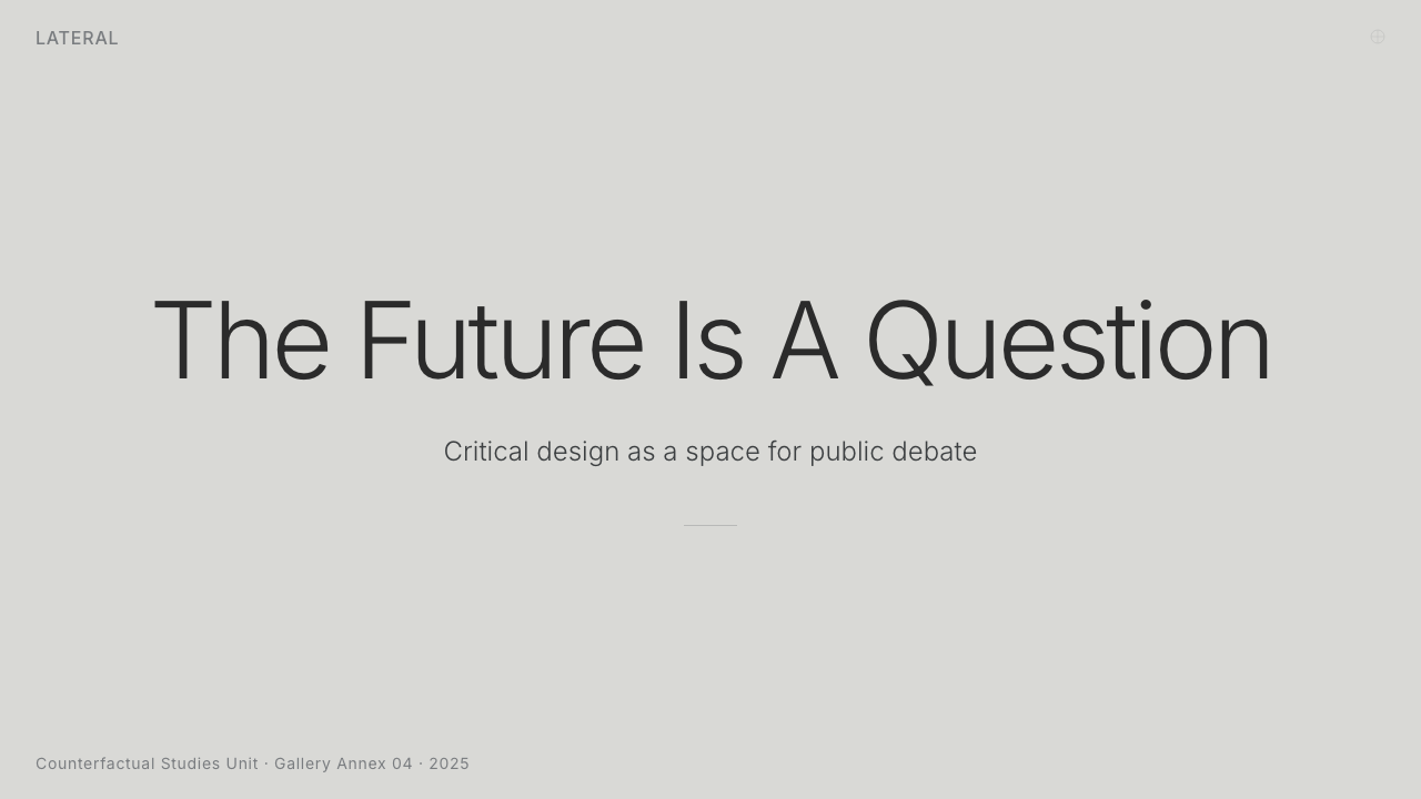
For presentation slides, use the language most strongly on the cover and on conceptual framing pages. A cool-grey field, a single matte object or restrained render, and an Inter title can establish the mood immediately. Content slides should read like exhibit labels: concise, spacious, and explanatory. Data slides should avoid decorative drama and instead present evidence as a calm proposition, with hierarchy carried by placement and tone.
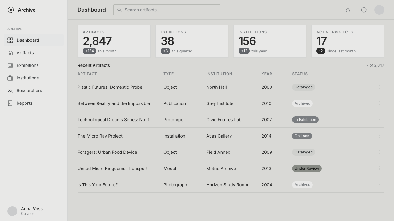
For web interfaces, the style suits dashboards, analytical tools, and pricing pages that want to question assumptions rather than create urgency. Keep panels quiet, labels plain, and interaction states restrained. A pricing page can present plans as propositions with clear conditions instead of using visual pressure, while a dashboard can make uncertainty, scenarios, or competing outcomes feel legitimate parts of the interface.
For editorial and marketing work, Speculative Design is useful when the subject is a possible future, a social consequence, or a concept that should remain open to interpretation. Use museum-like captions, plainly framed images, cool neutral backgrounds, and generous separation between claims. Marketing should behave more like an invitation to think than a promise to transform the reader’s life.
For exhibition pages, portfolios, and concept case studies, let the object and its framing share authority. Show the prototype or render plainly, then provide the question, context, and implication nearby. Avoid lifestyle scenes that make the object appear already adopted. The most effective composition feels provisional: clear enough to understand, unresolved enough to continue thinking.
The common mistake is confusing neutrality with emptiness. A grey background, sparse type, and desaturated object do not automatically create Speculative Design. If the page still uses urgency, glossy product language, decorative futurism, or a persuasive call to action, the visual restraint becomes a costume. The concept must remain the dominant source of tension.
Speculative Design (Dunne & Raby) — FAQ
Is Speculative Design simply minimalist design in grey?
No. Its restraint is not primarily an attempt to make a page elegant or quiet. The grey field and sparse composition create distance so that a concept can be examined without immediate persuasion. Minimalism may reduce visual elements for clarity; Speculative Design uses reduction to make a question, tension, or possible future harder to ignore.
Can the style use strong colour?
It can, but colour should be conceptually motivated rather than used to create excitement. The supplied language is near-colourless, and that near-absence functions as its visual identity. A strong colour may be appropriate when it clarifies the proposition, but a full, energetic palette will usually shift the work toward product styling or advertising.
What makes an object speculative rather than merely futuristic?
A futuristic object mainly signals a look: advanced, sleek, or technologically distant. A speculative object carries a question about the conditions around it. It may be rendered coldly or shown as a plain concept prototype, but its value comes from what it makes the viewer consider, not from how convincingly it predicts a finished future.
How should a call to action be handled in this style?
Use it sparingly and make it informational when possible. A forceful invitation to buy, subscribe, or convert conflicts with the language’s refusal to persuade. If an action is necessary, it should lead to further context, the full proposition, or an opportunity to inspect the concept. The interface should preserve the pause that gives the work its critical force.
Related design styles
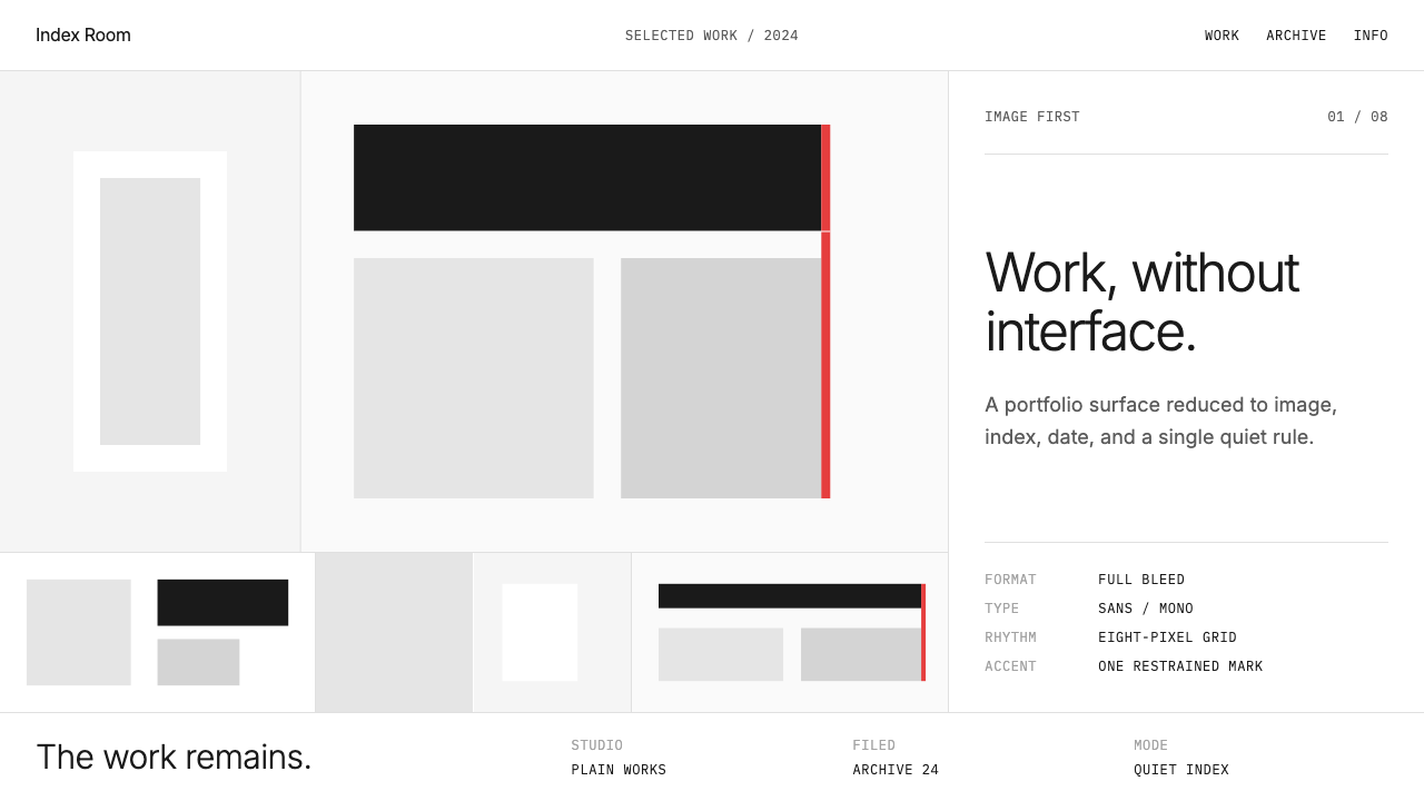 Cargo Collective PortfolioInterface disappears. White space, full-bleed blocks, mono metadata and hairl…
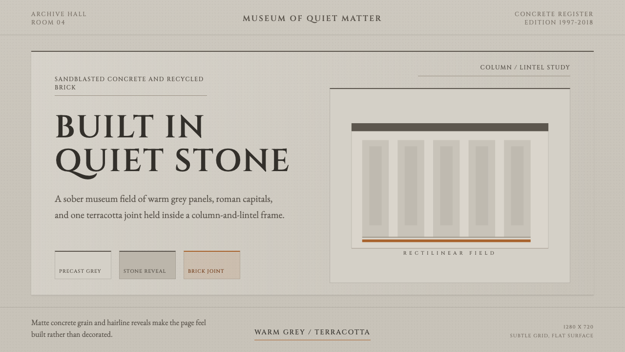 Chipperfield Museum GrayMuseum gravity, rendered quietly. Warm concrete grey, roman capitals, one ter…
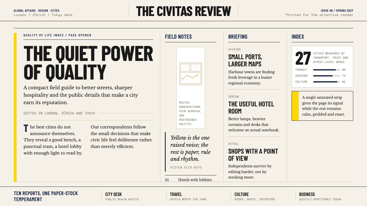 Monocle MagazineQuiet authority. Yellow spine, warm paper and dense ruled columns speak at li…
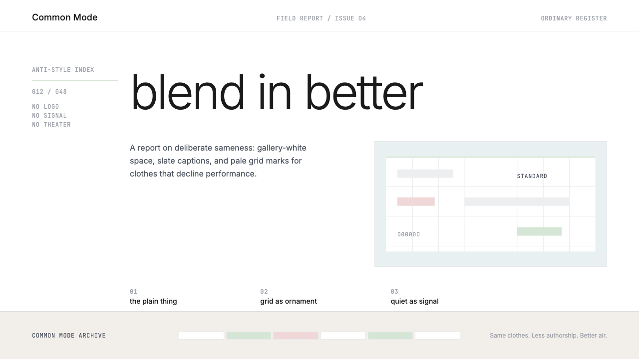 Normcore (2014)Quiet is radical. Inter, slate captions, and pale mint grid marks make refusa…
 Cereal Magazine MinimalLuxury as margin. Cool paper-gray, light sans, and Garamond captions hold the…
 Karl Gerstner ProgrammesDesign becomes a programme. Black hairlines and a strict matrix turn paramete…