What is Hyundai Card?
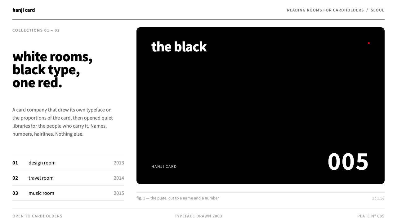
Hyundai Card is a credit-card company that decided its brand was a typeface and a rectangle, then carried that discipline into white reading rooms where the only heavy object is a black plate.
Hyundai Card in brief
The Hyundai Card style is the corporate identity of a Seoul credit-card company, as it developed between 2003 and 2016. Its central idea is that a financial brand can be built from a custom typeface and the proportion of the card itself. Cards show little more than a name and a number, premium cards are named simply by colour, and the company later extended the same restraint into physical libraries for design, travel and music.
On a screen, the system looks like a reading room. Pages are plain white, headlines are set in a black sans-serif, fine grey rules divide the layout into compartments, and pale index panels group related items. Images and tiles are cropped to the proportion of a credit card, so the card shape becomes the module of the whole layout. A single red is used sparingly, and the one heavy thing on the page is the black plate.
That discipline is the whole point. The style is not decorative minimalism; it is a way of treating a brand as a body of typography and proportion, so that every surface feels like part of the same card. It rewards content that has clear hierarchy, short labels and good photography, and it punishes clutter immediately.

Where does Hyundai Card come from?
Hyundai Card's design story begins with a typeface. In 2003 the company commissioned Total Identity, an Amsterdam studio, to draw a proprietary typeface called Youandi. According to the source material, its letterforms take their proportions directly from the long-and-short ratio of a credit card, which means the brand's text and its object share the same geometry. Aad van Dommelen is the figure from that studio named in the material. Choosing to make a typeface the heart of a financial identity was unusual at the time, and it set the tone for everything that followed.
The card faces followed the same logic. Instead of crowding the plastic with logos, offers and decorations, Hyundai Card cut its designs down to a name and a number. In 2005 it launched the premium card known simply as the Black, and it went on to name other top-tier cards by colour as well, such as the Purple and the Red. This was a brand saying that its products did not need adjectives, only a colour and a surface that felt substantial.
From 2013 the company moved the same attitude into physical space. The Design Library opened that year in Gahoe-dong, Seoul, in a series of white reading rooms open only to cardholders. A Travel Library followed in 2014 and a Music Library in 2015. These buildings are why the style is often described as brand-as-cultural-space: the identity is not just applied to cards and advertising, but is experienced as architecture, furniture, shelving and a curated collection of books. The source material also lists Karim Rashid and Choi Wook among the people associated with the company's design world, and Ted Chung, the company's chief executive, as the figure most associated with its design-led strategy.
The period of the source material runs from 2003 to 2016, and the movements it draws on are corporate typographic identity, brand-as-cultural-space and a Swiss-influenced strand of Korean modernism. That last point explains the character of the interface: a strict hierarchy, plenty of white space, a grid and a preference for type over image. Curio's system carries that discipline onto the screen, treating the card ratio as a module and the black plate as the one heavy element.
What defines the Hyundai Card look?
Card-ratio modules
Images, tiles and panels are cropped to the proportion of a credit card, so the brand's physical object becomes the building block of the layout. A grid of these tiles feels like a drawer of cards. The repetition gives pages a quiet rhythm and makes it easy to mix photographs, text blocks and data without breaking the system.
One black plate
The page's only heavy element is a solid black plate, the digital equivalent of the Black card. It can be a hero block, a primary panel or a featured card. Because everything else is white and grey, the plate gets full attention and gives the layout a firm anchor.
White reading-room ground
The ground is a plain, bright white, like the walls of the libraries. Margins are generous, and nothing competes with the content. Pale grey index panels group items like shelf labels, adding structure without adding colour.
Hairline grey rules
Compartments are defined by fine grey rules rather than boxes or shadows. Lists, tables and indexes are separated by lines that feel drawn with a ruler. The result is precise and quiet, and it keeps the page light even when it holds a great deal of information.
Black sans headlines
Headlines are set in a clean black sans-serif that echoes the brand's proprietary typeface. They are large enough to establish hierarchy but never ornamental. Body text is a smaller, quiet version of the same family, and the contrast between the two comes from scale and spacing rather than from weight tricks.
A single red
Red appears once, as a small dot or accent that marks the one thing the reader should notice. It is never repeated across the page. That scarcity is what gives it meaning, in the same way a single coloured card stands out in a drawer of plain ones.

Who shaped Hyundai Card?
Chung is the chief executive most associated with Hyundai Card's design-led approach. Under his leadership the company treated typography, product naming and architecture as strategic assets rather than decoration, which led to the Youandi typeface, the colour-named premium cards and the series of libraries.
Van Dommelen is the figure named in the source material in connection with Total Identity, the Amsterdam studio that drew the Youandi typeface for Hyundai Card in 2003. The typeface, built on the proportion of a credit card, established the brand's visual logic.
The industrial designer Karim Rashid is listed in the source material among the figures associated with Hyundai Card's design world. His inclusion reflects the company's habit of bringing recognised international designers into its cultural projects.
Choi Wook is also named in the source material among the people associated with the company's design and library projects in Seoul. As with the other figures, the material does not describe a precise role, so it is best read as a sign of the collaborative network around the brand.
How do you use Hyundai Card today?
Slides: A cover slide can be a white page with a black card-shaped plate holding the title, a thin grey rule and one small red dot. Content slides divide space with fine rules, using pale index panels for secondary information. For data slides, keep charts in black and grey, crop photographs to the card proportion and let the red mark only the one figure that matters.
Web and UI: This is a strong system for libraries, catalogues, membership services, editorial indexes, portfolios and financial or professional products that want to look precise. Build the hero as a single black plate, keep navigation light, use grey rules between sections and arrange cards in a consistent proportion. Dashboards work if the density is managed with whitespace and grouped in index panels.
Editorial and marketing: Brochures, annual reports, membership cards, catalogue pages, exhibition guides and wayfinding for reading rooms all suit the look. Because the style relies on proportion and type rather than imagery, it prints well and scales easily from a card to a poster. A black cover with a single coloured name is a natural identity for a collection or a series.
A common mistake is to treat the red as a theme colour and spread it around buttons, links and icons. It works only when it appears once. Another is to ignore the card ratio, mixing arbitrary image shapes and losing the rhythm that makes the layout feel like a drawer of cards. A third is to add decoration to fill the white space; the emptiness is intentional.
Finally, treat typography as the brand. Choose a clean sans-serif, keep the hierarchy to a few steps and let the labels be short. When the type is right and the plate is firm, the system needs very little else.

Hyundai Card — FAQ
What is the Hyundai Card design style?
It is the identity of a Seoul credit-card company built on a proprietary typeface and the proportion of the card itself. Its screen version uses plain white pages, black sans-serif headlines, fine grey rules, pale index panels, card-ratio tiles, a single black plate and one small red accent.
What is Youandi?
Youandi is the proprietary typeface that Hyundai Card commissioned from the Amsterdam studio Total Identity in 2003. According to the source material, its proportions are taken from the shape of a credit card, so the brand's text and its object share one geometry.
What are the Hyundai Card libraries?
They are physical reading rooms the company opened for cardholders: the Design Library in 2013 in Gahoe-dong, Seoul, followed by the Travel Library in 2014 and the Music Library in 2015. They are the clearest example of the brand-as-cultural-space idea and the model for this system's white, orderly look.
Why is red used only once?
A single red accent makes the reader notice one thing and gives the colour weight. If it were repeated across buttons, links and icons, it would stop being a signal and turn into decoration. The scarcity matches how a single coloured card stands out among plain ones.
What projects suit this style?
Catalogues, libraries, membership services, portfolios, editorial indexes and financial or professional products that value precision suit it best. It is less suited to playful, ornamental or image-heavy designs, because its strength is order, proportion and restraint.
Related design styles
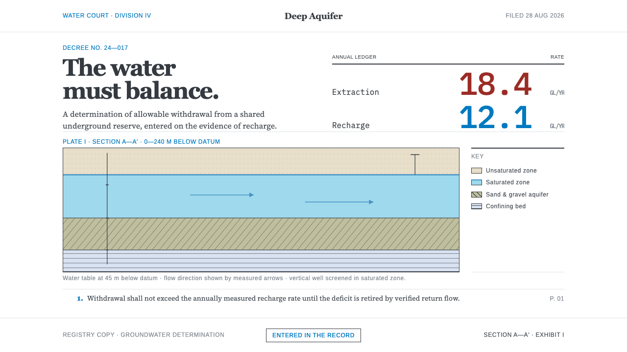 Deep Aquifer Water CourtRestraint makes the deficit undeniable. White bond, book serif, and a keyed a…
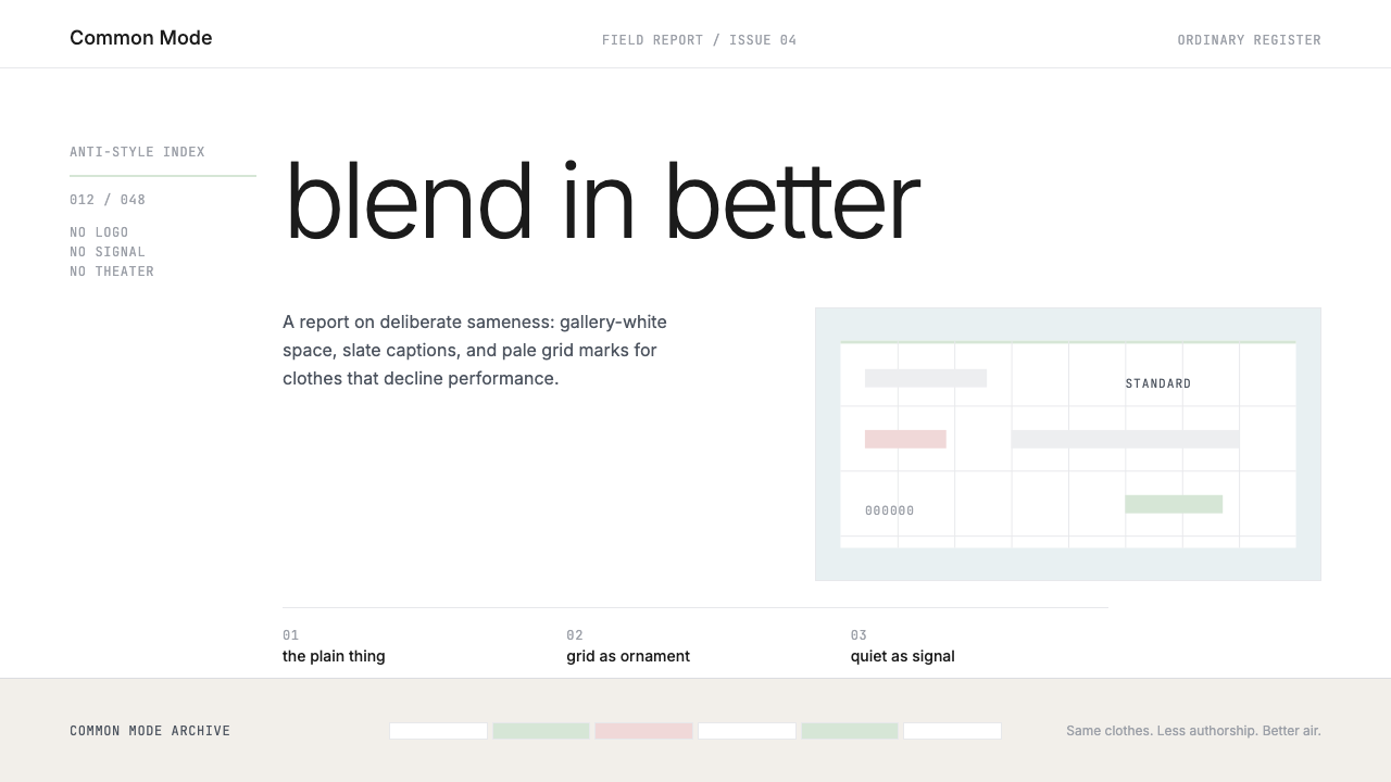 Normcore (2014)Quiet is radical. Inter, slate captions, and pale mint grid marks make refusa…
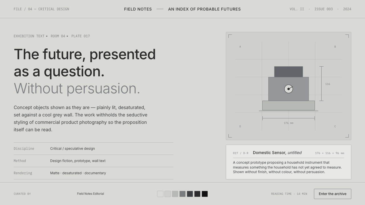 Speculative DesignRefuses to seduce. Cool-grey wall, Inter labels, matte concept objects — the…
 UNIQLO LifeWear (2006)Whitespace is the product. A hard modular grid and one rationed red square en…
 Airport Baggage TagBuilt to be read in motion. Burned-black codes, hard rules and functional cha…
 Chipperfield Museum GrayMuseum gravity, rendered quietly. Warm concrete grey, roman capitals, one ter…