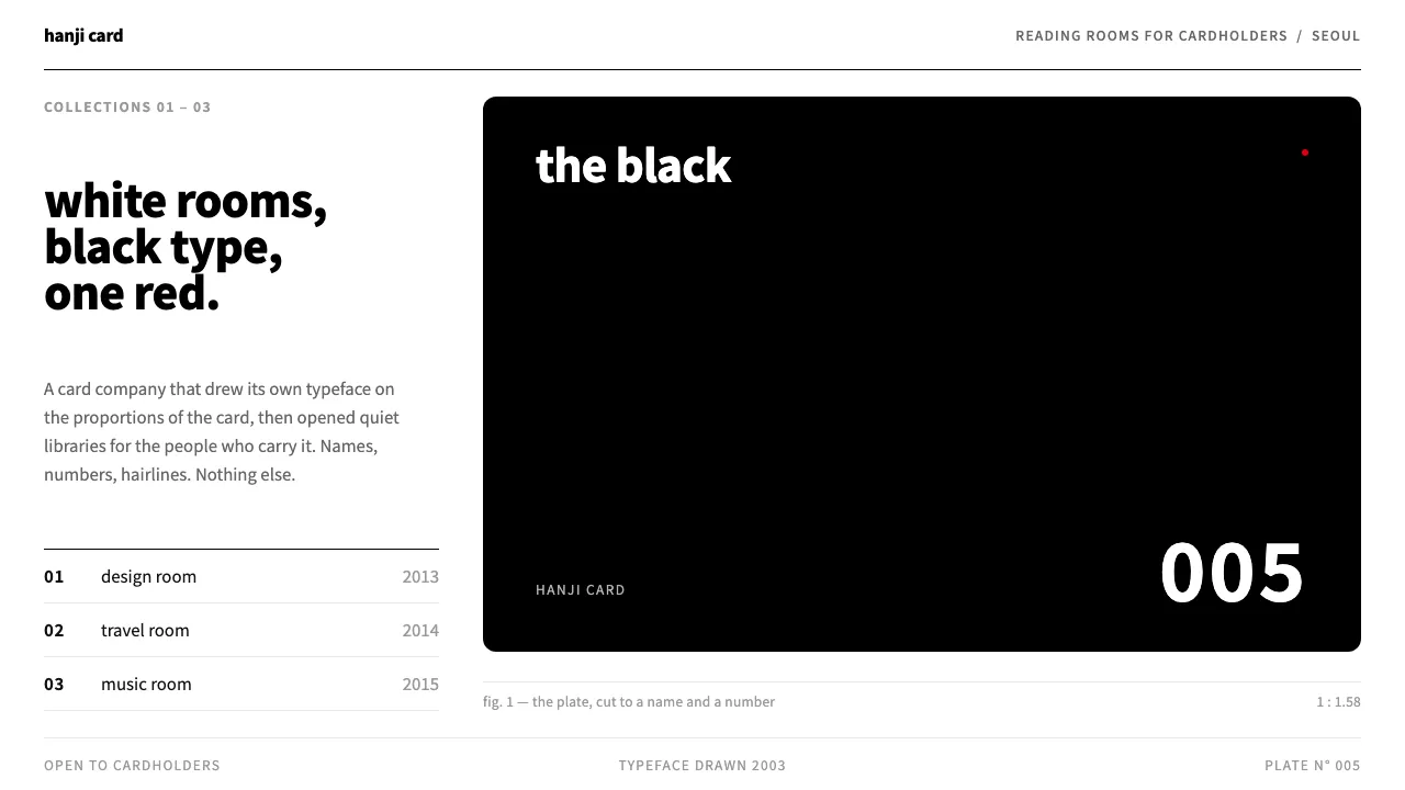
About Hyundai Card
A credit-card company that decided its brand was a typeface and a rectangle. Hyundai Card drew Youandi on the 1:1.58 proportion of the card itself, cut its card faces down to a name and a number, and named its premium plates by colour — the Black, the Purple, the Red.
This system carries that discipline onto the screen: plain white pages, black sans headlines, fine grey rules, pale index panels, and tiles cropped to the card ratio. One red, used sparingly. The black plate is the only heavy thing on the page.
- Origin
- Seoul, South Korea
- Era
- 2003–2016; Youandi typeface 2003, the Black card 2005, Design Library 2013, Travel Library 2014, Music Library 2015
- Key figures
- Ted Chung (정태영) · Aad van Dommelen · Karim Rashid · Choi Wook
- Movements
- Corporate typographic identity · Brand-as-cultural-space · Swiss-influenced Korean modernism
Hyundai Card design spec
Colors
Typography
The other 11 sections — buttons, cards, spacing, motion, techniques and more — open once you unlock. Download the DESIGN.md or send it to your AI in one click. Unlock once, yours forever.
Sign up nowStyles similar to Hyundai Card
Also inspired by brands & products, with a close feel.
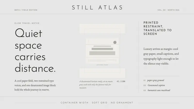 Cereal Magazine MinimalLuxury as margin. Cool paper-gray, light sans, and Garamond captions hold the silence.
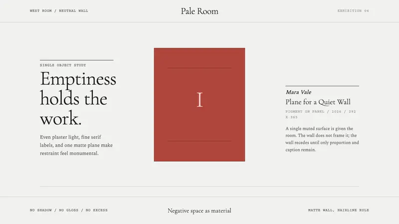 White Cube GalleryEmptiness is the medium. Cormorant labels and one terracotta plane hold the wall.
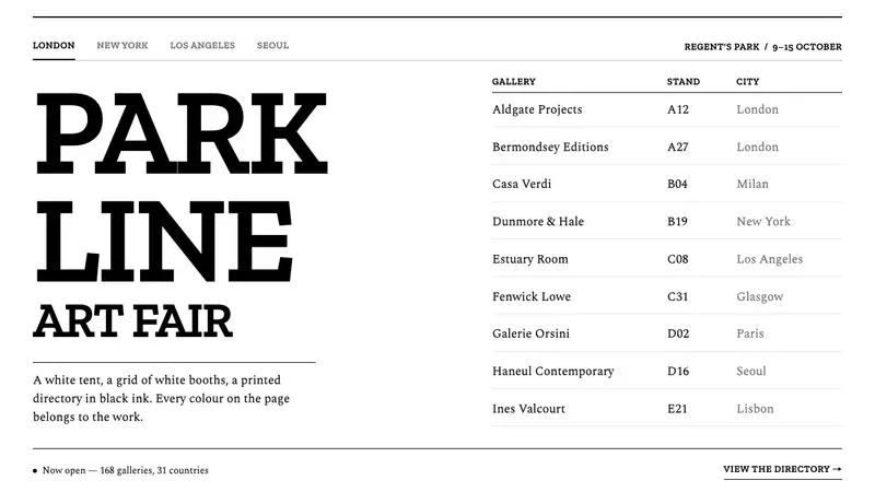 Frieze Art FairColour belongs to the art. Tight slab capitals and a hairline directory grid, black on white.
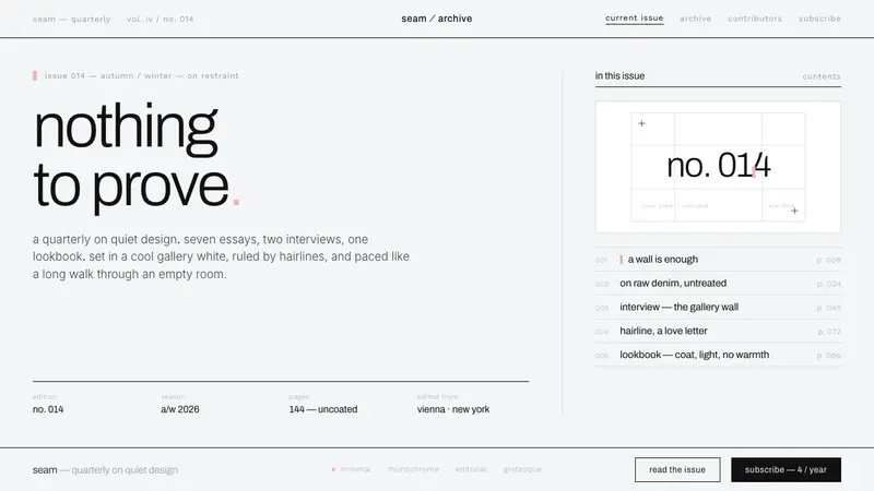 Helmut Lang MinimalismNothing to prove. Cool gallery white, 1px black hairlines, lowercase Archivo — a single cerise mark.