What is Experimental Jetset?
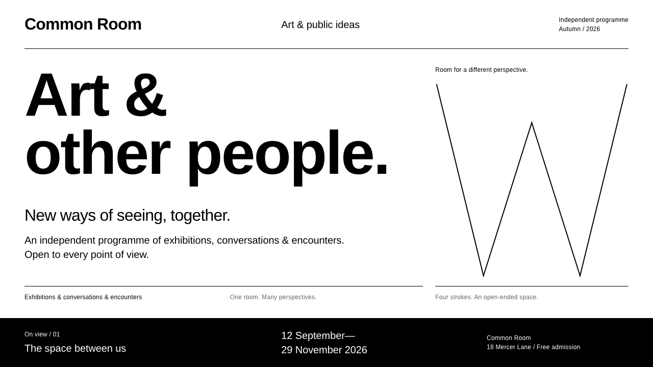
Experimental Jetset's Whitney identity proved that nothing extra could be enough: black on white, one tight grotesk, and a four-rod W that folds into whatever space is left.
Experimental Jetset in brief
The Experimental Jetset style takes its look from the studio's 2013 identity for the Whitney Museum of American Art. It is black on white, set in one tightly tracked grotesk, and built around the Responsive W: a zigzag made of four rods that folds like a carpenter's ruler to fill the space beside a single artwork.
Nothing in it is decorative. There are no rounded corners, no shadows and no gradients. Hierarchy comes from size, weight and position on a strict grid. Sections are divided by thin black rules, and lists of names are joined with an ampersand, as in the studio's 2001 white shirt that printed only four Beatles names.
An inverted white-on-black mode is part of the kit rather than an afterthought, so the system has two equal faces. The style is for interfaces that want to be restrained and clear, with content, not chrome, as the star.

Where does Experimental Jetset come from?
Experimental Jetset is an Amsterdam design studio founded in 1997 by Marieke Stolk, Erwin Brinkers and Danny van den Dungen. It belongs to a long line of Dutch graphic design, and its work carries the International Typographic Style's faith in grids, neutral type and objective clarity. The studio has long used limited means, and its approach is often described as a refusal of the superfluous.
One early piece shows the attitude. In 2001 the studio made a white shirt printed with the four names John, Paul, Ringo and George, joined by ampersands. The piece reduced a famous band to typographic arrangement alone, and the habit of linking names with an ampersand and letting plain words do the work returned in later projects.
The turning point for this system came in May 2013, when the studio's identity for the Whitney Museum of American Art was unveiled. The central idea was the Responsive W, a mark made from four straight rods. Rather than being a fixed logo, it adapts to the proportion of the space it is placed in, folding like a ruler so that it can sit beside an artwork at any format. The identity was then carried into the museum's 2015 building in the Meatpacking District.
The system belongs to three overlapping movements: Dutch graphic design, the International Typographic Style, and the newer idea of responsive identity systems, in which a brand is defined by a flexible behaviour instead of a single frozen shape. Taken together they explain why it feels both classical and contemporary.
What defines the Experimental Jetset look?
Black on white only
The palette is black, white and, at most, a few greys. Without colour, structure and typography must do all the work, which is exactly the point.
One tightly tracked grotesk
A single neutral sans is used throughout, with the spacing between letters pulled tight. One typeface, handled with discipline, gives the system its voice.
The Responsive W
A zigzag of four straight rods that folds like a carpenter's ruler. Its shape changes with the available space, so the mark behaves like part of the layout rather than a sticker on top of it.
Strict grid hierarchy
Importance is expressed through size, weight and position, never through ornament. Readers learn where things belong, and the grid turns white space into visible structure.
Thin black rules
Sections are separated by hairline rules rather than boxes, panels or shadows. The rule marks a boundary without adding mass.
Ampersand lists
Names and items are joined with an ampersand to form a single typographic line, echoing the studio's four-name shirt. It turns a list into a rhythm.
Inverted mode built in
White on black is a full member of the system, with the same type and rules in inverted form. It is used for emphasis and for alternate sections, not as a separate dark theme.

Who shaped Experimental Jetset?
Co-founder of Experimental Jetset in Amsterdam, one of the three designers behind the studio's work.
Co-founder of the studio and one of its three principal designers.
Co-founder of the studio, working with Marieke Stolk and Erwin Brinkers.
How do you use Experimental Jetset today?
In slides, the style suits museums, cultural institutions, architecture talks and any presentation where the content must stay in front. A cover can be a white slide with one large black title and a thin rule. Content slides follow a strict grid: title, rule, text. For data slides, draw charts in black and grey only, label directly, and use the inverted mode to mark a section change.
On the web, it is a natural fit for museum sites, exhibition calendars, publishing houses, portfolios and documentation. Use a single typeface, a clear grid and thin rules instead of boxes. Navigation and lists can use the ampersand motif. Avoid rounded corners and shadows entirely.
In editorial and marketing work, it suits catalogues, programme guides, posters and annual reports. The responsive idea is especially useful: a mark or pattern that adapts to each format keeps a large set of materials coherent without repeating the same layout.
As an interface base, it also works well for tools that demand focus, such as reading apps and research dashboards. The absence of ornament means the interface almost disappears, and all attention falls on text and data.
The common mistake is adding a bright accent colour or a soft shadow to make it friendlier. Each addition weakens the discipline. Another mistake is using several typefaces or loose spacing; the tightly tracked single grotesk is what holds the system together.

Experimental Jetset — FAQ
What is the Experimental Jetset style?
It is a restrained black-and-white system based on the studio's 2013 Whitney Museum identity: one tightly tracked grotesk, thin black rules, a strict grid, an inverted mode and the four-rod Responsive W.
Who is Experimental Jetset?
An Amsterdam design studio founded in 1997 by Marieke Stolk, Erwin Brinkers and Danny van den Dungen, rooted in Dutch graphic design and the International Typographic Style.
What is the Responsive W?
A mark made from four straight rods in a zigzag. It folds like a carpenter's ruler to fit the space beside an artwork, so the identity adapts to each layout instead of staying fixed.
Does the style use colour?
Essentially no. It is black, white and a few greys. Structure comes from type, grid and rules, and the inverted white-on-black mode provides contrast.
When does it work best?
When the content is the star: museums, exhibitions, publishing, documentation, portfolios and research tools that need clarity, order and restraint.
Related design styles
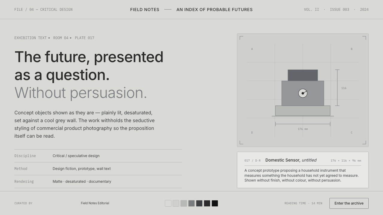 Speculative DesignRefuses to seduce. Cool-grey wall, Inter labels, matte concept objects — the…
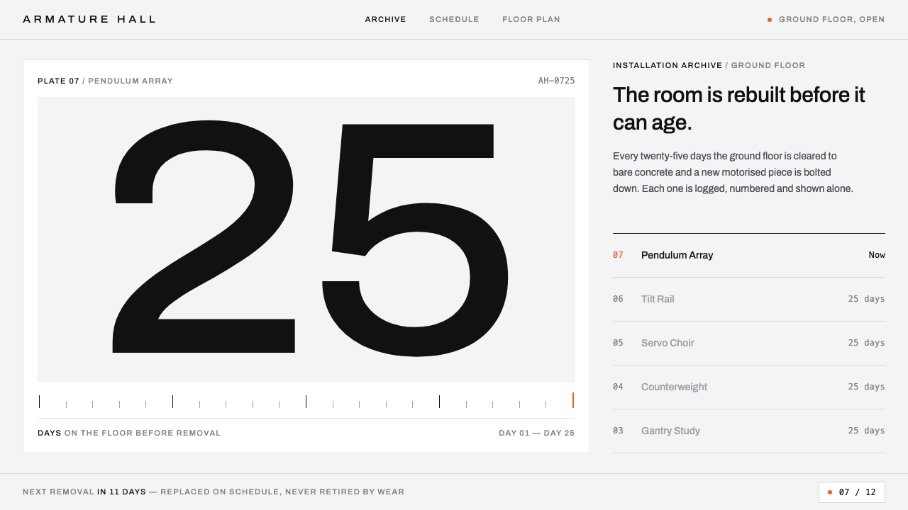 Gentle MonsterObjects filed like machine parts. Grey sweep, tracked Archivo, hairline rules…
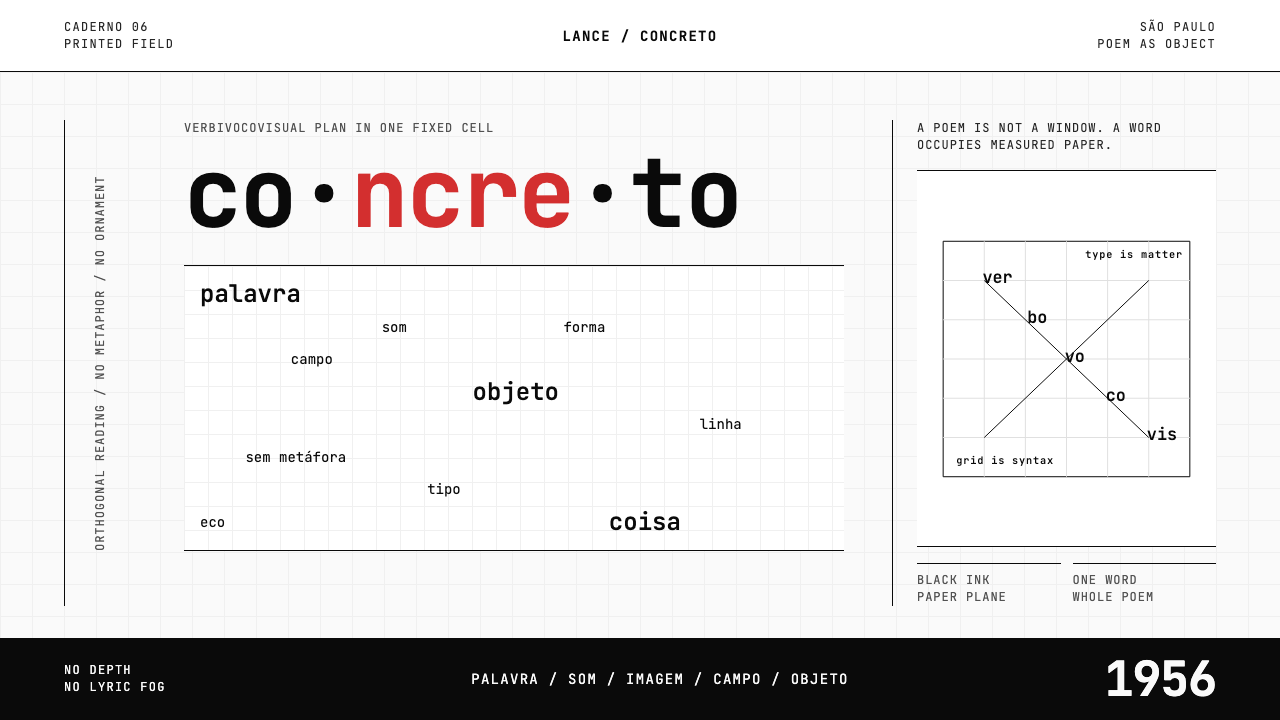 Brazilian Concrete PoetryWords become objects. Monospace cells, black-white paper, one cadmium red rup…
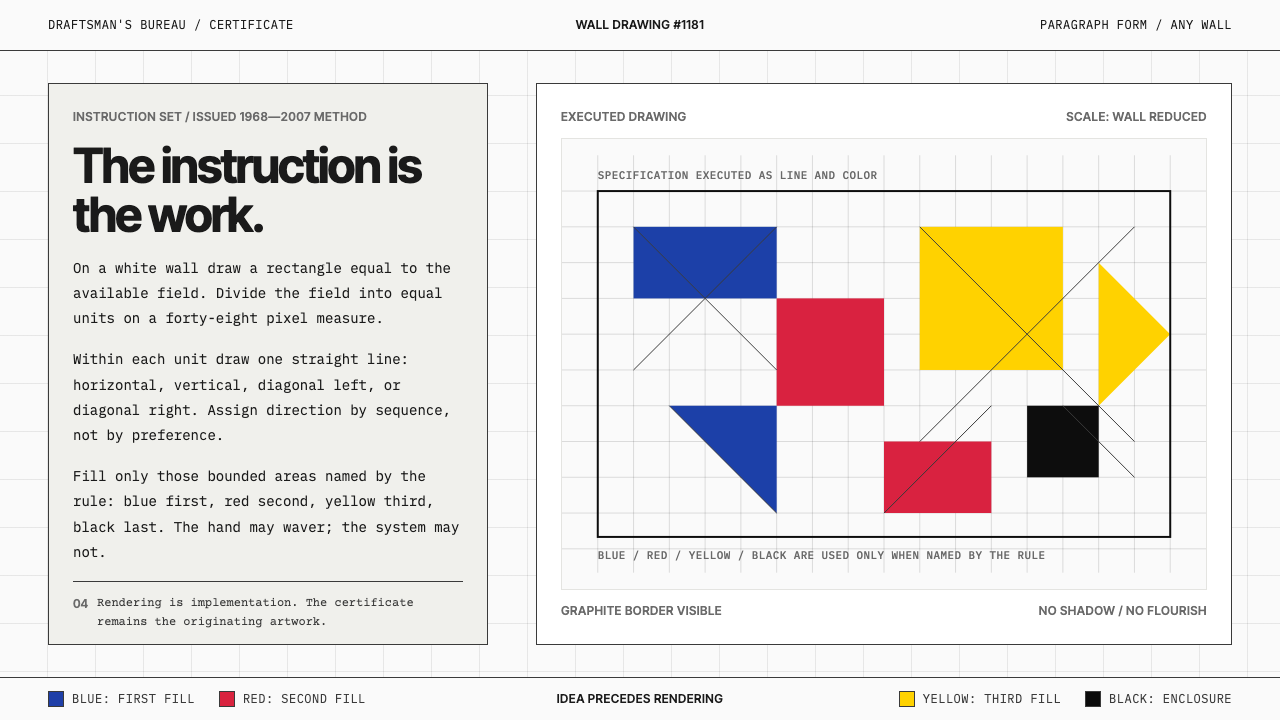 Sol LeWitt ConceptualInstruction becomes art. Mono certificates face wavering graphite grids in fo…
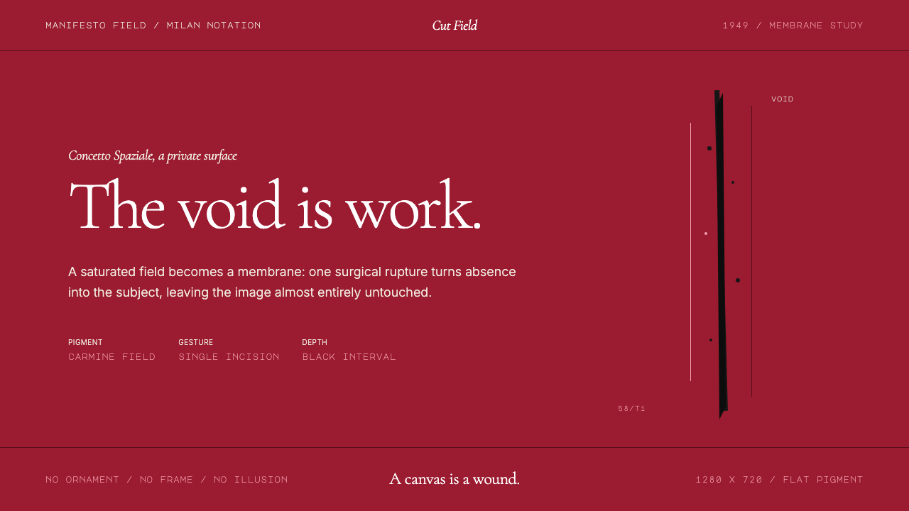 Spatialism (Fontana Cut, 1949)Absence becomes medium. Carmine field, Garamond restraint, one black incision.
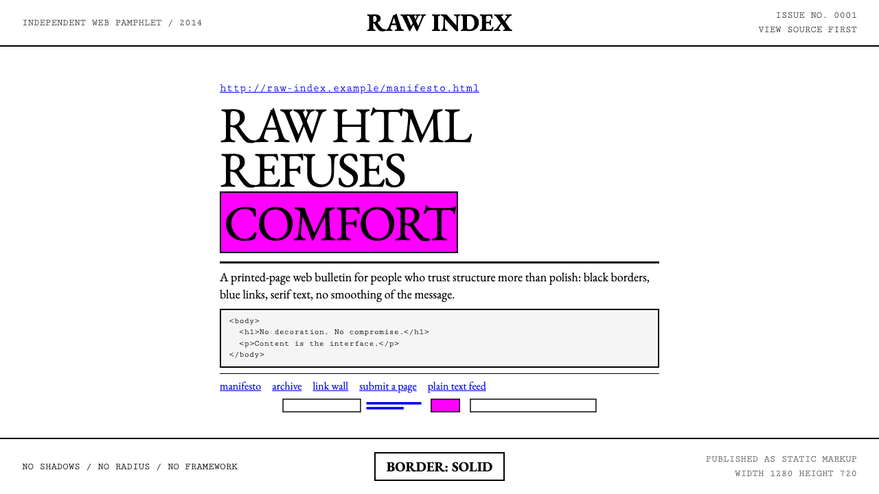 Brutalist Web 2014Browser defaults, weaponized. Times New Roman, electric-blue links — raw HTML…