What is Campo Baeza Luminous White?
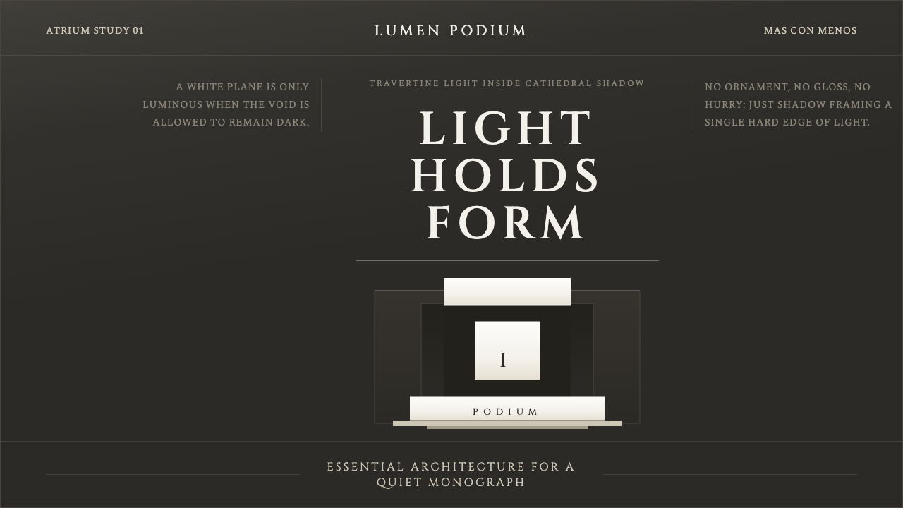
Alberto Campo Baeza builds walls of pure white to catch the sun, then sinks them into a darkness so total that the light itself becomes the building's real subject.
Campo Baeza Luminous White in brief
Campo Baeza Luminous White translates a contemporary Spanish architectural language into visual design: a pale, warm-white volume seems to float inside a field of near-black, cathedral-deep shadow. The effect is not brightness for its own sake. It is drama built entirely from contrast — a glowing plane set against a void so dark it reads as absence, so that the eye has nowhere to rest except on the light.
The style belongs to a strain of Spanish minimalism that took shape in Madrid from the 1990s onward, built on the architect Alberto Campo Baeza's own motto, más con menos — 'more with less.' It is a deliberate answer to Mies van der Rohe's 'less is more': where Mies pursued the fewest possible elements, Campo Baeza pursues the fewest possible elements arranged to produce the greatest possible experience. Reduction, in his hands, is not austerity for its own sake but a strategy for making light do more work.
Visually, the system reads as a study in extremes rather than a middle ground. There is very little in the mid-tones: a surface is either a luminous, sunstruck white plane or it recedes into a cavernous, almost undifferentiated dark. Ornament does not exist. What replaces it is proportion — walls, voids, and apertures are sized and placed with the deliberateness of classical architecture, so that even a completely flat, unornamented surface feels composed rather than empty.
Where does Campo Baeza Luminous White come from?
Alberto Campo Baeza is a Madrid-based architect whose houses and public buildings, built mostly between the 1990s and 2010s, became a reference point for a quieter, more contemplative strain of Spanish minimalism. Rather than the glass-and-steel transparency associated with much international modernism, Campo Baeza works with mass — thick planes of stone and plaster that behave like the walls of a Mediterranean courtyard house, admitting light through carefully placed openings rather than dissolving into glazing.
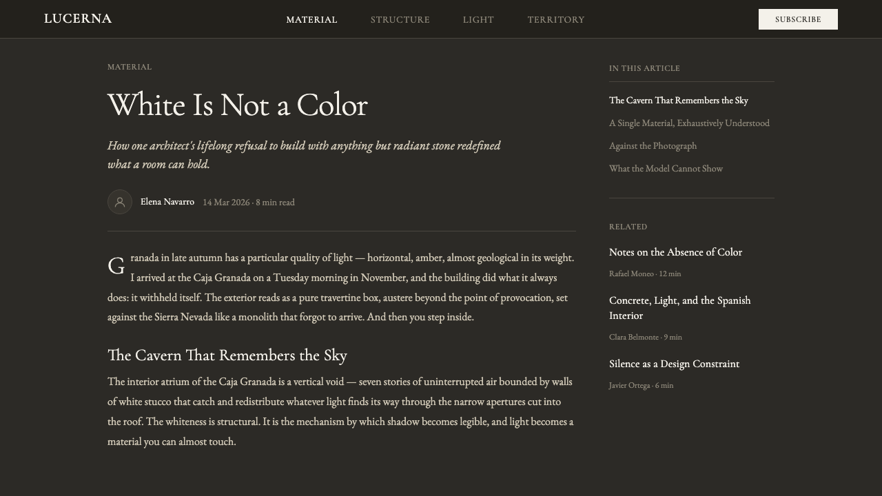
Three houses and a bank headquarters, all named in the record of his work, established the vocabulary that this system draws on. Casa Gaspar, from 1992, and Casa de Blas, from 2000, are private houses in which a plain white volume is set against deep, shaded recesses, so that the building reads as a solid, quiet block from a distance and only reveals its internal drama of light on approach. Caja Granada, a savings-bank headquarters completed in 2001, scales the same idea up to an institutional building — a travertine-clad volume raised on a base, its interior flooded with top light while its lower reaches sink into shadow.
The governing idea across all three projects, and the one this system stages directly, is that radiant white does not read as radiant in isolation. It needs a foil. Campo Baeza consistently pairs his brightest surfaces with the darkest, most cavernous voids he can construct — deeply recessed windows, shadowed undercrofts, stairwells that seem to disappear into black. The luminous white plane is the payoff; the cathedral-dark surround is the setup that makes it legible as luminous at all.
This approach sits inside a broader current sometimes called 'essential' or 'luminous' architecture, and it draws, at a greater distance, on the classical tradition of Roman monumental building — solid mass, restrained proportion, and lettering with the gravity of inscriptional Roman capitals rather than the informality of a contemporary sans-serif. The result is a visual language that feels ancient and contemporary at once: the material honesty of stone and plaster, disciplined by a proportion system, staged inside a self-consciously theatrical use of shadow.
What defines the Campo Baeza Luminous White look?
Color
The palette sits at two extremes with almost nothing in between: a warm, stone-toned white and a near-black, cathedral-deep gray. There is no supporting cast of secondary hues. Warmth comes from the stone tone itself — closer to travertine or aged plaster than to a clinical, cool white — while the dark ground reads as depth rather than as a flat black backdrop.
Light and Shadow
Light is treated as the primary building material, not an afterthought applied to finished forms. Contrast is pushed to its extreme: the brightest plane sits directly against the darkest void, with almost no gradual transition between them. Shadow is not softened or diffused — it is cavernous, total, and used deliberately to make the lit surface legible as light rather than simply as a pale color.
Materiality
Surfaces reference travertine stone and hand-applied stucco — matte, faintly fibrous or grained, never glossy or reflective. This is a material honesty principle: a white surface should look like the stone or plaster it evokes, with a tactile, slightly imperfect quality, rather than the flat uniformity of a printed or digitally rendered white.
Geometry and Volume
Forms are reduced to plain rectilinear volumes — boxes, planes, and podiums — with almost no curvature and no applied detail. A shape is either a solid mass or a deep recess; there is little in between. This is architecture's platonic vocabulary carried into two dimensions: the rectangle as wall, the recessed rectangle as void.
Composition
The organizing device is figure against ground: a single luminous volume set within a much larger dark field, often appearing to hover or float above a base rather than sit flush with it. This 'podium' logic — a light form elevated and isolated by darkness — recurs across layouts, giving even simple pages a sense of gravity and quiet ceremony.
Typography
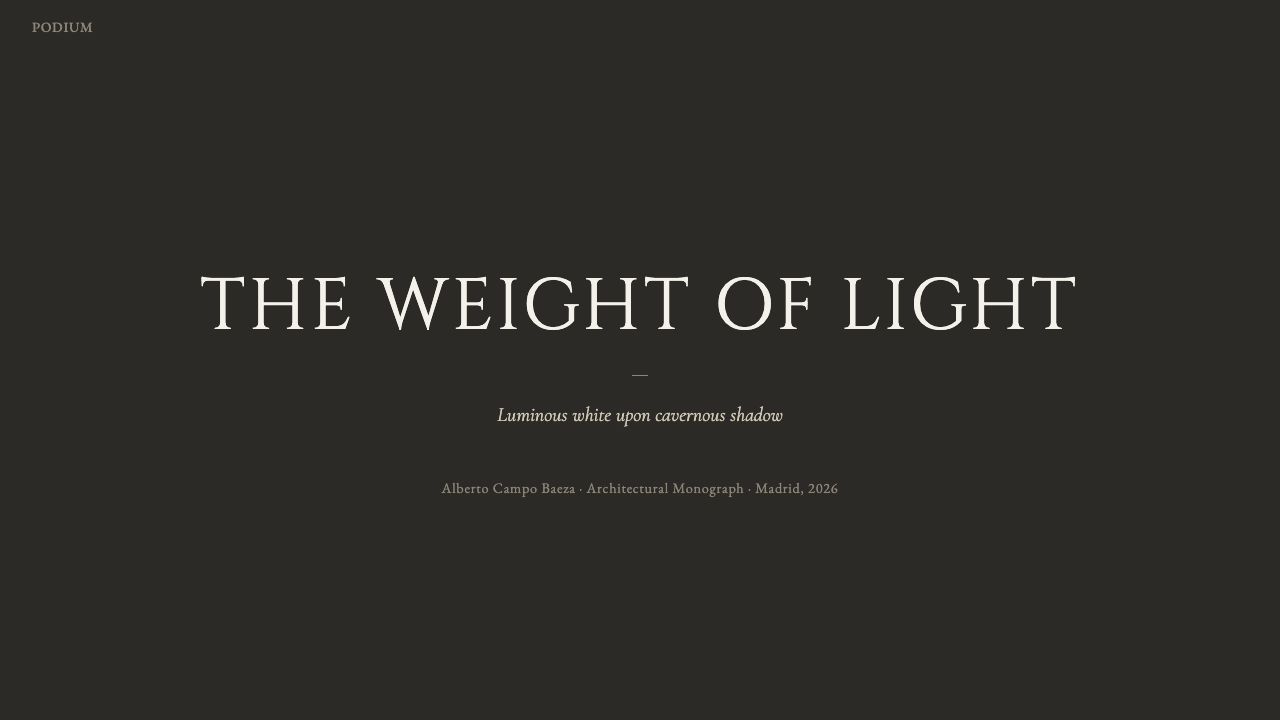
Lettering carries the gravity of classical Roman inscriptional capitals rather than the informality of a casual sans-serif: upright, evenly weighted, and spaced with restraint. Type is used sparingly and set large against dark ground or dark against light stone, functioning more like an engraved label than a conversational headline.
Space and Atmosphere
The overall mood is contemplative and quiet rather than energetic — closer to the hush of a chapel than the bustle of a storefront. Generous negative space around the lit element is essential; crowding the composition with competing bright elements destroys the sense of a single, considered source of light.

Who shaped Campo Baeza Luminous White?
A Madrid-based architect whose houses and institutional buildings, built mainly from the 1990s through the 2010s, defined this luminous, high-contrast strain of Spanish minimalism. His recurring method — a plain white volume staged against deep, cavernous shadow — turns light itself into the primary material of a building, and his motto más con menos ('more with less') frames reduction as a way to intensify experience rather than merely simplify form.
A private house completed in 1992, among the earliest built statements of Campo Baeza's mature approach: a quiet, largely closed white volume that reveals a carefully staged interplay of light and deep shadow only as it is approached and entered, rather than announcing itself from the street.
A private house completed in 2000, built into a hillside so that a long, low, largely blank stone volume sits beneath and beside a lighter, more open glazed level — reinforcing the system's core logic of solid, shadowed mass paired with a luminous counterpart.
A savings-bank headquarters in Granada completed in 2001, scaling the house-scale idea of a lit volume in a dark surround up to an institutional building — a stone-clad cubic form raised on a base, lit from above, with its lower level receding into shadow. It remains one of the most cited demonstrations of the style at civic scale.
How do you use Campo Baeza Luminous White today?
Because this style is built from extreme contrast and restraint rather than decoration, applying it correctly means resisting the urge to fill space. Every layout should have one clear luminous element and a generous, largely empty dark field around it — the moment a second or third bright element competes for attention, the sense of a single considered light source collapses.
For presentation slides, the style is strongest on cover and title pages: a single striking statement — a word, a number, an image — sits as the lit element against a near-black field, with the rest of the slide left deliberately empty. Content slides should keep body text and supporting elements confined to a narrow, well-lit zone, treating the surrounding dark space as an active compositional choice rather than empty margin. Data slides benefit from the same discipline: one chart or one number rendered brightly against the dark ground reads as authoritative in a way that a page crowded with several charts cannot.
For web interfaces, the approach suits dashboards and pricing pages that want to project calm authority rather than energy. A dark, near-black application shell with a single luminous card or panel — a key metric, a featured plan — draws the eye immediately and requires almost no additional visual signposting. Buttons and interactive elements should stay quiet in scale and use restraint in placement; the drama should come from the light-versus-dark relationship of major surfaces, not from small ornamental flourishes.
For editorial and marketing pages, the style supports a slow, deliberate reading rhythm: large blocks of dark space between short passages of type, images cropped and lit so that one plane clearly reads as the brightest thing on the page, and headlines set with the restraint of an inscription rather than a shout. It reads as premium and considered, which makes it well suited to architecture, hospitality, and high-end product marketing, but poorly suited to anything that needs to feel urgent, playful, or immediate.
A common mistake is treating this as simply 'dark mode with a white card' and then filling that card with dense, busy content. The style depends on the dark field staying genuinely empty and the lit element staying genuinely singular — once several elements are lit at similar brightness, the cathedral-and-light logic disappears and the result reads as an ordinary dark theme rather than as this specific, contemplative one.
Campo Baeza Luminous White — FAQ
Is this the same thing as generic minimalism?
No. Generic minimalism is usually defined by what it removes — clutter, ornament, color. This style removes those things too, but its defining move is additive: it stages an extreme contrast between a luminous plane and a cavernous dark void, so that the emptiness itself becomes charged and dramatic rather than simply neutral or clean.
Does it require an all-white palette?
No — the darkness is just as essential as the white. A page or interface built in this style needs a substantial, near-black field for the lit element to be set against; an all-white layout with no dark counterpart loses the contrast that gives the style its drama and reads as generic bright minimalism instead.
How is this different from Scandinavian minimalism?
Scandinavian minimalism tends toward soft, even, diffused daylight, warm neutral tones across a fairly narrow range, and a comfortable, domestic feeling. This style pursues the opposite of evenness: it wants the most extreme contrast it can construct between light and dark, and its emotional register is closer to a chapel or an institutional monument than to a comfortable living room.
Can this style be inverted to use a light background instead of dark?
It is possible but it changes the effect substantially. The style's drama depends on genuine near-black depth surrounding the lit plane; a pale surround softens that depth into something closer to a shadow tint rather than a void, which weakens the cathedral-like intensity that defines the look. If a lighter ground is required, the contrast between the lit plane and its surround should be pushed as far as the palette allows.
What kinds of products or brands does it suit — and where does it struggle?
It suits contexts that want to project calm authority, permanence, and considered taste — architecture and real estate, hospitality, high-end goods, cultural institutions, and any product that benefits from feeling unhurried. It struggles wherever a brand needs to feel fast, playful, affordable, or densely informative: the style's insistence on emptiness and a single focal point works against layouts that need to communicate many things at once.
Related design styles
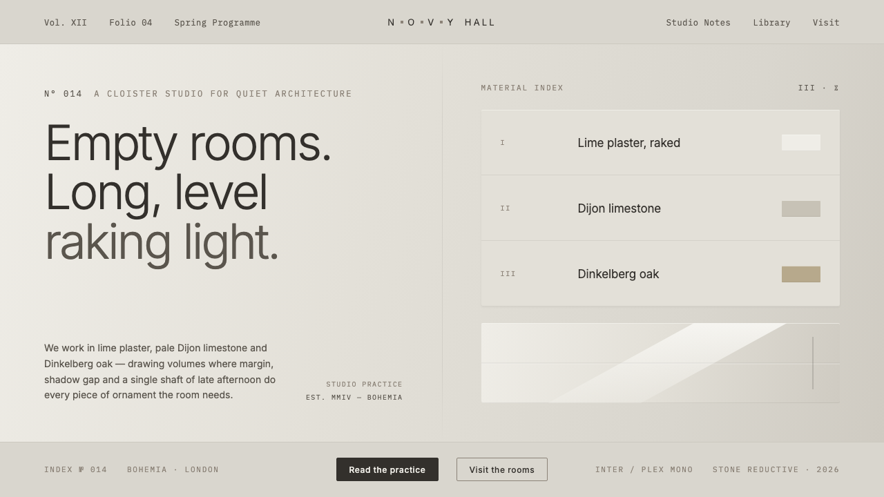 John Pawson MinimalismMonastic reduction. Cool stone-grey, pale oak, hairline shadow gaps as the on…
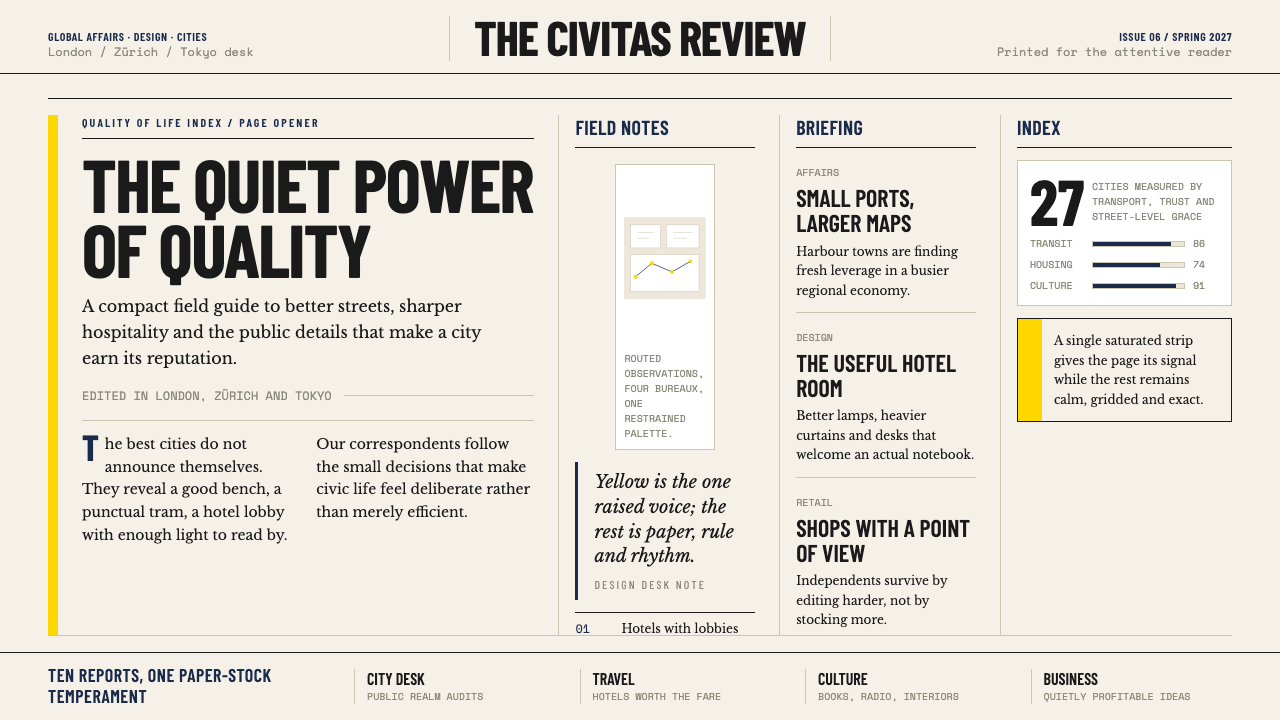 Monocle MagazineQuiet authority. Yellow spine, warm paper and dense ruled columns speak at li…
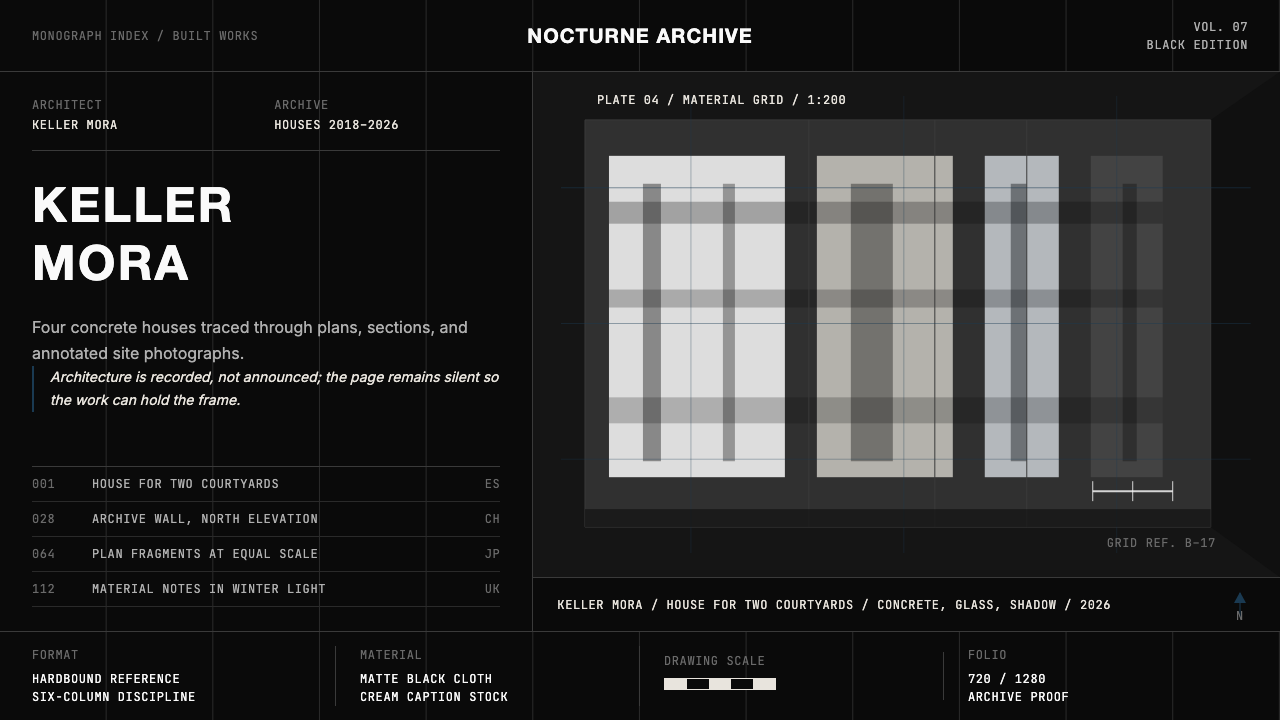 Architect Monograph (Black Edition)Architecture stays sovereign. Matte black, Helvetica caps, hairline grids, bl…
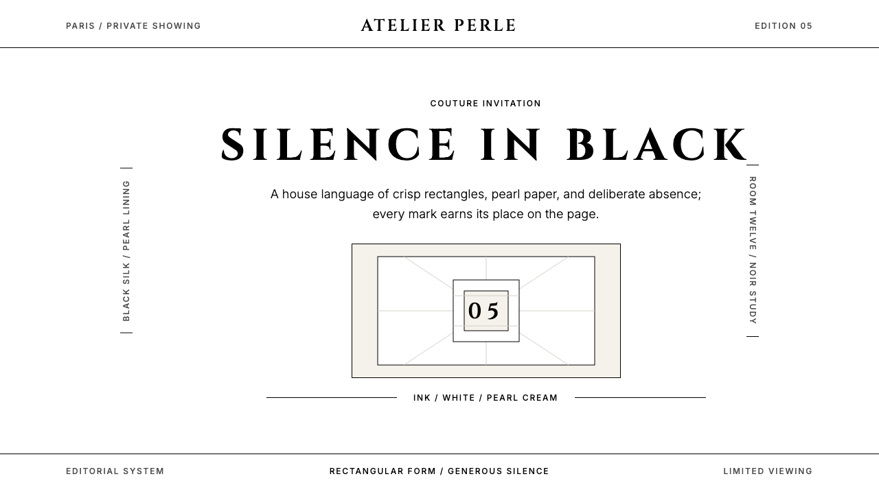 ChanelLuxury needs no color. Black on white, pearl-cream warmth, geometric capitals…
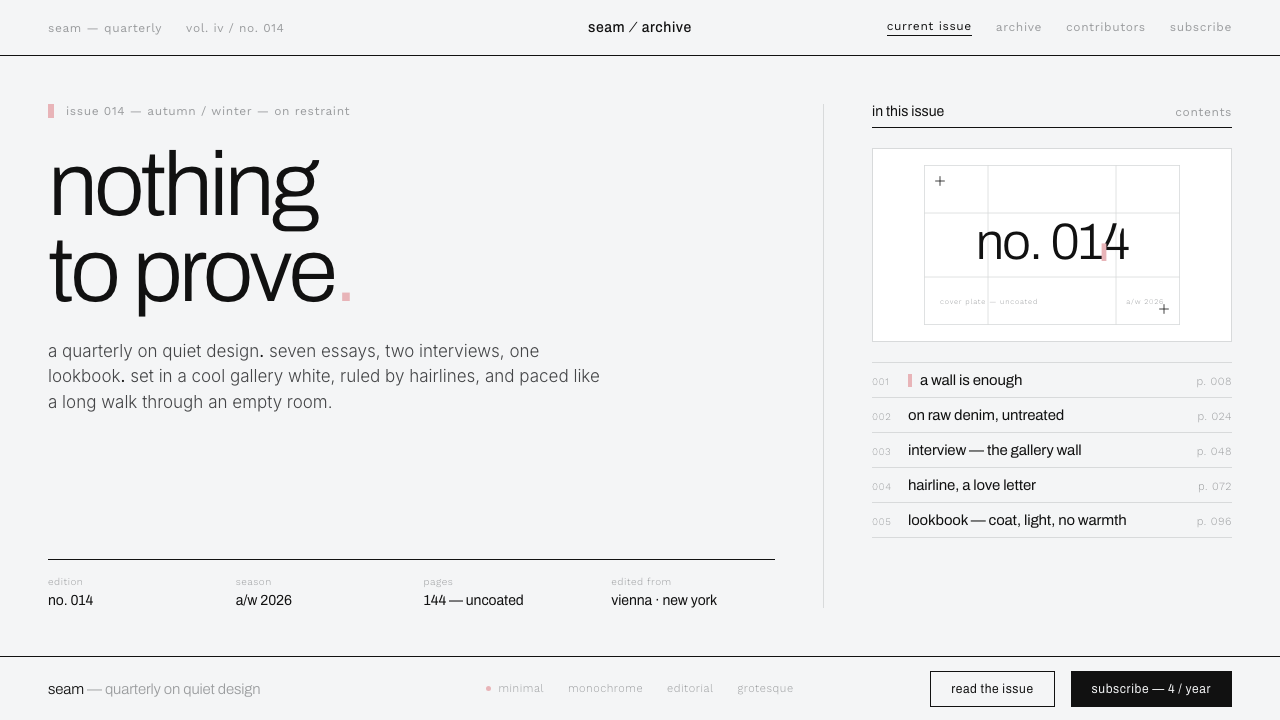 Helmut Lang MinimalismNothing to prove. Cool gallery white, 1px black hairlines, lowercase Archivo…
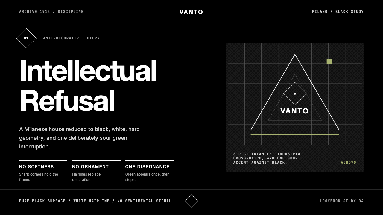 Prada Milan MinimalistLuxury refuses ornament. Pure black, austere sans, and one sour green hairlin…