What is Sri Lankan Batik?
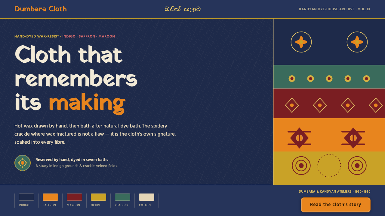
Sri Lankan batik brings the memory of the dye-house to the screen: indigo depth, saffron warmth, and hot-wax crackle preserved as evidence of making.
Sri Lankan Batik in brief
Sri Lankan batik is wax-resist cloth shaped by layered natural-dye fields, hot-wax lines, and the spidery crackle created when wax fractures under dye. Its visual character is tactile rather than polished. Indigo establishes the ground, while saffron, maroon, and undyed-cotton highlights emerge as distinct passages within the cloth.
The pattern language is built from elephants, peacocks, and lotus blooms arranged in banded, symmetric panels. These motifs repeat across the surface without becoming mechanically identical. The result is ordered but alive: a clear rhythm held together by the visible irregularities of wax, dye, and cloth.
As a design system, Sri Lankan batik carries the material logic of the textile into digital layouts. Indigo grounds replace neutral white space; crackle-veined fields replace flat fills; resist-line edging frames blocks like fabric borders. The goal is not to imitate a photograph of cloth, but to preserve the sense that every surface has passed through a human process.
Where does Sri Lankan Batik come from?
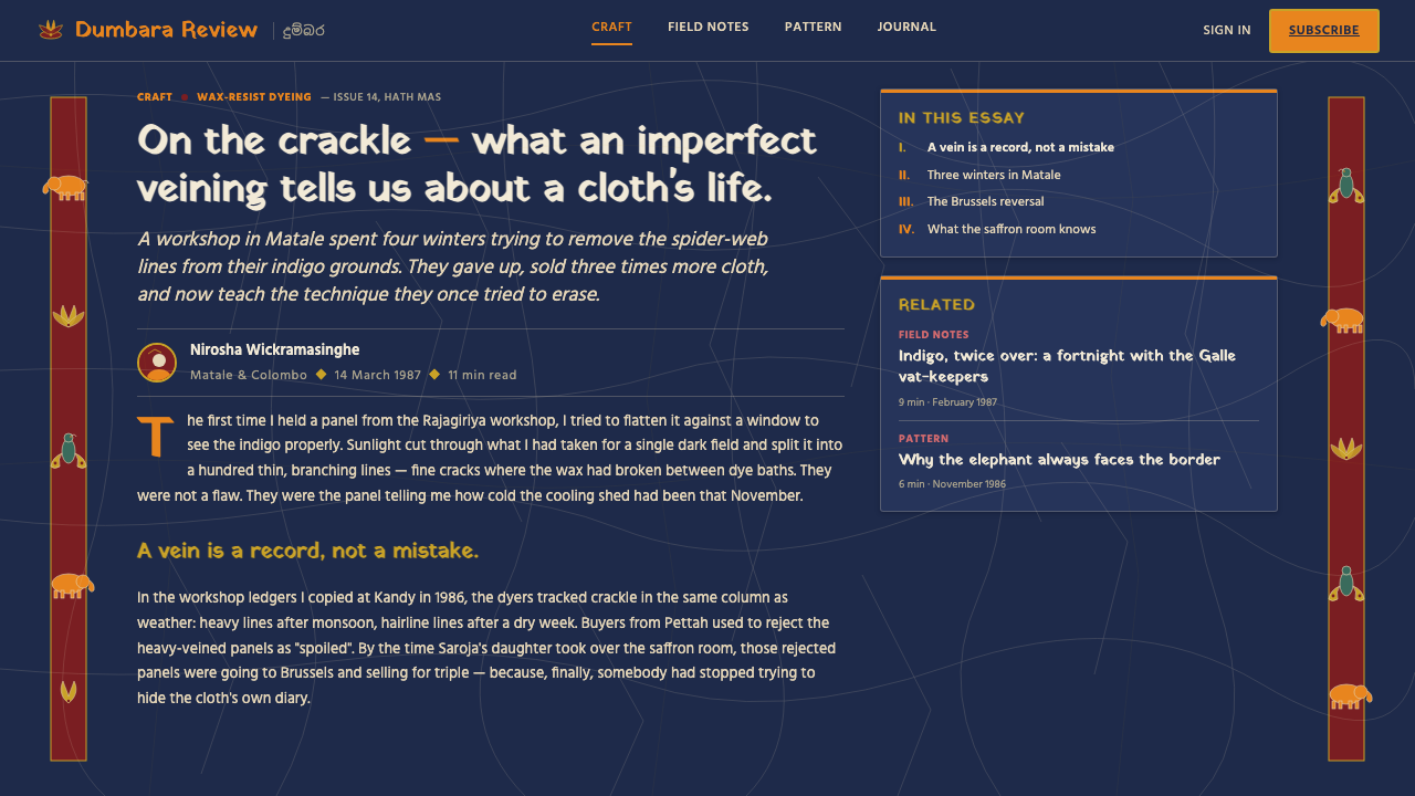
The modern Lankan batik revival belongs to the period from 1950 to 1990 and builds on Indonesian wax-resist technique. Its identity therefore begins with continuity rather than isolation: an established resist process becomes part of a distinctly Sri Lankan visual system, shaped through local workshops, dye-houses, and craft traditions.
The principal regional setting is Sri Lanka, especially the Dumbara and Kandyan craft belt, alongside ateliers operating across the island. Lankan batik artisan workshops, Kandyan family dye-houses, and Dumbara craft-belt ateliers form the human framework behind the style. The cloth remembers this framework through visible layers, bordered fields, repeated motifs, and the marks left by wax and dye.
Within the approved lineage, Sri Lankan batik sits at the meeting point of South Asian wax-resist textile craft, the post-Indonesian Lankan batik tradition, and a natural-dye revival. These are not merely historical labels. Together they explain why the aesthetic feels both patterned and material: the surface is organized by inherited technique, but its depth comes from accumulated dye fields and the physical behavior of wax.
What defines the Sri Lankan Batik look?
Indigo Ground
Indigo is the atmospheric foundation of the system. It creates a dark, saturated field against which saffron and maroon motifs appear to glow. The ground should feel dyed rather than digitally filled: deep, substantial, and capable of carrying both pattern and texture without losing its visual weight.
Natural-Dye Contrast
Saffron, maroon, and undyed-cotton tones provide contrast without breaking the textile unity. Color appears in layered fields and bordered passages, not as arbitrary decoration. The palette is warm against the indigo ground, with the lightest areas reserved for relief, emphasis, and the impression of exposed cloth.
Wax Crackle
The spidery crackle is the signature trace of hot wax. It should branch unpredictably through dyed areas, producing fine fractures that interrupt flat color and reveal the making of the surface. Crackle is not a noise filter or a decorative overlay; it is the central proof that the field has resisted, fractured, and received dye.
Resist-Line Edging
Hot-wax lines define the boundaries between fields and give each block a hand-drawn edge. These lines may frame a motif, separate a band, or hold a panel together. Their authority comes from slight variation: they are legible enough to organize the composition, yet irregular enough to remain visibly made rather than mechanically plotted.
Banded Symmetry
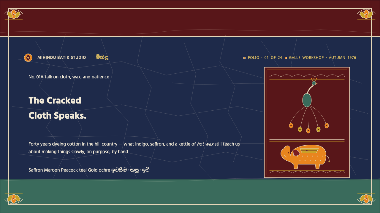
Composition relies on repeated horizontal bands and balanced panels. Symmetry provides the system's calm, ceremonial order, while the internal texture keeps that order from becoming sterile. Motifs should feel arranged within a cloth tradition, with clear intervals and edges rather than scattered across an empty field.
Motif as Memory
Elephants, peacocks, and lotus blooms are not incidental illustrations. They are the recurring visual vocabulary through which the cloth identifies itself. Use them as anchors within panels or bands, allowing repetition and variation to establish continuity. Their value lies in recognition, rhythm, and the feeling of a surface carrying inherited pattern.
Who shaped Sri Lankan Batik?
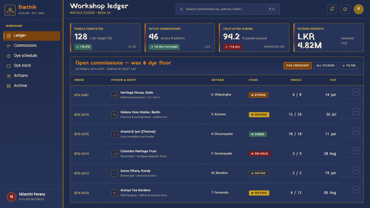
These workshops represent the practical continuity of the modern Lankan batik revival. Their contribution is visible in the full language of the cloth: layered dye fields, wax-resist lines, crackled surfaces, and recurring motifs held within bordered panels. In a digital adaptation, the workshop is remembered through process marks rather than through a polished imitation of handmade merchandise.
Kandyan family dye-houses embody the domestic and inherited side of the craft tradition. Their place in the system is expressed through accumulated color, patterned repetition, and the sense that a surface develops through successive acts of resist and dye. The resulting aesthetic feels intimate, layered, and grounded in continuity.
The Dumbara craft-belt ateliers locate the style in a specific Sri Lankan making landscape. Their influence is carried by the balance between structured bands and unruly material evidence: symmetric arrangement on one side, wax fracture and dye variation on the other. This tension is essential to the character of Sri Lankan batik.
How do you use Sri Lankan Batik today?
For presentation slides, use the indigo ground as the visual field and let the cover introduce one strong banded composition rather than a collection of scattered ornaments. Content slides should preserve clear bordered blocks, with saffron or maroon reserved for headings, motif panels, or key transitions. Data slides can turn charts into dyed fields: structure remains easy to read, while crackle texture and resist-line edging make the information feel embedded in material rather than floating above it.
For web interfaces, Sri Lankan batik suits dashboards and pricing pages that need strong grouping and a distinctive dark atmosphere. Use indigo to establish the main surface, undyed-cotton tones for readable text areas, and warm dye colors for active states, selected plans, or important summaries. Cards should feel like bordered textile panels. Texture belongs inside the system's hierarchy, supporting recognition and depth without obscuring labels, controls, or comparisons.
For editorial and marketing work, the style supports stories about craft, place, process, heritage, and material culture. A feature page can alternate dark indigo fields with lighter cloth-like passages, using resist lines to separate pull quotes, captions, and image areas. Marketing compositions benefit from a repeated motif language and a restrained warm accent, so the page feels like one continuous textile rather than a series of unrelated decorative moments.
A common mistake is treating Sri Lankan batik as a generic dark theme with a few floral symbols placed on top. That approach loses the essential relationship between dye, wax, border, and repetition. Another mistake is making every crackle mark identical or perfectly regular. The surface should retain hand-made irregularity: enough structure to communicate, enough variation to show that the design remembers its making.
Sri Lankan Batik — FAQ
Is Sri Lankan batik the same as Indonesian batik?
The approved history describes modern Lankan batik as building on Indonesian wax-resist technique, so the traditions are connected. Sri Lankan batik develops that foundation through its own revival, regional craft belt, island-wide ateliers, indigo grounds, warm dye fields, banded symmetry, and recurring elephants, peacocks, and lotus blooms. It is best understood as a Lankan visual system formed from an inherited process.
Why is the indigo ground so important?
Indigo gives the system its dark atmospheric foundation and allows the warmer motifs to carry visual energy. It also supports the tactile reading of the cloth: crackle, resist lines, and undyed highlights remain legible against it. Replacing indigo with an arbitrary dark color can preserve mood, but it weakens the specific material identity of Sri Lankan batik.
Should the crackle texture be uniform across the design?
No. The crackle should behave like a trace of wax under dye, with branching, interruption, and local variation. A consistent visual language is useful, but identical crackle repeated everywhere looks synthetic. Preserve the feeling of hand-made difference while keeping the texture subordinate to reading order and content clarity.
How should elephants, peacocks, and lotus blooms be used?
Use them as recurring anchors within bands and bordered panels, not as isolated clip-art decorations. Repetition establishes the textile rhythm; small changes in placement or internal treatment keep the surface alive. The motifs should support the composition's symmetry and continuity, while the wax lines and dyed fields remain equally visible.
Can this style work for every kind of interface?
It works especially well where a dark, tactile, crafted identity is valuable: dashboards, pricing pages, editorial features, and campaign surfaces. It is less suitable when the interface must feel entirely neutral, frictionless, or clinically minimal. The style asks the product to acknowledge materiality and process. If that character supports the product's voice, the system becomes distinctive; if not, the texture may feel like an imposed costume.
Related design styles
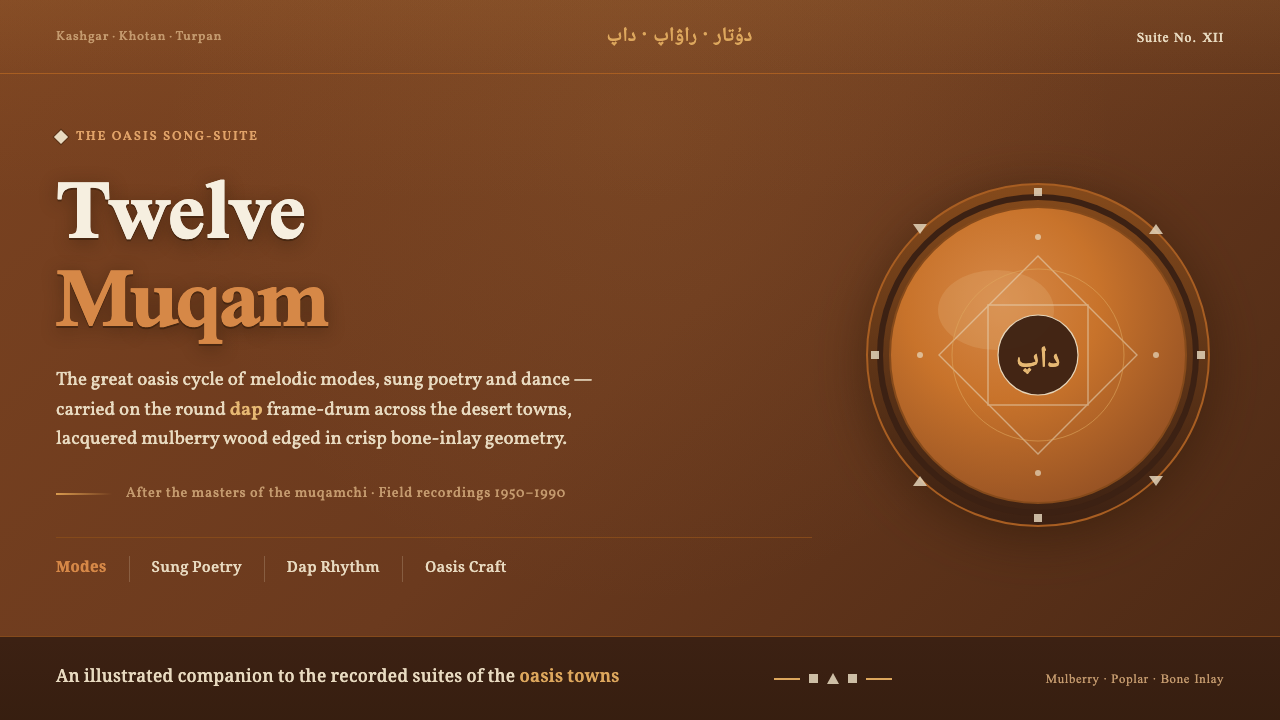 Uyghur Muqam & Dap DrumLamplight on carved wood. Ochre and amber over mulberry-brown, edged in bone-…
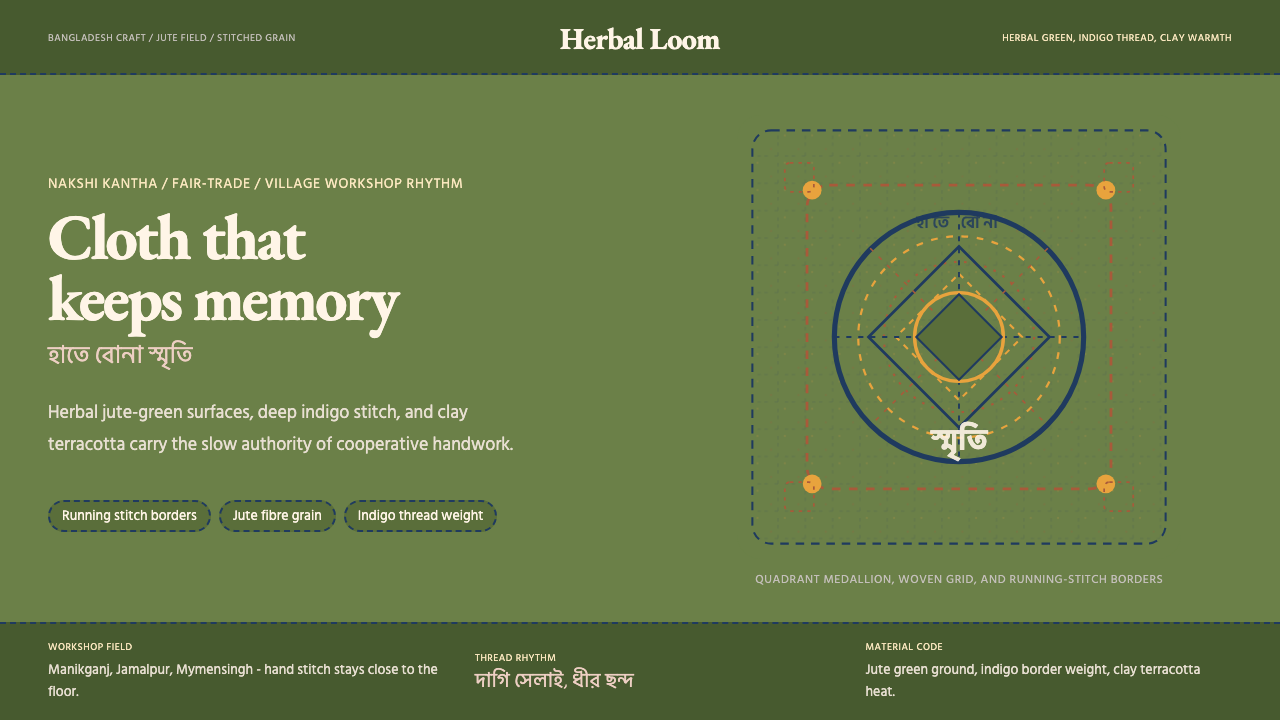 Bangladeshi Jute CraftMemory stays stitched. Jute green, indigo borders, terracotta warmth.
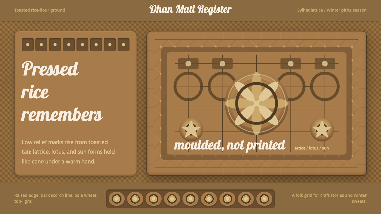 Bangladeshi Nakshi Pitha MotifsWarm relief, never print. Galada type and tan lattice press rice-flour craft…
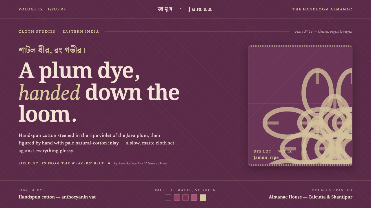 Indian Jamun Violet HandloomHandspun, never glossy. Jamun-violet dyed cotton figured with pale natural-th…
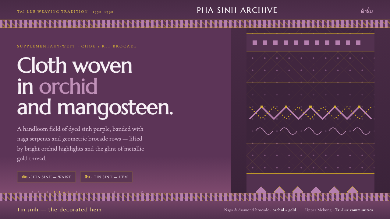 Lao Orchid Mauve TextileHandwoven sinh silk made digital. Orchid-mangosteen ground banded with naga b…
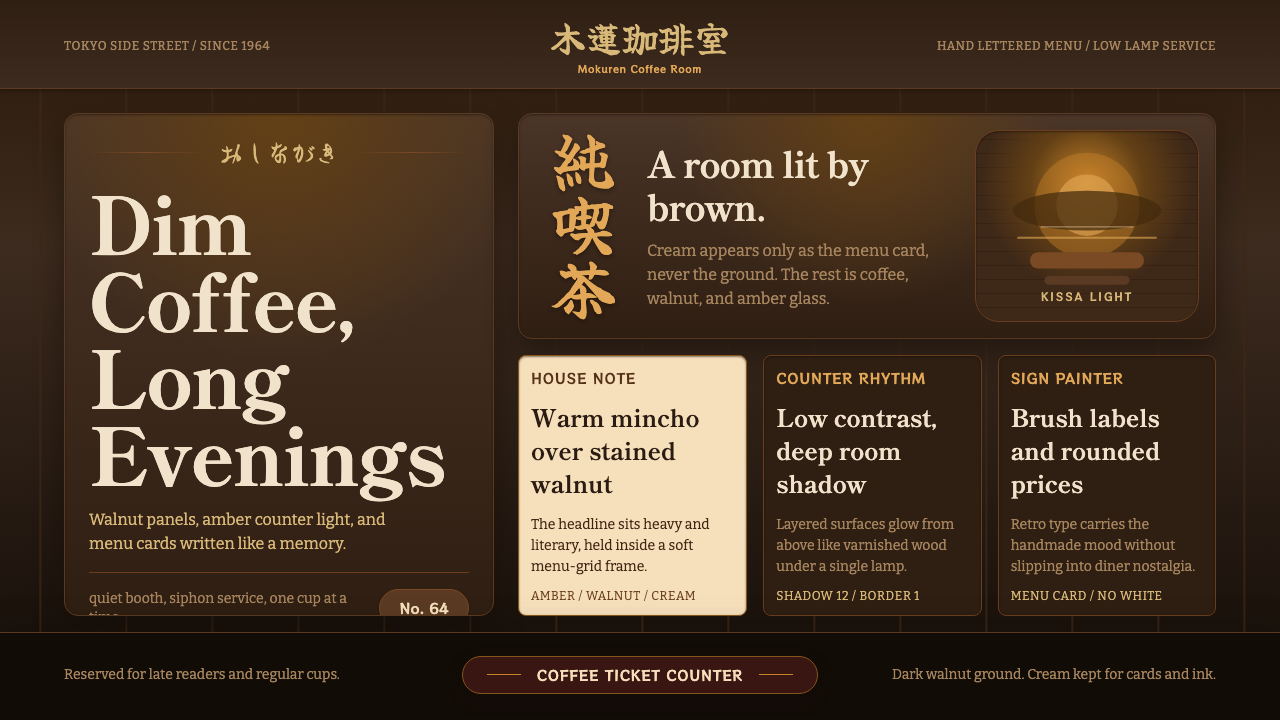 Shōwa KissatenDimness is the luxury. Walnut browns, amber glow, and Mincho type frame a men…