What is Squid Game (2021)?
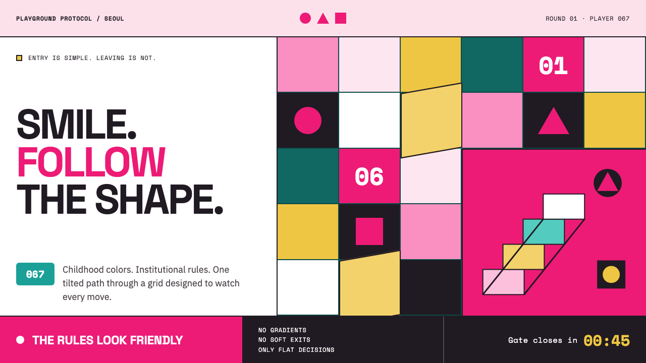
Squid Game turns playground cheer into controlled dread — fuchsia, teal, pastel architecture, and three simple shapes become the visible language of surveillance.
Squid Game (2021) in brief
Squid Game is a visual style drawn from the 2021 Korean Netflix series, where childhood games, institutional control, and pop-scale graphic clarity are held in deliberate conflict. Its surfaces are cheerful enough to suggest a playground, yet the repetition of uniforms, numbers, masks, and rules makes that cheerfulness feel coercive. The style does not need darkness to create unease; it creates unease by making bright order feel inescapable.
The central palette places fuchsia guard suits beside teal player tracksuits, then stages both within candy-pastel architectural spaces. These colors are not used to soften the world. They separate roles, organize movement, and make groups legible at a glance. A viewer can understand who is watched, who enforces the rules, and who belongs to the system before reading a single line of text.
Its most portable visual device is the circle, triangle, and square grammar associated with masked guards. These shapes work as badges, navigation markers, bullets, chapter labels, states, and warnings. Because the vocabulary is so limited, every repetition gains force: a simple symbol stops feeling decorative and starts feeling like an instruction.
Where does Squid Game (2021) come from?
The style begins with Squid Game Season 1, released globally by Netflix in September 2021. Its stated setting is Seoul, South Korea, while its audience and circulation were global from the outset. That combination matters: the visual world is grounded in a Korean television production while being designed to communicate immediately across languages, screens, and markets.
The source material situates the series within Korean New Wave TV, graphic minimalism, and dystopian pop design. These descriptions explain the style's unusual balance. It is emotionally direct rather than visually obscure, reduced to bold signs rather than intricate decoration, and dystopian without relying on rust, ruin, or muted industrial gloom. The menace comes from immaculate systems, cheerful surfaces, and rules expressed as graphic form.
Its temporal frame extends beyond the first season. The source identifies Seasons 2 and 3 with the period from 2024 to 2025, making the style a continuing visual language rather than a one-off promotional look. Across that frame, the recognizable materials remain the same: role-based color, repeated symbols, oversized numbers, flat planes, and architectural routes that seem to promise play while denying freedom.
Hwang Dong-hyuk, Chae Kyoung-sun, Jung Jae-il, and Lee Jung-jae are identified as key figures in the source material. For a design reader, their presence underscores that this is not merely a palette to borrow. The visual identity belongs to a larger television work in which image, atmosphere, performance, and narrative pressure operate together.
What defines the Squid Game (2021) look?
Role-Based Color
Fuchsia and teal are assigned with the clarity of uniforms rather than the softness of lifestyle branding. Color identifies position inside a hierarchy: one group administers, another group is processed. Candy-pastel surroundings complicate that logic by making the controlled environment appear playful, almost safe, until the contrast becomes unsettling.
Three-Shape Grammar
Circle, triangle, and square form a compact iconographic grammar. Their force comes from disciplined repetition and role distinction, not from ornamental variation. Used in interfaces, they should behave like commands, categories, or access markers. The moment they become scattered decorative confetti, the style loses its institutional edge.
Flat Graphic Surfaces
Surfaces read like poster paint: solid, clean, and without simulated material richness. Blocks of color meet directly, numbers resemble stencil marks, and objects are understood by silhouette before texture. The flatness makes the world feel designed in advance, as if every visible surface has already been approved by an unseen authority.
Rigid Grid, Interrupted Plane
Hard right-angle grids establish order, then a single tilted plane interrupts the expectation. This small disturbance is more effective than visual chaos because it suggests that the system is precise but not trustworthy. Stairways and passages can look game-like while making orientation uncertain, turning circulation into suspense.
Overscaled Marking
Numbers, glyphs, and blocks are oversized enough to be read as environmental signals, not minor interface details. Marking becomes architecture: a label can feel like a rule, and a badge can feel like a designation. This scale gives sparse layouts authority without requiring dense decoration.
Cheerful Dread
The defining emotional effect is tension between friendly visual cues and punitive control. Bright color, simple shapes, and toy-like cleanliness normally promise accessibility. Here they frame surveillance, sorting, and constrained choice. Successful applications preserve that contradiction; they should feel inviting at first glance and slightly overregulated on second look.
Who shaped Squid Game (2021)?
Hwang Dong-hyuk is identified in the source material as a key figure associated with Squid Game. In reading the style, his inclusion matters because the visual system must be understood as part of a narrative world: its colors and symbols do not operate independently from the pressure of rules, games, and constrained choice.
Chae Kyoung-sun is named as a key figure in the provided material. The series' enduring design lesson is that spatial systems can carry story: a route, a stairway, a color field, or a repeated marking can communicate control before dialogue explains it.
Jung Jae-il is listed among the key figures for the series. His inclusion reinforces that the style is atmospheric as well as visual. Designers borrowing its graphic language should preserve pacing, restraint, and emotional contrast rather than reducing it to a collection of bright colors and game symbols.
Lee Jung-jae is identified as a key figure in the source material. The visual language gains its charge through human presence: uniforms, numbered clothing, and directional spaces are powerful because they classify people. Without that human stakes layer, the same motifs risk becoming empty spectacle.
How do you use Squid Game (2021) today?
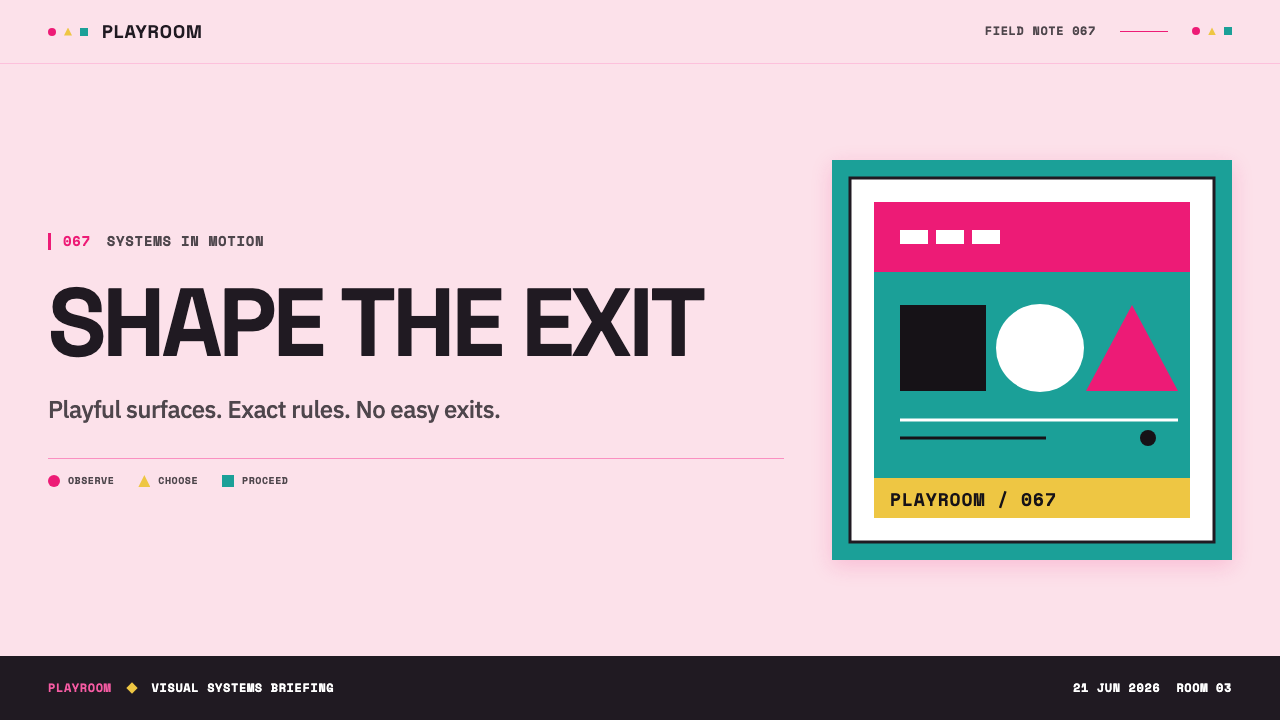
For presentation covers, use a bright field as an unsettlingly calm stage for one dominant symbol, one large numeral, or a tightly grouped title. Let fuchsia or teal establish the main role distinction, then use the remaining color family sparingly. The cover should read like a game instruction that has acquired bureaucratic authority.
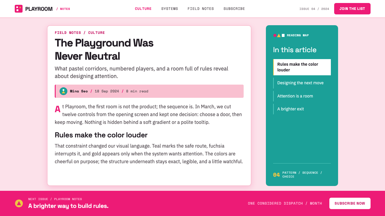
For content and data slides, organize material through strict repeated zones: title, rule, status, and result. Circle, triangle, and square can encode categories only when their meaning remains stable across the deck. Charts should remain flat and graphic, with labels treated as visible marks rather than fine-print cleanup. A single diagonal interruption can signal exception, risk, or a change of route.
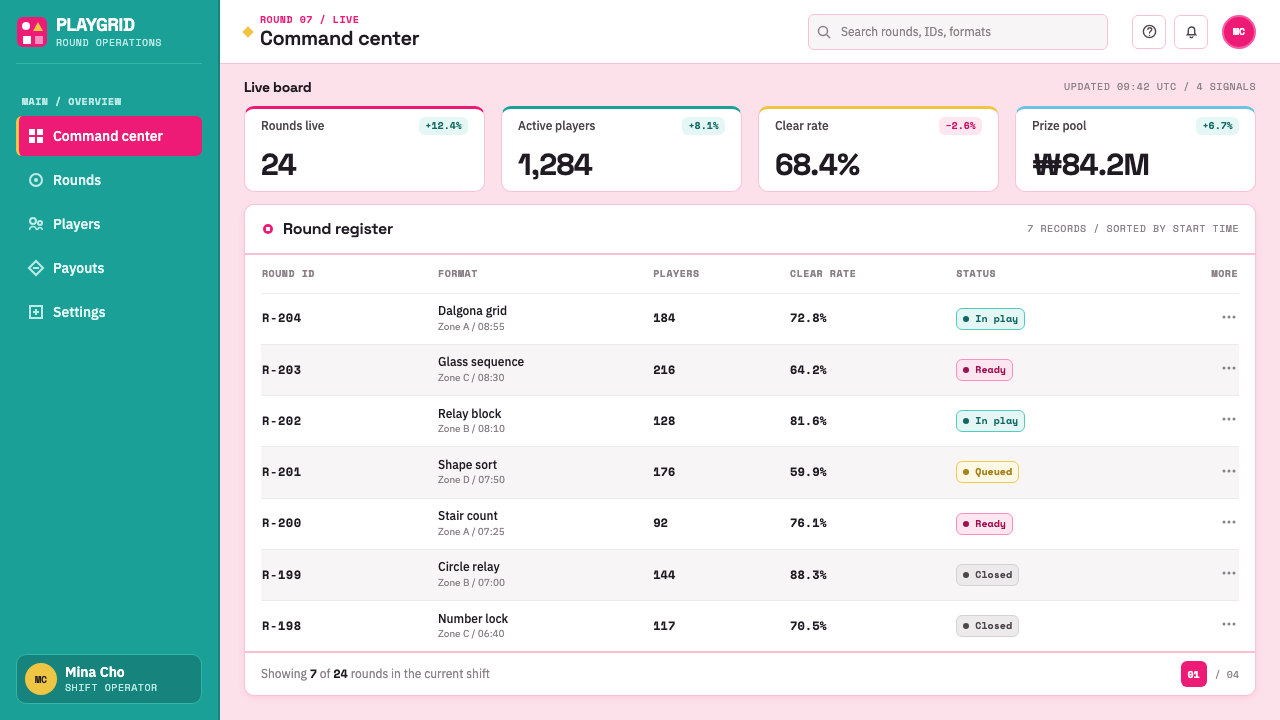
For web dashboards and pricing pages, the style works best where a product already has real states, permissions, queues, tiers, or decision paths. Use role-based color to distinguish system actors, reserve glyphs for clear functional labels, and keep panels crisp and bounded. The effect should improve scanability first; a playful dystopian atmosphere is a secondary outcome, not the usability goal.
For editorial and marketing work, use the contrast between sweet color and severe instruction to frame high-stakes information. A campaign page can alternate broad pastel fields with stern black type, short rules, and oversized identifiers. Editorial layouts benefit from sparse copy blocks, repeated symbols as sectional anchors, and architectural crops that make movement and enclosure visible.
The common mistake is treating Squid Game as a generic neon-pastel trend. Random fuchsia, teal, triangles, and maze imagery produce a costume, not the system. The style depends on disciplined role assignment, clean flat surfaces, and an emotional contradiction between invitation and control. If every element is playful, or every element is threatening, the defining tension disappears.
Squid Game (2021) — FAQ
Is this style just pastel dystopia?
Pastel color is only the outer layer. The more important structure is institutional legibility: roles are color-coded, symbols are repeated, routes are regulated, and markings classify people. The dystopian feeling comes from that orderly system operating through cheerful visual cues, not from pastel color alone.
Can the circle, triangle, and square be used as ordinary decoration?
They can appear decoratively, but that weakens the reference. In the Squid Game vocabulary, the three forms are strongest when they carry stable meaning and appear with procedural regularity. Assign them to categories, actions, access levels, or sections, then repeat that assignment consistently.
Why does a bright version of the style feel more unsettling than a dark one?
Because bright color ordinarily signals play, friendliness, and low risk. When the same signals frame surveillance or restricted choice, viewers experience a mismatch between expectation and meaning. A dark version may still be dramatic, but it can lose the essential contradiction between childhood visual language and authoritarian order.
What kinds of products suit this approach?
It suits products that genuinely benefit from visible rules and sharp hierarchy: dashboards, operations tools, event systems, analytical experiences, structured learning, and campaigns with a strong game-like flow. It is less suitable for products that need reassurance, privacy, tenderness, or an atmosphere of open-ended exploration.
How can a designer reference the style without making it feel like fan art?
Borrow the underlying method rather than reproducing the recognizable costume. Build a limited symbol grammar, assign color by role, use flat environmental marking, and create tension between friendly form and firm instruction. Avoid copying specific character imagery or treating the series title as a visual shortcut; the transferable value lies in the system of control and contrast.
Related design styles
 BTS Army Purple 2020Fandom becomes atmosphere. Borahae purple, pearl cards, lavender glow, one go…
 Medellín Comuna 13 MuralsRefuses blank walls. Hot pink, neon green, and cobalt blocks pack the grid li…
 Thai Mor Lam Isaan (2020)Joy at maximum volume. Fuchsia-cyan neon, chrome type, and halftone grids hit…
 Brat Album Green 2024Ugly green becomes identity. Blurred Arial floats on one flat acidic field.
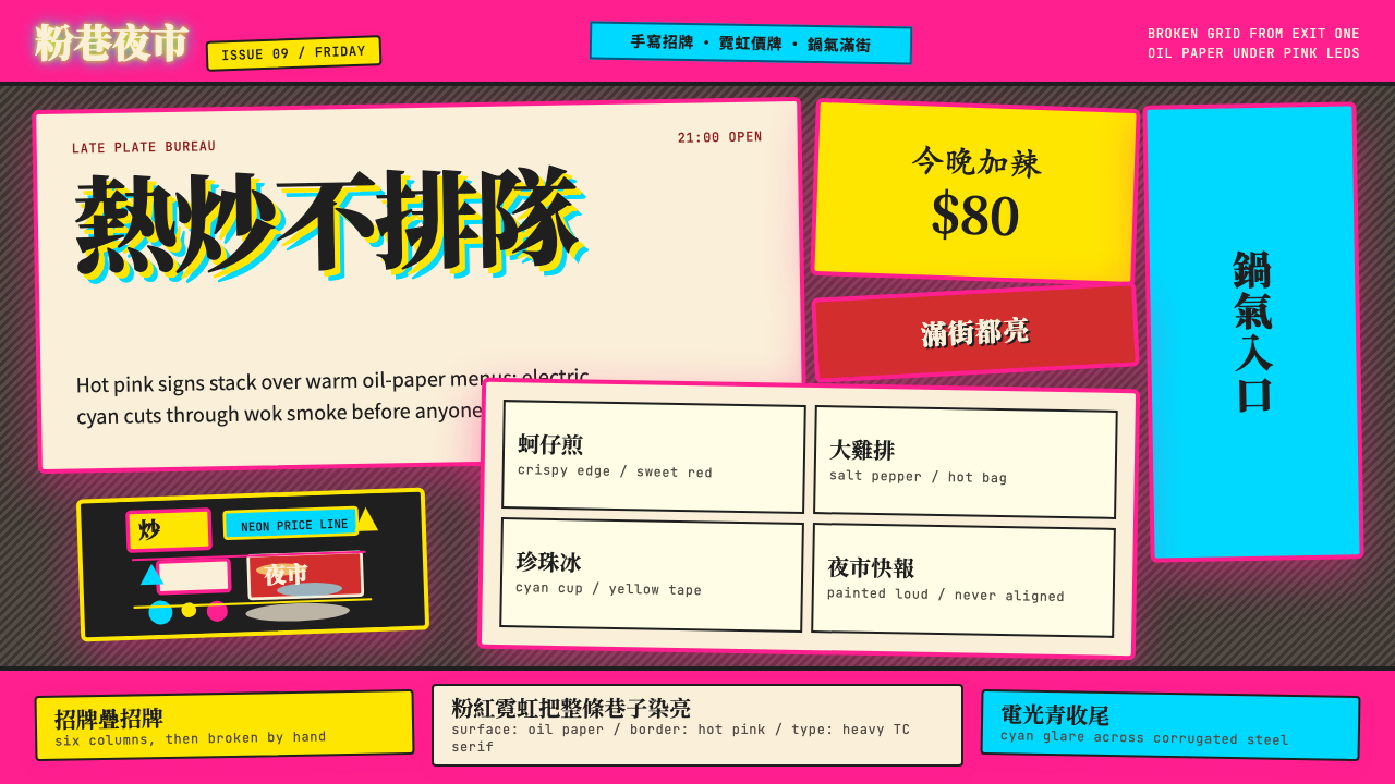 Taipei Shilin Night Market NeonLoud by design. Hot pink, neon yellow, and stacked TC serif signs break the g…
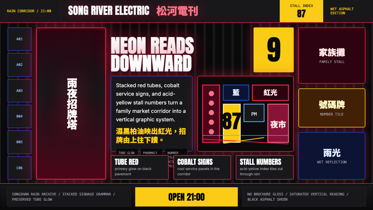 Taiwanese Raohe Night Market NeonTaipei night reads vertically. Neon red, cobalt panels, and acid-yellow numbe…