What is Brat Album Green 2024?
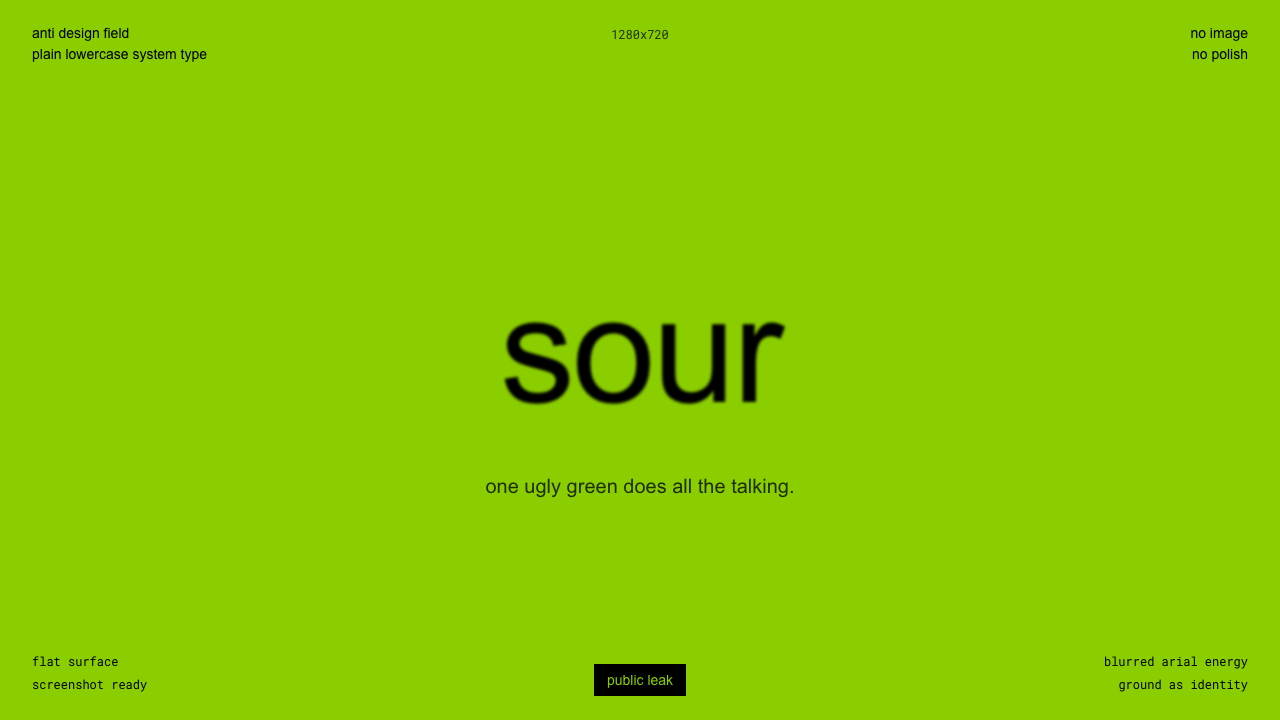
Brat proved a single ugly color could carry a whole brand — one flat acid-green field, one blurred lowercase word, nothing else.
Brat Album Green 2024 in brief
Brat is the branding built around Charli XCX's sixth studio album, released in June 2024, and it strips album art down to a single gesture: one flat, saturated, faintly sickly yellow-green fills the entire frame edge to edge, with the word 'brat' set small, lowercase, and slightly off-register near the center in a plain, deliberately unglamorous sans-serif — the kind of default system typeface associated with basic office documents rather than luxury branding. The type is also visibly blurred, as though photographed off a low-resolution screen or exported at the wrong compression setting.
Nothing else appears. There is no photograph of the artist, no logo, no secondary graphic, no gradient, no shadow, no texture beyond the faint digital noise of the blur itself. Every convention of pop album art — the glamour shot, the elaborate typographic lockup, the color-graded mood board — is refused in favor of a single unadorned field of color. The cover does not sit on a background; the cover is its own background.
That radical flatness was not an accident of minimalism so much as a deliberate anti-polish strategy: a single-color field with one blurred word is trivially easy to reproduce in any basic image editor, which meant fans, brands, and meme accounts could recreate, recolor, and recaption the exact same format within minutes of the album's release. The design's simplicity was its distribution mechanism — an image built to be endlessly, effortlessly copied rather than admired as a finished artifact.
Where does Brat Album Green 2024 come from?
Brat was released in June 2024 as the sixth studio album by Charli XCX, a British pop artist whose earlier work had already leaned into a confrontational, club-adjacent, internet-fluent visual identity — hyperpop textures, deliberately lo-fi visuals, and a general suspicion of conventional pop polish. Brat pushed that instinct to its logical extreme: rather than art-directing an elaborate cover, the album announced itself with almost no imagery at all.
Art direction for the album's stripped-down visual identity is credited to Special Offer Inc., a design studio that worked with Charli XCX to develop the cover's single-color, single-word format. The choice of a plain, generic system typeface over a custom or licensed display face was itself part of the statement: the cover deliberately looks like something anyone could have made in a few minutes, rather than something that required a design budget.
The specific yellow-green quickly became known online simply as 'brat green,' and by the summer of 2024 the color had escaped the album cover entirely, spreading across social media as a shorthand for a particular mood — unruly, hedonistic, unapologetic, and proudly un-polished. Unofficial web tools appeared within weeks letting anyone type their own word onto the same flat green field and export it in the same blurred lowercase type, turning the album cover's format into a shareable meme template used by fans, brands, and strangers with no connection to the album at all.
The aesthetic's reach became a widely reported case study in how far a deliberately minimal, internet-native visual identity could travel outside its original context: in July 2024, after Charli XCX described a sitting U.S. vice president as 'brat' on social media, that politician's own campaign account briefly adopted the same green field and blurred lowercase lettering for its own social media presence — a crossover moment that dominated design and culture commentary that summer as proof that a stripped-down meme format could function as real-world political branding, not just music marketing.
What defines the Brat Album Green 2024 look?
Color
The entire composition is a single flat field of a saturated, faintly sickly yellow-green — a color chosen for feeling deliberately 'off' and slightly unpleasant rather than conventionally attractive, filling the frame edge to edge with no gradient, no vignette, and no secondary hue anywhere.
Typography
The word set on top is small, lowercase, and rendered in a plain, generic system sans-serif rather than a custom display face — a typographic choice meant to look unbranded and unglamorous, almost like a placeholder that was never replaced. The letterforms are also deliberately blurred, as if compressed too far or photographed off a low-resolution screen.
Composition
Placement is radically minimal and slightly imprecise: one word sits near, but not perfectly locked to, the center of the field, with no logo, no supporting graphic, and no secondary element competing for attention. The looseness of the placement reads as intentional carelessness rather than a mistake.
Finish
The overall finish is low-fidelity on purpose — a soft blur, faint digital noise, and a slightly degraded, screenshot-like quality replace the crisp vector polish typical of pop branding, signaling that the image was not meant to look expensive.
Reproducibility
The format functions like a template rather than a finished artwork: a flat color field plus one blurred word is simple enough for anyone to recreate in a basic image editor within minutes, which is precisely what made it spread as a meme rather than stay a static piece of album art.
Restraint
There is a near-total absence of decoration — no photography, no illustration, no shadow, no secondary color, no ornament of any kind — making the style the visual opposite of the maximalist, image-heavy conventions of most contemporary pop-album branding.
Who shaped Brat Album Green 2024?
Charli XCX is the British pop artist behind Brat, released in June 2024 as her sixth studio album. Her earlier visual identity already favored a confrontational, internet-fluent, deliberately un-glossy aesthetic, and Brat's stripped-down cover extended that instinct into a single, radically minimal gesture that became one of the most recognizable album designs of its year.
Special Offer Inc. is the design studio credited with developing Brat's visual identity alongside Charli XCX, translating the album's confrontational, anti-polish sensibility into the single-color-field, single-word cover format that defined its branding.
Anti-design is the broader design tradition Brat draws on — deliberately rejecting conventional good taste, polish, and craft signals in favor of a rougher, more confrontational visual language. In Brat, that shows up as a plain system typeface, visible blur, and a color chosen for being unpleasant rather than beautiful.
Deliberate-ugly branding uses a color, typeface, or composition that reads as unattractive by conventional standards as a way of signaling authenticity and confidence — the idea that a brand secure enough in its identity doesn't need to look conventionally polished to be recognized. Brat's sickly green and blurred lettering are a direct expression of this approach.
Digital-native meme aesthetics describes visual formats designed from the outset to be copied, remixed, and recaptioned across social platforms rather than admired as a fixed image. Brat's flat color field and simple lettering were minimal enough that unofficial tools letting anyone recreate the format appeared within weeks of release, and the aesthetic spread into contexts — including, briefly, political branding — far beyond the original album.
How do you use Brat Album Green 2024 today?
Brat's entire visual power comes from radical reduction, so applying the style well means resisting the urge to add anything back in. The discipline is not just 'use a lurid green' — it's committing to one flat field of color, one small piece of plain, slightly imperfect type, and nothing else competing for attention.
On presentation slides, a cover works as a single flat field of the acid-green (or an equivalently 'off' saturated hue for a different palette) with one small, lowercase, plainly-set word or phrase near center — resist the instinct to center it perfectly or dress it up. Content slides should stay just as minimal: a single statement per slide, generous flat color, and text kept small relative to the field rather than blown up as a dominant headline. Data slides work best as a single number or a short, blunt statement rendered the same way as the cover treatment, rather than a conventional chart — the style doesn't really support dense data visualization, and forcing it in undermines the whole gesture.
For web interfaces, the aesthetic is a poor fit for dashboards or anything requiring dense information hierarchy, but it works well for a single bold landing moment — a waitlist page, a teaser, an event microsite — where one flat color field and one short line of plain type need to stop a scroll. Pricing pages can borrow the confidence of the flat field for a single, standout plan callout, but should not try to extend the style across a full comparison table, which needs more structure than this system provides.
In editorial and marketing contexts, the style suits provocation-first campaigns, single-image social posts, and any moment that needs to look deliberately unpolished and confident rather than art-directed — a poster, a single social tile, a teaser drop. Because the format is inherently easy to copy, it also works well as a participatory campaign device: a flat field plus a short line of plain type invites an audience to remix it themselves, the way the original cover was recreated thousands of times within weeks of release.
The most common mistake is treating this as simply 'pick a bright green' while keeping every other convention of polished branding — a crisp custom typeface, a centered logo lockup, a drop shadow, a gradient. None of that is Brat; the style's entire meaning comes from refusing those conventions, not from the specific hue. A second frequent error is overcrowding the field with multiple lines of text or secondary graphics — the moment there is more than one plain word competing for attention, the deliberate, confident emptiness that makes the style recognizable disappears.
Brat Album Green 2024 — FAQ
Why is the green deliberately unattractive?
Because looking conventionally pleasant was never the goal — the color is closer to a sickly, acidic yellow-green than a fashionable or calming hue, chosen precisely because it reads as slightly 'off.' That discomfort is the point: an unpolished, faintly ugly color signals confidence and authenticity in a way a conventionally attractive palette can't, and it makes the image instantly recognizable against a sea of glossier competitors.
What typeface does the cover use?
The cover uses a plain, generic system sans-serif — the kind of default typeface built into most basic software rather than a custom or licensed display face — set small, lowercase, and visibly blurred. The choice signals that no design budget or custom typography was involved, reinforcing the cover's deliberately un-glamorous, anyone-could-have-made-this feeling.
Why did the format spread as a meme so quickly?
Because it was designed to be copyable: a single flat color field with one small piece of plain type requires no illustration skill or design software beyond the most basic tools to recreate. Within weeks of the album's release, unofficial web tools let anyone type their own word onto the same green field, and the format spread across social media as a shorthand for a specific mood far beyond the album itself.
Did the aesthetic really reach politics?
Yes — in July 2024, after Charli XCX referred to a U.S. political figure as 'brat' on social media, that figure's own campaign account briefly adopted the same flat-green, blurred-lowercase treatment for its own online presence. The moment was widely covered at the time as an unusually direct example of an internet meme aesthetic crossing over into mainstream political branding.
Can this style work without the specific green?
Yes, as long as the underlying logic survives the substitution: a single flat, saturated, slightly 'off' color filling the whole frame, paired with plain, small, lowercase type and nothing else. The specific yellow-green is what made Brat's cover recognizable, but the transferable idea is radical reduction plus a deliberately unpolished, confident typographic gesture — not the exact hue itself.
Related design styles
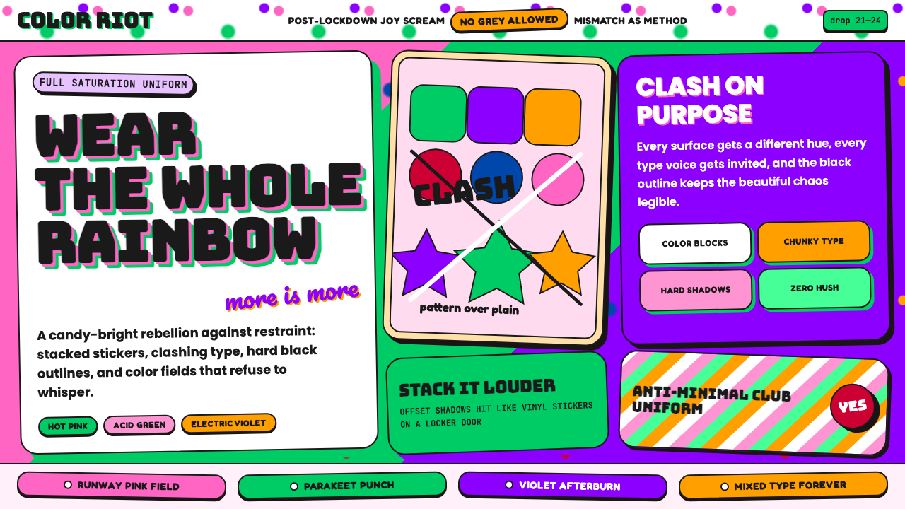 Dopamine Dressing / MaximalismJoy refuses restraint. Hot pink, parakeet green, Bungee type, and brick shado…
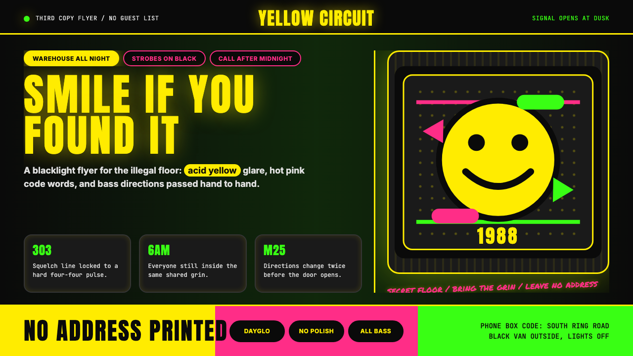 Acid House Smiley (1988)Rave energy hits first. Acid yellow on black, Anton caps, smiley glow.
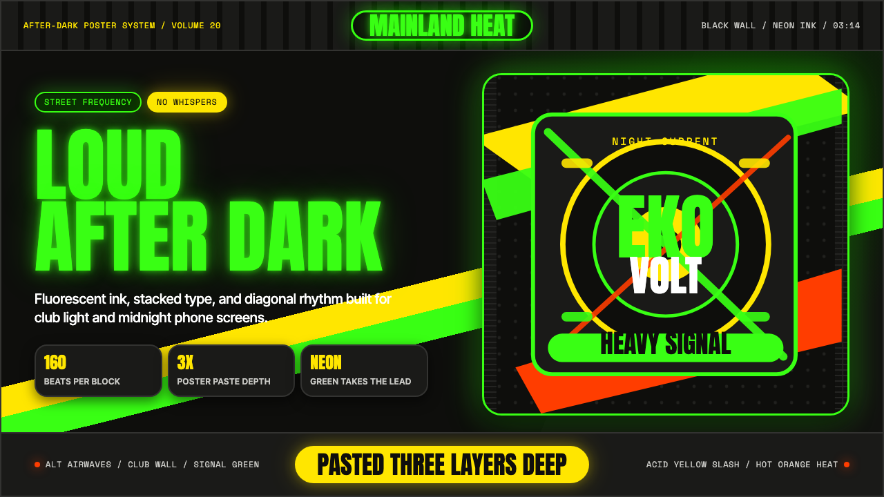 Afrobeats LagosLoud after dark. Neon green type and yellow diagonals hit black like pasted s…
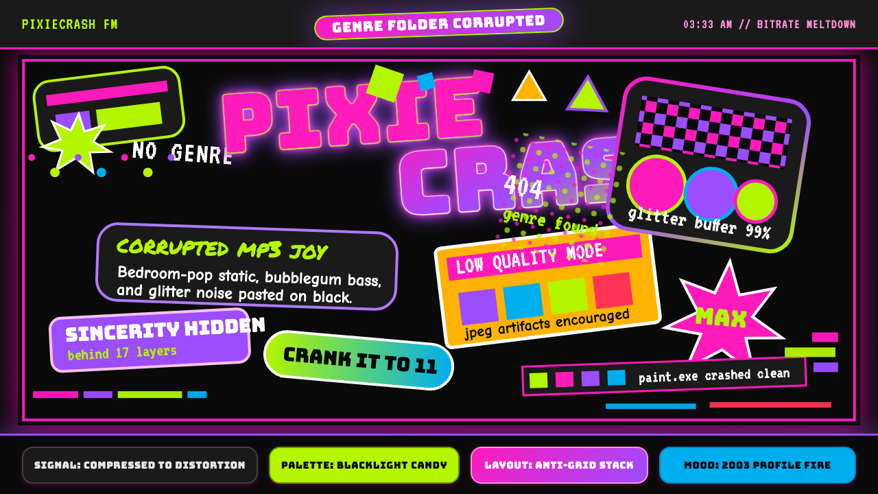 Hyperpop 100 gecs (2019)Cute chaos detonates. Blacklight candy, Bungee type, and pixel trash collide.
 Squid Game (2021)Childhood color turns menacing. Fuchsia, teal, and rigid shape grids enforce…
 90s Aggressive Inline SkateX-Games attitude in plastic and paint. Fluoro lime and magenta slash across m…