What is Dandadan?
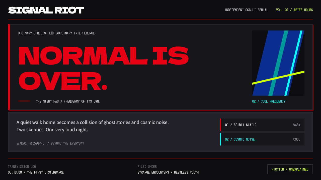
Dandadan's design language is quiet until impact: a near-black ground, a brush-cut red logo, and lime and cyan accents that look like interface pulled straight out of a psychic fight.
Dandadan in brief
Dandadan is the visual language of Science SARU's anime adaptation of Yukinobu Tatsu's manga, which began in 2021 and reached television in October 2024, with a second season following from July 2025. As a design system it lifts the look of the show's official site: a near-black ground, a brush-cut red logo set at the top, and accents of lime and cyan that serve as buttons, tags and character names. The overall effect is of a user interface that has been pulled directly out of a psychic battle.
Its governing principle is restraint followed by explosion. Most of the page is dark, calm and spacious, with large areas of near-black and sparing text. Then, at moments of impact, huge red type breaks through the panels and the full red, lime and cyan palette is released at maximum saturation. The contrast between the quiet surface and the sudden burst is what gives the system its rhythm.
Typography supports the same contrast. Headlines are set in a heavy, blunt Japanese display face with a thick black weight, while timecodes, UFO readings and technical labels use a pixel-dot face that recalls old instrument displays. The two together describe the show's twin worlds: the loud, folkloric world of spirits and the cold, mechanical world of aliens.

Where does Dandadan come from?
The starting point is the manga by Yukinobu Tatsu, published as a web manga on Shonen Jump Plus from 2021. It mixes occult folklore and science-fiction UFO culture in a single teenage story, where spirits and aliens collide in everyday Japan. That blend of the supernatural and the extraterrestrial is the reason the design system has two color worlds rather than one.
The anime was produced by Science SARU, a studio known for fluid, graphic, limited-palette animation that treats each frame like a poster. The source material names Fūga Yamashiro and Naoyuki Onda among the key figures of the adaptation. The first season aired in October 2024 and the second began in July 2025. Both are associated with an unusually bold, almost illustrative approach to color and movement, in which the frame regularly shifts from realistic to abstract in mid-action.
The color logic is credited to the color designer Satoshi Hashimoto, and it is the key to the system. Yokai sections run in warm colors, alien sections run in cobalt and cyan, and everyday scenes sit in desaturated, grainy tones that resemble old photographs. Full red, lime and cyan saturation is held back for impact moments, new episode drops and primary calls to action. That discipline is what keeps the explosions meaningful.
Behind all of it is a broader context of Japanese occult and UFO pop culture, the paperback-and-magazine world of ghost stories, contactee tales and mysterious lights in the sky. The design borrows its ironic seriousness from that tradition: instrument-style readouts, warning-label bluntness and pulp-poster colors, applied to a story that is also funny, romantic and strange.
What defines the Dandadan look?
Near-black ground
Pages sit on a very dark ground that is not quite black, leaving room for subtle texture and grain. This creates the quiet that the system depends on: when the surface is calm, a single red headline or cyan label can feel like an event.
Brush-cut red logo and type
The logo and key headlines are cut like brush strokes in a hot red, with ragged, angled edges. At impact moments the red type is enormous and breaks across panel borders, so that the type itself behaves like a visual effect.
Lime and cyan accents
Lime and cyan are the working accents of the interface, used for buttons, tags, character names and links. They are neon-bright against the dark ground and read as signals, never as decoration, so a page needs only a few to feel alive.
Two color worlds: yokai and alien
Warm reds and oranges belong to yokai sections, while cobalt and cyan belong to alien sections. Switching between them tells the reader which side of the story a block belongs to without a word of explanation.
Desaturated, grainy everyday scenes
Ordinary-life sections are drained of color and given film grain, like old photographs. This makes ordinary sections feel like a held breath and leaves the full-saturation palette available for contrast.
Blunt heavy display type with dot-matrix labels
Headlines use a very heavy, blunt Japanese display face, and small data such as timecodes and UFO readings use a dot-matrix face. The pairing sets monumental against technical, and makes the small text feel like instrument output.
Impact moments reserved for full saturation
Full red, lime and cyan saturation is held back for fights, episode drops and main calls to action. Everything else stays dark, calm and muted, so that the system can escalate when it needs to.

Who shaped Dandadan?
The creator of the manga, whose blend of occult folklore and UFO science fiction is the foundation of the work.
Named in the source material among the key figures of the Science SARU adaptation.
The color designer credited with the rule that governs the palette: warm for yokai, cobalt and cyan for aliens, desaturated for everyday scenes.
Named in the source material among the key figures of the adaptation.
The animation studio behind the series, known for graphic, limited-palette animation that treats each frame like a poster.
How do you use Dandadan today?
In slides, the style suits launch decks, pop-culture talks, gaming and anime presentations, and any deck that wants drama. Use a near-black background, with one huge red word for the cover and lime or cyan labels for categories. Keep content slides dark and quiet, with generous space, and save the full-saturation burst for the one slide that carries the key message. Data slides can use dot-matrix numerals for readouts, with a single neon bar to mark the number that matters.
On the web, it fits anime and series sites, manga serial pages, collaboration campaigns and event pages with fast, dense information. Buttons in lime or cyan stand out immediately on the dark ground, tags can be small bordered labels, and episode lists can be styled as instrument panels with dot-matrix timecodes. Hover and scroll moments are good places to let a red slash or a cyan flash break through, as a controlled impact.
For editorial and marketing, it makes powerful posters, key visuals and social announcements. A single oversized red word cut across a dark photograph, with a cyan label in the corner, communicates energy at a glance. Collaborations with streetwear and merchandise also work well, because the palette is high-contrast and reproduces cleanly on garments and packaging.
Remember that the system is built on contrast. Use full saturation sparingly, ideally for one element per screen, and let the rest of the page stay dark and calm. If everything is neon, nothing is an impact, and the page becomes simply loud.
The most common mistake is to treat it as a generic dark mode with bright accents. Without the brush-cut red type, the grain, the two color worlds and the dot-matrix labels, the result is a standard dark dashboard. Another mistake is to use all three accent colors equally; instead, let red lead, and let lime and cyan serve as signals with clear jobs.

Dandadan — FAQ
What is the Dandadan design style?
It is a design language based on Science SARU's Dandadan anime: a near-black ground, a brush-cut red logo and headlines, and lime and cyan accents that look like interface from a psychic fight. It is quiet until impact, when full-saturation red, lime and cyan break through.
What do the colors mean?
Following the color designer Satoshi Hashimoto's rule for the show, yokai sections run warm, alien sections run cobalt and cyan, and everyday scenes are desaturated and grainy. Full saturation is held back for impact moments, episode drops and calls to action.
Which fonts does it use?
Headlines use the heavy Japanese display face Dela Gothic One, while timecodes, UFO readings and technical labels use the dot-matrix face DotGothic16. The pairing sets a monumental headline against instrument-like small text.
What projects is it good for?
It works for anime and series sites, manga serial pages, streetwear collaborations and fast, dense event pages. It also suits slide decks that want drama, with one burst of saturation placed on the key slide.
What is the most common mistake?
Treating it as a generic dark mode. Without the brush-cut red type, the grain, the two color worlds and the dot-matrix labels, it loses its identity, and using every accent color at full strength at once removes the sense of impact.
Related design styles
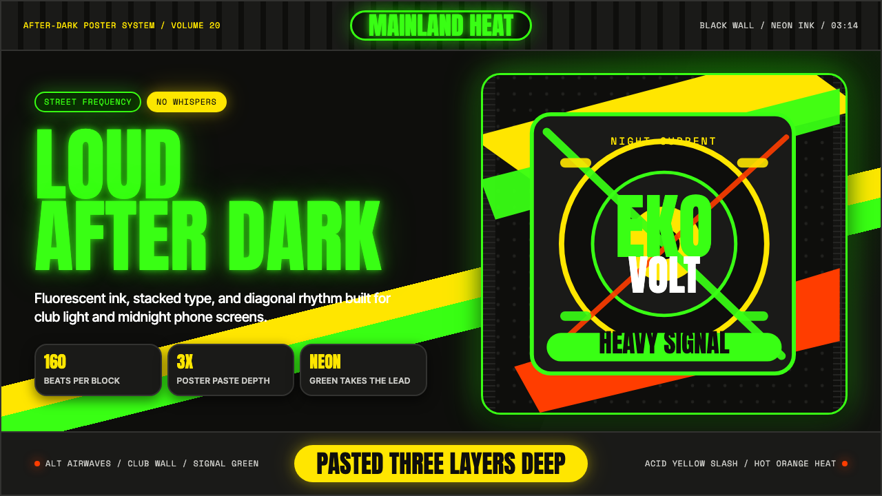 Afrobeats LagosLoud after dark. Neon green type and yellow diagonals hit black like pasted s…
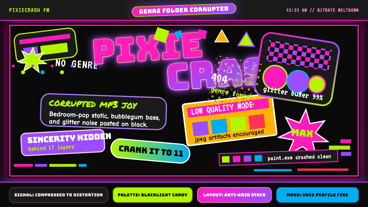 Hyperpop 100 gecs (2019)Cute chaos detonates. Blacklight candy, Bungee type, and pixel trash collide.
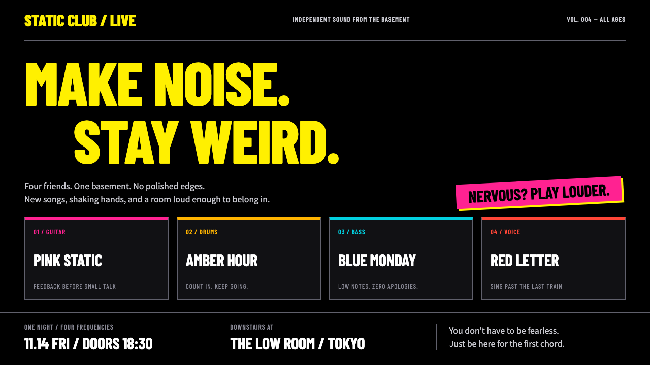 Bocchi the Rock!Nervous energy, turned up. Fluorescent yellow condensed type and four-colour…
 Brat Album Green 2024Ugly green becomes identity. Blurred Arial floats on one flat acidic field.
 Dopamine Dressing / MaximalismJoy refuses restraint. Hot pink, parakeet green, Bungee type, and brick shado…
 Edgerunners NeonNeon overload. Fluorescent yellow, cyan HUD grids, and magenta glitches burn…