What is Bocchi the Rock!?
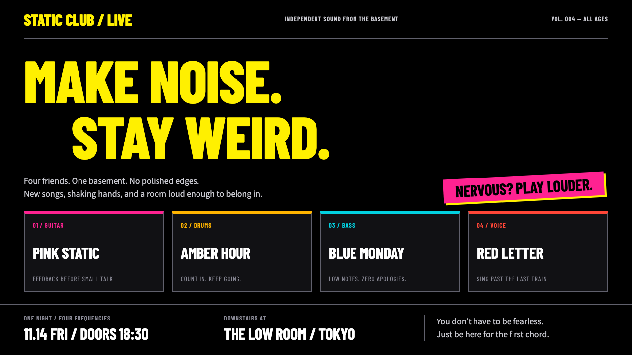
Bocchi the Rock! turns nervous energy up to full volume: fluorescent yellow condensed type and hard four-colour cuts on black, like a flyer from a basement gig.
Bocchi the Rock! in brief
This style is drawn from Bocchi the Rock!, the story of Hitori Gotoh, a painfully shy girl who plays guitar and joins a small band called Kessoku Band. The series began as a four-panel manga in 2017 and became a television anime in October to December 2022, followed by theatrical films in 2024. Its setting is the live-house scene of Shimokitazawa in Tokyo.
The visual system imagines the flyers taped to the door of STARRY, the basement live house where the band plays its first gigs. The ground is pure black. Headings are in a fluorescent yellow condensed type stacked like a setlist, and a hot pink, the colour of Hitori, marks anything that matters most. The other three members each contribute a colour: amber for Nijika, cyan for Ryo and red for Ikuyo.
Underneath the neat flyer layout lies a second mode. When Hitori spirals into anxiety, the anime breaks its own rules and switches to photographs, clay, collage and other handmade effects. The design system mirrors this with a panic mode in which cards tilt, tape shows and inserts burst out of the grid.

Where does Bocchi the Rock! come from?
The source is the manga by Aki Hamaji, which began in 2017 in the Kirara tradition of four-panel comics: short, gag-driven strips about small groups of girls, often with a school or club setting. The format favours tight timing and a bit of exaggeration, and the series quickly built a following for its mix of music passion and social awkwardness.
The 2022 television anime, directed by Keiichirō Saitō, is the source of the most distinctive visual ideas. Its main trick is visual comedy. When the heroine is overwhelmed, the picture itself breaks down: the anime swaps to live-action photographs, clay models, deformed drawings and parody effects. The studio treated the screen as a space where graphic style could change as quickly as a mood.
The title sequence and the series' artwork lean on poster design. The ending and the band's materials use bold, hand-lettered or condensed titles, bright blocks of colour and a flyer-like rawness that fit the live-house setting. Kerorira, the artist credited with the series' image and design work, is associated with that look.
The setting itself, Shimokitazawa, is a Tokyo neighbourhood known for small music venues, record shops and a youth culture that thrives in basements. The visual system takes that environment seriously: posters, tape, photocopied textures and handwritten setlists are part of the pictures. Combined with the anime's habit of mixing media for gags, the result is a style that feels both cute and punk.
What defines the Bocchi the Rock! look?
Pure black ground
Everything sits on black, like a poster seen in a dim corridor. The black lets bright colours glow, and it gives the whole system the feeling of a night-time venue.
Fluorescent yellow headings
Headlines are set in a bright, almost electric yellow, in a tall condensed face. Lines are stacked tightly like a setlist or a lineup on a gig poster, so a page reads as a list of acts.
Hitori's hot pink
A vivid pink is reserved for what matters most: the primary button, the key label, the thing to click. Its strength comes from how rarely it appears.
Four band colours
Amber, cyan, red and pink map to the four members. They work as category colours for tags, buttons and chart series, so a data view can borrow the identity of the band.
Hard, cut-out edges
Colour comes in sharp flat blocks with no gradients or soft shadows, as if cut from paper or printed in a few inks. The result is raw and graphic, closer to a photocopied flyer than a polished app.
Panic mode
In moments of tension, cards tilt, gaffer tape shows at their corners and photographs or clay-style inserts break the grid. It is the style's comic release valve, used deliberately and sparingly.

Who shaped Bocchi the Rock!?
Creator of the original manga, which debuted in 2017 as a four-panel series.
Director of the 2022 television anime, whose mixed-media visual gags shaped its look.
Artist credited with the series' image and design work, associated with its bold poster-like style.
How do you use Bocchi the Rock! today?
In slides, Bocchi the Rock! is a perfect fit for band pitches, music-industry talks, anime-themed presentations and creative-team introductions. Use a black cover with a stacked yellow title and a single pink accent. For content slides, keep everything black and yellow and give each speaker or topic one of the four colours. For data slides, assign the four colours to series, and use the panic mode, with a tilted card and a visible strip of tape, for one surprising number.
On the web, it suits band pages, ticketing sites, live-music calendars, independent label stores and fan projects. A lineup can be a stacked list of yellow condensed titles, each with a small coloured tag for the genre or venue. Buttons should be hard-edged rectangles in pink, and cards should sit square on black, tilting only when hovered or in an error or celebration state.
In editorial and marketing work, it makes strong gig posters, zines, campaign flyers and festival announcements. Because the system imitates a photocopied flyer, it benefits from roughness: visible tape, slightly misaligned blocks and a mix of photographs with flat colour all feel right.
It can also bring humour into otherwise serious products, such as a music app's empty state or a bug report page, by using panic mode for the moment when something goes wrong.
The most common mistake is to use all four band colours with equal weight, which turns the page into a rainbow. Yellow and black should dominate, with pink as the single accent and the other colours kept for categories. The second mistake is to leave panic mode on everywhere: chaos is only funny when the layout around it is orderly.

Bocchi the Rock! — FAQ
What is the Bocchi the Rock! design style?
It is a dark, flyer-inspired system based on the series: pure black ground, fluorescent yellow condensed headings stacked like a setlist, hot pink for key actions and four band colours, with an optional panic mode of tilted cards and tape.
Where does it come from?
From the manga by Aki Hamaji, which began in 2017, and the 2022 television anime directed by Keiichirō Saitō, set in the live-house scene of Shimokitazawa, Tokyo. Theatrical films followed in 2024.
What is panic mode?
A deliberate break in the layout inspired by the anime's gags: cards tilt, tape shows, and photographs or clay-like inserts burst through the grid. Use it for rare, expressive moments rather than as the default state.
Which projects suit this style?
Band and music pages, gig posters, independent labels, anime and fan projects, and creative-team presentations. It is less suited to formal finance, healthcare or other contexts that need a calm, neutral tone.
How do I keep it readable?
Keep body text light on black with generous contrast, reserve the yellow condensed face for short headings, and avoid placing coloured text on coloured blocks. The energy should come from structure and colour blocks, not from hard-to-read type.
Related design styles
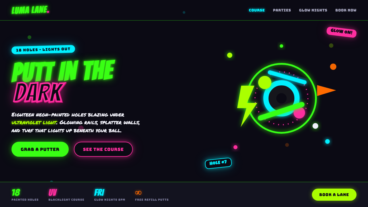 Blacklight Mini-GolfFamily-arcade kitsch under UV light. Day-glo green and hot pink glow off a bl…
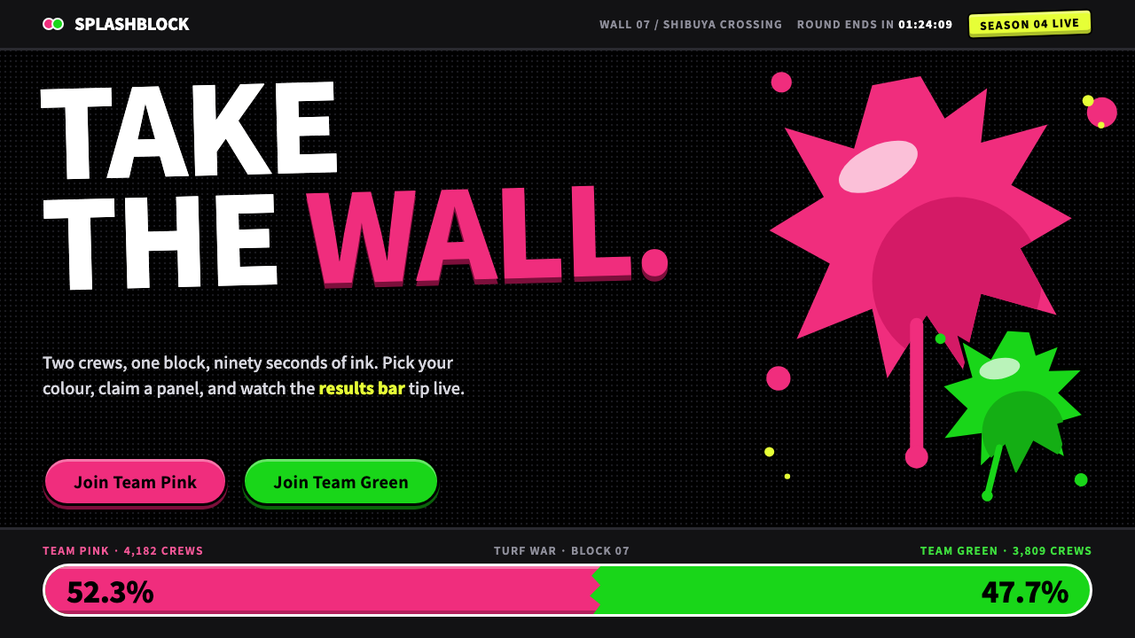 SplatoonTwo inks, one black wall. Fat 900-weight type, glossy ragged splats and tilte…
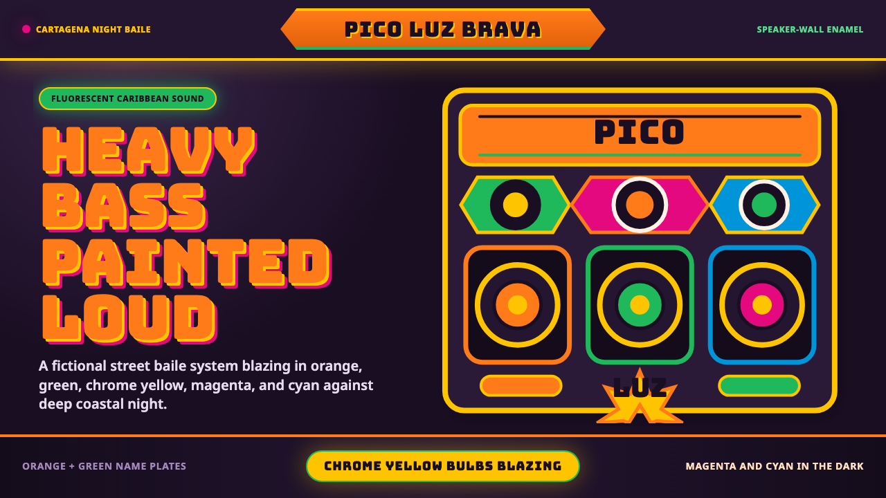 Champeta Picó SoundLoud after dark. Orange-green banners and fat Bungee type glow like a speaker…
 DandadanQuiet until impact. Massive red type breaks near-black panels; cyan and lime…
 Jujutsu KaisenCrimson only at impact. Ink-black night, purple cursed glow, brush kanji and…
 TikTok 2024Attention vibrates. Near-black feed, cyan-magenta offsets, and vertical frame…