What is Splatoon?
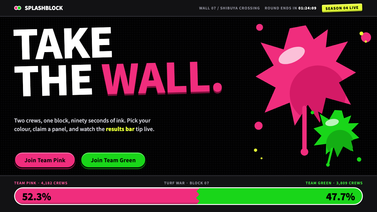
Splatoon turned a shooter into a street-fashion poster: two teams of glossy ink fighting over one black wall, with fat round type, crowded stickers and not a drop of military grit.
Splatoon in brief
The Splatoon Ink Turf War style is a loud, dark-ground pop aesthetic based on Nintendo's ink-shooter series. Black panels are covered in a dot-matrix pattern of tiny squids, and two opposing inks, a hot pink and a neon green, fight across them. Splats have drips and stray droplets, stickers sit at tilted angles, and every number is set fat and round.
What defines the style is its tone. Ink here is glossy toy paint, never blood and never anything tactical. The competition is cheerful and teasing: two teams, two colors, one wall. This friendly, rowdy attitude is what separates it from the grim, desaturated palettes that most shooter games use, and it is the reason the style can work for events, communities and youth brands.
Layouts are crowded on purpose. Posters overlap, gear cards stack, stage cards and results bars are packed edge to edge, and no space is left to feel empty. The effect is the visual noise of a street full of fliers, made coherent by a strict system of two colors, fat letters and a dark ground.

Where does Splatoon come from?
Splatoon first appeared on the Wii U on May 28, 2015, and its sequel, Splatoon 2, arrived on the Switch on July 21, 2017. It was made in Kyoto, Japan, by Nintendo, as a new franchise at a time when the company was best known for long-running series. Hisashi Nogami, Tsubasa Sakaguchi, Yusuke Amano and Seita Inoue are listed among its key creative figures.
The game's visual identity borrowed from the streets of Japan. Shibuya street fashion, with its layered logos, stickers and sneaker culture, is the most obvious influence. The neon sportswear of the 2010s supplied the saturated color pairings and glossy surface treatments, and idol-unit pop supplied the idea that teams, in-world celebrities and branding could be as important as the gameplay itself.
A defining design decision was to make a competitive shooter look like fashion. Instead of weapons and armor, players choose clothing, shoes and headgear, which appear in the interface as collectible gear cards. Instead of grey, brown and green military tones, the world is saturated, bright and graphic. The user interface is not a neutral overlay but part of the world's street-poster visual identity.
The typography is part of that identity. The title and number lettering is fat, rounded and hand-drawn, often described as a squid-themed font, with irregular edges that feel closer to marker than to machine. When this style is applied to a web or slide system, that letterform becomes the anchor: heavy, friendly and just a bit sloppy.
What defines the Splatoon look?
Two opposing inks
Each screen chooses two competing colors, typically a hot pink and a neon green, and lets them fight. The pair is the structure of the page: one ink for one side, the other for the opposite. A third accent is rarely needed, because contrast between two saturated colors already provides all the energy.
Black wall with squid dot-matrix
The ground is a pure black panel covered in a regular grid of tiny squid icons, like an LED sign on a Shibuya building. The pattern is subtle but constant, and it makes the black feel like a surface that can be painted on, not an empty background.
Ragged, glossy splats
Ink shapes have irregular edges, drips and loose droplets around them, and a glossy sheen that reads as toy paint. Splats work as backgrounds for text blocks, as dividers between sections and as emphasis behind a key number. They are organic shapes in a layout otherwise made of hard rectangles.
Fat, round lettering
Headlines and numerals use a very heavy, rounded, hand-drawn letterform with slightly uneven edges. It reads instantly, even small, and it makes numbers feel like scores. Body text is kept plain and light by comparison so that the contrast between shouting and speaking is clear.
Tilted stickers
Labels, badges and tags are set at slight angles, as if slapped on by hand. The tilt is small and consistent, never random enough to cause confusion. It signals that the interface is playful and made by people, and it breaks the stiffness of grid layouts.
Crowded card layouts
Gear cards, stage cards, posters and results bars are packed tight and often overlap. Density is a deliberate choice: it recreates the feeling of a street wall covered in fliers. Order comes from repeated card shapes and from the strict limitation to two colors and one lettering style.
Playful, never tactical
Nothing in the style signals war. There are no camouflage tones, no stencil crosshairs, no weathered metal. The ink is bright and glossy, the shapes are rounded, and the humor is teasing. This keeps the style approachable for younger audiences and non-gamers alike.

Who shaped Splatoon?
Nogami is credited among the key creative figures behind the Splatoon series. His name is tied to the series' origin at Nintendo in Kyoto, where a new team set out to build a shooter with a very different tone from the genre's norm.
Sakaguchi is another of the series' credited key figures. The team's shared decision to treat ink as glossy toy paint, rather than as violence, is one of the choices that gives this design system its friendly, street-poster character.
Amano is listed among the principal creators of the series. The strong, graphic, fashion-minded presentation that distinguishes the game, from its gear cards to its stage posters, is the product of this kind of team design thinking.
Inoue is also credited among the key figures. Along with the others, he is part of the group whose work defined a bright, saturated, instantly readable look for a new Nintendo franchise, which later became a reference point for neon, ink-based interface design.
How do you use Splatoon today?
In slides, this style is ideal for event covers, team announcements, game nights, workshops and youth programs. A black slide with a squid dot-matrix, one huge fat headline and two clashing ink splats immediately sets the mood. For content slides, pick one pair of colors for the whole deck and assign them roles, such as pink for the problem and green for the answer. Data slides can use results bars, with two colors showing the two sides of a comparison.
On the web, it suits community sites, game and esports pages, event microsites, youth-oriented shops and music or festival promotions. A landing page can be built from stacked cards, each with a tilted sticker label and a splat behind its headline. Pricing or plan pages work well as gear-card style tiles. Buttons should be fat, rounded and glossy, with a little tilt on hover to reinforce the sticker feel.
In editorial and marketing work, it fits street-style posters, social covers, tournament announcements, limited-edition drops and campaign flyers. Short, cheerful, slightly cheeky headlines suit it best. Overlap elements deliberately, but keep one clear focal point per layout so the crowding reads as a poster, not a mess.
Hold the system to two inks per screen. When a page needs more categories than two colors can carry, vary shape or label rather than adding a third saturated hue.
The most common mistake is making it serious. Dark, desaturated tones, thin type or tactical iconography drain the style of its playfulness and leave only an odd black page. A second mistake is crowding without structure: tight layouts work only if card shapes repeat, the colors stay limited and the lettering stays consistent. A third is using the ink effect on body text, which makes long reading nearly impossible.

Splatoon — FAQ
What is the Splatoon Ink Turf War style?
It is a loud, dark-ground pop style based on Nintendo's Splatoon. It combines a black wall covered in a squid dot-matrix, two opposing neon inks with drips and droplets, fat rounded lettering, tilted stickers and crowded cards of gear and results. Its tone is playful, not tactical.
Where did the look come from?
It came from Nintendo's game series made in Kyoto, with the first game released on May 28, 2015 for the Wii U and the sequel on July 21, 2017 for the Switch. The visual influences include Shibuya street fashion, 2010s neon sportswear and idol-unit pop, all combined with a hand-drawn squid-style lettering.
Why does it use only two colors at a time?
The game is about two teams fighting over one space, so the color system is built around a pair of opposites. Limiting each screen to two saturated inks keeps a very loud layout readable and gives the page an immediate sense of conflict and balance. Extra categories are handled through shape and labels.
Is it suitable for professional or corporate content?
Generally not. It is built for energy, humor and street-level attitude, so it fits events, communities, youth brands and entertainment better than finance, healthcare or legal services. If you need to borrow from it, use only the fat lettering and a single accent ink on an otherwise calm layout.
How do I keep a crowded layout from becoming messy?
Repeat the same few card shapes, keep to two colors per screen, use a single lettering style, and give every layout one clear focal point. Let overlap and tilt be consistent in size and direction. Structure comes from repetition, so the crowding reads as deliberate and energetic instead of random.
Related design styles
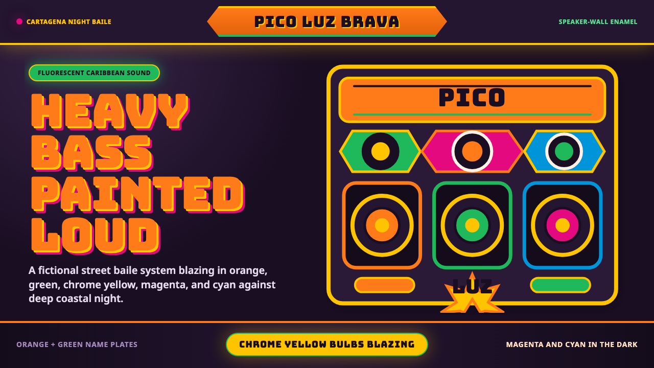 Champeta Picó SoundLoud after dark. Orange-green banners and fat Bungee type glow like a speaker…
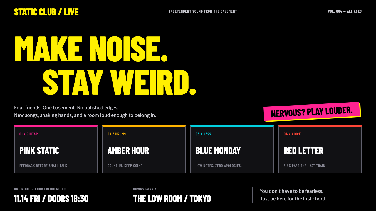 Bocchi the Rock!Nervous energy, turned up. Fluorescent yellow condensed type and four-colour…
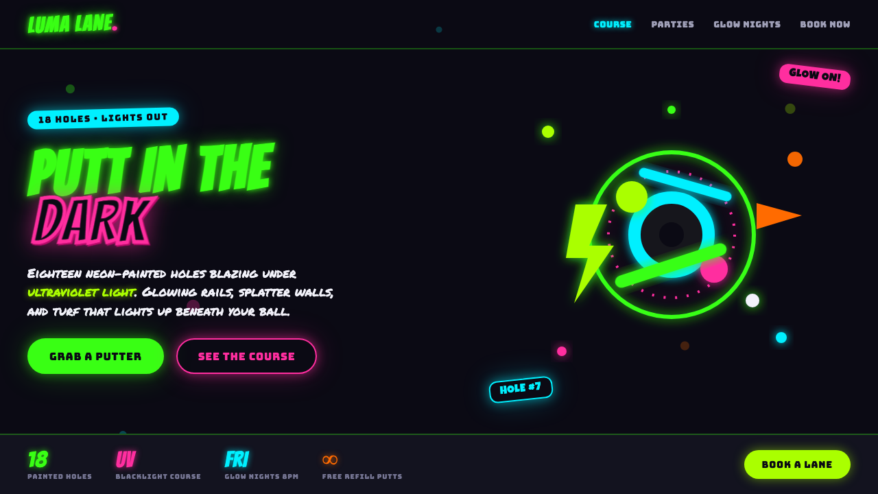 Blacklight Mini-GolfFamily-arcade kitsch under UV light. Day-glo green and hot pink glow off a bl…
 Ghana Barber Shop SignsChoice becomes a painted language. Chrome-yellow codes cut across an enamel-b…
 Redline Space RaceSpeed made violent. Ink-black mass, racing red, chrome yellow, and diagonal k…
 DanganronpaSweet ink, vicious tension. Hot-pink Anton capitals collide on white with har…