What is Danganronpa?
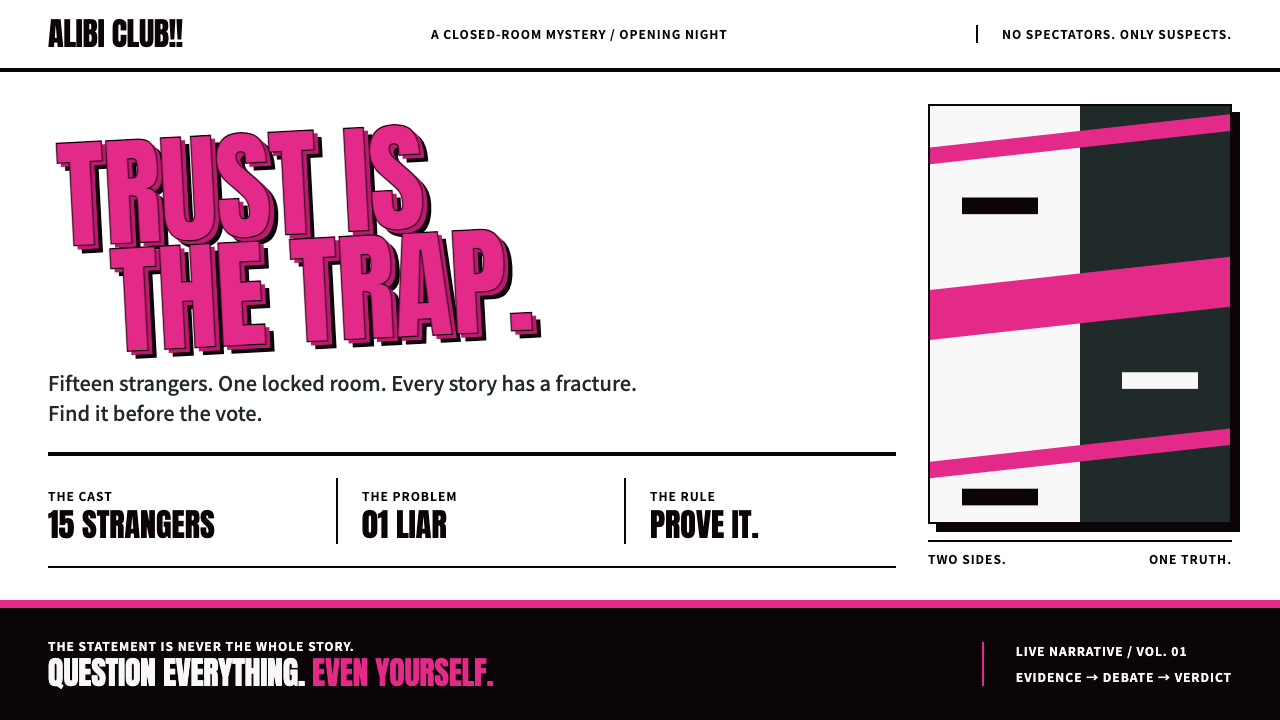
Danganronpa's look is sweet ink with vicious tension: hot-pink capitals stacked until they collide on a white poster ground, held up by hard black offsets and diagonal cuts.
Danganronpa in brief
Danganronpa is the visual language of Spike's 2010 murder-mystery adventure game, in which students trapped in a school are pushed to kill one another under the supervision of the bear Monokuma. This system takes the game's key art, which is often described as psycho-pop, and turns it into a working interface language: a white poster ground, hot-pink capitals stacked so tightly that they collide, and a black school silhouette cutting across the bottom.
Pink does the shouting. Headlines, evidence, buttons and paint-splash blocks all use the same hot pink, set in a heavy condensed capital face that fills the width of its container. Black and charcoal do the structural work, forming the frames, silhouettes and hard offset shadows that anchor the pink. Monokuma's jagged red eye is held back for one purpose only: it appears when something is guilty.
The result is an interface that looks printed rather than rendered. Panels tilt, edges are cut on the diagonal, type overlaps images, and surfaces are flat color blocks with a hard black shadow instead of a soft glow. It is cute and menacing at once, which is exactly the tension of the original game.

Where does Danganronpa come from?
The game was released in 2010 on the PSP in Japan by Spike, and reached English-speaking players in 2014 as Trigger Happy Havoc. The source material places the key-art look in the period from 2010 to 2014. Kazutaka Kodaka, the writer of the game, Rui Komatsuzaki, the character designer, and Masafumi Takada, the composer, are named in the source material among the key figures of the work. Together they gave it a distinctive mix of cheerful and sinister tone across story, art and sound.
Its roots lie in the Japanese visual novel and the closed-circle mystery: a small group of people confined together, a crime among them, and a process of investigation and accusation. Danganronpa updates this structure by turning the investigation into a series of classroom trials, with a dramatic, theatrical sensibility. The interface that surrounds the trials had to feel like a stage set, and the strong graphic language of the key art provided it.
The second influence is pop-art collage. Stacked type, flat color blocks, torn shapes and splash patterns are inherited from the posters of the sixties and seventies, then pushed into a more aggressive register. Instead of the soft consumer optimism of classic pop art, the collage here is used to deliver a sense of dread dressed in candy colors, with a deliberately jarring contrast between the packaging and the content.
That contrast is the core of psycho-pop. Pink, the color of sweets and toys, is attached to violence and deceit, and the cheerful capital letters announce terrible things. The design system preserves that discomfort. It does not tone down the pink to be tasteful, and it does not darken the whole page to be grim; the clash itself is the identity.
What defines the Danganronpa look?
White poster ground
Pages sit on clean white, like a poster pasted on a wall. White gives pink and black maximum contrast and makes the printed, flat quality possible. It is a surprising choice for a murder story, and the surprise is part of the effect.
Hot-pink capitals stacked until they collide
Headlines use a heavy condensed capital face in hot pink, set with almost no line spacing so that lines touch or overlap. The type fills its container and feels like a shout. Pink also carries evidence, buttons and splash shapes, so the color means voice.
Hard black offset shadows
Elements cast solid black offsets with no blur, as if a second layer had been printed slightly out of register. These shadows give depth without softness, and they keep every card and button looking like cut paper.
Black school silhouette
A black silhouette of a school building cuts across the base of the layout, grounding the page and signaling the closed setting of the story. It acts as a heavy footer that holds the whole composition down.
Diagonal cuts and tilted panels
Panels are rotated slightly and edges are sliced at an angle, so the grid never feels settled. The tilt creates tension and speed, similar to a manga spread, and it keeps the layout from reading as a calm corporate template.
Monokuma's red eye as a guilt signal
The jagged red eye of the bear mascot appears only when something is guilty. Because red is otherwise absent, it becomes the single most meaningful mark on a page, a signal that is hard to ignore.
Printed, never polished
Surfaces are flat blocks of color with sharp edges, never glossy highlights, glows or photographic gradients. The look resembles screen-printed posters and cut-out collage, which keeps the interface honest and a little rough.

Who shaped Danganronpa?
Named in the source material as a key figure of the game; the mystery structure and dark comic tone originate with him.
Named in the source material as a key figure of the game, associated with its character art and bold, graphic look.
Named in the source material as the composer, whose music gave the game its cheerful and sinister sound.
The publisher that released the game on PSP in Japan in 2010.
How do you use Danganronpa today?
In slides, the style suits storytelling, true-crime and mystery topics, game-industry talks and any deck that wants tension. A white cover with a pink stacked headline and a black silhouette at the base is enough to set the tone. For content slides, use a tilted panel with a black offset shadow for each key point, and let pink highlight a single word. Data slides can show numbers in huge pink capitals, with evidence-style labels pinned beside them.
On the web, it fits narrative pages, game and visual-novel sites, event teasers, quizzes and any interface built around reveals. Buttons are pink blocks with a hard black shadow that shifts on press, cards are slightly tilted, and section dividers are diagonal cuts. The red eye can be used as a status indicator for the single most important alert, such as a final result or an error.
For editorial and marketing, it produces strong posters, album-style covers and social announcements. Type can be stacked in pink over a black-and-white photograph, with a splash shape behind it, and the whole piece will read like a printed handbill. It is particularly effective for campaigns that want a twist or a reveal, because the contrast between sweet color and dark subject creates curiosity.
Discipline in the palette is essential. Pink and black do almost everything, white is the ground, and red is rare. If red is used as a general accent, the guilt signal loses meaning. Keep pink for voice and structure in black, and the page will stay sharp.
The most common mistake is to soften it: swapping the condensed capitals for a gentle rounded sans-serif, adding blur to the shadows or tidying the tilted panels into a straight grid. That produces a bubblegum-pink template that has lost its menace. The tension between sweet and vicious is the whole point, and each softening move releases it.

Danganronpa — FAQ
What is the Danganronpa design style?
It is a design language based on the psycho-pop key art of Spike's 2010 murder-mystery game: a white poster ground, hot-pink capitals stacked until they collide, hard black offset shadows, a black school silhouette and tilted, diagonally cut panels. It is sweet in color and vicious in mood.
What does psycho-pop mean?
It describes pop-art collage turned toward dread: cheerful candy colors and bold type are used to deliver violent or unsettling content. The clash between the packaging and the subject creates the tension that defines the look.
When should the red eye appear?
Only when something is guilty. Red is otherwise absent from the system, which makes the jagged red eye of Monokuma a rare and unmistakable signal, suitable for a final verdict, a critical alert or an error state.
What kinds of projects suit it?
It suits narrative pages, game and visual-novel sites, mystery and true-crime content, quizzes, teasers and posters. Anything that benefits from tension, a twist or a mischievous edge is a good fit.
What is the most common way to ruin it?
Softening it. Rounded type, blurred shadows, straight tidy grids and using red as a general accent all dilute the clash between sweet and vicious, leaving a generic bubblegum-pink template.
Related design styles
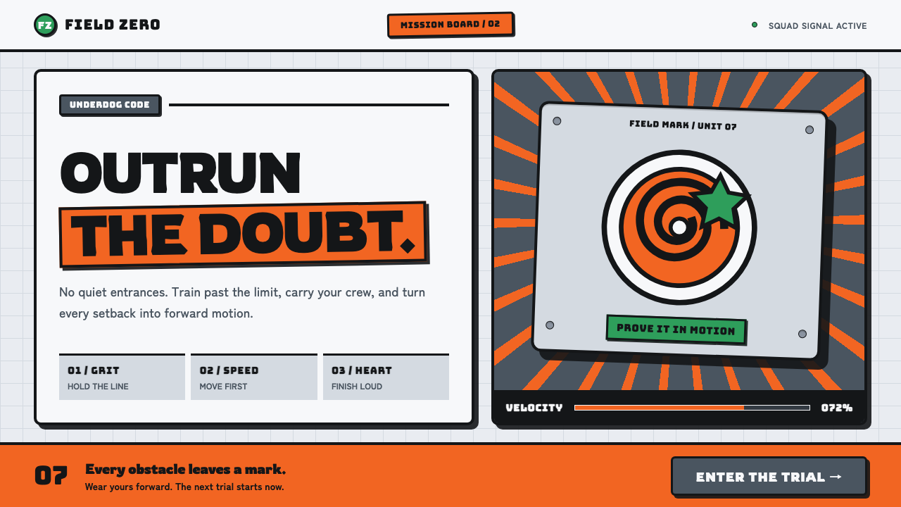 Naruto (2002 anime era)Underdog energy refuses the background. Hazard orange strikes steel-gray grid…
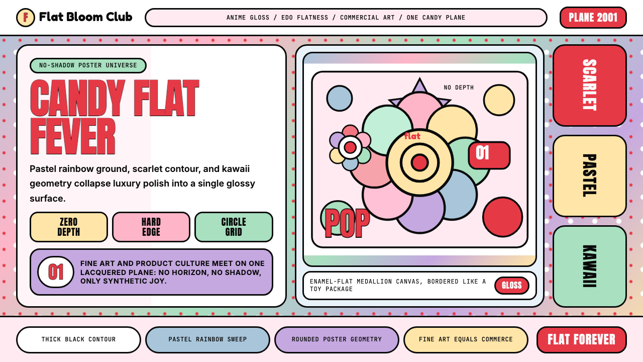 Takashi Murakami SuperflatJoy has no depth. Pastel rainbow, scarlet accents, and black contours flatten…
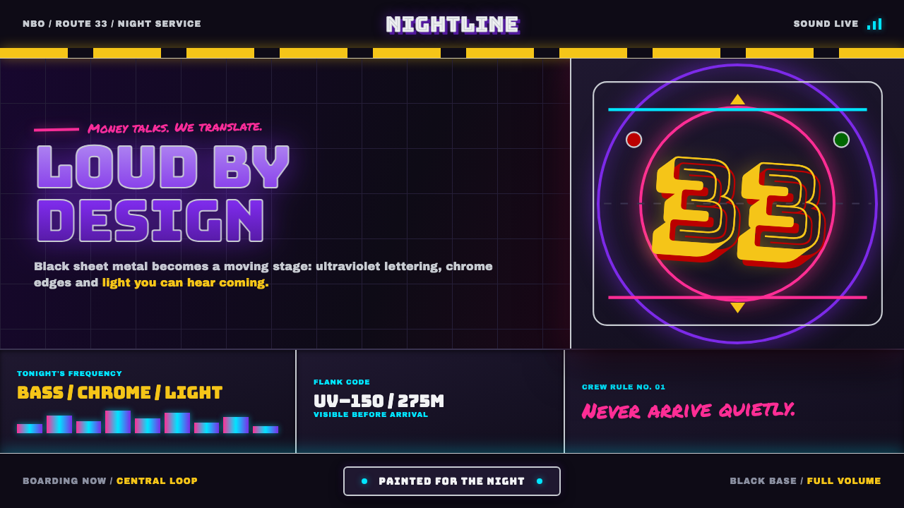 Nairobi Matatu ArtBuilt to be unmissable. Neon airbrush and chrome blaze across night-black hor…
 Nigerian Nollywood DVD Poster (2010)Market-stall cinema shouts. Tomato red type and yellow burst collide on jet b…
 Rick and MortyCartoon chaos goes nuclear. Acid green portals, cyan jolts, yellow panic, thi…
 Squid Game (2021)Childhood color turns menacing. Fuchsia, teal, and rigid shape grids enforce…