What is Spotify Dark?什么是 Spotify Dark?
Spotify's near-black canvas and phosphor-green play button became the universal visual shorthand for music streaming — a design language so consistent it defined an entire product category.Spotify 的近黑画布与磷光绿播放键,已成为全球音乐流媒体的视觉符号——一套连贯到足以定义整个产品类别的设计语言。
Spotify Dark in briefSpotify Dark 速览
Spotify Dark is the visual design system developed by Spotify from its early years in Stockholm, built around a deep near-black surface, a single vivid green as its sole accent color, and album artwork as the primary visual content. The interface treats the music — its cover art, artist imagery, and playlist visuals — as the dominant graphic element, while all structural chrome recedes to near-invisibility.Spotify Dark 是 Spotify 自斯德哥尔摩创业初期逐步建立的视觉设计体系:深邃的近黑色表面、作为唯一强调色的鲜亮绿色,以及作为主要视觉内容的专辑封面。这套界面将音乐本身——封面图、艺术家形象与播放列表视觉——置于最突出的位置,而所有结构性界面元素则退隐至几乎不可见的程度。
The system's discipline is rigorous: surfaces remain flat and dark, typography is clean and unadorned, and the signature green appears only where interaction matters most — play controls, progress indicators, active states, and selected items. This scarcity of color gives the accent its power. Because it appears nowhere decoratively, every green element communicates a clear functional message.这套体系的自律极为严苛:表面保持平坦与深色,字体干净而无装饰,标志性绿色只出现在交互最关键的节点——播放控件、进度条、激活状态与已选项目。正是这种色彩的稀缺性赋予了强调色力量。因为它从不出现在装饰性位置,每一处绿色元素都传递着清晰的功能信息。
Spotify Dark also proved that a brand's visual language can extend well beyond a single application. The annual Spotify Wrapped campaign — which turns personal listening data into shareable visual cards — demonstrates the system's flexibility, transforming analytical data into an emotionally resonant, culturally viral format while remaining immediately recognizable as Spotify.Spotify Dark 还证明了一套视觉语言能够延伸至单一应用之外。每年十二月的 Spotify Wrapped 活动——将个人聆听数据转化为可分享的视觉卡片——展示了这套体系的弹性:它将分析性数据变成了富有情感共鸣、引发全民社交传播的格式,同时依然让人一眼认出是 Spotify。
Where does Spotify Dark come from?Spotify Dark 从何而来?
Spotify launched in October 2008 out of Stockholm, Sweden, founded by Daniel Ek and Martin Lorentzon. The service entered a market still dominated by physical media and illegal downloads, and its visual identity needed to accomplish something ambitious: make digital music feel premium, organized, and immediately accessible. The early interface established the core visual logic — dark background, content-forward card grid, green as the single functional accent — that would persist through nearly two decades of product evolution.Spotify 于 2008 年 10 月在瑞典斯德哥尔摩正式上线,由 Daniel Ek 与 Martin Lorentzon 共同创立。这项服务进入了一个仍由实体媒介和非法下载主导的市场,其视觉标识需要完成一件雄心勃勃的事情:让数字音乐感觉高端、有序且触手可及。早期界面确立了核心视觉逻辑——深色背景、内容优先的卡片网格、绿色作为唯一功能性强调色——这套逻辑贯穿了近二十年的产品演进。
The choice of a deep, near-black surface was partly aesthetic and partly functional. Dark backgrounds make album artwork — itself a rich, varied visual medium developed over decades of vinyl and CD design — pop with maximum contrast. Every album cover becomes a self-contained visual statement against the dark ground. This approach positioned Spotify as a frame for the music rather than a product competing with it, a subtle but important distinction that shaped the entire feel of the interface.选择深邃的近黑色表面,既有美学考量也有功能原因。深色背景能让专辑封面——这一经过数十年黑胶与 CD 设计积淀而成的丰富视觉媒介——以最大对比度呈现出来。每张专辑封面在深色底面上都成为一个自成一体的视觉陈述。这种做法将 Spotify 定位为音乐的框架而非与之竞争的产品,一种微妙但至关重要的区分,塑造了整个界面的气质。
Tobias Ahlin, who served as Spotify's lead designer during a formative period, helped codify the visual system's principles around content-over-chrome: the interface should disappear as much as possible, leaving the user in direct relationship with the music. This philosophy aligned with a broader shift in digital product design away from the skeuomorphic textures of early mobile software toward flatter, more content-focused interfaces — but Spotify arrived at the approach through its own reasoning rather than simply following industry trends.曾在 Spotify 关键成长期担任首席设计师的 Tobias Ahlin,帮助将这套视觉体系的原则系统化为「内容先于界面」:界面应尽可能隐退,让用户与音乐建立直接关系。这一理念与数字产品设计从早期移动软件的拟物化纹理转向更扁平、更以内容为中心的大趋势相契合——但 Spotify 是通过自身的推演而非单纯跟随行业潮流得出这一路径的。
Spotify Wrapped, which debuted in its current shareable format in 2016, represented a significant expansion of the design system's reach. By applying the brand's visual language to personal data — listening time, top artists, genre percentages — the Wrapped campaign transformed a data visualization exercise into a cultural ritual. The visual system had to be expressive and flexible enough to carry personal narrative weight while remaining clearly Spotify. The bold typography, high-contrast color blocking, and restrained layout that Wrapped employs are direct extensions of the dark interface's underlying principles.Spotify Wrapped 以当前可分享格式于 2016 年正式亮相,代表着这套设计体系影响力的重大扩张。通过将品牌视觉语言应用于个人数据——聆听时长、常听艺术家、流派占比——Wrapped 活动将数据可视化练习转化为一种文化仪式。这套视觉系统必须足够富有表现力与灵活性,以承载个人叙事的情感重量,同时清晰地保有 Spotify 的辨识度。Wrapped 所使用的粗重字体、高对比度色块与克制的版面,正是深色界面底层原则的直接延伸。
What defines the Spotify Dark look?Spotify Dark 的视觉特征是什么?
Near-Black Surface近黑色表面
The foundational surface is a very deep, slightly warm near-black — dark enough to create maximum contrast with album artwork, but not a pure flat black that would feel cold and harsh. This near-black is consistent across all surfaces: sidebars, main content areas, and modal overlays all share the same depth, creating visual continuity that lets content elements stand out without the interface itself competing for attention.基础表面是一种极深、略带暖意的近黑色——深到足以与专辑封面形成最大对比,但又不是会显得冰冷生硬的纯平黑。这种近黑色贯穿所有表面:侧边栏、主内容区与模态遮罩层共享同一深度,形成视觉连贯性,让内容元素自然突出,而界面本身不与之争夺注意力。
Single-Accent Green单一强调绿
The entire design system operates with a single, vivid green as its sole accent color. This restraint is the system's most distinctive discipline: green does not appear in backgrounds, decorative elements, or illustrations — only in interactive controls, active states, and progress indicators. The color's scarcity is its power; because it appears nowhere arbitrary, every instance of green carries clear functional meaning and draws the eye precisely where the system intends.整套设计体系以一种鲜亮的绿色作为唯一强调色运作。这种克制是该系统最显著的自律:绿色不出现在背景、装饰元素或插图中——仅出现于交互控件、激活状态与进度指示器。色彩的稀缺性正是其力量所在;因为绿色从不随意出现,每一处绿色都承载清晰的功能意义,并将视线精确引导至系统希望的位置。
Album Art as Content专辑封面即内容
Album artwork functions as the primary visual element of every screen, not as decoration within a designed layout. The grid of cover images is the interface. This means the design system must remain neutral enough to accommodate artwork from every era, genre, and aesthetic tradition — from minimalist covers to maximalist pop imagery — without creating visual conflict. The near-black surface and restrained structural elements ensure the artwork always reads as the dominant visual presence.专辑封面作为每个页面的主要视觉元素运作,而非作为设计版面中的装饰。封面图片的网格就是界面本身。这意味着设计体系必须保持足够的中性,以容纳来自各个时代、流派与美学传统的封面——从极简主义封面到极繁主义流行图像——而不产生视觉冲突。近黑色表面与克制的结构性元素确保封面始终是最主导的视觉存在。
Card-Based Grid卡片式网格
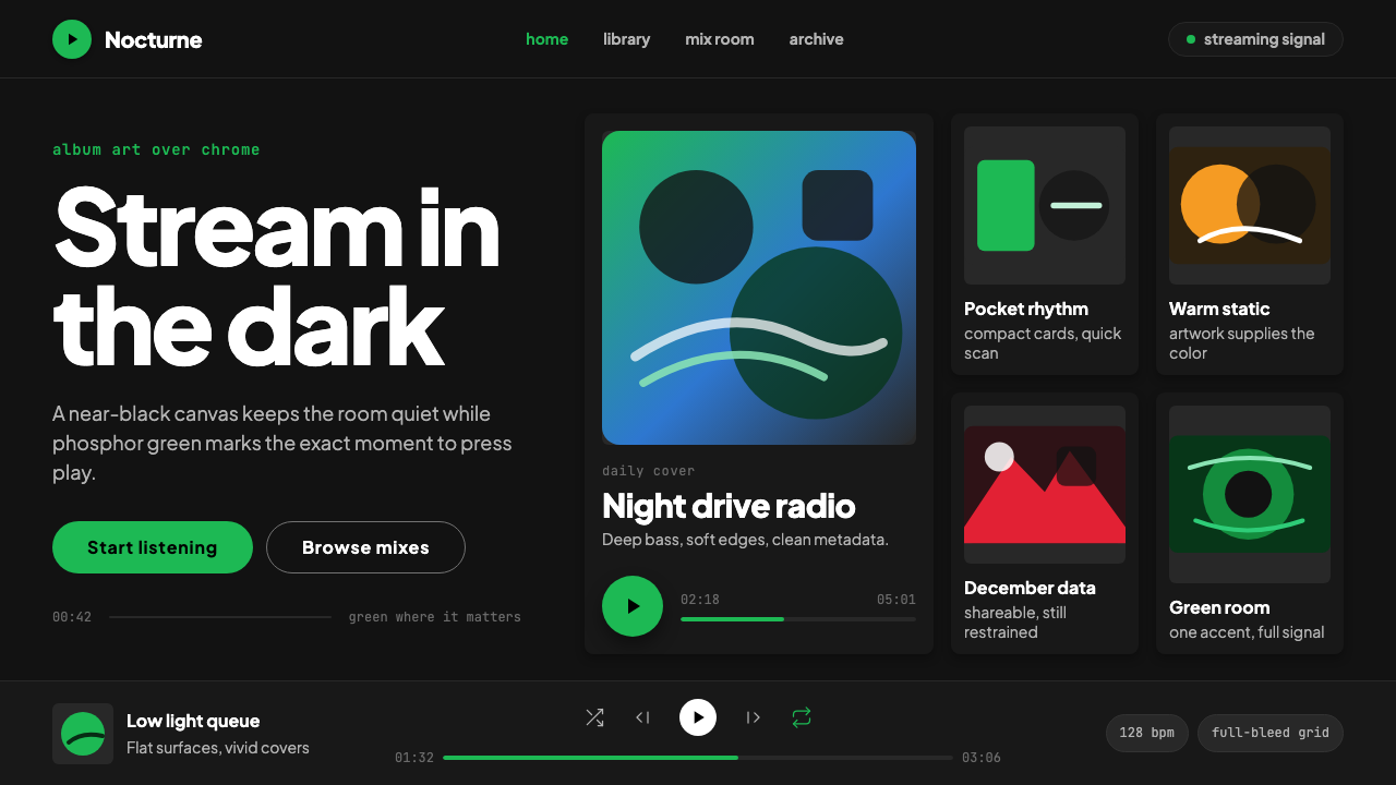
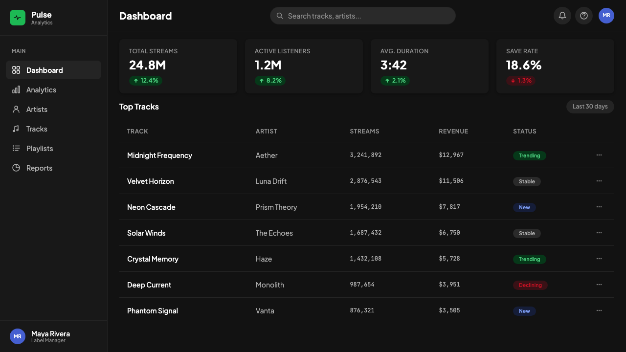
Content is organized into consistent card modules — square image thumbnails with minimal metadata below — arranged in horizontal rows or full grid layouts. The card structure creates visual rhythm through repetition, allowing users to scan large libraries efficiently. Cards have minimal borders or containers; the dark surface acts as the implicit grid, with cards floating against it rather than sitting inside explicit boxes. Scrolling is the primary navigation metaphor within any section.内容被组织为统一的卡片模块——方形图片缩略图,下方附最少量元数据——排列成水平行或完整的网格版面。卡片结构通过重复创造视觉节奏,让用户能够高效浏览庞大的音乐库。卡片拥有极少的边框或容器;深色表面作为隐性网格,卡片漂浮其上而非被置于明确的方框内。滚动是任何区块内的主要导航隐喻。
Pill-Shaped Controls药丸形控件
Play buttons, action buttons, and interactive controls use fully rounded, pill-shaped outlines. The play button — arguably the most-seen interactive element in the entire product — is a solid green circle or rounded rectangle. This pill form appears consistently across the product: genre tags, filter chips, and call-to-action buttons all share the fully-rounded silhouette. The shape reads as friendly and approachable while remaining visually distinct from the rectangular card grid surrounding it.播放按钮、操作按钮与交互控件采用完全圆角的药丸形轮廓。播放键——可以说是整个产品中被看到次数最多的交互元素——是一个实心的绿色圆形或圆角矩形。这种药丸形在产品中保持一致:流派标签、筛选片段与行动号召按钮都共享完全圆角的轮廓。这种形状给人友好而亲切的感觉,同时在视觉上与周围的矩形卡片网格保持清晰区分。
Clean Typographic Hierarchy清晰的字体层级
Typography is set in a single clean sans-serif family, with hierarchy established through size, weight, and opacity rather than through multiple typefaces or decorative styling. Track titles appear in full-brightness white, metadata and secondary information in reduced-opacity white, and inactive or supplementary items in a further-dimmed tone. This stepped opacity system allows multiple levels of information hierarchy within the dark palette without introducing additional colors.字体排印使用单一的干净无衬线字体家族,通过尺寸、字重与不透明度而非多种字体或装饰性排版建立层级。曲目名称以全亮度白色显示,元数据与次要信息以降低不透明度的白色显示,非激活或补充性内容以进一步降暗的色调显示。这套渐变不透明度系统允许在深色色板内呈现多个层级的信息层次,而无需引入额外的颜色。
Minimal Interface Chrome极简界面装饰
Borders, dividers, backgrounds, and structural markers are reduced to the absolute minimum needed for spatial orientation. Sections are separated by generous spacing rather than visible lines; navigation elements use simple text labels; icons are spare and outline-based. The persistent playback bar at the bottom of the screen — containing track info, playback controls, and progress — is the most structurally complex element in the interface, yet it maintains the same surface color and typographic restraint as every other area.边框、分割线、背景与结构性标记被缩减至空间定向所需的绝对最低限度。区块之间以充裕的间距而非可见线条分隔;导航元素使用简洁的文字标签;图标简洁且基于轮廓。屏幕底部的常驻播放栏——包含曲目信息、播放控件与进度条——是界面中结构最复杂的元素,却依然保持着与其他所有区域相同的表面色彩与排版克制。
Who shaped Spotify Dark?谁塑造了 Spotify Dark?
Daniel Ek co-founded Spotify in Stockholm in 2006 and served as CEO through its growth from a Swedish startup into the world's dominant music streaming platform. Ek's product philosophy — that the service should make the world's music universally accessible with near-zero friction — shaped every major design decision. His insistence on the content-first approach, where the interface serves the music rather than competing with it, established the aesthetic discipline that became Spotify Dark's most enduring characteristic.Daniel Ek 于 2006 年在斯德哥尔摩共同创立了 Spotify,并担任 CEO,带领公司从瑞典创业公司成长为全球主导的音乐流媒体平台。Ek 的产品哲学——这项服务应以近乎零摩擦的方式让全世界的音乐普遍可及——塑造了每一个重大设计决策。他对内容优先方法的坚持——界面服务于音乐而非与之竞争——确立了成为 Spotify Dark 最持久特质的美学自律。
Tobias Ahlin served as a lead designer at Spotify during a formative period of the product's visual development. He helped articulate and systematize the design principles that defined the Spotify interface: content-over-chrome, the dark surface as a neutral frame for album art, the disciplined use of the single green accent. Ahlin's work established the visual logic that persisted through years of redesigns and platform expansions, demonstrating that the system's clarity came from principle rather than from superficial style choices.Tobias Ahlin 在 Spotify 产品视觉发展的关键时期担任首席设计师。他帮助阐明并系统化了定义 Spotify 界面的设计原则:内容先于界面、深色表面作为专辑封面的中性框架、对单一绿色强调色的自律使用。Ahlin 的工作确立了贯穿多年改版与平台扩张的视觉逻辑,证明了这套体系的清晰性源自原则而非表面风格的选择。
The Spotify Brand Team, working across product design, marketing, and brand identity, developed the visual system through iterative refinement over more than a decade. Their most culturally significant contribution was the design and evolution of Spotify Wrapped, which required extending the core dark-and-green vocabulary into a data-visualization and social-sharing format. The Wrapped work proved that a product design system can carry emotional and narrative weight far beyond its functional origins — a lesson that influenced how many other digital brands approached their own visual identity expansions.Spotify 品牌团队横跨产品设计、营销与品牌识别,在超过十年间通过迭代打磨发展了这套视觉体系。他们在文化层面最重要的贡献是 Spotify Wrapped 的设计与演进——这需要将核心的深色加绿色词汇延伸至数据可视化与社交分享格式。Wrapped 的工作证明,一套产品设计体系能够承载远超其功能起源的情感与叙事重量——这一经验影响了许多其他数字品牌处理自身视觉识别扩张的方式。
Martin Lorentzon co-founded Spotify alongside Daniel Ek and brought significant experience from his earlier venture Tradedoubler. As chairman and co-founder, Lorentzon's entrepreneurial vision helped secure the business foundations that allowed Spotify's design team the stability to develop a coherent, long-term visual identity rather than pivoting reactively to competitor aesthetics. The sustained consistency of Spotify's dark visual language across more than fifteen years is partly a product of organizational continuity that Lorentzon helped establish.Martin Lorentzon 与 Daniel Ek 共同创立了 Spotify,并带来了他早期创业公司 Tradedoubler 积累的丰富经验。作为董事长与联合创始人,Lorentzon 的创业眼光帮助奠定了商业基础,使 Spotify 设计团队拥有稳定性去发展连贯的长期视觉标识,而非被动应对竞争对手的美学变化。Spotify 深色视觉语言在逾十五年间保持的持续一致性,部分正是 Lorentzon 帮助建立的组织连续性的产物。
How do you use Spotify Dark today?今天怎么用 Spotify Dark?
Spotify Dark translates most naturally to contexts that share its core premise: a dark, content-rich environment where curated media — music, video, podcasts, images — is the reason the user is there, and the interface's job is to get out of the way. Applying the style correctly requires internalizing this logic rather than simply borrowing its visual surface. A near-black background with a single accent color is not enough; the discipline extends to what is absent — the decorative borders, the gradient fills, the ambient shadows, the competing accent colors that dark interfaces so often accumulate.Spotify Dark 最自然地迁移到与其核心前提相通的场景:深色、内容丰富的环境,在这里被策划的媒介——音乐、视频、播客、图像——是用户到来的原因,界面的任务是尽可能退隐。正确应用这种风格需要内化这一逻辑,而非仅仅借用其视觉表面。近黑色背景加单一强调色是不够的;自律延伸至缺席的部分——装饰性边框、渐变填充、环境阴影、深色界面如此频繁积累的多个竞争性强调色。
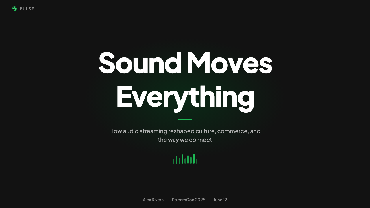
For presentation slides, Spotify Dark works powerfully as a cover and section-divider treatment. A deep near-black full-bleed background with the title in large, clean white type and a single accent-colored element — a progress-pill shape, a highlighted word — captures the system's precision. Content slides built in this style should use the dark surface consistently, reserving the accent color only for the single most important data point or call-out on each slide. Data visualization slides take on a striking quality when chart elements are rendered against the dark ground: bars and lines in the accent color against the near-black background achieve the same contrast-and-scarcity logic as the play button in the original interface.在演示文稿中,Spotify Dark 作为封面与章节分隔页的处理方式极具冲击力。以深邃的近黑色满幅背景为底,大号干净的白色标题字体配以单一强调色元素——一个进度药丸形状或一个高亮词——能够精准捕捉这套体系的精密感。以这种风格构建的内容幻灯片应一致使用深色表面,将强调色仅保留给每张幻灯片上最重要的单一数据点或引用语。数据可视化幻灯片在深色底面上呈现出惊人的质感:在近黑色背景上以强调色绘制的柱条与折线,实现了与原始界面中播放键相同的对比度与稀缺性逻辑。
For web dashboards and product interfaces, Spotify Dark is an excellent reference for media-adjacent products — music or podcast platforms, video libraries, digital art marketplaces, reading apps, game stores. The card-grid layout, dark surface, and single-accent discipline apply directly. For SaaS dashboards and analytics tools, the style works well when the data itself is the content: charts and tables rendered against a near-black ground with accent-colored highlights on key metrics provide excellent readability and visual hierarchy without decorative overhead. Pricing pages in this system should use the accent color for the recommended tier only, maintaining the accent's scarcity principle.对于网页仪表板与产品界面,Spotify Dark 是媒介类周边产品的绝佳参考——音乐或播客平台、视频库、数字艺术市场、阅读应用、游戏商店。卡片网格版面、深色表面与单一强调色的自律可以直接应用。对于 SaaS 仪表板与分析工具,当数据本身就是内容时,这种风格表现出色:在近黑色底面上呈现的图表与表格,在关键指标上以强调色高亮,提供出色的可读性与视觉层级,且无装饰性负担。这套体系中的定价页面应仅对推荐方案使用强调色,维持强调色的稀缺性原则。
For editorial and marketing work, Spotify Dark lends a premium, culturally fluent feel that is especially effective for music, entertainment, gaming, and youth-oriented brands. A marketing page built in this idiom uses a deep near-black ground throughout, with section breaks defined by content transitions rather than visible dividers. Feature blocks alternate between full-bleed imagery or album-art-style cards and typographic sections in which large white headlines carry the emotional weight. The accent color appears on calls to action only — a single button or link in each section — maintaining the click-here precision that makes the original interface so navigable.对于编辑与营销内容,Spotify Dark 赋予一种高端的、具有文化流动感的气质,对音乐、娱乐、游戏与面向年轻人的品牌尤为有效。以这种风格构建的营销页面自始至终使用深邃的近黑色底面,以内容的切换而非可见的分割线标记区块的转换。特性区块在全幅图像或专辑封面式卡片与字体性区块之间交替,后者以大号白色标题承载情感重量。强调色仅出现在行动号召上——每个区块中的单一按钮或链接——维持着令原始界面如此易于导航的「点击此处」精确感。
A common mistake when applying Spotify Dark is treating the dark background as license to use multiple accent colors for visual variety. The style's power comes specifically from color scarcity — one accent, appearing only functionally. A second accent color, even if used sparingly, breaks the logic entirely and transforms the interface from focused and disciplined into merely dark. Similarly, soft, diffuse shadows applied to cards and modals in the Spotify Dark style undercut the flat, surface-level quality that makes content elements feel like objects placed on a stage. If depth cues are needed, use sharp borders or brightness shifts rather than blurred shadow effects.应用 Spotify Dark 时最常见的错误,是将深色背景理解为使用多种强调色以增加视觉多样性的许可。这种风格的力量恰恰来自于色彩的稀缺性——一种强调色,仅在功能性位置出现。第二种强调色,即便使用节制,也会彻底打破这套逻辑,将界面从专注而自律转变为仅仅是深色。同样,在 Spotify Dark 风格的卡片与模态框上应用柔和、漫射的阴影,会削弱让内容元素感觉像被置于舞台上的对象那种平坦、表面感的质量。若需要深度暗示,应使用清晰的边框或亮度变化而非模糊的阴影效果。
Spotify Dark — FAQSpotify Dark · 常见问题
Is Spotify Dark only suitable for music and entertainment products?Spotify Dark 只适合音乐和娱乐类产品吗?
Not exclusively, but those are its strongest fit. The style's deep near-black surface originated as a frame for album artwork, which makes it naturally suited to any interface where rich visual media is the primary content. Beyond entertainment, it works well for gaming platforms, digital portfolios, developer tools and terminals, dark-mode SaaS dashboards, and any product positioning itself as premium and technically sophisticated. It struggles in contexts that call for warmth, accessibility for extended reading sessions, or an inclusive, family-friendly tone — dark interfaces require careful contrast work to maintain readability for all users, and the cool aesthetic can feel uninviting in consumer-facing emotional contexts like health, parenting, or financial wellness.并非绝对,但那是它最强的适配场景。这种风格的深邃近黑色表面起源于作为专辑封面的框架,因此自然适合任何以丰富视觉媒介为主要内容的界面。在娱乐之外,它适用于游戏平台、数字作品集、开发者工具与终端、深色模式 SaaS 仪表板,以及任何将自身定位为高端且技术感强烈的产品。它在需要温暖感、长时间阅读的无障碍性,或包容的、适合全家的氛围的场景中表现欠佳——深色界面需要仔细处理对比度以保持对所有用户的可读性,而这种冷峻美学在面向消费者的情感场景中——如健康、育儿或财务理财——可能显得不够亲切。
How does Spotify Dark differ from generic dark mode?Spotify Dark 和通用深色模式有何不同?
Generic dark mode is typically a tonal inversion of a light-mode interface — the same layouts, colors, and hierarchy, shifted to dark backgrounds and light text. Spotify Dark is a designed-from-the-ground-up dark aesthetic with its own specific logic: content-as-interface, single-accent discipline, card-grid organization, and the near-black tone calibrated for album art contrast rather than simple light reduction. Many dark-mode interfaces are dark in color but not in approach — they retain decorative dividers, multiple accent colors, and ambient shadows that the Spotify system eliminates. The difference is the difference between wearing dark clothes and having internalized a philosophy of restraint.通用深色模式通常是浅色模式界面的色调反转——相同的版面、颜色与层级,只是切换到深色背景和浅色文字。Spotify Dark 是一套从零开始设计的深色美学,拥有自身特定的逻辑:内容即界面、单一强调色的自律、卡片网格组织,以及为专辑封面对比度而非简单降低亮度而精心校准的近黑色调。许多深色模式界面在颜色上是深色的,但在方法上并非如此——它们保留了装饰性分割线、多种强调色和 Spotify 体系所消除的环境阴影。这种差别,犹如穿深色衣服与真正内化了克制哲学之间的差别。
Can the Spotify Dark style work for a light-background layout?Spotify Dark 风格能用于浅色背景的版面吗?
The style can be partially transposed — the card-grid structure, pill-shaped controls, single-accent discipline, and content-forward hierarchy are all transferable to a light surface. However, the fundamental visual logic of the dark system depends on the near-black ground creating contrast with artwork and making the green accent luminous. On a light background, the same green accent reads very differently — less luminous, more casual — and loses some of its functional precision. A light adaptation is possible and is essentially what Spotify's own light mode approximates, but it is a different aesthetic experience: warmer and more approachable, with less of the cinematic, stage-lit quality that makes the dark version so distinctive.这种风格可以部分移植——卡片网格结构、药丸形控件、单一强调色的自律与内容优先的层级都可以迁移到浅色表面。然而,深色体系的基本视觉逻辑依赖于近黑色底面与封面形成对比,并让绿色强调色发出光亮感。在浅色背景上,同样的绿色强调色呈现出截然不同的感觉——光亮感减弱,更显随意——并失去了部分功能性精确感。浅色适配是可行的,本质上接近 Spotify 自身浅色模式的样子,但那是一种不同的美学体验:更温暖、更亲切,少了深色版本那种电影感与舞台打光质感所带来的独特性。
How should imagery and photography be handled in a Spotify Dark layout?在 Spotify Dark 风格的版面中,应如何处理图像与摄影?
Photography and imagery are treated as content objects, not as atmospheric backgrounds or decorative elements. Album covers, artist photos, and playlist artwork appear as square or rectangular cards in a grid, maintaining their original aspect ratios and color content against the dark ground. Photography is never used as a full-bleed background with text overlaid, which would compromise both the typographic clarity and the integrity of the image. When a single image must occupy a large space — an artist header or featured playlist — it is typically faded or darkened at the edges to maintain surface continuity with the near-black interface rather than breaking the spatial logic of the dark plane.摄影与图像被当作内容对象处理,而非作为氛围背景或装饰性元素。专辑封面、艺术家照片与播放列表图像以方形或矩形卡片的形式出现在网格中,在深色底面上保持其原始比例与色彩内容。摄影从不被用作叠加文字的全幅背景,那样会同时损害字体清晰度与图像的完整性。当单张图像必须占据较大空间——如艺术家头图或特色播放列表——通常会在边缘处渐暗或淡出,以与近黑色界面保持表面连续性,而非打破深色平面的空间逻辑。
What are the most common pitfalls when adapting Spotify Dark for branded use?在将 Spotify Dark 应用于品牌场景时,最常见的陷阱是什么?
The most common pitfall is substituting a different brand color for the signature green without understanding why the green works. The original green is highly saturated and luminous — it glows against the near-black ground, which is why it functions so precisely as a play button and active-state indicator. A muted brand color substituted in the same position will not achieve the same contrast or functional clarity. If adapting the system with a custom brand color, ensure it has enough saturation and luminosity to hold its own against the near-black surface. A second frequent error is introducing surface variety — using multiple shades of dark gray for different sections, or adding subtle gradient overlays — which erodes the flat surface coherence that makes content elements read as foreground objects rather than elements embedded in a layered background.最常见的陷阱是在没有理解绿色为何有效的情况下,用不同的品牌色替换标志性绿色。原始绿色具有高饱和度与发光性——它在近黑色底面上发光,这正是它作为播放键与激活状态指示器发挥精确功能的原因。在同一位置替换一种低饱和度的品牌色,将无法达到相同的对比度或功能清晰度。若要以自定义品牌色适配这套体系,需确保该颜色具有足够的饱和度与亮度,以在近黑色表面上自立。第二个常见错误是引入表面多样性——为不同区块使用多种深灰色阶,或添加微妙的渐变叠加——这会侵蚀平坦表面的连贯性,而正是这种连贯性让内容元素被感知为前景对象,而非嵌入于分层背景中的元素。
Related design styles相关设计风格
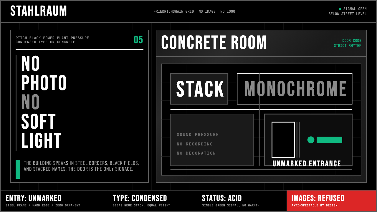 Berlin Techno (Berghain era)Refuses spectacle. Black grid, steel rules, condensed type, one acid-green si…拒绝景观:黑色网格、钢灰粗线、窄体大字,只留一盏酸绿信号。
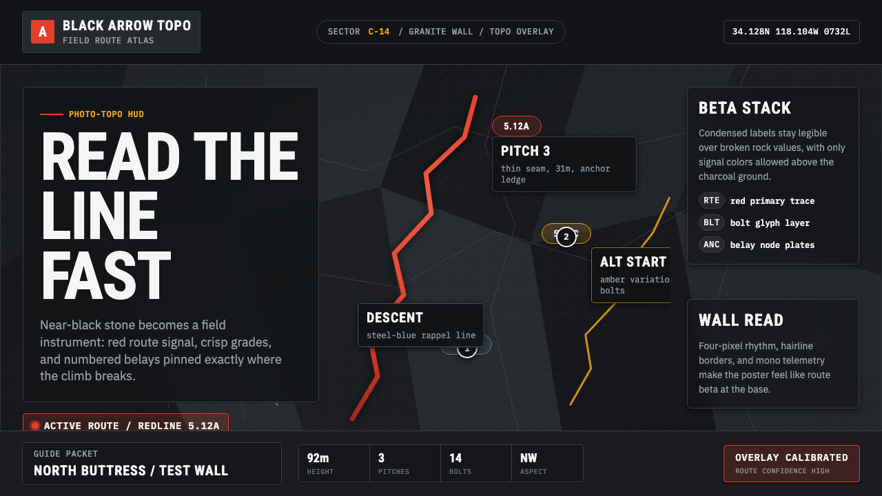 Climbing Topo GuideBeta at a glance. Red route telemetry cuts across near-black stone and conden…一眼读懂路线。红色拓扑线切过近黑岩面,紧缩标签如仪表读数。
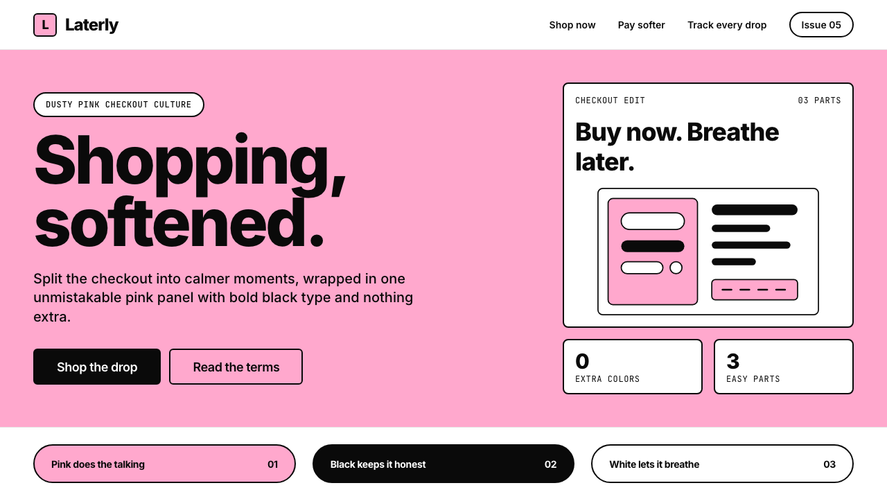 KlarnaFintech turns fashion-editorial. Dusty bubblegum pink, black Inter, and white…金融科技变成时尚编辑:灰泡泡糖粉、黑色 Inter 与留白完成表达。
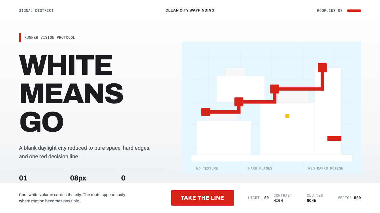 Mirror's Edge Clean CityWhite becomes motion. Cool daylight planes leave one signal-red route to comm…白色成为运动:冷日光平面只留一条信号红路线。
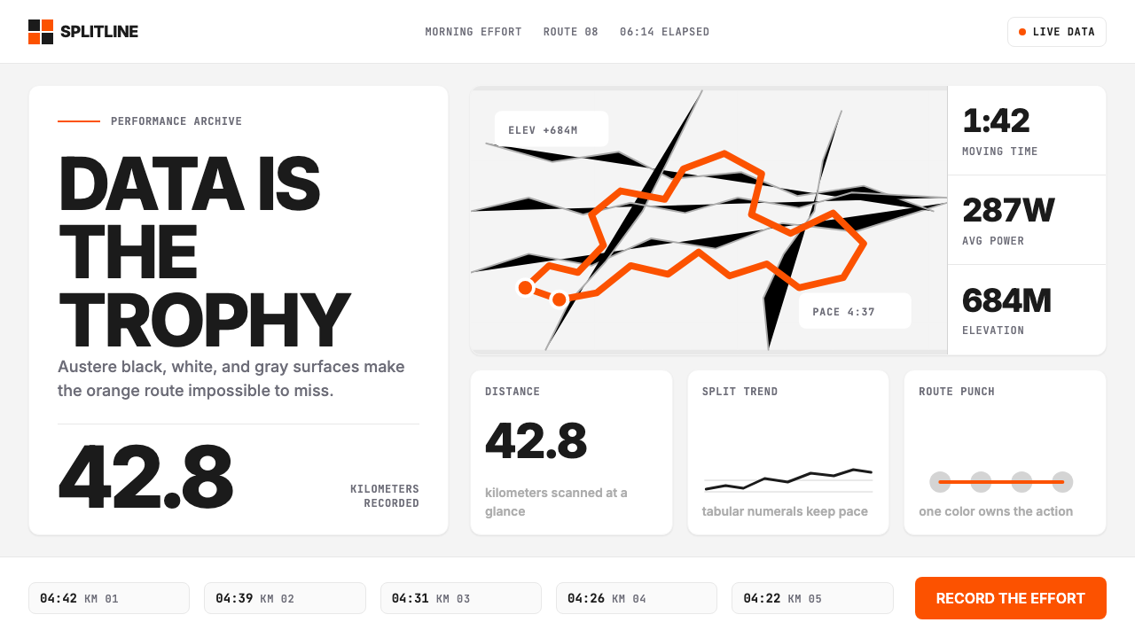 Strava Orange FitnessData becomes trophy. Inter numerals, gray metric grids, and one orange route…数据即奖杯:Inter数字、灰色指标网格与一条橙色路线。
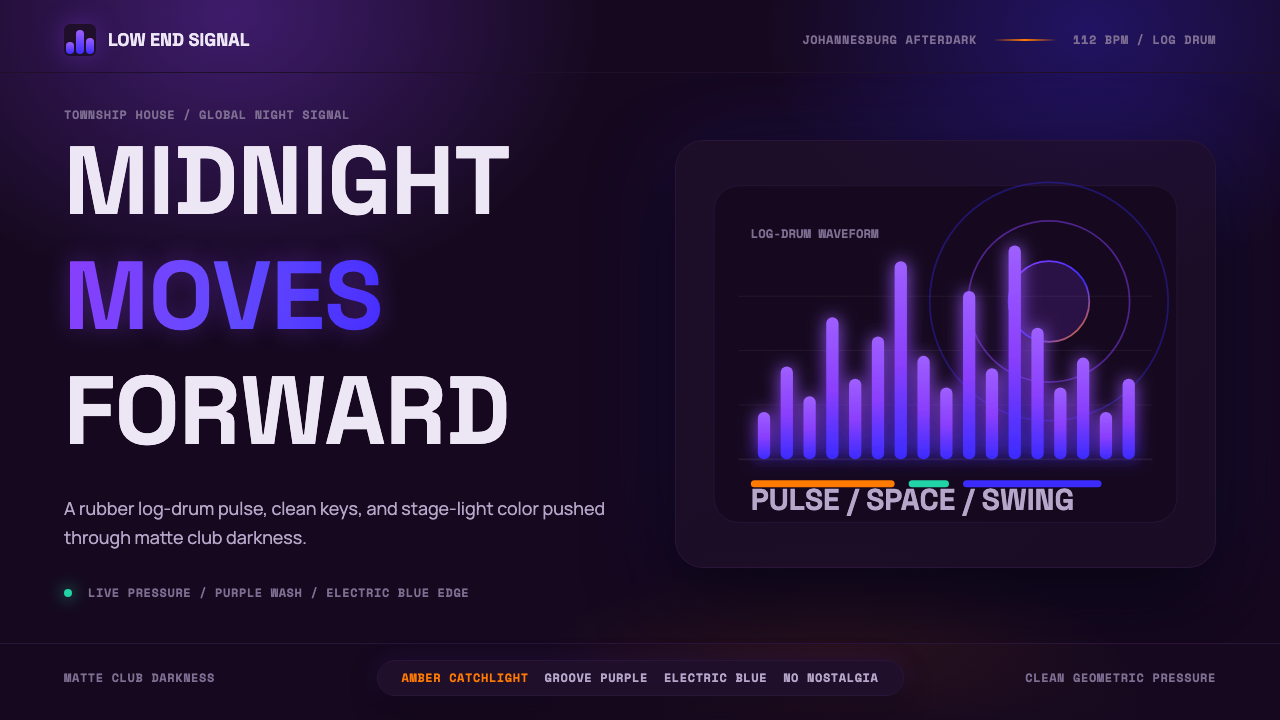 AmapianoClub darkness, fully awake. Purple-blue waveforms pulse through geometric typ…午夜黑场醒着:紫蓝声波穿过几何字体。