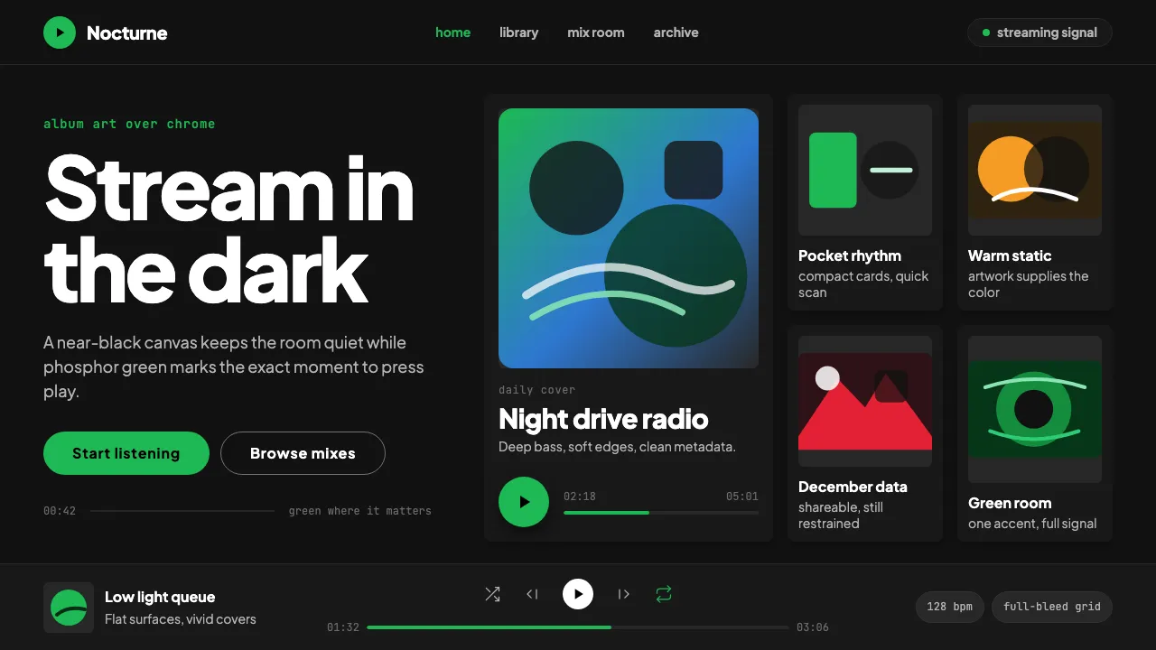
About Spotify Dark
Spotify launched in 2008 from Stockholm and quickly defined what digital music looks like. Its visual identity — phosphor green #1db954 set against a near-black #121212 canvas — became the universal shorthand for "streaming app." The interface is built around album art as the primary visual element, with card-based grids, pill-shaped play buttons, and a restrained typographic system that keeps everything readable at a glance.
The design system prioritizes content over chrome. Surfaces are flat and dark, typography is clean and unadorned, and the signature green appears only where interaction matters most: play buttons, progress bars, active states. Spotify Wrapped proved the brand's visual fluency extends beyond the app itself, turning data visualization into a shareable cultural moment every December.
- Origin
- Stockholm, Sweden
- Era
- 2008 launched; signature green-on-black visual ~2010–2024
- Key figures
- Daniel Ek · Tobias Ahlin · Spotify Brand Team
- Movements
- Music streaming interfaces · Media-rich dark UI · Album-art-driven design
Spotify Dark design spec
Colors
Typography
The other 11 sections — buttons, cards, spacing, motion, techniques and more — open once you unlock. Download the DESIGN.md or send it to your AI in one click. Unlock once, yours forever.
Sign up nowStyles similar to Spotify Dark
Also inspired by brands & products, with a close feel.
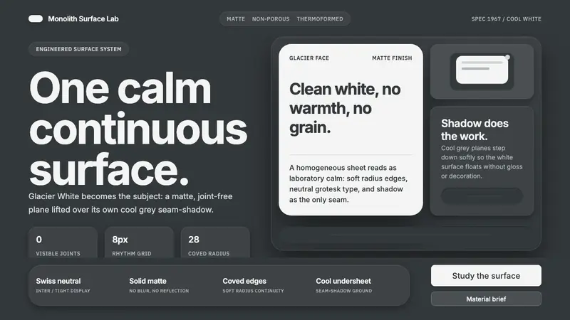 Corian Solid SurfaceSeamless matte calm. Glacier White floats over cool grey shadow with neutral Inter type.
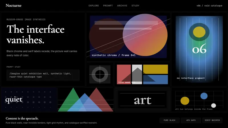 MidjourneyInvisible chrome, visible art. Pure black grid and Cormorant serif give color to images.
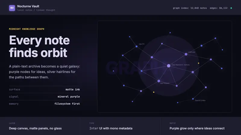 Obsidian Knowledge GraphNetworked thought glows at midnight. Purple nodes and silver hairlines map a local-first galaxy.
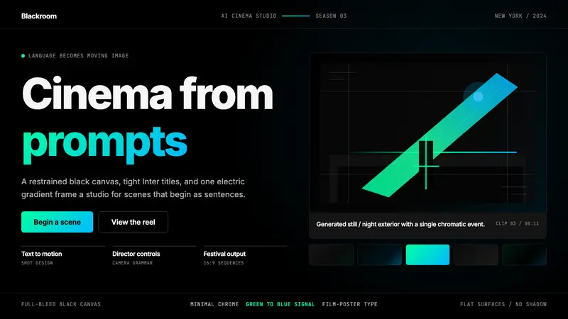 Runway MLCinema, not dashboard. Deep black frames tight Inter type and one green-blue electric signal.