What is Specialty Coffee Bag?
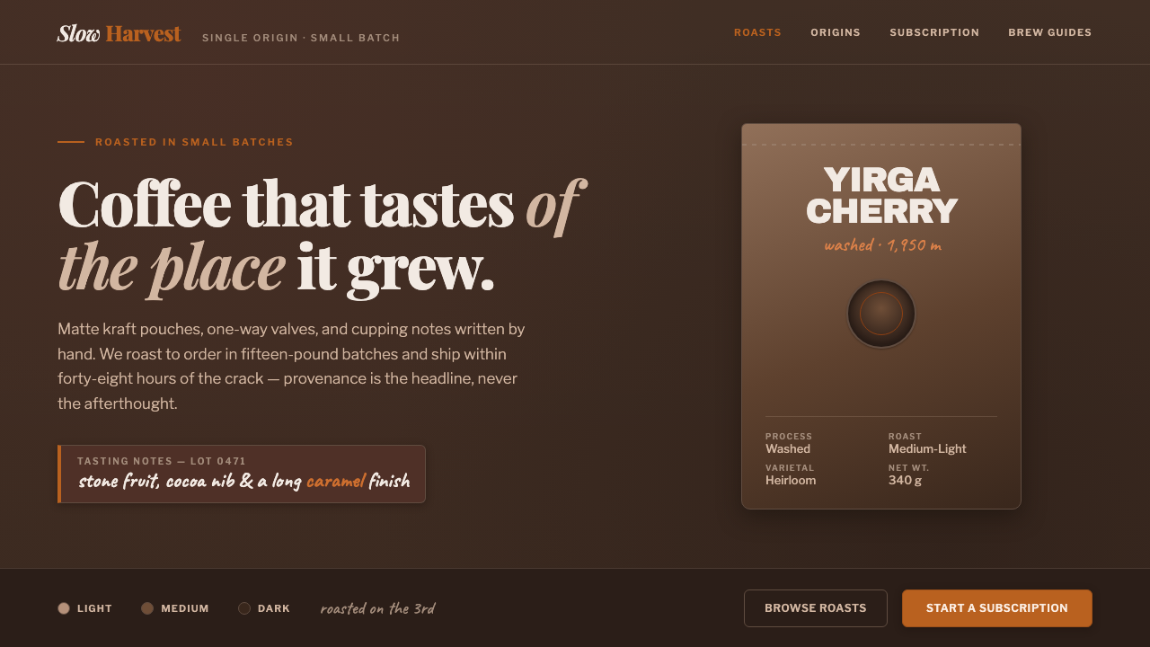
Specialty Coffee Bag makes provenance the headline — a deep matte espresso ground, tactile kraft packaging, and one roast-orange note that feels measured rather than decorative.
Specialty Coffee Bag in brief
Specialty Coffee Bag is the visual language of third-wave coffee roaster storefronts online: dark roasted-bean browns, matte surfaces, kraft-and-foil pouches, one-way valves, and labels that make origin and tasting notes feel like the primary content. It is authentically dark, with no dependence on cream or café-white backgrounds.
The style treats the bag as both package and editorial artifact. Its surface suggests roasted material and careful handling, while its information hierarchy gives provenance, roast character, and cupping notes the authority normally reserved for a headline. The design feels close to the product because it shows the package as evidence rather than hiding it behind generic lifestyle imagery.
Typography creates the central tension. Refined editorial serif headlines lend authority and narrative weight; heavy packaging display type gives the label a physical, shelf-ready presence; hand-lettered flourishes soften the system around origin and tasting notes. Roast-orange appears sparingly, like a roast-level mark or a small signal of warmth within the darker field.
Where does Specialty Coffee Bag come from?
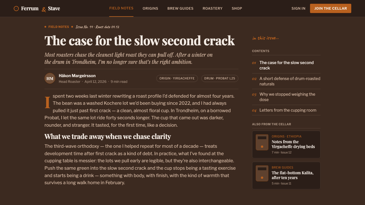
The style belongs to the period from 2010 to now, when third-wave specialty coffee roaster e-commerce became its defining setting. It is not presented as the invention of a single designer or institution. Instead, it grows from the shared visual needs of independent roasters selling a product whose value is closely tied to where it comes from and how it is described.
The internet changed the role of the coffee bag. In a physical shop, the pouch can be held, turned, and read as a material object. A direct-to-consumer storefront must translate those qualities into a screen. The dark matte ground, kraft surface, foil detail, valve, label, and tasting-note language become visual proof that the online product still has a physical origin.
Third-wave coffee branding supplies the editorial attitude. Provenance is not treated as secondary metadata beneath a lifestyle promise; it becomes the headline and the organizing principle. Origin names, cupping notes, and roast information can therefore sit alongside strong typography without feeling like technical afterthoughts. The result is a storefront language that is commercial, but still attentive to the specificity of the product.
Matte-pouch and valve-bag packaging design supplies the material vocabulary. Kraft paper signals tactility, foil introduces a controlled industrial note, and the one-way valve makes the package feel purpose-built rather than symbolic. Online, these cues are abstracted into composition, texture, contrast, and lettering. The style works when those elements remain connected to the bag and its information, not when they become decorative coffee nostalgia.
What defines the Specialty Coffee Bag look?
Espresso Ground
The dominant field is a deep matte espresso brown, closer to roasted beans and ground coffee than to a polished black. Its darkness gives the package-like elements authority and allows warm details to register with restraint. The ground should feel dry, dense, and absorbent rather than glossy or luminous.
Kraft and Foil
Kraft and foil create the material contrast at the heart of the style. Kraft carries a handmade, tactile impression; foil introduces a quieter sense of sealing, protection, and purpose. Neither should become a texture pasted over the interface. Their value comes from how they distinguish the package body, label, and functional details.
Editorial Serif
Serif headlines bring the authority of a carefully edited coffee publication. They are suited to origin names, collection titles, and statements that need to feel considered rather than promotional. Against the dark ground, their contrast should remain calm and legible, creating narrative distinction without turning the storefront into a newspaper imitation.
Packaging Display Type
Heavy display lettering gives the bag its physical presence. It can carry roast identity, product naming, or the main label information with the blunt confidence of packaging meant to be recognized quickly. Used beside the editorial serif, it creates a productive contrast between literary description and direct product declaration.
Provenance Hierarchy
Origin is not a caption placed after the product name; it is a primary organizing device. Country, region, farm language, and cupping notes should feel connected to the object being sold. The hierarchy can move from broad provenance to intimate tasting detail, but every layer should reinforce the sense that the coffee has a traceable story.
Roast Orange
Roast-orange is the single warm accent in an otherwise dark and restrained system. It works best as a marker: a roast cue, a small label detail, a selected state, or a short line that directs attention. Its scarcity is part of its meaning. If it spreads across every component, it stops feeling like a deliberate roast signal.
Hand-Lettered Notes
Hand-lettered flourishes belong to origin and cupping notes, where a human voice is useful. They introduce intimacy without weakening the packaging structure. The lettering should behave like a tasting annotation or roaster mark, not like a second headline system. Its role is to make specific details feel observed and remembered.
Who shaped Specialty Coffee Bag?
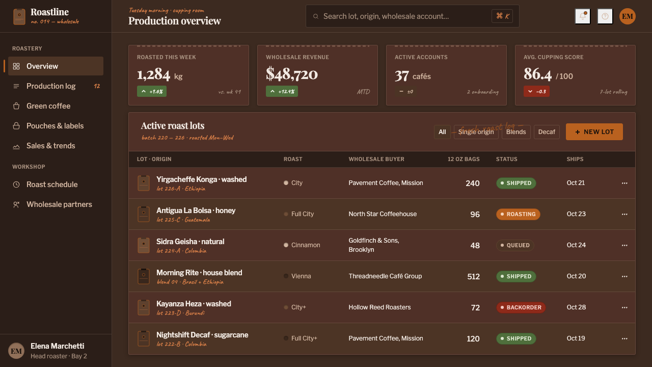
Independent specialty roasters are the central authors of this visual language. Their storefronts need to communicate product specificity, origin, and tasting character while retaining the tactile authority of a physical bag. The style gives those facts a dark, editorial, and recognizably packaged form.
Direct-to-consumer storefronts provide the main digital setting. They translate kraft, foil, valves, labels, and tasting notes into a screen-based shopping experience. Their challenge is to preserve physical credibility without relying on generic café imagery, making the package itself the primary interface reference.
Third-wave coffee branding supplies the style’s insistence on provenance and considered description. It makes origin and cupping language visible rather than subordinate, allowing a product page to feel like a concise editorial statement about what is in the bag.
Matte-pouch and valve-bag packaging design provides the physical vocabulary: dense dark surfaces, kraft-and-foil construction, and the visible logic of a one-way valve. In digital work, these references keep the aesthetic grounded in a real package rather than an abstract coffee mood.
How do you use Specialty Coffee Bag today?
Apply Specialty Coffee Bag when the product needs to feel specific, tactile, and traceable. Start with the package logic: let the dark espresso ground establish the field, let typography separate editorial authority from product recognition, and let provenance organize the information. The design should feel like a bag opened into a storefront, not a generic dark theme with coffee references added afterward.
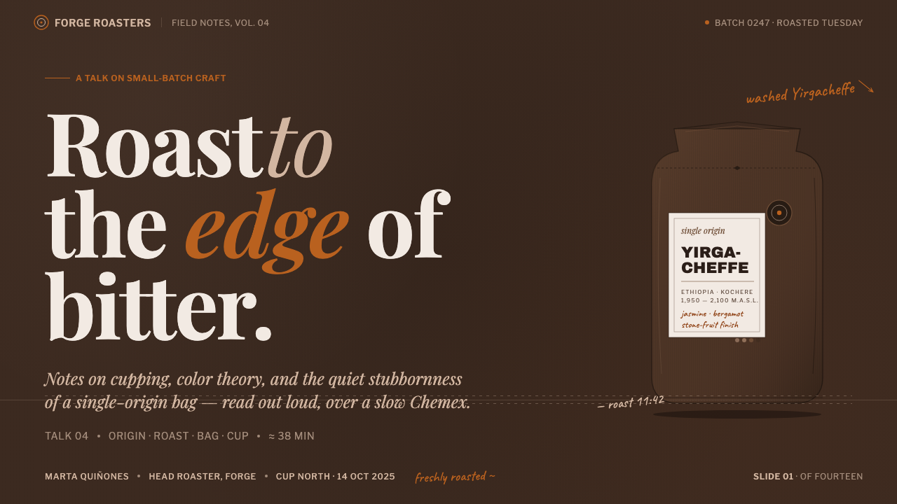
For presentation slides, use the cover to establish the package immediately: a dark matte field, a strong origin-led title, a kraft or foil reference, and a restrained roast-orange mark. Content slides should give the editorial serif the narrative role and the heavy display type the labeling role. Data slides can treat roast information, provenance, and tasting notes as ordered package annotations rather than decorative charts.
For web interfaces, the style suits dashboards and pricing pages for roasters, subscription services, and product catalogs. Keep the espresso ground as the stable field, use packaging display type for product names and actions, and reserve roast-orange for selected states or important signals. Cards should feel like labeled pouches: dense, legible, materially grounded, and organized around what the customer needs to know.
For editorial and marketing work, lead with origin, then let tasting language supply intimacy. Product stories can pair a refined serif headline with hand-lettered notes, while campaign sections can use kraft-and-foil contrast to distinguish product facts from narrative copy. The system is especially effective when a small amount of warm orange directs attention through an otherwise quiet, dark composition.
The common mistake is over-romanticizing the coffee mood. Adding cream backgrounds, spreading roast-orange across every action, or covering the page with rustic textures weakens the source logic. Another failure is using hand lettering for every message, which removes its value as a tasting annotation. Keep the darkness genuine, keep provenance prominent, and let each material and type voice perform a distinct job.
Specialty Coffee Bag — FAQ
Is Specialty Coffee Bag supposed to look light and café-like?
No. Its defining field is deep matte espresso brown, closer to roasted beans and ground coffee than to cream or café-white. Warmth comes from kraft material, foil contrast, hand-lettered notes, and the restrained roast-orange accent. Light backgrounds can be used for contrast in a broader system, but they should not replace the style’s authentically dark foundation.
How much roast-orange should the design use?
Use it sparingly as a single warm signal. It can mark roast identity, a selected state, a small label detail, or a directional cue. Its purpose is to create focus inside the dark field, not to become a second dominant palette. If orange appears everywhere, it loses the measured quality that makes it feel like a roast-level mark.
Why combine editorial serif type with heavy packaging display type?
The two voices perform different jobs. The editorial serif gives origin stories and considered statements narrative authority. The heavy display type makes product names and label information easy to recognize with the directness of physical packaging. Keeping those roles distinct creates hierarchy and prevents either the literary or commercial voice from taking over the entire storefront.
Where should hand-lettered flourishes appear?
They belong around origin and cupping notes, where a human annotation adds intimacy and specificity. They should not replace the main product label, navigation, or every heading. Treat the lettering as a roaster’s note or tasting mark: a focused detail that makes the coffee feel observed, while the primary type system continues to carry structure and usability.
Related design styles
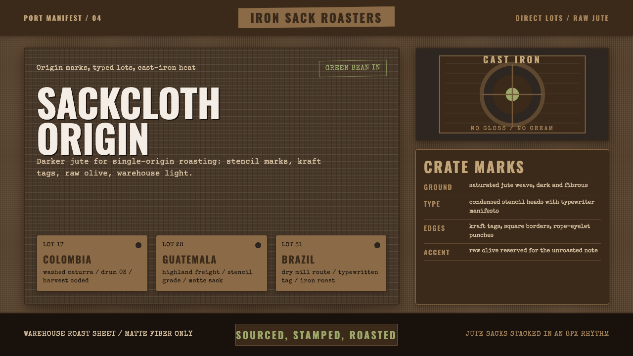 Coffee Roastery BurlapRaw craft, never cream. Dark jute weave, stencil type, and one olive accent.
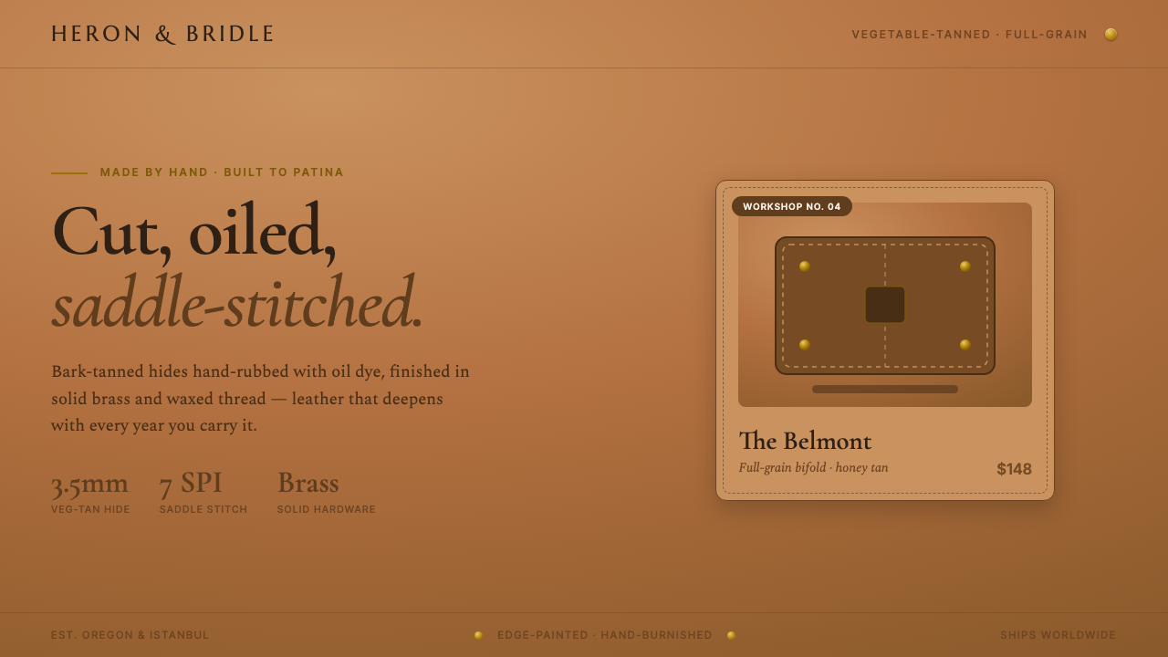 Leather Goods TanMade by hand, built to patina. Saddle-tan ground, brass rivets, dashed saddle…
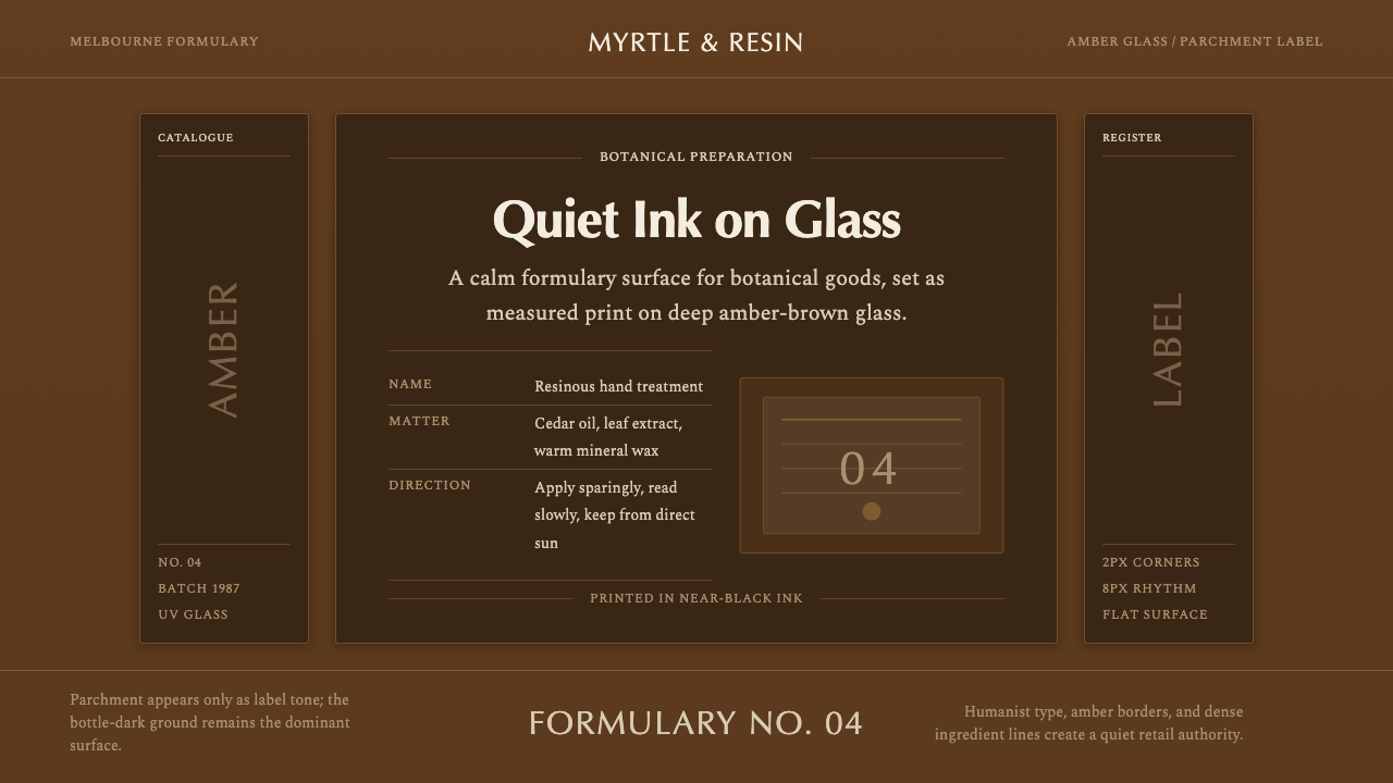 Aesop Apothecary AmberQuiet authority in glass. Amber-brown ground, parchment labels, and humanist…
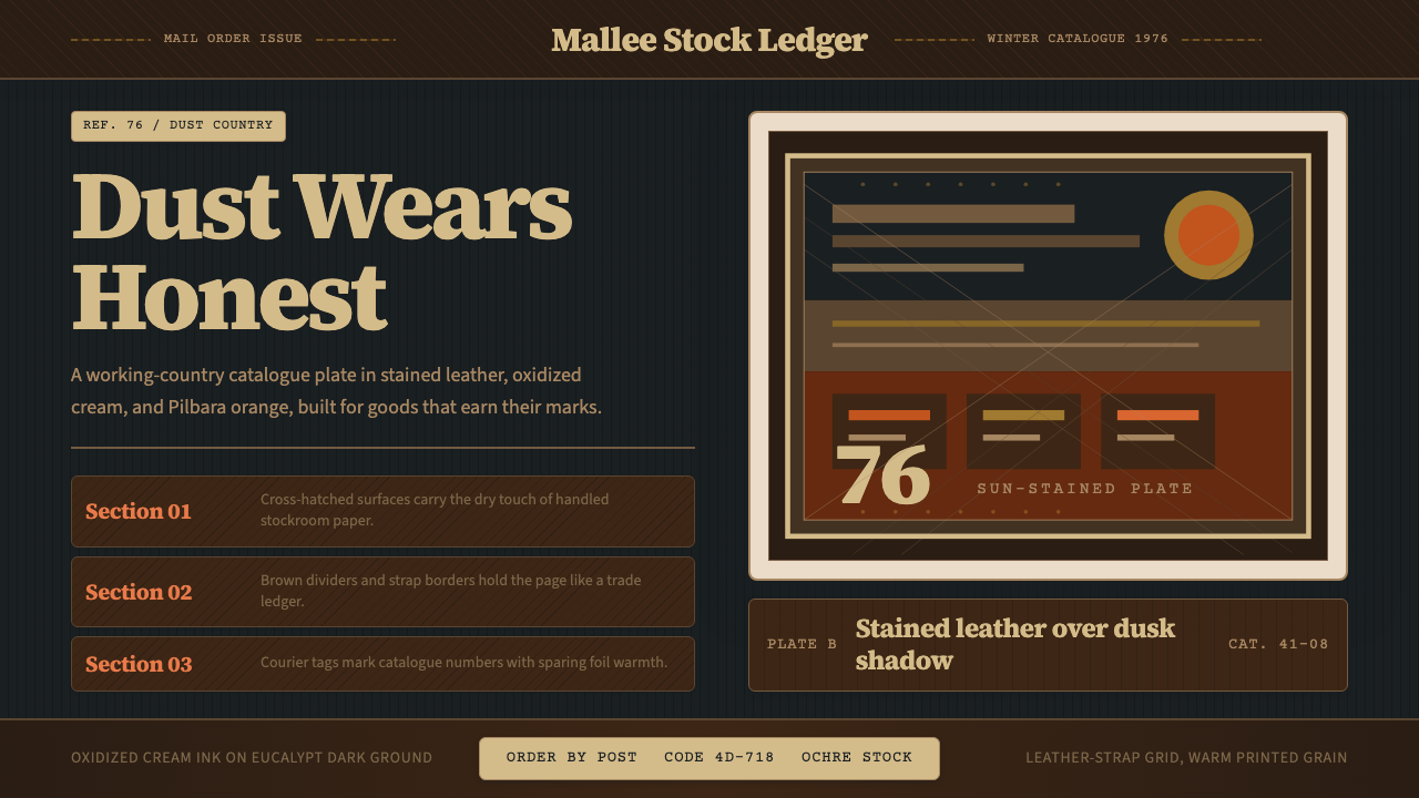 Akubra Outback (1970s Stockman)Worn honesty. Leather brown, Pilbara orange, and cream catalogue frames carry…
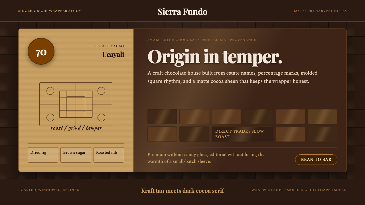 Bean-to-Bar ChocolateOrigin tastes tactile. Cocoa serif, kraft panel, and molded squares carry the…
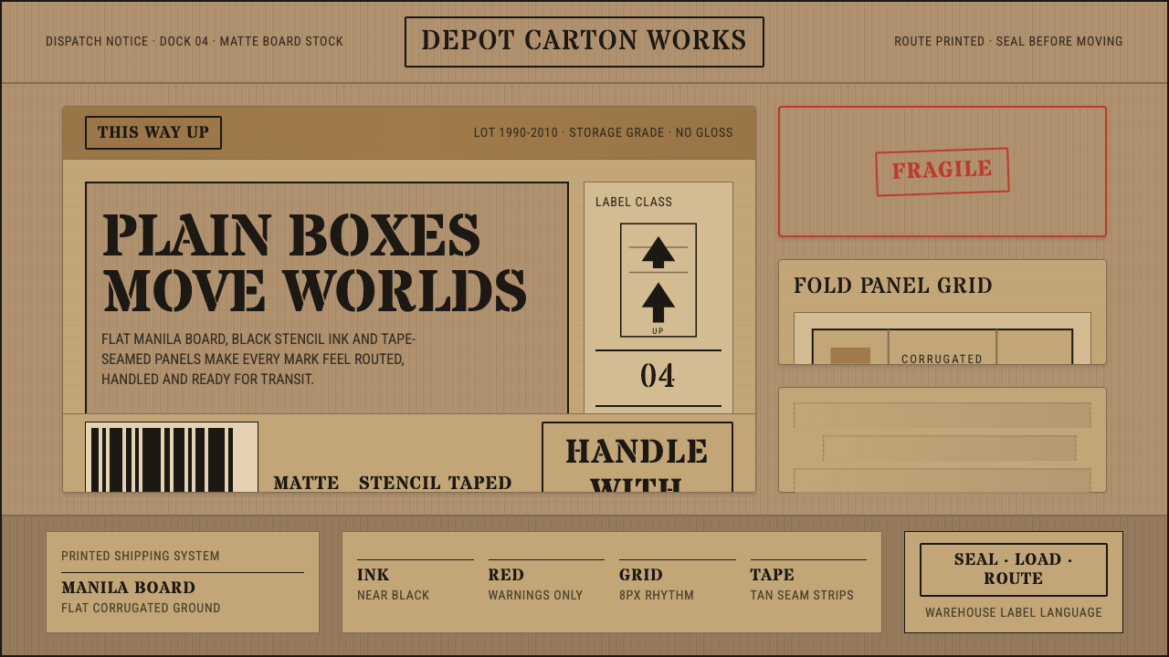 Cardboard Box CraftPlain utility has texture. Manila board, black stencil type, tape seams, red…