What is Coffee Roastery Burlap?
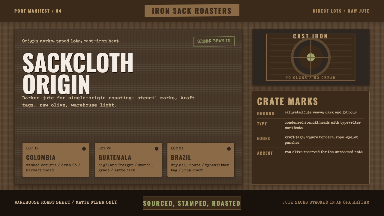
Coffee Roastery Burlap grounds an interface in the coarse jute sack that raw coffee beans travel in — deep-woven fiber, stenciled origin marks, and cast-iron roasting machinery, with color kept to roasted brown and a single raw-bean olive.
Coffee Roastery Burlap in brief
Coffee Roastery Burlap is a working-craft material style built around the actual object that green (unroasted) coffee beans are shipped in: a coarse woven jute sack, dyed dark rather than the pale, bleached cotton bag many people picture when they hear 'burlap.' The system insists on this distinction — it is modeled on the authentic, deeply saturated raw-fiber weave used in real specialty-coffee shipping, not the lighter, more decorative ivory-printed sacks that show up in generic café branding.
Its visual vocabulary comes directly from the working life of a roastery rather than from a finished café counter: condensed stencil lettering of the kind used to mark origin, grade, and weight directly onto shipping sacks; typewriter-style lot labels; kraft-paper tags layered over the woven-fiber ground; and cast-iron roasting equipment standing in as a material and color reference. The palette stays deliberately narrow and dark — deep roasted-brown tones dominate, lifted by exactly one accent, a raw, unroasted green-bean olive, rather than a full spectrum of café-friendly pastels.
The overall register is intentionally rough and unglamorous: nothing in this system is glossy, pale, or cream-colored. Where a conventional coffee brand might reach for warm cream backgrounds and soft rounded typography to suggest comfort, this style reaches instead for saturated darkness, visible weave texture, and stamped or stenciled lettering to suggest labor, provenance, and the industrial process a bean goes through long before it ever reaches a cup.
Where does Coffee Roastery Burlap come from?
The jute sack itself has a long industrial history: jute fiber, grown primarily in South Asia, became the standard global packing material for bulk agricultural goods — coffee, cocoa, grain, cotton — through the nineteenth and twentieth centuries because it was cheap, strong, breathable, and biodegradable, all properties that matter enormously for beans that need to survive weeks at sea without spoiling. The coarse weave and dark, undyed fiber color that this style borrows are not stylistic choices made for a coffee brand; they are simply what the actual shipping material looks like before anyone tries to make it presentable.
Onto that raw material, exporters and cooperatives stencil identifying marks — country of origin, farm or cooperative name, grade, and weight — directly onto the fiber, usually in a condensed, high-contrast lettering style chosen because it has to remain legible after weeks of handling, stacking, and exposure to weather in transit. This stenciling tradition, born entirely out of logistical necessity, is the direct source of the condensed display lettering and stamped lot-label typography this system uses decoratively; in its original context, none of it was decoration at all.
This style's era and geography are tied to the modern specialty-coffee, or 'third-wave,' movement that emerged from roughly 2010 onward, though its roots reach back further. Third-wave coffee treats the bean the way wine culture treats grapes — foregrounding single-origin sourcing, traceability back to a specific farm or region, and direct-trade relationships between roasters and growers, rather than treating coffee as an interchangeable commodity blended for consistency. Green beans central to this style typically originate from Latin American growing regions — Colombia, Guatemala, Brazil among them — and travel by sea in exactly the kind of jute sacking this system depicts.
The style's key figures, as it were, are roles rather than named individuals: the specialty roasters who buy and roast small, traceable lots rather than blending anonymous bulk coffee; the green-coffee importers who manage the physical logistics of getting sacks from farm to port to roastery; and the origin-stencil labeling tradition itself, which turned a purely functional marking system into a visual language now recognizable well beyond the industry that invented it. Cast-iron drum roasters, the heavy industrial machines that turn green beans brown through controlled heat, complete the material world this system draws its texture and color logic from.
What defines the Coffee Roastery Burlap look?
Color
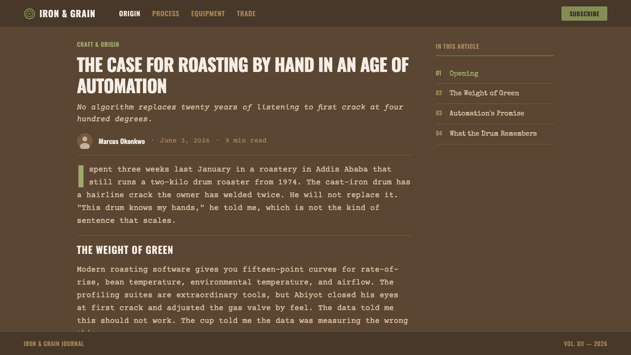
The palette stays deep and narrow: roasted-brown tones anchor almost every surface, lifted by exactly one accent — a raw, unroasted green-bean olive — rather than a broad range of café-friendly pastels. Nothing in the system reads as pale, cream, or ivory; even highlights stay within a dark, saturated register.
Texture & Material
The dominant surface is a coarse, deeply woven fiber texture — visibly rough rather than smooth, evoking real jute rather than a polished, decorative pattern. This raw-weave ground is treated as a structural material in its own right, not a background pattern applied for atmosphere.
Typography
Lettering draws on two working sources at once: condensed stencil letterforms, the kind stamped through a cut template directly onto shipping fiber, and plainer typewriter-style characters used for lot and weight labeling. Both favor legibility under rough handling over refinement, giving the system's type a stamped, utilitarian character rather than a polished editorial one.
Tags & Labels
Kraft-paper tags, layered directly over the woven-fiber ground, carry secondary information — lot numbers, weights, origin notes — the way a physical tag would be tied or stapled onto a real sack. This layering of a flatter paper material over a textured fiber ground gives the system a natural sense of depth without relying on shadow or gradient.
Composition
Marks are placed the way a real sack is marked — stamped or stenciled directly onto the woven ground rather than floating in a clean, isolated layout. Elements overlap and sit slightly askew rather than aligning to a pristine grid, reinforcing the sense of a hand-marked working object rather than a manufactured, mass-produced label.
Restraint & Finish
The system actively refuses gloss, sheen, and softness at every level — no rounded corners standing in for comfort, no glossy highlights suggesting a polished retail product. Roughness is the point: this is meant to evoke the loading dock and the roasting floor, not the finished café counter.
Who shaped Coffee Roastery Burlap?
The roasters at the center of the third-wave movement who buy small, traceable lots directly rather than blending anonymous bulk coffee, treating each origin's beans as worth showcasing on their own terms rather than folding into a house blend. Their emphasis on transparency and provenance is what gives this style its documentary, working-object character.
The intermediaries who manage the physical logistics of moving raw beans from farm gate to port to roastery, handling the actual sacks, shipping documentation, and quality grading that this style's stencil marks and lot labels are modeled on. Their operational world — warehouses, pallets, cargo holds — is the literal setting this system depicts.
A purely functional practice — marking country, farm, grade, and weight directly onto shipping sacks so information survives weeks of handling — that has, almost by accident, become a recognizable visual language of its own. This system borrows that language deliberately, as decoration, while its original users applied it purely as necessity.
The broader movement, emerging from roughly 2010 onward, that reframed coffee as a traceable, single-origin product deserving the same attention to provenance and craft as wine — direct-trade relationships, farm-level transparency, and artisanal roasting all trace back to this shift, and this design system is its material-culture expression.
How do you use Coffee Roastery Burlap today?
Coffee Roastery Burlap works best wherever a brand wants to signal authenticity, craft, and traceable provenance rather than polish or convenience — applying it well means leaning into roughness and restraint rather than softening the palette into something more conventionally 'cozy.'
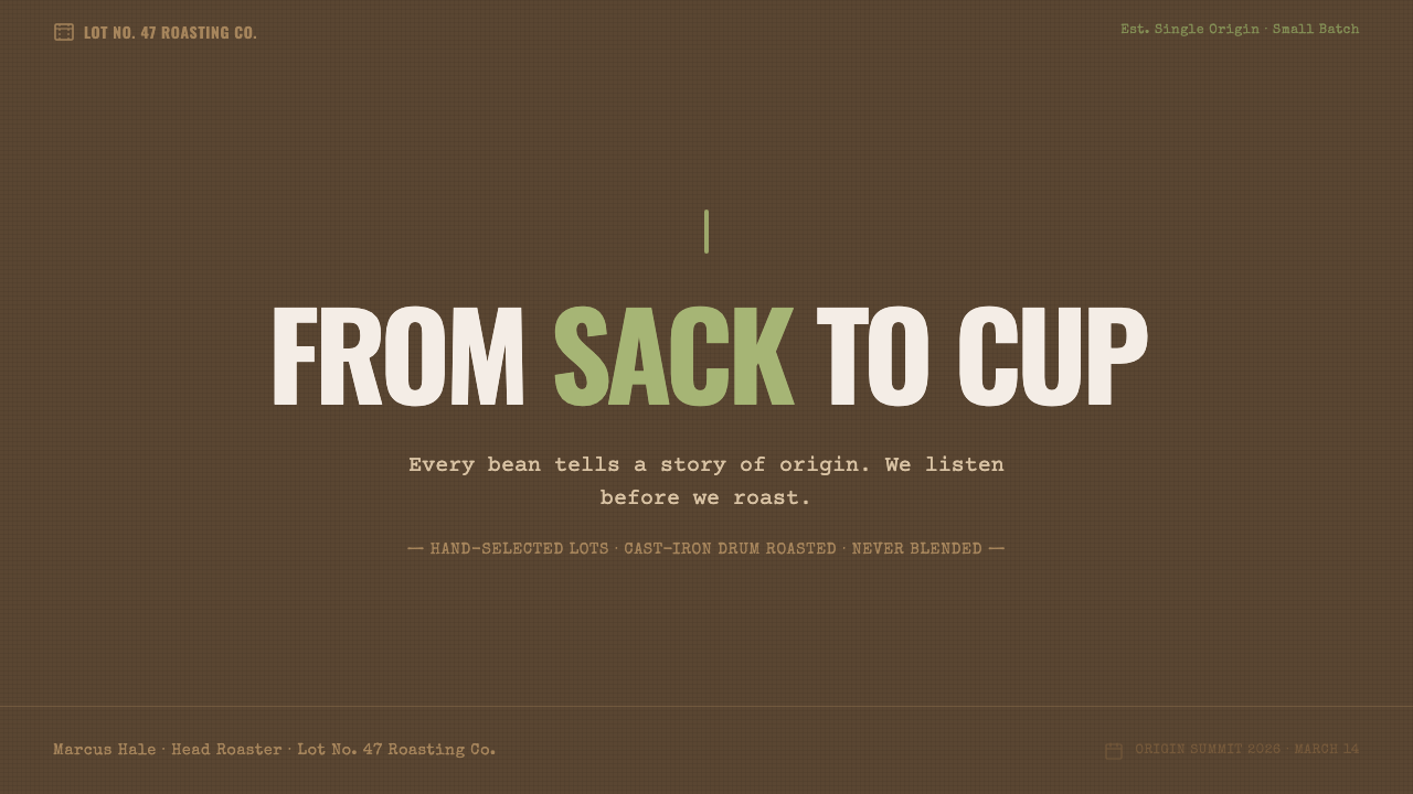
On presentation slides, a cover works well built around a large expanse of woven-fiber texture with a single stenciled title stamped across it, kept to the roasted-brown-and-olive palette rather than introducing new color. Content slides should treat kraft-paper tags as the natural container for callouts and labels, layered over a darker textured field; body text should stay plain and typewriter-plain rather than decorative. Data slides read well as stamped or stenciled numerals directly on the fiber ground, with the single olive accent reserved for the one figure that matters most on a given slide.
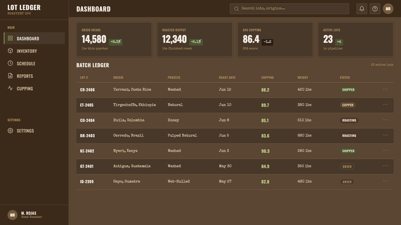
For web interfaces, this style suits e-commerce and storytelling-driven brand sites more naturally than dense dashboards, since its narrow, dark palette is built for evocative mood rather than for distinguishing many simultaneous data states. Product cards can use kraft-tag styling for price and origin information layered over a woven-texture card background; navigation and buttons should stay plain and stamped-looking rather than glossy or rounded, and the olive accent should be reserved for a single primary action per screen so it keeps its meaning as 'this is the one green thing here.'
In editorial and marketing work, the style is well suited to origin storytelling — farm profiles, roasting process explainers, packaging design — where the goal is to make the reader feel the weight and texture of the physical supply chain. Long-form articles benefit from stencil-style pull quotes and section markers stamped directly into the fiber-textured background, while marketing pages can use the same woven ground as a full-bleed backdrop with kraft-tag callouts doing the work that a conventional call-to-action button would do elsewhere.
A common mistake is reaching for the pale, ivory-printed cotton look that this style deliberately rejects — softening the ground toward cream or adding rounded, friendly typography undoes the entire premise, since the whole point is the darker, coarser, more industrial jute. It is equally a mistake to introduce a second or third accent color beyond the single olive; the system's credibility depends on that restraint, the same way a real shipping sack carries exactly the marks it needs and nothing more.
Coffee Roastery Burlap — FAQ
Why does this style insist on darker jute rather than the paler burlap look most café brands use?
Because the pale, ivory-printed cotton bag look that many café brands use is a decorative simplification, not what real green-coffee shipping material actually looks like. This system is modeled on the authentic, deeply saturated raw-fiber weave used in genuine specialty-coffee logistics, and treats that authenticity as the entire point — softening it toward cream would mean abandoning the working-object premise the style is built on.
Can this style work for a finished, retail-facing café rather than a wholesale or roastery brand?
Yes, particularly for brands that want to foreground their sourcing story at the point of sale — a bag of beans, a menu, or packaging that visually connects the finished cup back to the shipping sack it traveled in. It works best when that connection is genuine; a retail brand with no real single-origin or direct-trade story will find the style's specificity works against it rather than for it.
Is the olive accent color flexible, or should it always stay a single color?
The discipline of a single accent is central to the system — it represents the one moment of raw, unroasted green visible against a world of roasted brown, and that meaning depends on scarcity. It can shift in hue slightly depending on the specific brand, but introducing a second competing accent color dilutes the logic and makes the palette read as generically 'earthy' rather than specifically tied to the bean's own transformation from green to brown.
Does the stencil-lettering approach limit how much text a layout can carry?
It favors short, punchy labels — origin names, lot numbers, single-word section markers — over long-form dense paragraphs set in the same stencil style. In practice, stencil lettering works best for headlines and callouts, while body copy should shift to a plainer, typewriter-adjacent style, the same division of labor a real sack shows between its bold stamped marks and any smaller handwritten notes added later.
What kind of brand voice or industry would this style struggle to represent?
Anything that wants to feel light, playful, or instantly welcoming will fight against this style's deliberate roughness and darkness — children's products, casual snack brands, or anything positioned as effortless indulgence rather than deliberate craft. It also struggles for products with no real connection to sourcing or provenance, where the working-dock aesthetic would read as an affectation rather than an honest reflection of process.
Related design styles
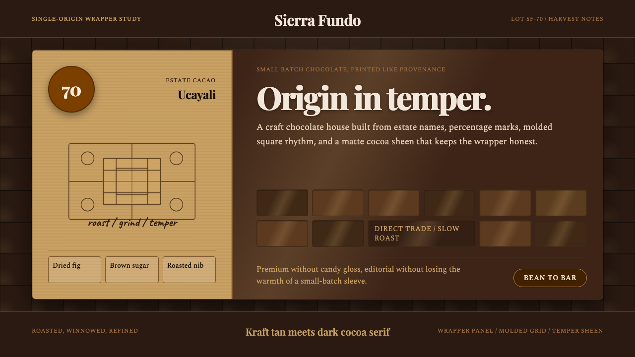 Bean-to-Bar ChocolateOrigin tastes tactile. Cocoa serif, kraft panel, and molded squares carry the…
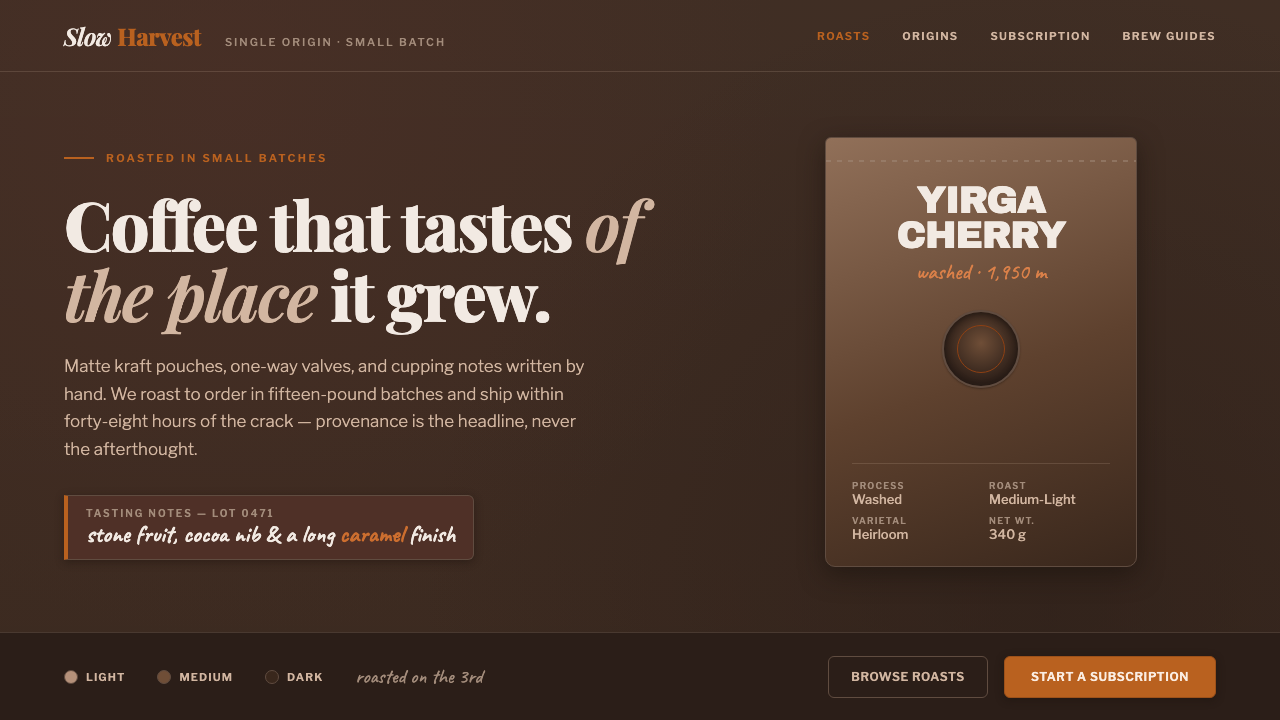 Specialty Coffee BagProvenance is the headline. Matte espresso ground, kraft-pouch type, one roas…
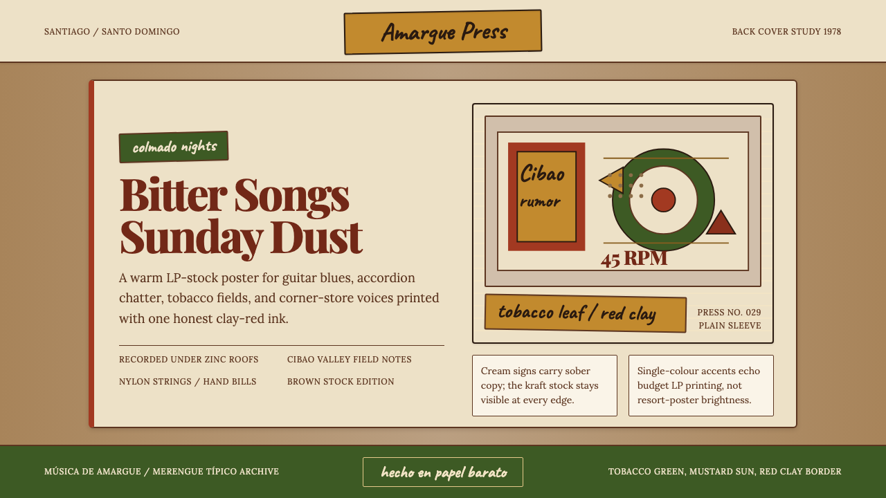 Dominican Bachata & Perico RipiaoPlainspoken warmth. Kraft stock, red clay serif, and typewriter credits carry…
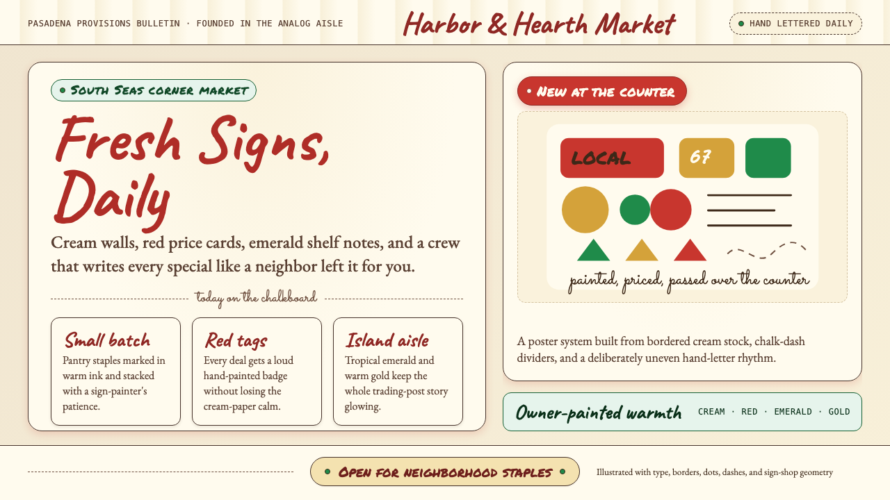 Trader Joe's Hand-LetteredHandmade grocery warmth. Cream chalkboards, red price tags, emerald accents.
 Gambian Griot Kora (21-string)Oral history feels tactile. Calabash beige, indigo bands, and 21 brass string…
 Mexican Mezcal CraftRooted and exact. Agave green, terracotta borders, and DM Serif labels tell t…