What is Card Catalogue Drawer?
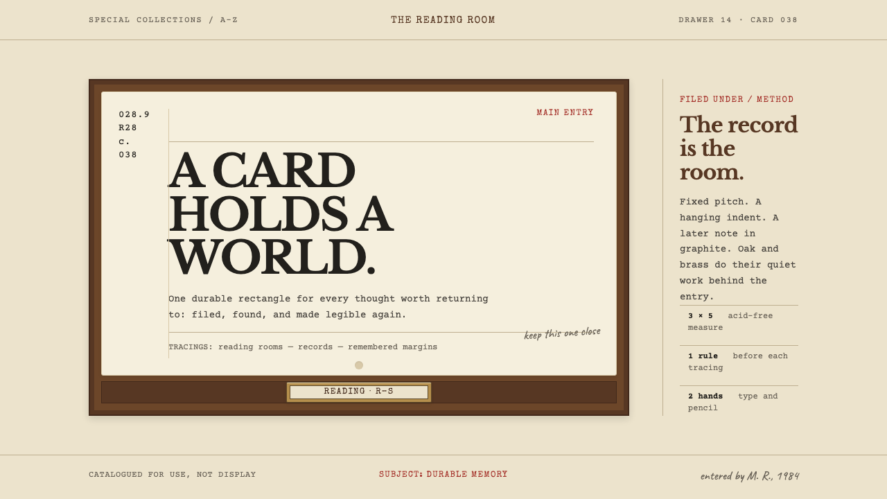
The card catalogue turned memory into an address — one cream rectangle, typed in fixed pitch, annotated in pencil, and held in its drawer by a brass rod.
Card Catalogue Drawer in brief
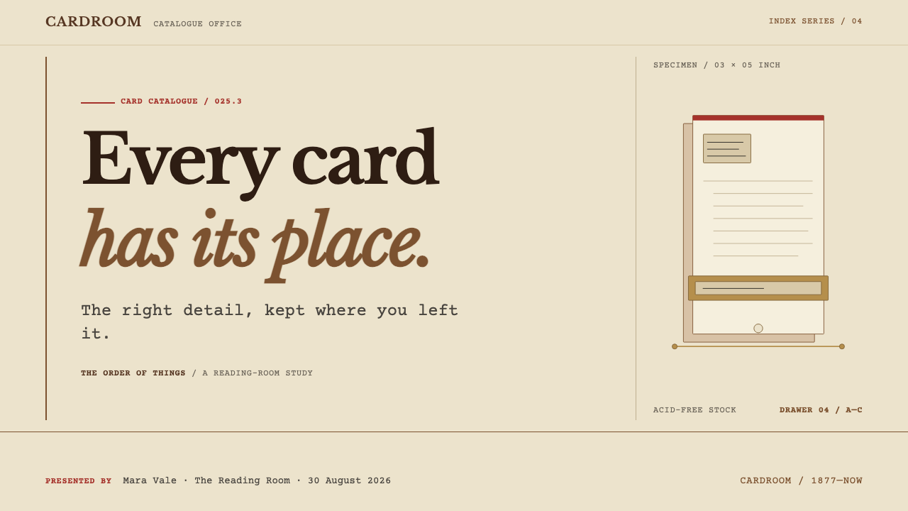
Card Catalogue Drawer is a visual system built from one of the most familiar objects of the twentieth-century reading room: the library catalogue card. Everything in the style happens on a single rectangle, a three-by-five-inch cream card of acid-free stock, threaded onto a brass rod so that nobody can walk off with it. The call number sits blocked in the upper left, the main entry hangs over its indent, and the tracings run along the bottom in the order a cataloguer would type them.
What makes the style distinctive is that it is a system of record, not a system of ornament. The type is struck rather than set: fixed pitch, uneven impression, the occasional letter riding a hair high, the ribbon fading toward grey as it wears. A second hand arrives later in pencil, annotating the margins long after the typist has gone home. Oak and brass stay behind the card as frame and hardware. They hold the content; they are never the content.
Read as a design language, it is warm without being decorative and orderly without being cold. It belongs to the family of archival and administrative aesthetics, where authority comes from consistency of format and from the visible traces of human handling rather than from polish. A catalogue card makes a quiet promise: anything worth knowing has a fixed place, and anyone who understands the order can find it.
Where does Card Catalogue Drawer come from?
The visual system rests on a standard that is easy to overlook precisely because it worked so well. In 1877, through the American Library Association, the library card was fixed at three inches by five, and for roughly a century afterwards it barely changed. A fixed size meant that cards from different libraries, publishers and typewriters could share a drawer, and that a drawer could be built to hold them. The unit of the catalogue stopped being a book or a page and became a card: small enough to hold in one hand, large enough to carry everything a reader needed to find a single title.
The number in the upper-left corner owes its logic to the Dewey Decimal Classification, the system associated with Melvil Dewey. A decimal call number turns a subject into a location: the same figure that appears on the card appears on the spine, so the card is a promise that the book sits at a particular address. That promise is the emotional core of the style. The line that summarises it, memory gets a durable address, is meant literally. The card does not describe a book so much as point at it.
Mature card-catalogue practice, in the source's phrasing, runs from about 1950 to 1990, and the look it left behind is shaped by the typewriter. Cataloguers typed the main entry and hung it over an indent so that an author's name could be scanned down a whole drawer, then typed the tracings, the list of other headings under which the book could be found, along the bottom in a set order. The Library of Congress Card Division supplied printed cards that libraries could file as they arrived, and library suppliers such as Gaylord Bros. furnished the surrounding apparatus, which is why the oak, the brass rod and the label frame look so alike from one reading room to the next.
Geographically the style is North American: public and university reading rooms, with Syracuse in New York and Stockton in California singled out in the source. Its social setting is the shared reading room, where strangers consulted the same drawers and left small marks behind: a pencilled correction here, a softened corner there. Today the drawers have largely given way to screens, which is part of why the look now reads as the memory of a particular kind of trust, an institution that kept its records in plain sight, in one format, for anyone to pull open.
What defines the Card Catalogue Drawer look?
Color
The ground is cream, the colour of acid-free card stock: never pure white, never aged to yellow-brown. Ink is a dark, slightly softened black, the colour of a ribbon in daily use, and the second voice is graphite, the soft grey of pencil in the margins. Brass supplies the only metallic note and is used with restraint, as a hint of the rod, the label frame and the hardware. Oak is a backdrop material, not a palette to paint with. Saturated colour has no place here; if a signal is needed it comes from a pencilled mark or a rule, not a bright fill.
Typography
Type is monospaced, struck by a typewriter rather than set by a typographer. Every character occupies the same width, which gives text blocks their columnar order, and the uneven impression, a letter a little heavier here and a little high there, keeps the surface human. A typewriter has no sizes to play with, so hierarchy comes from position, indentation and spacing rather than from scale. The effect is closer to a form that was filled in than a page that was designed, and that is exactly the authority the style wants.
Card Anatomy
Every card follows the same anatomy. The call number sits blocked in the upper left; the main entry hangs over its indent; descriptive lines follow in the order a cataloguer would type them; the tracings run along the bottom. This anatomy is the grid of the style. Layouts built on it make hierarchy out of position and indentation, so a reader learns where to look once and is rewarded everywhere afterwards. Consistency across cards matters more than the beauty of any single card.
Pencil Annotation
Pencil arrives later, in a second hand. A corrected number, a cross-reference or a note might sit in the margin in graphite grey, in a different hand from the typed entry and never competing with it. The result is a document with a history rather than a freshly printed one. In interface terms this is a separate layer of voice for comments, notes and edits: visibly secondary, visibly human, and clearly added after the fact.
Oak and Brass
Oak and brass stay behind the card as frame and hardware. The brass rod through the card, the label frame on the drawer front and the warm wood at the edges suggest the physical archive without becoming it. The rule is clear: they hold the content, they are never the content. A wooden cabinet should not become the page, and wood grain should not be tiled across a whole screen. The content always grows on the card.
Wear and Imperfection
Authority here comes from consistency and wear, not polish. The ribbon is a little tired, the impression uneven, the card edges softened by hands. These small imperfections are part of the vocabulary, and they should be suggested through restrained irregularity in tone and weight rather than faked with noise filters or grunge overlays. A catalogue card that looked brand new would be less convincing; one that looked deliberately distressed would be false.
Who shaped Card Catalogue Drawer?
Dewey is the name behind the Dewey Decimal Classification, the numbering system whose call numbers occupy the upper-left corner of the card. In the source he stands for the idea at the heart of the style: a subject can be given a number, and a number can be given a place. His system gave the catalogue its backbone; the card gave it a surface. Every design decision about where the number sits and how it is blocked descends from that pairing.
A library-supply company named in the source among the key figures. Its importance to the style is physical: the catalogue was not only information but furniture, with drawers, rods, label frames and cards supplied as a coordinated system. Gaylord Bros. stands for the supply trade that made one reading room resemble another, and with it the oak-and-brass hardware that the style keeps firmly in the background.
The Card Division of the Library of Congress supplied standardised printed cards to libraries, so that a title catalogued once could be filed in many places. It stands for the standardisation half of the story: the idea that format itself is a form of trust, and that a reader should be able to walk into any library and read any card. For designers, it is the argument for strict consistency across every entry.
The professional body through which the card standard was settled in 1877. Its role in the story is the quiet kind: it did not design a look, it set a size and a set of expectations, and a century of reading rooms organised themselves around them. The style inherits that spirit, in which a shared constraint is more powerful than any individual flourish.
How do you use Card Catalogue Drawer today?
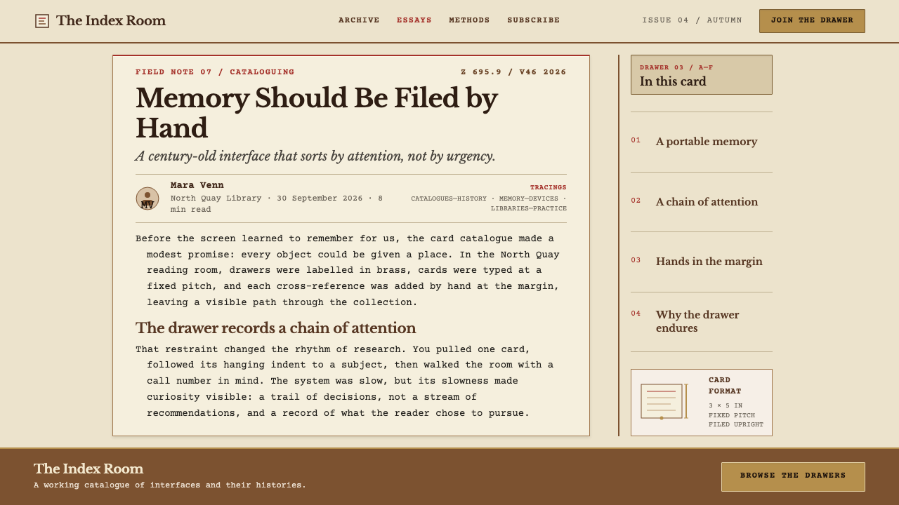
As a slide cover, the card is the whole composition. Place a single cream card on a quiet ground, type the title in monospace at the upper left, put a call-number-style marker above it and a few lines of metadata below in the order a cataloguer would type them. Resist the urge to fill the slide. A cover that looks like a catalogue entry is authoritative precisely because it is plain.
Content slides can each be treated as a card: a hanging-indent heading, short typed lines, and a small tracing line at the bottom for sources or related topics. For data, prefer tables, tallies and ruled lists to glossy charts. Fixed-pitch type lines numeric columns up naturally, and graphite grey is the right voice for annotating the one figure that matters. Keep charts monochrome, with brass or pencil grey as the only accent.
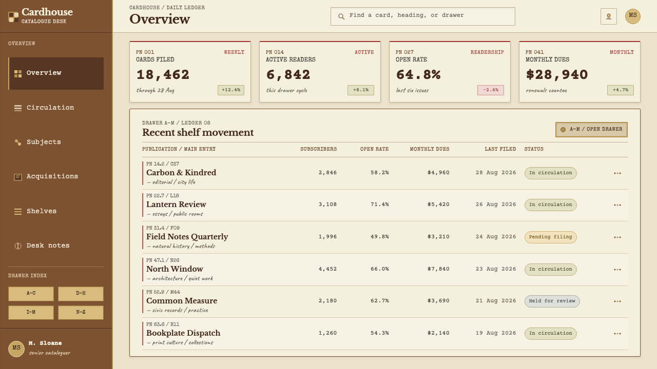
In web interfaces the style suits archives, documentation, knowledge bases, reference tools, search results and any product where finding is the point. A results list is naturally a drawer of cards: each result is a short typed entry with an identifier on one side and a hanging title. For dashboards and pricing pages, use cards sparingly and keep the arrangement ordered: plan names as entries, features as typed lines, the price in the place the call number would sit. The goal is calm, ordered and fast to scan.
Editorial and marketing work benefits from the style's sense of institutional trust. Reading lists, annual reports, library and museum projects, essays about memory and records, and products that promise to keep things safe all gain from a card-shaped layout with a typed byline and pencil-grey footnotes. Marketing pages should let the card carry the headline; photography, if it appears at all, should be quiet and documentary.
The most common mistake is over-literalising. Drawing a full wooden cabinet, tiling wood grain behind every section, or adding shadowed brass screws and curling paper edges turns an exercise in restraint into a theme-park prop. Close behind is the opposite error: keeping the monospaced type but setting it on pure white with bright accent colours, which gives a code-editor look and loses the catalogue. The card, the typed text and the quiet hardware have to appear together, in that order of importance.
Card Catalogue Drawer — FAQ
What separates Card Catalogue Drawer from a generic vintage-paper look?
Specificity. A generic vintage look reaches for stains, torn edges and sepia everywhere. This style is built around one unit, the catalogue card, with a fixed anatomy: call number upper left, hanging main entry, tracings along the bottom. The type is monospaced and uneven because it was typed, pencil appears as a second hand, and the oak and brass stay behind the card as hardware. It is a system of record with rules, not a mood board of old paper.
Should I draw the wooden cabinet and the brass rod?
Hint at them; do not build them. The source is explicit that oak and brass are frame and hardware, never content. A strip of warm wood tone at an edge, a small brass-coloured detail where a rod would pass through the card, or a label-frame outline is enough. A full cabinet illustration or wood grain behind every section pulls attention from the card, which is where the content must live.
Doesn't monospaced type make it feel like a code editor?
Only if the rest is wrong. In a code editor, fixed-pitch type sits on a clean, high-contrast ground in perfectly even strokes. Here it sits on warm cream, in dark softened ink, with uneven impression and an occasional letter riding high, and it is framed by pencil annotation and quiet hardware. Those surrounding cues turn fixed pitch from a tool signal into a typewriter signal.
Can the style work in dark mode?
The reference is light: a cream card in a lit reading room. A dark version is possible if the card stays the bright object. Treat the drawer interior or surrounding frame as a dark ground, keep the card cream with softened dark type, and let graphite and brass remain quiet. If the whole screen turns dark, the card stops being a card and the style loses its anchor.
Which products suit this style, and which do not?
It suits products built on finding, keeping and referencing: archives, libraries, documentation, research tools, notes apps, reading lists and institutional publishing. It struggles where energy, speed or playfulness is the brand promise, such as games, entertainment and loud consumer launches, because its calm and its reliance on consistency work against spectacle.
Related design styles
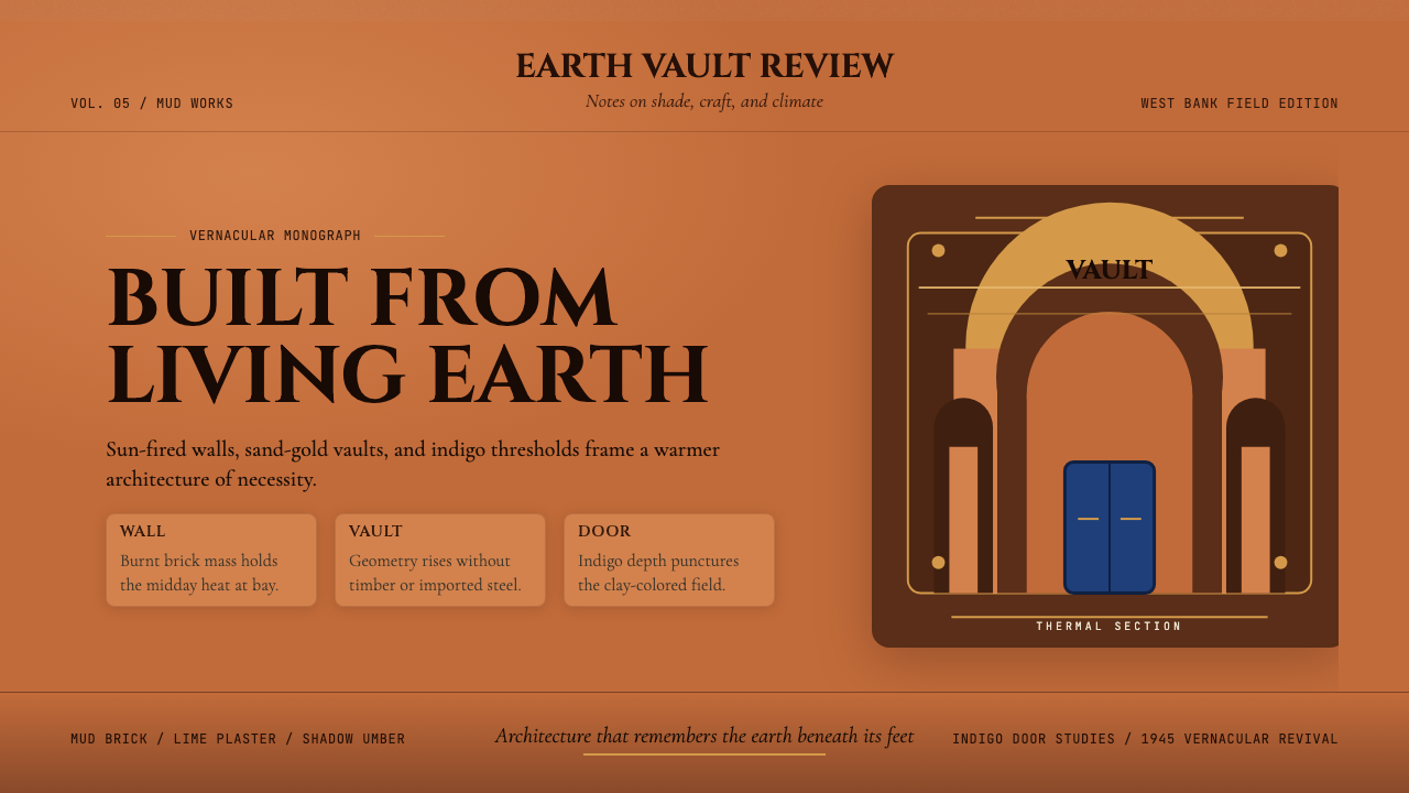 Egyptian Hassan Fathy Vernacular (1945)Earth remembers craft. Burnt brick, sand-gold vaults, and indigo doors carry…
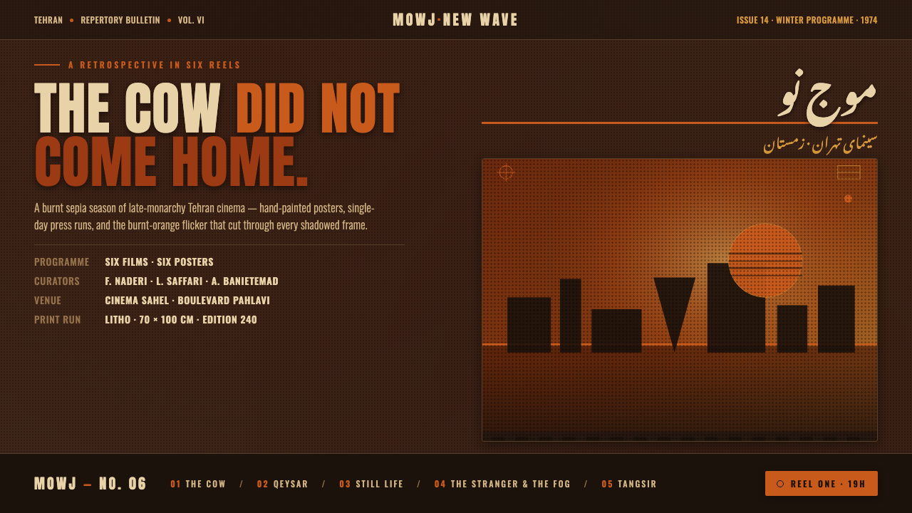 Iranian New Wave PosterPre-revolution Tehran cinema, burnt. Grainy ochre duotone over dark sepia, st…
 Soviet Sanatorium PinkState calm in stone. Salmon terrazzo, condensed signage, and chrome rails for…
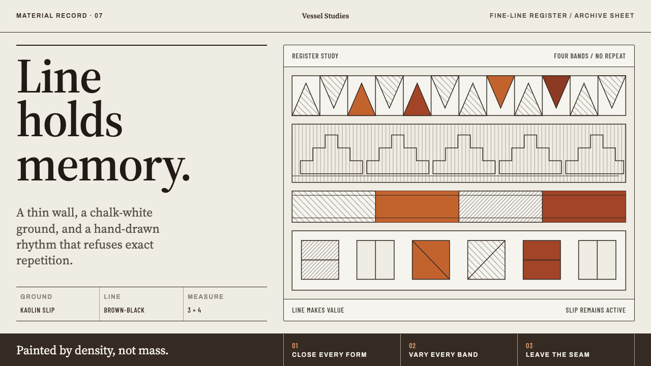 Acoma Pueblo PotteryLine carries the whole story. Brown-black hachure and mineral-red bands cross…
 Afar Nomad TextileWeight lives at the edge. Rust and madder selvedges cut across a quiet cotton…
 Budapest Millennium LineChestnut glaze turns transit into a room. Fired slab type and flat yellow run…