What is Acoma Pueblo Pottery?
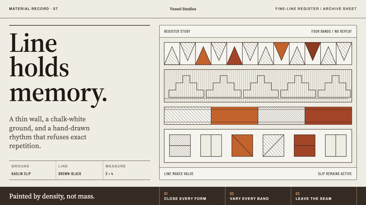
Acoma pottery gets everything from two things: a chalk-white slip ground and one brown-black line, with density built by hatching rather than fill.
Acoma Pueblo Pottery in brief
Acoma Pueblo Pottery is the painted-vessel tradition of Acoma Pueblo, known to its own people as Haak'u, in Cibola County, New Mexico. Its look is unmistakable once you know the parts: a chalky white slip ground, fine brown-black linework drawn with a yucca brush, and bands of mineral red, all wrapped around thin-walled vessels in stacked horizontal registers. The style draws on two layers of the tradition, the historic Acoma polychrome of the eighteenth and nineteenth centuries and the fine-line revival that runs from the middle of the twentieth century to the present.
What makes it a design system rather than a decorative look is that every visual decision traces back to a material decision. Acoma clay fires grey, so the potter wipes a kaolin slip over the entire body with a rag to make a white ground. The painted line comes from beeweed boiled down to a syrup, and it fires brown-black rather than neutral black. The walls are struck paper-thin. The picture is not applied to the pot; it grows out of how the pot is made.
Visually the result is spare, and exact in a hand-made way. Line does all the structural work, and tone comes from how closely the lines are packed, not from how much ink is laid down. The unpainted slip counts as much as the painted shape, so figure and ground lock together and can be read either way. Nothing is glazed, nothing is shaded, and the brush is allowed to drift. Where most digital styles lean on fills, shadows and gloss, this one gets its richness from stroke and ground alone.
Where does Acoma Pueblo Pottery come from?
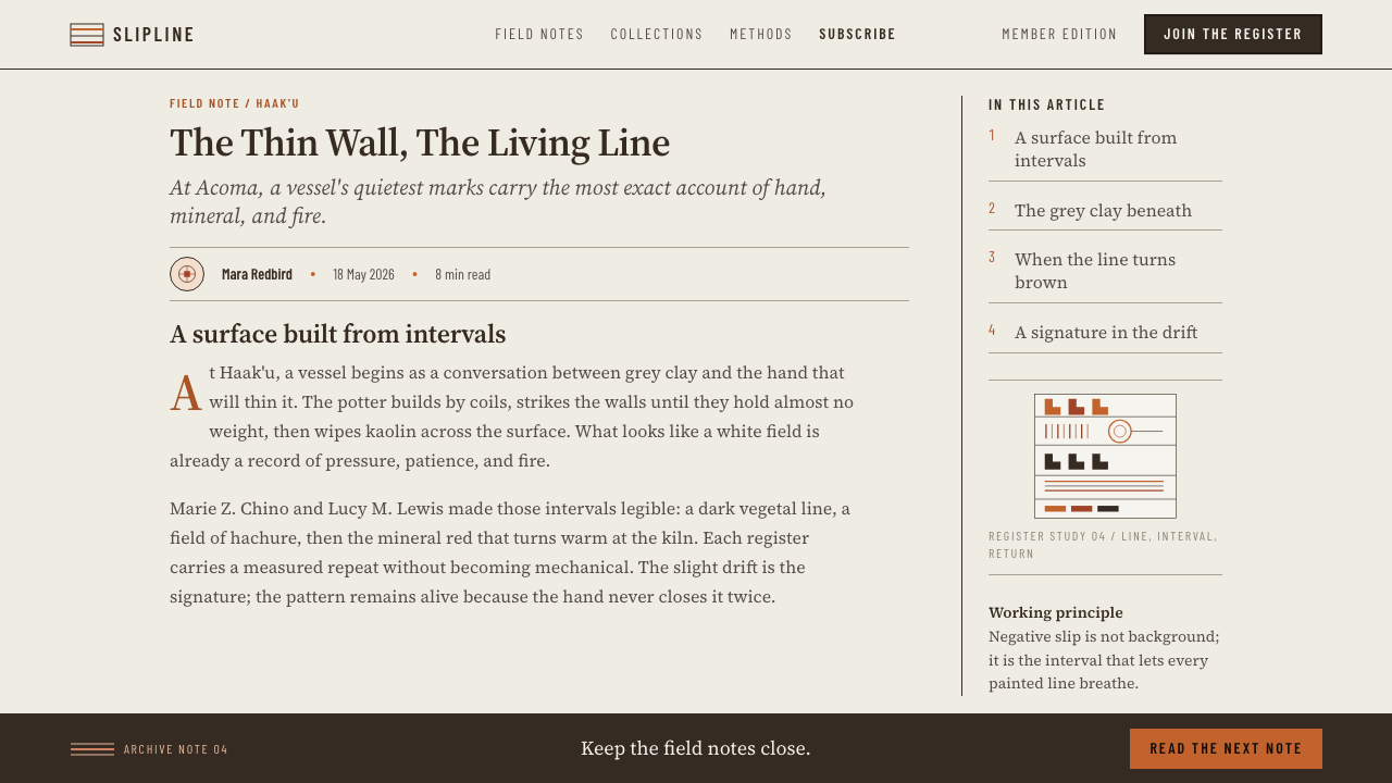
Acoma Pueblo stands in Cibola County in western New Mexico. Its people call it Haak'u, and it is widely known as the Sky City. Pottery has long been central to life there, and the vessel is the tradition's main surface: a curved, thin-walled body that the painter reads as a continuous wrapped band rather than a flat page. The historic Acoma polychrome of the eighteenth and nineteenth centuries set the template that later work answers to, with a pale ground carrying dark linework and areas of mineral red in a controlled, banded arrangement.
The material chain explains the look. Acoma clay fires grey, which is not the colour anyone wants behind a fine drawing. The remedy is slip: kaolin, a white-firing clay, thinned to a liquid and wiped over the whole vessel with a rag until it dries to a soft, chalky skin. That skin is the page. The potter paints on it with a brush made from yucca, and the dark paint is beeweed boiled until it turns to syrup. Fired, it settles into a warm brown-black instead of a flat black, which is why this system's darkest tone leans brown. Because the walls are struck paper-thin, the vessel is light in the hand, and the painter works on a surface that is both fragile and unforgiving.
The fine-line revival of the mid-twentieth century is where the tradition's most recognizable modern look comes from, and it continues today. Potters such as Lucy M. Lewis and Marie Z. Chino are the names most often attached to it. The revival is usually understood as looking back to Ancestral Puebloan pottery as much as continuing nineteenth-century Acoma work, and it pushes the linework finer and the surface fuller: bands stacked around the vessel, each ruled to a different figure, none of them repeated. The effect is a surface that rewards close looking, dense yet light, because the density is made of line rather than mass.
Translating this into a digital design system means taking the pot's logic literally rather than copying its pictures. The system keeps the slip ground, the single dark line, the red bands, the registers and the hand drift. It does not reproduce specific figures, which are the work of the potters who paint them. Anyone using the style should treat it as a set of constraints borrowed with respect, credit Acoma potters where the context allows, and avoid passing the result off as generic Native American decoration. It is one community's craft, with specific materials and specific makers.
What defines the Acoma Pueblo Pottery look?
Slip Ground
The ground is a chalky, warm white, not the pure white of a screen. It reads as a material, a wiped clay skin, and it carries slight unevenness. Treat it as the page's real surface: large, quiet and present, never a blank void waiting to be filled.
Brown-Black Line
The drawing line is a warm brown-black, the colour beeweed fires to, rather than a neutral black. It is thin, steady and slightly irregular, with the soft edge of a dry brush. Outlines, rules, hatching and even type all take this one line colour, which keeps the whole page unified.
Mineral Red Bands
A mineral red enters as bands and filled areas, an earthen red-brown rather than a bright signal red. It marks registers and emphasis and sits beside the dark line without competing with it. Used sparingly, it gives the page a second voice while the white and the brown-black stay in charge.
Hatching for Density
Where other styles would fill a shape solid, this one fills it with parallel strokes. Closer spacing means a darker tone, wider spacing a lighter one, and the slip shows between every stroke. Density becomes a matter of line count, which keeps even the busiest panel light and breathable.
Registers
Pattern is organized in horizontal bands that wrap around the form, each band ruled to a different figure, and no band repeats another. The rhythm comes from variation inside a strict structure: parallel rows, each with its own character, stacked rather than tiled.
Figure and Ground
Negative slip reads as actively as painted shape. Motifs interlock with the spaces between them, so the eye can flip between reading dark on light and light on dark. In layout terms, margins and gaps are designed shapes, not leftovers.
No Gloss, Hand Drift
Nothing is glazed and nothing is shaded: no glassy highlights, no gradient shadows, no soft depth. Bands vary in width and do not always close perfectly, because a yucca brush wanders. The system keeps that drift instead of tidying it into vector precision.
Who shaped Acoma Pueblo Pottery?
One of the two key figures named for Acoma's fine-line tradition. Her name is attached to the mid-twentieth-century revival that made hatched, tightly ruled bands the face of Acoma painting, and to the thin-walled, finely drawn vessels this system takes as its model.
A second key name in the fine-line revival. Her place in the tradition is a reminder that the style is the accumulated work of many hands, and that its fineness is a shared standard among Acoma potters rather than one person's trademark.
The tradition is collective. The potters of Haak'u built the chain of choices this system treats as its logic: kaolin slip, yucca brush, beeweed paint, thin wall, banded registers. Every rule in the design system is a rule they worked out in clay first.
The older pottery tradition that Acoma's fine-line revival is usually understood to look back to. The pale ground, the banded layout and the dark linework sit in a long regional lineage, which is a reminder that Acoma work belongs to a deep history, not a recent look.
How do you use Acoma Pueblo Pottery today?
Acoma Pueblo Pottery works best as a discipline of line, ground and band rather than a costume of motifs. Applied well, it makes a page feel hand-made, patient and precise. Applied badly, it becomes a southwestern pastiche. A useful test is whether the layout would still read as Acoma-derived if every decorative figure were removed: if the answer is yes, the structure is doing the work.
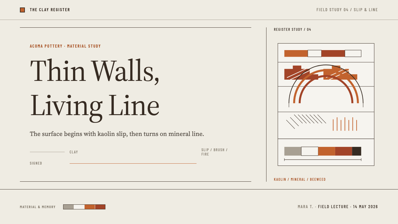
On slides, a cover can be nearly empty: a slip-coloured ground, a title in a plain, quiet typeface, and a single band of hatching and red across the lower third, like the shoulder of a vessel. Content slides work as registers: one horizontal band per idea, separated by the dark line, each band allowed its own internal rhythm. For data, replace solid bars with hatched ones; the density of the hatching encodes magnitude, and the slip shows through between strokes. Circular charts become radial hatching rather than solid wedges.
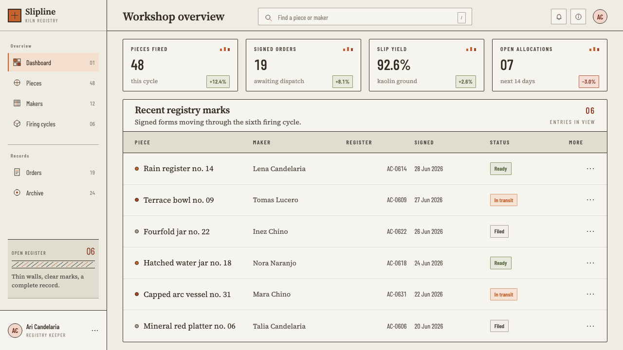
In interfaces, the style suits calm, content-led products: documentation, craft commerce, cultural institutions, learning tools. Surfaces stay on the slip ground. Cards are separated by drawn rules rather than shadows, inputs are outlined or underlined in the dark line, and state changes come from hatch density or a red band, not from glow or elevation. A dashboard in this style stays quiet: a hatched trend line looks beautiful, while a glossy gradient chart destroys the system.
For editorial and marketing work, treat the page as a vessel with registers: a header band, body bands and a closing band, each divided by a fine rule. Photography sits in plain frames with no drop shadows, and illustration is line-only. Pull quotes and captions can occupy their own bands. Long reading text should stay unadorned, since the style asks for restraint in the text area and saves its pattern for margins and dividers.
The most common mistake is making the line too perfect and too black. Pure black vector strokes on a pure white screen throw away the two things that make this system specific: the warm brown-black of the fired line and the chalky material ground. The second mistake is fill. Solid blocks, gradients and soft shadows all reintroduce the mass that this style deliberately avoids. And do not paste actual Acoma figures into products; borrow the structure, not the pictures.
Acoma Pueblo Pottery — FAQ
Is this the same as a generic Southwestern or Native American style?
No. Generic Southwestern decor tends to mix motifs and colours from many sources. This system is derived from one pueblo's slip-painted pottery and its specific material logic: grey-firing clay, kaolin slip, yucca brush, beeweed line. Treat it as a specific craft tradition, and describe it as Acoma-inspired rather than as a catch-all regional look.
Can it work in dark mode?
The system is built around a pale slip ground carrying a dark line, so a dark inversion changes its character. If you need one, keep the line logic, the hatching and the banded structure, and make the ground a deep warm earth tone. Expect it to feel like a departure from the tradition rather than a faithful variant, and keep line contrast high enough to read comfortably.
How do I show density or emphasis without shading?
Use hatching. Packing the strokes more closely darkens a region and spacing them out lightens it, while the slip stays visible between lines. For emphasis, add a band of mineral red or a heavier run of hatching. Both options keep the page flat and hand-made, which is the point of the system.
Why does the line colour lean brown instead of black?
Because the paint is beeweed boiled to a syrup, and it fires brown-black, never neutral. The warmth matters visually: it ties the line to the chalky ground and to the earthen red, so the three read as one material family. A neutral black would look digital and pull the page apart.
Is it appropriate to use this style commercially?
The system borrows methods, namely slip ground, a single line, hatching and registers, not specific figures, and that is the safest way to use it. Avoid reproducing actual Acoma designs, credit the tradition where context allows, and be cautious about using it for products that have nothing to do with craft, culture or learning. When in doubt, favour restraint over pastiche.
Related design styles
 Bangladeshi Nakshi Pitha MotifsWarm relief, never print. Galada type and tan lattice press rice-flour craft…
 Miʼkmaq QuillworkColour never blends. Bright quill bands step across dark birchbark toward an…
 Uyghur Muqam & Dap DrumLamplight on carved wood. Ochre and amber over mulberry-brown, edged in bone-…
 Ainu Attus RobeProtection is cut, not painted. Indigo bands and square-ended thread hold elm…
 Assam Muga Silk & GamosaWarm ceremony in silk. Muga gold sheen meets crimson borders and woven diamon…
 Belarusian RushnykRed carries meaning. Madder rhombs crowd aged flax edges while the woven cent…