What is Soviet Sanatorium Pink?
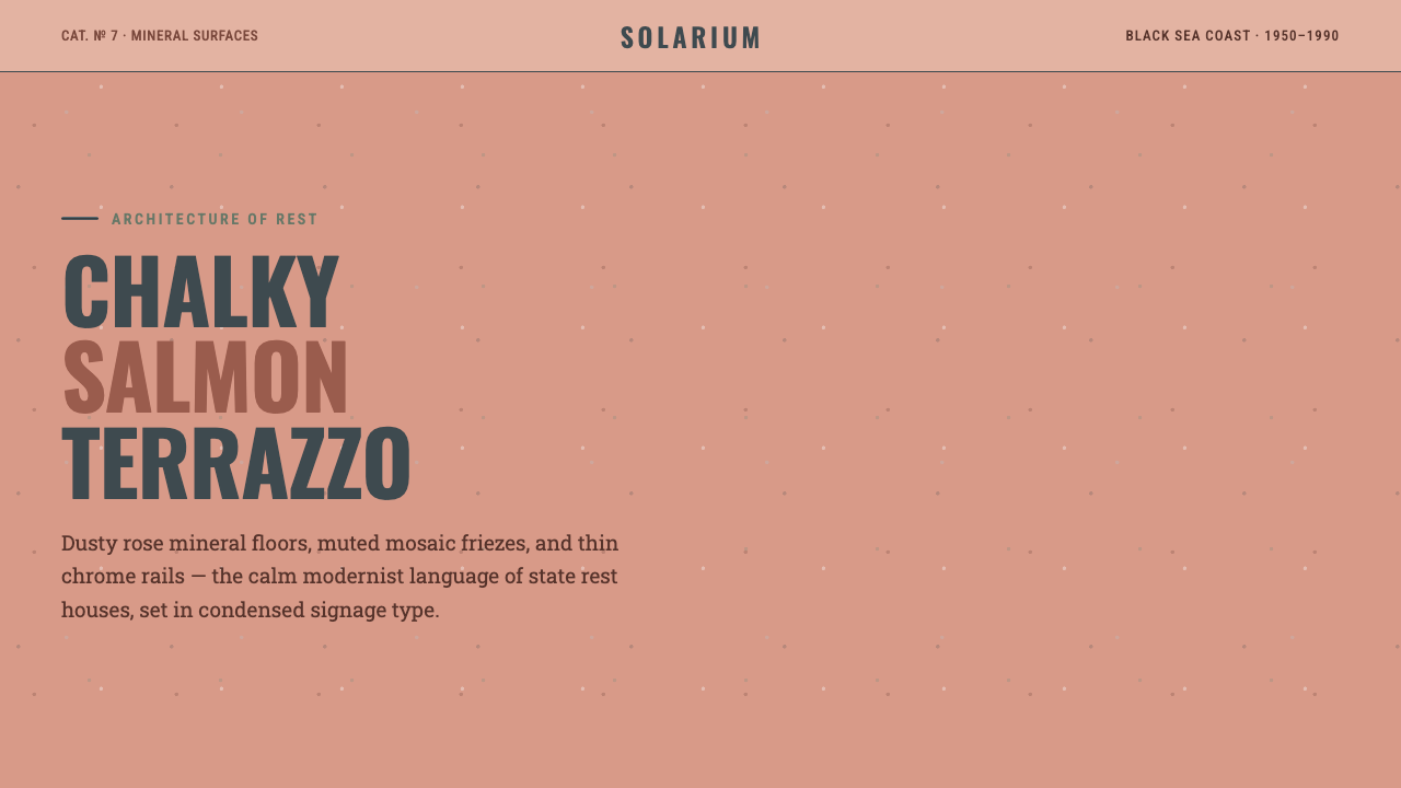
Soviet Sanatorium Pink turns state retreat into a visual system of chalky salmon stone, compressed signage, tiled order, and chrome restraint.
Soviet Sanatorium Pink in brief
Soviet Sanatorium Pink draws from the mature resort architecture of the Soviet Black Sea, especially the sanatoria of Sochi, Crimea, and Abkhazia. Its mood is calm but never delicate: warm salmon-rose terrazzo, chalky plaster, muted mosaic, and chrome rails create an atmosphere of institutional rest shaped by stone, tile, and routine.
The palette begins with a mineral rose surface rather than a sugary pastel pink. Against it, pale plaster and restrained tile fields provide air, while chrome introduces a narrow line of cool reflection. Condensed signage type gives the system its official voice, and rectilinear grids make the interface feel planned, navigable, and quietly public.
The style is modernist without becoming clinical. It borrows the architecture of recovery — surfaces designed to endure, paths designed to guide, rooms designed to settle the body — and translates those qualities into a composed digital language. Nothing needs to sparkle. The character comes from material memory, measured repetition, and the confidence of a place built for calm.
Where does Soviet Sanatorium Pink come from?
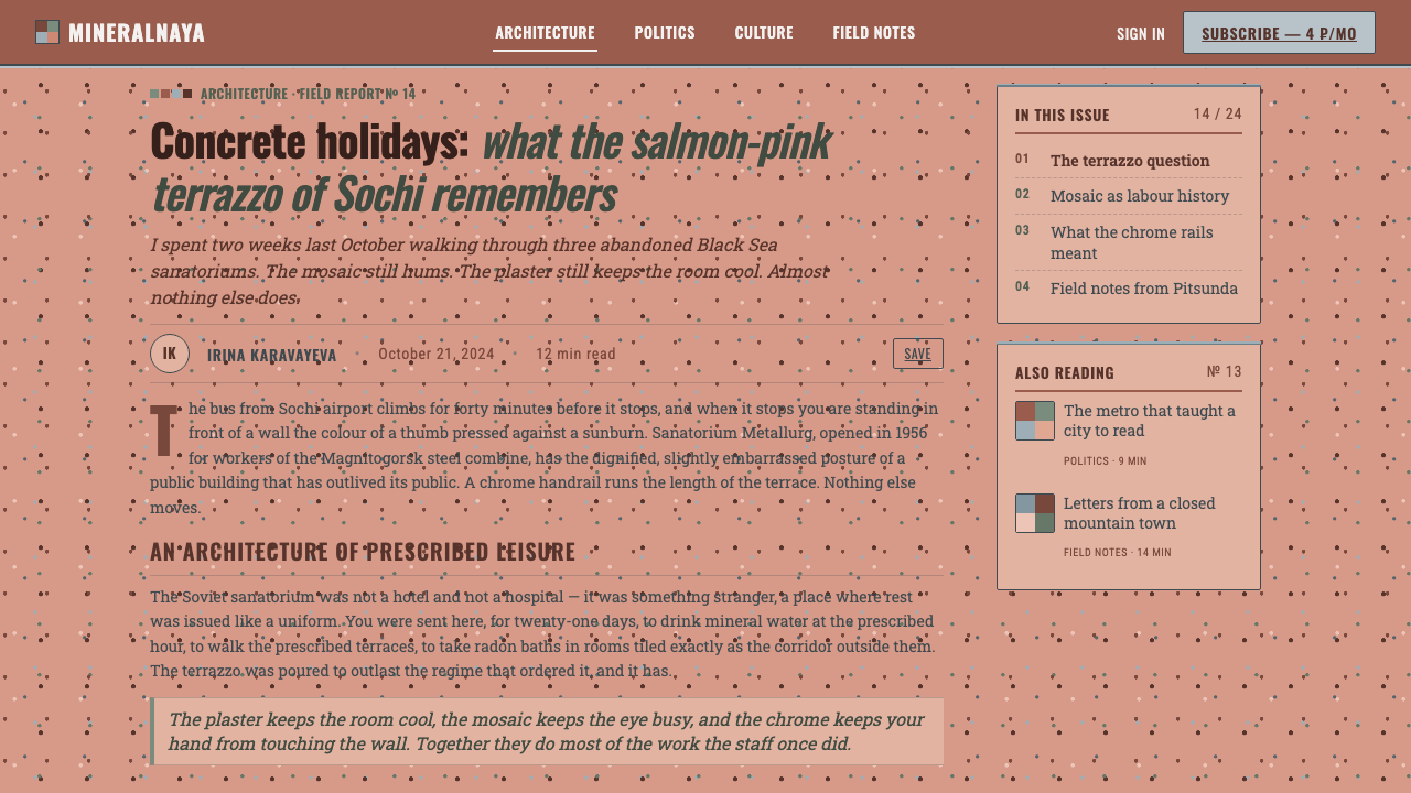
The historical frame is the Soviet Black Sea resort from 1950–1990, a mature architectural culture associated with Sochi, Crimea, and Abkhazia in Eastern Europe. Soviet Sanatorium Pink does not point to a single building or author. It treats the resort sanatorium as a shared visual environment: a place where architecture, interior surfaces, wayfinding, and public ritual were made to operate together.
Its material language comes from the combination of terrazzo, tinted plaster, mosaic, and chrome. Terrazzo gives the style its granular ground and its sense of permanence. Plaster softens the mineral weight with a dry, chalky surface. Mosaic introduces muted variation without breaking the field into visual noise, while chrome rails and fittings draw narrow lines through the heavier architecture.
The style sits between Stalinist-to-modernist Soviet resort architecture and the practical interior culture of the sanatorium. The former supplies a sense of civic scale and ordered structure; the latter supplies the intimate details of corridors, signs, tiles, rails, and resting spaces. Soviet mosaic muralism belongs to the same frame, but here it is understood as a controlled field of pattern and atmosphere rather than as spectacle.
Maryam Omidi is included among the key figures through Holidays in Soviet Sanatoriums, which gives the theme a contemporary point of reference. Alongside the collective work of state resort architects and sanatoria interior designers, her presence reminds us that this aesthetic is not only an architectural style but also a subject of cultural documentation and renewed attention.
What defines the Soviet Sanatorium Pink look?
Mineral Salmon Surface
The dominant color is a warm salmon rose with a dusty, mineral character. It should feel embedded in stone or plaster rather than applied as a cheerful cosmetic layer. Its warmth is substantial and architectural, carrying the visual weight of terrazzo while remaining calm enough for long reading and repeated use.
Chalky Light
Pale plaster tones keep the palette from becoming dense. Their surface quality is dry, chalky, and slightly muted, not glossy or luminous. Light areas function as architectural breathing room: they separate content, clarify routes, and make the salmon ground feel like a material field rather than a flat digital fill.
Condensed Signage
Typography takes its cue from institutional wayfinding. Condensed letterforms create a narrow, vertical rhythm and make labels feel intentional without becoming loud. Headlines, navigation, and metadata should share a disciplined typographic voice, with hierarchy created through scale, spacing, and placement rather than ornamental type effects.
Tile Geometry
Rectilinear tile grids supply the underlying order. Their repetition may be visible or nearly subliminal, but it should always help the viewer understand structure. Tiles can divide panels, frame information, or establish a quiet cadence behind content. The grid is architectural first and decorative only as a consequence.
Chrome Rails
Chrome appears as a thin, cool line against warmer mineral surfaces. It works best as a rail, divider, edge, or directional guide, giving the composition a sense of circulation. Reflection should remain controlled; excessive shine would turn the style from restrained modernism into decorative retro.
Speckled Aggregate
Terrazzo aggregate is the style's small-scale visual texture. Speckles should feel irregular, quiet, and physically embedded, with enough variation to suggest mineral fragments but not enough to compete with text. This texture gives large calm surfaces a tactile memory and prevents the pink from feeling synthetic.
Civic Calm
The overall atmosphere is composed, durable, and quietly collective. It should suggest a shared institution rather than a private luxury retreat. Order comes from aligned edges, repeated surfaces, legible signs, and restrained contrast. The result is restful because it is dependable, not because it is soft or sentimental.
Who shaped Soviet Sanatorium Pink?
These architects form the broadest authorship behind the style. Their work established the civic scale, planned circulation, durable surfaces, and mature resort identity that Soviet Sanatorium Pink reinterprets. The relevant figure is collective: a body of state resort architecture whose visual language survives in materials, facades, corridors, and organized public space.
Sanatoria interior designers gave the architecture its daily texture. Through terrazzo, plaster, tile, signage, mosaic, and chrome fittings, they shaped how recovery was experienced at close range. Their contribution explains why this style depends on surfaces and details as much as on monumental form: the atmosphere is built through repeated encounters with ordinary materials.
Maryam Omidi is a contemporary reference attached to the theme through Holidays in Soviet Sanatoriums. Her inclusion connects the visual language of the sanatorium to the act of looking back at Soviet resort culture. Within this design system, she represents renewed documentation: a way of bringing overlooked interiors, materials, and atmospheres into present-day visual conversation.
How do you use Soviet Sanatorium Pink today?
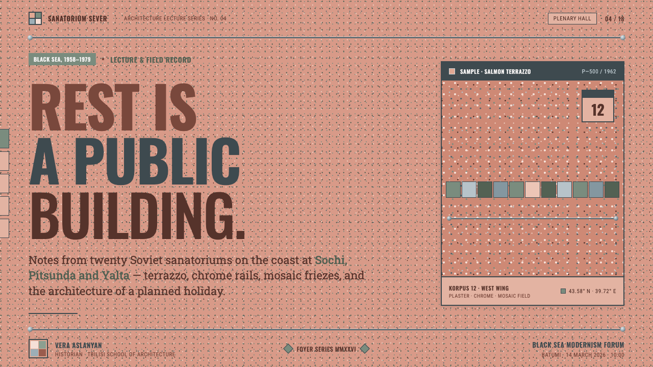
For presentation slides, use the salmon terrazzo character as the cover field and let condensed signage type carry the title. Content slides should behave like calm architectural rooms: pale plaster areas hold the reading surface, chrome rules separate sections, and tile geometry organizes the flow. Data slides can treat charts as mosaic or terrazzo compositions, using muted contrast and material variation to distinguish categories without creating visual agitation.
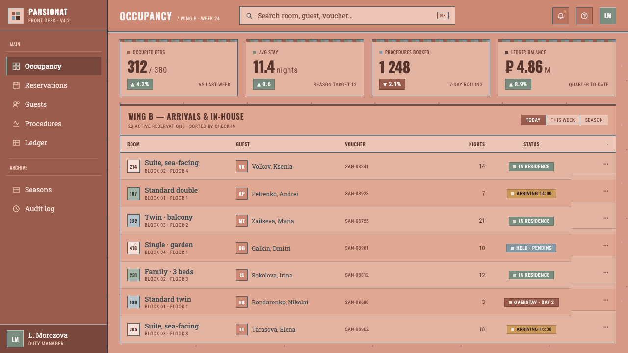
For web interfaces, the style suits dashboards, pricing pages, and service tools that need authority without aggressive technology cues. Use the warm mineral rose for prominent surfaces or selected states, pale plaster for the main reading field, and chrome-like lines for boundaries and navigation. Panels should feel assembled from durable architectural materials. Avoid excessive rounding, glossy effects, or floating cards that would detach the interface from its sanatorium logic.
For editorial and marketing work, build a strong relationship between large quiet fields and narrow informational bands. A feature article can place condensed headings beside terrazzo-like blocks, with mosaic texture reserved for chapter openings, pull quotes, or image frames. Marketing pages can use the theme to position a product as dependable, restorative, and thoughtfully organized. The tone is especially effective when the copy is direct and the composition leaves room for the materials to register.
The style also works for directories, booking experiences, wellness tools, and educational interfaces where the user benefits from a sense of orientation and calm. Wayfinding should remain explicit: signage-like labels, aligned content blocks, and clear directional accents are more important than decorative motifs. If imagery is introduced, it should support the material world through architecture, tile, plaster, or quiet human-scale spaces rather than competing with the system through saturated lifestyle photography.
The common mistake is treating Soviet Sanatorium Pink as generic retro pink. A candy-like palette, playful rounded lettering, ornamental nostalgia, or excessive chrome will erase the source character. The essential balance is mineral warmth with institutional discipline: salmon should feel dusty and embedded, typography should feel compressed and purposeful, and texture should remain subordinate to structure. When every surface tries to perform, the style loses its restorative calm.
Soviet Sanatorium Pink — FAQ
Is Soviet Sanatorium Pink simply a retro pink style?
No. Its defining pink is a chalky salmon mineral tone drawn from terrazzo and tinted plaster, not a sugary pastel. The style depends on the relationship between that warm surface, condensed signage, rectilinear tile grids, muted mosaic, and chrome rails. Remove the architectural discipline and it becomes generic nostalgia.
Can the style use a dark background?
It can be adapted, but the source character is fundamentally light and mineral. A dark field tends to make the chrome more dramatic and the salmon more decorative, which can weaken the calm institutional atmosphere. If a darker variation is necessary, keep pale plaster, terrazzo texture, and restrained signage present so the design still reads as sanatorium architecture rather than nightlife retro.
How should chrome be used without making the design feel flashy?
Treat chrome as linework, not jewelry. Rails, dividers, edges, and directional traces are its strongest roles. Its reflection should remain narrow and controlled, supporting circulation through the layout. Large mirror-like surfaces or repeated metallic decoration shift the style toward luxury and spectacle, while the source language is based on restraint and public utility.
Does the style require actual terrazzo or mosaic imagery?
No, but the material logic should remain visible. A quiet speckled aggregate field, a tiled division, or a dry plaster-like surface can carry the reference without becoming literal. The important thing is that texture feels embedded and structural. If every component receives a busy pattern, the interface loses the spaciousness and dependable order associated with the sanatorium.
What kinds of products suit Soviet Sanatorium Pink?
It suits products that benefit from calm authority, orientation, and a sense of durable care: dashboards, pricing tools, directories, booking flows, wellness services, and educational interfaces. It is less suitable when the product depends on sugary cheerfulness, luxury glamour, or highly organic visual richness. The right question is whether the product can share the style's values of order, rest, material honesty, and public usefulness.
Related design styles
 Iranian New Wave PosterPre-revolution Tehran cinema, burnt. Grainy ochre duotone over dark sepia, st…
 Mid-Century Modern (Eames)Optimistic, not austere. Cream canvas, mustard starburst, teal geometry and w…
 Amber Inclusion SpecimenAncient light, catalogued. Honey-gold resin glows in a black field with mono…
 Budapest Millennium LineChestnut glaze turns transit into a room. Fired slab type and flat yellow run…
 Cricket Whites FlannelsSummer, kept in good order. Ecru serif and fine club trim cross a dark mown g…
 Czechoslovak New Wave CinemaNoir without nostalgia. Letterbox bars, off-white titling, and 35mm grain do…