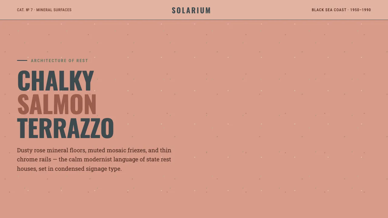
About Soviet Sanatorium Pink
Soviet Sanatorium Pink draws from the dusty salmon-rose terrazzo, chalky plaster, and muted mosaic of mid-century Black Sea sanatoria in Sochi, Crimea, and Abkhazia. Its dominant surface is a warm-rose mineral terrazzo — a genuine chalky salmon, not a sugary pastel.
Condensed signage type, rectilinear tile grids, thin chrome rail lines, and speckled aggregate fills turn the architecture of state rest and recovery into a calm, modernist interface language.
- Origin
- Soviet Black Sea resorts — Sochi, Crimea, Abkhazia (Eastern Europe)
- Era
- 1950–1990 (mature Soviet resort architecture)
- Key figures
- Soviet state resort architects · Sanatoria interior designers · Maryam Omidi (Holidays in Soviet Sanatoriums)
- Movements
- Stalinist-to-modernist Soviet resort architecture · Terrazzo and tinted-plaster interiors · Soviet mosaic muralism
Soviet Sanatorium Pink design spec
Colors
Background
Surface
Primary
Secondary
Accent
Text
Typography
OswaldHeadings
Roboto SlabBody
Roboto CondensedMono
Unlock for 1 credit
The other 11 sections — buttons, cards, spacing, motion, techniques and more — open once you unlock. Download the DESIGN.md or send it to your AI in one click. Unlock once, yours forever.
Sign up nowHave an account? Sign in
Styles similar to Soviet Sanatorium Pink
Also inspired by architecture & places, with a close feel.
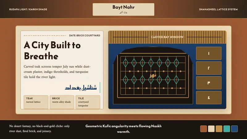 Iraqi Baghdad Shanasheel HouseBreathes through ornament. Date-brick ground, teak lattice, and turquoise tile frame the page.
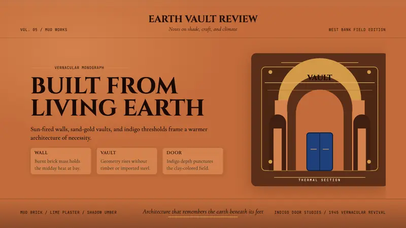 Egyptian Hassan Fathy Vernacular (1945)Earth remembers craft. Burnt brick, sand-gold vaults, and indigo doors carry the warmth.
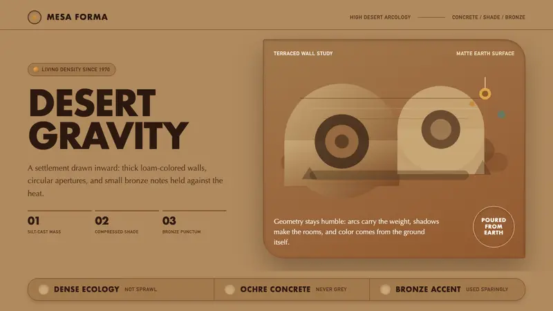 Arcosanti ArcologyArchitecture becomes desert. Ochre concrete, circular apertures, and bronze accents hold the shade.
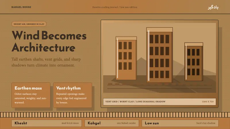 Persian WindcatcherClimate becomes geometry. Adobe ochre, Reem Kufi, vent grids, and hard shadows.