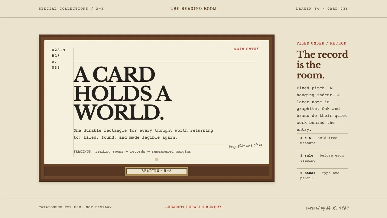
About Card Catalogue Drawer
Everything here happens on one rectangle: a 3 × 5 inch cream card, acid-free, skewered on a brass rod so nobody walks off with it. The call number sits blocked in the upper left, the main entry hangs over its indent, and the tracings run along the bottom in the order a cataloguer would type them.
The type is struck, not set. Fixed pitch, uneven impression, the occasional letter riding a hair high. Pencil arrives later, in a second hand. Oak and brass stay behind the card as frame and hardware — they hold the content, they are never the content.
- Origin
- North America — public and university reading rooms; Syracuse and Stockton
- Era
- 1877 card standard fixed at the first ALA conference; mature card-catalogue practice 1950–1990
- Key figures
- Melvil Dewey · Gaylord Bros. · Library of Congress Card Division
- Movements
- Dewey Decimal Classification · ALA card standardisation · typewriter cataloguing practice
Card Catalogue Drawer design spec
Colors
Typography
The other 11 sections — buttons, cards, spacing, motion, techniques and more — open once you unlock. Download the DESIGN.md or send it to your AI in one click. Unlock once, yours forever.
Sign up nowStyles similar to Card Catalogue Drawer
Also inspired by print & type, with a close feel.
 Cherokee SyllabaryLiteracy as inked record. Carbon type, muted red rules, and syllabary on tan newsprint.
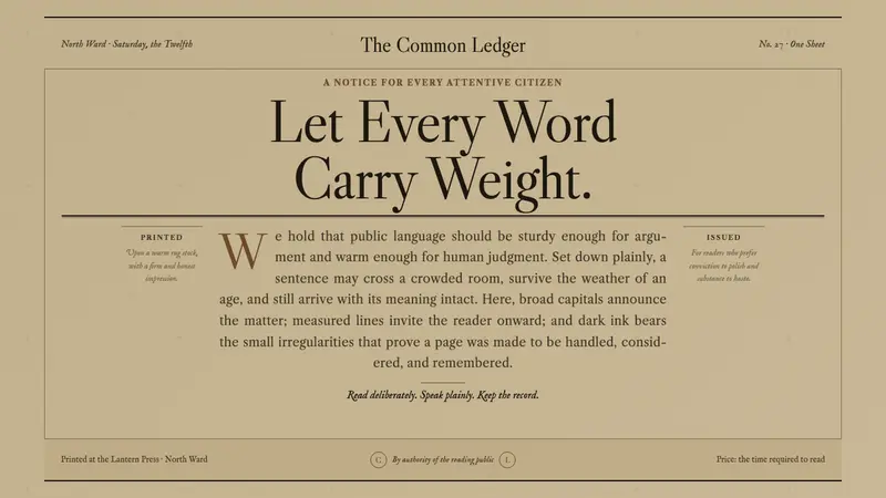 Caslon English Text SerifWarm authority, pressed into paper. Caslon capitals and engraved rules command an amber-grey sheet.
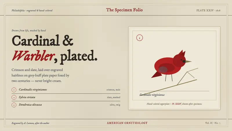 Wilson Ornithology PlateAn 1808 ornithology plate reborn. Cardinal crimson and slate, washed over engraving on foxed paper.
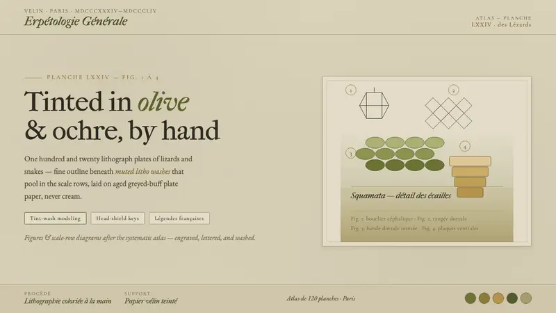 Herpetology Scale PlateA 19th-century herpetology atlas, digitized. Olive-and-ochre litho washes on buff plate paper.