What is Leather Goods Tan?
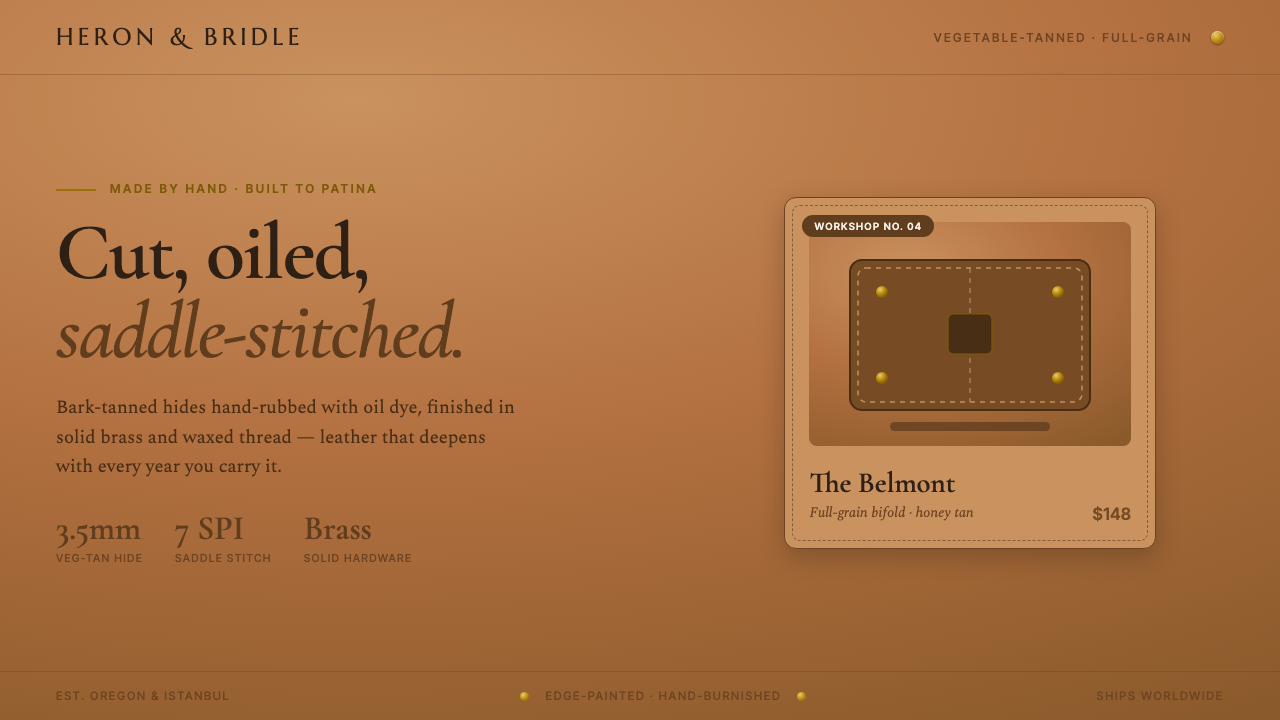
Leather Goods Tan makes the internet feel like a well-used workshop: saddle-brown leather, brass hardware, waxed thread, and the quiet promise that beauty improves with handling.
Leather Goods Tan in brief
Leather Goods Tan is the premium leather-craft DTC aesthetic: vegetable-tanned, full-grain saddle hides, hand-rubbed with oil dyes and presented on warm tan studio grounds. It translates the visual language of a small leather workshop into an online storefront, where the product must communicate material quality, handwork, and dependable worldwide service at a glance.
Its defining field is saturated saddle tan, deliberately deeper and more grounded than cream or ivory. Honey-to-dark-brown leather carries the visual warmth, while brass rivets, painted edges, and waxed saddle-stitch thread supply the evidence of construction. The palette does not merely suggest rusticity; it frames the object as something made from a real material, assembled by hand, and intended to acquire a richer patina through use.
Typography balances heritage with operational clarity. Refined high-contrast serifs give headlines the mannered authority of a craft label, while a tidy modern sans handles specifications, navigation, and commerce details. The resulting voice is neither nostalgic costume nor rustic informality. It is the composed voice of a workshop that knows its materials, photographs them carefully, and ships its work worldwide.
Where does Leather Goods Tan come from?
Leather Goods Tan belongs to the heritage leather-craft revival that has shaped artisan product branding from 2010 to now. Its region is global and internet-native: the style is not tied to a single city or historical school, but to the way small leather workshops present themselves through direct-to-consumer commerce. The screen becomes a storefront, a catalog, and a material sample at the same time.
The aesthetic grows from the meeting of vegetable-tanned full-grain leather and online product photography. Full-grain saddle hides are shown with their warm tonal range intact, from honey through dark brown, rather than flattened into a generic neutral. Warm tan studio grounds extend that material world around the product. The result makes the digital setting feel continuous with the bench, hide, thread, and hardware implied by the object.
Its craft vocabulary is deliberately concrete. Hand-rubbed oil dyes suggest variation rather than factory uniformity; painted edges make construction visible; brass rivets turn fastening into a visual feature; waxed saddle-stitch thread gives the perimeter a measured rhythm. These details allow a direct-to-consumer brand to express making without relying on a long explanation. The product image carries the argument: this is a crafted good, not an anonymous commodity.
Walnut Studiolo and Galen Leather are the clearest source references for this online workshop sensibility. Their relevance is not that they define a universal corporate identity, but that they show how heritage leather craft can become a calm, premium digital language. Leather Goods Tan gathers the same cues into a coherent system: saturated saddle tan for the field, refined serif display type for distinction, modern sans-serif information text for clarity, and material details that make the storefront feel made rather than merely styled.
What defines the Leather Goods Tan look?
Saddle-Tan Field
The ground is a saturated saddle tan, warmer and deeper than cream or ivory. It establishes the visual temperature before any product appears and gives leather imagery a natural place to belong. Honey and dark-brown variations can sit within the same field without feeling like unrelated colors. The effect is enveloping rather than stark: the page behaves like a warm studio surface, not a blank digital canvas.
Vegetable-Tanned Material
Vegetable-tanned, full-grain leather is the aesthetic’s central proof of quality. It should look substantial, natural, and capable of changing through use. Hand-rubbed oil dyes support a surface with tonal depth and slight variation, while the honey-to-dark-brown range keeps the material legible. The design should make the hide feel present, even when the user is encountering it only through photography and interface copy.
Brass Construction
Brass rivets provide a warm metallic counterpoint to the leather field. They are not decorative glitter; they visibly explain how the object is held together. In a layout, brass-toned details work best as restrained signals around product imagery, labels, or purchase actions. Their role is to reinforce construction and durability, keeping hardware subordinate to the leather while making the act of fastening memorable.
Stitched and Painted Edges
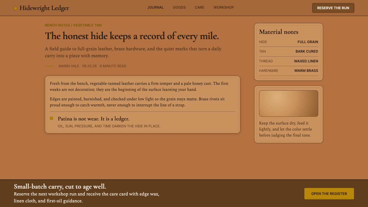
Painted edges and waxed saddle-stitch thread turn the perimeter into a design element. Dashed stitching introduces a calm, repeated rhythm that can guide the eye around a product card, image frame, or content panel. Painted edges add a finished boundary without requiring ornamental borders. Together they make the interface echo the object’s construction: edges are handled, seams are intentional, and the finish is part of the value.
Heritage Serif and Modern Sans
High-contrast serif type carries the premium, heritage-facing voice of the workshop. Its contrast gives headlines a polished presence without making them feel theatrical. A tidy modern sans-serif handles specifications, navigation, and functional commerce text, preserving speed and clarity. The contrast between the two voices should feel purposeful: the serif speaks for craft and distinction, while the sans speaks for service and use.
Warm Studio Photography
Product photography should place leather on warm tan grounds and preserve the material’s tonal range. Images benefit from showing the object as an assembled good: hide, edge paint, thread, and brass should remain visually connected. The mood is careful and tactile rather than dramatic. Photography is the bridge between the physical workshop and the online storefront, so it should make the product feel handled, inspected, and ready to ship.
Patina as Promise
Patina is the aesthetic’s emotional horizon. The object is not presented as permanently pristine; it is made to become more personal through handling. This changes how surfaces, photography, and copy should behave. Slight tonal variation is evidence of life, not a flaw to conceal. The visual system therefore favors warmth, tactility, and composure over sterile perfection, allowing the promise of continued use to become part of the brand story.
Who shaped Leather Goods Tan?
Walnut Studiolo is named in the source material as a signature example of the small-workshop leather-goods presence that Leather Goods Tan evokes online. Its reference value lies in the combination of crafted product, warm material language, and direct-to-consumer presentation. Within this aesthetic, it represents the workshop as a globally visible brand without losing the evidence of handwork.
Galen Leather is another source-approved reference for the aesthetic’s online expression. It stands for the meeting of vegetable-tanned leather, carefully handled product presentation, and a calm commerce voice. In a Leather Goods Tan system, that combination supports a premium impression grounded in material specificity rather than generic luxury signals.
The heritage leather-craft revival supplies the aesthetic’s cultural direction. It brings the visual language of saddle hides, handwork, hardware, and patina into contemporary product branding. Its importance is less about reproducing an old period than about restoring value to visible making, durable materials, and goods that are expected to develop character over time.
Vegetable-tanned full-grain leather is the material foundation of the style. Because the source describes it as hand-rubbed with oil dyes and capable of moving from honey to dark brown, it gives the visual system both richness and credibility. It is the reason the tan field feels like a material environment instead of a merely fashionable color choice.
Direct-to-consumer product branding gives the aesthetic its contemporary setting. It requires heritage cues to coexist with clear specifications, navigation, and worldwide shipping information. The serif-and-sans pairing, warm product grounds, and visible construction details solve that tension by making the storefront feel premium, useful, and personally made at the same time.
How do you use Leather Goods Tan today?
Leather Goods Tan works best when the entire experience feels like a considered workshop rather than a collection of brown decorative effects. Establish the saddle-tan field first, then let leather imagery, brass hardware, stitched edges, and the serif-and-sans typographic contrast carry the identity. The style should communicate material confidence and patient making before it communicates ornament or trend.
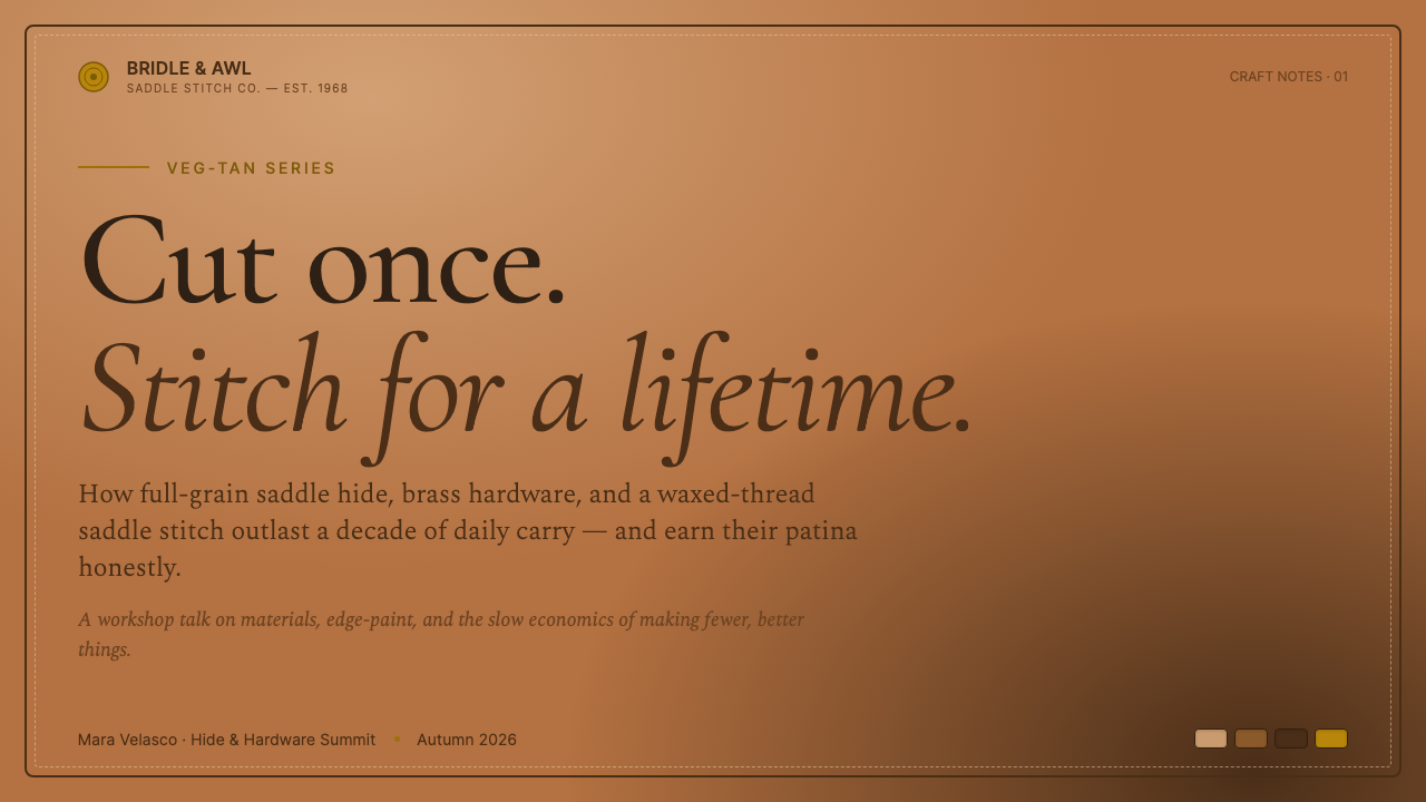
For presentation slides, use the tan field as the stable stage for a refined serif cover headline and a carefully framed product or material image. Content slides should shift responsibility to the modern sans, keeping specifications and explanatory copy easy to scan while stitched rules or painted-edge cues provide continuity. Data slides can turn comparisons, product families, and shipping information into calm catalog-like panels, using leather tones and brass accents to distinguish categories without overwhelming the page.
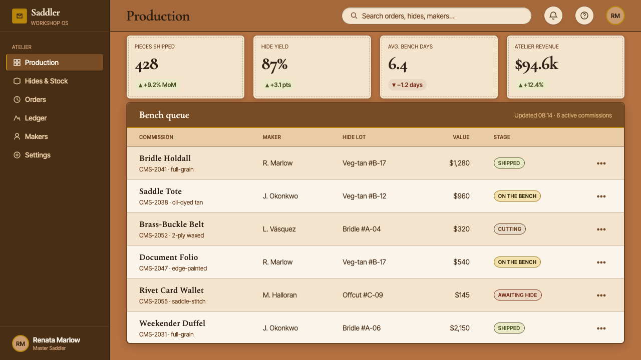
For web interfaces, the style suits dashboards and pricing pages for premium goods, workshop services, and product systems where trust and material quality matter. Product cards can use warm grounds, visible edge treatment, and small brass-like signals around actions or status. Specifications should remain clean and modern, while headlines and section introductions retain the high-contrast serif voice. The interface should feel tactile and dependable, not like a novelty leather texture applied over a generic storefront.
For editorial and marketing work, Leather Goods Tan supports product stories, care guides, workshop profiles, launch pages, and catalog campaigns. Use narrow, readable text areas beside generous material imagery, and let dashed stitching or painted edges mark transitions between sections. Marketing copy can emphasize handwork, full-grain material, oil-rubbed color, worldwide shipping, and the promise of patina. The strongest compositions alternate intimate detail with composed product presentation.
The common mistake is confusing warmth with visual clutter. Adding too many rustic motifs, distressed textures, dark-brown surfaces, or decorative hardware can make the work feel like a costume of craftsmanship. The system depends on restraint: saddle tan should remain the environment, leather should remain the subject, brass and stitching should explain construction, and typography should preserve the distinction between premium storytelling and practical commerce information.
Leather Goods Tan — FAQ
What is Leather Goods Tan?
Leather Goods Tan is a premium leather-craft DTC aesthetic built from vegetable-tanned, full-grain saddle leather and warm tan product presentation. Its recognizable cues are saturated saddle-brown grounds, honey-to-dark-brown leather, brass rivets, painted edges, waxed saddle-stitch thread, refined high-contrast serifs, and a tidy modern sans for practical information. The overall impression is a small workshop with global reach.
Why is the background deeper than cream or ivory?
The deeper saddle tan makes the style feel grounded in leather rather than in a generic luxury palette. It creates a warm studio environment around the product and gives honey, brown, brass, and painted-edge details enough presence to read clearly. A pale neutral would make the work lighter and more delicate; Leather Goods Tan needs a denser field that supports the material’s weight and the promise of long use.
Why combine a high-contrast serif with a modern sans-serif?
The pairing separates two jobs that the brand must perform simultaneously. The serif gives headlines a refined, heritage-facing character and makes the workshop feel premium. The sans-serif keeps specifications, navigation, and commerce information direct and efficient. Together they express the central tension of the style: a product rooted in handwork must still operate as a clear, contemporary global storefront.
Can Leather Goods Tan use a dark interface?
It can be adapted, but a fully dark treatment works against the source aesthetic, which is explicitly light-ground and warm-tan rather than dark-background. If a dark section is necessary, preserve the material logic through warm tan product grounds, visible leather tones, brass details, and clear type contrast. The dark treatment should remain an occasional framing device, not replace the saddle-tan environment that gives the style its identity.
How do you keep it from looking like generic rustic branding?
Keep every cue tied to actual construction or material. Vegetable-tanned full-grain leather, oil-rubbed color, painted edges, brass rivets, and waxed saddle stitching are specific signals; random distressed textures and excessive rustic ornament are not. The typography should also remain composed, with the serif reserved for distinction and the sans-serif used for clarity. The goal is a workshop that is premium and globally capable, not a theatrical imitation of one.
Related design styles
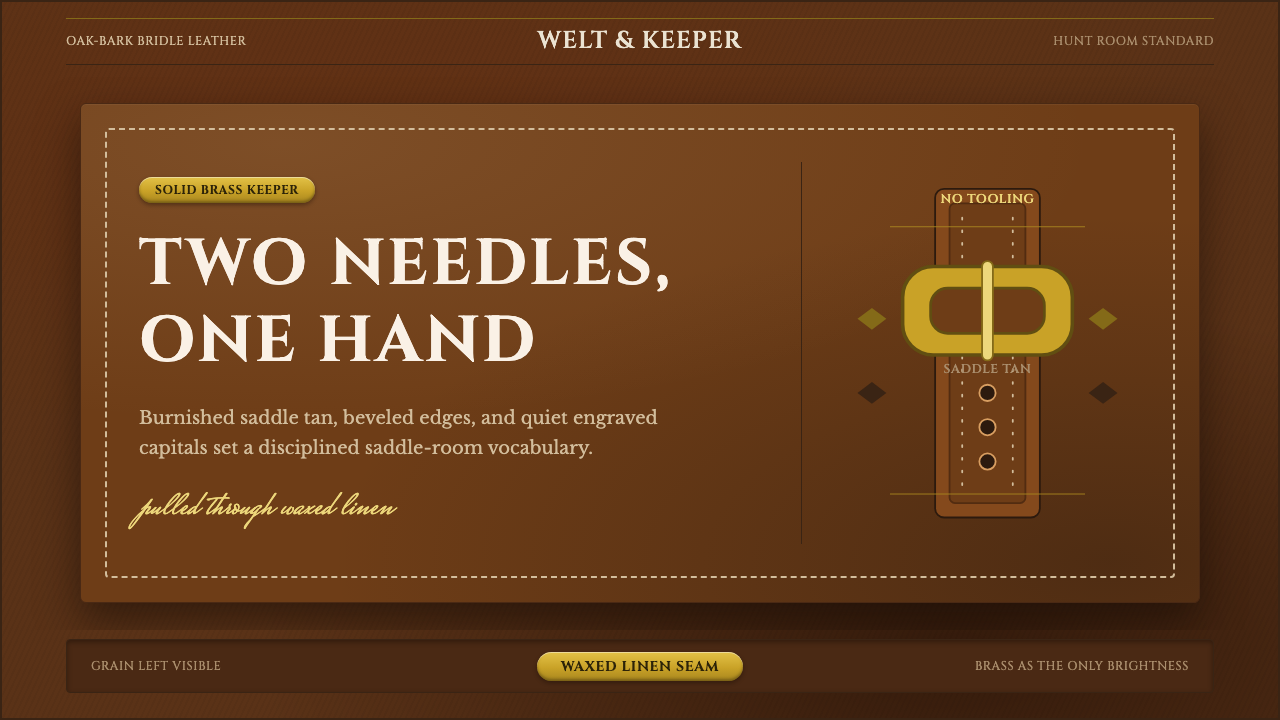 English Saddlery TanQuiet hand-made luxury. Saddle tan leather, brass accents, and waxed-linen st…
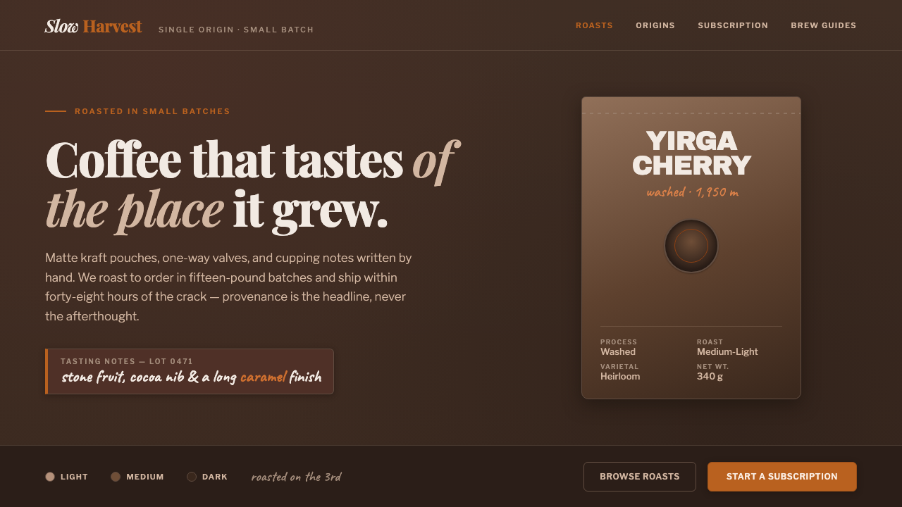 Specialty Coffee BagProvenance is the headline. Matte espresso ground, kraft-pouch type, one roas…
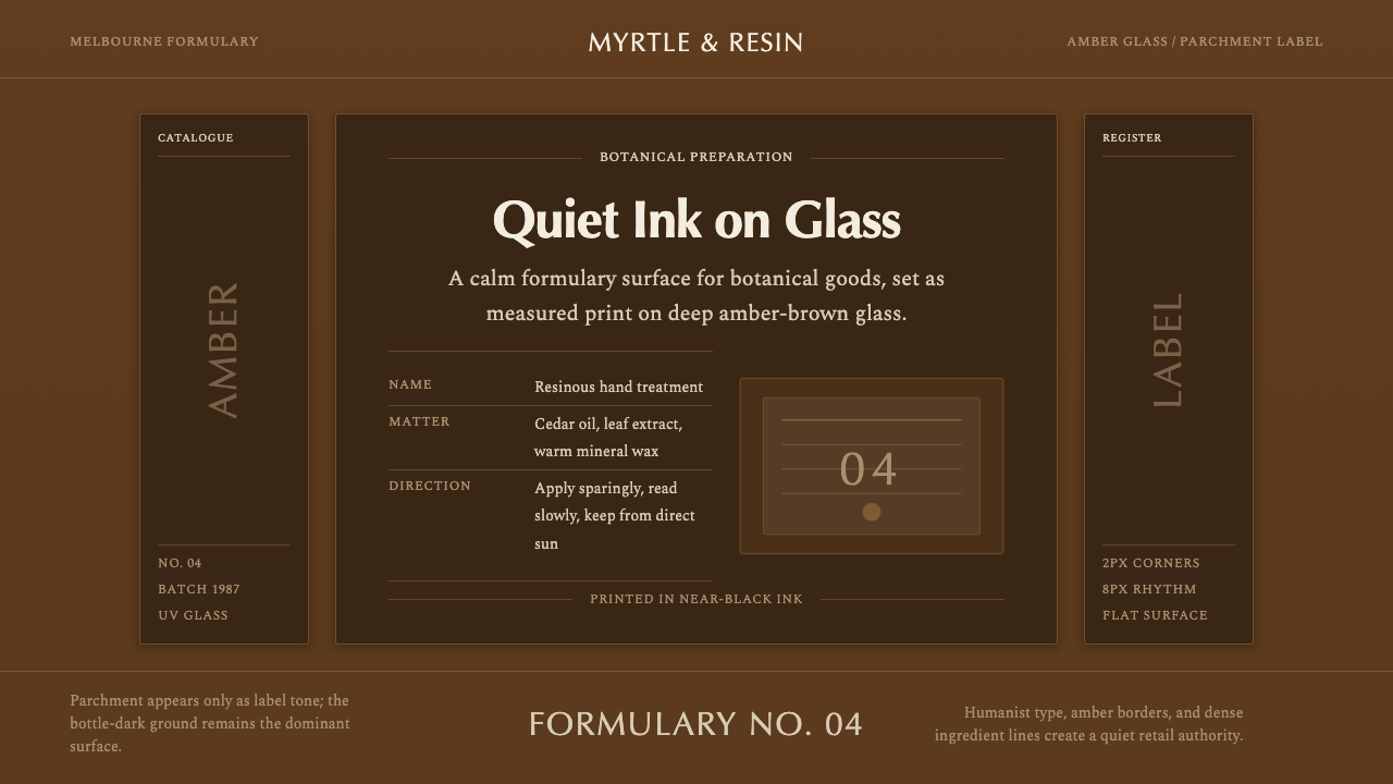 Aesop Apothecary AmberQuiet authority in glass. Amber-brown ground, parchment labels, and humanist…
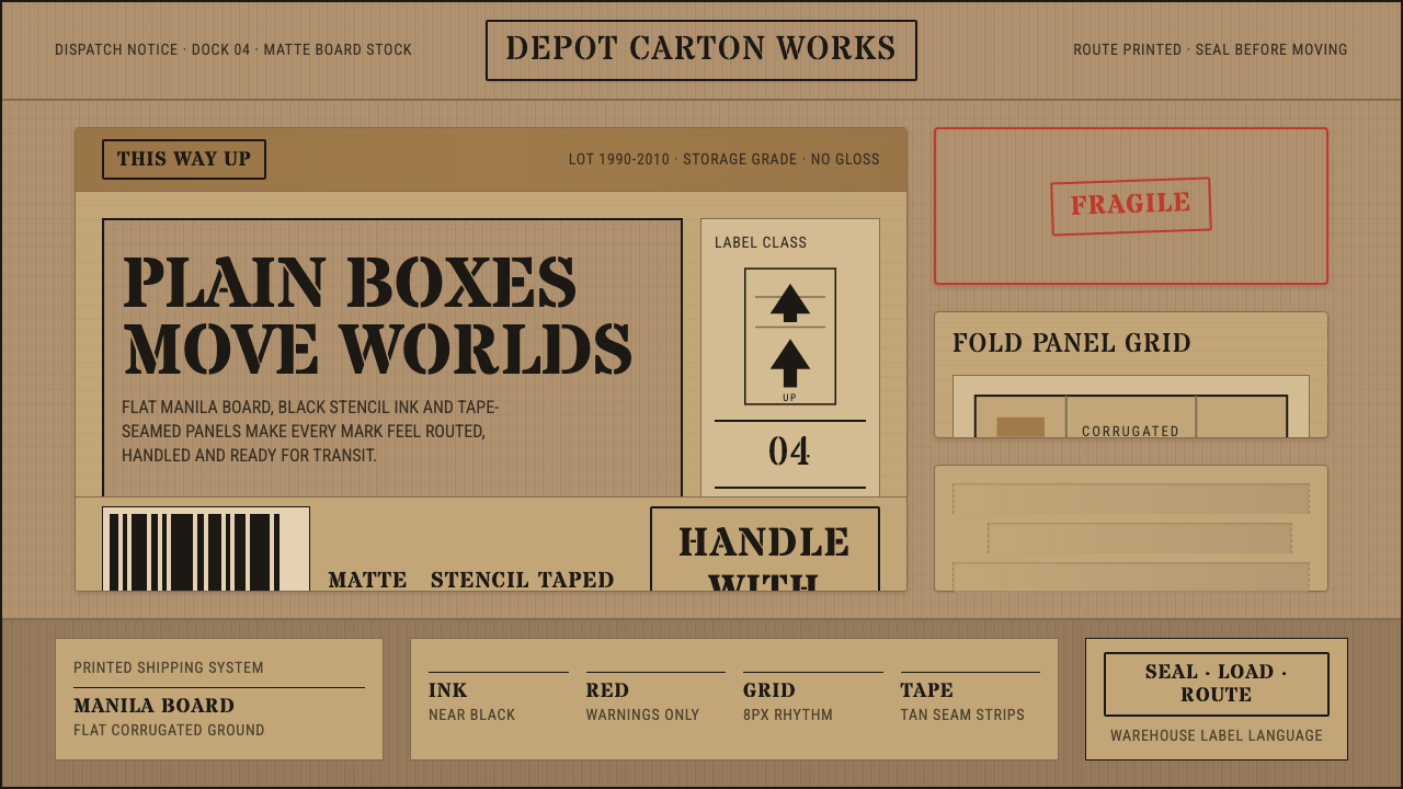 Cardboard Box CraftPlain utility has texture. Manila board, black stencil type, tape seams, red…
 MUJIAnti-brand restraint. Cream paper, kraft brown, and regular Inter leave only…
 Platinum-Palladium PrintAbsorbed, not printed. Warm palladium brown-blacks grade into aged cotton-rag…