What is Cardboard Box Craft?
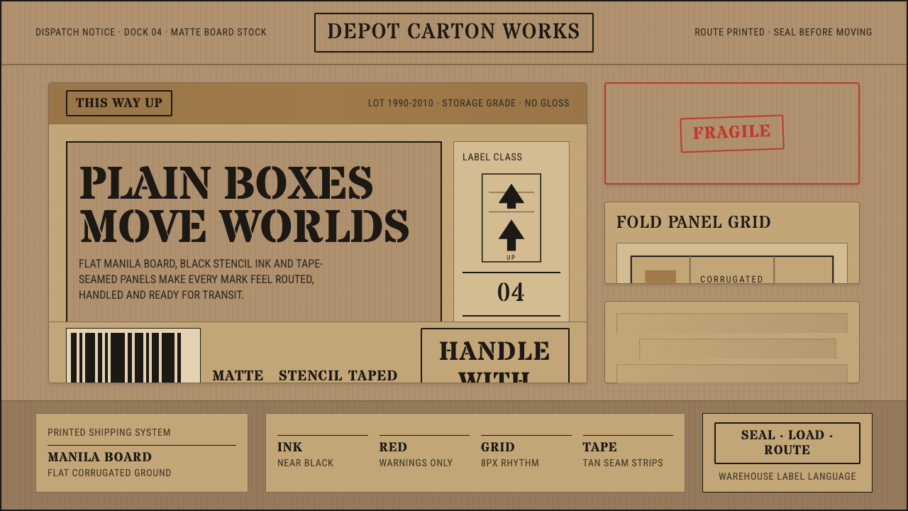
Cardboard Box Craft takes the plainest object in logistics — the moving box — and treats its stenciled warnings, taped seams, and fibrous brown board as a complete design language in its own right.
Cardboard Box Craft in brief
Cardboard Box Craft is drawn directly from the everyday visual world of moving boxes, shipping cartons, and warehouse handling — the flat manila-brown of corrugated fiberboard, stenciled black warnings like FRAGILE and THIS-WAY-UP, and the tan strips of packing tape that seal a box shut. Nothing about it is invented for decorative effect; every mark it borrows already exists for a practical reason on a real carton somewhere in a warehouse.
The style's discipline comes from its restraint. The base is always a warm, fibrous brown — never a glossy surface, never a cream tone dressed up to look premium, and never plain white. Black carries almost all of the informational weight, applied in the blunt, slightly uneven way a hand-held stencil brush leaves ink. Red is treated as an alarm, not a decoration: it appears only where a real warning label would use it, which makes its rare appearances genuinely read as urgent.
Composition follows the logic of an actual box rather than an abstract grid: flat panels meet at creased edges, tape runs in straight seams across a seam line, and stamped marks sit slightly askew, the way ink actually lands when it is pressed through a stencil card onto a fibrous, imperfect surface. The aesthetic is utilitarian by design — it earns its texture from function, not from an applied filter.
Where does Cardboard Box Craft come from?
The visual vocabulary this style borrows from is not the product of any single designer or firm — it is a vernacular language, built up anonymously over decades by whoever printed warning marks on shipping cartons: packaging engineers, warehouse operations staff, and the printers who supplied stencil plates to freight companies. Its authorship is genuinely collective and largely unrecorded, which is part of why it reads as so unpretentious: nobody was trying to make it beautiful, only legible and fast to apply.
Stencil lettering itself has a long practical history that predates cardboard shipping by decades — the technique of cutting a letterform out of a card or metal plate so ink can be brushed or sprayed through it, leaving the small connecting bridges that keep enclosed letterforms like O or A from falling apart, was standard practice for marking military crates, industrial equipment, and freight long before it became a recognizable aesthetic. Those bridge-gaps in the ink are not a stylistic flourish; they are a structural necessity of the technique that later became one of the style's most recognizable signatures.
The style this system draws on crystallized as a visible, self-aware aesthetic during the shipping and flat-pack culture of roughly 1990 to 2010 — a period defined by the global scaling-up of consumer freight, the boom of self-storage as an industry, and the rise of flat-pack furniture that shipped in exactly this kind of corrugated carton. As more people personally handled, packed, and moved boxes during this stretch — through relocation, mail order, and self-storage — the visual grammar of the shipping carton became broadly familiar for the first time outside of professional logistics.
Because the source material is anonymous and collective rather than attributable to named designers, the origin record for this style is best understood as a set of conventions rather than a lineage of individual authors — warehouse stencil practice, freight labeling standards, and the utilitarian graphics of the flat-pack retail era together, rather than any one studio or movement leader.
What defines the Cardboard Box Craft look?
Color
The base is a warm, muted manila-brown, treated as a raw material color rather than a design choice — it is simply what corrugated fiberboard looks like. Black carries information: stenciled warnings, box numbers, handling instructions. Red is reserved exclusively for genuine alerts and appears sparingly, which is precisely what keeps it feeling urgent rather than decorative.
Materiality
Every surface reads as matte and fibrous, with the faint corrugated ribbing and slightly rough grain of real cardboard. Nothing is glossy, polished, or slick. This is a material-honesty principle taken from the source object directly: cardboard should look like cardboard, not like a printed illustration of cardboard.
Stencil Typography
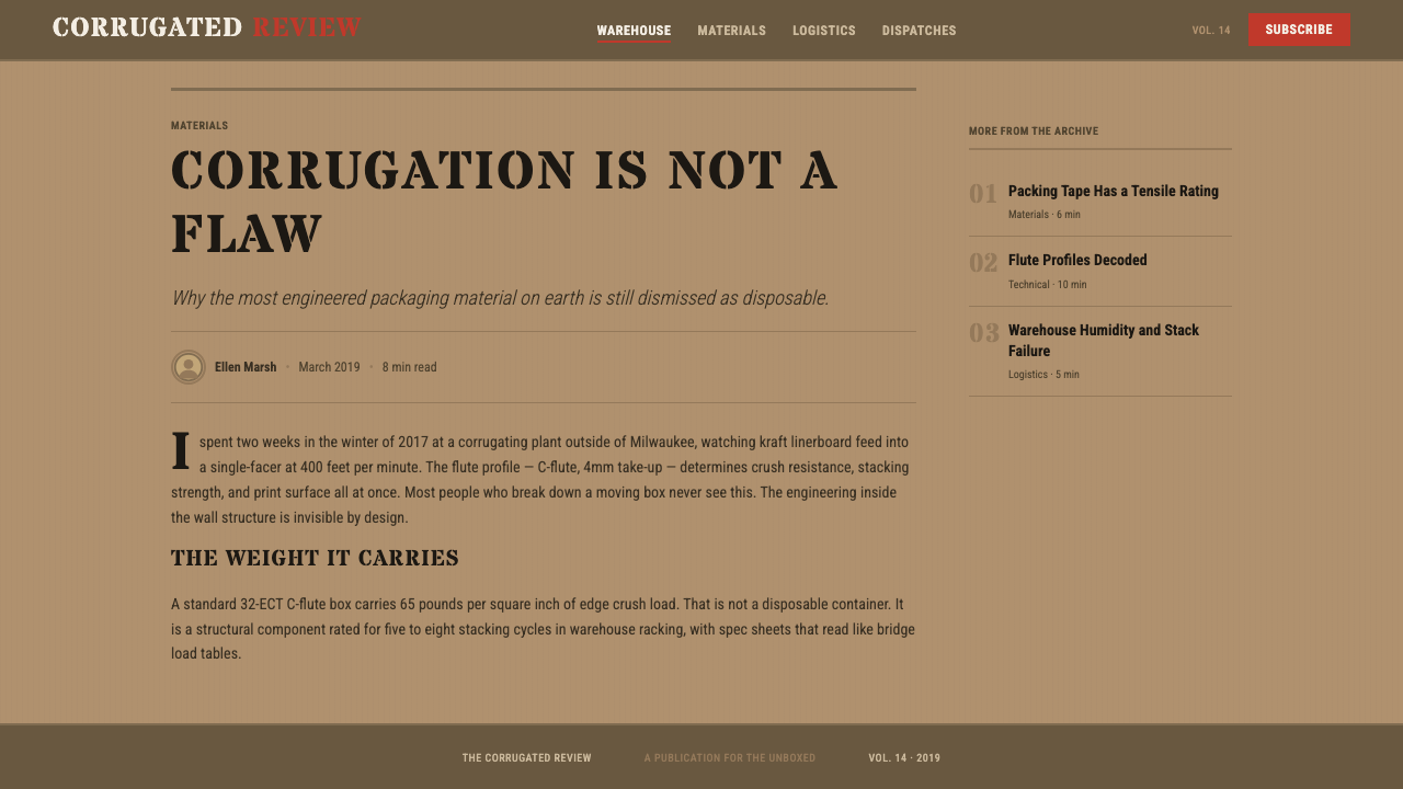
Lettering imitates hand-stenciled warehouse marking: blocky, evenly weighted capital forms with small gaps in the strokes where a physical stencil bridge would have interrupted the ink. Placement is deliberately a little uneven, as if brushed or sprayed by hand rather than perfectly typeset, reinforcing that the mark was applied quickly and functionally.
Warning Iconography
Pictograms borrow directly from shipping convention — a broken wineglass for fragile contents, an umbrella for keep-dry instructions, stacked arrows for orientation. These symbols are used exactly as they would be on a real carton: small, in black or red, and placed at the edge or corner of a panel rather than centered as a decorative motif.
Panel and Seam Composition
Layouts are organized the way a physical box is: flat panels bounded by fold-crease lines, with straight strips of tape running across seams to hold sections together. This gives even a simple page a sense of construction — content sits inside a panel the way printed marks sit inside a carton face, rather than floating freely on a blank field.
Wear and Imperfection
Genuine handling leaves traces — slightly crushed corners, uneven ink coverage where a stencil brush ran dry, faint creases from folding — and this style keeps those traces rather than smoothing them away. The imperfection is what signals authenticity: a pristine, evenly printed version of this aesthetic reads as a costume rather than the real thing.
Who shaped Cardboard Box Craft?
The visual conventions this style borrows — carton panel layout, warning placement, corner and edge marking — were developed collectively by unnamed packaging engineers and industrial designers working for freight and manufacturing companies, optimizing for legibility and fast application rather than for aesthetic signature.
The specific practice of marking crates and cartons with brushed or sprayed stencil lettering — including the characteristic gaps left by the physical bridges that hold enclosed letterforms together — is a long-standing convention of warehouse and freight handling, and it supplies this system's defining typographic signature.
As a broader design tradition, utilitarian shipping graphics prioritize instruction over identity: every mark on a carton exists to tell a handler what to do, never to build brand recognition. This system inherits that hierarchy — function first, decoration never.
The rise of flat-pack furniture retail and the self-storage industry through the 1990s and 2000s brought shipping-carton visual language into ordinary consumer life for the first time, making the aesthetic of the moving box broadly recognizable well beyond professional logistics.
How do you use Cardboard Box Craft today?
This style works best when its plainness is treated as a feature, not a limitation to dress up. The temptation is always to make it look more polished; resisting that temptation is what keeps it honest and recognizable.
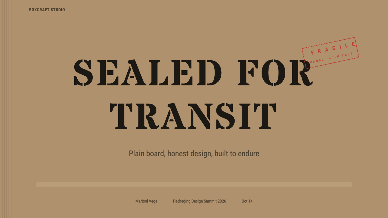
For presentation slides, a cover page can be treated like the top flap of a box: a stenciled title mark, a shipping-label-style block of metadata in a corner, and generous manila-brown space around it. Content slides work well organized like a packing manifest — a list of items, each with a small stamped icon, laid out in the blunt, legible hierarchy of a shipping label rather than a polished editorial grid. Data slides can lean directly into the metaphor: a chart framed like an inventory count on a crate, with numbers stamped rather than elegantly typeset.
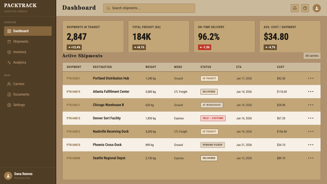
For web interfaces, the aesthetic suits dashboards that want to feel operational and no-nonsense — status indicators as stamped labels, alerts in the reserved red, and section dividers that read like tape seams rather than soft rules. Pricing pages can borrow the 'package tier' framing directly: each plan presented as a labeled carton, with the same stencil-style marks used consistently across tiers so the hierarchy reads at a glance.
For editorial and marketing work, the style suits brands genuinely connected to moving, shipping, logistics, storage, or no-frills retail — it signals honesty and practicality rather than luxury. A marketing page can use large cropped 'carton panel' blocks as section breaks, with stenciled headlines doing the work that a decorative display face would do in a more ornamental style.
The most common mistake is over-using red or letting it slip into a purely decorative accent color rather than a genuine warning signal — once red appears everywhere, it stops reading as urgent and the whole system loses its credibility. A second common mistake is making the surface too clean: glossy renders, perfectly even ink, and crisp corners undercut the vernacular, handled-object honesty that makes this style work in the first place.
Cardboard Box Craft — FAQ
Is this the same as a generic 'kraft paper' or 'rustic brown' aesthetic?
No. A generic kraft-paper look borrows the color but usually stops there, often adding decorative flourishes like hand lettering or illustration. This style is specifically about shipping-carton function — stenciled warning marks, tape seams, and pictograms used exactly as they appear on a real box — which makes it more restrained and more literal than a rustic or artisanal brown-paper theme.
Does it require the texture to look literally like real cardboard?
It needs to read as fibrous and matte rather than smooth and glossy, but it does not need to be a photorealistic cardboard texture. What matters more is the behavior of the marks on top of it — stenciled type with bridge-gaps, tape-seam dividers, slightly uneven ink — since those are what make the reference legible even at a glance.
Does the red have to follow real shipping-warning conventions?
It does not need to match any official standard exactly, but it should behave the way a warning color behaves: rare, high-contrast against the brown and black, and attached to something that genuinely needs attention. Treating red as a general accent color rather than an alert undermines the entire logic of the style.
What products or brands does this style suit, and where does it fall flat?
It suits moving companies, logistics and freight brands, self-storage services, flat-pack or direct-to-consumer shipping products, and anything that wants to project honest, no-frills practicality. It falls flat for luxury goods, anything that needs to feel soft or premium, or consumer categories like beauty, wellness, or fine dining, where the deliberately rough, warehouse-utility feel works directly against the desired mood.
Can this style be combined with bright, saturated colors for a more playful brand?
Adding bright colors beyond the reserved warning red breaks the core discipline of the style, which depends on a narrow, utilitarian palette to feel authentic. A brand wanting a more playful result is usually better served by borrowing individual motifs — the stencil type, the tape seam, a warning icon — and applying them within its own broader color system, rather than trying to brighten the moving-box palette itself.
Related design styles
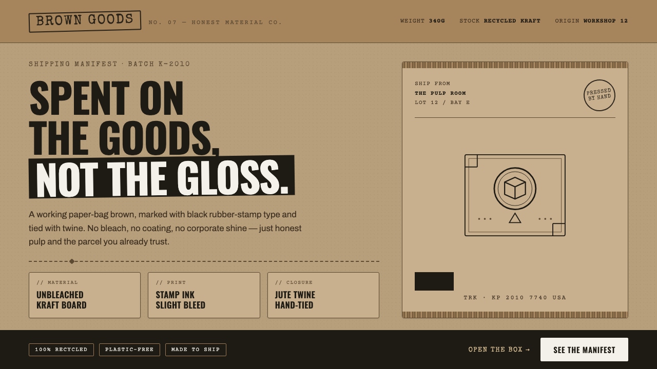 Kraft Paper PackagingThe goods, not the gloss. Mid kraft-brown fields, black rubber-stamp type, co…
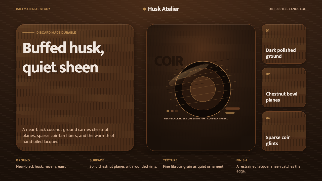 Balinese Coconut ShellQuietly hand-oiled. Near-black husk, chestnut planes, and sparse coir-tan gra…
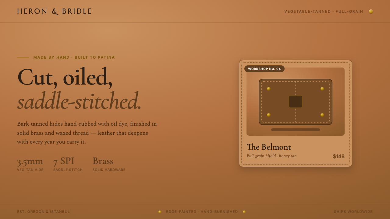 Leather Goods TanMade by hand, built to patina. Saddle-tan ground, brass rivets, dashed saddle…
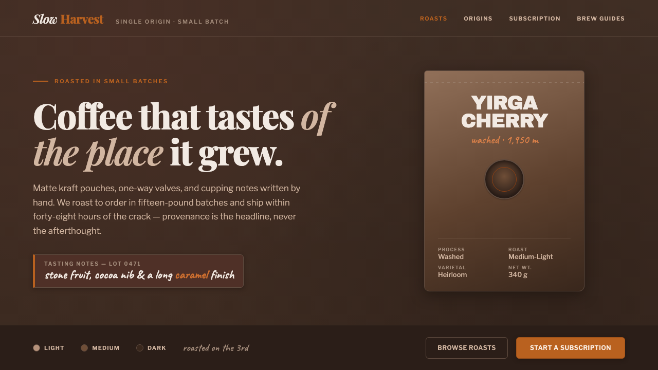 Specialty Coffee BagProvenance is the headline. Matte espresso ground, kraft-pouch type, one roas…
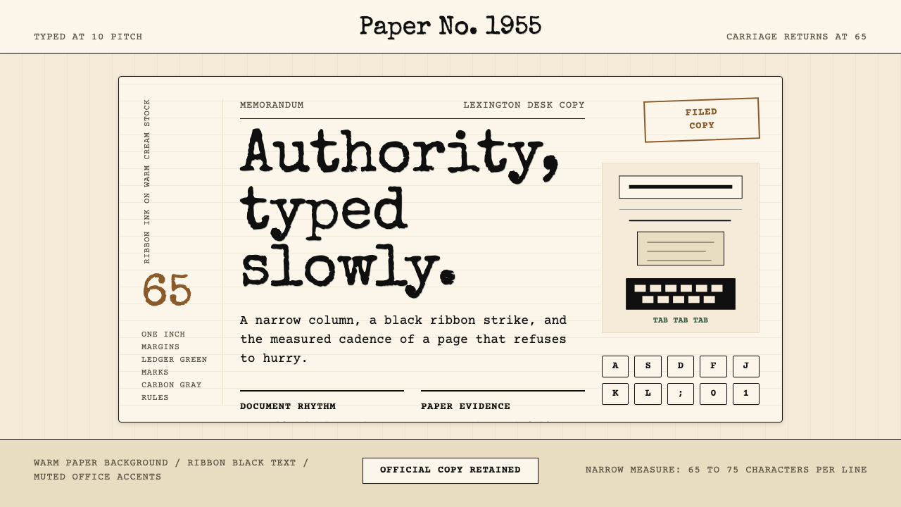 Typewriter Courier (1955)Unhurried authority. Cream paper, ribbon-black monospace, and bordered 65-cha…
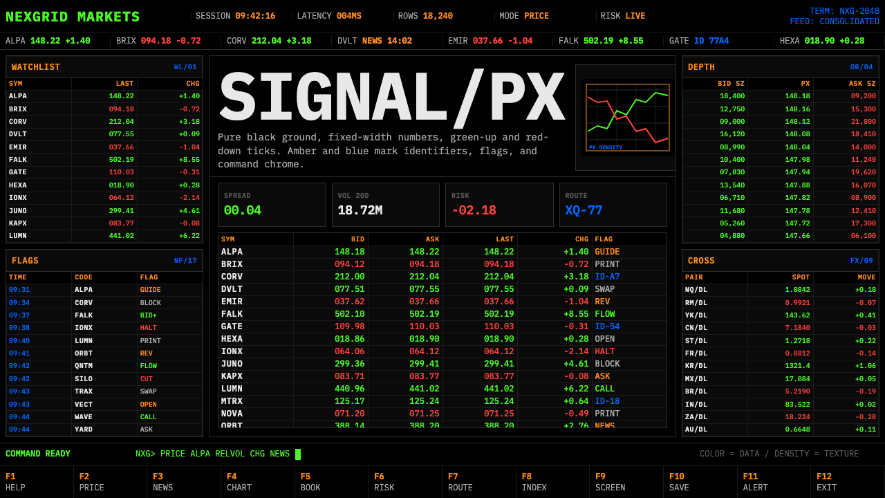 Financial Terminal MonoMaximum signal per pixel. Pure black, IBM Plex Mono, green-red ticks, amber-b…