What is Kraft Paper Packaging?
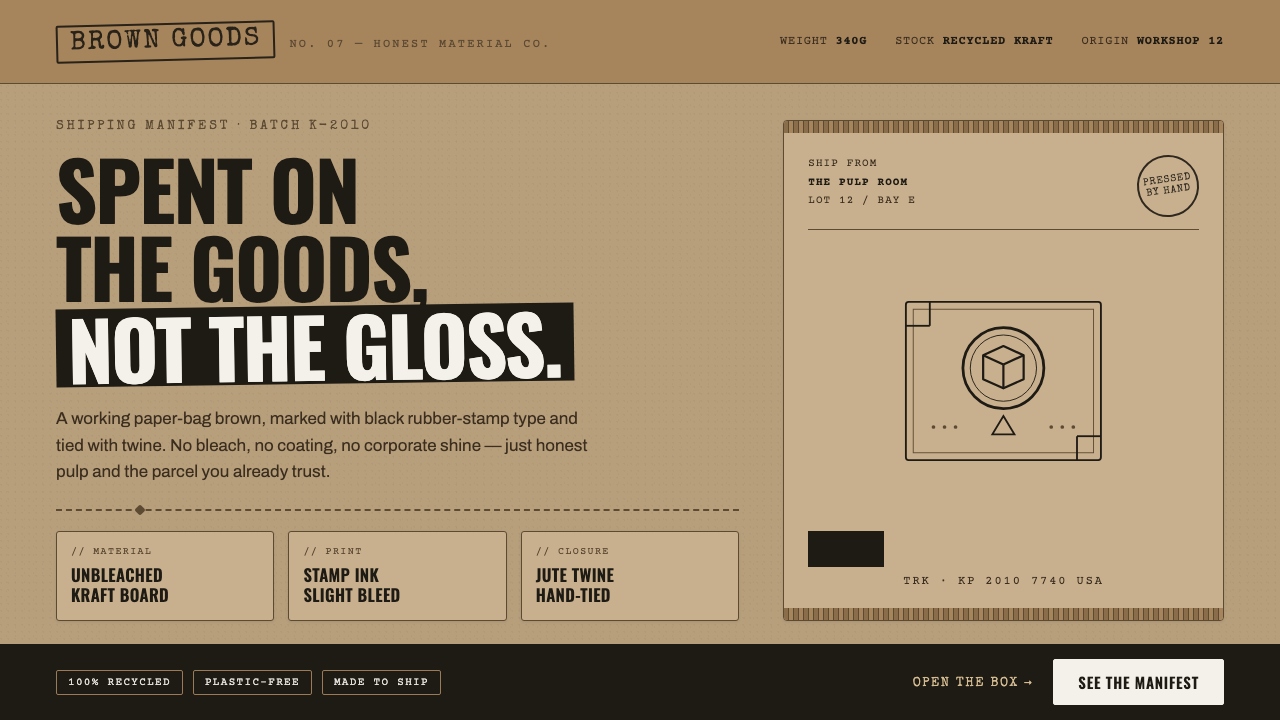
Kraft Paper Packaging puts the goods, not the gloss, at the center: honest paper, blunt ink, visible structure, and the quiet dignity of a parcel made to travel.
Kraft Paper Packaging in brief
Kraft Paper Packaging is the deliberately plain visual language of unbleached cardboard and recycled pulp, associated with DTC commerce and artisan-maker brands from the 2010s to today. Its working-paper brown, black marking ink, corrugated edges, and twine ties communicate craft, sustainability, and material truth before they communicate luxury.
The style rejects the polished neutrality of cream and bleached white. Its background should feel like an actual paper bag or shipping carton: warm, fibrous, and slightly utilitarian. Across that ground, black type behaves like a rubber stamp or shipping label. The surface is allowed to show its grain, and ink may bleed just enough to suggest a physical hand rather than a frictionless digital finish.
Everything is judged by whether it appears useful. A label identifies, a band wraps, a fold protects, and a knot closes. Corrugated flutes are not hidden as imperfections; they become visual evidence of construction. The result is not careless minimalism but a controlled plainness in which the package feels made, handled, and ready to deliver.
Where does Kraft Paper Packaging come from?
The style belongs to the global internet economy rather than to a single geographic school. It emerged through DTC e-commerce, where small brands needed packaging that could carry identity through shipping without requiring the polish or expense of conventional luxury presentation. The parcel itself became a public-facing brand surface.
Its material language grew alongside sustainable honest-material packaging. Recycled pulp, unbleached cardboard, and corrugated board made environmental intention visible instead of merely claiming it in copy. The package showed what it was made from. Brown paper was not disguised as a neutral background; it became the central field from which the brand's character was read.
Independent makers and craft roasters helped establish the vocabulary. Their packages often needed to feel personal, repeatable, and direct: a stamped name, a practical label, a wrapped edge, a tied bundle. The visual system suited products whose value came from making, sourcing, and use rather than from elaborate presentation.
The Etsy-era small-brand scene and sustainable-packaging studios extended the language across categories. What began as a practical response to shipping and production became a recognizable aesthetic: DTC minimalism with tactile evidence left intact. Its authority comes from consistency between appearance and claim. A package that says craft, reuse, and care should look constructed from real material, not merely decorated with rustic signals.
What defines the Kraft Paper Packaging look?
Material Ground
The dominant field is mid kraft-brown: warmer and more practical than beige, but not treated as a luxury neutral. It should recall an unbleached paper bag, recycled carton, or parcel surface. Fibers and slight variation are assets because they establish that the material has not been cosmetically erased.
Stamped Ink
Black is used as marking ink rather than as a polished typographic color. Rubber-stamp lettering, stencil forms, and label-like blocks create the sense of an object identified for handling. Slight bleeding, uneven density, and blunt edges add physical credibility without turning the design into visual noise.
Working Typography
Monospaced typewriter lettering supplies an even, mechanical rhythm, while stencil lettering suggests packing, sorting, and workshop tools. Type is often blunt, highly legible, and arranged like information on a shipping label. Personality comes from the method of marking, not from ornamental letterforms or elaborate font combinations.
Corrugated Structure
Flutes, folds, seams, and scored edges act as graphic features as well as construction details. They introduce repeated linear rhythm and make the package's protection system visible. Structure should feel built into the object, not drawn on afterward as a decorative texture.
Twine and Binding
Twine introduces a tactile closure and a visible act of tying. It softens the industrial character of cardboard without making the package precious. Used sparingly, a knot or wrapped strand can signal hand assembly, small-batch care, and the final human gesture before dispatch.
Functional Plainness
The style keeps decoration subordinate to use. Labels clarify, bands secure, folds protect, and marks identify. Any added element should earn its place by reinforcing craft, sustainability, handling, or product information. The strongest compositions feel restrained because every visible decision belongs to the package's working life.
Who shaped Kraft Paper Packaging?
Independent makers gave the style its intimate scale and practical credibility. Their packaging turned small-batch identity into visible evidence: direct labels, hand-applied marks, simple closures, and materials that could be handled without ceremony. The aesthetic feels personal because it preserves the trace of production.
Craft roasters helped make kraft packaging legible as a sign of care rather than austerity. Their labels and parcel-like formats connect raw material, hands-on process, and everyday ritual, allowing the brown paper ground and black stamp language to carry both provenance and product confidence.
Etsy-era small brands expanded the aesthetic through internet-native commerce. Their packages needed to feel distinct in a crowded feed and sincere when opened at home. Kraft fields, stamped type, twine, and visible folds offered a repeatable identity that remained recognizable across modest production runs.
Sustainable-packaging studios helped turn honest material into a deliberate design position. Their influence lies in making recycled pulp, corrugated board, and unbleached surfaces read as a coherent system rather than as leftover production material. The package communicates responsibility through what it exposes.
How do you use Kraft Paper Packaging today?
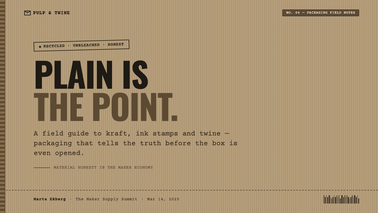
For presentation slides, use the kraft-brown field as a physical stage rather than a decorative background. Cover slides can treat the title like a stamped dispatch label, with a large product-like mark or corrugated edge establishing the tone. Content slides should separate headline, body copy, and metadata as clearly as information on a parcel. Data slides work best when charts feel like inventory marks or packing diagrams, with black carrying the information and small kraft-paper accents reinforcing the material world.
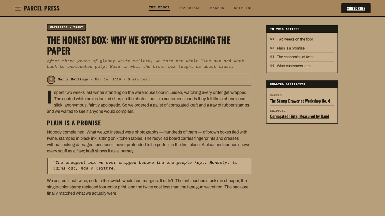
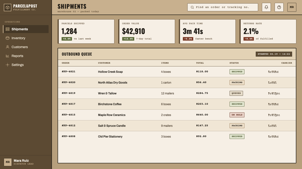
For web interfaces, the language suits dashboards, order systems, maker storefronts, and pricing pages that want to feel transparent and grounded. Use kraft-brown for the main surface, black for readable information, and visible borders or bands to make the interface feel assembled rather than floating. Cards can suggest folded stock or labeled parcels; controls should read as practical instruments. Pricing tiers should be differentiated through labels, bands, or stamps, not through glossy gradients or ornamental effects.
For editorial work, build a narrow, label-like reading column inside a broader field of paper. Metadata can sit beside the article as if it were handling information, while section breaks use ruled marks, folds, or compact stamped headings. Images should feel selected and packed rather than theatrically presented. The page gains authority when its material cues support the subject instead of competing with the reading experience.
For marketing, Kraft Paper Packaging works especially well for artisan goods, small-batch products, sustainable services, and brands that want to foreground making and provenance. A campaign can move between parcel labels, wrapped bundles, product notes, and close views of fibers or corrugation. Calls to action should remain direct and useful, phrased like an instruction or dispatch rather than a luxury invitation. The visual promise is care made visible, not scarcity manufactured through polish.
The common mistake is treating the style as a costume: adding random stamps, faux fibers, twine illustrations, and brown backgrounds without giving any element a job. Rustic signals quickly become theatrical when the package does not feel operational. Keep the vocabulary limited, make the information hierarchy blunt, and let material evidence do the emotional work. The result should feel honestly made, not artificially distressed.
Kraft Paper Packaging — FAQ
Is Kraft Paper Packaging simply a rustic brown color palette?
No. The brown field is only the material ground. The style depends on a relationship between unbleached paper, black marking ink, practical typography, visible construction, and useful labels or closures. Remove the working logic and keep only the color, and the result becomes generic rustic decoration rather than Kraft Paper Packaging.
Why does the style avoid cream and bleached white?
Because those surfaces suggest refinement and neutrality, while Kraft Paper Packaging wants the material to announce itself. A real working-paper brown carries the history of the parcel, the pulp, and the production decision. The refusal is not about making a surface darker; it is about letting the package look like what it is.
How should typography feel in this aesthetic?
Typography should feel stamped, typed, stenciled, or labeled. Monospaced typewriter forms create a steady practical rhythm, while stencil letters suggest sorting, packing, and workshop use. Keep the hierarchy clear and the forms legible. Character should come from physical marking and placement, not from ornamental type treatment.
Can the style work for a polished digital product?
Yes, when the product values transparency, craft, sustainability, or direct service. It is particularly effective for dashboards, order tools, maker storefronts, and pricing experiences that benefit from a grounded, operational tone. It is less convincing when applied merely as a decorative skin to a product whose experience is otherwise glossy, ornamental, or detached from material reality.
Related design styles
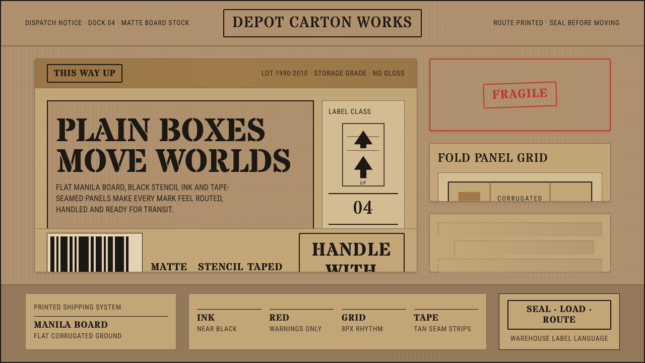 Cardboard Box CraftPlain utility has texture. Manila board, black stencil type, tape seams, red…
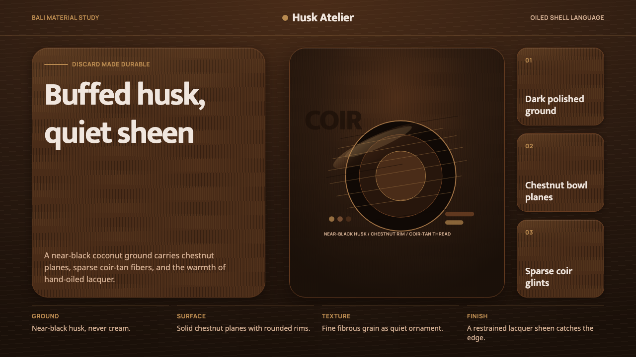 Balinese Coconut ShellQuietly hand-oiled. Near-black husk, chestnut planes, and sparse coir-tan gra…
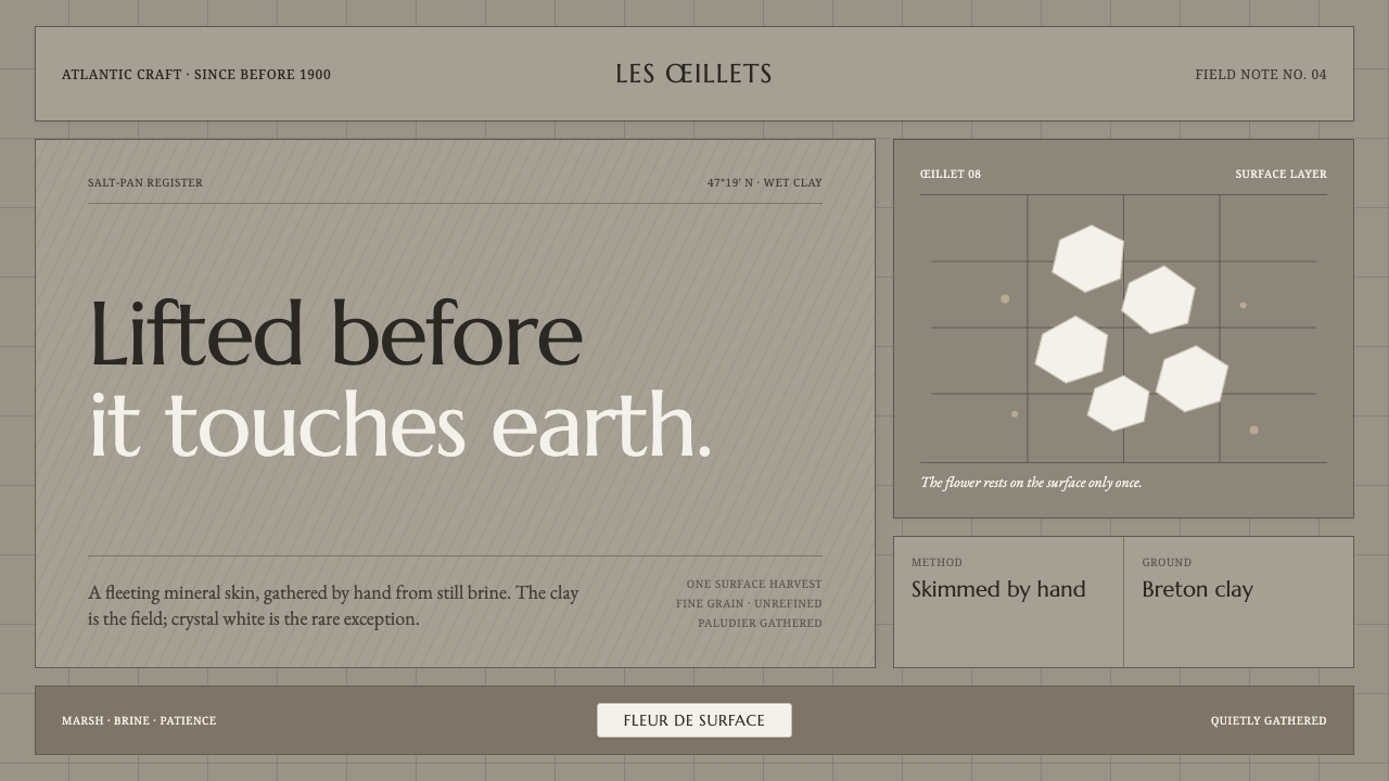 Guérande Fleur de SelCrystal white is the exception. Mineral serif and hairline grids rise from we…
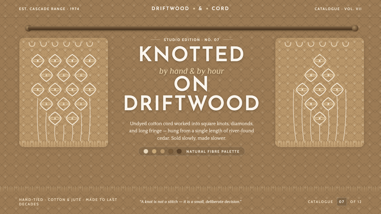 Macramé Fiber ArtSlow craft, hand to fiber. Undyed ecru cotton on raw-jute walnut, square knot…
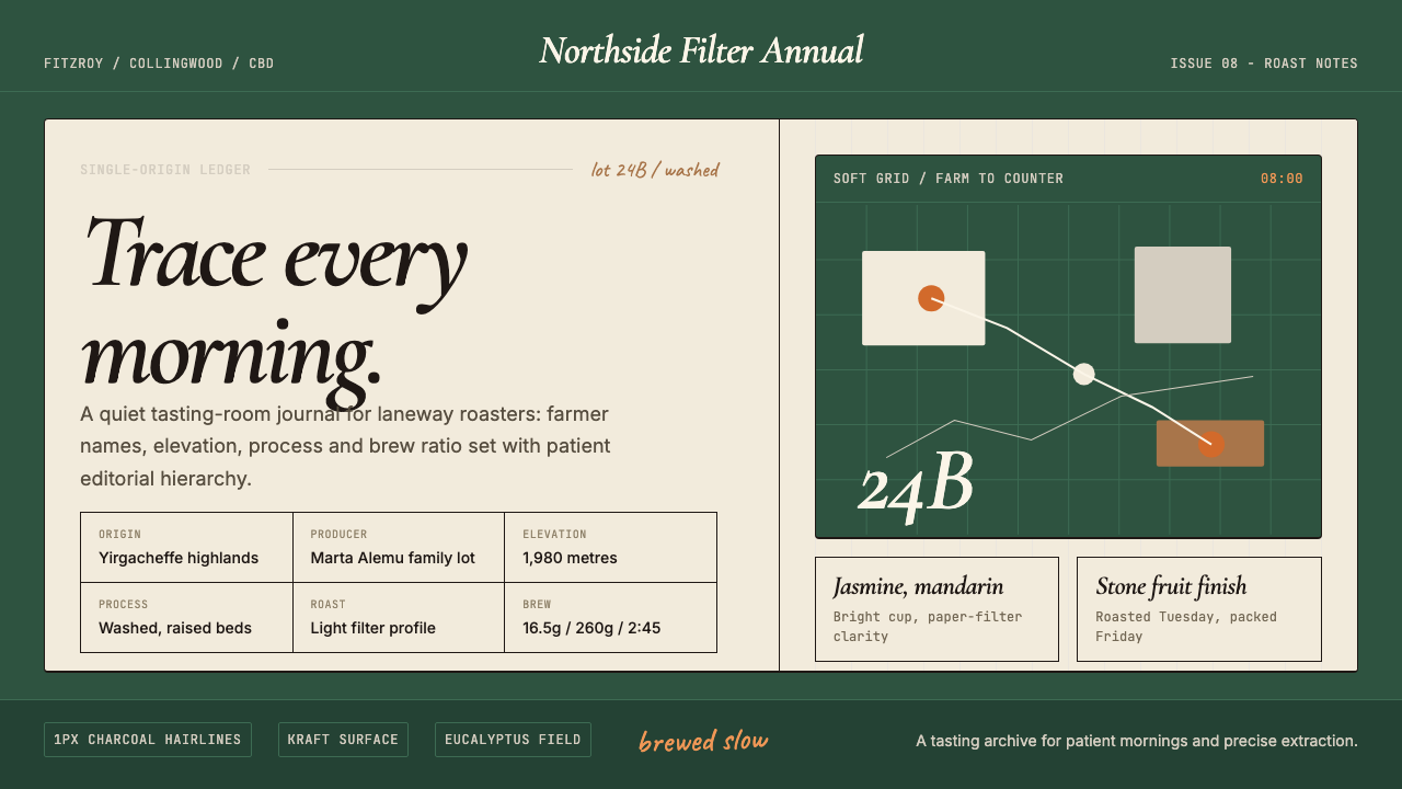 Melbourne Third-Wave Coffee ModernQuiet provenance. Eucalyptus green, cream cards and italic serif tables pace…
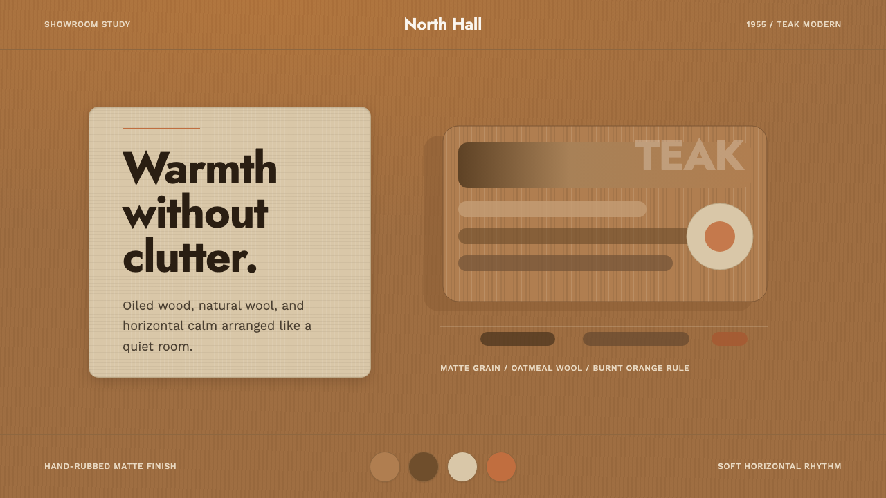 Scandinavian Teak ModernWarmth without clutter. Teak grain, oatmeal wool, and one burnt-orange rule h…