What is Icelandic Lopapeysa?
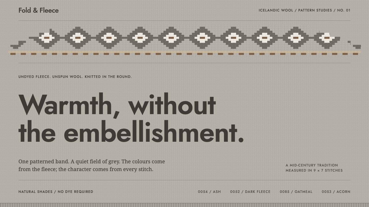
The lopapeysa puts one band of stepped geometry on a field of flecked, sheep-coloured grey, and trusts that to be enough.
Icelandic Lopapeysa in brief
The lopapeysa (Icelandic for 'lopi sweater') is a round-yoke sweater knitted in the round from lopi, the soft, thick, essentially unspun strand of Icelandic fleece. Its visual identity is easy to describe and hard to fake: a wide, plain body in a heathered natural colour, one concentrated ring of stepped geometric pattern across the shoulders and chest, and neat ribbed edges at the neck, cuffs and hem. Read as a design system, it is a lesson in restraint: warmth that is carried by material and structure rather than by accumulation.
The garment's authority comes from the fact that its look is a by-product of how it is made. Knitting in the round with a thick fleece yarn produces a seamless tube; shaping the shoulders into a yoke means the pattern can be worked as a closed circle that narrows with the neckline. Every motif is built from stitches, so every motif steps along a grid. Diagonals become staircases, circles become faceted rosettes, and nothing curves smoothly. Colour comes from the sheep rather than from a dye catalogue: white, several greys, oatmeal, acorn brown and a near-black, each matching a real shade of commercial Icelandic yarn.
It also has a precise place in time. The lopapeysa belongs to the middle of the twentieth century, roughly the 1950s through the 1990s in the record, and not to the Viking age or the medieval north, however easily popular imagery blurs the two. A good design in this style says so honestly. It is folk-revival design built on a home-knitting economy, not an archaeological reproduction, and that candour about period is part of what makes the system feel credible rather than themed.

Where does Icelandic Lopapeysa come from?
The lopapeysa belongs to the family of Nordic yoke knitting, in which the upper body of a sweater is worked as a circular, patterned shoulder piece that narrows toward the neck. The theme's record names a specific reference point for the yoke form: the 1930 pattern chart of Annichen Sibbern Bøhn. The detail matters because a chart is a grid. Each square stands for one stitch and one colour, and a designer who works from a chart thinks in steps, repeats and mirror symmetry rather than in freehand curves. The visual grammar of the Icelandic sweater, countable, stepped and symmetrical about its centre, starts here.
Consolidation came after the Second World War. The record dates the garment's settled form to the period between the 1950s and the 1990s, and it names Auður Laxness among the key figures of that consolidation. This is a useful corrective to the usual picture of timeless tradition. The lopapeysa was assembled in the mid-century from a Nordic charting method, a local fibre and a culture of home knitting, at a time when handcraft across the Nordic countries was being rediscovered as a form of national identity. Historians of design sometimes call this pattern folk-revival design: tradition built consciously, with modern means, then lived in so thoroughly that it feels old.
The material is the second origin. Lopi is made from Icelandic fleece that is barely twisted, so the strand stays soft, lofty and slightly uneven, and the knitted fabric shows tiny flecks where darker and lighter fibres meet. The sheep's own colours gave knitters a ready-made palette, and the Álafoss and Ístex yarn production named in the record turned those colours into a numbered range, so that a given grey could be bought again and matched. The record describes the wider setting as an Icelandic domestic craft economy: knitting done in homes, supplied by a national wool industry, and woven into household life.
What emerges over those four decades is not a single inventor's style but a shared logic that individual knitters varied endlessly: a plain field, one pattern ring, a limited natural palette and ribbed finishing. Because the logic is structural, it survives translation into other media. That is why the lopapeysa works as a design system at all. Its rules concern proportion and restraint, and any surface, whether a slide, a web page or a printed leaflet, can obey them.
What defines the Icelandic Lopapeysa look?
Colour from the animal
The palette is the sheep's own range: white, several greys from pale to dark, oatmeal, acorn brown and a near-black. There are no dyed brights. Contrast is made by stepping between light and dark natural tones, so the strongest accent on the page is simply the darkest or lightest fleece colour. Warm brown is the nearest thing to a highlight, and it is used sparingly against the grey field.
The heathered field
The ground is never flat. Flecks of darker and lighter fibre run through the grey, so large areas carry a quiet, even texture that reads as wool rather than paint. In interface terms, the background should feel faintly speckled or tonal, neither a dead flat fill nor a glossy gradient. The texture is the warmth.
One ornamental band
All of the pattern is concentrated in a single ring across the shoulders. Below it, the body is plain. This ratio, a large quiet field and one dense band, is the system's central proportion. The band is not decoration scattered across the garment; it is a crown, and its force comes from everything around it being calm.
Stitch-grid geometry
Every motif is built on a grid of stitches, so diagonals become staircases and circles become faceted rosettes or stars. Nothing curves smoothly, and nothing is softened by blur: edges step. Patterns repeat in rows, are usually mirrored about the centre, and are separated into narrow bands by plain stripes between them.
Ribbed edges
Where the garment meets the body, at neck, cuffs and hem, the knit changes to ribbing, a fine vertical texture that holds the shape. In a layout the equivalent is a finishing detail: tight, evenly spaced parallel lines on borders or dividers, small in scale and used where a surface ends, never as a major feature.
Matte, lofty, structural
There is no gloss, no glow and no cast shadow. Depth comes from loft: the thick yarn gives a gentle, tactile relief, but the surface stays matte. Shapes are practical rather than ornate, with a slightly irregular, handmade tolerance. The mood is cosy but disciplined, which is what warmth without excess looks like.
An honest period
The system looks mid-century, not medieval. Avoid runes, knotwork, dragon heads and pseudo-ancient lettering; the reference is a twentieth-century home-knitted garment and its charts. A plain, sturdy, human text face and generous spacing complete the tone.

Who shaped Icelandic Lopapeysa?
Her 1930 chart is the reference the record gives for the yoke form behind the lopapeysa. Its significance is conceptual as much as visual: a chart reduces a motif to a grid of stitches, which is why the pattern vocabulary of the garment is stepped, symmetrical and countable. She stands in the theme as a reminder that the 'traditional' look was partly assembled from published patterns.
Listed among the key figures of the garment's mid-century consolidation. Her name is the one most often attached to the popularisation of the yoke sweater in Iceland after the Second World War. For a designer, the lesson is that the lopapeysa was shaped by people who wrote, charted and taught as well as knitted, and that a style can be both folk and consciously designed.
The Icelandic wool company named in the record alongside Álafoss for yarn production. Its numbered range of natural shades is what lets the palette be specified and reproduced: a grey is not a mood but a shade that can be ordered again. That habit of naming and numbering real colours is the same discipline a design system asks of its own palette.
How do you use Icelandic Lopapeysa today?
The lopapeysa style suits products whose value is warmth, craft and trust: outdoor and travel brands, food and home goods, schools and community projects, wellness and slow-living services, anything that wants to feel handmade without looking rustic. Its single organising idea, one concentrated ornament in a great deal of quiet, is easy to carry across media, provided you keep the proportions honest.
For presentation slides, treat the cover as the garment itself. A wide heathered grey field fills the slide, a single stepped band crowns the top or bottom edge, and the title sits below it in plain, sturdy type. Content slides stay almost bare: text on the grey field, a hierarchy built only from size and weight, and the band reduced to a thin echo or removed entirely. The full band returns only at section breaks. Data slides suit the style naturally, because bar charts and step charts are made of square increments; colour them from the natural palette and let the darkest tone carry the key series.
For web interfaces, put the band across the top of the hero and let the rest of the page be calm. Body sections use the heathered ground with no gradients or soft glows; cards are defined by fine tonal edges rather than cast shadows; buttons are near-black or acorn brown with squared, practical corners. Fine ribbed rules mark the end of sections or the borders of inputs. The style is excellent for storefronts, content sites and onboarding flows. For very dense dashboards it may feel too gentle, so use the palette's lightest and darkest tones to restore contrast where numbers must be scanned quickly.
For editorial and marketing work, the stepped band becomes a recurring section marker: one at the head of a feature, perhaps a thinner version above pull quotes, never between every paragraph. Photography of knitwear, landscape and hands at work sits well on the grey field, and captions can use plain, factual language, even naming the real shades of yarn. The copy voice should be modest and specific, in keeping with a garment that never raises its voice.
The most common mistake is wallpapering. Scattering the pattern across every card and header destroys the one-band logic that gives the style its force, and it turns a disciplined system into a generic winter print. Close behind are cliches: reindeer, snowflakes, runes and Viking cues that the record explicitly rules out, and smooth curved motifs that no stitch grid could produce. Keep the pattern stepped, keep it in one place, and let the grey field do the rest.

Icelandic Lopapeysa — FAQ
What does lopapeysa mean, and what is lopi?
Lopapeysa is Icelandic for a sweater (peysa) made of lopi. Lopi is the thick, soft, essentially unspun strand of Icelandic fleece used to knit it. Because the yarn is so lofty and barely twisted, the fabric is warm and slightly flecked, and that flecked texture is what the design system translates into its heathered grey ground.
Is the lopapeysa a Viking or medieval design?
No. The record places the garment in the mid-twentieth century, with its yoke form traced to a 1930 pattern chart and its settled shape consolidated after the Second World War. It is mid-century folk-revival design. A faithful use of the style therefore avoids runes, knotwork and other medieval cues and lets the stepped, charted geometry and natural wool colours carry the identity.
Why does the style use only natural colours?
Because the palette comes from the sheep, not from a dye book. White, several greys, oatmeal, acorn brown and a near-black are the fleece's own range, and the yarn producers numbered them as real shades. Restricting a design to that range gives it a calm, coherent look and makes its few contrasts meaningful. Adding a saturated accent would break the logic that the colour is a material, not a decoration.
Can the lopapeysa style work on a dark background?
It is fundamentally a light, heathered style, but the palette does include a near-black, so a dark variant is possible: use the deep fleece tone as the ground, keep the flecked texture, and let oatmeal and pale grey carry the single pattern band. It will feel more nocturnal and less cosy, and the key is still to keep the pattern in one place and avoid bright accents that no sheep could supply.
How is it different from generic Scandinavian minimalism?
Scandinavian minimalism usually means clean white surfaces, pale wood and almost no pattern. The lopapeysa system keeps the restraint but adds two things: a textured, tonal ground that reads as wool, and one strongly patterned band that gives the page a focal point. It is also grid-based and stepped where minimalism tends to be smooth and soft-edged, and it is not the snowflake-and-reindeer styling of a holiday card.
Related design styles
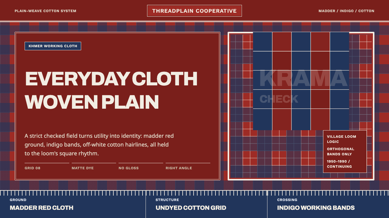 Cambodian Krama CheckPlain cloth has authority. Madder red, indigo bands, and cotton grid lines do…
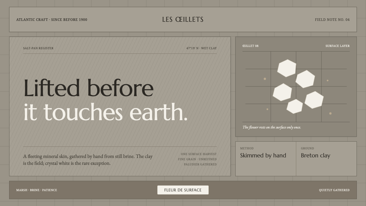 Guérande Fleur de SelCrystal white is the exception. Mineral serif and hairline grids rise from we…
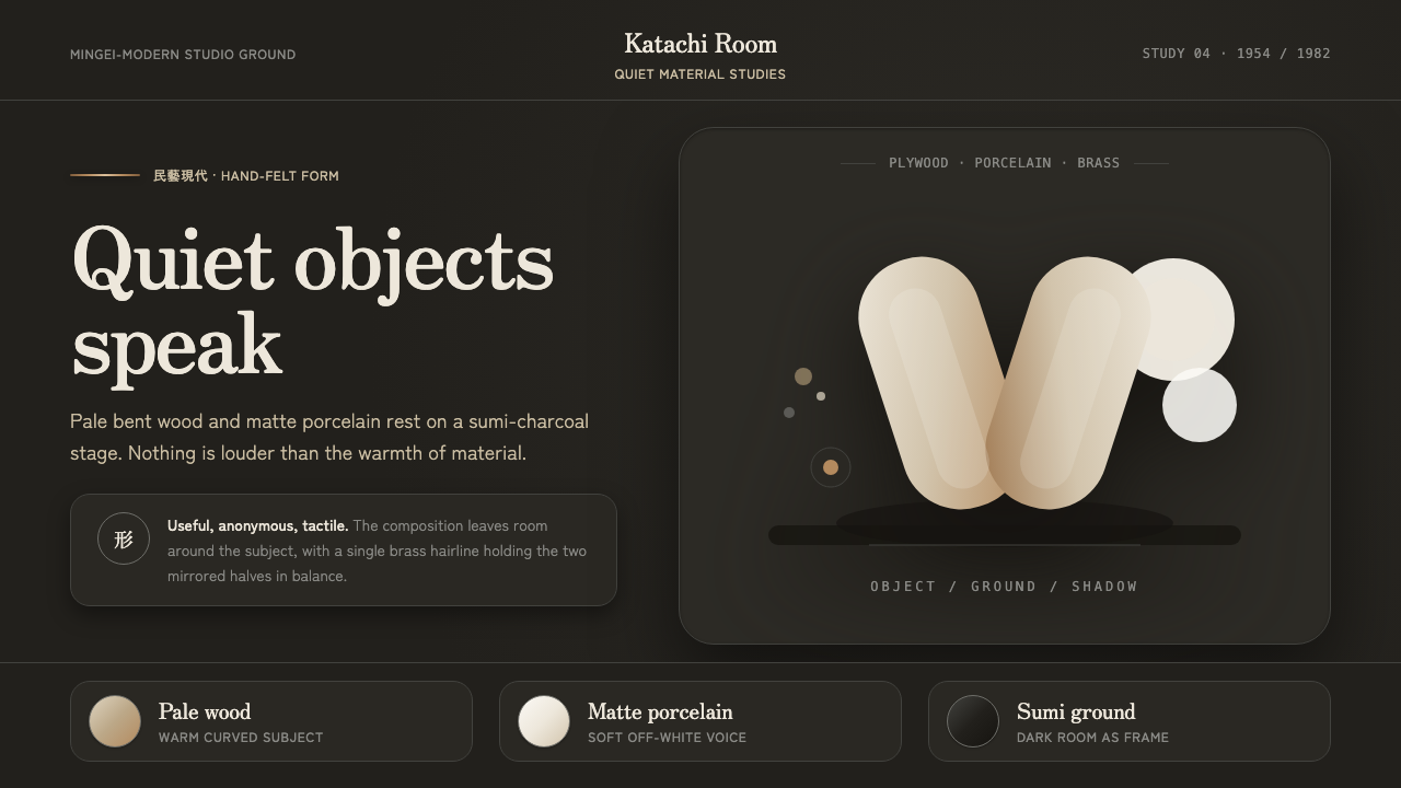 Sori Yanagi ButterflyQuiet objects speak. Pale plywood and matte porcelain glow on a sumi-charcoal…
 Kraft Paper PackagingThe goods, not the gloss. Mid kraft-brown fields, black rubber-stamp type, co…
 Scandinavian Teak ModernWarmth without clutter. Teak grain, oatmeal wool, and one burnt-orange rule h…
 Shona Serpentine SculptureStone breathes in shadow. Oiled green surfaces and honey-amber veins catch th…