What is Sori Yanagi Butterfly?
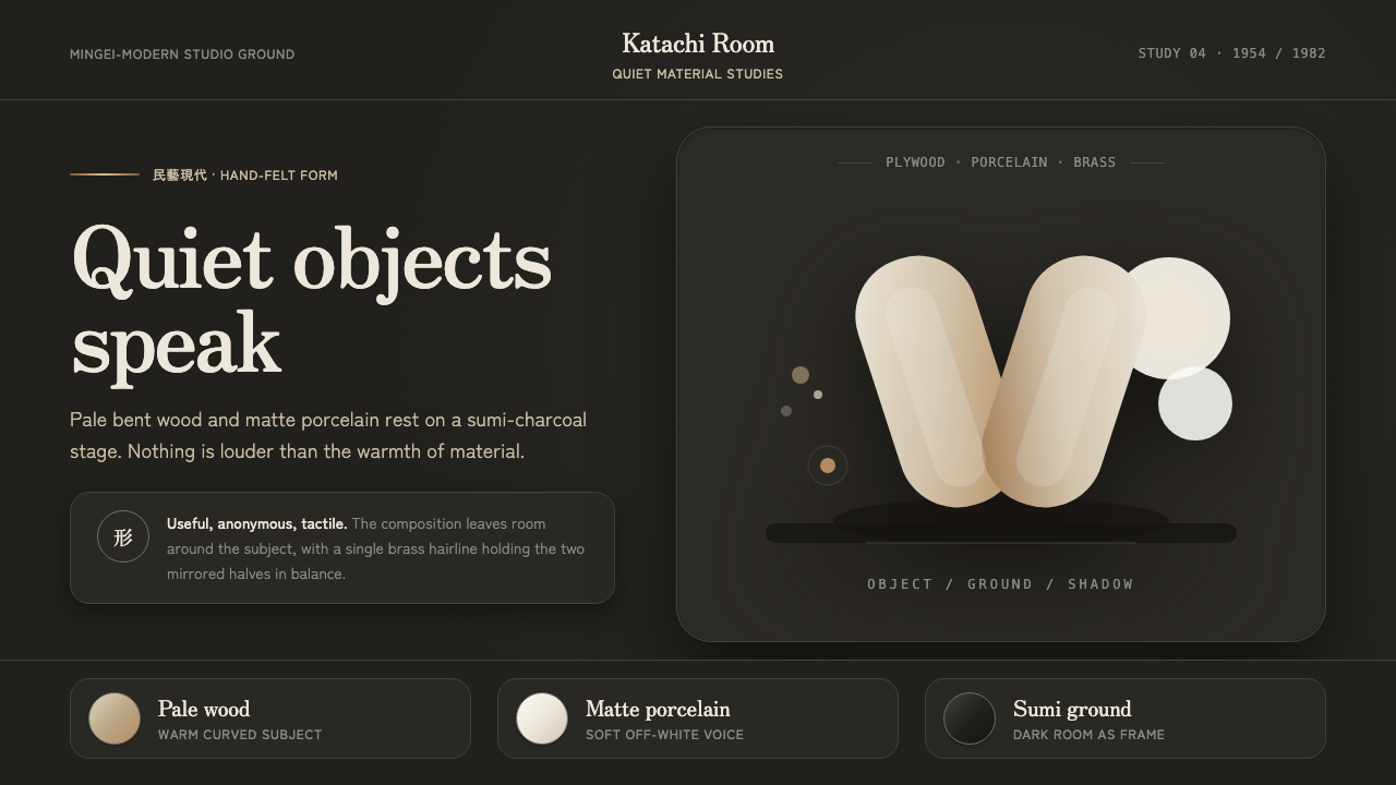
Sori Yanagi Butterfly gives Japanese Mingei-modern design its quietest register: pale wood, matte porcelain, a charcoal room, and forms that ask to be touched before they are explained.
Sori Yanagi Butterfly in brief
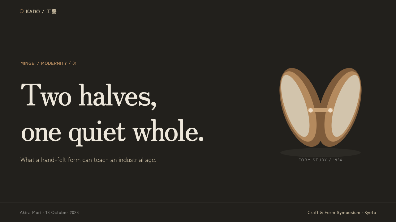
Sori Yanagi Butterfly is a material-led visual language drawn from Sori Yanagi’s Japanese Mingei-modern industrial design. Its central image is the 1954 Butterfly Stool: mirrored panels of molded rosewood or maple plywood, curved into a poised open form and joined by a brass bar. Beside it sits Yanagi’s white-porcelain tableware of 1982, whose warm, matte off-white surface brings the same restraint from furniture into everyday dining objects.
The style is dark without being severe. A sumi-charcoal ground withdraws so that pale plywood, porcelain, and brass can appear with unusual presence. The palette is not theatrical contrast for its own sake; darkness gives the object a room, while the light material seems to retain warmth. The result feels closer to a still-life photograph than a display system: each object has air around it, and each surface is allowed to remain legible.
Its governing principle is restraint through material honesty. Wood should be read as bent plywood, porcelain as quiet clay, and brass as a small structural interruption rather than a luxury accent. The composition does not compete with the object through decorative pattern, bright interface chrome, or visual noise. It makes a case for attention by lowering the volume of everything else.
Where does Sori Yanagi Butterfly come from?
The source period for this language runs from 1950 to 1990, in Japan, with the Butterfly Stool of 1954 and white porcelain tableware of 1982 as its clearest anchors. It belongs to the meeting point of the Mingei folk-craft revival and Japanese mid-century Mingei-modern industrial design. That meeting is crucial: the work is industrially made in character, yet it preserves the tactile appeal associated with craft.
The Butterfly Stool establishes the vocabulary in a single object. Its mirrored plywood panels are not treated as flat boards awaiting ornament; they are the form itself. Their bend produces both silhouette and structure, while the brass bar makes the joining mechanism visible. The stool therefore feels composed rather than decorated, with every visible part participating in how it stands and how it is recognized.
Yanagi’s approach is described as having been felt into form by hand rather than drawn on paper. This phrase does not reject industry; instead, it gives industrial material a bodily standard. A successful form should feel right in the hand, in the eye, and in relation to use before it is rationalized as an abstract diagram. The gentle tension of the Butterfly Stool becomes a model for the wider system.
The 1982 porcelain tableware carries this Mingei-modern idiom into a different material and scale. Its warm matte off-white ceramic does not imitate wood, nor does it seek glossy refinement. Together, the stool and tableware define a world in which crafted sensitivity survives inside repeatable objects. Pale materials are placed against darkness, and the resulting atmosphere is intimate, measured, and quietly modern.
What defines the Sori Yanagi Butterfly look?
Charcoal Ground
The background should behave like a sumi-charcoal room: deep, absorbent, and visually recessive. It is not a dramatic black stage. Its job is to remove competing context so pale wood and porcelain can appear luminous, tactile, and close.
Pale Material
Plywood and porcelain are the primary light sources of the composition. Their pale appearance should remain warm rather than clinical, with grain, clay character, and gentle surface variation carrying more interest than graphic color.
Molded Curve
The defining geometry is not a sharp geometric symbol but a controlled bend. Curves should feel load-bearing and hand-tested, as though they emerged from the behavior of the material. Avoid ornamental swoops that do not explain form, balance, or use.
Matte Tactility
Surfaces should invite touch before they demand attention. Matte porcelain, softly finished wood, and restrained brass prevent reflections from becoming the subject. Texture is present, but it is never amplified into rustic spectacle or luxury gloss.
Visible Joinery
The brass bar in the Butterfly Stool provides a useful rule: structural detail may be visible when it clarifies the object. A join should read as a necessary relationship between parts, not as jewelry added after the form has already been resolved.
Quiet Composition
Composition relies on isolation, spaciousness, and a small number of carefully placed objects. The visual hierarchy comes from material contrast and silhouette, not from crowded labels or decorative framing. Empty space is part of the object’s presence.
Who shaped Sori Yanagi Butterfly?
Yanagi is the central designer of this language. The 1954 Butterfly Stool and the 1982 white-porcelain tableware establish its most direct material references: molded plywood, visible brass structure, warm matte ceramic, and a form of modernity that remains tactile rather than abstract.
Sōetsu Yanagi appears among the key figures surrounding the Mingei folk-craft revival named in the source. Within this visual system, Mingei matters as the cultural condition that keeps usefulness, touch, and everyday objects connected rather than separating them into craft and industry.
Tendo Mokko is identified as a key name in the source context for the Butterfly period. Its inclusion reinforces that this aesthetic is not only a photographic mood or a furniture silhouette; it is grounded in the industrial realization of carefully shaped plywood.
Vitra is also named among the key figures in the source material. In this system, it stands as part of the continuing design context around the Butterfly Stool, whose quiet authority depends on preserving the legibility of its material, curve, and visible joining detail.
How do you use Sori Yanagi Butterfly today?
For presentation covers, use the stool or a similarly quiet material study as the central subject rather than as decoration. Place a pale object against a charcoal field, keep the title restrained, and let the silhouette establish the first impression. Content slides should feel like a dark room with a small pool of attention: concise text, generous breathing space, and a clear distinction between object, caption, and supporting note.
Data slides can borrow the same discipline without turning information into furniture photography. Use the dark ground to recede, reserve pale tones for primary values, and let brass-like warmth mark only the most consequential comparison or conclusion. Charts should retain their own logic, with calm labels and uncluttered axes, so that contrast directs reading rather than merely adding atmosphere.
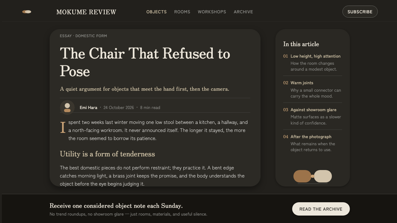
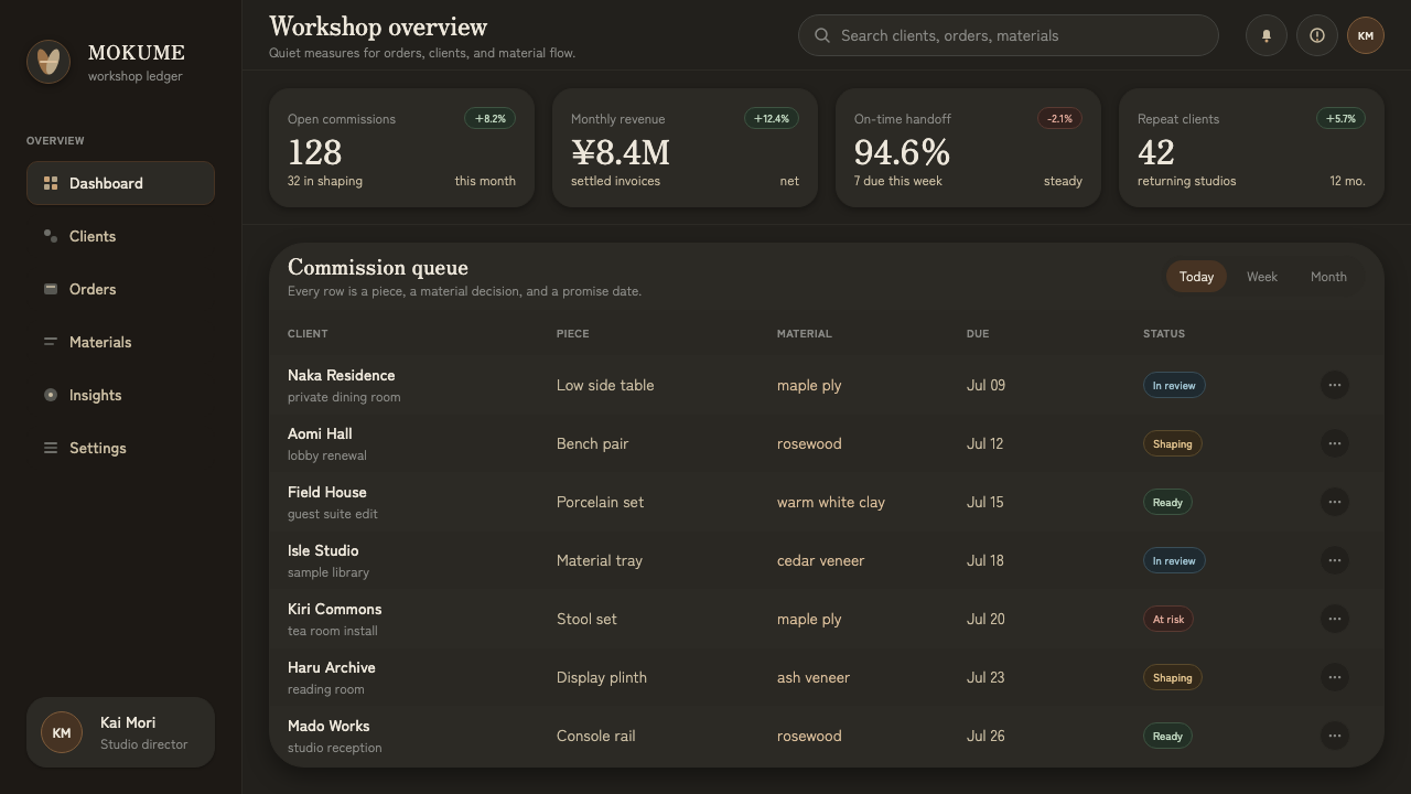
For web interfaces, this language is especially effective for product catalogs, material libraries, editorial commerce, and considered dashboards. A dark interface should be treated as a gallery-like environment, not a place to fill with bright controls. Use pale surfaces for records, selected states, and tactile product details; allow navigation and utility information to stay visually quiet until it is needed.
For pricing or comparison pages, let material hierarchy do the work usually assigned to decorative cards. One offer or recommendation can receive a warmer pale treatment, while alternatives remain quieter against the charcoal field. The emphasis should feel like an object brought closer under light, not like an urgent badge demanding action. This preserves the style’s confidence and avoids turning restraint into luxury theater.
The common mistake is confusing darkness with premium excess. Glossy black surfaces, metallic ornament everywhere, oversized product drama, and aggressively sparse copy all weaken the Mingei-modern balance. The better approach is to make the background recede, keep surfaces matte and believable, and use contrast only where it helps a person understand material, structure, or choice.
Sori Yanagi Butterfly — FAQ
Is this style simply Japanese minimalism?
No. Minimalism describes an outcome of reduction, while this system is specifically rooted in Mingei-modern industrial design and in the material references of Sori Yanagi’s work. Its quietness comes from tactile plywood, matte porcelain, visible structure, and a charcoal photographic setting. Removing content alone will not produce the same result.
Why is the background so dark when the objects are so gentle?
The charcoal ground is a framing condition, not an emotional statement. It withdraws visual competition and makes pale wood and ceramic easier to read as materials. The darkness gives the object atmosphere and separation, while the warmth comes from the object’s own surface rather than from decorative color.
Can the style work without a Butterfly Stool image?
Yes. The stool is a precise reference, but the transferable principles are material warmth, controlled curves, matte tactility, visible structural logic, and quiet composition. A pale ceramic vessel, a bent wood detail, or another honest everyday object can carry the language if the setting remains restrained.
Should brass become a dominant accent color?
Usually not. In the Butterfly Stool, brass has force because it is limited to a clear joining role. Treat it as a small moment of warmth or structure, not as a broad decorative finish. If brass appears everywhere, the eye stops reading it as a necessary detail and begins reading it as styling.
What makes an application feel inauthentic?
It becomes inauthentic when it borrows the charcoal-and-cream mood while ignoring material logic. Excess gloss, ornamental curves, crowded product staging, and decorative metallic effects turn a quiet object study into a luxury cliché. The test is simple: can every visible choice be connected to material, use, or attention?
Related design styles
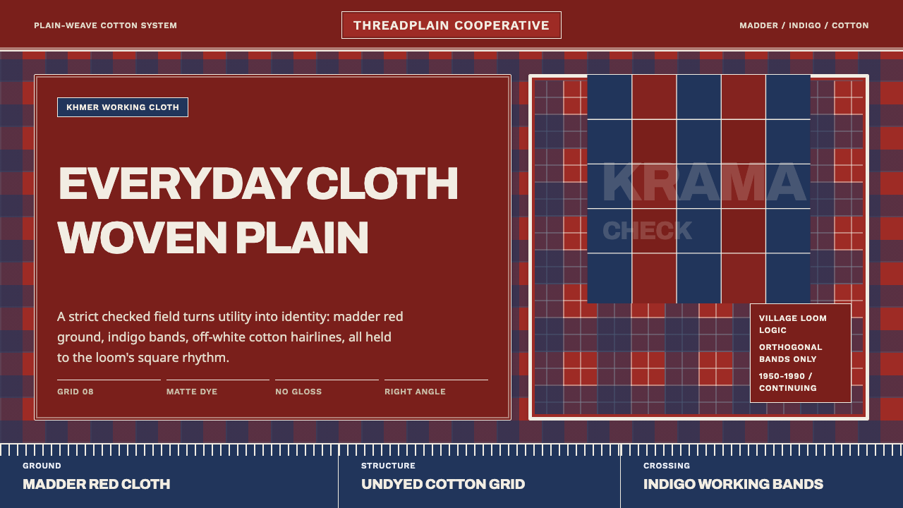 Cambodian Krama CheckPlain cloth has authority. Madder red, indigo bands, and cotton grid lines do…
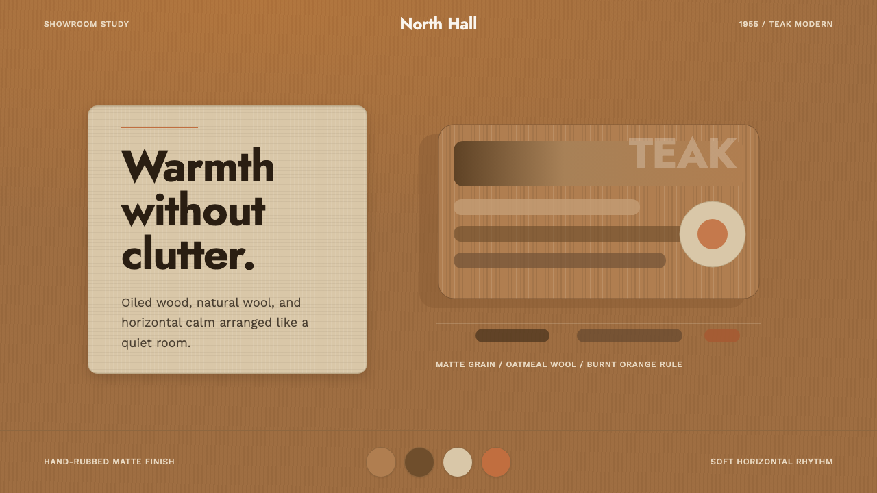 Scandinavian Teak ModernWarmth without clutter. Teak grain, oatmeal wool, and one burnt-orange rule h…
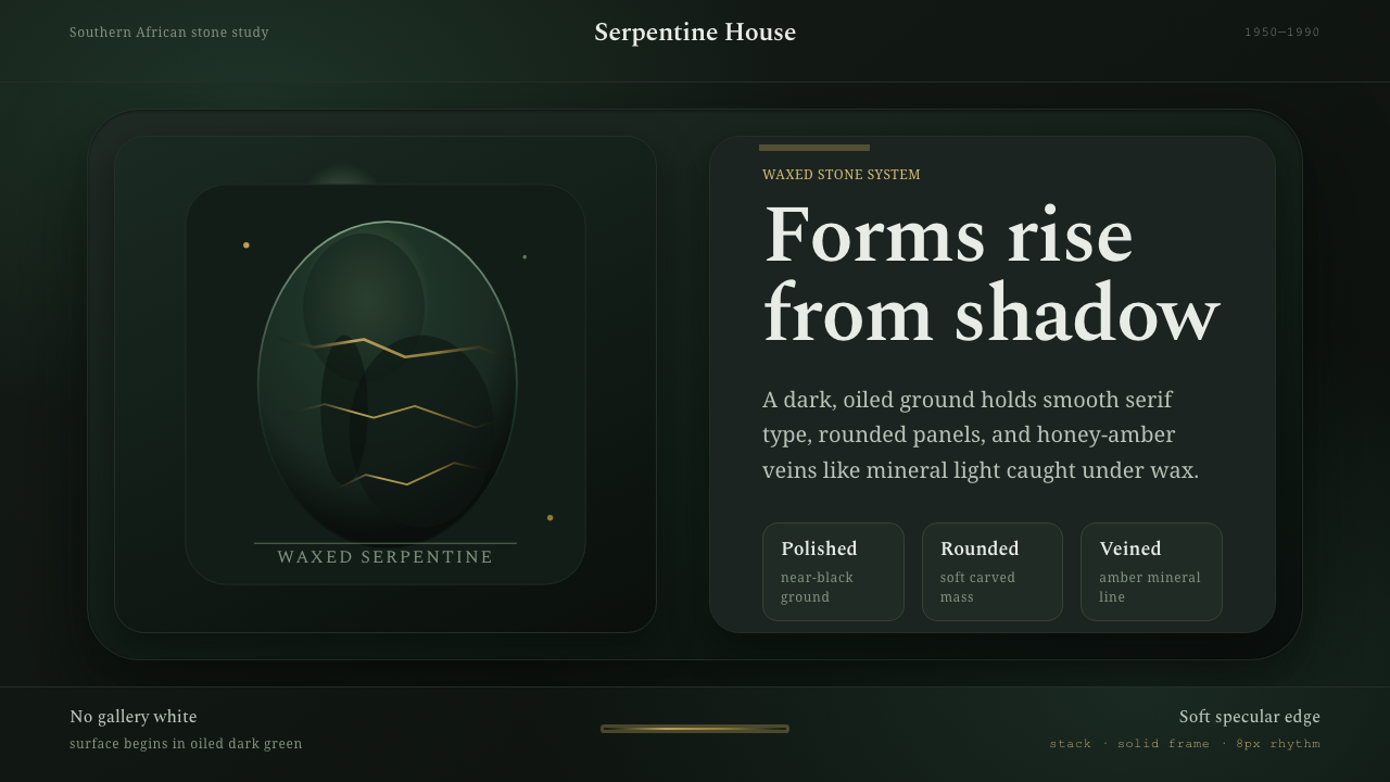 Shona Serpentine SculptureStone breathes in shadow. Oiled green surfaces and honey-amber veins catch th…
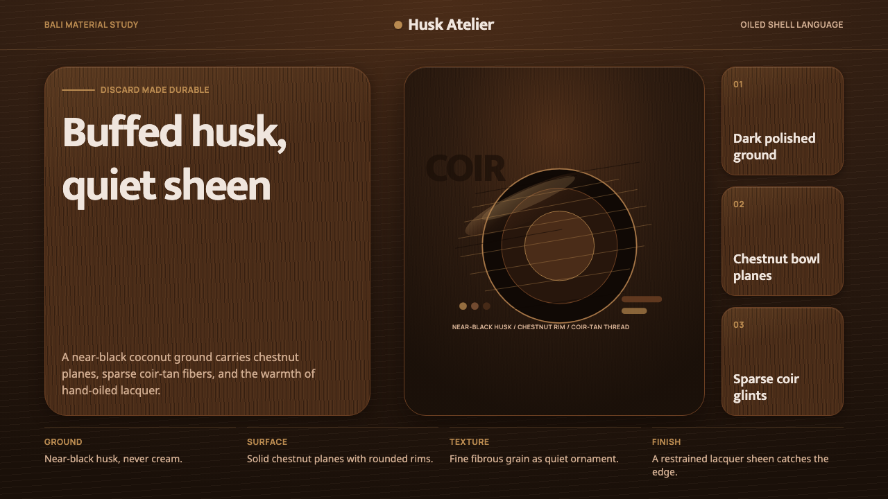 Balinese Coconut ShellQuietly hand-oiled. Near-black husk, chestnut planes, and sparse coir-tan gra…
 Matcha Latte Powder GreenA single vivid green at full strength. Stone-ground matcha on a dark tea-bowl…
 Wool FeltingHandmade stillness. Oatmeal-gray felt, humanist serifs, and soft rolled panel…